Fall is my favorite season of the year. Thus far, Texas isn’t really cooperating. It’s unseasonably warm for November and the leaves have only just started to hint at changing color. I’m ready for sweater weather and a big pile of leaves in the yard!
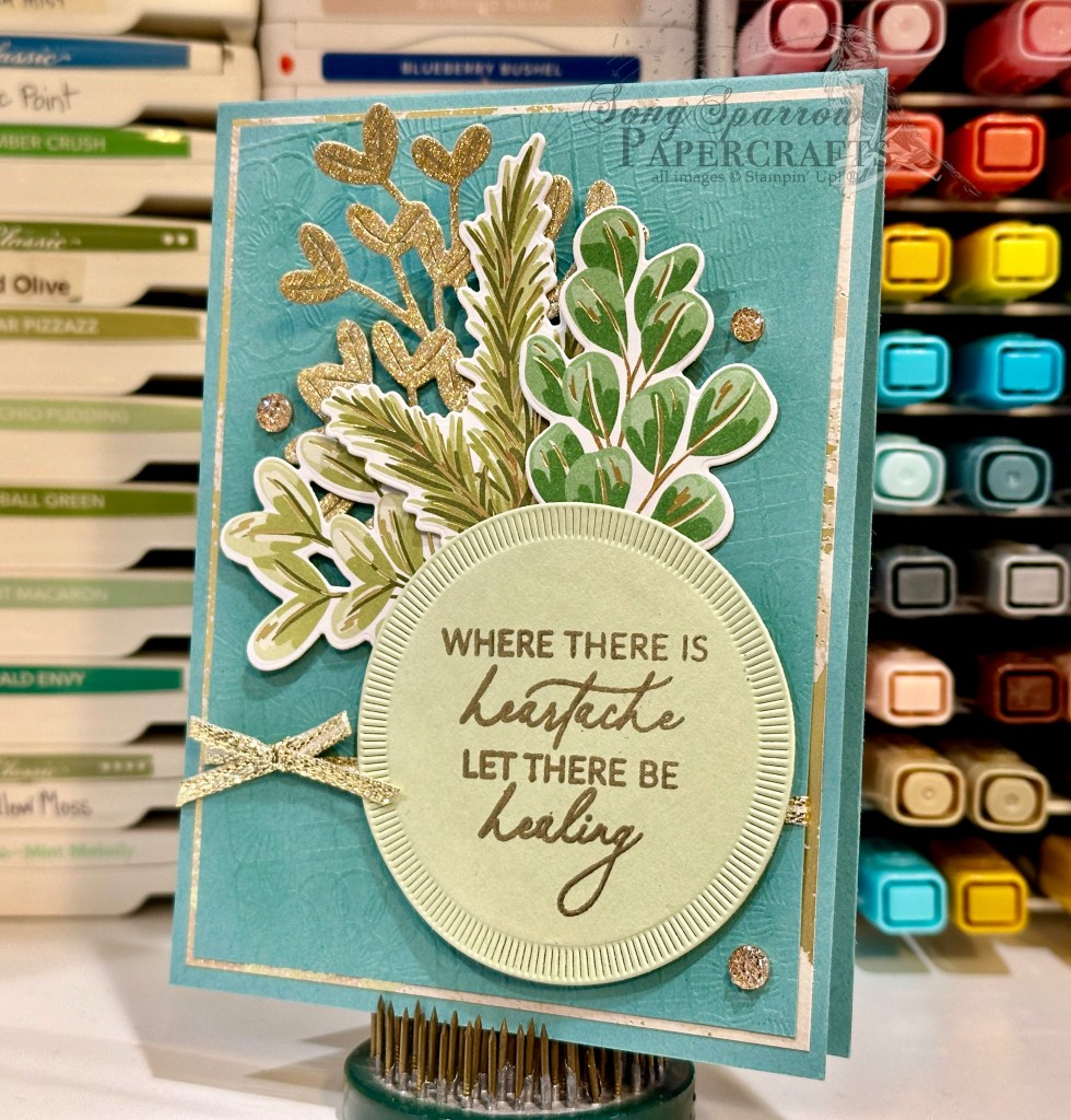
This week, we’re working within the theme of thankfulness. Aside from this time of year lending itself to this type of reflection, it just really feels like we all need a little reminder to slow down and appreciate all of the little things. Even when we don’t have it all, there are so many small ways we are living in the overflow of God’s grace and goodness.
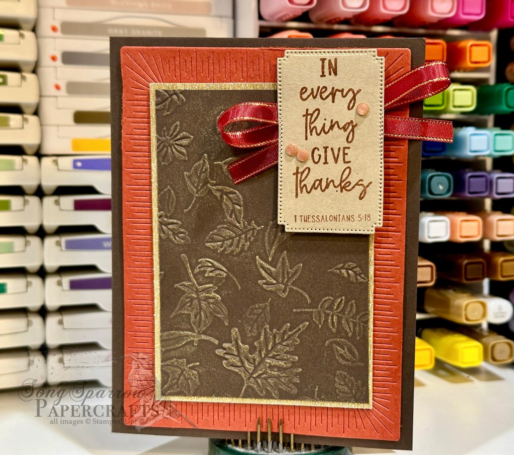
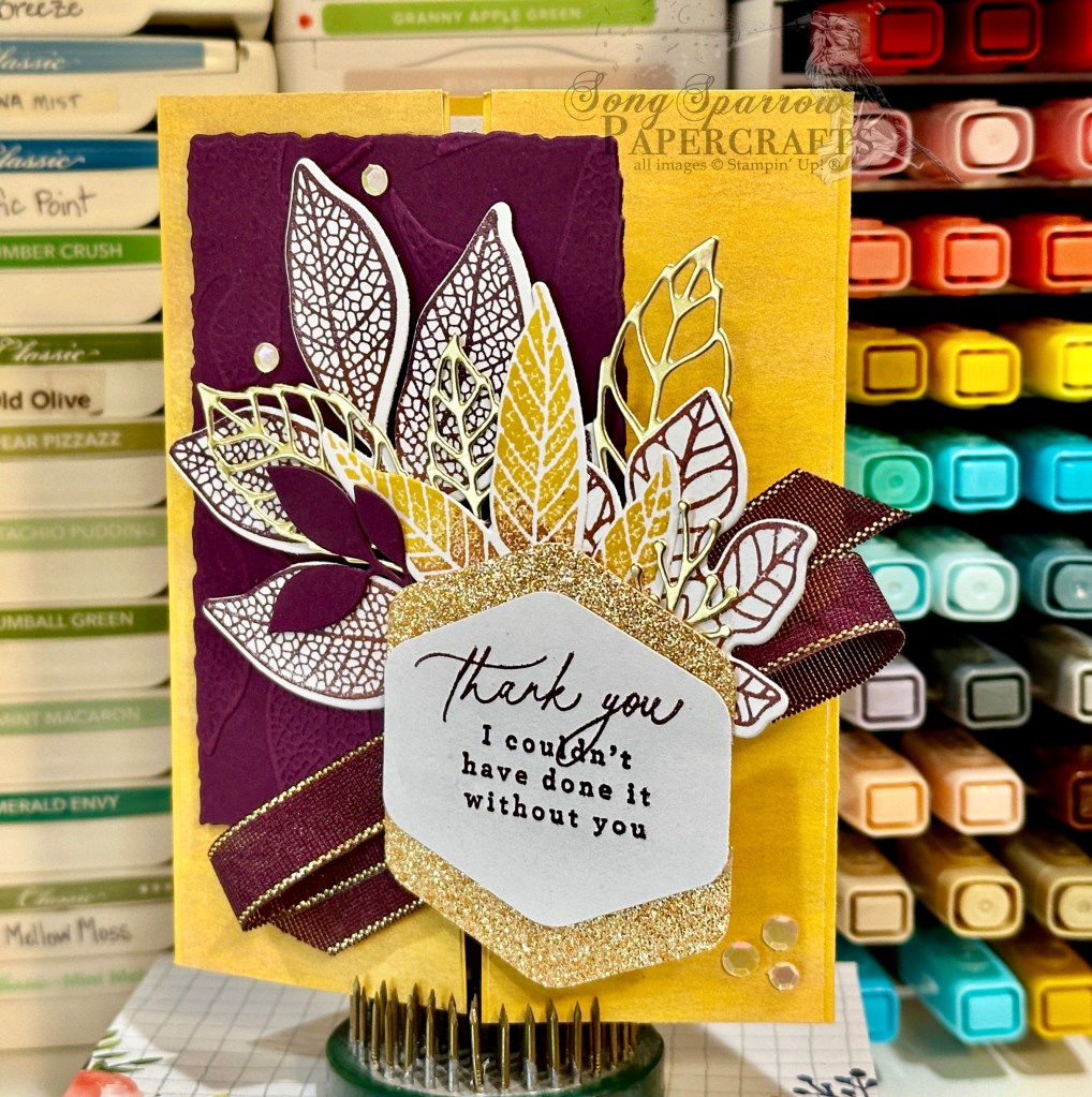
For today’s card design, I took inspiration from the usual color palette of fall foliage that we see in our area. I really love the combination of foliage color and texture in today’s design.
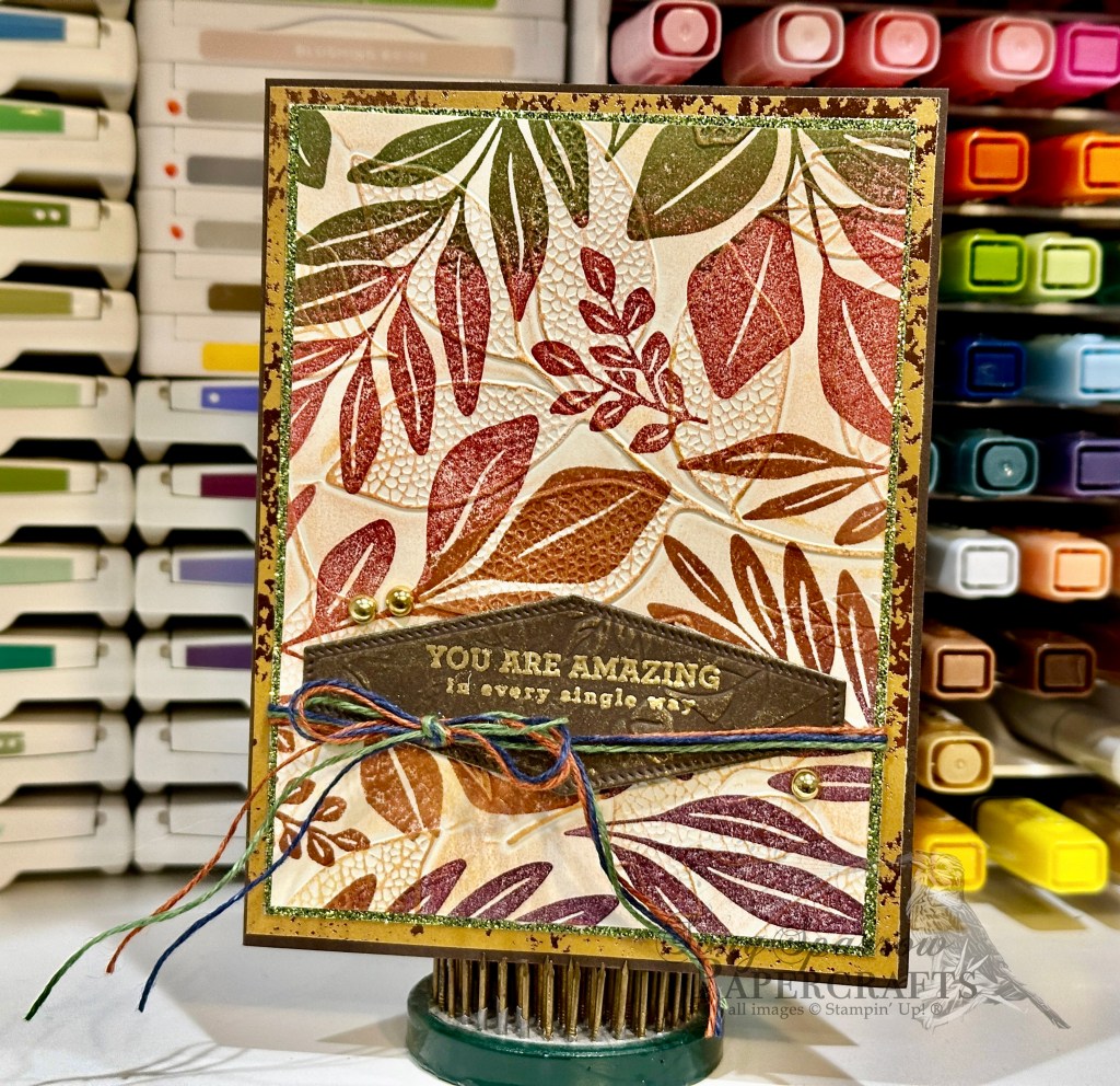
We get started with a base of Early Espresso cardstock. Our leaf patterned focal panel is matted with lots of shimmer between the Oxidized Copper specialty paper and the Old Olive glimmer paper. For the focal panel, I inked the Leaf Collection background stamp with a combination of Blackberry Bliss, Copper Clay, Cherry Cobbler, and Mossy Meadow ink and stamped on Very Vanilla cardstock. I then embossed with the Changing Leaves embossing folder. I used gold ink to bring out the embossing and add a sparkly sheen to the leaves. The sentiment from the Changing Leaves stamp set is heat embossed in gold on a piece of Early Espresso that was embossed with the Leaf Fall embossing folder and then diecut with the Nested Essentials dies. Another rub of some gold ink helps bring out the pattern in the sentiment panel and match the sheen of our focal panel. A twist of the Natural Tones linen thread and some gold Blooming Pearls add the final touches.
Next week we’re going to take a trek through the trees and see what we can find. Hope you will tag along.


 Designer Series Paper")
 Designer Series Paper")


")
")


 Specialty Designer Series Paper")
 Glimmer Specialty Paper")
 Foil Sheets")


")

 Striped Trim")


 Specialty Designer Series Paper")


")


 Satin Ribbon")


 Specialty Designer Series Paper")

")
 Metallic Ribbon")


 Designer Series Paper")
 Specialty Designer Series Paper")
 Specialty Designer Series Paper")

")


 Specialty Designer Series Paper")

")


 Specialty Paper")

")