Howdy, friends! Did you miss me? Last week didn’t exactly turn out as I had planned. I had grand plans for all of last week’s posts and then our schedules just kinda imploded. Between a major office furniture swap out and then a home update project, last week was chocked FULL and I didn’t have anything left for crafts.
Sooo here we are in a brand new week and I finally get to bring you all the fun ideas I have for this new design theme — the spotlight technique. Typically, this technique will, in some way, repeat a pattern or an image in a fresh, new way. Today, we’re using the elevated coloring method to spotlight a portion of the Flowers Fair stamped image.
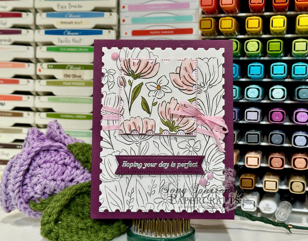
We get started with a background of Blackberry Bliss cardstock. The focal panel backdrop is a quarter panel of white cardstock stamped with the Flowers Fair stamp and then cut to size with the largest Perennial Postage die. A second white quarter panel is also stamped with the identical image and then we use one of 2025 Advent Calendar dies to cut out a small portion of the image and then color it with Stampin Blends. The small colored panel is matted with pink shimmer paper and the two are adhered together with dimensionals. We wrap our background panel with pink ribbon before adhering it to our card front with dimensionals. The spotlight panel is adhered in place with dimensionals so it is just above its uncolored counterpart in the image below. The sentiment from the Rolling Waves stamp set is heat embossed in silver on Blackberry Bliss cardstock and then cut out with the Stylish Shapes banner due. Some pink flat pearls in opposing corners finish things off perfectly.
I hope you’ll drop in again to see what other spotlight methods we’ll be using this week!
Product List![Blackberry Bliss 8-1/2" X 11" Cardstock [ 133675 ]](https://assets1.tamsnetwork.com/images/EC042017NF/133675s.jpg "Blackberry Bliss 8-1/2\" X 11\" Cardstock [ 133675 ]")
![Basic White 8 1/2" X 11" Cardstock [ 166780 ]](https://assets1.tamsnetwork.com/images/EC042017NF/166780s.jpg "Basic White 8 1/2\" X 11\" Cardstock [ 166780 ]")
![Pastels Shimmer 12" X 12" (30.5 X 30.5 Cm) Specialty Paper [ 167198 ]](https://assets1.tamsnetwork.com/images/EC042017NF/167198s.jpg "Pastels Shimmer 12\" X 12\" (30.5 X 30.5 Cm) Specialty Paper [ 167198 ]")
![Flowers Fair Photopolymer Stamp Set [ 167217 ]](https://assets1.tamsnetwork.com/images/EC042017NF/167217s.jpg "Flowers Fair Photopolymer Stamp Set [ 167217 ]")
![Rolling Waves Photopolymer Stamp Set [ 167142 ]](https://assets1.tamsnetwork.com/images/EC042017NF/167142s.jpg "Rolling Waves Photopolymer Stamp Set [ 167142 ]")
![Jet Black Stāzon Ink Pad [ 101406 ]](https://assets1.tamsnetwork.com/images/EC042017NF/101406s.jpg "Jet Black Stāzon Ink Pad [ 101406 ]")
![Versamark Pad [ 102283 ]](https://assets1.tamsnetwork.com/images/EC042017NF/102283s.jpg "Versamark Pad [ 102283 ]")
![Metallics Wow! Embossing Powder [ 165678 ]](https://assets1.tamsnetwork.com/images/EC042017NF/165678s.jpg "Metallics Wow! Embossing Powder [ 165678 ]")
![Perennial Postage Dies [ 162607 ]](https://assets1.tamsnetwork.com/images/EC042017NF/162607s.jpg "Perennial Postage Dies [ 162607 ]")
![Stylish Shapes Dies [ 159183 ]](https://assets1.tamsnetwork.com/images/EC042017NF/159183s.jpg "Stylish Shapes Dies [ 159183 ]")
![12 Days Of Crafting Advent Calendar (English) [ 167335 ]](https://assets1.tamsnetwork.com/images/EC042017NF/167335s.jpg "12 Days Of Crafting Advent Calendar (English) [ 167335 ]")
![Old Olive Stampin' Blends Combo Pack [ 154892 ]](https://assets1.tamsnetwork.com/images/EC042017NF/154892s.jpg "Old Olive Stampin' Blends Combo Pack [ 154892 ]")
![Pretty In Pink Stampin’ Blends Combo Pack [ 163824 ]](https://assets1.tamsnetwork.com/images/EC042017NF/163824s.jpg "Pretty In Pink Stampin’ Blends Combo Pack [ 163824 ]")
![Daffodil Delight Stampin' Blends Combo Pack [ 154883 ]](https://assets1.tamsnetwork.com/images/EC042017NF/154883s.jpg "Daffodil Delight Stampin' Blends Combo Pack [ 154883 ]")
![2024–2026 In Color™ Shimmer Gems [ 163781 ]](https://assets1.tamsnetwork.com/images/EC042017NF/163781s.jpg "2024–2026 In Color™ Shimmer Gems [ 163781 ]")
![Bubble Bath 1/8" (3.2 Mm) Faux Linen Ribbon [ 167075 ]](https://assets1.tamsnetwork.com/images/EC042017NF/167075s.jpg "Bubble Bath 1/8\" (3.2 Mm) Faux Linen Ribbon [ 167075 ]")
![Stampin' Dimensionals [ 104430 ]](https://assets1.tamsnetwork.com/images/EC042017NF/104430s.jpg "Stampin' Dimensionals [ 104430 ]")

![Balmy Blue 8-1/2" X 11" Cardstock [ 146982 ]](https://assets1.tamsnetwork.com/images/EC042017NF/146982s.jpg "Balmy Blue 8-1/2\" X 11\" Cardstock [ 146982 ]")
![Cajun Craze 8-1/2" X 11" Cardstock [ 119684 ]](https://assets1.tamsnetwork.com/images/EC042017NF/119684s.jpg "Cajun Craze 8-1/2\" X 11\" Cardstock [ 119684 ]")
![Mossy Meadow 8-1/2" X 11" Cardstock [ 133676 ]](https://assets1.tamsnetwork.com/images/EC042017NF/133676s.jpg "Mossy Meadow 8-1/2\" X 11\" Cardstock [ 133676 ]")
![Shaded Spruce 8-1/2" X 11" Cardstock [ 146981 ]](https://assets1.tamsnetwork.com/images/EC042017NF/146981s.jpg "Shaded Spruce 8-1/2\" X 11\" Cardstock [ 146981 ]")
![Oxidized Copper 12" X 12" (30.5 X 30.5 Cm) Specialty Designer Series Paper [ 162190 ]](https://assets1.tamsnetwork.com/images/EC042017NF/162190s.jpg "Oxidized Copper 12\" X 12\" (30.5 X 30.5 Cm) Specialty Designer Series Paper [ 162190 ]")
![Peaceful Garden 12" X 12" (30.5 X 30.5 Cm) Glimmer Paper [ 165929 ]](https://assets1.tamsnetwork.com/images/EC042017NF/165929s.jpg "Peaceful Garden 12\" X 12\" (30.5 X 30.5 Cm) Glimmer Paper [ 165929 ]")
![True Blue Florals 12" X 12" (30.5 X 30.5 Cm) Designer Series Paper [ 167970 ]](https://assets1.tamsnetwork.com/images/EC042017NF/167970s.jpg "True Blue Florals 12\" X 12\" (30.5 X 30.5 Cm) Designer Series Paper [ 167970 ]")
![Branching Out Dies [ 165775 ]](https://assets1.tamsnetwork.com/images/EC042017NF/165775s.jpg "Branching Out Dies [ 165775 ]")
![On Display Bundle (English) [ 167306 ]](https://assets1.tamsnetwork.com/images/EC042017NF/167306s.jpg "On Display Bundle (English) [ 167306 ]")
![Misty Moonlight Classic Stampin' Pad [ 153118 ]](https://assets1.tamsnetwork.com/images/EC042017NF/153118s.jpg "Misty Moonlight Classic Stampin' Pad [ 153118 ]")
![Hues Of Blue Flowers [ 165930 ]](https://assets1.tamsnetwork.com/images/EC042017NF/165930s.jpg "Hues Of Blue Flowers [ 165930 ]")
![Charming Shimmer Faceted Dots [ 166139 ]](https://assets1.tamsnetwork.com/images/EC042017NF/166139s.jpg "Charming Shimmer Faceted Dots [ 166139 ]")
![Natural Tones Linen Thread [ 164071 ]](https://assets1.tamsnetwork.com/images/EC042017NF/164071s.jpg "Natural Tones Linen Thread [ 164071 ]")
![Tear & Tape Adhesive [ 154031 ]](https://assets1.tamsnetwork.com/images/EC042017NF/154031s.jpg "Tear & Tape Adhesive [ 154031 ]")

![Secret Sea 8 1/2" X 11" Cardstock [ 165624 ]](https://assets1.tamsnetwork.com/images/EC042017NF/165624s.jpg "Secret Sea 8 1/2\" X 11\" Cardstock [ 165624 ]")
![Strawberry Slush 8 1/2" X 11" Cardstock [ 165625 ]](https://assets1.tamsnetwork.com/images/EC042017NF/165625s.jpg "Strawberry Slush 8 1/2\" X 11\" Cardstock [ 165625 ]")
![Pretty In Pink 8 1/2" X 11" Cardstock [ 163793 ]](https://assets1.tamsnetwork.com/images/EC042017NF/163793s.jpg "Pretty In Pink 8 1/2\" X 11\" Cardstock [ 163793 ]")
![Pool Party 8-1/2" X 11" Cardstock [ 122924 ]](https://assets1.tamsnetwork.com/images/EC042017NF/122924s.jpg "Pool Party 8-1/2\" X 11\" Cardstock [ 122924 ]")
![Pretty Peacock 8-1/2" X 11" Cardstock [ 150880 ]](https://assets1.tamsnetwork.com/images/EC042017NF/150880s.jpg "Pretty Peacock 8-1/2\" X 11\" Cardstock [ 150880 ]")
![Smoky Slate 8-1/2" X 11" Cardstock [ 131202 ]](https://assets1.tamsnetwork.com/images/EC042017NF/131202s.jpg "Smoky Slate 8-1/2\" X 11\" Cardstock [ 131202 ]")
![Plaster Painting 3 D Embossing Folder [ 164656 ]](https://assets1.tamsnetwork.com/images/EC042017NF/164656s.jpg "Plaster Painting 3 D Embossing Folder [ 164656 ]")
![Pretty Florals Dies [ 165178 ]](https://assets1.tamsnetwork.com/images/EC042017NF/165178s.jpg "Pretty Florals Dies [ 165178 ]")
![More Messages Bundle (English) [ 165473 ]](https://assets1.tamsnetwork.com/images/EC042017NF/165473s.jpg "More Messages Bundle (English) [ 165473 ]")
![Gray Granite Classic Stampin' Pad [ 147118 ]](https://assets1.tamsnetwork.com/images/EC042017NF/147118s.jpg "Gray Granite Classic Stampin' Pad [ 147118 ]")
![Gold & Silver 1/8" (3.2 Mm) Trim Combo Pack [ 161633 ]](https://assets1.tamsnetwork.com/images/EC042017NF/161633s.jpg "Gold & Silver 1/8\" (3.2 Mm) Trim Combo Pack [ 161633 ]")
![Clear Wink Of Stella Glitter Brush [ 141897 ]](https://assets1.tamsnetwork.com/images/EC042017NF/141897s.jpg "Clear Wink Of Stella Glitter Brush [ 141897 ]")
![Drusy Adhesive Backed Embellishments [ 164223 ]](https://assets1.tamsnetwork.com/images/EC042017NF/164223s.jpg "Drusy Adhesive Backed Embellishments [ 164223 ]")
![Strawberry Slush & Pretty In Pink Gems [ 165615 ]](https://assets1.tamsnetwork.com/images/EC042017NF/165615s.jpg "Strawberry Slush & Pretty In Pink Gems [ 165615 ]")


 Specialty Paper")

")


 Circle Punch")
 Bordered Ribbon")


")

")


")


 Designer Series Paper")
")
")


 Satin Ribbon")

 Specialty Designer Series Paper")


")


 Textured Ribbon")
 Metallic Ribbon")


 Designer Series Paper")


")
")

")


