Welcome to another day in our week with the SU! 12 Days of Crafting Advent Calendar, where each day we’re opening two boxes together and then creating a fun project with the goodies we found inside. Thus far, we’ve scored a set of dies that coordinate with the Advent Calendar stamp set, some patterned paper, some glitter shaker elements, and a set of foiled diecut elements. Today, we’re opening boxes 5 & 6. Let’s see what’s inside!
Alrighty, so today we have a set of decorative masks and some fluffy felt stickers. I’m not gonna lie, I was initially pretty stumped on what to do with our new goodies. But I started looking through the rest of the Advent Calendar goodies for some inspiration and decided that continuing with the floral theme would work best, especially since I wanted to incorporate the new items in today’s design. After stacking the decorative masks and getting a sense for the scene they would create, I pulled a sheet of patterned paper that would coordinate and went to town.
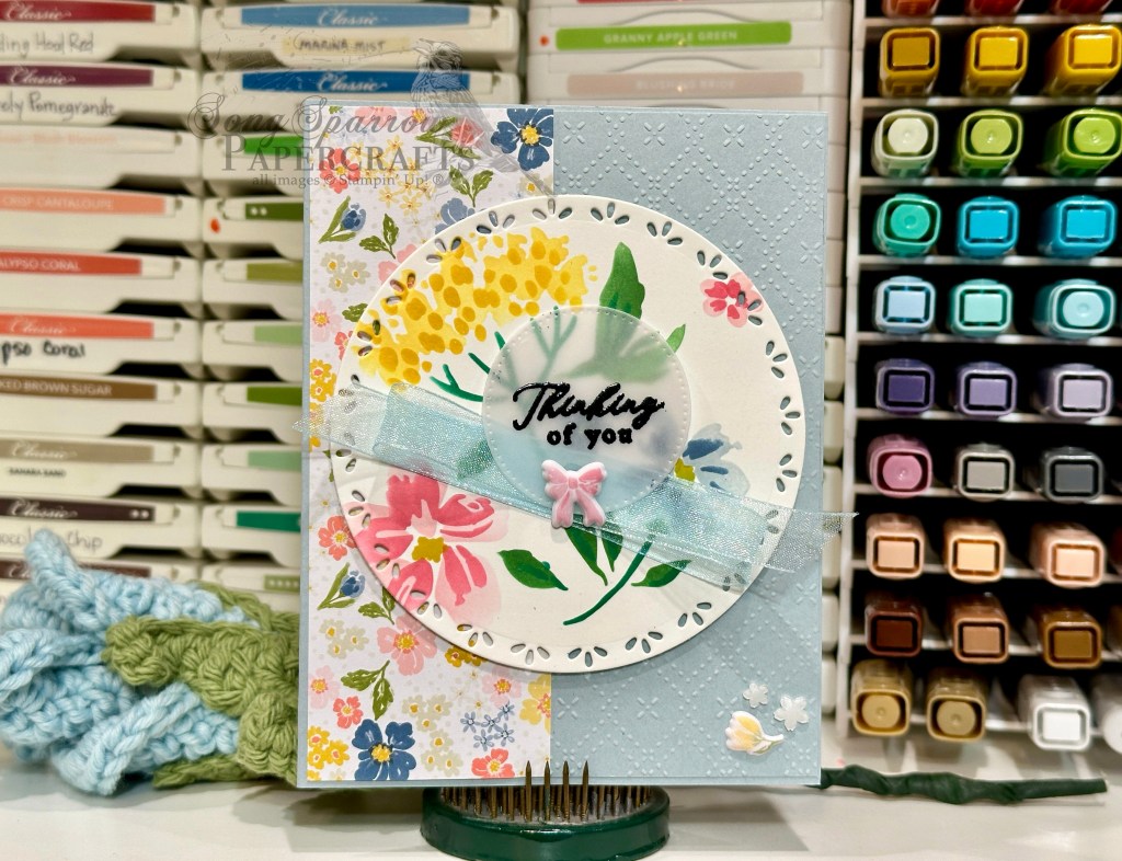
We get started with a backdrop of Cloud Cover cardstock. A quarter sheet of Cloud Cover is machine embossed with the *new* Beautiful Pattern embossing folder, which releases next week. I used a strip of the coordinating Advent Calendar patterned paper on the left of the panel. The focal panel floral scene is created with today’s decorative masks, blending brushes, and a combination of inks — Daffodil Delight, Crushed Curry, Pretty in Pink, Strawberry Slush, Cloud Cover, Misty Moonlight, Garden Green, and Shaded Spruce. The panel is cut with the largest circle in the Spotlight on Nature die set and then adhered with dimensionals. The sentiment from the Advent Calendar stamp set is heat embossed in black on vellum and then diecut with one of the smaller circles from the Stylish Shapes set. The panel is adhered over Balmy Blue sheer ribbon with dimensionals and a pink bow from the new fluffy felt sticker set finishes off the sentiment panel. A fluffy felt flower and a few of the Hues of Blue Flowers in the corner finish off our floral theme.
Isn’t this fun? Every day we’re stretching our creativity! Can’t wait to see what our Advent Calendar brings us tomorrow!
Product List![12 Days Of Crafting Advent Calendar (English) [ 167335 ]](https://assets1.tamsnetwork.com/images/EC042017NF/167335s.jpg "12 Days Of Crafting Advent Calendar (English) [ 167335 ]")
![Cloud Cover 8 1/2" X 11" Cardstock [ 165621 ]](https://assets1.tamsnetwork.com/images/EC042017NF/165621s.jpg "Cloud Cover 8 1/2\" X 11\" Cardstock [ 165621 ]")
![Basic White 8 1/2" X 11" Cardstock [ 166780 ]](https://assets1.tamsnetwork.com/images/EC042017NF/166780s.jpg "Basic White 8 1/2\" X 11\" Cardstock [ 166780 ]")
![Spotlight On Nature Dies [ 163580 ]](https://assets1.tamsnetwork.com/images/EC042017NF/163580s.jpg "Spotlight On Nature Dies [ 163580 ]")
![Versamark Pad [ 102283 ]](https://assets1.tamsnetwork.com/images/EC042017NF/102283s.jpg "Versamark Pad [ 102283 ]")
![Basics Wow! Embossing Powder [ 165679 ]](https://assets1.tamsnetwork.com/images/EC042017NF/165679s.jpg "Basics Wow! Embossing Powder [ 165679 ]")
![Daffodil Delight Classic Stampin' Pad [ 147094 ]](https://assets1.tamsnetwork.com/images/EC042017NF/147094s.jpg "Daffodil Delight Classic Stampin' Pad [ 147094 ]")
![Crushed Curry Classic Stampin' Pad [ 147087 ]](https://assets1.tamsnetwork.com/images/EC042017NF/147087s.jpg "Crushed Curry Classic Stampin' Pad [ 147087 ]")
![Pretty In Pink Classic Stampin Pad [ 163807 ]](https://assets1.tamsnetwork.com/images/EC042017NF/163807s.jpg "Pretty In Pink Classic Stampin Pad [ 163807 ]")
![Strawberry Slush Classic Stampin' Pad [ 165286 ]](https://assets1.tamsnetwork.com/images/EC042017NF/165286s.jpg "Strawberry Slush Classic Stampin' Pad [ 165286 ]")
![Cloud Cover Classic Stampin' Ink Refill [ 165279 ]](https://assets1.tamsnetwork.com/images/EC042017NF/165279s.jpg "Cloud Cover Classic Stampin' Ink Refill [ 165279 ]")
![Misty Moonlight Classic Stampin' Pad [ 153118 ]](https://assets1.tamsnetwork.com/images/EC042017NF/153118s.jpg "Misty Moonlight Classic Stampin' Pad [ 153118 ]")
![Garden Green Classic Stampin' Pad [ 147089 ]](https://assets1.tamsnetwork.com/images/EC042017NF/147089s.jpg "Garden Green Classic Stampin' Pad [ 147089 ]")
![Shaded Spruce Classic Stampin' Pad [ 147088 ]](https://assets1.tamsnetwork.com/images/EC042017NF/147088s.jpg "Shaded Spruce Classic Stampin' Pad [ 147088 ]")
![Balmy Blue 1/2" (1.3 Cm) Sheer Ribbon [ 165767 ]](https://assets1.tamsnetwork.com/images/EC042017NF/165767s.jpg "Balmy Blue 1/2\" (1.3 Cm) Sheer Ribbon [ 165767 ]")
![Hues Of Blue Flowers [ 165930 ]](https://assets1.tamsnetwork.com/images/EC042017NF/165930s.jpg "Hues Of Blue Flowers [ 165930 ]")
![Stampin' Dimensionals [ 104430 ]](https://assets1.tamsnetwork.com/images/EC042017NF/104430s.jpg "Stampin' Dimensionals [ 104430 ]")
![Mini Glue Dots [ 103683 ]](https://assets1.tamsnetwork.com/images/EC042017NF/103683s.jpg "Mini Glue Dots [ 103683 ]")
![Strawberry Slush 8 1/2" X 11" Cardstock [ 165625 ]](https://assets1.tamsnetwork.com/images/EC042017NF/165625s.jpg "Strawberry Slush 8 1/2\" X 11\" Cardstock [ 165625 ]")
![Pretty In Pink 8 1/2" X 11" Cardstock [ 163793 ]](https://assets1.tamsnetwork.com/images/EC042017NF/163793s.jpg "Pretty In Pink 8 1/2\" X 11\" Cardstock [ 163793 ]")
![Mossy Meadow 8-1/2" X 11" Cardstock [ 133676 ]](https://assets1.tamsnetwork.com/images/EC042017NF/133676s.jpg "Mossy Meadow 8-1/2\" X 11\" Cardstock [ 133676 ]")
![Timid Tiger Classic Stampin' Pad [ 165278 ]](https://assets1.tamsnetwork.com/images/EC042017NF/165278s.jpg "Timid Tiger Classic Stampin' Pad [ 165278 ]")
![Mixed Labels Dies [ 164652 ]](https://assets1.tamsnetwork.com/images/EC042017NF/164652s.jpg "Mixed Labels Dies [ 164652 ]")
![Strawberry Slush 3/8" (1 Cm) Faux Linen Ribbon [ 165274 ]](https://assets1.tamsnetwork.com/images/EC042017NF/165274s.jpg "Strawberry Slush 3/8\" (1 Cm) Faux Linen Ribbon [ 165274 ]")
![Strawberry Slush & Pretty In Pink Gems [ 165615 ]](https://assets1.tamsnetwork.com/images/EC042017NF/165615s.jpg "Strawberry Slush & Pretty In Pink Gems [ 165615 ]")
![Tear & Tape Adhesive [ 154031 ]](https://assets1.tamsnetwork.com/images/EC042017NF/154031s.jpg "Tear & Tape Adhesive [ 154031 ]")
![Mini Stampin' Dimensionals [ 144108 ]](https://assets1.tamsnetwork.com/images/EC042017NF/144108s.jpg "Mini Stampin' Dimensionals [ 144108 ]")
![Cajun Craze 8-1/2" X 11" Cardstock [ 119684 ]](https://assets1.tamsnetwork.com/images/EC042017NF/119684s.jpg "Cajun Craze 8-1/2\" X 11\" Cardstock [ 119684 ]")
![Nature's Sweetness 12" X 12" (30.5 X 30.5 Cm) Specialty Designer Series Paper [ 162616 ]](https://assets1.tamsnetwork.com/images/EC042017NF/162616s.jpg "Nature's Sweetness 12\" X 12\" (30.5 X 30.5 Cm) Specialty Designer Series Paper [ 162616 ]")
![Gathering Together 12" X 12" (30.5 X 30.5 Cm) Specialty Designer Series Paper [ 165969 ]](https://assets1.tamsnetwork.com/images/EC042017NF/165969s.jpg "Gathering Together 12\" X 12\" (30.5 X 30.5 Cm) Specialty Designer Series Paper [ 165969 ]")
![Changing Leaves Hybrid Embossing Folder [ 164138 ]](https://assets1.tamsnetwork.com/images/EC042017NF/164138s.jpg "Changing Leaves Hybrid Embossing Folder [ 164138 ]")
![Gathering Moments Bundle (English) [ 165980 ]](https://assets1.tamsnetwork.com/images/EC042017NF/165980s.jpg "Gathering Moments Bundle (English) [ 165980 ]")
![Mossy Meadow Classic Stampin' Pad [ 147111 ]](https://assets1.tamsnetwork.com/images/EC042017NF/147111s.jpg "Mossy Meadow Classic Stampin' Pad [ 147111 ]")
![Flirty Flamingo Classic Stampin' Pad [ 147052 ]](https://assets1.tamsnetwork.com/images/EC042017NF/147052s.jpg "Flirty Flamingo Classic Stampin' Pad [ 147052 ]")
![Real Red Classic Stampin' Pad [ 147084 ]](https://assets1.tamsnetwork.com/images/EC042017NF/147084s.jpg "Real Red Classic Stampin' Pad [ 147084 ]")
![Old Olive Classic Stampin' Pad [ 147090 ]](https://assets1.tamsnetwork.com/images/EC042017NF/147090s.jpg "Old Olive Classic Stampin' Pad [ 147090 ]")
![Blackberry Bliss Classic Stampin' Pad [ 147092 ]](https://assets1.tamsnetwork.com/images/EC042017NF/147092s.jpg "Blackberry Bliss Classic Stampin' Pad [ 147092 ]")
![Early Espresso Classic Stampin' Pad [ 147114 ]](https://assets1.tamsnetwork.com/images/EC042017NF/147114s.jpg "Early Espresso Classic Stampin' Pad [ 147114 ]")
![Cajun Craze Classic Stampin' Pad [ 147085 ]](https://assets1.tamsnetwork.com/images/EC042017NF/147085s.jpg "Cajun Craze Classic Stampin' Pad [ 147085 ]")
![Metallics Wow! Embossing Powder [ 165678 ]](https://assets1.tamsnetwork.com/images/EC042017NF/165678s.jpg "Metallics Wow! Embossing Powder [ 165678 ]")
![Gold Striped 3/8" (1 Cm) Mesh Ribbon [ 165599 ]](https://assets1.tamsnetwork.com/images/EC042017NF/165599s.jpg "Gold Striped 3/8\" (1 Cm) Mesh Ribbon [ 165599 ]")
![Cajun Craze & Gold Dots [ 165984 ]](https://assets1.tamsnetwork.com/images/EC042017NF/165984s.jpg "Cajun Craze & Gold Dots [ 165984 ]")
![Darling Duckling 8 1/2" X 11" Cardstock [ 165622 ]](https://assets1.tamsnetwork.com/images/EC042017NF/165622s.jpg "Darling Duckling 8 1/2\" X 11\" Cardstock [ 165622 ]")
![Crumb Cake 8-1/2" X 11" Cardstock [ 120953 ]](https://assets1.tamsnetwork.com/images/EC042017NF/120953s.jpg "Crumb Cake 8-1/2\" X 11\" Cardstock [ 120953 ]")
![Pastel Ombre Glimmer 12" X 12" (30.5 X 30.5 Cm) Specialty Paper [ 164851 ]](https://assets1.tamsnetwork.com/images/EC042017NF/164851s.jpg "Pastel Ombre Glimmer 12\" X 12\" (30.5 X 30.5 Cm) Specialty Paper [ 164851 ]")
![2024–2026 In Color™ Glimmer 12" X 12" (30.5 X 30.5 Cm) Specialty Paper [ 163771 ]](https://assets1.tamsnetwork.com/images/EC042017NF/163771s.jpg "2024–2026 In Color™ Glimmer 12\" X 12\" (30.5 X 30.5 Cm) Specialty Paper [ 163771 ]")
![Textured Notes Dies [ 165555 ]](https://assets1.tamsnetwork.com/images/EC042017NF/165555s.jpg "Textured Notes Dies [ 165555 ]")
![Label Me Grateful Dies [ 166111 ]](https://assets1.tamsnetwork.com/images/EC042017NF/166111s.jpg "Label Me Grateful Dies [ 166111 ]")
![Gathering Moments Dies [ 165979 ]](https://assets1.tamsnetwork.com/images/EC042017NF/165979s.jpg "Gathering Moments Dies [ 165979 ]")
![Stylish Shapes Dies [ 159183 ]](https://assets1.tamsnetwork.com/images/EC042017NF/159183s.jpg "Stylish Shapes Dies [ 159183 ]")
![Scenic Adventure Photopolymer Stamp Set (English) [ 165466 ]](https://assets1.tamsnetwork.com/images/EC042017NF/165466s.jpg "Scenic Adventure Photopolymer Stamp Set (English) [ 165466 ]")
![With You In Mind Photopolymer Stamp Set (English) [ 164747 ]](https://assets1.tamsnetwork.com/images/EC042017NF/164747s.jpg "With You In Mind Photopolymer Stamp Set (English) [ 164747 ]")
![Drusy Adhesive Backed Embellishments [ 164223 ]](https://assets1.tamsnetwork.com/images/EC042017NF/164223s.jpg "Drusy Adhesive Backed Embellishments [ 164223 ]")


![Soft Waves 3 D Embossing Folder [ 164695 ]](https://assets1.tamsnetwork.com/images/EC042017NF/164695s.jpg "Soft Waves 3 D Embossing Folder [ 164695 ]")
![Jar Of Joy Photopolymer Stamp Set (English) [ 166176 ]](https://assets1.tamsnetwork.com/images/EC042017NF/166176s.jpg "Jar Of Joy Photopolymer Stamp Set (English) [ 166176 ]")
![Sweet Jar Builder Punch [ 165506 ]](https://assets1.tamsnetwork.com/images/EC042017NF/165506s.jpg "Sweet Jar Builder Punch [ 165506 ]")
![Notes & Totes Photopolymer Stamp Set (English) [ 165239 ]](https://assets1.tamsnetwork.com/images/EC042017NF/165239s.jpg "Notes & Totes Photopolymer Stamp Set (English) [ 165239 ]")
![Pool Party Classic Stampin' Pad [ 147107 ]](https://assets1.tamsnetwork.com/images/EC042017NF/147107s.jpg "Pool Party Classic Stampin' Pad [ 147107 ]")
![Secret Sea Classic Stampin' Pad [ 165285 ]](https://assets1.tamsnetwork.com/images/EC042017NF/165285s.jpg "Secret Sea Classic Stampin' Pad [ 165285 ]")
![Lost Lagoon Classic Stampin' Pad [ 161678 ]](https://assets1.tamsnetwork.com/images/EC042017NF/161678s.jpg "Lost Lagoon Classic Stampin' Pad [ 161678 ]")
![Starburst Sequins [ 165539 ]](https://assets1.tamsnetwork.com/images/EC042017NF/165539s.jpg "Starburst Sequins [ 165539 ]")
![Real Red 8-1/2" X 11" Cardstock [ 102482 ]](https://assets1.tamsnetwork.com/images/EC042017NF/102482s.jpg "Real Red 8-1/2\" X 11\" Cardstock [ 102482 ]")
![Take A Bow 6" X 6" (15.2 X 15.2 Cm) Designer Series Paper [ 164309 ]](https://assets1.tamsnetwork.com/images/EC042017NF/164309s.jpg "Take A Bow 6\" X 6\" (15.2 X 15.2 Cm) Designer Series Paper [ 164309 ]")
![Festive 12" X 12" (30.5 X 30.5 Cm) Glimmer Paper [ 164106 ]](https://assets1.tamsnetwork.com/images/EC042017NF/164106s.jpg "Festive 12\" X 12\" (30.5 X 30.5 Cm) Glimmer Paper [ 164106 ]")
![Cute Crochet 3 D Embossing Folder [ 163792 ]](https://assets1.tamsnetwork.com/images/EC042017NF/163792s.jpg "Cute Crochet 3 D Embossing Folder [ 163792 ]")
![Nested Essentials Dies [ 161597 ]](https://assets1.tamsnetwork.com/images/EC042017NF/161597s.jpg "Nested Essentials Dies [ 161597 ]")
![Real Red & White Baker's Twine [ 164051 ]](https://assets1.tamsnetwork.com/images/EC042017NF/164051s.jpg "Real Red & White Baker's Twine [ 164051 ]")
![Real Red & White Adhesive Backed Peppermints [ 164050 ]](https://assets1.tamsnetwork.com/images/EC042017NF/164050s.jpg "Real Red & White Adhesive Backed Peppermints [ 164050 ]")
![Rhinestone Basic Jewels [ 144220 ]](https://assets1.tamsnetwork.com/images/EC042017NF/144220s.jpg "Rhinestone Basic Jewels [ 144220 ]")

![Secret Sea 8 1/2" X 11" Cardstock [ 165624 ]](https://assets1.tamsnetwork.com/images/EC042017NF/165624s.jpg "Secret Sea 8 1/2\" X 11\" Cardstock [ 165624 ]")
![Pool Party 8-1/2" X 11" Cardstock [ 122924 ]](https://assets1.tamsnetwork.com/images/EC042017NF/122924s.jpg "Pool Party 8-1/2\" X 11\" Cardstock [ 122924 ]")
![Pretty Peacock 8-1/2" X 11" Cardstock [ 150880 ]](https://assets1.tamsnetwork.com/images/EC042017NF/150880s.jpg "Pretty Peacock 8-1/2\" X 11\" Cardstock [ 150880 ]")
![Smoky Slate 8-1/2" X 11" Cardstock [ 131202 ]](https://assets1.tamsnetwork.com/images/EC042017NF/131202s.jpg "Smoky Slate 8-1/2\" X 11\" Cardstock [ 131202 ]")
![Plaster Painting 3 D Embossing Folder [ 164656 ]](https://assets1.tamsnetwork.com/images/EC042017NF/164656s.jpg "Plaster Painting 3 D Embossing Folder [ 164656 ]")
![Pretty Florals Dies [ 165178 ]](https://assets1.tamsnetwork.com/images/EC042017NF/165178s.jpg "Pretty Florals Dies [ 165178 ]")
![More Messages Bundle (English) [ 165473 ]](https://assets1.tamsnetwork.com/images/EC042017NF/165473s.jpg "More Messages Bundle (English) [ 165473 ]")
![Gray Granite Classic Stampin' Pad [ 147118 ]](https://assets1.tamsnetwork.com/images/EC042017NF/147118s.jpg "Gray Granite Classic Stampin' Pad [ 147118 ]")
![Gold & Silver 1/8" (3.2 Mm) Trim Combo Pack [ 161633 ]](https://assets1.tamsnetwork.com/images/EC042017NF/161633s.jpg "Gold & Silver 1/8\" (3.2 Mm) Trim Combo Pack [ 161633 ]")
![Clear Wink Of Stella Glitter Brush [ 141897 ]](https://assets1.tamsnetwork.com/images/EC042017NF/141897s.jpg "Clear Wink Of Stella Glitter Brush [ 141897 ]")
