We’re winding down this week, and I don’t know about you but I’m ready for the weekend ahead. The first week of school is always a rough transition as we work to find the school year rhythm again. Poor fella had a rough day yesterday after leaving some important papers and his school computer at home. Learning personal responsibility is tough!
This week, we’ve been working with a brand new suite of products that is due to release in September in the SU! Holiday Mini catalog. Peaceful Garden lends itself to a whole host of different styles and seasons. Today I thought it would be fun to work in a monochromatic color palette and with just a few simple elements from the suite. So our featured color is one of the new In Colors called Secret Sea and we’re letting the lovely Peaceful Greenery embossing folder do all of the heavy lifting for our design.
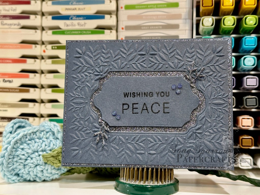
We start with a base of Secret Sea cardstock. Our Secret Sea focal panel is machine embossed with the Peaceful Greenery embossing folder and then matted with Secret Sea glimmer paper. One thing I love about the Peaceful Greenery embossing folder and Peace on Earth dies is that the decorative panels are made to inlay in the center of the debossed portion of the embossing folder. So I used the largest die to cut out the debossed section. And then I used the smaller die to cut down the cutout piece and create a smaller panel for the sentiment. The sentiment from Peace on Earth is stamped in Versamark and heat embossed with clear embossing powder. I cut some of the smaller greenery elements from a scrap of Secret Sea glimmer paper and adhered them on opposing corners of the sentiment panel before adhering the sentiment panel to the center of the card front with dimensionals. A few shimmer dots finish things off perfectly.
Tomorrow we’ll be using a sketch to create our card. I hope you’ll drop in and see what’s in store!
Products used in today’s card:
Secret Sea cardstock
Peaceful Garden glimmer SP (coming in Sept)
Peace on Earth stamp & die bundle (coming in Sept)
Peaceful Greenery embossing folder (coming in Sept)
Clear embossing powder
Charming shimmer faceted dots
Dimensionals
Adhesives


![Pastel Ombre Glimmer 12" X 12" (30.5 X 30.5 Cm) Specialty Paper [ 164851 ]](https://assets1.tamsnetwork.com/images/EC042017NF/164851s.jpg "Pastel Ombre Glimmer 12\" X 12\" (30.5 X 30.5 Cm) Specialty Paper [ 164851 ]")
![Soft Waves 3 D Embossing Folder [ 164695 ]](https://assets1.tamsnetwork.com/images/EC042017NF/164695s.jpg "Soft Waves 3 D Embossing Folder [ 164695 ]")
![Jar Of Joy Photopolymer Stamp Set (English) [ 166176 ]](https://assets1.tamsnetwork.com/images/EC042017NF/166176s.jpg "Jar Of Joy Photopolymer Stamp Set (English) [ 166176 ]")
![Sweet Jar Builder Punch [ 165506 ]](https://assets1.tamsnetwork.com/images/EC042017NF/165506s.jpg "Sweet Jar Builder Punch [ 165506 ]")
![Notes & Totes Photopolymer Stamp Set (English) [ 165239 ]](https://assets1.tamsnetwork.com/images/EC042017NF/165239s.jpg "Notes & Totes Photopolymer Stamp Set (English) [ 165239 ]")
![Pool Party Classic Stampin' Pad [ 147107 ]](https://assets1.tamsnetwork.com/images/EC042017NF/147107s.jpg "Pool Party Classic Stampin' Pad [ 147107 ]")
![Secret Sea Classic Stampin' Pad [ 165285 ]](https://assets1.tamsnetwork.com/images/EC042017NF/165285s.jpg "Secret Sea Classic Stampin' Pad [ 165285 ]")
![Strawberry Slush Classic Stampin' Pad [ 165286 ]](https://assets1.tamsnetwork.com/images/EC042017NF/165286s.jpg "Strawberry Slush Classic Stampin' Pad [ 165286 ]")
![Lost Lagoon Classic Stampin' Pad [ 161678 ]](https://assets1.tamsnetwork.com/images/EC042017NF/161678s.jpg "Lost Lagoon Classic Stampin' Pad [ 161678 ]")
![Starburst Sequins [ 165539 ]](https://assets1.tamsnetwork.com/images/EC042017NF/165539s.jpg "Starburst Sequins [ 165539 ]")
![Stampin' Dimensionals [ 104430 ]](https://assets1.tamsnetwork.com/images/EC042017NF/104430s.jpg "Stampin' Dimensionals [ 104430 ]")
![Basic White 8 1/2" X 11" Cardstock [ 166780 ]](https://assets1.tamsnetwork.com/images/EC042017NF/166780s.jpg "Basic White 8 1/2\" X 11\" Cardstock [ 166780 ]")
![Real Red 8-1/2" X 11" Cardstock [ 102482 ]](https://assets1.tamsnetwork.com/images/EC042017NF/102482s.jpg "Real Red 8-1/2\" X 11\" Cardstock [ 102482 ]")
![Take A Bow 6" X 6" (15.2 X 15.2 Cm) Designer Series Paper [ 164309 ]](https://assets1.tamsnetwork.com/images/EC042017NF/164309s.jpg "Take A Bow 6\" X 6\" (15.2 X 15.2 Cm) Designer Series Paper [ 164309 ]")
![Festive 12" X 12" (30.5 X 30.5 Cm) Glimmer Paper [ 164106 ]](https://assets1.tamsnetwork.com/images/EC042017NF/164106s.jpg "Festive 12\" X 12\" (30.5 X 30.5 Cm) Glimmer Paper [ 164106 ]")
![Cute Crochet 3 D Embossing Folder [ 163792 ]](https://assets1.tamsnetwork.com/images/EC042017NF/163792s.jpg "Cute Crochet 3 D Embossing Folder [ 163792 ]")
![Nested Essentials Dies [ 161597 ]](https://assets1.tamsnetwork.com/images/EC042017NF/161597s.jpg "Nested Essentials Dies [ 161597 ]")
![Shaded Spruce Classic Stampin' Pad [ 147088 ]](https://assets1.tamsnetwork.com/images/EC042017NF/147088s.jpg "Shaded Spruce Classic Stampin' Pad [ 147088 ]")
![Cajun Craze Classic Stampin' Pad [ 147085 ]](https://assets1.tamsnetwork.com/images/EC042017NF/147085s.jpg "Cajun Craze Classic Stampin' Pad [ 147085 ]")
![Real Red Classic Stampin' Pad [ 147084 ]](https://assets1.tamsnetwork.com/images/EC042017NF/147084s.jpg "Real Red Classic Stampin' Pad [ 147084 ]")
![Versamark Pad [ 102283 ]](https://assets1.tamsnetwork.com/images/EC042017NF/102283s.jpg "Versamark Pad [ 102283 ]")
![Basics Wow! Embossing Powder [ 165679 ]](https://assets1.tamsnetwork.com/images/EC042017NF/165679s.jpg "Basics Wow! Embossing Powder [ 165679 ]")
![Real Red & White Baker's Twine [ 164051 ]](https://assets1.tamsnetwork.com/images/EC042017NF/164051s.jpg "Real Red & White Baker's Twine [ 164051 ]")
![Real Red & White Adhesive Backed Peppermints [ 164050 ]](https://assets1.tamsnetwork.com/images/EC042017NF/164050s.jpg "Real Red & White Adhesive Backed Peppermints [ 164050 ]")
![Rhinestone Basic Jewels [ 144220 ]](https://assets1.tamsnetwork.com/images/EC042017NF/144220s.jpg "Rhinestone Basic Jewels [ 144220 ]")

![Secret Sea 8 1/2" X 11" Cardstock [ 165624 ]](https://assets1.tamsnetwork.com/images/EC042017NF/165624s.jpg "Secret Sea 8 1/2\" X 11\" Cardstock [ 165624 ]")
![Strawberry Slush 8 1/2" X 11" Cardstock [ 165625 ]](https://assets1.tamsnetwork.com/images/EC042017NF/165625s.jpg "Strawberry Slush 8 1/2\" X 11\" Cardstock [ 165625 ]")
![Pretty In Pink 8 1/2" X 11" Cardstock [ 163793 ]](https://assets1.tamsnetwork.com/images/EC042017NF/163793s.jpg "Pretty In Pink 8 1/2\" X 11\" Cardstock [ 163793 ]")
![Pool Party 8-1/2" X 11" Cardstock [ 122924 ]](https://assets1.tamsnetwork.com/images/EC042017NF/122924s.jpg "Pool Party 8-1/2\" X 11\" Cardstock [ 122924 ]")
![Pretty Peacock 8-1/2" X 11" Cardstock [ 150880 ]](https://assets1.tamsnetwork.com/images/EC042017NF/150880s.jpg "Pretty Peacock 8-1/2\" X 11\" Cardstock [ 150880 ]")
![Smoky Slate 8-1/2" X 11" Cardstock [ 131202 ]](https://assets1.tamsnetwork.com/images/EC042017NF/131202s.jpg "Smoky Slate 8-1/2\" X 11\" Cardstock [ 131202 ]")
![Plaster Painting 3 D Embossing Folder [ 164656 ]](https://assets1.tamsnetwork.com/images/EC042017NF/164656s.jpg "Plaster Painting 3 D Embossing Folder [ 164656 ]")
![Pretty Florals Dies [ 165178 ]](https://assets1.tamsnetwork.com/images/EC042017NF/165178s.jpg "Pretty Florals Dies [ 165178 ]")
![More Messages Bundle (English) [ 165473 ]](https://assets1.tamsnetwork.com/images/EC042017NF/165473s.jpg "More Messages Bundle (English) [ 165473 ]")
![Gray Granite Classic Stampin' Pad [ 147118 ]](https://assets1.tamsnetwork.com/images/EC042017NF/147118s.jpg "Gray Granite Classic Stampin' Pad [ 147118 ]")
![Gold & Silver 1/8" (3.2 Mm) Trim Combo Pack [ 161633 ]](https://assets1.tamsnetwork.com/images/EC042017NF/161633s.jpg "Gold & Silver 1/8\" (3.2 Mm) Trim Combo Pack [ 161633 ]")
![Clear Wink Of Stella Glitter Brush [ 141897 ]](https://assets1.tamsnetwork.com/images/EC042017NF/141897s.jpg "Clear Wink Of Stella Glitter Brush [ 141897 ]")
![Drusy Adhesive Backed Embellishments [ 164223 ]](https://assets1.tamsnetwork.com/images/EC042017NF/164223s.jpg "Drusy Adhesive Backed Embellishments [ 164223 ]")
![Strawberry Slush & Pretty In Pink Gems [ 165615 ]](https://assets1.tamsnetwork.com/images/EC042017NF/165615s.jpg "Strawberry Slush & Pretty In Pink Gems [ 165615 ]")
![Tear & Tape Adhesive [ 154031 ]](https://assets1.tamsnetwork.com/images/EC042017NF/154031s.jpg "Tear & Tape Adhesive [ 154031 ]")
![Coastal Cabana 8-1/2" X 11" Cardstock [ 131297 ]](https://assets1.tamsnetwork.com/images/EC042017NF/131297s.jpg "Coastal Cabana 8-1/2\" X 11\" Cardstock [ 131297 ]")
![The Right Words Cling Stamp Set (English) [ 165316 ]](https://assets1.tamsnetwork.com/images/EC042017NF/165316s.jpg "The Right Words Cling Stamp Set (English) [ 165316 ]")
![Pretty Florals Bundle [ 165179 ]](https://assets1.tamsnetwork.com/images/EC042017NF/165179s.jpg "Pretty Florals Bundle [ 165179 ]")
![Textured Notes Dies [ 165555 ]](https://assets1.tamsnetwork.com/images/EC042017NF/165555s.jpg "Textured Notes Dies [ 165555 ]")
![Everyday Arches Dies [ 164629 ]](https://assets1.tamsnetwork.com/images/EC042017NF/164629s.jpg "Everyday Arches Dies [ 164629 ]")
![Countryside Corners Dies [ 161471 ]](https://assets1.tamsnetwork.com/images/EC042017NF/161471s.jpg "Countryside Corners Dies [ 161471 ]")
![Distressed Tile 3 D Embossing Folder [ 162189 ]](https://assets1.tamsnetwork.com/images/EC042017NF/162189s.jpg "Distressed Tile 3 D Embossing Folder [ 162189 ]")
![Pretty In Pink Classic Stampin Pad [ 163807 ]](https://assets1.tamsnetwork.com/images/EC042017NF/163807s.jpg "Pretty In Pink Classic Stampin Pad [ 163807 ]")
![Daffodil Delight Classic Stampin' Pad [ 147094 ]](https://assets1.tamsnetwork.com/images/EC042017NF/147094s.jpg "Daffodil Delight Classic Stampin' Pad [ 147094 ]")
![Crushed Curry Classic Stampin' Pad [ 147087 ]](https://assets1.tamsnetwork.com/images/EC042017NF/147087s.jpg "Crushed Curry Classic Stampin' Pad [ 147087 ]")
![Peach Pie Classic Stampin Pad [ 163810 ]](https://assets1.tamsnetwork.com/images/EC042017NF/163810s.jpg "Peach Pie Classic Stampin Pad [ 163810 ]")
![Timid Tiger Classic Stampin' Pad [ 165278 ]](https://assets1.tamsnetwork.com/images/EC042017NF/165278s.jpg "Timid Tiger Classic Stampin' Pad [ 165278 ]")
![Flirty Flamingo Classic Stampin' Pad [ 147052 ]](https://assets1.tamsnetwork.com/images/EC042017NF/147052s.jpg "Flirty Flamingo Classic Stampin' Pad [ 147052 ]")
![Calypso Coral Classic Stampin' Pad [ 147101 ]](https://assets1.tamsnetwork.com/images/EC042017NF/147101s.jpg "Calypso Coral Classic Stampin' Pad [ 147101 ]")
![Cloud Cover Classic Stampin' Ink Refill [ 165279 ]](https://assets1.tamsnetwork.com/images/EC042017NF/165279s.jpg "Cloud Cover Classic Stampin' Ink Refill [ 165279 ]")
![Gold Striped 3/8" (1 Cm) Mesh Ribbon [ 165599 ]](https://assets1.tamsnetwork.com/images/EC042017NF/165599s.jpg "Gold Striped 3/8\" (1 Cm) Mesh Ribbon [ 165599 ]")
![Iridescent Foil Gems [ 162842 ]](https://assets1.tamsnetwork.com/images/EC042017NF/162842s.jpg "Iridescent Foil Gems [ 162842 ]")
![Mini Stampin' Dimensionals [ 144108 ]](https://assets1.tamsnetwork.com/images/EC042017NF/144108s.jpg "Mini Stampin' Dimensionals [ 144108 ]")
![Mini Glue Dots [ 103683 ]](https://assets1.tamsnetwork.com/images/EC042017NF/103683s.jpg "Mini Glue Dots [ 103683 ]")

![Florals In Bloom 12" X 12" (30.5 X 30.5 Cm) Designer Series Paper [ 165175 ]](https://assets1.tamsnetwork.com/images/EC042017NF/165175s.jpg "Florals In Bloom 12\" X 12\" (30.5 X 30.5 Cm) Designer Series Paper [ 165175 ]")
![Beautiful Bokeh 6" X 6" (15.2 X 15.2 Cm) Designer Series Paper [ 164607 ]](https://assets1.tamsnetwork.com/images/EC042017NF/164607s.jpg "Beautiful Bokeh 6\" X 6\" (15.2 X 15.2 Cm) Designer Series Paper [ 164607 ]")
![Beautiful Butterflies Hybrid Embossing Folder [ 164614 ]](https://assets1.tamsnetwork.com/images/EC042017NF/164614s.jpg "Beautiful Butterflies Hybrid Embossing Folder [ 164614 ]")
![Spotlight On Nature Dies [ 163580 ]](https://assets1.tamsnetwork.com/images/EC042017NF/163580s.jpg "Spotlight On Nature Dies [ 163580 ]")
![Sentimental Framing Photopolymer Stamp Set (English) [ 165475 ]](https://assets1.tamsnetwork.com/images/EC042017NF/165475s.jpg "Sentimental Framing Photopolymer Stamp Set (English) [ 165475 ]")
![Iridescent 1/2" (1.3 Cm) Striped Trim [ 163299 ]](https://assets1.tamsnetwork.com/images/EC042017NF/163299s.jpg "Iridescent 1/2\" (1.3 Cm) Striped Trim [ 163299 ]")
![2025–2027 In Color™ Flat Pearls [ 165192 ]](https://assets1.tamsnetwork.com/images/EC042017NF/165192s.jpg "2025–2027 In Color™ Flat Pearls [ 165192 ]")

![Blackberry Bliss 8-1/2" X 11" Cardstock [ 133675 ]](https://assets1.tamsnetwork.com/images/EC042017NF/133675s.jpg "Blackberry Bliss 8-1/2\" X 11\" Cardstock [ 133675 ]")
![Shaded Spruce 8-1/2" X 11" Cardstock [ 146981 ]](https://assets1.tamsnetwork.com/images/EC042017NF/146981s.jpg "Shaded Spruce 8-1/2\" X 11\" Cardstock [ 146981 ]")
![Lovely Garden 12" X 12" (30.5 X 30.5 Cm) Designer Series Paper [ 165524 ]](https://assets1.tamsnetwork.com/images/EC042017NF/165524s.jpg "Lovely Garden 12\" X 12\" (30.5 X 30.5 Cm) Designer Series Paper [ 165524 ]")
![Thoughtful Designs 12" X 12" (30.5 X 30.5 Cm) Specialty Designer Series Paper [ 163317 ]](https://assets1.tamsnetwork.com/images/EC042017NF/163317s.jpg "Thoughtful Designs 12\" X 12\" (30.5 X 30.5 Cm) Specialty Designer Series Paper [ 163317 ]")
![Berry Burst, Old Olive & White 12" X 12" (30.5 X 30.5 Cm) Glimmer Specialty Paper [ 163769 ]](https://assets1.tamsnetwork.com/images/EC042017NF/163769s.jpg "Berry Burst, Old Olive & White 12\" X 12\" (30.5 X 30.5 Cm) Glimmer Specialty Paper [ 163769 ]")
![Silver Foil 12" X 12" (30.5 X 30.5 Cm) Specialty Pack [ 163096 ]](https://assets1.tamsnetwork.com/images/EC042017NF/163096s.jpg "Silver Foil 12\" X 12\" (30.5 X 30.5 Cm) Specialty Pack [ 163096 ]")
![Dotted Circles 3 D Embossing Folder [ 163789 ]](https://assets1.tamsnetwork.com/images/EC042017NF/163789s.jpg "Dotted Circles 3 D Embossing Folder [ 163789 ]")
![Thankful Garden Bundle (English) [ 165534 ]](https://assets1.tamsnetwork.com/images/EC042017NF/165534s.jpg "Thankful Garden Bundle (English) [ 165534 ]")
![She's The Greatest Photopolymer Stamp Set (English) [ 165439 ]](https://assets1.tamsnetwork.com/images/EC042017NF/165439s.jpg "She's The Greatest Photopolymer Stamp Set (English) [ 165439 ]")
![Sweet Blooms Dies (English) [ 165186 ]](https://assets1.tamsnetwork.com/images/EC042017NF/165186s.jpg "Sweet Blooms Dies (English) [ 165186 ]")
![Jet Black Stāzon Ink Pad [ 101406 ]](https://assets1.tamsnetwork.com/images/EC042017NF/101406s.jpg "Jet Black Stāzon Ink Pad [ 101406 ]")
![Blackberry Bliss Classic Stampin' Pad [ 147092 ]](https://assets1.tamsnetwork.com/images/EC042017NF/147092s.jpg "Blackberry Bliss Classic Stampin' Pad [ 147092 ]")
![Shy Shamrock Classic Stampin Pad [ 163808 ]](https://assets1.tamsnetwork.com/images/EC042017NF/163808s.jpg "Shy Shamrock Classic Stampin Pad [ 163808 ]")
![Regal Foiled Adhesive Backed Dots [ 164038 ]](https://assets1.tamsnetwork.com/images/EC042017NF/164038s.jpg "Regal Foiled Adhesive Backed Dots [ 164038 ]")
![Fine-Tip Glue Pen [ 138309 ]](https://assets1.tamsnetwork.com/images/EC042017NF/138309s.jpg "Fine-Tip Glue Pen [ 138309 ]")


![Gray Granite 8-1/2" X 11" Cardstock [ 146983 ]](https://assets1.tamsnetwork.com/images/EC042017NF/146983s.jpg "Gray Granite 8-1/2\" X 11\" Cardstock [ 146983 ]")
![Misty Moonlight 8-1/2" X 11" Cardstock [ 153081 ]](https://assets1.tamsnetwork.com/images/EC042017NF/153081s.jpg "Misty Moonlight 8-1/2\" X 11\" Cardstock [ 153081 ]")
![Country Woods 12" X 12" (30.5 X 30.5 Cm) Designer Series Paper [ 163393 ]](https://assets1.tamsnetwork.com/images/EC042017NF/163393s.jpg "Country Woods 12\" X 12\" (30.5 X 30.5 Cm) Designer Series Paper [ 163393 ]")
![Nature's Sweetness 12" X 12" (30.5 X 30.5 Cm) Specialty Designer Series Paper [ 162616 ]](https://assets1.tamsnetwork.com/images/EC042017NF/162616s.jpg "Nature's Sweetness 12\" X 12\" (30.5 X 30.5 Cm) Specialty Designer Series Paper [ 162616 ]")
![Textured Metallic 12" X 12" (30.5 X 30.5 Cm) Specialty Paper [ 163772 ]](https://assets1.tamsnetwork.com/images/EC042017NF/163772s.jpg "Textured Metallic 12\" X 12\" (30.5 X 30.5 Cm) Specialty Paper [ 163772 ]")
![Country Flowers Bundle (English) [ 163411 ]](https://assets1.tamsnetwork.com/images/EC042017NF/163411s.jpg "Country Flowers Bundle (English) [ 163411 ]")
![Calypso Coral Stampin' Blends Markers Combo Pack [ 144045 ] (Retired)](https://assets1.tamsnetwork.com/images/EC042017NF/144045s.jpg "Calypso Coral Stampin' Blends Markers Combo Pack [ 144045 ] (Retired)")
![Pretty In Pink Stampin’ Blends Combo Pack [ 163824 ]](https://assets1.tamsnetwork.com/images/EC042017NF/163824s.jpg "Pretty In Pink Stampin’ Blends Combo Pack [ 163824 ]")
![Melon Mambo Stampin' Blends Combo Pack [ 153112 ]](https://assets1.tamsnetwork.com/images/EC042017NF/153112s.jpg "Melon Mambo Stampin' Blends Combo Pack [ 153112 ]")
![Moody Mauve Stampin’ Blends Combo Pack [ 161660 ]](https://assets1.tamsnetwork.com/images/EC042017NF/161660s.jpg "Moody Mauve Stampin’ Blends Combo Pack [ 161660 ]")
![Granny Apple Green Stampin' Blends Combo Pack [ 154885 ]](https://assets1.tamsnetwork.com/images/EC042017NF/154885s.jpg "Granny Apple Green Stampin' Blends Combo Pack [ 154885 ]")
![Soft Sea Foam Stampin' Blends Markers Combo Pack [ 148059 ] (Retired)](https://assets1.tamsnetwork.com/images/EC042017NF/148059s.jpg "Soft Sea Foam Stampin' Blends Markers Combo Pack [ 148059 ] (Retired)")
![Shaded Spruce Stampin' Blends Combo Pack [ 154903 ]](https://assets1.tamsnetwork.com/images/EC042017NF/154903s.jpg "Shaded Spruce Stampin' Blends Combo Pack [ 154903 ]")
![Stampin’ Blends Light Combo Pack [ 159465 ]](https://assets1.tamsnetwork.com/images/EC042017NF/159465s.jpg "Stampin’ Blends Light Combo Pack [ 159465 ]")
![Iridescent Faceted Gems [ 163368 ]](https://assets1.tamsnetwork.com/images/EC042017NF/163368s.jpg "Iridescent Faceted Gems [ 163368 ]")
