Our design theme for this week is thankfulness. And on this post-election day, I can certainly give thanks for the ability to vote. How fortunate we are as Americans to be able to voice our opinions by choosing our leaders on all levels. What a tremendous privilege this is!
Back to the crafty task at hand. This week, my son actually helped me choose a theme. And I think it works perfectly for inspiring designs of all kinds. Today’s card borrows a fall color palette to deliver our message of thanks.
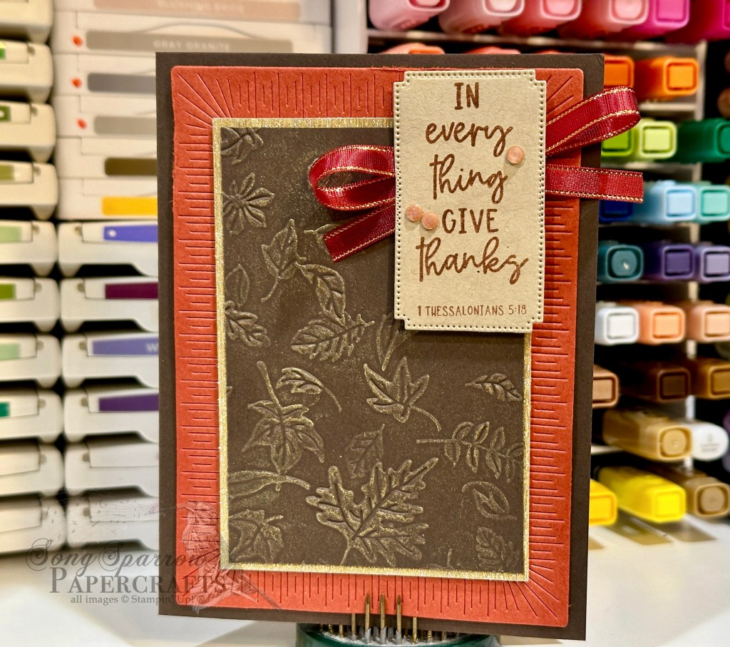
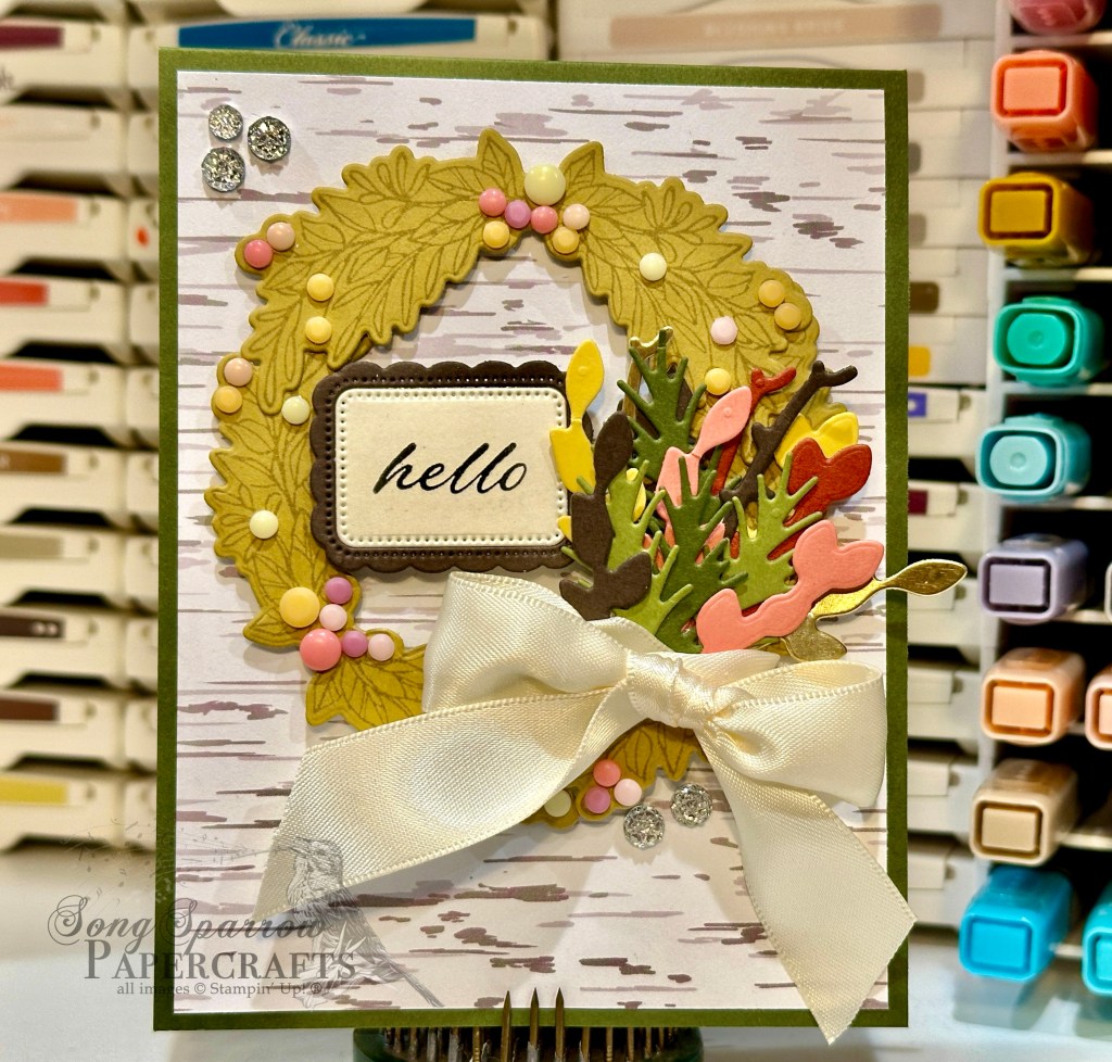
We get started with a base of Early Espresso cardstock. The backdrop for our focal panel is a piece of Cajun Craze diecut with the largest rectangle from the Radiating Stitches dies. I just love the pop the detail in this die lends to this card design. Our focal panel is a sheet of Early Espresso cardstock that has been embossed using the Leaf Fall embossing folder and then cut to fit within the center of the Cajun Craze panel. To add more depth and dimension to the embossing, I rubbed gold ink over the raised portions with my finger and then wiped the excess across the full panel so it has a slight gold sheen all the way across. To really bring this forward, the embossed panel is matted with textured gold specialty paper. The sentiment from the Courage & Faith stamp set is stamped in Copper Clay on Crumb Cake cardstock and then diecut with the Autumn Leaves die using the extension method. A faux bow of Cherry Cobbler & Gold satin ribbon is adhered behind the sentiment panel which is popped up over our focal panel using dimensionals. I added a few Earth Tone shimmer gems on either side of the sentiment to draw the eye and add a little sparkle.
Tune in tomorrow to see where our thankfulness theme takes us.
Products used in today’s card:
Early Espresso, Cajun Craze, Crumb Cake cardstock
Textured gold SP
Leaf Fall embossing folder
Courage & Faith stamps
Autumn Leaves, Radiating Stitches dies
Cherry Cobbler & Gold satin ribbon
Natural tones shimmer gems
Dimensionals
Adhesives


 Glimmer Specialty Paper")

")


 Trim Combo Pack")


 Specialty Designer Series Paper")
 Foil Sheets")


")

 Striped Trim")


 Specialty Paper")


 Specialty Paper")


 Cardstock")


 Designer Series Paper")
")
")


 Satin Ribbon")

