Autumn · No Stamp Design

Easy Easel that Failed

Welcome to today’s BONUS post! It’s the time of year where many of us crafty creators begin thinking about items that we will put in our booths at craft fairs. I have two upcoming craft fairs and am already well underway in the product creation department. One of the many items that I love to offer craft fair customers is an easel calendar. And this year, I’ve been playing around with several different layouts and methods of constructing them.

Today, I’m sharing a prototype with you that didn’t make the cut. Why am I sharing a “failure,” you might ask? Well, it may not work for my customers, but it’s still a lovely design that I intend to enjoy on my own desk. And we’re going to talk about why it doesn’t work because I think there’s value in sharing things that didn’t work out as planned and how we “fix” it.
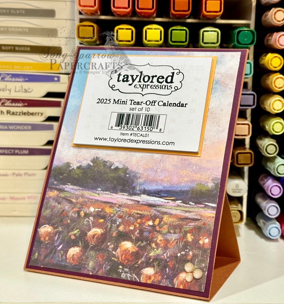
I knew that I wanted to build a calendar on a standard-sized card base in an easel design. I wanted the calendar to lie flat and be mailable for anyone who purchased one in my craft booth and wanted to mail it to a loved one. So I began with the simplest of easel stands where the easel folds up in the back to prop up the front-facing portion. But what doesn’t work about this design is the prop catch in the back to ensure that the easel stays in place. The only thing I could find that worked to keep the easel in place was a very large stack of dimensionals, which is not at all pretty. And for me, I like for every angle of a crafty creation I made to be lovely to look at. And that’s how this lovely calendar (from the front) became my new desk companion. But let’s talk about how it comes together outside of my faulty easel design.

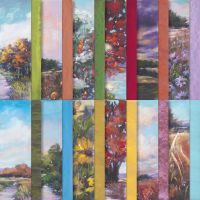
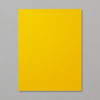
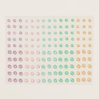
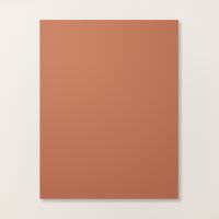
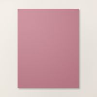
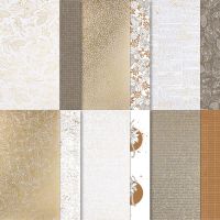
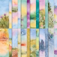
I love the new Splendid Autumn designer series paper pack and really wanted to pull out the lovely, more subtle colors in the patterned sheet I chose for this easel calendar. After placing a lot of different color combinations behind the Splendid Autumn sheet, I felt like the combination of Cajun Craze and Blackberry Bliss worked best at pulling forward the lovely shades of fall in the field of blooms AND all of the lovely colors of dusk in the sky. So our Cajun Craze sheet serves as our base for the calendar easel and the Blackberry Bliss serves as the mat directly behind the Splendid Autumn sheet. To pull forward the yellows, I matted the small tear-off calendar (by Taylored Expressions) in Crushed Curry. I added a few Peach Pie shimmer gems in the bottom corner for just a little sparkle. I just love how it turned out!

In this week’s episode of Terrific Tuesdays, I’m going to be sharing the full details on this easel calendar with you, including how this particular design was a fail for me PLUS how I changed things up to create an easel that works how I intended. So I hope you’ll tune in!

Products used in today’s featured design:
Cajun Craze, Blackberry Bliss, Crushed Curry cardstock
Splendid Autumn DSP
Taylored Expressions mini tear-off calendar
In Color shimmer gems
Product List
Autumn · Fall · sketches · Sketchy Fridays

Sketchy Fridays: Accomplished So Much

This week is all about autumn, and we’re using unique combinations of Stampin’ Up! products to make some beautiful card designs.

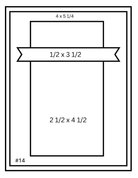
And it’s already time again for another installment of Sketchy Fridays, where each week we’ll be using a card sketch to design our featured card. Right now, we’re working through a full series of designs using the card sketches found on page 22 of the current Stampin’ Up! Annual Catalog.

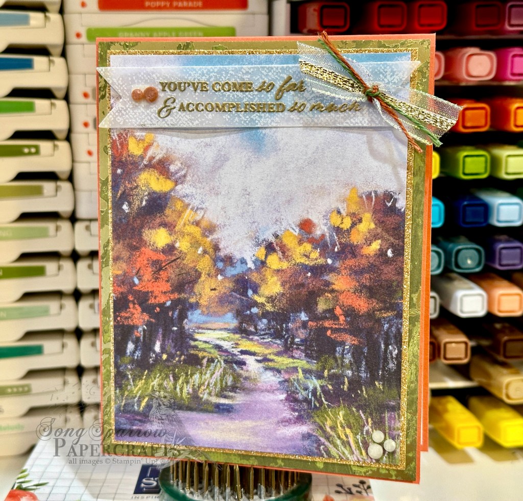
This week’s card is based on Sketch #14 and features the gorgeous Splendid Autumn designer paper from the new Stampin’ Up! Holiday Mini catalog.

As I was thumbing through the papers in the Splendid Autumn paper pack, I was looking for a sheet that would lend itself to an unexpected combination of products. When I saw this beautiful sheet of the groves of trees separated by a stream with its hues of greens and purples, along with the usual fall foliage colors, I knew I had found the sheet I was looking for.

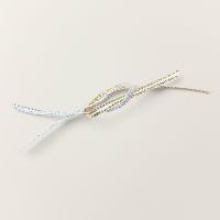
The beauty of today’s Sketch #14 is it lets us use this gorgeous paper as the focal point and then support it with mats as complements. We get started with a base of Calypso Coral cardstock. I love how this base color makes the oranges in the trees pop over the golden hues. Our sheet of Splendid Autumn is matted in two different colors. We use a very thin mat of Peach Pie glimmer paper right up against the Splendid Autumn, and it’s such a nice complement to the golden hues in our paper. Then we’re using a larger secondary mat of Old Olive Season of Elegance designer paper. Just look at how this brings out the grass along either side of our creek that’s reflecting our gorgeous dusky sky. And in person, the sparkle of the gold foiling in this sheet plays along perfectly with the glimmer paper. The sentiment from Wonderful Thoughts is heat embossed in gold on a sheet of white vellum from the Graceful Greenery vellum pack and then diecut using the Greetings of the Season dies using the extension method to give us a full banner. We finish things off with a twist of ribbons, including iridescent striped sheer ribbon, gold trim, and two colors of linen thread from the new Natural Tones pack, and a few of the new Earth Tones shimmer gems in opposing corners for a little sparkle.
I hope you tune in tomorrow as we round out our All About Autumn card series. I’ll be bringing you another emboss resist project, as well as a BONUS post showing how you can make a simple easel project that packs a big punch!

Products used in today’s card:
Calypso Coral cardstock
Season of Elegance, Splendid Autumn, Graceful Greenery vellum, Gold textured DSP
Wonderful Thoughts stamps
Greetings of the Season dies
Iridescent striped ribbon
Gold trim
Natural Tones linen thread
Earth Tones shimmer gems
Dimensionals
Adhesives

Product List
Autumn · Fall

Feel Better

This week’s designs are all about autumn. Aside from using some great new product from Stampin’ Up!, we’re using some fun new techniques to boot!

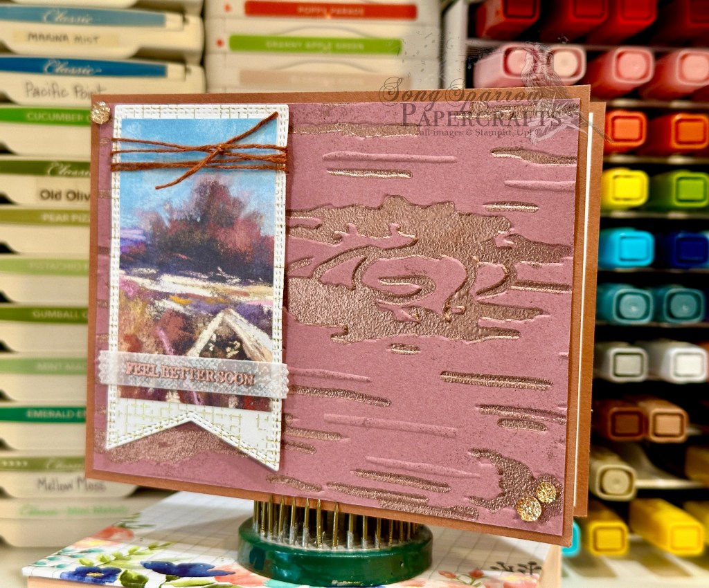
Today, we’re pairing up the beautiful new Splendid Autumn patterned paper pack with the new Birch Wood embossing folder and a cool heat embossing effect that I learned from a team member. So let’s check it out.

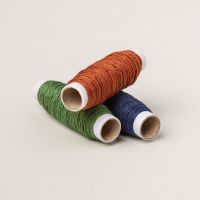
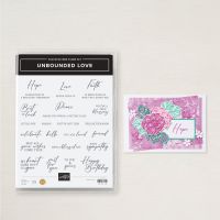
For today’s color palette, we’re drawing out all of the beautiful autumn hues in our Splendid Autumn patterned paper — Copper Clay, Moody Mauve, and Very Vanilla. So we get started with a card base of Copper Clay. Our focal panel is a piece of Moody Mauve that’s been embossed using the new Birch Wood embossing folder. I then filled in all of the debossed sections with Versamark and embossed with copper, BUT I did not completely set the embossing powder. Instead, I only embossed it to the point of looking grainy and then quickly moved on to another section. I felt like the grainy texture looks much more like bark. I wanted a polaroid look for the sentiment panel, so we get started by diecutting a cross-hatch gold foiled sheet from the Nature’s Sweetness paper pack using the largest Nested Essentials banner die. The sheet of Splendid Autumn is then cut to size to fit within, leaving a small border. The sentiment from Unbounded Love is heat embossed in copper on a banner diecut from a sheet of the white Graceful Greenery vellum using the Happy Little Things die. The top of the sentiment panel is wrapped in the new Copper Clay linen thread and the full panel is adhered to the focal panel using dimensionals. A few of the new drusy embellishments in each corner help move the eye across the card.

Isn’t this such a fun embossing technique? I really love the realism it adds to the woodgrain embossed panel. Speaking of embossing techniques, tomorrow we’ll be using another oldie but goodie. I hope you’ll pop by and check it out!

Products used in today’s card:
Copper Clay, Moody Mauve cardstock
Nature’s Sweetness, Splendid Autumn DSP
Graceful Greenery vellum
Birch Wood embossing folder
Unbounded Love stamps
Nested Essentials, Happy Little Things dies
Copper embossing powder
Copper Clay linen thread
Drusy embellishments
Dimensionals
Adhesives

Product List
Terrific Tuesdays

Autumn Birthday

We’re continuing our All About Autumn design series today, and I’m excited to bring you the much-anticipated in-depth look at the acetate rub technique that I first mentioned in my post on Saturday.

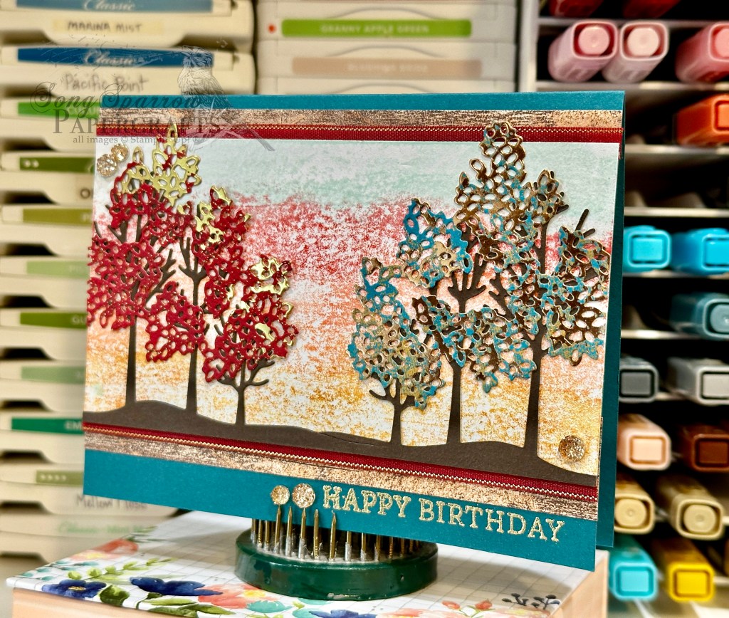
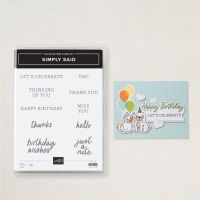
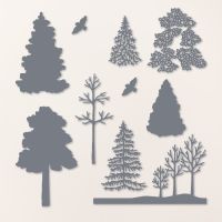
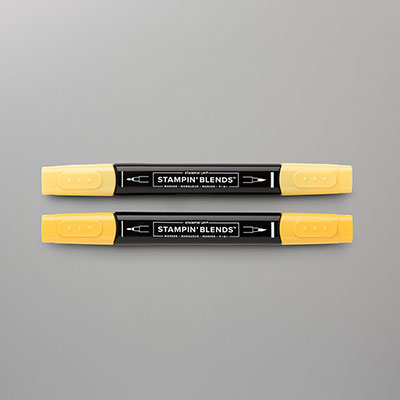
Today’s card mixes things up just a little bit to give us a different look to Saturday’s card design. We start with a card base of Pretty Peacock. Our focal panel background starts with a piece of white cardstock. Using the acetate sheet and 4 colors of Stampin’ Blends — Daffodil Delight, Calypso Coral, Cherry Cobbler, and Pool Party, we create another dusky backdrop for our trees in the midst of a wardrobe change. To achieve that look, we’re using the Pretty Peacock Oxidized Copper and the Real Red Season of Elegance specialty papers and Frosted Forest dies to create the foliage for our trees. Our groves of trees are diecut from Early Espresso cardstock using the Frosted Forest dies. To help our focal panel stand out against our card base, we mat it with a combination of Country Woods woodgrain patterned paper and the Real Red & Gold satin ribbon. The sentiment from Simply Said is heat embossed in gold and then flanked with some drusy embellishments. A few extra drusy embellishments are added in opposing corners to help draw the eye across our focal panel to the sentiment.

You can learn all about the acetate rub technique and how to make this card from start to finish in this week’s episode of Terrific Tuesdays.

I hope you’ll tune in tomorrow to check out a cool technique to try with your embossing folders.

Products used in today’s card:
Pretty Peacock, Early Espresso, Basic White cardstock
Country Woods, Oxidized Copper, Season of Elegance (out tomorrow!) DSP
Window sheets
Simply Said stamps
Frosted Forest dies
Stampin’ Blends
Gold embossing powder
Cherry Cobbler & Gold satin ribbon (out today!)
Drusy embellishments (out tomorrow!)
Adhesives

Product List
Fun Folds · sketches · Sketchy Fridays

Sketchy Fridays: Brighten Your Day

I don’t know about you, but I can’t believe that we’re wrapping up the month of August and marching right into September already! I mean, it’s Labor Day weekend. Whaaaaaa?! I feel like the older I get the faster the time seems to fly by.

And speaking of time flying by, it’s time again for another installment of Sketchy Fridays, where each week we’ll be using a card sketch to design our featured card. Right now, we’re working through a full series of designs using the card sketches found on page 22 of the current Stampin’ Up! Annual Catalog.

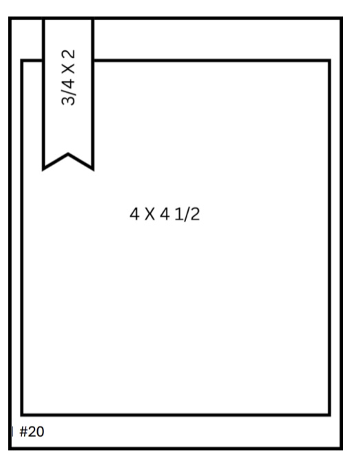
This week’s card is based on Sketch #20 and features the gorgeous Splendid Autumn designer paper from the new Stampin’ Up! Holiday Mini catalog that launches on September 4th.

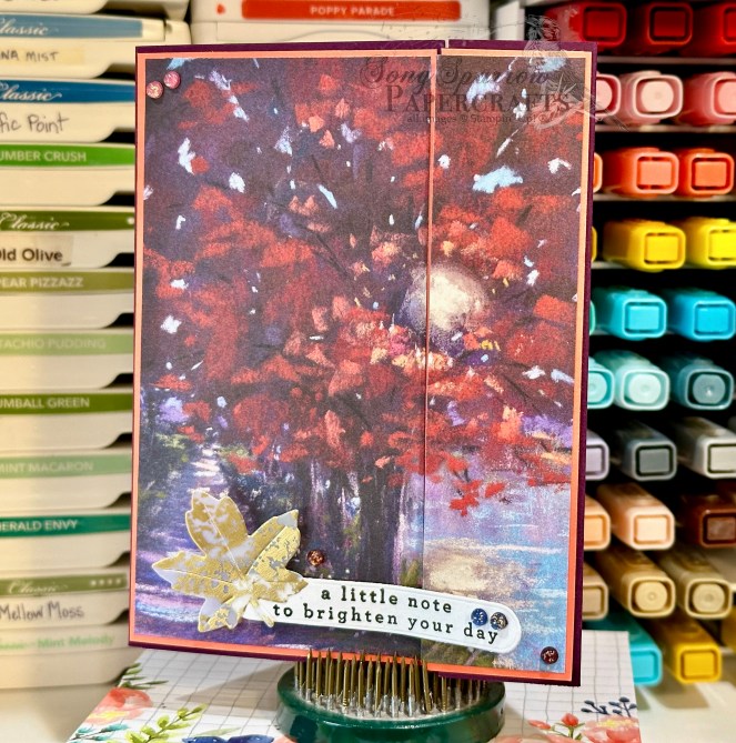
This paper pack just turns out sheet after sheet of stunning designs, and I’m loving each and every one. I’m pairing up a fun fold shared by my upline Patty Bennett with Sketch #20 from the Annual Catalog. I’ve taken the liberty of changing the orientation of the sentiment piece. And that’s the best thing about using a sketch — it gives you a place to start and then you tweak things to work for you.

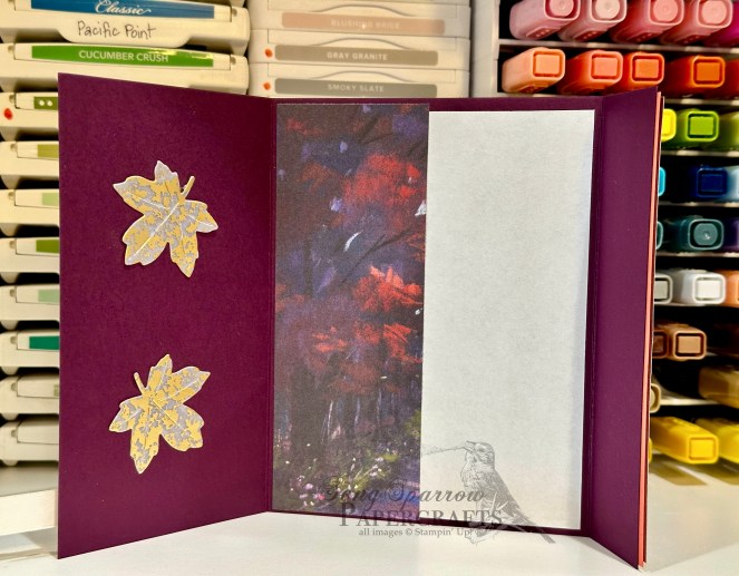
So our fun fold starts with a base of Blackberry Bliss cardstock. Rather than scoring in the center, we score and fold at 3-inches and 7.25-inches to give us our front fold with a standard-sized inside message panel. I decided to double mat the gorgeous sheet of Splendid Autumn patterned paper and used Flirty Flamingo to bring out the pinky-orange hues of the leaves. I cut and mounted the patterned paper so that the panels meet to form a complete picture when the card is closed. When open, there is a small border of Flirty Flamingo visible on the left panel and a slight overhang of the Splendid Autumn sheet on the right panel. The sentiment from Changing Leaves is stamped in black on white cardstock and then diecut using the Greetings of the Season die. I diecut a leaf from gold mercury vellum using the Autumn Leaves dies and adhered to the sentiment panel. The sentiment panel is mounted to the left panel of the card front using dimensionals. We finish off the card front with an assortment of regal foiled dots, which release next week. I felt like it was a shame to waste the remainder of the Splendid Autumn sheet, so it serves as the decorative strip next to the message panel on the inside of the card. I added a few additional gold mercury vellum leaves to tie things together.

I loved this fun fold because it offered the perfect opportunity to showcase a gorgeous sheet of paper. When I have paper that’s so pretty that I don’t want to cut it, I search for layouts like this one that let me put it on full display. Give it a try the next time you have a sheet of paper too pretty to cut up!

Tomorrow, we’re closing out our In the Woods card series with a fall sunset. I hope you’ll stop by and check it out!

Products used in today’s card:
Blackberry Bliss, Flirty Flamingo, Basic White cardstock
Splendid Autumn (coming soon!), gold mercury vellum DSP
Changing Leaves stamps
Autumn Leaves, Greetings of the Season dies
Regal foiled dots (coming soon!)
Dimensionals
Adhesives

Product List
Fun Folds · L2S Group Instahop

You Can Do This

This week, we’re making our way through the woods as we feature a whole array of woodsy products from the Stampin’ Up! lineup. Today, we’re dreaming of winter with this diamond fold card design featuring the Thoughtful Journey designer series paper and Frosted Forest bundle.

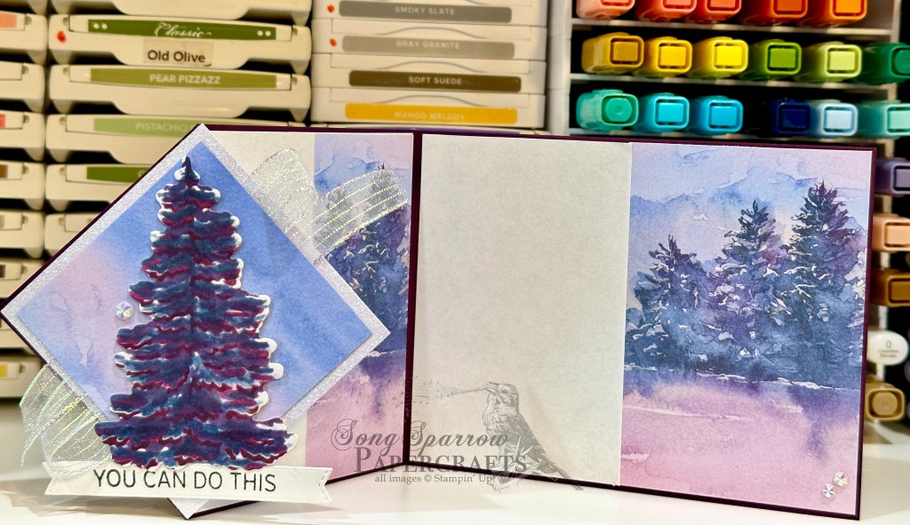
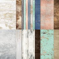
Stampin’ Up! has released some gorgeous watercolored patterned paper packs over the last year, and I think I have loved each and every one. I thought it would be fun to use the snowy scene paper from the Thoughtful Journey paper pack and create a pop-out using Frosted Forest since the evergreens closely resembled those in the paper. So let’s see how it all comes together.

We get started with a base of Blackberry Bliss cardstock. I love how this really pulls forward the purple hues in the patterned paper. Our diamond panel leaves a little of the Blackberry Bliss peeking around the edges and the mat for our panel is a piece of white glimmer cardstock to be reminiscent of twinkling snowdrifts. I used the Frosted Forest masks to create the evergreen using a combination of Blackberry Bliss, Fresh Freesia, Night of Navy, and Misty Moonlight inks and then diecut it using the coordinating Frosted Forest die. I went over the tree with Wink of Stella and added iridescent ribbon for added sparkle on the diamond panel. The sentiment from Saying Hey is stamped in black on white cardstock and then diecut using the Happy Little Things banner die. A few iridescent faceted gems finish things off nicely with an additional twinkly touch.
Isn’t this just a gorgeous scene?! Today’s card is a part of the Luv 2 Stamp Group Instagram Hop, which goes live today at 9 AM Pacific Time (PST).  Click here to head over to my Instagram feed at 11 AM Central and check out what the other demos in our L2S Group have created for you today! Tomorrow we’ll be walking in the woods with another fun fold design using the new Splendid Autumn designer series paper. I hope you’ll pop in and check it out!

Want to see how a Diamond Fold card layout comes together from start to finish? You can watch the full Terrific Tuesdays video where we make one together and snag a FREE printable tutorial to boot. Click here to download the PDF.

Products used in today’s card:
Blackberry Bliss, Basic White cardstock
Thoughtful Journey, white glimmer DSP
Frosted Forest masks and dies
Saying Hey stamps
Happy Little Things dies
Iridescent striped trim
Iridescent faceted gems
Dimensionals
Adhesives

Product List
Terrific Tuesdays · Winter

Warm Feelings

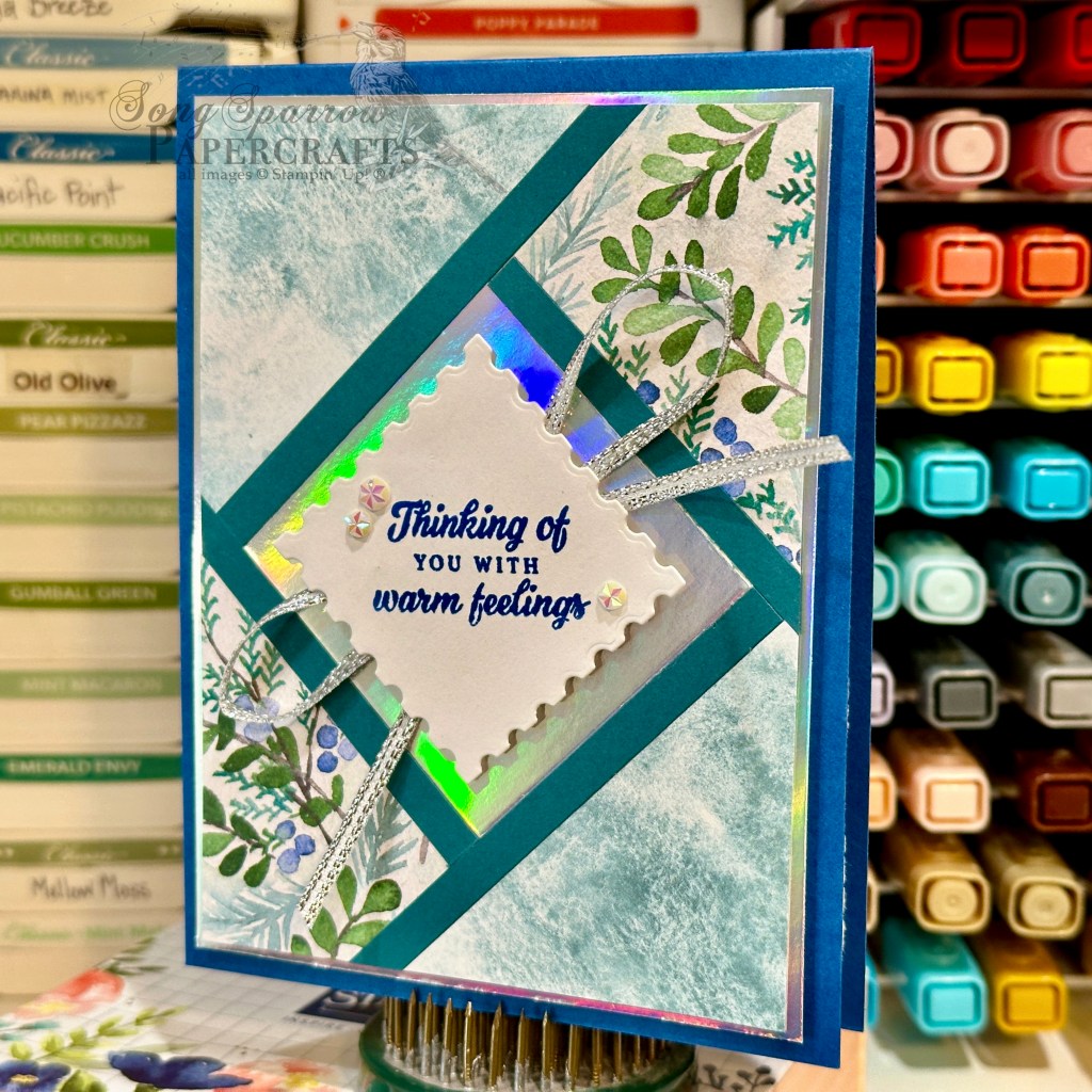
We’re continuing our trek through the woods today with a fun new-to-me card technique called a fractured card design. I’ve seen this card layout featured a number of times in my inspiration searches but, honestly, thought it was going to be too difficult to learn and so I passed it by. But I decided to do a little more research on fractured card designs and do you want to know what I discovered? It’s probably the easiest “hard” card you’ll ever learn! Let’s take a look and you’ll see what I mean.

What I love about this particular card layout is that it’s a great way to showcase designer series paper patterns. And there are all kinds of variations that make this card layout easy to adapt to any patterned paper and keep your cards interesting even when using the same patterns multiple times.

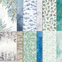
For today’s card, we get started with a base of Blueberry Bushel cardstock. I used white cardstock as the backing for the fractured panel. I chose to showcase the Winter Meadow designer series paper and chose two coordinating patterns. Silver serves as a nice compliment to the wintery feel and a terrific sparkly backdrop. Pretty Peacock serves as our fracture strips and draws out the predominant color in our patterned paper pieces. The sentiment from the new Peaceful Season stamp set is stamped in Blueberry Bushel and then diecut on the diagonal using the Perennial Postage die. A faux bow of silver ribbon and few iridescent faceted gems draw the eye front and center to the sentiment.
Want to know how to make today’s card step-by-step? You can catch this week’s of episode of Terrific Tuesdays to see a fractured card design come together from start to finish and see first-hand how versatile this design can be. I’ve also provided a FREE PDF tutorial here. Please note that some of the products shown will not be available until September 4th.

Products used in today’s card:
Blueberry Bushel, Pretty Peacock, Basic White cardstock
Winter Meadow, silver foil DSP
Peaceful Season stamps (coming soon!)
Perennial Postage dies
Silver trim
Iridescent faceted gems
Dimensionals
Adhesives

Product List
Coming Soon · Fun Folds

Happy Birthday Deer

Do you ever see a card design and think, “man, that’s brilliant!” as you’re scrolling Pinterest or some other platform for inspiration? There are some cards that are just show stoppers! Today’s tri-fold card design was inspired by a stunning card posted by fellow demonstrator Stamp With Amy K, and as soon as I saw it, I knew that I had to give it a try for this week’s In the Woods card series.

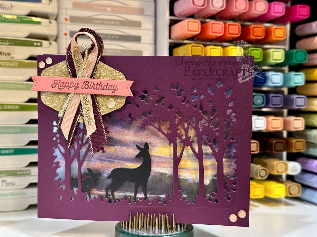
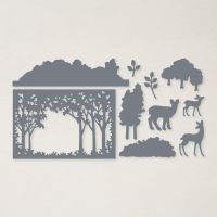
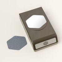
I knew that I wanted to spotlight a gorgeous sunrise scene paper from the upcoming Splendid Autumn paper pack. We get started with this super simple tri-fold fun fold design with a base of Blackberry Bliss cardstock. I laid the open tree grove die from the Grove die set over the sheet of paper to determine what portion I wanted to peek through to the card front and then diecut the front panel of Blackberry Bliss cardstock. I diecut two deer silhouettes in black cardstock with the Grove dies and then adhered them in the grove of trees with tear-n-tape. To keep the deer in place, a sheet of acetate is then adhered to the back of the card front. The focal sentiment from Adventurous Sky is stamped on Flirty Flamingo and diecut using the Happy Little Things banner die. It’s adhered over a ribbon of Blackberry Bliss & Gold, gold trim, and Peach Pie and then mounted to a textured gold hexagonal mat.

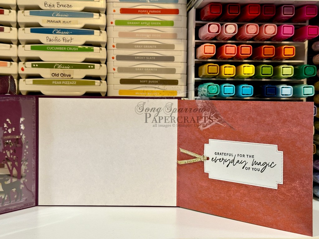
The sheet of Splendid Autumn is then cut to fit inside the card and the far right of the patterned paper panel is scored to create the fold-out portion. The inside card base is covered with white cardstock, which also serves to cover the anchor for the patterned paper sheet.

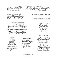
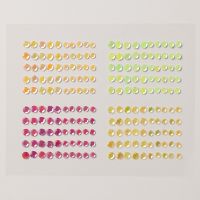
I stamped the sentiment from Something Fancy in black ink on white cardstock and then diecut with the Greetings of the Season die, adding some gold trim to finish things off before adhering to the fold-out panel. We finish off the whole design with careful placement of shiny sequins and sparkle gems to add twinkles on several of the panels to help draw the eye across and through the full tri-fold.

Although this card looks complicated, it comes together quickly and is even more stunning in person! Tomorrow, we’re going to be walking through a new-to-me design technique. I hope you’ll pop by and check it out!

Products used in today’s card:
Blackberry Bliss, Flirty Flamingo, Basic Black, Basic White cardstock
Splendid Autumn (coming soon!), textured gold DSP
Acetate window sheets
Something Fancy, Adventurous Sky stamps
Grove, Autumn Leaves, Happy Little Things dies
Heartfelt Hexagon punch
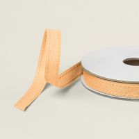
Peach Pie bordered ribbon, Blackberry Bliss & gold textured ribbon (coming soon!), gold trim
In Color shimmer gems, shiny sequins
Adhesives

Product List
Changing Leaves · Fun Folds

Not Without You

Welcome to another bright & shining Monday. I don’t know about you, but it was a busy weekend for us. The kiddo finished up his summer bowling league and took some lessons in preparation for the start of the fall league. So we spent a lot of time at the bowling alley. But given the inferno we’re experiencing here in North Texas, that worked out just fine!

This week, we’re starting a new card series called In the Woods. Each we’ll be using products from Stampin’ Up! that fit our weekly theme. Today, I’m feeling all the fall vibes and thought it would be appropriate to get started with the Changing Leaves bundle paired up with the Splendid Autumn designer series paper that launches next week on September 6th.

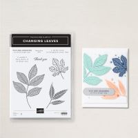
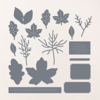
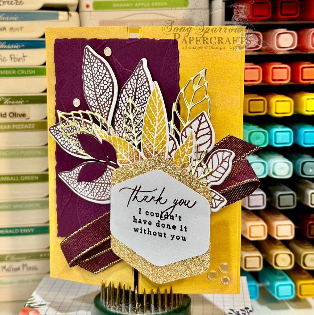
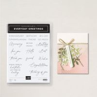
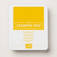
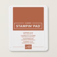
To give an opportunity for our gorgeous leaves from the Changing Leaves bundle to take center stage, we’re working with the barn fold today. And we get started on today’s card with a base of Crushed Curry cardstock. We cover each of the front flaps of our barn fold with a strip of paper from the Splendid Autumn paper pack. The pattern is a very subtle brushed, grainy texture that gives some nice depth in our color palette. Next up, we emboss a quarter panel of Blackberry Bliss cardstock using the Changing Leaves hybrid embossing folder and then diecut it into a smaller panel with one of the larger Deckled Rectangles dies. On a quarter sheet of white cardstock, I traced the outside of the trio of leaves from the Changing Leaves die set in pencil to make it easier to stamp each of the leaf images and then diecut all at once. I used a combination of fall colors to ink each leaf from the stamp set, including Copper Clay, Blackberry Bliss, and Crushed Curry, and imitated the look of leaves in a color metamorphosis by going over sections of each leaf with other colors for a subtle two-toned look. I diecut a few additional leaves in gold foil and Blackberry Bliss and then layered everything together to create a leafy focal section behind the sentiment panel. Our hexagonal sentiment panel consists of a white center panel and mat of Peach Pie glimmer paper. The sentiments from Everyday Greetings and Changing Leaves are stamped in Blackberry Bliss. Our focal panel section is finished off with Blackberry Bliss & Gold textured ribbon from the upcoming Holiday Mini catalog, releasing next week on September 6th. A few shiny sequins finish things off with a little extra sparkle and help draw the eye across all the gorgeous design elements on the front of this card.

Tomorrow we’re working with another fun fold design and another gorgeous sheet from the Splendid Autumn paper pack to create a gorgeous peek-through scene. You won’t want to miss it!

Products used in today’s card:
Crushed Curry, Blackberry Bliss, Basic White cardstock
Splendid Autumn (coming soon!), gold foil, In Color glimmer DSP
Changing Leaves stamps, dies & hybrid embossing folder
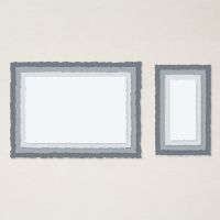
Deckled Rectangles
Everyday Greetings stamps
Hexagon punch
Blackberry Bliss & Gold textured ribbon (coming soon!)
Shiny sequins
Dimensionals
Adhesives

Product List
Inspiration

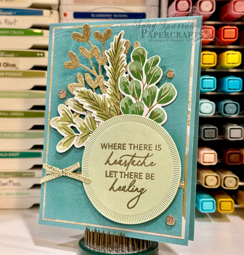
Where There is Heartache

I love finding new ways to use product in my stash. And I realized that I often look at the “holiday” products as just that – products for the holidays and not for the everyday. So I wanted to challenge myself to expand designs with those holiday products.

Today, we’re using the Season of Green & Gold patterned paper to create a stunning sympathy card. I feel like sympathy cards should offer love, hope, and encouragement. And while it’s certainly a somber occasion, a design of carefully selected colors and elements can convey hope without words.

We get started on our card with a base of Lost Lagoon cardstock. Our focal panel backdrop consists of a panel of Lost Lagoon embossed on an angle with the Cute Crochet embossing folder and then matted with the gold mercury vellum. The Lost Lagoon panel has gold trim tied around it with a small bow. The sentiment from Everyday Greetings is stamped in Versamark on Soft Sea Foam and then heat embossed in gold. This is then diecut with the Spotlight on Nature dies. I love that the Season of Green & Gold designer paper coordinates with the Golden Greenery dies and have used the two together to cut out several of the stalks of greenery for the sentiment panel. I also cut a sheet of textured gold with the greenery dies. All of these greenery pieces are layered behind the sentiment panel. The drusy embellishments add extra sparkle.

Next week, we’re going to be in the woods. I hope you’ll come along!

Products used in today’s card:
Lost Lagoon, Soft Sea Foam cardstock
Season of Green & Gold, mercury vellum, textured gold DSP
Cute Crochet embossing folder
Everyday Greetings stamps
Spotlight on Nature, Golden Greenery dies
Gold embossing powder
Gold trim
Drusy embellishments
Dimensionals
Adhesives