This week is all about fun folds. I have to admit that I was pretty intimidated by fun folds at first, but once you’re brave enough to try your first one, there’s really no going back! Now, there’s nothing more exciting than adding another fun fold to my arsenal, especially when it’s an easy one that looks hard. *wink*
Today, we’re trying out a fun fold that I learned from my Luv2Stamp team leader Patty Bennett called the Explosion Pop-Up. And there are tons of variations of this fold out there that really dress it up and dress it down. I went with a pretty simple version for my first go.


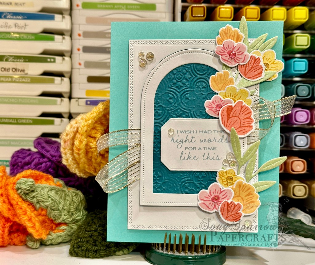
We get started with a standard A2-sized card base of Pool Party cardstock. The two-panel focal panel starts with a backdrop of Pretty in Pink plaid from the Wildflower Birthdays paper pack that is diecut using the largest Textured Notes rectangle die. Then we cut a circle from the Pool Party and gold sheet using the Spotlight on Nature dies. To help set off the center of our focal panel, I mounted the circle panel atop a faux bow of gold striped mesh ribbon. Our focal image is from the ephemera sheet included in the Wildflower Birthday pack and mounted with dimensionals. A few gold drusy embellishments on either side set things off nicely and really bring the eye in.
The inside pop-up panel is a 6×6 sheet of the striped paper from the Wildflower Birthdays pack. I used more ephemera to decorate the left side. The sentiment panel is a small square of white cardstock that is stamped with a sentiment from The Right Words set in Pool Party ink. A few drusy embellishments on either end of the gold banner tie the design together nicely.
It takes just a minute to get the hang of folding the pop-up panel correctly. But other than that, this is a really simple fun fold that packs so much visual fun. Wanna give it a try? You can snag the free tutorial for today’s card here.
Product List![Pool Party 8-1/2" X 11" Cardstock [ 122924 ]](https://assets1.tamsnetwork.com/images/EC042017NF/122924s.jpg "Pool Party 8-1/2\" X 11\" Cardstock [ 122924 ]")
![Basic White 8 1/2" X 11" Cardstock [ 166780 ]](https://assets1.tamsnetwork.com/images/EC042017NF/166780s.jpg "Basic White 8 1/2\" X 11\" Cardstock [ 166780 ]")
![Wildflower Birthday 12" X 12" (30.5 X 30.5 Cm) Specialty Designer Series Paper [ 164591 ]](https://assets1.tamsnetwork.com/images/EC042017NF/164591s.jpg "Wildflower Birthday 12\" X 12\" (30.5 X 30.5 Cm) Specialty Designer Series Paper [ 164591 ]")
![Textured Notes Dies [ 165555 ]](https://assets1.tamsnetwork.com/images/EC042017NF/165555s.jpg "Textured Notes Dies [ 165555 ]")
![Spotlight On Nature Dies [ 163580 ]](https://assets1.tamsnetwork.com/images/EC042017NF/163580s.jpg "Spotlight On Nature Dies [ 163580 ]")
![The Right Words Cling Stamp Set (English) [ 165316 ]](https://assets1.tamsnetwork.com/images/EC042017NF/165316s.jpg "The Right Words Cling Stamp Set (English) [ 165316 ]")
![Pool Party Classic Stampin' Pad [ 147107 ]](https://assets1.tamsnetwork.com/images/EC042017NF/147107s.jpg "Pool Party Classic Stampin' Pad [ 147107 ]")
![Gold Striped 3/8" (1 Cm) Mesh Ribbon [ 165599 ]](https://assets1.tamsnetwork.com/images/EC042017NF/165599s.jpg "Gold Striped 3/8\" (1 Cm) Mesh Ribbon [ 165599 ]")
![Drusy Adhesive Backed Embellishments [ 164223 ]](https://assets1.tamsnetwork.com/images/EC042017NF/164223s.jpg "Drusy Adhesive Backed Embellishments [ 164223 ]")
![Stampin' Dimensionals [ 104430 ]](https://assets1.tamsnetwork.com/images/EC042017NF/104430s.jpg "Stampin' Dimensionals [ 104430 ]")

![Cloud Cover 8 1/2" X 11" Cardstock [ 165621 ]](https://assets1.tamsnetwork.com/images/EC042017NF/165621s.jpg "Cloud Cover 8 1/2\" X 11\" Cardstock [ 165621 ]")
![Petunia Pop 8 1/2" X 11" Cardstock [ 163801 ]](https://assets1.tamsnetwork.com/images/EC042017NF/163801s.jpg "Petunia Pop 8 1/2\" X 11\" Cardstock [ 163801 ]")
![Blackberry Bliss 8-1/2" X 11" Cardstock [ 133675 ]](https://assets1.tamsnetwork.com/images/EC042017NF/133675s.jpg "Blackberry Bliss 8-1/2\" X 11\" Cardstock [ 133675 ]")
![Smoky Slate 8-1/2" X 11" Cardstock [ 131202 ]](https://assets1.tamsnetwork.com/images/EC042017NF/131202s.jpg "Smoky Slate 8-1/2\" X 11\" Cardstock [ 131202 ]")
![Brushed Silver And Gold Foil 12" X 12" (30.5 X 30.5 Cm) Specialty Paper [ 164861 ]](https://assets1.tamsnetwork.com/images/EC042017NF/164861s.jpg "Brushed Silver And Gold Foil 12\" X 12\" (30.5 X 30.5 Cm) Specialty Paper [ 164861 ]")
![Florals In Bloom 12" X 12" (30.5 X 30.5 Cm) Designer Series Paper [ 165175 ]](https://assets1.tamsnetwork.com/images/EC042017NF/165175s.jpg "Florals In Bloom 12\" X 12\" (30.5 X 30.5 Cm) Designer Series Paper [ 165175 ]")
![Country Woods 12" X 12" (30.5 X 30.5 Cm) Designer Series Paper [ 163393 ]](https://assets1.tamsnetwork.com/images/EC042017NF/163393s.jpg "Country Woods 12\" X 12\" (30.5 X 30.5 Cm) Designer Series Paper [ 163393 ]")
![Pretty Florals Dies [ 165178 ]](https://assets1.tamsnetwork.com/images/EC042017NF/165178s.jpg "Pretty Florals Dies [ 165178 ]")
![More Messages Bundle (English) [ 165473 ]](https://assets1.tamsnetwork.com/images/EC042017NF/165473s.jpg "More Messages Bundle (English) [ 165473 ]")
![Smoky Slate Classic Stampin' Pad [ 147113 ]](https://assets1.tamsnetwork.com/images/EC042017NF/147113s.jpg "Smoky Slate Classic Stampin' Pad [ 147113 ]")
![Petunia Pop 1/4" (6.4 Mm) Iridescent Ribbon [ 166203 ]](https://assets1.tamsnetwork.com/images/EC042017NF/166203s.jpg "Petunia Pop 1/4\" (6.4 Mm) Iridescent Ribbon [ 166203 ]")
![Charming Shimmer Faceted Dots [ 166139 ]](https://assets1.tamsnetwork.com/images/EC042017NF/166139s.jpg "Charming Shimmer Faceted Dots [ 166139 ]")
![Mini Glue Dots [ 103683 ]](https://assets1.tamsnetwork.com/images/EC042017NF/103683s.jpg "Mini Glue Dots [ 103683 ]")
![Mini Stampin' Dimensionals [ 144108 ]](https://assets1.tamsnetwork.com/images/EC042017NF/144108s.jpg "Mini Stampin' Dimensionals [ 144108 ]")

![Secret Sea 8 1/2" X 11" Cardstock [ 165624 ]](https://assets1.tamsnetwork.com/images/EC042017NF/165624s.jpg "Secret Sea 8 1/2\" X 11\" Cardstock [ 165624 ]")
![Strawberry Slush 8 1/2" X 11" Cardstock [ 165625 ]](https://assets1.tamsnetwork.com/images/EC042017NF/165625s.jpg "Strawberry Slush 8 1/2\" X 11\" Cardstock [ 165625 ]")
![Pretty In Pink 8 1/2" X 11" Cardstock [ 163793 ]](https://assets1.tamsnetwork.com/images/EC042017NF/163793s.jpg "Pretty In Pink 8 1/2\" X 11\" Cardstock [ 163793 ]")
![Pretty Peacock 8-1/2" X 11" Cardstock [ 150880 ]](https://assets1.tamsnetwork.com/images/EC042017NF/150880s.jpg "Pretty Peacock 8-1/2\" X 11\" Cardstock [ 150880 ]")
![Plaster Painting 3 D Embossing Folder [ 164656 ]](https://assets1.tamsnetwork.com/images/EC042017NF/164656s.jpg "Plaster Painting 3 D Embossing Folder [ 164656 ]")
![Gray Granite Classic Stampin' Pad [ 147118 ]](https://assets1.tamsnetwork.com/images/EC042017NF/147118s.jpg "Gray Granite Classic Stampin' Pad [ 147118 ]")
![Gold & Silver 1/8" (3.2 Mm) Trim Combo Pack [ 161633 ]](https://assets1.tamsnetwork.com/images/EC042017NF/161633s.jpg "Gold & Silver 1/8\" (3.2 Mm) Trim Combo Pack [ 161633 ]")
![Clear Wink Of Stella Glitter Brush [ 141897 ]](https://assets1.tamsnetwork.com/images/EC042017NF/141897s.jpg "Clear Wink Of Stella Glitter Brush [ 141897 ]")
![Strawberry Slush & Pretty In Pink Gems [ 165615 ]](https://assets1.tamsnetwork.com/images/EC042017NF/165615s.jpg "Strawberry Slush & Pretty In Pink Gems [ 165615 ]")
![Tear & Tape Adhesive [ 154031 ]](https://assets1.tamsnetwork.com/images/EC042017NF/154031s.jpg "Tear & Tape Adhesive [ 154031 ]")
![Shaded Spruce 8-1/2" X 11" Cardstock [ 146981 ]](https://assets1.tamsnetwork.com/images/EC042017NF/146981s.jpg "Shaded Spruce 8-1/2\" X 11\" Cardstock [ 146981 ]")
![Sweet Blooms Dies (English) [ 165186 ]](https://assets1.tamsnetwork.com/images/EC042017NF/165186s.jpg "Sweet Blooms Dies (English) [ 165186 ]")
![Everyday Arches Dies [ 164629 ]](https://assets1.tamsnetwork.com/images/EC042017NF/164629s.jpg "Everyday Arches Dies [ 164629 ]")
![Fine-Tip Glue Pen [ 138309 ]](https://assets1.tamsnetwork.com/images/EC042017NF/138309s.jpg "Fine-Tip Glue Pen [ 138309 ]")

![Thoughtful Designs 12" X 12" (30.5 X 30.5 Cm) Specialty Designer Series Paper [ 163317 ]](https://assets1.tamsnetwork.com/images/EC042017NF/163317s.jpg "Thoughtful Designs 12\" X 12\" (30.5 X 30.5 Cm) Specialty Designer Series Paper [ 163317 ]")
![Pretty Florals Photopolymer Stamp Set [ 165177 ]](https://assets1.tamsnetwork.com/images/EC042017NF/165177s.jpg "Pretty Florals Photopolymer Stamp Set [ 165177 ]")
![Countryside Corners Dies [ 161471 ]](https://assets1.tamsnetwork.com/images/EC042017NF/161471s.jpg "Countryside Corners Dies [ 161471 ]")
![Secret Sea Classic Stampin' Pad [ 165285 ]](https://assets1.tamsnetwork.com/images/EC042017NF/165285s.jpg "Secret Sea Classic Stampin' Pad [ 165285 ]")
![Garden Green Classic Stampin' Pad [ 147089 ]](https://assets1.tamsnetwork.com/images/EC042017NF/147089s.jpg "Garden Green Classic Stampin' Pad [ 147089 ]")
![Strawberry Slush Classic Stampin' Pad [ 165286 ]](https://assets1.tamsnetwork.com/images/EC042017NF/165286s.jpg "Strawberry Slush Classic Stampin' Pad [ 165286 ]")
![Timid Tiger Classic Stampin' Pad [ 165278 ]](https://assets1.tamsnetwork.com/images/EC042017NF/165278s.jpg "Timid Tiger Classic Stampin' Pad [ 165278 ]")
![Fresh Freesia Classic Stampin' Pad [ 155611 ]](https://assets1.tamsnetwork.com/images/EC042017NF/155611s.jpg "Fresh Freesia Classic Stampin' Pad [ 155611 ]")
![Blackberry Bliss Classic Stampin' Pad [ 147092 ]](https://assets1.tamsnetwork.com/images/EC042017NF/147092s.jpg "Blackberry Bliss Classic Stampin' Pad [ 147092 ]")
![Crushed Curry Classic Stampin' Pad [ 147087 ]](https://assets1.tamsnetwork.com/images/EC042017NF/147087s.jpg "Crushed Curry Classic Stampin' Pad [ 147087 ]")
![Daffodil Delight Classic Stampin' Pad [ 147094 ]](https://assets1.tamsnetwork.com/images/EC042017NF/147094s.jpg "Daffodil Delight Classic Stampin' Pad [ 147094 ]")
![Iridescent Foil Gems [ 162842 ]](https://assets1.tamsnetwork.com/images/EC042017NF/162842s.jpg "Iridescent Foil Gems [ 162842 ]")
![Petal Pink & White 1/4" (6.4 Mm) Diagonal Trim Combo Pack [ 163417 ]](https://assets1.tamsnetwork.com/images/EC042017NF/163417s.jpg "Petal Pink & White 1/4\" (6.4 Mm) Diagonal Trim Combo Pack [ 163417 ]")
![Silver & White 1/2" (1.3 Cm) Sheer Ribbon [ 162149 ]](https://assets1.tamsnetwork.com/images/EC042017NF/162149s.jpg "Silver & White 1/2\" (1.3 Cm) Sheer Ribbon [ 162149 ]")


![Highland Heather 8-1/2" X 11" Cardstock [ 146986 ]](https://assets1.tamsnetwork.com/images/EC042017NF/146986s.jpg "Highland Heather 8-1/2\" X 11\" Cardstock [ 146986 ]")
![Three Color Glimmer 12" X 12" (30.5 X 30.5 Cm) Specialty Paper [ 162813 ]](https://assets1.tamsnetwork.com/images/EC042017NF/162813s.jpg "Three Color Glimmer 12\" X 12\" (30.5 X 30.5 Cm) Specialty Paper [ 162813 ]")
![Pastel Ombre Glimmer 12" X 12" (30.5 X 30.5 Cm) Specialty Paper [ 164851 ]](https://assets1.tamsnetwork.com/images/EC042017NF/164851s.jpg "Pastel Ombre Glimmer 12\" X 12\" (30.5 X 30.5 Cm) Specialty Paper [ 164851 ]")
![Silver Foil 12" X 12" (30.5 X 30.5 Cm) Specialty Pack [ 163096 ]](https://assets1.tamsnetwork.com/images/EC042017NF/163096s.jpg "Silver Foil 12\" X 12\" (30.5 X 30.5 Cm) Specialty Pack [ 163096 ]")
![Gorgeous Grape Classic Stampin' Pad [ 147099 ]](https://assets1.tamsnetwork.com/images/EC042017NF/147099s.jpg "Gorgeous Grape Classic Stampin' Pad [ 147099 ]")
![Purple Adhesive Backed Sequins [ 164970 ]](https://assets1.tamsnetwork.com/images/EC042017NF/164970s.jpg "Purple Adhesive Backed Sequins [ 164970 ]")
![Coastal Cabana 8-1/2" X 11" Cardstock [ 131297 ]](https://assets1.tamsnetwork.com/images/EC042017NF/131297s.jpg "Coastal Cabana 8-1/2\" X 11\" Cardstock [ 131297 ]")
![Pretty Florals Bundle [ 165179 ]](https://assets1.tamsnetwork.com/images/EC042017NF/165179s.jpg "Pretty Florals Bundle [ 165179 ]")
![Distressed Tile 3 D Embossing Folder [ 162189 ]](https://assets1.tamsnetwork.com/images/EC042017NF/162189s.jpg "Distressed Tile 3 D Embossing Folder [ 162189 ]")
![Pretty In Pink Classic Stampin Pad [ 163807 ]](https://assets1.tamsnetwork.com/images/EC042017NF/163807s.jpg "Pretty In Pink Classic Stampin Pad [ 163807 ]")
![Peach Pie Classic Stampin Pad [ 163810 ]](https://assets1.tamsnetwork.com/images/EC042017NF/163810s.jpg "Peach Pie Classic Stampin Pad [ 163810 ]")
![Flirty Flamingo Classic Stampin' Pad [ 147052 ]](https://assets1.tamsnetwork.com/images/EC042017NF/147052s.jpg "Flirty Flamingo Classic Stampin' Pad [ 147052 ]")
![Calypso Coral Classic Stampin' Pad [ 147101 ]](https://assets1.tamsnetwork.com/images/EC042017NF/147101s.jpg "Calypso Coral Classic Stampin' Pad [ 147101 ]")
![Cloud Cover Classic Stampin' Ink Refill [ 165279 ]](https://assets1.tamsnetwork.com/images/EC042017NF/165279s.jpg "Cloud Cover Classic Stampin' Ink Refill [ 165279 ]")

![Peach Pie 8 1/2" X 11" Cardstock [ 163799 ]](https://assets1.tamsnetwork.com/images/EC042017NF/163799s.jpg "Peach Pie 8 1/2\" X 11\" Cardstock [ 163799 ]")
![2024–2026 In Color™ Glimmer 12" X 12" (30.5 X 30.5 Cm) Specialty Paper [ 163771 ]](https://assets1.tamsnetwork.com/images/EC042017NF/163771s.jpg "2024–2026 In Color™ Glimmer 12\" X 12\" (30.5 X 30.5 Cm) Specialty Paper [ 163771 ]")
![Label Me Grateful Cling Stamp Set (English) [ 166108 ]](https://assets1.tamsnetwork.com/images/EC042017NF/166108s.jpg "Label Me Grateful Cling Stamp Set (English) [ 166108 ]")
![Mixed Labels Dies [ 164652 ]](https://assets1.tamsnetwork.com/images/EC042017NF/164652s.jpg "Mixed Labels Dies [ 164652 ]")
![Riverside Irregular Pearls [ 164937 ]](https://assets1.tamsnetwork.com/images/EC042017NF/164937s.jpg "Riverside Irregular Pearls [ 164937 ]")
![2025–2027 In Color™ Flat Pearls [ 165192 ]](https://assets1.tamsnetwork.com/images/EC042017NF/165192s.jpg "2025–2027 In Color™ Flat Pearls [ 165192 ]")
![Summer Splash 3/8" (1 Cm) Bordered Ribbon [ 163786 ]](https://assets1.tamsnetwork.com/images/EC042017NF/163786s.jpg "Summer Splash 3/8\" (1 Cm) Bordered Ribbon [ 163786 ]")

![Misty Moonlight 8-1/2" X 11" Cardstock [ 153081 ]](https://assets1.tamsnetwork.com/images/EC042017NF/153081s.jpg "Misty Moonlight 8-1/2\" X 11\" Cardstock [ 153081 ]")
![Mossy Meadow 8-1/2" X 11" Cardstock [ 133676 ]](https://assets1.tamsnetwork.com/images/EC042017NF/133676s.jpg "Mossy Meadow 8-1/2\" X 11\" Cardstock [ 133676 ]")
![Berry Burst, Old Olive & White 12" X 12" (30.5 X 30.5 Cm) Glimmer Specialty Paper [ 163769 ]](https://assets1.tamsnetwork.com/images/EC042017NF/163769s.jpg "Berry Burst, Old Olive & White 12\" X 12\" (30.5 X 30.5 Cm) Glimmer Specialty Paper [ 163769 ]")
![Versamark Pad [ 102283 ]](https://assets1.tamsnetwork.com/images/EC042017NF/102283s.jpg "Versamark Pad [ 102283 ]")
![Basics Wow! Embossing Powder [ 165679 ]](https://assets1.tamsnetwork.com/images/EC042017NF/165679s.jpg "Basics Wow! Embossing Powder [ 165679 ]")
![Label Me Grateful Bundle (English) [ 166112 ]](https://assets1.tamsnetwork.com/images/EC042017NF/166112s.jpg "Label Me Grateful Bundle (English) [ 166112 ]")
![Country Flowers Dies [ 163410 ]](https://assets1.tamsnetwork.com/images/EC042017NF/163410s.jpg "Country Flowers Dies [ 163410 ]")

