Coming Soon · January Mini Catalog

Clear Skies for ’25

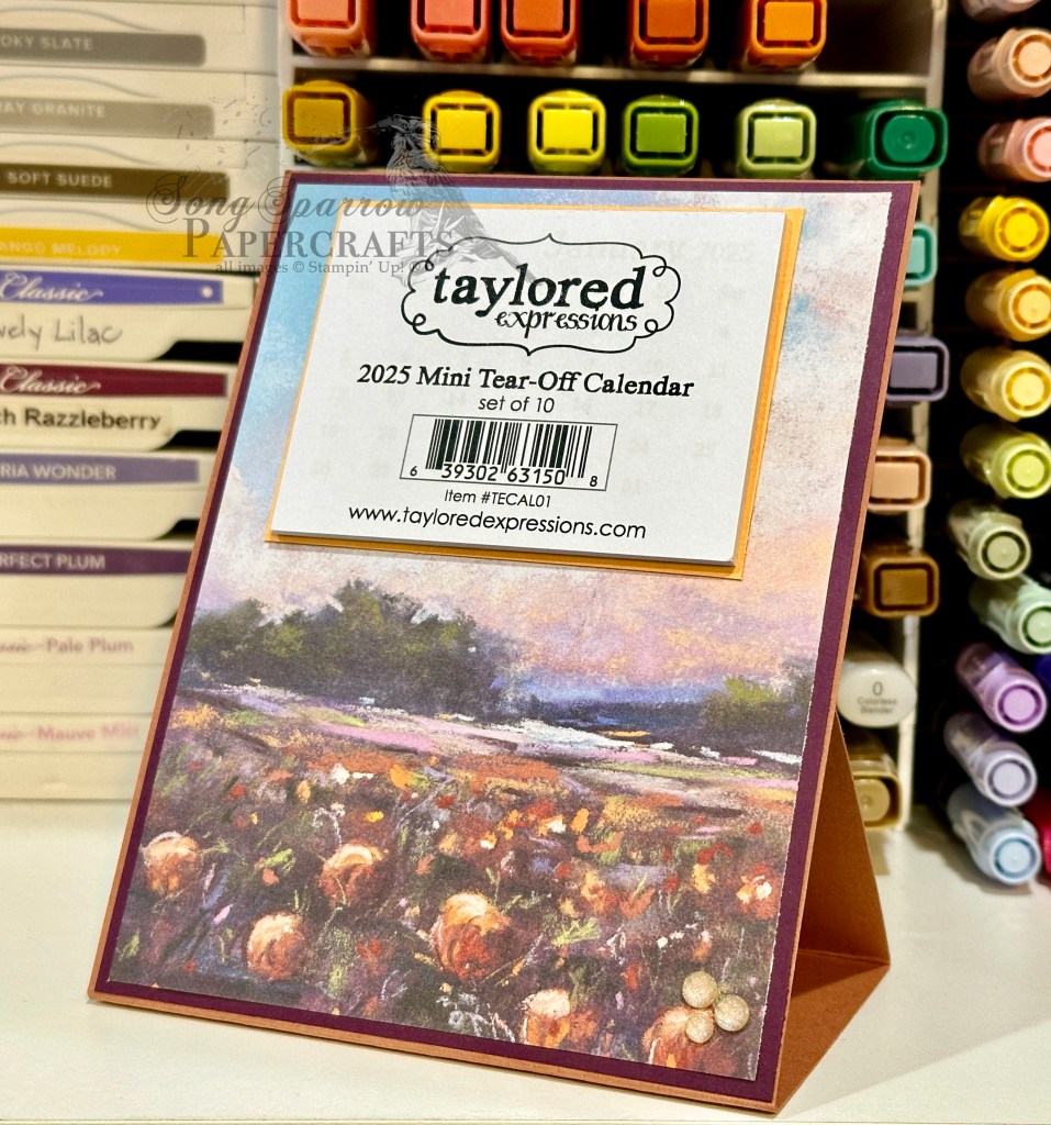
We’re continuing our sneak peeks at some of my favorite products from the upcoming Stampin’ Up! January Mini and Sale-a-Bration catalogs. And today, we’re making a super easy easel calendar using the new Everyday Skies designer paper and (what is clearly showing as one of my top favorites) the pastel ombre glimmer paper. I just love all of the skies depicted in this paper pack — from moody to dark to beautiful sunrises & sunsets, this pack has them all!

I needed some simple Christmas gift stuffers, so I whipped up these two easel calendars last night. Let’s see how these two beauties come together.

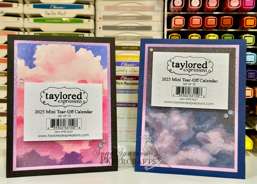
For the first calendar, we get started with Basic Black cardstock. This is cut so that the card would be in portrait orientation and the score mark is at the top. To make the easel holder in the center of the base, I cut down a quarter panel of black to 4-inches by 5.5-inches and scored it in half and then a half-inch from each side on the short edge. I chose a lovely sunrise sheet from the Everyday Skies paper pack and matted it with the pink/purple ombre glimmer paper. I moved the mini calendar around until I got the placement just right to show off the beautiful sky. A few two-tone sparkle gems give us some twinkle.

For the second calendar, we start with a base of Night of Navy cardstock. This time I chose a night sky from the Everyday Skies paper pack. I kept the mat color the same but varied the direction of the ombre coloring to really bring out the subtle colors in the sky. Two-tone sparkle gems give little glints of twinkle like stars.

These calendars are super easy to put together. I made the two of these in less than 30 minutes. You can try it out for yourself by downloading the full PDF instructions here.

Products used in today’s featured designs:
Taylored Expressions mini calendars
Basic Black, Night of Navy cardstock
Everyday Skies (coming soon), Pastel ombre glimmer (coming soon) DSP
Two-tone sparkle gems (coming soon)
Adhesives

Autumn · No Stamp Design

Easy Easel that Failed

Welcome to today’s BONUS post! It’s the time of year where many of us crafty creators begin thinking about items that we will put in our booths at craft fairs. I have two upcoming craft fairs and am already well underway in the product creation department. One of the many items that I love to offer craft fair customers is an easel calendar. And this year, I’ve been playing around with several different layouts and methods of constructing them.

Today, I’m sharing a prototype with you that didn’t make the cut. Why am I sharing a “failure,” you might ask? Well, it may not work for my customers, but it’s still a lovely design that I intend to enjoy on my own desk. And we’re going to talk about why it doesn’t work because I think there’s value in sharing things that didn’t work out as planned and how we “fix” it.

I knew that I wanted to build a calendar on a standard-sized card base in an easel design. I wanted the calendar to lie flat and be mailable for anyone who purchased one in my craft booth and wanted to mail it to a loved one. So I began with the simplest of easel stands where the easel folds up in the back to prop up the front-facing portion. But what doesn’t work about this design is the prop catch in the back to ensure that the easel stays in place. The only thing I could find that worked to keep the easel in place was a very large stack of dimensionals, which is not at all pretty. And for me, I like for every angle of a crafty creation I made to be lovely to look at. And that’s how this lovely calendar (from the front) became my new desk companion. But let’s talk about how it comes together outside of my faulty easel design.

I love the new Splendid Autumn designer series paper pack and really wanted to pull out the lovely, more subtle colors in the patterned sheet I chose for this easel calendar. After placing a lot of different color combinations behind the Splendid Autumn sheet, I felt like the combination of Cajun Craze and Blackberry Bliss worked best at pulling forward the lovely shades of fall in the field of blooms AND all of the lovely colors of dusk in the sky. So our Cajun Craze sheet serves as our base for the calendar easel and the Blackberry Bliss serves as the mat directly behind the Splendid Autumn sheet. To pull forward the yellows, I matted the small tear-off calendar (by Taylored Expressions) in Crushed Curry. I added a few Peach Pie shimmer gems in the bottom corner for just a little sparkle. I just love how it turned out!

In this week’s episode of Terrific Tuesdays, I’m going to be sharing the full details on this easel calendar with you, including how this particular design was a fail for me PLUS how I changed things up to create an easel that works how I intended. So I hope you’ll tune in!

Products used in today’s featured design:
Cajun Craze, Blackberry Bliss, Crushed Curry cardstock
Splendid Autumn DSP
Taylored Expressions mini tear-off calendar
In Color shimmer gems

Product List