This week, we’re having some fun exploring a whole new crop of fun folds that I’ve been dying to try. Today, we’re working on a “faux” fun fold I learned from my fellow Luv 2 Stamp team member Patti Dolan called the Fan Fold. I call this a faux fun fold because it’s made to look like a folded fan but doesn’t actually involve any special folding.
We’re working the lovely Floral Delight paper pack for this new fun fold design. And we get started with a base of Mossy Meadow. The card front uses two patterns from the Floral Delight pack — the daisy and fleur de lis patterns. Our fan element is created by cutting our card base and paper panels and then adhering them together to create the fan look. I used a More Messages sentiment and accented with Daffodil Delight satin ribbon and some Peach Pie glimmer paper. Drusy embellishments on either side draw the eye to the sentiment.
Our peek-through panel from the inside card panel also uses a sheet of the Floral Delight paper and is mounted on a quarter sheet of Cloud Cover to bring together the outside and inside color palettes.
This fun “fold” looks a little complicated but is super easy to put together. You can download the free tutorial here.
This week is all about fun folds. I have to admit that I was pretty intimidated by fun folds at first, but once you’re brave enough to try your first one, there’s really no going back! Now, there’s nothing more exciting than adding another fun fold to my arsenal, especially when it’s an easy one that looks hard. *wink*
Today, we’re trying out a fun fold that I learned from my Luv2Stamp team leader Patty Bennett called the Explosion Pop-Up. And there are tons of variations of this fold out there that really dress it up and dress it down. I went with a pretty simple version for my first go.
We get started with a standard A2-sized card base of Pool Party cardstock. The two-panel focal panel starts with a backdrop of Pretty in Pink plaid from the Wildflower Birthdays paper pack that is diecut using the largest Textured Notes rectangle die. Then we cut a circle from the Pool Party and gold sheet using the Spotlight on Nature dies. To help set off the center of our focal panel, I mounted the circle panel atop a faux bow of gold striped mesh ribbon. Our focal image is from the ephemera sheet included in the Wildflower Birthday pack and mounted with dimensionals. A few gold drusy embellishments on either side set things off nicely and really bring the eye in.
The inside pop-up panel is a 6×6 sheet of the striped paper from the Wildflower Birthdays pack. I used more ephemera to decorate the left side. The sentiment panel is a small square of white cardstock that is stamped with a sentiment from The Right Words set in Pool Party ink. A few drusy embellishments on either end of the gold banner tie the design together nicely.
It takes just a minute to get the hang of folding the pop-up panel correctly. But other than that, this is a really simple fun fold that packs so much visual fun. Wanna give it a try? You can snag the free tutorial for today’s card here.
Happy Monday, everyone! Our summer is flying by in a flash as we begin the last two weeks of summer break here in N. Texas. It’s hard to believe that school is just around the corner. And I don’t know about you, but that brings about a lot of anxious preparation as we begin gathering new school supplies and shopping for new clothes with a preteen (not for the faint of heart!).
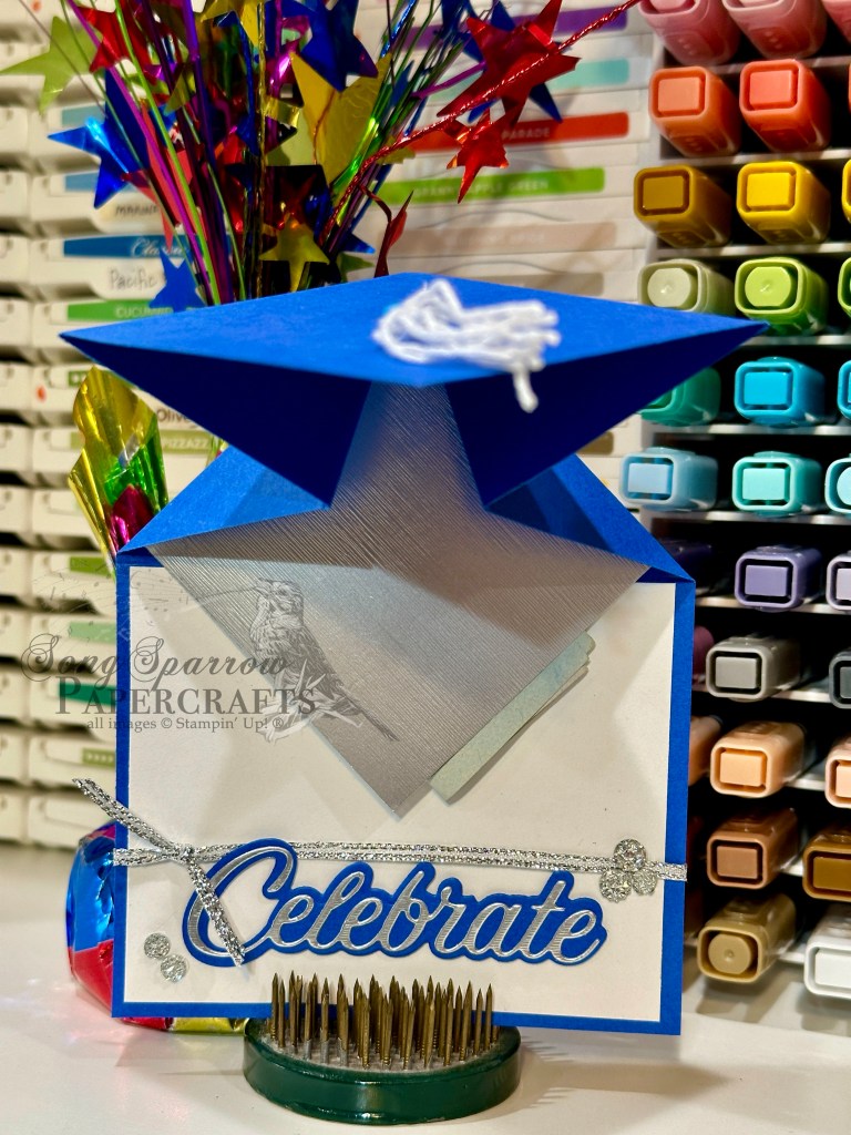
It also means that we’re beginning a new week of fun crafty designs. And this week we’re going to be working through a stash of fun folds that I’ve been dying to try. And first up comes a design of necessity as my oldest nephew is headed off to college in a few short weeks. I might be just a teensy bit behind in honoring his graduation, but there’s always the last-minute items to buy right? *wink* Today, I’m trying my hand at a super cute cap & tassel fun fold that I saw over at Beth’s Paper Cuts.
For a giftie like this one, I try to coordinate the color palette with the graduate’s school colors. In this case, I need to work with a palette of royal blue, white, and black. Finding just the right shade of blue proved a little tricky since I was out of Blueberry Bushel. BUT I happened to still have a supply of Pacific Point in my retired stash, so here we go.
I decided to have the royal blue serve as the predominant color in the design and then I used white and silver as accent colors. I used white baker’s twine to tie the tassel and happened to have some silver thread on hand that I used to bind the tassel together. I liked having this silver detail tie together with the sentiment. I used the recently-retired die set called Wanted to Say to cut the sentiment. Silver trim and drusy embellishments give us nice pops of festive shimmer around the sentiment.
As I was putting my card together, I got a little ahead of myself and ended up adhering the panel that was intended to be the gift pocket, which meant I had to improvise a solution. I cut an extra square of silver specialty paper to serve as the money pocket and placed it in the center of the folding section. It works, but it wasn’t exactly how envisioned this coming out. I’ll fix it on the next go-around. *grin*
I chose to use the top-inside panel to include a hand-written note, so it is not strongly affixed in this short demo. But I still wanted to show how this adorable fun fold opens and where that message panel will eventually be situated. I haven’t had time to make the how-to video for this design yet, but I did take the time to create a PDF tutorial which is free to download here.
Products used in today’s fun fold: Pacific Point (retired), Basic White cardstock Brushed metallic silver specialty paper Wanted to Say dies (retired) Silver trim White baker’s twine Drusy embellishments Brad Dimensionals
We’re closing out our 3D design series this week with a fun combination of designs. Do you ever find yourself looking for a cute way to give a gift card? This combo is the perfect way to dress it up! Our gift box has the Timeless Plaid paper and up-and-coming Label Me Thankful set sitting front & center, while our card pairs the Everyday Arches and Scenic Adventure dies.
The card and gift box have coordinating bases of Misty Moonlight cardstock. The gift card box is covered with a sheet of the Timeless Plaid cardstock. The sentiment panel is cut from white cardstock using the Everyday Arches dies and then the sentiment from The Right Words stamp set is stamped in Early Espresso. I used one of the newest Online Exclusive die sets called Label Me Thankful (releasing Tuesday!) to cut the leaves and acorns and finished things off with a few of the Earth Tones shimmer gems.
I wanted the card to give the feeling of looking through an old window, so I used the Everyday Arches dies to cut a window shape out of the sheet of Country Woods patterned paper that serves as the focal panel. I set this panel aside to build the scene using the Scenic Adventure dies. The underlying scene panel starts with a sheet of white cardstock that I cut with the largest arch die to fit behind the focal panel that will ultimately sit on top. I started by filling in the top with Cloud Burst ink using a blending brush to create a soft sky. Next, we move to creating the water element at the bottom using the detail die in the Scene Adventure set. Moving the die around and passing through several times gives us the realist-looking shimmery water. To bring out the details of the water, I went over that section with Pool Party ink and a blending brush. The grass at the shore is cut from Mossy Meadow cardstock, while the small stand of flowers is cut from Granny Apple Green for a pop of contrast. The flowers are cut from pastel ombre glimmer paper and adhered to the floral stems with glue dots and then tucked behind the grass at the shore. The trees are a combination of Pecan Pie and Shaded Spruce cardstock and layered both behind and in front of the grass at the shore. The mountain in the distance is cut from Thoughtful Journey paper and adhered behind the grass and trees in the foreground. Dimensionals help give this scene a lot of depth and layers. The window pane layer is adhered on top using several layers of dimensionals to ensure that the scene looks as though it’s outside the window. We finish things off with the sentiment cut from Flower Garden Foil using the Wanted to Say dies. An assortment of riverside pearls, two tone gems, and In Color pearls add the finishing touches and help the eye pass across the design.
I hope you’ve found some inspiration in this week’s designs and have maybe even downloaded a tutorial or two to try out sometime soon! I hope you’ll stop in next week as we take a look at some new Online Exclusives!
And just like that, we’ve made it to the weekend. Do you have things on your weekend to-do list? This weekend is all about playing catch-up for us. Lots of things to do around the house, and of course, there’s always something to do in the craft room.
This week, we’ve been working with our crafty stash to create some super fun 3D and interactive designs. Today, I’m borrowing a slide-out panel design from fellow demo Rose Coleman. I changed it up a bit by having a larger moving panel and moved the peek-a-boo sentiment to the hidden portion of the card front. Let’s take a look at how it all comes together.
Our card is built on a base of Pretty Peacock cardstock. I selected a sheet of the fish pattern from the Otterly Adorable paper pack to serve as backdrop for the card front and our hidden sentiment. A slit in this piece of patterned paper allows for the movement of the front focal panel and the reveal of our hidden sentiment. I used pieces of the Pretty Peacock cardstock for the movement pieces. The focal panel is a combination of a cute otter scene from another sheet of the Otterly Adorable paper and a mat of Pretty Peacock glimmer paper. A piece of the Pretty Peacock & gold metallic ribbon serves as the pull. The focal panel is affixed to the slide to complete the sliding panel. I broke up the sentiment stamp from the Sweet Blooms set so that each word is on a separate line so that the sentiment hides perfectly behind the front sliding panel for its big reveal. The card front is finished off with riverside pearls, shimmer gems, and heart sequins for some eye-catching twinkle. I used a Mixed Labels sentiment for the inside message and finished with piece of the fish patterned paper to tie everything together.
Here’s the card motion in action. What do you think?
We’ll be rounding our series this week with a gift set. I hope you’ll drop back by later today to check it out.
Happy Monday, everyone! We’re on the downward slope for the month of June and summer is just cranking up. Thus far, we haven’t had any unusually hot days here in North Texas just yet, but the temps are definitely starting to creep up and the rain is becoming less frequent.
This week, we’re beginning a new design series — 3D projects. And today we get started with a fun fold card called a Z-fold pop-up card. This is a card design that I’ve had hanging out in my “want to make it” pile for quite a while and I thought there was no time like the present to give it a whirl! We’re combining the Lovely Garden patterned papers with the Beautiful Butterflies dies to create this fun garden scene.
As you might expect, this garden scene is full of bright, vibrant color. And we get started with a base of Melon Mambo cardstock. This is a standard A2 card base that is scored in the center as you would with any standard A2 card. To create the Z-fold pop-up base though, we add a slit and a few extra score lines to give us the dynamic portion of our design.
I chose two coordinating floral patterns from the Lovely Garden paper pack. I really like the contrast between the white and dark backgrounds. Each panel is a quarter sheet that is cut to cover each side of the card panel, including the small panels of the dynamic folding portion in the center.
Our butterflies are the real stars of the show here and the perfect opportunity to add not only beautiful pops of color, but the lovely pops of sparkle to really draw the eye in. I pulled out my collection of glimmer papers, including the pastel ombré and In Color packs, along with the (now retired) three color pack. I cut the larger butterfly background pieces in both sizes from the glimmer papers and then all of the detail pieces are cut from black cardstock. Each of the small butterflies is two-sided with a small strip of acetate window sheet in between, which is what allows them to look as tho they’re fluttering in the flower garden.
We’re keeping the sentiment panel very simple by cutting it from white cardstock using the smallest Something Fancy scalloped tag die and then cutting it to fit at the top of the front panel. The sentiment from Pattern of Friendship is stamped on the tag in Melon Mambo. And we finish things off with some iridescent faceted gems.
And here’s the Z-panel pop-up card in action. What do you think — does it look as though the butterflies are fluttering in the garden?
Wanna give a pop-up card a try? You can download the tutorial for today’s card here.
Happy Father’s Day to all the dads out there. For every big thing and small thing that you do for your family, you are loved and appreciated!
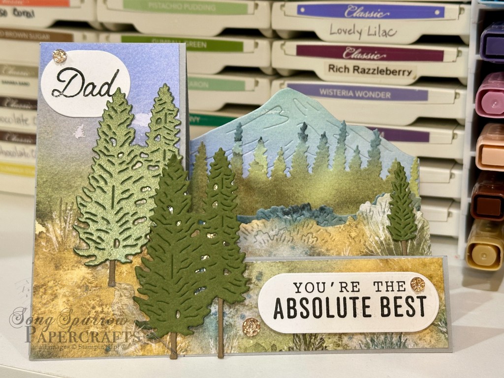
We’re wrapping up our special Father’s Day card series with a variation on one of my favorite fun folds – the step card. Today’s card is the side step fun fold that combines the lovely Thoughtful Journey patterned papers with the new Online Exclusive Scenic Adventure and More Messages bundles.
We get started with a base of Smoky Slate cardstock. The side step fun fold consists of a single cut and some scoring to create a tall panel on the left and smaller graduated panels on the right, which happens to be perfect for creating this mountain scene. I cut a sheet of the Thoughtful Journey patterned paper to fit the L-shaped front panel of the fun fold and then used the scrap to cut the grass and trees for the two smaller side steps using the Scenic Adventure dies. I happened to have several other scraps of Thoughtful Journey and chose one that coordinated with the primary sheet here in order to cut the mountain for the back side step panel. The trees are cut from a combination of Mossy Meadow and Pecan Pie and I chose to shade one of the larger trees with Wink of Stella for a little extra pizzazz. The small tree is adhered to the center side step panel with a dimensional. I layered the larger trees and had the pair in the foreground a wee bit higher and oriented to overlap the side step panels. The sentiment panels are stamped using the More Messages and He’s the Greatest sets and are diecut using the More Messages die. I finished things off with a few drusy embellishments for a bit of sparkle because even dad deserves some oo-la-la!
Isn’t this variation of the center step fun fold super fun? And I especially love it with the Scenic Adventure stamp & die bundle. You can download the tutorial for today’s fun fold here.
Next week is all about sentiments. I hope you’ll drop in a see what that’s all about!
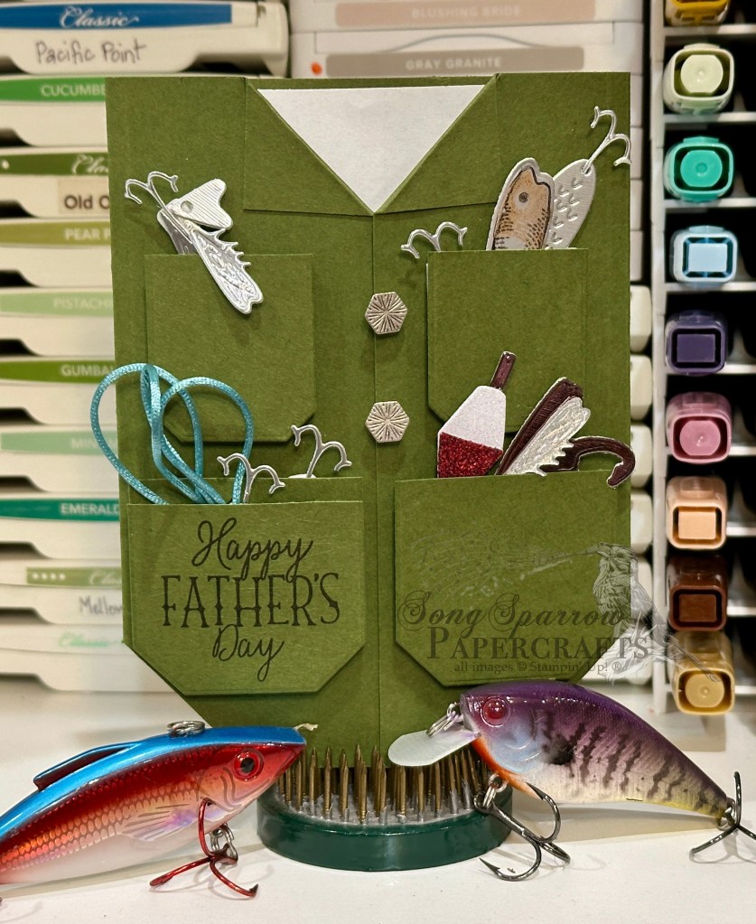
Welcome in, friends. We’re having fun trekking through the crafty stash this week to create Father’s Day designs, and today we’re headed to the pond. Today’s fun fold design uses the Gone Fishing bundle by Stampin’ Up! While the Gone Fishing bundle is quickly on its way out via the Last Chance List, it’s hard to resist this opportunity to create a fun card with this bundle, especially when you have avid fishermen in your family!
This standard sized card begins with a base of Mossy Meadow cardstock cut so that it opens in the center. Each of the bottom corners is cut at an angle. The top flaps of each side are turned down and affixed to the card front. A few Industrial Trinkets serve as the buttons at the top. This combination gives the look of a shirt or jacket. The pockets for the fishing jacket are cut from Mossy Meadow cardstock using the Countryside Corners dies. Each shape is then cut in half to create the four pockets. The pockets are each adhered to the card front with foam strips, ensuring that the top of each pocket is open to slide our tackle in. Using a combination of foil and glimmer papers and the Gone Fishing dies, I cut and assembled lures to tuck in each of the pockets. I used the Lost Lagoon soft cording to serve as a twist of extra line. The sentiment from the Gone Fishing stamp set is stamped on the pocket. HOT TIP: Be sure you stamp the sentiment before you decide to adhere the pocket to your card front. Otherwise, you’re going to have to punt in order to cover up your stamping boo-boo! *wink*
When the Gone Fishing suite first released, I saw so many cute designs. And one of the ones that really caught my eye was creating a fishing jacket. I didn’t get around to trying it out while the full suite was current, but I think the dies did a nice job of creating this fun card.
Tune in tomorrow as we take a trip through dad’s closet. You’re going to love it!
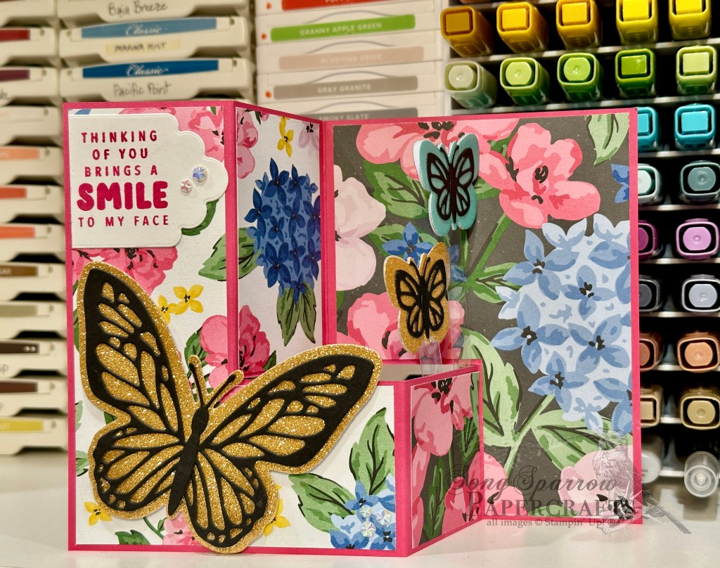
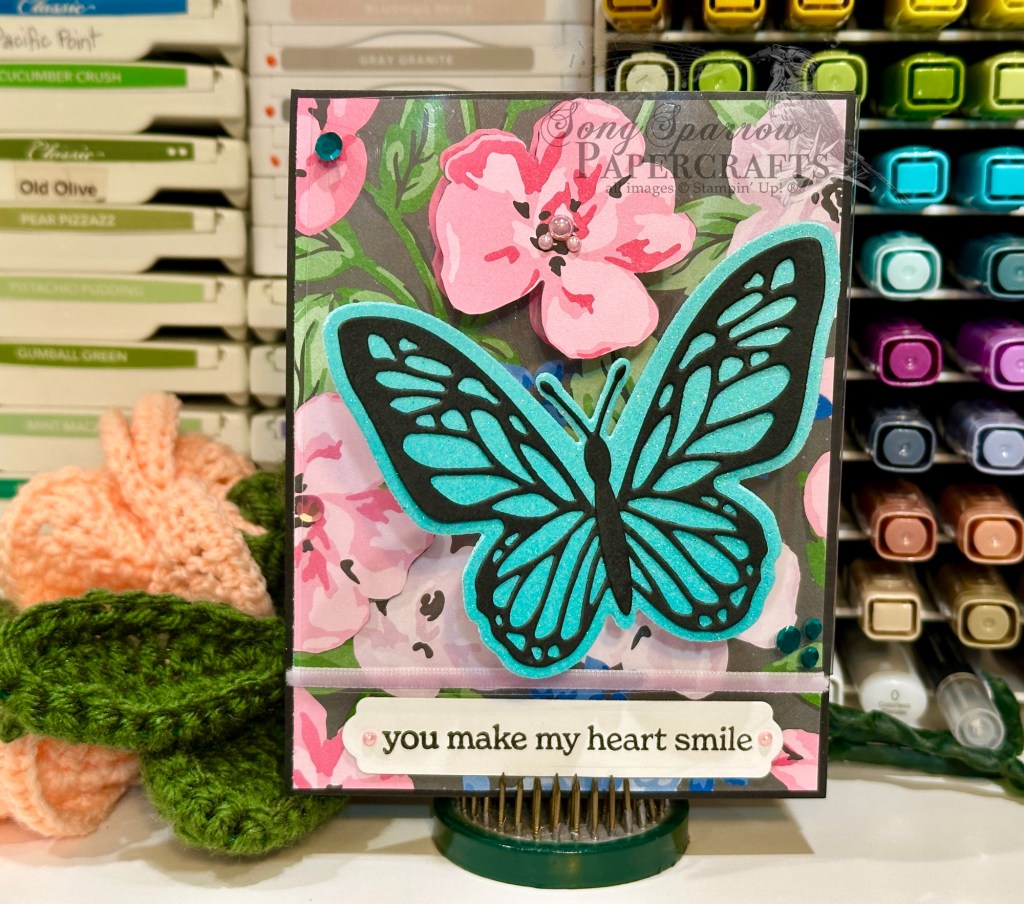
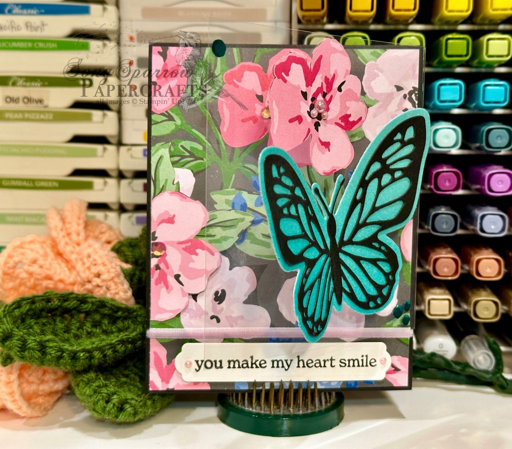
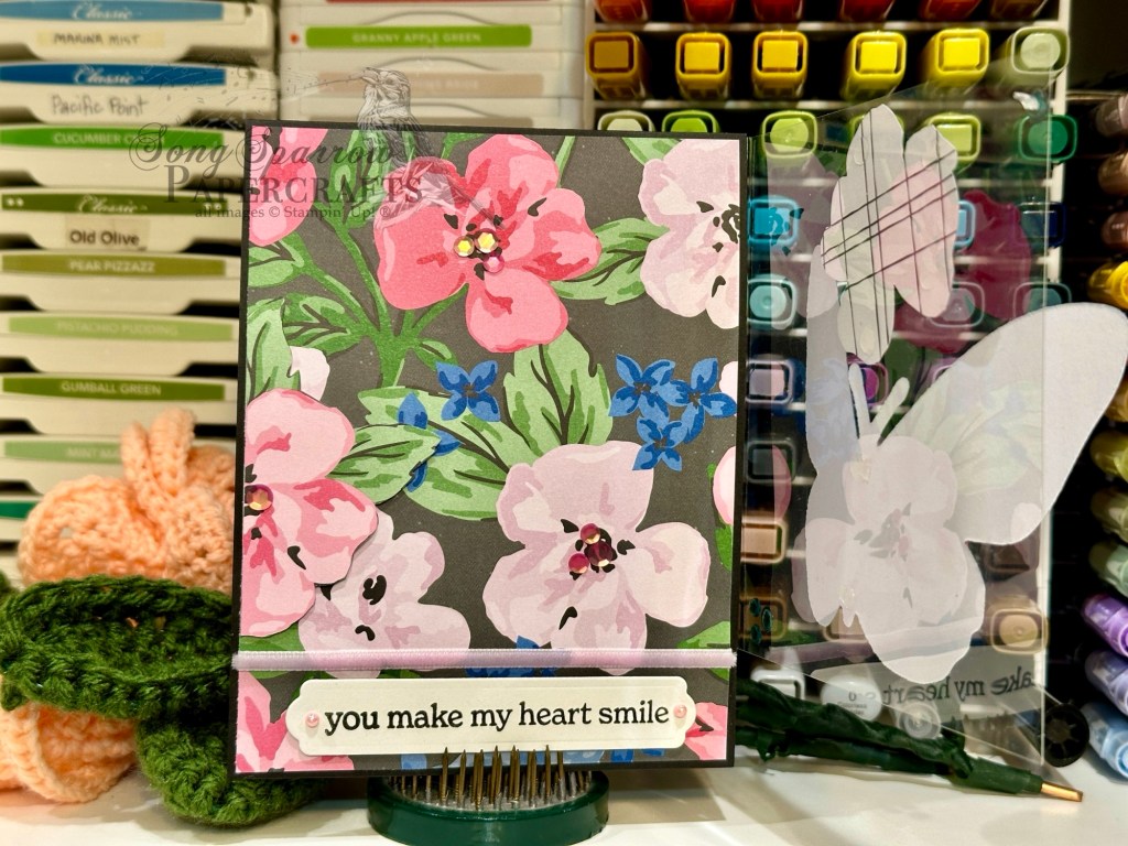
Although I’m not much a fan of the allergies that accompany the advent of spring, I’m a huge fan of all things becoming new again. I love the early spring flowers — irises, daffodils, and primrose — the budding trees and the first influx of butterflies.
This week, we’re walking through the garden of our crafty collection and working with florals in our stash. Today, I’m combining the Stampin’ Up! Thankful Garden collection with Beautiful Butterflies. And what better way to showcase both than with a fun twist on a two-panel fun fold!
I wanted this design to have a fun twist on the usual layers you might incorporate into a more conventional two-panel fun fold design. And most especially, I wanted to give a more realistic look to a fluttering butterfly.
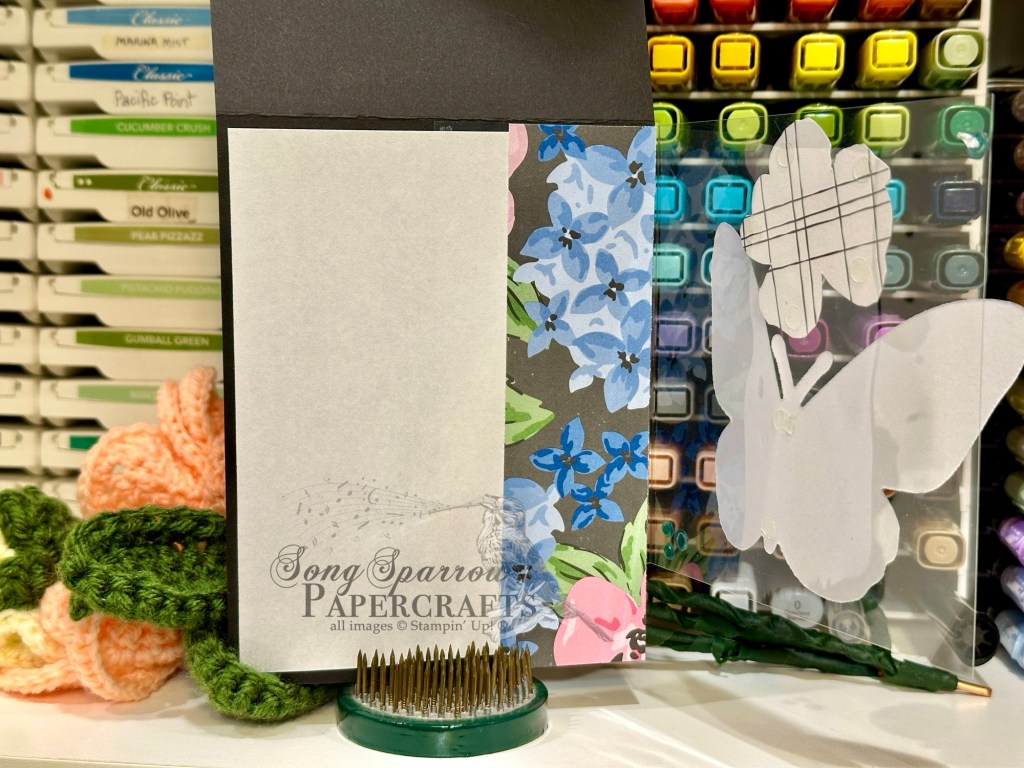
To accomplish this idea, I incorporated a sheet of acetate as the outer flap. This does two things — first, it allows the florals to remain center stage, and second, it gives the illusion of the butterfly coming in to light on the garden of flowers. Tip: I save the sheets of acetate from new photopolymer stamp sets to use later (act as window sheets).
So we get started with a base of Basic Black cardstock. I really love how this provides a nice but neutral contrast for the focal elements of the design. The focal backdrop on the card front is a sheet of the Lovely Garden designer series paper. I used paper snips to fussy cut two flowers from a separate sheet of the paper to add dimension to the flowers in the garden. One is adhered directly to the front card base on the left side and the other is reserved for the acetate panel. I wrapped some Fresh Freesia velvet ribbon around the bottom of the patterned paper, which acts to hide, if you will, the bottom of the acetate panel when the card is fully closed. I added pink sequins from the sequins trio to several of the floral centers for a bit of interesting dimension to the garden of flowers. The sentiment from the Layers of Beauty set is stamped in black on white cardstock and then diecut with the largest Beautiful Butterflies decorative banner and adhered to the bottom of the panel with dimensionals and finished with a pink Blooming Pearl on either side.
The acetate panel wraps around the front card panel from the inside of the card. The inside message panel and decorative paper cover where the acetate panel is affixed to the card base. A bone folder helps give a deep score line to the acetate so that it folds and lies flat more easily. Using the Beautiful Butterflies dies, I cut the base of the large butterfly from the sheet of aqua-hued Pastel Ombré glimmer paper and then cut the detailed piece from black cardstock to make the butterfly look similar to a Ulysses swallowtail. It’s adhered to the acetate panel with glue dots. The flower cut from the Lovely Garden paper is adhered with glue dots onto the acetate so that it perfectly aligns with the flower on the front card panel underneath. I added pink Blooming Pearls to the flower’s center and then added a few peacock sequins from the sequins trio to either corner of the acetate to tie the full design color palette together.
Today’s card is a part of the Luv 2 Stamp Group Instagram Hop, which goes live at 9 AM Pacific Time (PST). Click here to head over to my Instagram feed at 9 AM Pacific/11 AM Central and check out what the other demos in our L2S Group have created for you today!
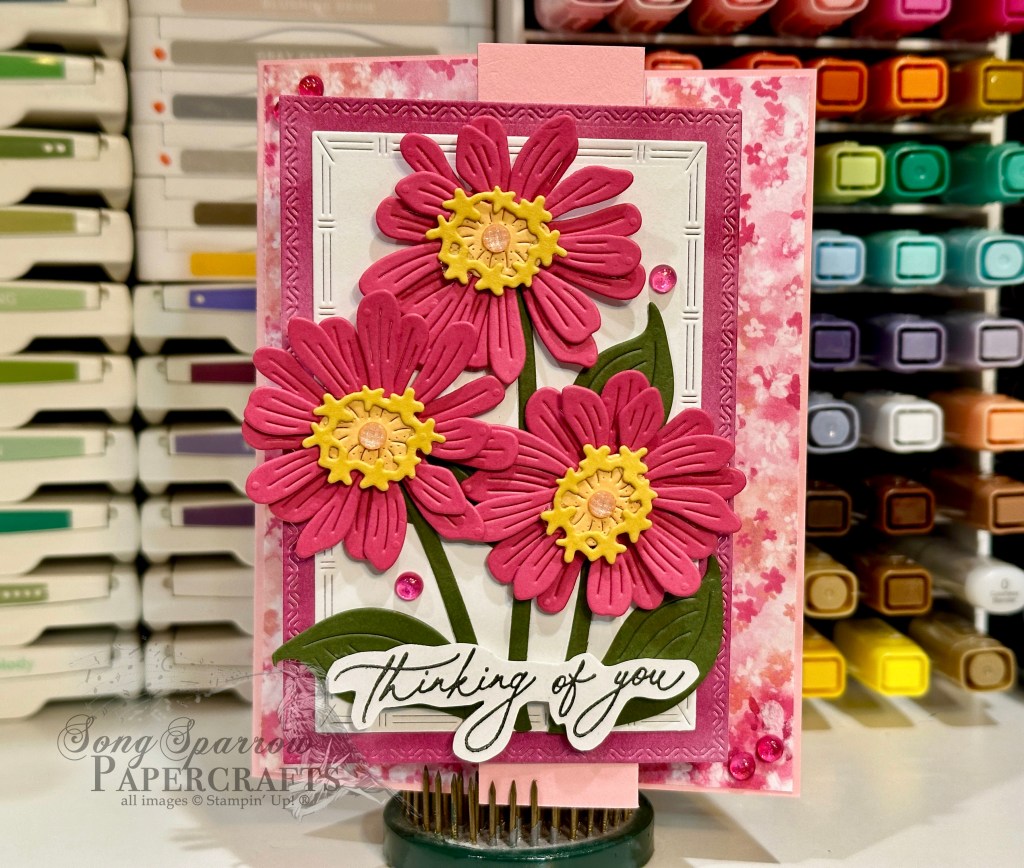
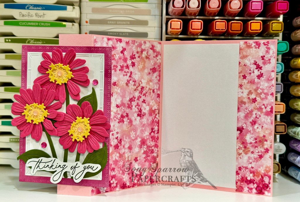
With spring making its appearance here in North Texas, it seemed appropriate to have this week’s designs hone in on a nature theme. And it also seemed like the perfect way to revisit some of my favorite sets that may soon find themselves fully retired.
We get started this week with a fun fold design that features the Simply Zinnia dies and the Bloom Impressions patterned paper. I used a simple fold-back skinny z-panel design for this card to really bring emphasis to the fun panel of diecut flowers.
We started with a base of Pretty in Pink cardstock. I’m using the standard A2 size but folding the front card panel back a little over an inch on the right side to create the slender z-panel effect. I used a sheet of the pink Bloom Impressions patterned paper from the most recent Sale-a-Bration catalog to cover the front and inside panels.
For the focal panel affixed to the slender fold-back panel, I started with a sheet of the pink Beautiful Bokeh paper and diecut it with the Textured Notes dies and then cut a nesting white panel using the next smallest die. I decided to keep the color palette of the zinnias very simple and chose to use Melon Mambo as the featured hue. I used Peach Pie as the floral centers with the surrounding disc and ray florets being Crushed Curry. The stems are cut from Mossy Meadow. The flowers and floral elements are all cut with the Simply Zinnia dies. I layered the flowers with a combination of dimensionals and glue dots to create a more realistic look. The sentiment from Everyday Greetings is stamped in black on white cardstock and cut out with paper snips and affixed with dimensionals. I added some In Color shimmer gems as floral centers and then scattered a few Sunny Days iridescent dots for a little extra pop of pink.
Tomorrow we’re going to continue our ode to nature by sticking to the garden path. I hope you’ll pop by and take a look!


![Mossy Meadow 8-1/2" X 11" Cardstock [ 133676 ]](https://assets1.tamsnetwork.com/images/EC042017NF/133676s.jpg "Mossy Meadow 8-1/2\" X 11\" Cardstock [ 133676 ]")
![Cloud Cover 8 1/2" X 11" Cardstock [ 165621 ]](https://assets1.tamsnetwork.com/images/EC042017NF/165621s.jpg "Cloud Cover 8 1/2\" X 11\" Cardstock [ 165621 ]")
![Smoky Slate 8-1/2" X 11" Cardstock [ 131202 ]](https://assets1.tamsnetwork.com/images/EC042017NF/131202s.jpg "Smoky Slate 8-1/2\" X 11\" Cardstock [ 131202 ]")
![Floral Delight 12" X 12" (30.5 X 30.5 Cm) Designer Series Paper [ 164700 ]](https://assets1.tamsnetwork.com/images/EC042017NF/164700s.jpg "Floral Delight 12\" X 12\" (30.5 X 30.5 Cm) Designer Series Paper [ 164700 ]")
![2024–2026 In Color™ Glimmer 12" X 12" (30.5 X 30.5 Cm) Specialty Paper [ 163771 ]](https://assets1.tamsnetwork.com/images/EC042017NF/163771s.jpg "2024–2026 In Color™ Glimmer 12\" X 12\" (30.5 X 30.5 Cm) Specialty Paper [ 163771 ]")
![More Messages Bundle (English) [ 165473 ]](https://assets1.tamsnetwork.com/images/EC042017NF/165473s.jpg "More Messages Bundle (English) [ 165473 ]")
![Smoky Slate Classic Stampin' Pad [ 147113 ]](https://assets1.tamsnetwork.com/images/EC042017NF/147113s.jpg "Smoky Slate Classic Stampin' Pad [ 147113 ]")
![Daffodil Delight 1/8" (3.2 Mm) Satin Ribbon [ 164715 ]](https://assets1.tamsnetwork.com/images/EC042017NF/164715s.jpg "Daffodil Delight 1/8\" (3.2 Mm) Satin Ribbon [ 164715 ]")
![Drusy Adhesive Backed Embellishments [ 164223 ]](https://assets1.tamsnetwork.com/images/EC042017NF/164223s.jpg "Drusy Adhesive Backed Embellishments [ 164223 ]")
![Tear & Tape Adhesive [ 154031 ]](https://assets1.tamsnetwork.com/images/EC042017NF/154031s.jpg "Tear & Tape Adhesive [ 154031 ]")
![Stampin' Dimensionals [ 104430 ]](https://assets1.tamsnetwork.com/images/EC042017NF/104430s.jpg "Stampin' Dimensionals [ 104430 ]")


![Pool Party 8-1/2" X 11" Cardstock [ 122924 ]](https://assets1.tamsnetwork.com/images/EC042017NF/122924s.jpg "Pool Party 8-1/2\" X 11\" Cardstock [ 122924 ]")
![Basic White 8 1/2" X 11" Cardstock [ 166780 ]](https://assets1.tamsnetwork.com/images/EC042017NF/166780s.jpg "Basic White 8 1/2\" X 11\" Cardstock [ 166780 ]")
![Wildflower Birthday 12" X 12" (30.5 X 30.5 Cm) Specialty Designer Series Paper [ 164591 ]](https://assets1.tamsnetwork.com/images/EC042017NF/164591s.jpg "Wildflower Birthday 12\" X 12\" (30.5 X 30.5 Cm) Specialty Designer Series Paper [ 164591 ]")
![Textured Notes Dies [ 165555 ]](https://assets1.tamsnetwork.com/images/EC042017NF/165555s.jpg "Textured Notes Dies [ 165555 ]")
![Spotlight On Nature Dies [ 163580 ]](https://assets1.tamsnetwork.com/images/EC042017NF/163580s.jpg "Spotlight On Nature Dies [ 163580 ]")
![The Right Words Cling Stamp Set (English) [ 165316 ]](https://assets1.tamsnetwork.com/images/EC042017NF/165316s.jpg "The Right Words Cling Stamp Set (English) [ 165316 ]")
![Pool Party Classic Stampin' Pad [ 147107 ]](https://assets1.tamsnetwork.com/images/EC042017NF/147107s.jpg "Pool Party Classic Stampin' Pad [ 147107 ]")
![Gold Striped 3/8" (1 Cm) Mesh Ribbon [ 165599 ]](https://assets1.tamsnetwork.com/images/EC042017NF/165599s.jpg "Gold Striped 3/8\" (1 Cm) Mesh Ribbon [ 165599 ]")


![Misty Moonlight 8-1/2" X 11" Cardstock [ 153081 ]](https://assets1.tamsnetwork.com/images/EC042017NF/153081s.jpg "Misty Moonlight 8-1/2\" X 11\" Cardstock [ 153081 ]")
![Shaded Spruce 8-1/2" X 11" Cardstock [ 146981 ]](https://assets1.tamsnetwork.com/images/EC042017NF/146981s.jpg "Shaded Spruce 8-1/2\" X 11\" Cardstock [ 146981 ]")
![Pecan Pie 8 1/2" X 11" Cardstock [ 161717 ]](https://assets1.tamsnetwork.com/images/EC042017NF/161717s.jpg "Pecan Pie 8 1/2\" X 11\" Cardstock [ 161717 ]")
![Granny Apple Green 8-1/2" X 11" Cardstock [ 146990 ]](https://assets1.tamsnetwork.com/images/EC042017NF/146990s.jpg "Granny Apple Green 8-1/2\" X 11\" Cardstock [ 146990 ]")
![Thoughtful Journey 6" X 6" (15.2 X 15.2 Cm) Designer Series Paper [ 163303 ]](https://assets1.tamsnetwork.com/images/EC042017NF/163303s.jpg "Thoughtful Journey 6\" X 6\" (15.2 X 15.2 Cm) Designer Series Paper [ 163303 ]")
![Pastel Ombre Glimmer 12" X 12" (30.5 X 30.5 Cm) Specialty Paper [ 164851 ]](https://assets1.tamsnetwork.com/images/EC042017NF/164851s.jpg "Pastel Ombre Glimmer 12\" X 12\" (30.5 X 30.5 Cm) Specialty Paper [ 164851 ]")
![Flower Garden Foils 12" X 12" (30.5 X 30.5 Cm) Specialty Paper [ 165511 ]](https://assets1.tamsnetwork.com/images/EC042017NF/165511s.jpg "Flower Garden Foils 12\" X 12\" (30.5 X 30.5 Cm) Specialty Paper [ 165511 ]")
![Country Woods 12" X 12" (30.5 X 30.5 Cm) Designer Series Paper [ 163393 ]](https://assets1.tamsnetwork.com/images/EC042017NF/163393s.jpg "Country Woods 12\" X 12\" (30.5 X 30.5 Cm) Designer Series Paper [ 163393 ]")
![Scenic Adventure Dies [ 165467 ]](https://assets1.tamsnetwork.com/images/EC042017NF/165467s.jpg "Scenic Adventure Dies [ 165467 ]")
![Everyday Arches Dies [ 164629 ]](https://assets1.tamsnetwork.com/images/EC042017NF/164629s.jpg "Everyday Arches Dies [ 164629 ]")
![Wanted To Say Dies [ 161594 ]](https://assets1.tamsnetwork.com/images/EC042017NF/161594s.jpg "Wanted To Say Dies [ 161594 ]")
![Cloud Cover Classic Stampin' Ink Refill [ 165279 ]](https://assets1.tamsnetwork.com/images/EC042017NF/165279s.jpg "Cloud Cover Classic Stampin' Ink Refill [ 165279 ]")
![Riverside Irregular Pearls [ 164937 ]](https://assets1.tamsnetwork.com/images/EC042017NF/164937s.jpg "Riverside Irregular Pearls [ 164937 ]")
![Two Tone Sparkle Gems [ 164633 ]](https://assets1.tamsnetwork.com/images/EC042017NF/164633s.jpg "Two Tone Sparkle Gems [ 164633 ]")
![2025–2027 In Color™ Flat Pearls [ 165192 ]](https://assets1.tamsnetwork.com/images/EC042017NF/165192s.jpg "2025–2027 In Color™ Flat Pearls [ 165192 ]")
![Timid Tiger 8 1/2" X 11" Cardstock [ 165626 ]](https://assets1.tamsnetwork.com/images/EC042017NF/165626s.jpg "Timid Tiger 8 1/2\" X 11\" Cardstock [ 165626 ]")
![Early Espresso 8-1/2" X 11" Cardstock [ 119686 ]](https://assets1.tamsnetwork.com/images/EC042017NF/119686s.jpg "Early Espresso 8-1/2\" X 11\" Cardstock [ 119686 ]")
![Timeless Plaid 6" X 6" (15.2 X 15.2 Cm) Designer Series Paper [ 164678 ]](https://assets1.tamsnetwork.com/images/EC042017NF/164678s.jpg "Timeless Plaid 6\" X 6\" (15.2 X 15.2 Cm) Designer Series Paper [ 164678 ]")
![Early Espresso Classic Stampin' Pad [ 147114 ]](https://assets1.tamsnetwork.com/images/EC042017NF/147114s.jpg "Early Espresso Classic Stampin' Pad [ 147114 ]")
![Earth Tones Shimmer Gems [ 164070 ]](https://assets1.tamsnetwork.com/images/EC042017NF/164070s.jpg "Earth Tones Shimmer Gems [ 164070 ]")
![Mini Glue Dots [ 103683 ]](https://assets1.tamsnetwork.com/images/EC042017NF/103683s.jpg "Mini Glue Dots [ 103683 ]")


![Pretty Peacock 8-1/2" X 11" Cardstock [ 150880 ]](https://assets1.tamsnetwork.com/images/EC042017NF/150880s.jpg "Pretty Peacock 8-1/2\" X 11\" Cardstock [ 150880 ]")
![Three Color Glimmer 12" X 12" (30.5 X 30.5 Cm) Specialty Paper [ 162813 ]](https://assets1.tamsnetwork.com/images/EC042017NF/162813s.jpg "Three Color Glimmer 12\" X 12\" (30.5 X 30.5 Cm) Specialty Paper [ 162813 ]")
![Otterly Adorable 12" X 12" (30.5 X 30.5 Cm) Designer Series Paper [ 164936 ]](https://assets1.tamsnetwork.com/images/EC042017NF/164936s.jpg "Otterly Adorable 12\" X 12\" (30.5 X 30.5 Cm) Designer Series Paper [ 164936 ]")
![Sweet Blooms Photopolymer Stamp Set (English) [ 165181 ]](https://assets1.tamsnetwork.com/images/EC042017NF/165181s.jpg "Sweet Blooms Photopolymer Stamp Set (English) [ 165181 ]")
![Mixed Labels Cling Stamp Set (English) [ 164643 ]](https://assets1.tamsnetwork.com/images/EC042017NF/164643s.jpg "Mixed Labels Cling Stamp Set (English) [ 164643 ]")
![Pretty Peacock Classic Stampin’ Pad [ 150083 ]](https://assets1.tamsnetwork.com/images/EC042017NF/150083s.jpg "Pretty Peacock Classic Stampin’ Pad [ 150083 ]")
![Pretty Peacock & Gold 3/8" (1 Cm) Metallic Ribbon [ 162588 ]](https://assets1.tamsnetwork.com/images/EC042017NF/162588s.jpg "Pretty Peacock & Gold 3/8\" (1 Cm) Metallic Ribbon [ 162588 ]")
![Adhesive Backed Heart Sequins [ 164920 ]](https://assets1.tamsnetwork.com/images/EC042017NF/164920s.jpg "Adhesive Backed Heart Sequins [ 164920 ]")
![Melon Mambo 8-1/2" X 11" Cardstock [ 115320 ]](https://assets1.tamsnetwork.com/images/EC042017NF/115320s.jpg "Melon Mambo 8-1/2\" X 11\" Cardstock [ 115320 ]")
![Basic Black 8-1/2" X 11" Cardstock [ 121045 ]](https://assets1.tamsnetwork.com/images/EC042017NF/121045s.jpg "Basic Black 8-1/2\" X 11\" Cardstock [ 121045 ]")
![Window Sheets [ 142314 ]](https://assets1.tamsnetwork.com/images/EC042017NF/142314s.jpg "Window Sheets [ 142314 ]")
![Lovely Garden 12" X 12" (30.5 X 30.5 Cm) Designer Series Paper [ 165524 ]](https://assets1.tamsnetwork.com/images/EC042017NF/165524s.jpg "Lovely Garden 12\" X 12\" (30.5 X 30.5 Cm) Designer Series Paper [ 165524 ]")
![Pattern Of Friendship Photopolymer Stamp Set (English) [ 165383 ]](https://assets1.tamsnetwork.com/images/EC042017NF/165383s.jpg "Pattern Of Friendship Photopolymer Stamp Set (English) [ 165383 ]")
![Something Fancy Dies [ 160424 ]](https://assets1.tamsnetwork.com/images/EC042017NF/160424s.jpg "Something Fancy Dies [ 160424 ]")
![Beautiful Butterflies Hybrid Embossing Folder [ 164614 ]](https://assets1.tamsnetwork.com/images/EC042017NF/164614s.jpg "Beautiful Butterflies Hybrid Embossing Folder [ 164614 ]")
![Melon Mambo Classic Stampin' Pad [ 147051 ]](https://assets1.tamsnetwork.com/images/EC042017NF/147051s.jpg "Melon Mambo Classic Stampin' Pad [ 147051 ]")
![Iridescent Faceted Gems [ 163368 ]](https://assets1.tamsnetwork.com/images/EC042017NF/163368s.jpg "Iridescent Faceted Gems [ 163368 ]")
![Scenic Adventure Bundle (English) [ 165468 ]](https://assets1.tamsnetwork.com/images/EC042017NF/165468s.jpg "Scenic Adventure Bundle (English) [ 165468 ]")
![He's The Greatest Photopolymer Stamp Set (English) [ 165684 ]](https://assets1.tamsnetwork.com/images/EC042017NF/165684s.jpg "He's The Greatest Photopolymer Stamp Set (English) [ 165684 ]")
![Jet Black Stāzon Ink Pad [ 101406 ]](https://assets1.tamsnetwork.com/images/EC042017NF/101406s.jpg "Jet Black Stāzon Ink Pad [ 101406 ]")
![Mini Stampin' Dimensionals [ 144108 ]](https://assets1.tamsnetwork.com/images/EC042017NF/144108s.jpg "Mini Stampin' Dimensionals [ 144108 ]")
![Silver Foil 12" X 12" (30.5 X 30.5 Cm) Specialty Pack [ 163096 ]](https://assets1.tamsnetwork.com/images/EC042017NF/163096s.jpg "Silver Foil 12\" X 12\" (30.5 X 30.5 Cm) Specialty Pack [ 163096 ]")
![Berry Burst, Old Olive & White 12" X 12" (30.5 X 30.5 Cm) Glimmer Specialty Paper [ 163769 ]](https://assets1.tamsnetwork.com/images/EC042017NF/163769s.jpg "Berry Burst, Old Olive & White 12\" X 12\" (30.5 X 30.5 Cm) Glimmer Specialty Paper [ 163769 ]")
![Festive 12" X 12" (30.5 X 30.5 Cm) Glimmer Paper [ 164106 ]](https://assets1.tamsnetwork.com/images/EC042017NF/164106s.jpg "Festive 12\" X 12\" (30.5 X 30.5 Cm) Glimmer Paper [ 164106 ]")
![Countryside Corners Dies [ 161471 ]](https://assets1.tamsnetwork.com/images/EC042017NF/161471s.jpg "Countryside Corners Dies [ 161471 ]")
![Gone Fishing Dies [ 161541 ]](https://assets1.tamsnetwork.com/images/EC042017NF/161541s.jpg "Gone Fishing Dies [ 161541 ]")
![Gone Fishing Photopolymer Stamp Set (English) [ 161535 ]](https://assets1.tamsnetwork.com/images/EC042017NF/161535s.jpg "Gone Fishing Photopolymer Stamp Set (English) [ 161535 ]")
![Pumpkin Pie Classic Stampin' Pad [ 147086 ]](https://assets1.tamsnetwork.com/images/EC042017NF/147086s.jpg "Pumpkin Pie Classic Stampin' Pad [ 147086 ]")
![Lost Lagoon Soft Cording [ 164938 ]](https://assets1.tamsnetwork.com/images/EC042017NF/164938s.jpg "Lost Lagoon Soft Cording [ 164938 ]")
![Industrial Trinkets [ 163450 ]](https://assets1.tamsnetwork.com/images/EC042017NF/163450s.jpg "Industrial Trinkets [ 163450 ]")
![Foam Adhesive Strips [ 141825 ]](https://assets1.tamsnetwork.com/images/EC042017NF/141825s.jpg "Foam Adhesive Strips [ 141825 ]")
![Beautiful Butterflies Bundle (English) [ 164615 ]](https://assets1.tamsnetwork.com/images/EC042017NF/164615s.jpg "Beautiful Butterflies Bundle (English) [ 164615 ]")
![Layers Of Beauty Photopolymer Stamp Set (English) [ 163514 ]](https://assets1.tamsnetwork.com/images/EC042017NF/163514s.jpg "Layers Of Beauty Photopolymer Stamp Set (English) [ 163514 ]")
![Blooming Pearls [ 162238 ]](https://assets1.tamsnetwork.com/images/EC042017NF/162238s.jpg "Blooming Pearls [ 162238 ]")
![Adhesive Backed Sequins Trio [ 161206 ]](https://assets1.tamsnetwork.com/images/EC042017NF/161206s.jpg "Adhesive Backed Sequins Trio [ 161206 ]")
![Fresh Freesia 1/8" (3.2 Mm) Faux Velvet Ribbon [ 165540 ]](https://assets1.tamsnetwork.com/images/EC042017NF/165540s.jpg "Fresh Freesia 1/8\" (3.2 Mm) Faux Velvet Ribbon [ 165540 ]")


 Designer Series Paper")
 Designer Series Paper")
")


