As we’re racing to the finish of the fall semester, we find ourselves running to and fro from various school activities and holiday events and rehearsals. I think we might get one evening at home this week. I’m glad I took a little time over the weekend to work on some crafty projects!
This week, we’re taking some sneak peeks at products from the upcoming January Mini and Sale-a-Bration catalogs from Stampin’ Up! Today we’re pairing up a Sale-a-Bration patterned paper pack with new stamps & dies.
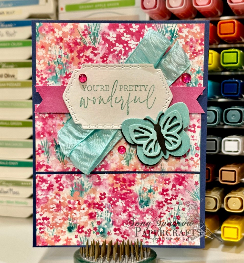
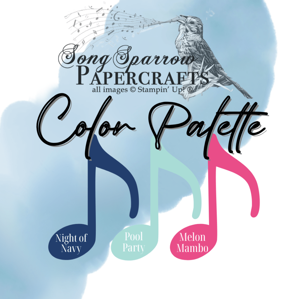
Our card design uses Sketch #18 from the Stampin’ Up! Annual Catalog, which makes putting this card together a breeze. Once again, we’re using the Luv 2 Stamp Group’s monthly color combo to make our color selections — Night of Navy, Pool Party, and Melon Mambo. We get started with a base of Night of Navy cardstock. Our background panel is a sheet of the new SAB Bloom Impressions paper separated into large shutters. The focal section consists of our sentiment and focal image. The sentiment from Mixed Labels is stamped in Pool Party on white cardstock and then cut with the coordinating sentiment die from the Mixed Labels die set, which is mounted over some crinkled Pool Party ribbon and a strip of the new Beautiful Bokeh paper cut into a banner. The butterfly is diecut using the new Beautiful Butterflies dies. I layered Pool Party pastel ombré glimmer paper and black cardstock to create the butterfly. The focal section is adhered with dimensionals to help it stand out against our field of flowers. A few of the new Sunny Day iridescent dots draw the eye to our sentiment.
I’m going to be showing you more of the Beautiful Butterflies a little later this week because, YOU GUYS, it is just fabulous! There are so many possibilities with this bundle, including some shape cards, that I can’t wait to share. But we’ll be getting a broader look at my new products favorites before we dive in to the details of each.
Products used in today’s design:
Night of Navy, Basic Black, Basic White cardstock
Bloom Impressions (coming soon!), Pastel ombre glimmer (coming soon!), Beautiful Bokeh (coming soon!) DSP
Beautiful Butterflies (coming soon!) dies
Mixed Labels bundles (coming soon!)
Pool Party crinkle ribbon
Sunny Day iridescent dots (coming soon!)
Dimensionals
Adhesives
 Designer Series Paper")
 Designer Series Paper")
 Specialty Paper")


")

")

 Metallic Ribbon")


")

")


 Specialty Designer Series Paper")
 Specialty Designer Series Paper")
 Glimmer Paper")
 Satin & Sheer Ribbon")