Fun Folds · Terrific Tuesdays

Diamond Birthday

Do you ever see a special fold and think WOW? That’s precisely what happened when a fellow demonstrator shared the Diamond Fold with our team. And I’m glad to finally have the time to sit down and learn this fold. It looks far more complicated than it is, and it is absolutely a perfect way to spotlight beautiful patterned paper!

This week, we’re looking at all the ways we can use traditional holiday products in everyday designs. Today, we’re pairing the Season of Gold & Green designer paper with part of the new Season of Elegance suite to make this gorgeous Diamond Fold card.

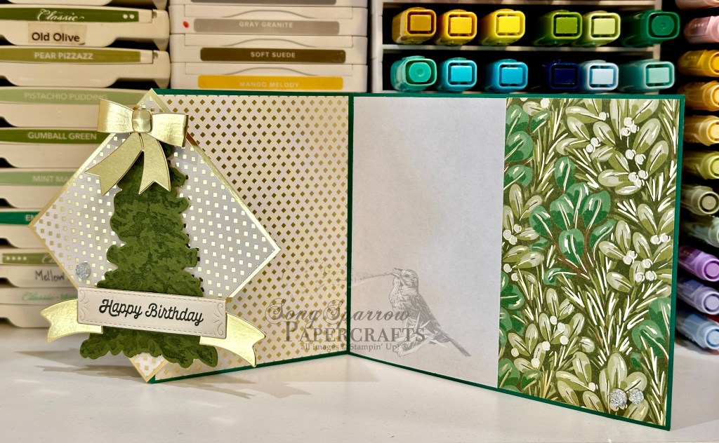
We get started on today’s fun fold design with a base of Shaded Spruce cardstock. We cut a standard-sized base but in landscape orientation with a fold in the center and then one to divide the second half. I chose two different patterns from the Season of Green & Gold designer series paper pack, a current Stampin’ Up! Online Exclusive. We’re bringing out the gold foiling by using the gold foil specialty paper as an accent color on our diamond panel. Our focal image is the largest tree from the new Peaceful Evergreens bundle. It’s stamped and diecut from Mossy Meadow with a gold bow diecut and added to the top. The new Peaceful Evergreens die set that will release on September 6th with the Holiday Mini catalog includes a set of dies to make paper bows and it really makes it easy to have perfect bows for your cards! Our sentiment from Adventurous Sky is stamped in black on Very Vanilla cardstock and then diecut using the Peaceful Season dies. This panel is mounted on a gold foil banner diecut with the largest banner from that same die set. I added some drusy embellishments for lots of extra sparkle and to help draw the eye across the card front.

Tomorrow we’ll be using a sketch to create a super fun thank-you design. I hope you’ll stop by and check it out.

Want to know how to make today’s card step-by-step? You can catch this week’s of episode of Terrific Tuesdays to see this card come together from start to finish. I’ve also provided a FREE PDF tutorial here. Please note that some of the products shown will not be available until September 6th.

Products used in today’s card:
Shaded Spruce, Mossy Meadow, Very Vanilla, Basic White cardstock
Season of Green & Gold, gold foil DSP
Adventurous Sky stamps
Peaceful Evergreens stamps & dies (coming soon!)
Peaceful Season dies (coming soon!)
Drusy embellishments (coming soon!)
Dimensionals
Adhesives

Holidays · Winter

Wish You Were Here

Thanks for joining me today as we continue our new design series — using holiday products to create everyday designs. I don’t know about you, but I tend to look at products in a holiday release from a single lens. But very often, these products are intended for designs far outside specific holidays.

Today, we’re using the new Take a Bow paper and Joyful ephemera packs to create a missing-you card. For me, there’s no question that the winter holidays make me think of friends and loved ones far away. So why not send them a card to let them know?!

We get started with a base of Pool Party cardstock. All of the patterned papers come from the Take a Bow paper pack, which will release on September 6th. I used the Nested Essentials dies to cut the two image background panels that hold our focal images from the Joyful Images ephemera packs. The sentiment comes from the Joyful Sayings ephemera pack. Varying layers of dimensionals behind elements gives depth and interest to our design. We finish things off and tie things together with a few gold snowflakes to bring out the gold striping in the sentiment banner backing.

Tomorrow we’re making an elegant sympathy card that is definitely a must-see! I hope you’ll pop in and check it out.

Products used in today’s card:
Pool Party cardstock
Take a Bow (coming soon!) DSP
Joyful Sayings & Images ephemera (coming soon!)
Nested Essentials dies
Snowflakes
Dimensionals
Adhesives

Coming Soon · Winter

Glad You Exist

I don’t know about you but I really love getting snail mail. I have since I was a very little girl. Some of my most cherished memories in my scrapbooks are handwritten notes from loved ones and friends. It’s one of the reasons that I continue to send notes to people I care about and why I became a cardmaker.

This week, we’re exploring ways we can use our holiday products for designs that speak to the everyday. Today’s card can serve a number of occasions — from birthday to encouragement to anniversary — and goes beyond the bounds of winter.

We get started with a base of black cardstock. A sheet of the Pretty Peacock and gold Season of Elegance designer paper serves as our gorgeous backdrop. Our focal panel base is a piece of white woodgrain from the Nests of Winter paper pack diecut with a larger Spotlight on Nature die. The focal image of the pair of titmice birds is fussy cut from another pattern of the Nests of Winter pack. The sentiment from the Saying Hey stamp set is stamped in black in white cardstock and then diecut using the Greetings of the Season banner die. A few Pretty Peacock and gold sequins across the card front add sparkle and draw the eye across our focal panel.

Tune in tomorrow as we use our ephemera packs to create a design to reach across the miles.

Products used in today’s card:
Basic Black, Basic White cardstock
Nests of Winter (coming soon!), Season of Elegance (coming soon!) DSP
Saying Hey stamps
Spotlight on Nature, Greetings of the Season dies
Sequins trio, neutrals sequins
Dimensionals
Adhesives

Holiday Mini Catalog · Holidays

Let’s Celebrate

Happy Monday, everyone! Can you believe we’re halfway through August already?! Me either! But that means, we’re just a few short weeks away from the launch of the Stampin’ Up! Holiday Mini catalog. And trust me when I say you’re gonna love it!

This week, we’re starting a new design series. We’re going to be looking at our holiday products from a different angle, taking them beyond the holidays into the everyday.

And today, we’re starting with the new Nests of Winter designer paper. We’re using the detailed bird patterned paper to create a celebratory card. While it’s a little wintery, the design doesn’t feel like a holiday card. This card would be perfect for a winter birthday, promotion, retirement, or graduation.

We get started with a base of Night of Navy cardstock. Our focal panel backdrop consists of a narrow panel of Night of Navy embossed with the Snowflake Sky embossing folder and two mats — white glimmer paper and textured gold specialty paper. The cluster of birds are diecut from the Nests of Winter designer paper using the Spotlight on Nature dies. The sentiments are stamped in navy on white cardstock using the Happy Little Things and Friends for Life stamp sets and then diecut using the Greetings of the Season banner die. I’ve tied Night of Navy & Gold sheer ribbon through the end. Our sentiment panel overlays the focal images. And the design is finished with a few gold sequins to draw the eye across the design.

Tune in tomorrow for another twist on the Nests of Winter.

Products used in today’s card:
Basic White, Night of Navy cardstock
White glimmer, textured gold, Nests of Winter (coming soon!) DSP
Happy Little Things, Friends for Life stamps
Spotlight on Nature, Greetings of the Season dies
Snowflake Sky embossing folder
Night of Navy & Gold sheer ribbon
Neutrals sequins
Dimensionals
Adhesives

Back to School · Sketchy Fridays

Sketchy Fridays: Packed for Success

How is it Friday already?! Anyone else feel this way? Our last week of summer has just flown by. We’ve shopped for school clothes and last-minute supplies, cleaned out the backpack and started fresh for the year, set next week’s lunch box menu, and squeezed in some random fun. What do you typically do with your kiddos for their last week of summer break?

For this week’s Sketchy Fridays, we’re taking a little detour from the Annual Catalog and, instead, are taking a page from my personal sketch book. Our sketch is a little unconventional, but then again, so is today’s card!

Today, we’re continuing our back-to-school theme, and I just love how this card design came out! I knew that I wanted to make a design that included a backpack, but I definitely didn’t have a backpack image in my current product stash. So I started looking at everything a little differently as I sorted through sets again. And that’s when I realized that I could use the sled die from Sophisticated Sled die set to make it happen. Let’s take a closer look!

Our card gets started with a base of Basic Black cardstock. I wanted the focal panel to look like a wall in a classroom. Although difficult to see here, the focal panel is a quarter sheet of black cardstock that has been trimmed slightly on each side and then raised with dimensionals. I used the Bright & Beautiful patterned papers to help me create this look with the bottom of the wall being the striped pattern. And then I wanted the top portion to look like a bulletin board, so the star pattern is serving as the decorative border around the bulletin board and our printed sentiment is the inspirational message from the teacher.

To create our backpack, we’ll start with a quarter sheet of Pretty Peacock cardstock and use the top portion of the sled die to cut our backpack. Be sure to save all of the negative space pieces to serve as backpack pockets, and we’ll trim any portion of the bottom of the sled off to keep the look of a backpack. Using the die itself, I traced around the outside of the portion I used to cut the backpack and then fussy cut on my trace marks to create a base to which I adhered all of my pieces. This also creates a more realistic look of a stuffed backpack. I used my glue pen to adhere the outline portion and then I used several layers of glue dots on each of the “pockets” to adhere them and give them the look of having items inside. Using the letter “i” from the Alphabet a La Mode die set, I cut the handle for the backpack and adhere it using tear & tape. I used the handle for the toolbox from the Trusty Toolbox die set to create the backpack straps. The backpack is adhered to the background with dimensionals. I added a few stars cut from silver foil with the Merriest Trees dies to finish off the design.

Isn’t this the most fun? Our inside sentiment says “reach for the stars” so everything ties together nicely. I just love how it turned out!

I hope you’ll tune in tomorrow where we’ll be making some Lunchbox Lovin’. You won’t want to miss it!

Products used in today’s card:
Basic Black, Basic White, Pretty Peacock, Crushed Curry cardstock
Bright & Beautiful, Silver foil DSP
Sophisticated Sled, Trusty Tools, Merriest Trees dies
Dimensionals
Adhesives

Product List
Back to School

Color With Greatness

This week, we’re putting on our creative hats to make back-to-school designs. Why do I need my creative hat? Well, for me personally, my current stash of products (as in, not retired products) doesn’t make it easy to stick to this week’s theme without a little ingenuity. And today, we’re combining the Trusty Tools set with Filled With Fun to create our desktop of color. Let’s see how we can make this one happen.

We get started with a card base of Crumb Cake cardstock. Our focal panel background consists of two layers of patterned paper — the bottom from Take to the Sky and the top from Nature’s Sweetness — and is cut to leave a very small border of the card base peeking around on each side. We cut a focal point out of the top layer of our background panel with the Spotlight on Nature dies and then adhere our two focal panels together with dimensionals. To create the storage box for our paint brushes, we use the wagon fencing from the Filled With Fun die set to cut Crumb Cake cardstock and then tuck the box in the center of the circle. Our paintbrushes are diecut using the Trusty Tools dies. The handles are cut from textured metallic gold while the bristles are cut from Smoky Slate. A dab of paint is stamped in primary colors on the end of each set of bristles. We tuck our paintbrushes into the storage box and adhere with several layers of dimensionals to give the look of multiple planes of view. Once again, I turned to my trusty printer to provide my custom sentiment and diecut it with the Everyday Essentials die using the extension method. The sentiment is adhered with dimensionals, as well. I added a few splatters of paint that were diecut from Real Red and Daffodil Delight cardstock using the Bright Skies dies. A few dollops of rhinestone jewels add just the right amount of sparkle across the card front to help the eye glide easily across the design.

Tomorrow we’ll be packing up some tools for success. I hope you’ll tag along and check it out!

Products used in today’s card:
Crumb Cake, Smoky Slate, Real Red, Daffodil Delight, Basic White cardstock
Take to the Sky, Nature’s Sweetness, Gold textured metallic DSP
Trusty Tools, Filled with Fun, Bright Skies, Everyday Details, Spotlight on Nature dies
Trusty Tools stamps
Rhinestone jewels
Dimensionals
Adhesives

Product List
Back to School

To a Sharp Year

Welcome in to this wonderful Wednesday! We’re halfway through this week and about halfway through our back-to-school design series. I hope you’ve been enjoying things thus far. Today, we’re keeping things on the simple side with a design using the Trusty Tools stamps and dies. Let’s dive in and learn more about how this card comes together.

We get started with a card base of Cajun Craze cardstock. Our focal panel is a piece of white cardstock that has been cut down on either side to allow a border of our card base to shine through. Using the Trusty Tools stamps, I stamped a pencil on Crushed Curry cardstock and then diecut with the coordinating die. I colored the erasers with Stampin’ Blends to give a realistic look. Using the smaller heart die from the Friends for Life die set, I drew a heart in the center of the focal panel to serve as a guide while adhering the pencils to the focal panel. Once again, I’ve used my printer to print a sentiment that I created to fit the card theme. The sentiment, and its mat of Peach Pie glimmer paper, is diecut using the Friends for Life die set. A layer of dimensionals behind the sentiment gives it a nice rise above the busy focal panel. And we finish things off with a few shiny sequins.

Of the back-to-school designs thus far, this one is by far the one that has come together the quickest. This would be a super cute card to accompany a small gift to teachers on the first day, don’t you think?

I hope you’ll tune in tomorrow when we paint the halls with greatness!

Products used in today’s card:
Cajun Craze, Crushed Curry, Basic White cardstock
Peach Pie glimmer paper
Trusty Tools stamps & dies
Friends for Life dies
Stampin’ Blends
Shiny sequins
Dimensionals
Adhesives

Product List
Back to School

Welcome Back

As we enjoy our last week of summer break here in our area of North Texas, I felt it was appropriate to have this week’s theme revolve around back to school designs. The fun and challenging thing about this particular theme is that I don’t actually have a ready supply of images or sentiments to easily work out designs. So this week is all about putting on the creativity hat.

Today, we’re heading to the garage to modify the Trucking Along truck into a school bus. Yep, that’s right. We’re splicing and dicing to lengthen our truck. So let’s talk about how this design comes together.

We get started with a base of Lost Lagoon cardstock. The background panel of our full focal panel is a quarter sheet of Pool Party cardstock. Our mountainous terrain in the background is a piece of Pretty Peacock that has been diecut using the long cloud die from the Bright Skies die set and cutting on an angle to give the look of a hill. Our trees are also diecut from Pretty Peacock with the Frosted Forest evergreen dies.

To make our school bus, we start with a stamped image of the truck from Trucking Along on Crushed Curry cardstock, which is then punched with the coordinating truck punch. I separated the cab from the bed with paper snips and then joined them back together with a small strip of Crushed Curry and filled in the outline with a black pen. Using the cab as a guide for the shape of the back of the bus, I traced and then cut a separate piece of Crushed Curry for the back of the bus. The lights and stop sign are all red iridescent discs. The bus is then adhered over our mountain with dimensionals to help it stand apart.

Our sentiment is another one that I set up in Word and printed on white cardstock with my printer. I used a larger cloud die from the Bright Skies dies to cut it out, along with a few smaller clouds to add behind. A spot of sunshine beams through in Crushed Curry compliments of the sun dies in the Bright Skies set. I finished things off with a hint of shine in the white sequins from the sequins trio.

What do you think? Did our chop shop bus fit the bill? Tomorrow we’re heading back to the drawing board, and I hope you’ll pop by!

Products used in today’s card:
Lost Lagoon, Pool Party, Pretty Peacock, Crushed Curry, Basic White cardstock
Trucking Along stamps & punch
Bright Skies, Frosted Forest dies
Iridescent discs, sequins trio
Dimensionals
Adhesives

Product List
Back to School

New Heights

Welcome back to a brand new week! I hope everyone enjoyed a restful weekend. We enjoyed watching more of the Olympic Games. Hard to pick a favorite event because we enjoy watching many of them. Have you been watching?

This week is our last week of summer break. School will be back in session on Monday and we’re still squeezing in all the end-of-summer fun. Break felt both short and long all at the same time! Did summer feel that way to you?

In honor of a new school year, this week’s design theme is back to school. And I must admit that I may have bitten off a little more than I can chew with this one. But I promised a week of using our products in surprising ways, didn’t I?! Well, I will certainly have to in order to work within our theme!

Today’s outside the box opportunity is solving a sentiment dilemma when you don’t have a stamp that fits the bill. How did I solve it? Well, let’s talk about our card and find out.

We get started with a base of Pool Party cardstock. After cutting a pice of white cardstock into quarter sheets, I used the Bright Skies dies to cut the two large clouds for the bottom of our front panel scene. Layers of dimensionals give the clouds are more realistic look against our Pool Party backdrop. I used my computer to set up a Word document sized to my quarter panel, sized up the space I would need to fill the medium cloud die, and printed my sentiment on the white cardstock. I then diecut the sentiment with the cloud die. I really wanted large font for the sentiment and that meant orienting my cloud in an unconventional way. But then, when you think about it, clouds come in all sorts of shapes and sizes, so is there really a conventional orientation? *grin* Several layers of dimensionals allow the sentiment panel to rise above the rest of our scene.

For the balloons, I pulled out the Hot Air Balloon stamps and dies set. I really liked the patterns that the Bright and Beautiful designer paper pack had to offer and decided I would layer the balloon shaping stamps on top. I think it turned out pretty neat. Our balloon baskets are cut from gold foil specialty paper. Each balloon is adhered on a different layer to give lots of dimension to our scene and really reinforce the sentiment theme of rising to new heights.

One of the fun things about challenging ourselves with various themes or ideas is that we don’t always have everything we think we need to pull it off. But with a little creative thinking and using tools that we maybe don’t turn to as often in a certain medium, like the printer in this case, we can usually make it work with beautiful results.

Tomorrow, we’ll be trucking along to school. I hope you’ll tune in to see what that’s all about!

Products used in today’s card:
Pool Party, Basic White cardstock
Bright & Beautiful, gold foil DSP
Hot Air Balloon stamps & dies
Bright Skies dies
Rainbow dots
Dimensionals
Adhesives

Product List