Online Exclusives · Sketchy Fridays

Sketchy Fridays: You Can!

As I mentioned in my earlier post today, my week kind-of got away from me. So we’re having our Sketchy Fridays post today instead. This week, we’re working with a nature theme and with a dreary, rainy day here in North Texas, I’m finding myself leaning into a water theme for our next card design.

For those of you who are new here, Sketchy Fridays is a weekly series where we’re using a card sketch to design our featured card. Right now, we’re working through a full series of designs using the card sketches found in current Stampin’ Up! catalogs.

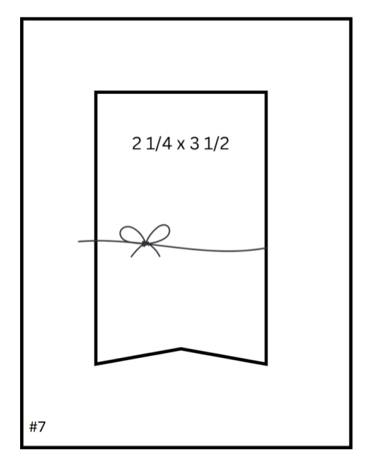
This week’s card is based on Sketch #7 from the Stampin’ Up! Annual Catalog. Today’s design features the Otterly Adorable suite from one of the latest Stampin’ Up! Online Exclusives releases.

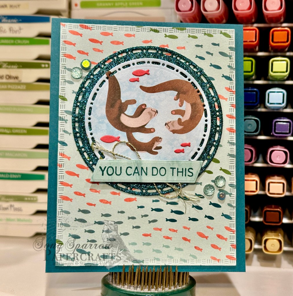
I just love the Otterly Adorable suite and was actually just mentioning to my husband how I hadn’t used it much. So as I was looking for a sketch, I had this set on my mind. One of the things we’ve talked about throughout our Sketchy Fridays series is that sometimes your final design follows a sketch to a tee, while other times the sketch was just your jumping off point. And I think for today’s card, my selected sketch from the SU! Annual Catalog was more of an inspiration for the placement of the card elements I had in mind. The beautiful thing about crafting is that there are NO rules!

We get started on this card with a base of Pretty Peacock cardstock. I chose the fish pattern from the Otterly Adorable paper pack as the focal panel backdrop and cut it out using the largest Textured Notes die. For the focal image, I chose the baby otter swimming with its parents because it seemed to work perfectly for the chosen sentiment of “you can do this.” I cut out the otters using the Spotlight on Nature dies. I wanted the focal image to stand out against the backdrop, so I matted it with some Pretty Peacock glimmer paper cut out with a slightly larger circle from the Spotlight on Nature die set. To add a bit more color and visual interest around the otters, I cut the smaller fish from Flirty Flamingo cardstock using the Otterly Amazing dies and then used my glue pen to adhere them. The otters are adhered to the sparkly mat with dimensionals and then adhered directly to the fishy backdrop. The sentiment from Saying Hey (currently on the Last Chance list!) is stamped in Pretty Peacock on a panel of the water paper from the Otterly Amazing paper pack that has been diecut using the Something Fancy banner die. I adhered this over a twist of some gold thread with two layers of dimensionals to be sure the sentiment really stands out. The full focal panel is adhered to the card base with dimensionals and we finish things off with a few Lost Lagoon faceted gems and riverside irregular pearls.

Next week, we’re going to look at some of my favorites that are on the Last Chance list. I hope you’ll follow along!

Product List
Retiring

Brighter Skies on the Way

Happy Saturday, crafty friends! It’s a rainy (and cold) day here in North Texas, and I’m playing catchup after a very busy end to the week. And with the weather as dreary as it is, I have my head in the clouds — the rain clouds, that is — and that works perfectly into this week’s design theme of all about nature.

This design is a combination of some of my favorite patterned paper — Everyday Skies — with two of my favorite pick-me-up stamp bundles — Playing in the Rain and Bright Skies. Both of these stamp bundles are on the current Last Chance list, so if you love them as much as I do, now is the time to swipe them for your stash! For today’s design, we’re keeping it pretty simple because these three products work super well together.

We get started with a base of Copper Clay cardstock. I really love how this pulled out the darker elements in the Everyday Skies paper but in a way that lends itself to our encouraging message. To add a touch of whimsy to the card to pair with our cute fox from the Playing in the Rain set, I chose to stamp the larger cloud from the Bright Skies stamp set onto black cardstock and then heat emboss in black before diecutting with the coordinating die. I add some rain in the area underneath where I intended to affix my cloud by heat embossing the stamped raindrops in clear powder and then affixed my cloud with dimensionals.

Next up, I worked on my focal character — the cute fox from the Playing in the Rain set. I stamped him in black onto Calypso Coral so that the space around the image would blend into the backdrop. I colored the fox with Stampin’ Blends before diecutting with the coordinating die. To ensure that the end of his tail had nice contrast, I used my Versamark pen to heat emboss the tip of the tail with white embossing powder. I used a couple of the ombre matte dots for buttons. I stamped the sentiment from Bright Skies in Blackberry Bliss ink and then affixed the fox to the right of the sentiment and used two layers of dimensionals so our character really stood front and center in the scene. I added a few two tone sparkle gems in the clouds for just a little added sparkly drama.

I really love the challenge of pairing products in my stash and I think this one turned out smashingly well. We’re going to continue our nature tour by using a sketch. I hope you’ll drop back by later to check it out.

Product List
Botanicals

The Best

It’s wonderful Wednesday and we’re halfway through the week. And it was quite the busy hump day for me today. Between performing a set for my professional music group and plugging away at work, it was a go-go-go day today! But in a few down moments, I thought about how we could use some of our newer goodies in the crafty stash to give a little ode to spring, and I think the Thankful Garden bundle definitely does the trick!

I don’t know about you, but there are certain sets — and florals, in particular — where I like to do a bit of research on color patterns and combinations to help with a more realistic look. And I knew I wanted to have more pink in the hydrangeas today. I think the combination of Flirty Flamingo, Pretty in Pink, and Melon Mambo is perfect for pulling out all of the subtle shading in these flower bunches.

We get started with a base of Berry Burst cardstock and use a sheet of the lighter pink floral pattern from the Unbounded Beauty patterned paper pack as the mat for our focal panel. Using the Thankful Garden stamps, I stamped a floral bunch in each of the corners and used the decorative masks to color them. I stamped a full bunch of hydrangea on a separate sheet of paper, shaded using masks, and then cut it out with the coordinating dies. I stamped a portion of the floral bunch two more times, shaded, and then diecut with the smaller detail die from the Thankful Garden dies to create a more realistic-looking floret to serve as our focal point in the center. Layering the dimensionals really helps with the more realistic look and feel to the hydrangea stem. The sentiment from the Pattern of Friendship set is stamped in black on white cardstock and then diecut with the smaller sentiment die in the Autumn Leaves die set. I stamped an identical panel from the berry Beautiful Bokeh and then cut it in half and mounted it under the sentiment panel to serve as a mat. I added a few pink Blooming Pearls for an eye-catching pop of sheen. The sentiment panel is adhered with dimensionals to help it catch the eye. I finished things off by adding some floral centers of foiled regal dots across our hydrangea florets.

Although it was pretty challenging to figure out the proper orientation of the smaller detail die for the hydrangea, once I did, it was a breeze to get the detail pieces cut. And to help myself remember the orientation the next time, I marked the image in my stamp case. A similar hack works well for the placement of the decorative masks.

I hope you’ll tune in tomorrow as we continue our ode to nature!

Product List
Uncategorized

Celebrate!

Welcome to a bright & shiny new week, everybody! I don’t know about you, but my weekend was BUSY! I spent a lot of time catching up on the homefront after being gone for training in the middle of the week. And my best laid plans for having time in the craft room totally went awry.

This week, I’ve decided to pick back up with last week’s design theme — nature. We’ll be looking at all of the current sets on the shelf this week to work in our theme. And today we’re getting started with the lovely floral bundle called Layers of Beauty, which includes stamps, dies, and coordinating decorative masks. I’ve borrowed the layout from fellow demo Stamping Beauty (@stampingbeautynz).

We get started with a base of Melon Mambo cardstock. The focal panel background is a sheet of the pinkish Beautiful Bokeh pattern and matted in Berry Burst glimmer paper. The focal panel itself is a sheet of the Lovely Garden paper that is cut with the Textured Notes dies and affixed slightly askew. I stamped the full Layers of Beauty image in Early Espresso ink and then colored using the masks and an assortment of pinks and greens. The image is cut out using the coordinating die and then affixed to the focal panel with dimensionals over a twist of Summer Splash ribbon and silver trim. I cut a few sprigs of leaves from Summer Splash cardstock with the Layers of Beauty dies and then tucked them behind the raised focal image. The sentiment is cut from silver foil and Berry Burst cardstock using the Wanted to Say dies and then mounted with dimensionals over the focal image. A few iridescent faceted gems finish things off with some subtle sparkle.

I must say that I wasn’t a huge fan of the decorative masks when they first came out, but they’ve really grown on me. Using them to color images makes quick work of beautiful shading — something that I’m not always the best at! Have you tried a bundle that includes masks? What are your thoughts on them? I’d love to know!

I hope you’ll pop in tomorrow as we revisit an older stamp set for a more masculine design that’s most certainly all about nature!

Product List
Everyday Skies · Sketchy Fridays

Sketchy Fridays: Family You Choose

Happy Friday, everyone. It was a very busy but productive week around here. And the weekend is shaping up to be pretty busy too with the kiddo’s various activities. But we’re excited for some nice weather in store for tomorrow before the rainy spring(ish) season kicks in here in North Texas.

But let’s go down to the real business – Sketchy Fridays! For those of you who are new here, Sketchy Fridays is a weekly series where we’re using a card sketch to design our featured card. Right now, we’re working through a full series of designs using the card sketches found in current Stampin’ Up! catalogs.

This week’s card is based on Sketch #11 from the Stampin’ Up! Annual Catalog. Today, we’re pairing up the Everyday Skies patterned paper with the new Online Exclusive stamp set called Pattern of Friendship (that releases next week!).

I just love this sentiment from the new Pattern of Friendship stamp set. It truly resonates with me because we certainly couldn’t have made it through the difficulties we faced in 2024 without our circle of friends who stepped in and helped our family!

This card gets started with a base of Blackberry Bliss cardstock. I used Fresh Freesia as the background for our focal panel which is made up of scraps of the reverse side patterns of the Everyday Skies papers. I stamped the sentiment from Pattern of Friendship in Blackberry Bliss on a striped sheet of Everyday Skies and adhered it on a strip with a swallow pattern. Blackberry Bliss transparent dots give us some pops of interest to draw our eye to the center sentiment. This is a very clean & simple design that literally came together in 5 minutes (once I picked my papers, that is).

We’ll be closing out our design series using Everyday Skies tomorrow. And we’ll be using the patterns on the backsides to create another quick, clean & simple card. I hope you’ll pop in.

Product List
Fun Folds · Sale-a-Bration

Toadstool Birthday

We’re continuing our patterns & sentiments design series as we tiptoe through the toadstools today. It’s been a long while since I’ve made an angled gatefold card, and I saw the cutest card using the Sale-a-Bration Toadstool Gardens designer series paper. So I’m taking a stab at this fun fold using our patterns & sentiments design theme.

Our card starts with Peach Pie cardstock. Each of the angled flaps are covered with a pattern from the Toadstool Gardens paper pack. I added some additional patterned texture o the purple stripe panel by running it through the machine embossed using the Birch Wood embossing folder. To bring out the woodgrain pattern, I then went over the top with a Fresh Freesia ink pad. The sentiment panel has two base layers. I cut the circle from Petal Pink glimmer paper using the Spotlight on Nature dies while the long hexagon is cut from Fresh Freesia glimmer paper using the Nested Essential dies. The sentiment from With You in Mind is stamped in Fresh Freesia on white cardstock and then cut out using paper snips. Before assembling the sentiment base layers, I adhered some Fresh Freesia seam binding ribbon in between and then adhered the panel to the left panel with dimensionals. The sentiment is adhered with a few extra layers of dimensionals to ensure that it stands out on the center panel. A few shiny sequins finish things off with a little sparkle. You can find the full PDF tutorial here.

Tomorrow we’ll be pairing up a sketch with our pattern & sentiment design theme. I hope you’ll pop by and check it out!

Product List
Inspiration

Miss You

Welcome to this wonderful Wednesday. I’m telling myself it’s wonderful even though our temps here in North Texas are currently in the teens and wind chills are below zero. 🥶 For some of you, this is a typical winter day, but we are simply not accustomed to brutally cold and windy days.

This week, our design theme explores pattern & texture with sentiments. And today’s design is totally inspired by a card by fellow demo over at Creative Stamping Designs. I don’t often make shaker cards, but when I saw this combination of Beautiful Butterflies and Bloom Impressions, I just had to give it a go!

We get started with a base of white cardstock. Since the base is only visible on the inside, I keep things simple. But you could easily choose a complimentary color if you wish. A quarter sheet of the rainbow Bloom Impressions paper covers the card front and serves as the base for our shaker elements. I chose a coordinating pink/orange/purple medley sheet from the Beautiful Bokeh paper pack and machine embossed it with the Beautiful Butterflies hybrid embossing folder to imprint the butterfly pattern and cut the center butterfly at the same time. I made a deep impression by passing the embossing folder through my machine twice, which allows the white center of the paper to show through for a distressed look. I used the butterfly cutout on the inside panel of my card (not shown).

Next, we construct our shaker cover by adhering a window sheet to the back of the Beautiful Bokeh panel using tear-n-tape for a strong hold. (Tip: I save the acetate sheets from new stamp sets to use a window sheets. Simply give them a good wipe with a damp cloth on both sides and you’re good to go!) Apply a square of foam tape around the butterfly (still on the back of the sheet), leaving plenty of room for your shaker pieces to move. Be sure your foam strips meet and overlap at each corner to prevent any shaker pieces from escaping! Apply dimensionals around the edges (or you could use foam strips) to adhere this panel to your card front over the Bloom Impressions paper. Remove all of the backings, fill the center with your chosen shaker elements (I used a stash of retired shaker pieces I had on hand), and then adhere your card front over the filled shaker panel as it stays flat on your craft table.

I used a scrap of the Beautiful Bokeh to stamp the sentiment from Friends for Life in Blackberry Bliss and cut the end on the diagonal with my paper snips. Adhere in the upper corner with dimensionals. I added a knot of iridescent striped trim on the straight end. The card front is embellished with purple sequins to help our eyes pass across the design over the major elements. Voila!

Tomorrow we’ll be tiptoeing through the toadstools. I hope you’ll come along!

Product List
Inspiration

Inspired by You

Happy Tuesday, crafty friends! We enjoyed a very restful day off yesterday. We got to enjoy a bonus day off doing things together as a family, which is always nice. And it was a beautifully sunny day, so we got to enjoy time outside before we get another round of arctic air.

This week, we’re using patterns and textures to help our sentiments really shine. And today we’re pairing up the lovely Bloom Impressions Sale-a-Bration paper with the Inspiring Snapdragons bundle for this encouragement card.

We started with a base of Blackberry Bliss cardstock. I used both sides of the sheet of Bloom Impressions paper for the patterned element. Using the Inspiring Snapdragons dies, we create two stems. I used Fresh Freesia and Petunia Pop as the base colors and then the Fresh Freesia glimmer paper as the detail piece on top. The sprig of grass is cut from Shaded Spruce. They’re all adhered to the base with layers of dimensionals. The sentiment from Inspiring Snapdragons is stamped in BlackBerry Bliss on white cardstock and then cut out with the large banner die from Greetings of the Season (but could also be cut with paper snips). A bow of Fresh Freesia seam binding ribbon and Blackberry Bliss & Gold metallic ribbon finish off the sentiment panel which is adhered across the card front using dimensionals. Some purple sequins add a touch of sparkle and help the eye move across the design.

Tomorrow things will take flight as we continue this fun pattern & sentiment series. I hope you’ll stop in.

Product List
Inspiration

Patterned Thoughts

Happy Monday, everyone! For those in the U.S., happy Presidents’ Day. Did you know that the holiday we commonly call Presidents’ Day was originally established to celebrate George Washington our nation’s founding father’s birthday? It wasn’t until an ad campaign in the 1980s that the 3rd Monday in February came to be known as it is today as Presidents’ Day.

As we do each Monday, we’re introducing a new design theme today. I enjoyed last week’s textures & sentiments so much that I thought we would expand on the theme this week and incorporate patterns. So we’ll be exploring the combination of patterns & textures to highlight some of the wonderful sentiments in the current Stampin’ Up! lineup. Today we’re getting started with a more masculine-feeling design with a combination of the Timeless Plaid paper, Distressed Tiles embossing folder, and With You in Mind stamp set.

Our design gets started with a base of Early Espresso cardstock. I machine embossed a quarter-panel of Early Espresso with the Distressed Tiles embossing folder and then cut it down to serve as the backdrop for this design. I rubbed the panel with some gold ink to highlight the embossing. A strip of the brown Timeless Plaid paper is adhered to a piece of the gold-splattered text sheet from Nature’s Sweetness and adhered over the embossed panel. A 3×3 panel serves as the backdrop for our oversized sentiment. The square of textured gold paper serves as the mat for piece of the gold-splattered text paper that is adhered slightly off-center onto our card front. The sentiment from With You in Mind is stamped in Early Espresso on white cardstock and then diecut with the Countryside Corners dies. The sentiment panel is adhered over gold trim to the backdrop with dimensionals. A few drusy embellishments and low profile dots finish things off with a little sparkly pizzazz.

I love showing how designs can have lots of sparkle and still be more masculine-looking. Never be afraid to add some touches of bling to a masculine card design. Just think of it like the sprinkles on a cupcake! Tune in tomorrow for an “inspiring” design.

Product List
Fun Folds

Thinking of You

We’ve had a mostly productive Saturday here as we made our monthly big box store trip and prepared for another deep cold snap headed our way. And that’s given me the afternoon to be able to play in my crafty goodies.

This week, we’ve been working with texture & sentiments as our design theme. And today I wanted to throw in a new fun fold. We’re pairing up the Dutch Door fold by fellow SU! demo Jackie Bolhuis with the Friends for Life stamp set and 2 embossing folders – the new Starstruck Sale-a-Bration folder and the Cute Crochet folder. I don’t yet have all of the dimensions for this design typed up yet, but I’ll drop it in the tutorials section & then link back here when I do.

We get started with a base of Pretty Peacock cardstock. This fun fold has a larger panel up top and two smaller panels on the bottom. I kept the top panel monochromatic and machine embossed a sheet of Pretty Peacock glimmer paper with the Starstruck embossing folder. To ensure that the subtle detail of the embossing would shine through, I went over the panel lightly with my finger and some silver metallic ink. For the two smaller panels on the bottom, I machine embossed a piece of the pastel ombre glimmer paper with the Cute Crochet embossing folder. And again, I wanted the pattern to be clearly visible from all angles and so I enhanced with some platinum metallic ink. For the overlapping focal panel, we start with a base of textured gold cardstock. The sentiment panel is just a hair smaller. I stamped the sentiment from Friends for Life in Pretty Peacock slightly off-center on Very Vanilla cardstock. I flanked the sentiment on the left with some flowery vines cut from Old Olive and Calypso Coral cardstock using the Heart Shaped dies. The flower centers are iridescent faceted gems, which give a nice pop of sparkle. A small bow of Pretty Peacock & Gold metallic ribbon in the upper-right corner and a few Pretty Peacock sequins below the sentiment finish things off and ensure your eye lands squarely on the focal panel.

I’ve had so much fun with this week’s theme! Next week, we’re going to continue having our sentiments be center stage but with some help from patterns. I hope you’ll pop in and see what that’s all about!

Product List