Christmas · Holiday Mini Catalog · Holidays

Christmas Greenery

Welcome to Monday, crafty friends! I hope you all enjoyed a nice weekend. Here in North Texas we’re beginning to enjoy the first of a string of very fall-like temperatures in the mornings and it’s been glorious!

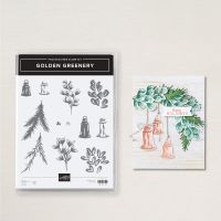
This week starts a new design series and we’re All About Christmas! I know it’s hard to want to think about the holidays when we’re not even officially into fall yet. But as you know, beautiful Christmas cards don’t just make themselves! *wink* Today’s card features the Golden Greenery stamps and dies, as well as several of the new patterned paper packs that just launched in the Stampin’ Up! Holiday Mini catalog.

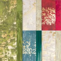
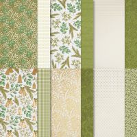
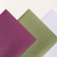
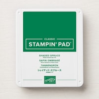
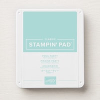
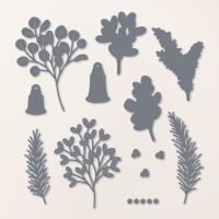
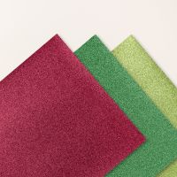
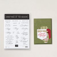
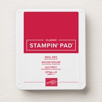
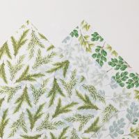
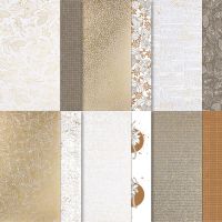
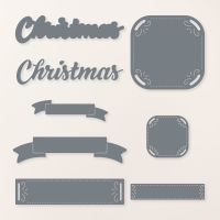
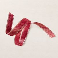
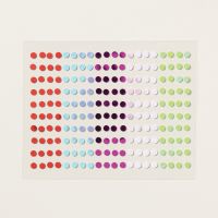
So let’s get a closer look at today’s card. We get started with a base of Mossy Meadow cardstock. Our focal panel base consists of two coordinating gold foil patterns — the foiled greenery patterned paper from the Season of Green & Gold paper pack and the Old Olive pattern from the Season of Elegance paper pack. I love how the gold foiling in each sheet plays off each other so well to give a cohesive sheen to the background. To create the layers of greenery, I began by stamping two different greenery patterns from the Golden Greenery stamp set onto Soft Sea Foam cardstock. These greenery bunches come together in two steps, and I used a combination of Shaded Spruce and Pool Party to create the stems of leaves. Each one is then diecut with the coordinating Golden Greenery dies. I also cut coordinating stems of the same varieties from shimmer papers using the detailed dies in the set. I chose a mixture of greens to cut the evergreen fronds. All of the stems are then layered up with dimensionals to give a variety of height to the bunch. The sentiment is broken into two parts for a little added drama. The Merry panel is diecut from white using the Peaceful Season dies and Merry is then stamped in Real Red in the center. A twist of Cherry Cobbler & Gold metallic ribbon is adhered behind the panel. Christmas is diecut from Real Red glimmer paper using the Peaceful Season die and then placed to overlap the sentiment panel and greenery. A few red iridescent discs add a pop of sparkle across the card front.

The style of this card would be what my grandmother would have referred to as “plop decorating.” You literally just plop things where they look good. And this card certainly made me smile as I plopped greenery and thought of her!

I hope you’ll pop in tomorrow as we take a little sleigh ride.

Products used in today’s card:
Mossy Meadow, Soft Sea Foam, Garden Green, Shaded Spruce, Basic White cardstock
Season of Elegance, Season of Green & Gold, Basic White shimmer, Festive shimmer DSP
Golden Greenery stamps & dies
Greetings of the Season stamps
Peaceful Season dies
Cherry Cobbler & Gold metallic ribbon
Iridescent discs
Dimensionals
Adhesives
Product List
Autumn · No Stamp Design

Easy Easel that Failed

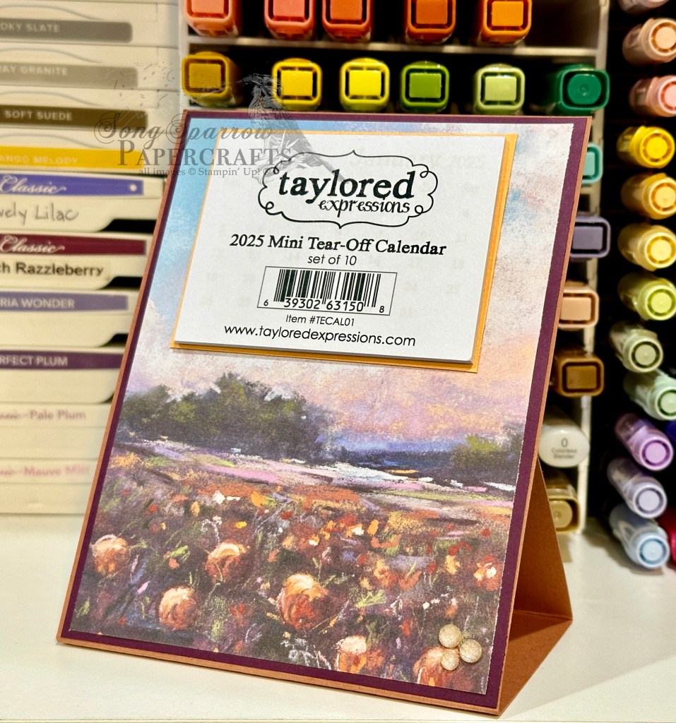
Welcome to today’s BONUS post! It’s the time of year where many of us crafty creators begin thinking about items that we will put in our booths at craft fairs. I have two upcoming craft fairs and am already well underway in the product creation department. One of the many items that I love to offer craft fair customers is an easel calendar. And this year, I’ve been playing around with several different layouts and methods of constructing them.

Today, I’m sharing a prototype with you that didn’t make the cut. Why am I sharing a “failure,” you might ask? Well, it may not work for my customers, but it’s still a lovely design that I intend to enjoy on my own desk. And we’re going to talk about why it doesn’t work because I think there’s value in sharing things that didn’t work out as planned and how we “fix” it.

I knew that I wanted to build a calendar on a standard-sized card base in an easel design. I wanted the calendar to lie flat and be mailable for anyone who purchased one in my craft booth and wanted to mail it to a loved one. So I began with the simplest of easel stands where the easel folds up in the back to prop up the front-facing portion. But what doesn’t work about this design is the prop catch in the back to ensure that the easel stays in place. The only thing I could find that worked to keep the easel in place was a very large stack of dimensionals, which is not at all pretty. And for me, I like for every angle of a crafty creation I made to be lovely to look at. And that’s how this lovely calendar (from the front) became my new desk companion. But let’s talk about how it comes together outside of my faulty easel design.

I love the new Splendid Autumn designer series paper pack and really wanted to pull out the lovely, more subtle colors in the patterned sheet I chose for this easel calendar. After placing a lot of different color combinations behind the Splendid Autumn sheet, I felt like the combination of Cajun Craze and Blackberry Bliss worked best at pulling forward the lovely shades of fall in the field of blooms AND all of the lovely colors of dusk in the sky. So our Cajun Craze sheet serves as our base for the calendar easel and the Blackberry Bliss serves as the mat directly behind the Splendid Autumn sheet. To pull forward the yellows, I matted the small tear-off calendar (by Taylored Expressions) in Crushed Curry. I added a few Peach Pie shimmer gems in the bottom corner for just a little sparkle. I just love how it turned out!

In this week’s episode of Terrific Tuesdays, I’m going to be sharing the full details on this easel calendar with you, including how this particular design was a fail for me PLUS how I changed things up to create an easel that works how I intended. So I hope you’ll tune in!

Products used in today’s featured design:
Cajun Craze, Blackberry Bliss, Crushed Curry cardstock
Splendid Autumn DSP
Taylored Expressions mini tear-off calendar
In Color shimmer gems

Product List
Autumn · Fall

Joy to My Heart

We’ve made it through the first week of September. I don’t know about you, but holiday weeks always feel longer, for some reason.

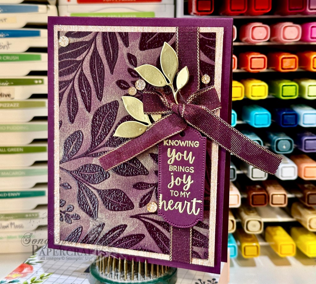
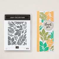
This week, we’ve been all about the autumn designs and looking at a variety of different ways to pair Stampin’ Up! products or to use techniques. Today, we’re revisiting the emboss resist technique with this card design which features the Leaf Collection background stamp. I recently saw a card posted by a fellow demonstrator that paired this stamp with a Blackberry Bliss and metallic gold color palette. It was super elegant and I wanted to give it a twist. So let’s see how it all comes together.

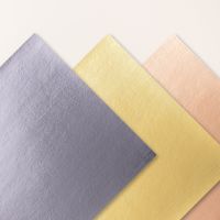
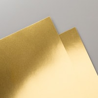
We get started with a base of Blackberry Bliss cardstock. The focal panel is also Blackberry Bliss that has been stamped with the Leaf Collection stamp and then heat embossed with clear embossing powder. To help the pattern pop, I went over the panel with metallic gold ink which gives the entire panel a subtle sheen and really makes the clear embossing twinkle. This panel is matted with Rose Gold textured specialty paper and then wrapped with Blackberry Bliss & Gold textured ribbon and tied with a bow. The sentiment from So Sincere is stamped on Blackberry Bliss cardstock and then heat embossed with gold before being diecut with the Greetings of the Season die using the extension method. The sentiment panel is adhered underneath the bow using several layers of dimensionals. I cut some sprigs of leaves from gold foil using the Changing Leaves die and adhered them with dimensionals around the bow to keep things cohesive. Drusy embellishments finish things off with lots of extra sparkle.

It’s been a lot of fun designing cards all about autumn, and I hope you’ve enjoyed the inspiration. Next week is all about Christmas as we get a better look at the new product from the Stampin’ Up! Holiday Mini Catalog. In the meantime, I hope you’ll tune in on the socials for a little bonus All About Autumn content this afternoon.

Products used in today’s card:
Blackberry Bliss cardstock
Gold foil, Rose Gold textured SP
Leaf Collection, So Sincere stamps
Greetings of the Season, Changing Leaves dies
Clear, gold embossing powder
Blackberry Bliss & Gold textured ribbon
Drusy embellishments
Dimensionals
Adhesives
Product List
Autumn · Fall · sketches · Sketchy Fridays

Sketchy Fridays: Accomplished So Much

This week is all about autumn, and we’re using unique combinations of Stampin’ Up! products to make some beautiful card designs.

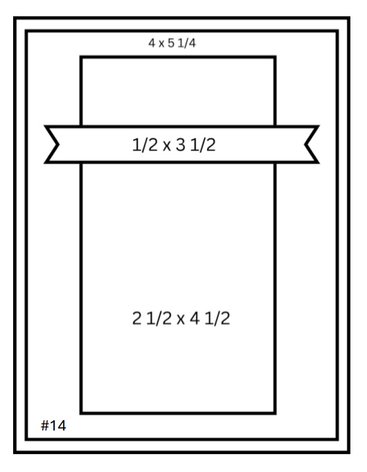
And it’s already time again for another installment of Sketchy Fridays, where each week we’ll be using a card sketch to design our featured card. Right now, we’re working through a full series of designs using the card sketches found on page 22 of the current Stampin’ Up! Annual Catalog.

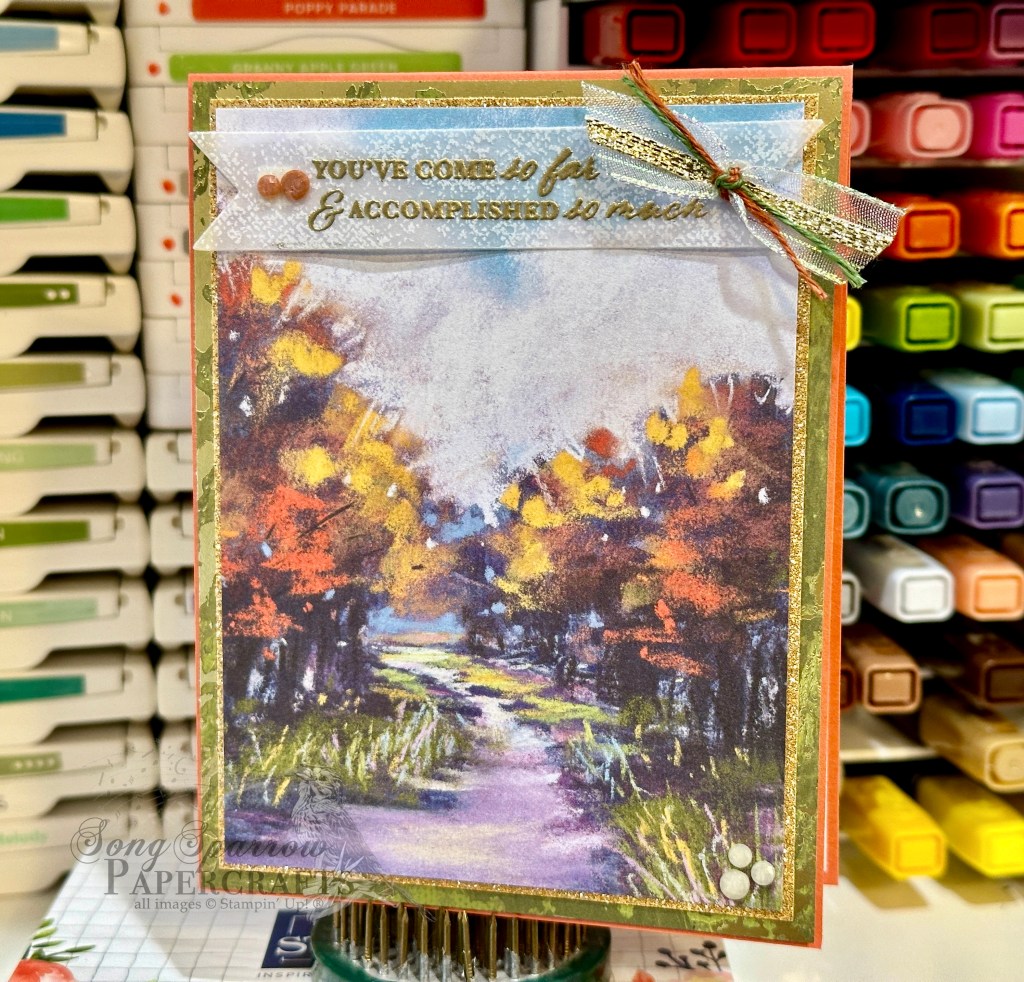
This week’s card is based on Sketch #14 and features the gorgeous Splendid Autumn designer paper from the new Stampin’ Up! Holiday Mini catalog.

As I was thumbing through the papers in the Splendid Autumn paper pack, I was looking for a sheet that would lend itself to an unexpected combination of products. When I saw this beautiful sheet of the groves of trees separated by a stream with its hues of greens and purples, along with the usual fall foliage colors, I knew I had found the sheet I was looking for.

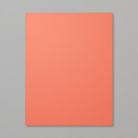
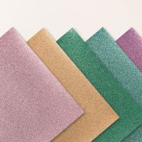
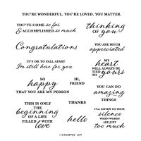
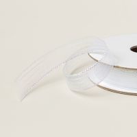
The beauty of today’s Sketch #14 is it lets us use this gorgeous paper as the focal point and then support it with mats as complements. We get started with a base of Calypso Coral cardstock. I love how this base color makes the oranges in the trees pop over the golden hues. Our sheet of Splendid Autumn is matted in two different colors. We use a very thin mat of Peach Pie glimmer paper right up against the Splendid Autumn, and it’s such a nice complement to the golden hues in our paper. Then we’re using a larger secondary mat of Old Olive Season of Elegance designer paper. Just look at how this brings out the grass along either side of our creek that’s reflecting our gorgeous dusky sky. And in person, the sparkle of the gold foiling in this sheet plays along perfectly with the glimmer paper. The sentiment from Wonderful Thoughts is heat embossed in gold on a sheet of white vellum from the Graceful Greenery vellum pack and then diecut using the Greetings of the Season dies using the extension method to give us a full banner. We finish things off with a twist of ribbons, including iridescent striped sheer ribbon, gold trim, and two colors of linen thread from the new Natural Tones pack, and a few of the new Earth Tones shimmer gems in opposing corners for a little sparkle.

I hope you tune in tomorrow as we round out our All About Autumn card series. I’ll be bringing you another emboss resist project, as well as a BONUS post showing how you can make a simple easel project that packs a big punch!

Products used in today’s card:
Calypso Coral cardstock
Season of Elegance, Splendid Autumn, Graceful Greenery vellum, Gold textured DSP
Wonderful Thoughts stamps
Greetings of the Season dies
Iridescent striped ribbon
Gold trim
Natural Tones linen thread
Earth Tones shimmer gems
Dimensionals
Adhesives
Product List
Autumn · Fall

Feel Better

This week’s designs are all about autumn. Aside from using some great new product from Stampin’ Up!, we’re using some fun new techniques to boot!

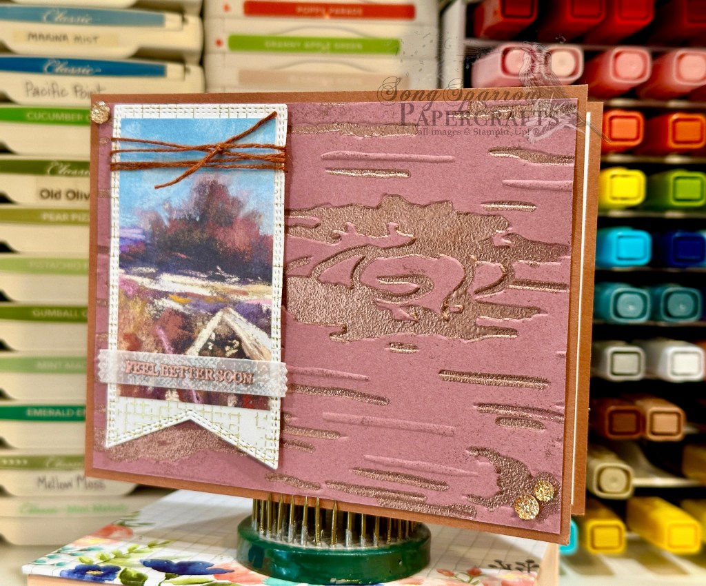
Today, we’re pairing up the beautiful new Splendid Autumn patterned paper pack with the new Birch Wood embossing folder and a cool heat embossing effect that I learned from a team member. So let’s check it out.

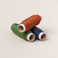
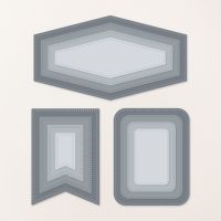
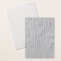
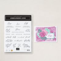
For today’s color palette, we’re drawing out all of the beautiful autumn hues in our Splendid Autumn patterned paper — Copper Clay, Moody Mauve, and Very Vanilla. So we get started with a card base of Copper Clay. Our focal panel is a piece of Moody Mauve that’s been embossed using the new Birch Wood embossing folder. I then filled in all of the debossed sections with Versamark and embossed with copper, BUT I did not completely set the embossing powder. Instead, I only embossed it to the point of looking grainy and then quickly moved on to another section. I felt like the grainy texture looks much more like bark. I wanted a polaroid look for the sentiment panel, so we get started by diecutting a cross-hatch gold foiled sheet from the Nature’s Sweetness paper pack using the largest Nested Essentials banner die. The sheet of Splendid Autumn is then cut to size to fit within, leaving a small border. The sentiment from Unbounded Love is heat embossed in copper on a banner diecut from a sheet of the white Graceful Greenery vellum using the Happy Little Things die. The top of the sentiment panel is wrapped in the new Copper Clay linen thread and the full panel is adhered to the focal panel using dimensionals. A few of the new drusy embellishments in each corner help move the eye across the card.

Isn’t this such a fun embossing technique? I really love the realism it adds to the woodgrain embossed panel. Speaking of embossing techniques, tomorrow we’ll be using another oldie but goodie. I hope you’ll pop by and check it out!

Products used in today’s card:
Copper Clay, Moody Mauve cardstock
Nature’s Sweetness, Splendid Autumn DSP
Graceful Greenery vellum
Birch Wood embossing folder
Unbounded Love stamps
Nested Essentials, Happy Little Things dies
Copper embossing powder
Copper Clay linen thread
Drusy embellishments
Dimensionals
Adhesives
Product List
Holiday Mini Catalog

Holiday Mini Catalog is LIVE

You guys! The Stampin’ Up! Holiday Mini catalog is now LIVE. Between thinking that the catalog launched on the 6th and THEN thinking the 4th was a Tuesday, I just messed up the launch date six ways to Sunday. But it’s TODAY! So if you’ve been anxiously awaiting some of products I’ve spotlighted or you’re just simply curious to see what’s new from Stampin’ Up!, now is your chance to check it all out!

https://susanfox-bowen.stampinup.net/

Terrific Tuesdays

Autumn Birthday

We’re continuing our All About Autumn design series today, and I’m excited to bring you the much-anticipated in-depth look at the acetate rub technique that I first mentioned in my post on Saturday.

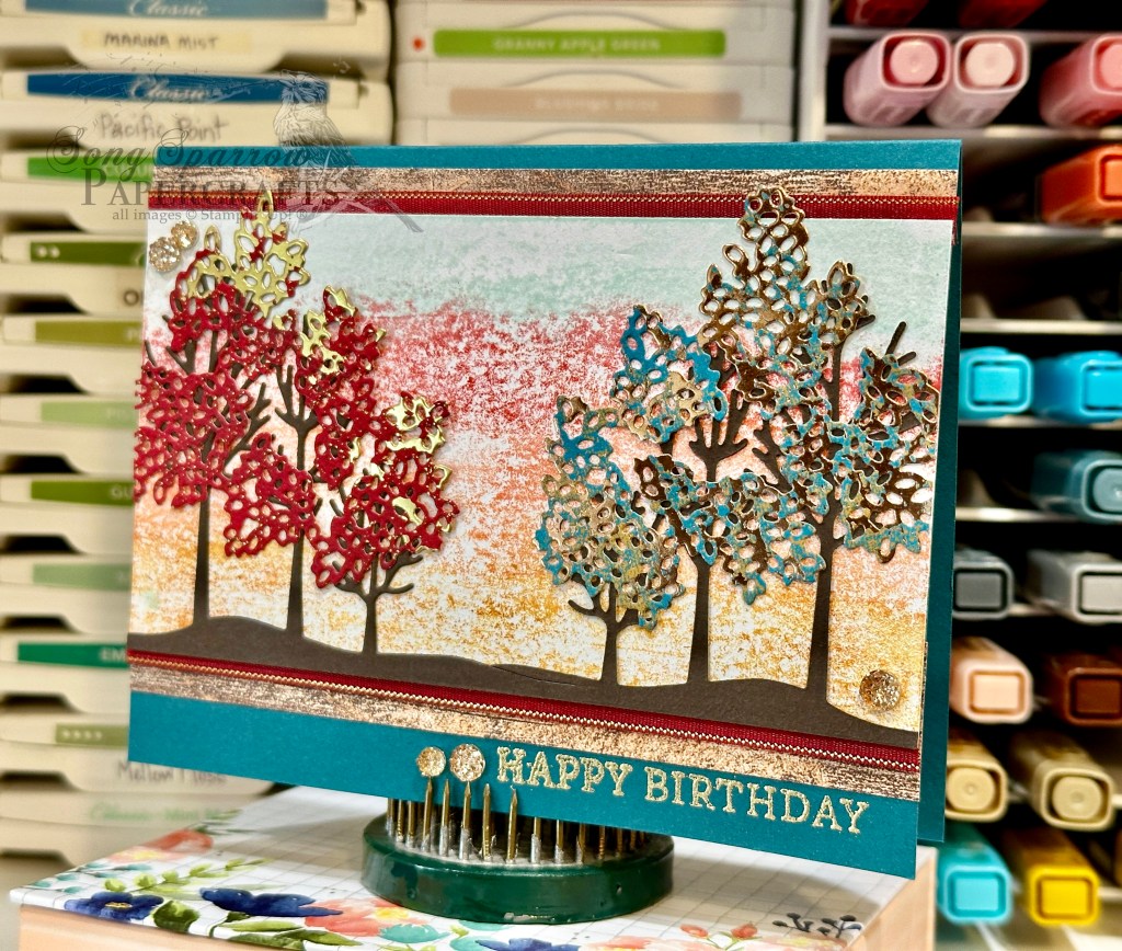
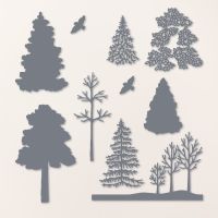
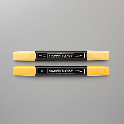
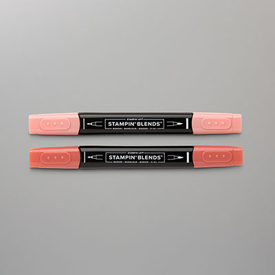
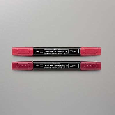
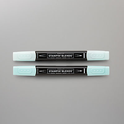
Today’s card mixes things up just a little bit to give us a different look to Saturday’s card design. We start with a card base of Pretty Peacock. Our focal panel background starts with a piece of white cardstock. Using the acetate sheet and 4 colors of Stampin’ Blends — Daffodil Delight, Calypso Coral, Cherry Cobbler, and Pool Party, we create another dusky backdrop for our trees in the midst of a wardrobe change. To achieve that look, we’re using the Pretty Peacock Oxidized Copper and the Real Red Season of Elegance specialty papers and Frosted Forest dies to create the foliage for our trees. Our groves of trees are diecut from Early Espresso cardstock using the Frosted Forest dies. To help our focal panel stand out against our card base, we mat it with a combination of Country Woods woodgrain patterned paper and the Real Red & Gold satin ribbon. The sentiment from Simply Said is heat embossed in gold and then flanked with some drusy embellishments. A few extra drusy embellishments are added in opposing corners to help draw the eye across our focal panel to the sentiment.

You can learn all about the acetate rub technique and how to make this card from start to finish in this week’s episode of Terrific Tuesdays.

I hope you’ll tune in tomorrow to check out a cool technique to try with your embossing folders.

Products used in today’s card:
Pretty Peacock, Early Espresso, Basic White cardstock
Country Woods, Oxidized Copper, Season of Elegance (out tomorrow!) DSP
Window sheets
Simply Said stamps
Frosted Forest dies
Stampin’ Blends
Gold embossing powder
Cherry Cobbler & Gold satin ribbon (out today!)
Drusy embellishments (out tomorrow!)
Adhesives

Product List
Fall

Piles of Blessings

Welcome to a brand new week AND month, crafty friends! This week, we have a new design theme — All About Autumn. And I have all kinds of fun new twists and techniques to show you using a whole host of products from Stampin’ Up! We get started today with the Changing Leaves bundle and the emboss resist watercolor technique.

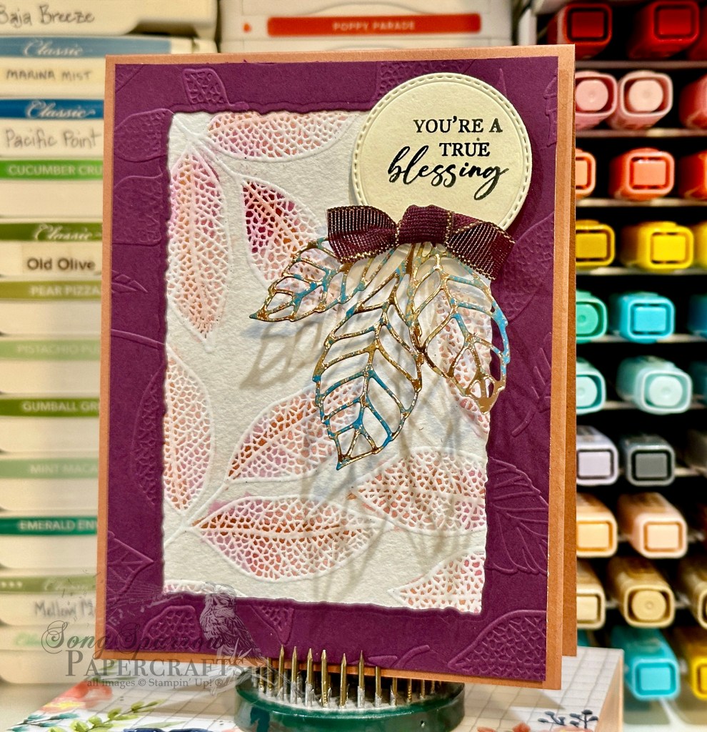
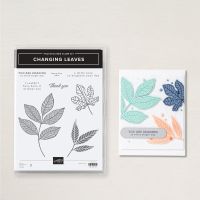
Our card base is Copper Clay cardstock and scored at the top for this portrait orientation design. For our focal panel, we start with a panel of watercolor paper. I stamped the largest leaf from Changing Leaves and heat embossed with white embossing powder. Using the water color painter, I used a combination of Blackberry Bliss, Copper Clay, and Flirty Flamingo ink to watercolor the leaves. The focal panel is then matted with a frame of Blackberry Bliss that has been embossed with the Changing Leaves embossing folder and the center portion is cut out using the Deckled Rectangles dies to make the frame. The framed panel is then mounted to the card base with dimensionals. The sentiment from Unbounded Love is stamped in black on Very Vanilla cardstock and then diecut with the decorative circle from Changing Leaves. The leaves are cut from Pretty Peacock Oxidized Copper paper using the elm leaves from the Changing Leaves die set. A twist of Blackberry Bliss & Gold textured ribbon is adhered over the leaves at the bottom of the sentiment panel using glue dots. The sentiment panel is adhered to the focal panel with dimensionals.

I just love the emboss resist technique and need to remember to incorporate it more into card designs. There are so many different applications and effects that can be achieved with this one technique!

Tune in tomorrow as we get a second look at the very cool Stampin’ Blends acetate rub technique.

Products used in today’s card:
Copper Clay, Blackberry Bliss, Very Vanilla cardstock
Oxidized Copper, watercolor SP
Changing Leaves bundle
Unbounded Love stamps
Deckled Rectanges dies
White embossing powder
Blackberry Bliss & Gold textured ribbon (coming tomorrow!)
Dimensionals
Adhesives
Product List
Frosted Forest

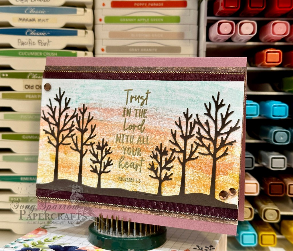
Trust in the Lord

We’re closing out the month of August and our week of In the Woods card designs. I’m still reeling over the fact that today is the last day of August! But I suppose I shouldn’t be surprised since the temps here in North Texas certainly reflect the usual magma-level heat we’re accustomed to in late August.

Today, we’re trekking through the woods at dusk. We’re pairing up the Frosted Forest dies with a fun new Stampin’ Blends background technique. This card was inspired by a recent Stampin’ Up! Artisan (@thecraftyoinkpen) spotlight on Frosted Forest. And I decided I wanted to create my own dusky background using Stampin’ Blends to finish up my projects for a current Luv 2 Stamp Group team challenge. So let’s see how this all comes together.

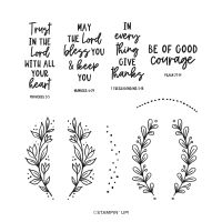
We get started with a base of Moody Mauve cardstock. Our focal panel is a piece of white cardstock that has been “painted” with Stampin’ Blends using an acetate rub technique. I used a combination of Daffodil Delight, Calypso Coral, and Pool Party Stampin’ Blends to create the dusky background. I’ll be sharing more on this Stampin’ Blend acetate rub technique in the next episode of Terrific Tuesdays, so be sure you tune in this coming week to learn all about it! I created a continuous panel of trees from Early Espresso cardstock using the die from the Frosted Forest die set and the extension method and then adhered it to the blended panel using a fine tip glue pen. The sentiment from Courage & Faith is heat embossed in gold between the two groves of trees. The focal panel is matted with Blackberry Bliss & Gold textured ribbon and the darker woodgrain panel from the Country Woods designer paper pack and adhered to the card front with dimensionals. For a little extra twinkle, I added some brown sequins in opposing corners.

Isn’t this just a beautiful backdrop for the trees? I just love this new background technique and can’t wait to tell you all about it on Tuesday! Speaking of which, next week is All About Autumn. I hope you’ll stop in each day to see how we’re putting some of the new items from the Holiday Mini Catalog to a unique use for our design theme!

Products used in today’s card:
Moody Mauve, Early Espresso, Basic White cardstock
Country Woods DSP
Courage & Faith stamps
Frosted Forest dies
Gold embossing powder
Blackberry Bliss & Gold textured ribbon (coming soon!)
Neutrals sequins
Dimensionals
Adhesives
Product List
Fun Folds · sketches · Sketchy Fridays

Sketchy Fridays: Brighten Your Day

I don’t know about you, but I can’t believe that we’re wrapping up the month of August and marching right into September already! I mean, it’s Labor Day weekend. Whaaaaaa?! I feel like the older I get the faster the time seems to fly by.

And speaking of time flying by, it’s time again for another installment of Sketchy Fridays, where each week we’ll be using a card sketch to design our featured card. Right now, we’re working through a full series of designs using the card sketches found on page 22 of the current Stampin’ Up! Annual Catalog.

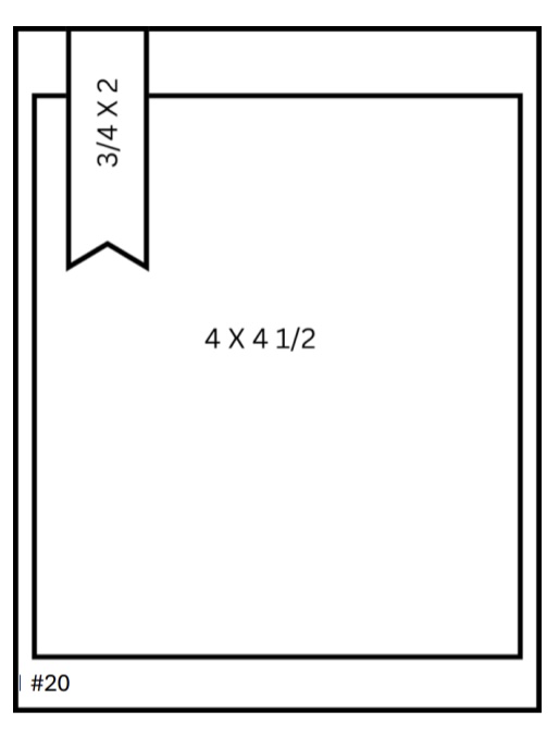
This week’s card is based on Sketch #20 and features the gorgeous Splendid Autumn designer paper from the new Stampin’ Up! Holiday Mini catalog that launches on September 4th.

This paper pack just turns out sheet after sheet of stunning designs, and I’m loving each and every one. I’m pairing up a fun fold shared by my upline Patty Bennett with Sketch #20 from the Annual Catalog. I’ve taken the liberty of changing the orientation of the sentiment piece. And that’s the best thing about using a sketch — it gives you a place to start and then you tweak things to work for you.

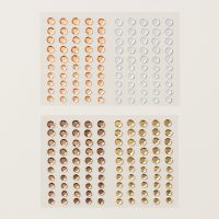
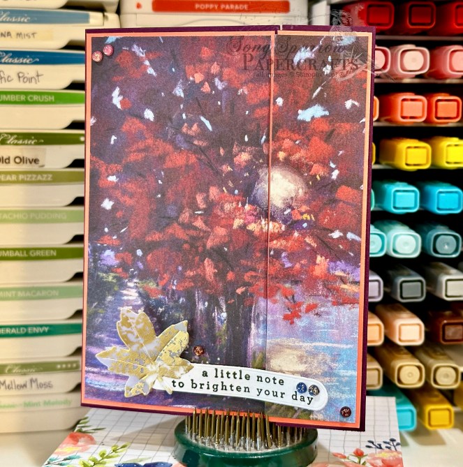
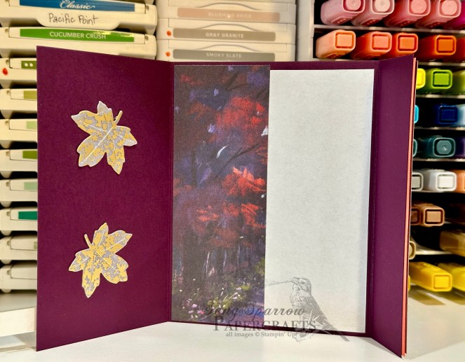
So our fun fold starts with a base of Blackberry Bliss cardstock. Rather than scoring in the center, we score and fold at 3-inches and 7.25-inches to give us our front fold with a standard-sized inside message panel. I decided to double mat the gorgeous sheet of Splendid Autumn patterned paper and used Flirty Flamingo to bring out the pinky-orange hues of the leaves. I cut and mounted the patterned paper so that the panels meet to form a complete picture when the card is closed. When open, there is a small border of Flirty Flamingo visible on the left panel and a slight overhang of the Splendid Autumn sheet on the right panel. The sentiment from Changing Leaves is stamped in black on white cardstock and then diecut using the Greetings of the Season die. I diecut a leaf from gold mercury vellum using the Autumn Leaves dies and adhered to the sentiment panel. The sentiment panel is mounted to the left panel of the card front using dimensionals. We finish off the card front with an assortment of regal foiled dots, which release next week. I felt like it was a shame to waste the remainder of the Splendid Autumn sheet, so it serves as the decorative strip next to the message panel on the inside of the card. I added a few additional gold mercury vellum leaves to tie things together.

I loved this fun fold because it offered the perfect opportunity to showcase a gorgeous sheet of paper. When I have paper that’s so pretty that I don’t want to cut it, I search for layouts like this one that let me put it on full display. Give it a try the next time you have a sheet of paper too pretty to cut up!

Tomorrow, we’re closing out our In the Woods card series with a fall sunset. I hope you’ll stop by and check it out!

Products used in today’s card:
Blackberry Bliss, Flirty Flamingo, Basic White cardstock
Splendid Autumn (coming soon!), gold mercury vellum DSP
Changing Leaves stamps
Autumn Leaves, Greetings of the Season dies
Regal foiled dots (coming soon!)
Dimensionals
Adhesives
Product List