Woohoo, we’ve made it to Friday! It’s been a rainy week here in North Texas, so lots of the usual outside activities have been put on hold. So we’re hoping for a respite from the predicted weekend rain showers. And I’ve got lots of things on the to-do list for the weekend. What about you? I’m super excited to have a card class on my to-do list. And this time, I get the privilege of being the student. *grin*
This week, we’ve been digging in our crafty stash to create cards for the awesome dads in our lives. And today we’re taking it outside by pairing up the new Scenic Adventure bundle with a super fun (and easy!) faux watercolor technique I learned over at On Y Go to create a lovely sunset scene.

Our card gets started with a base of Crumb Cake cardstock and then I cut a window using the Textured Notes die. To create the sunset in the background, cover a clear block with a combination of Crushed Curry, Pumpkin Pie, and Flirty Flamingo ink and then spritz with water before stamping on the quarter panel of Very Vanilla cardstock. For some extra interest and a touch of mystical sparkle, add some Wink of Stella to the panel before adhering to the back of the front panel so that it peeks through the window. The trees and grass are cut from a combination of Mossy Meadow, Shaded Spruce, and Crumb Cake using the Scenic Adventure dies. The grass is adhered directly to the front panel, while the trees are adhered with dimensionals to give some depth to the scene.
Our sentiment is in two parts. The top sentiment you’re amazing from Scenic Adventure is stamped in Versamark on Crumb Cake and then heat embossed with copper. I cut around this sentiment using paper snips. The sentiment panel is adhered to a sheet of pastel ombre glimmer paper and then cut to mat the sentiment. The full panel is adhered to the top of the sunset using dimensionals. We cut our bottom sentiment panel from Pretty Peacock glimmer paper using the Nested Essentials dies. The bottom DAD sentiment from He’s the Greatest is stamped directly in the center of the peacock panel in Versamark and then heat embossed with copper. This panel is mounted with dimensionals in the center of the card at the bottom of the front panel over some linen thread. We finish things off with some In Color flat pearls and riverside pearls.
Product List
![Crumb Cake 8-1/2" X 11" Cardstock [ 120953 ] Crumb Cake 8-1/2" X 11" Cardstock [ 120953 ]](https://assets1.tamsnetwork.com/images/EC042017NF/120953s.jpg)
![Mossy Meadow 8-1/2" X 11" Cardstock [ 133676 ] Mossy Meadow 8-1/2" X 11" Cardstock [ 133676 ]](https://assets1.tamsnetwork.com/images/EC042017NF/133676s.jpg)
![Shaded Spruce 8-1/2" X 11" Cardstock [ 146981 ] Shaded Spruce 8-1/2" X 11" Cardstock [ 146981 ]](https://assets1.tamsnetwork.com/images/EC042017NF/146981s.jpg)
![Very Vanilla 8 1/2" X 11" Cardstock [ 166784 ] Very Vanilla 8 1/2" X 11" Cardstock [ 166784 ]](https://assets1.tamsnetwork.com/images/EC042017NF/166784s.jpg)
![Pastel Ombre Glimmer 12" X 12" (30.5 X 30.5 Cm) Specialty Paper [ 164851 ] Pastel Ombre Glimmer 12" X 12" (30.5 X 30.5 Cm) Specialty Paper [ 164851 ]](https://assets1.tamsnetwork.com/images/EC042017NF/164851s.jpg)
![Three Color Glimmer 12" X 12" (30.5 X 30.5 Cm) Specialty Paper [ 162813 ] Three Color Glimmer 12" X 12" (30.5 X 30.5 Cm) Specialty Paper [ 162813 ]](https://assets1.tamsnetwork.com/images/EC042017NF/162813s.jpg)
![Crushed Curry Classic Stampin' Pad [ 147087 ] Crushed Curry Classic Stampin' Pad [ 147087 ]](https://assets1.tamsnetwork.com/images/EC042017NF/147087s.jpg)
![Pumpkin Pie Classic Stampin' Pad [ 147086 ] Pumpkin Pie Classic Stampin' Pad [ 147086 ]](https://assets1.tamsnetwork.com/images/EC042017NF/147086s.jpg)
![Flirty Flamingo Classic Stampin' Pad [ 147052 ] Flirty Flamingo Classic Stampin' Pad [ 147052 ]](https://assets1.tamsnetwork.com/images/EC042017NF/147052s.jpg)
![Textured Notes Dies [ 165555 ] Textured Notes Dies [ 165555 ]](https://assets1.tamsnetwork.com/images/EC042017NF/165555s.jpg)
![Nested Essentials Dies [ 161597 ] Nested Essentials Dies [ 161597 ]](https://assets1.tamsnetwork.com/images/EC042017NF/161597s.jpg)
![Scenic Adventure Bundle (English) [ 165468 ] Scenic Adventure Bundle (English) [ 165468 ]](https://assets1.tamsnetwork.com/images/EC042017NF/165468s.jpg)
![He's The Greatest Photopolymer Stamp Set (English) [ 165684 ] He's The Greatest Photopolymer Stamp Set (English) [ 165684 ]](https://assets1.tamsnetwork.com/images/EC042017NF/165684s.jpg)
![Versamark Pad [ 102283 ] Versamark Pad [ 102283 ]](https://assets1.tamsnetwork.com/images/EC042017NF/102283s.jpg)
![Metallics Wow! Embossing Powder [ 165678 ] Metallics Wow! Embossing Powder [ 165678 ]](https://assets1.tamsnetwork.com/images/EC042017NF/165678s.jpg)
![2025–2027 In Color™ Flat Pearls [ 165192 ] 2025–2027 In Color™ Flat Pearls [ 165192 ]](https://assets1.tamsnetwork.com/images/EC042017NF/165192s.jpg)
![Riverside Irregular Pearls [ 164937 ] Riverside Irregular Pearls [ 164937 ]](https://assets1.tamsnetwork.com/images/EC042017NF/164937s.jpg)
![Linen Thread [ 104199 ] Linen Thread [ 104199 ]](https://assets1.tamsnetwork.com/images/EC042017NF/104199s.jpg)
![Mini Stampin' Dimensionals [ 144108 ] Mini Stampin' Dimensionals [ 144108 ]](https://assets1.tamsnetwork.com/images/EC042017NF/144108s.jpg)
![Clear Wink Of Stella Glitter Brush [ 141897 ] Clear Wink Of Stella Glitter Brush [ 141897 ]](https://assets1.tamsnetwork.com/images/EC042017NF/141897s.jpg)
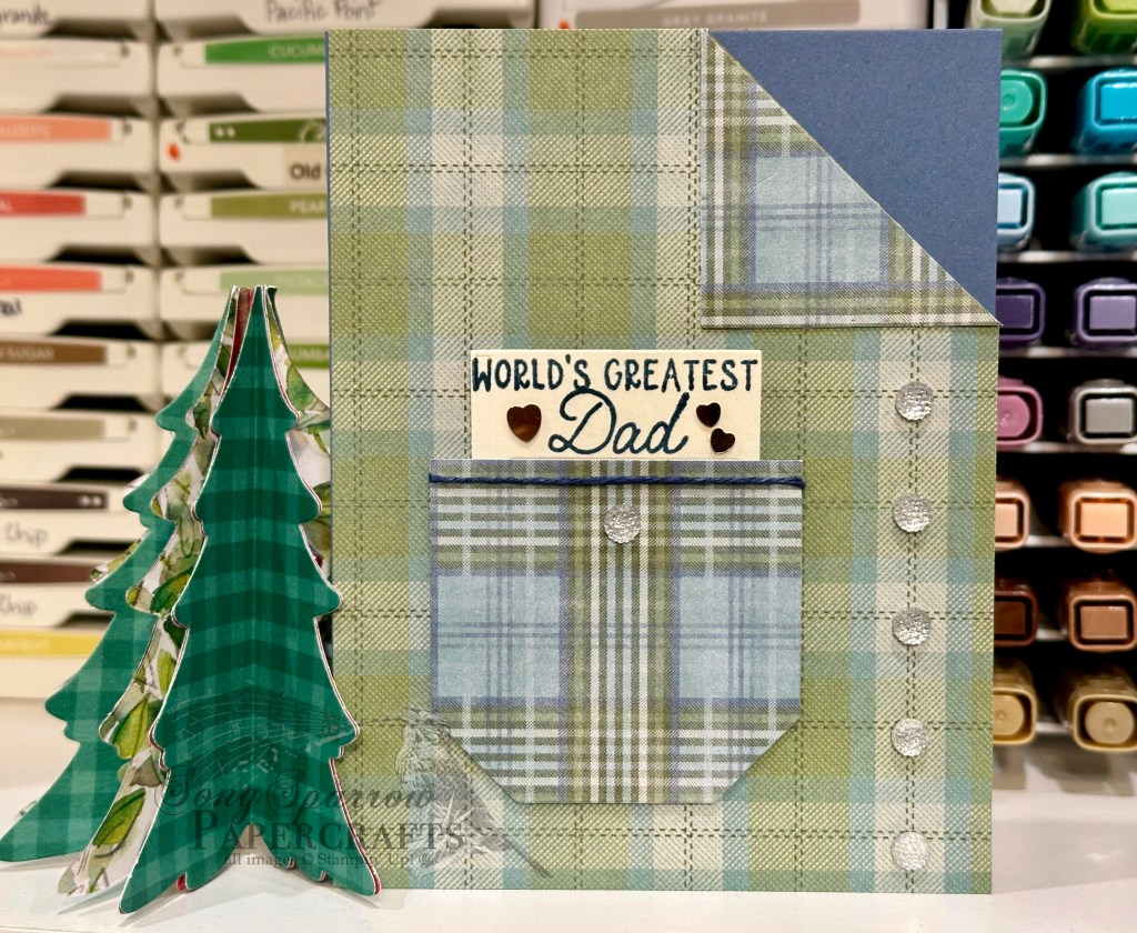
![Misty Moonlight 8-1/2" X 11" Cardstock [ 153081 ] Misty Moonlight 8-1/2" X 11" Cardstock [ 153081 ]](https://assets1.tamsnetwork.com/images/EC042017NF/153081s.jpg)
![Timeless Plaid 6" X 6" (15.2 X 15.2 Cm) Designer Series Paper [ 164678 ] Timeless Plaid 6" X 6" (15.2 X 15.2 Cm) Designer Series Paper [ 164678 ]](https://assets1.tamsnetwork.com/images/EC042017NF/164678s.jpg)
![Countryside Corners Dies [ 161471 ] Countryside Corners Dies [ 161471 ]](https://assets1.tamsnetwork.com/images/EC042017NF/161471s.jpg)
![Notes & Totes Dies [ 165240 ] Notes & Totes Dies [ 165240 ]](https://assets1.tamsnetwork.com/images/EC042017NF/165240s.jpg)
![She's The Greatest Photopolymer Stamp Set (English) [ 165439 ] She's The Greatest Photopolymer Stamp Set (English) [ 165439 ]](https://assets1.tamsnetwork.com/images/EC042017NF/165439s.jpg)
![Misty Moonlight Classic Stampin' Pad [ 153118 ] Misty Moonlight Classic Stampin' Pad [ 153118 ]](https://assets1.tamsnetwork.com/images/EC042017NF/153118s.jpg)
![Natural Tones Linen Thread [ 164071 ] Natural Tones Linen Thread [ 164071 ]](https://assets1.tamsnetwork.com/images/EC042017NF/164071s.jpg)
![Adhesive Backed Heart Sequins [ 164920 ] Adhesive Backed Heart Sequins [ 164920 ]](https://assets1.tamsnetwork.com/images/EC042017NF/164920s.jpg)
![Faceted Gems Trio Pack [ 162148 ] Faceted Gems Trio Pack [ 162148 ]](https://assets1.tamsnetwork.com/images/EC042017NF/162148s.jpg)
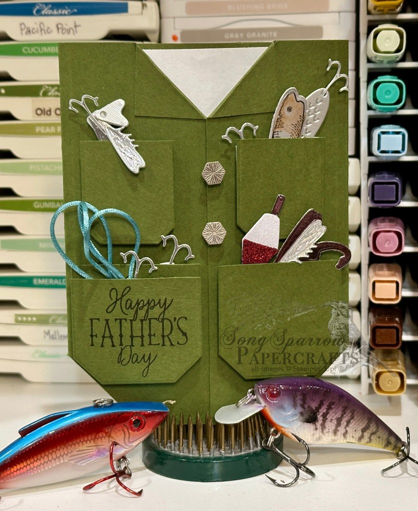
![Basic White 8 1/2" X 11" Cardstock [ 166780 ] Basic White 8 1/2" X 11" Cardstock [ 166780 ]](https://assets1.tamsnetwork.com/images/EC042017NF/166780s.jpg)
![Silver Foil 12" X 12" (30.5 X 30.5 Cm) Specialty Pack [ 163096 ] Silver Foil 12" X 12" (30.5 X 30.5 Cm) Specialty Pack [ 163096 ]](https://assets1.tamsnetwork.com/images/EC042017NF/163096s.jpg)
![Berry Burst, Old Olive & White 12" X 12" (30.5 X 30.5 Cm) Glimmer Specialty Paper [ 163769 ] Berry Burst, Old Olive & White 12" X 12" (30.5 X 30.5 Cm) Glimmer Specialty Paper [ 163769 ]](https://assets1.tamsnetwork.com/images/EC042017NF/163769s.jpg)
![Festive 12" X 12" (30.5 X 30.5 Cm) Glimmer Paper [ 164106 ] Festive 12" X 12" (30.5 X 30.5 Cm) Glimmer Paper [ 164106 ]](https://assets1.tamsnetwork.com/images/EC042017NF/164106s.jpg)
![Gone Fishing Dies [ 161541 ] Gone Fishing Dies [ 161541 ]](https://assets1.tamsnetwork.com/images/EC042017NF/161541s.jpg)
![Gone Fishing Photopolymer Stamp Set (English) [ 161535 ] Gone Fishing Photopolymer Stamp Set (English) [ 161535 ]](https://assets1.tamsnetwork.com/images/EC042017NF/161535s.jpg)
![Jet Black Stāzon Ink Pad [ 101406 ] Jet Black Stāzon Ink Pad [ 101406 ]](https://assets1.tamsnetwork.com/images/EC042017NF/101406s.jpg)
![Lost Lagoon Soft Cording [ 164938 ] Lost Lagoon Soft Cording [ 164938 ]](https://assets1.tamsnetwork.com/images/EC042017NF/164938s.jpg)
![Industrial Trinkets [ 163450 ] Industrial Trinkets [ 163450 ]](https://assets1.tamsnetwork.com/images/EC042017NF/163450s.jpg)
![Mini Glue Dots [ 103683 ] Mini Glue Dots [ 103683 ]](https://assets1.tamsnetwork.com/images/EC042017NF/103683s.jpg)
![Foam Adhesive Strips [ 141825 ] Foam Adhesive Strips [ 141825 ]](https://assets1.tamsnetwork.com/images/EC042017NF/141825s.jpg)
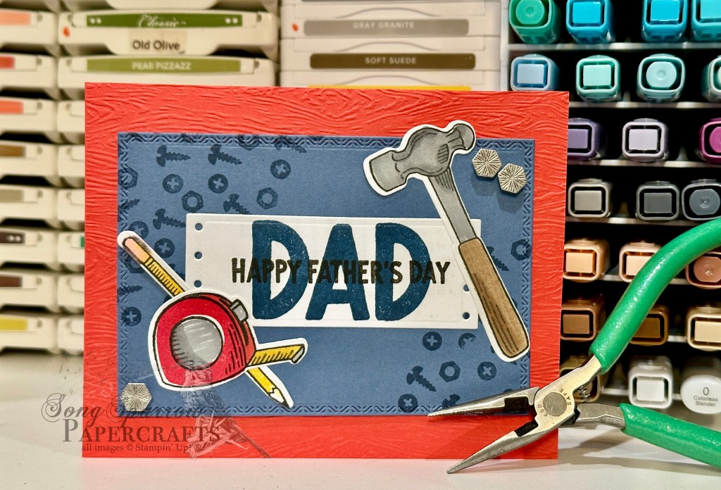
![Poppy Parade 8-1/2" X 11" Cardstock [ 119793 ] Poppy Parade 8-1/2" X 11" Cardstock [ 119793 ]](https://assets1.tamsnetwork.com/images/EC042017NF/119793s.jpg)
![Trusty Tools Bundle (English) [ 162723 ] Trusty Tools Bundle (English) [ 162723 ]](https://assets1.tamsnetwork.com/images/EC042017NF/162723s.jpg)
![Timber 3 D Embossing Folder [ 163094 ] Timber 3 D Embossing Folder [ 163094 ]](https://assets1.tamsnetwork.com/images/EC042017NF/163094s.jpg)
![Poppy Parade Classic Stampin' Pad [ 147050 ] Poppy Parade Classic Stampin' Pad [ 147050 ]](https://assets1.tamsnetwork.com/images/EC042017NF/147050s.jpg)
![Gray Granite Stampin' Blends Combo Pack [ 154886 ] Gray Granite Stampin' Blends Combo Pack [ 154886 ]](https://assets1.tamsnetwork.com/images/EC042017NF/154886s.jpg)
![Daffodil Delight Stampin' Blends Combo Pack [ 154883 ] Daffodil Delight Stampin' Blends Combo Pack [ 154883 ]](https://assets1.tamsnetwork.com/images/EC042017NF/154883s.jpg)
![Crumb Cake Stampin' Blends Combo Pack [ 154882 ] Crumb Cake Stampin' Blends Combo Pack [ 154882 ]](https://assets1.tamsnetwork.com/images/EC042017NF/154882s.jpg)
![Pretty In Pink Stampin’ Blends Combo Pack [ 163824 ] Pretty In Pink Stampin’ Blends Combo Pack [ 163824 ]](https://assets1.tamsnetwork.com/images/EC042017NF/163824s.jpg)
![Stampin' Dimensionals [ 104430 ] Stampin' Dimensionals [ 104430 ]](https://assets1.tamsnetwork.com/images/EC042017NF/104430s.jpg)
![Tear & Tape Adhesive [ 154031 ] Tear & Tape Adhesive [ 154031 ]](https://assets1.tamsnetwork.com/images/EC042017NF/154031s.jpg)

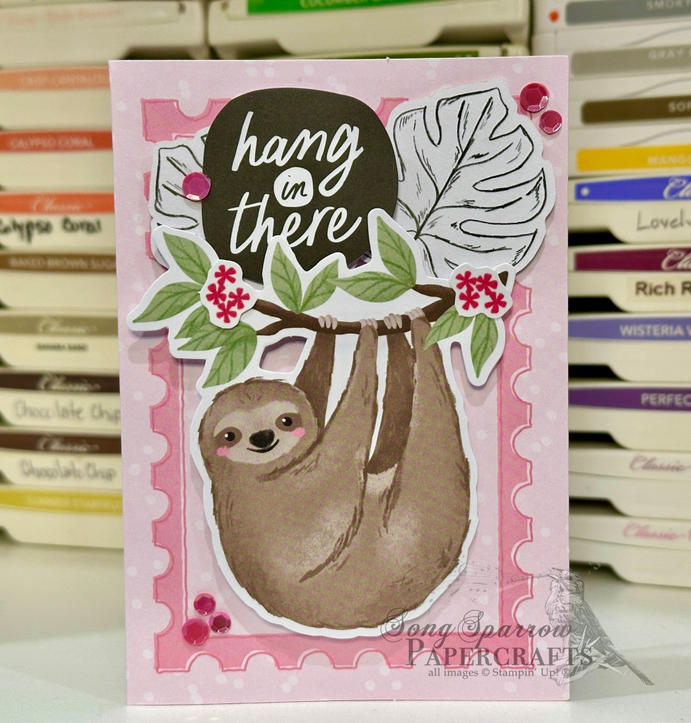

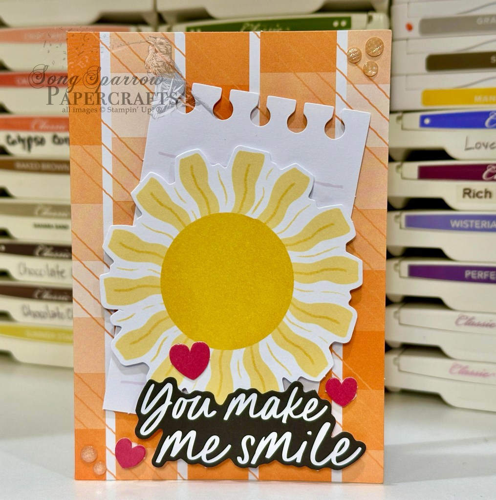
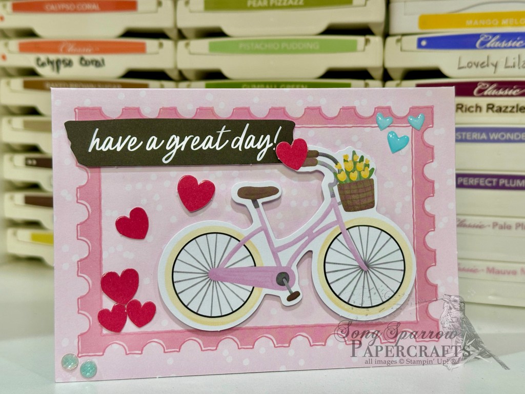
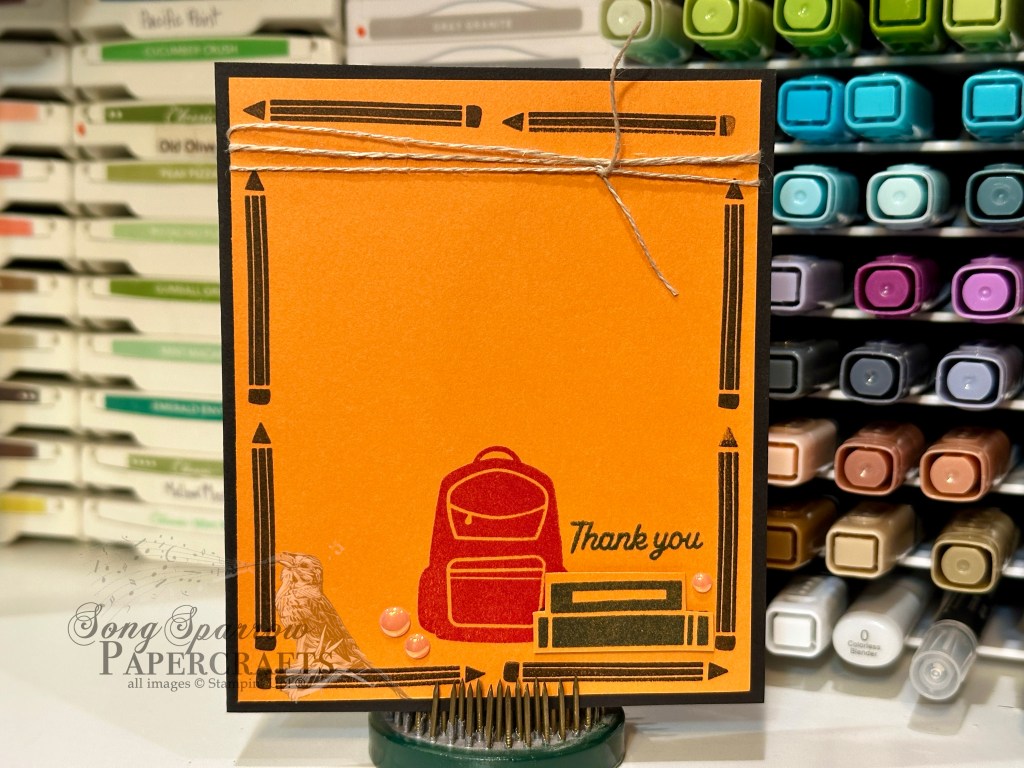
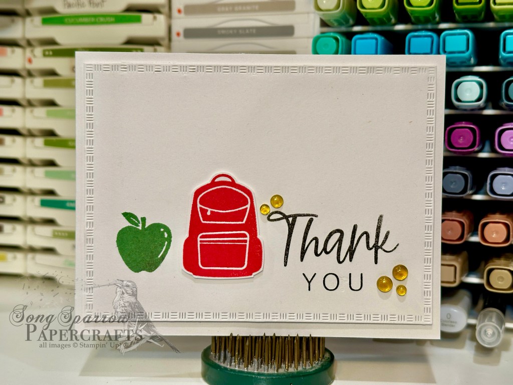


![Blackberry Bliss 8-1/2" X 11" Cardstock [ 133675 ] Blackberry Bliss 8-1/2" X 11" Cardstock [ 133675 ]](https://assets1.tamsnetwork.com/images/EC042017NF/133675s.jpg)
![Lovely Garden 12" X 12" (30.5 X 30.5 Cm) Designer Series Paper [ 165524 ] Lovely Garden 12" X 12" (30.5 X 30.5 Cm) Designer Series Paper [ 165524 ]](https://assets1.tamsnetwork.com/images/EC042017NF/165524s.jpg)
![Thoughtful Designs 12" X 12" (30.5 X 30.5 Cm) Specialty Designer Series Paper [ 163317 ] Thoughtful Designs 12" X 12" (30.5 X 30.5 Cm) Specialty Designer Series Paper [ 163317 ]](https://assets1.tamsnetwork.com/images/EC042017NF/163317s.jpg)
![Dotted Circles 3 D Embossing Folder [ 163789 ] Dotted Circles 3 D Embossing Folder [ 163789 ]](https://assets1.tamsnetwork.com/images/EC042017NF/163789s.jpg)
![Thankful Garden Bundle (English) [ 165534 ] Thankful Garden Bundle (English) [ 165534 ]](https://assets1.tamsnetwork.com/images/EC042017NF/165534s.jpg)
![Sweet Blooms Dies (English) [ 165186 ] Sweet Blooms Dies (English) [ 165186 ]](https://assets1.tamsnetwork.com/images/EC042017NF/165186s.jpg)
![Pretty In Pink Classic Stampin Pad [ 163807 ] Pretty In Pink Classic Stampin Pad [ 163807 ]](https://assets1.tamsnetwork.com/images/EC042017NF/163807s.jpg)
![Blackberry Bliss Classic Stampin' Pad [ 147092 ] Blackberry Bliss Classic Stampin' Pad [ 147092 ]](https://assets1.tamsnetwork.com/images/EC042017NF/147092s.jpg)
![Shy Shamrock Classic Stampin Pad [ 163808 ] Shy Shamrock Classic Stampin Pad [ 163808 ]](https://assets1.tamsnetwork.com/images/EC042017NF/163808s.jpg)
![Iridescent 1/2" (1.3 Cm) Striped Trim [ 163299 ] Iridescent 1/2" (1.3 Cm) Striped Trim [ 163299 ]](https://assets1.tamsnetwork.com/images/EC042017NF/163299s.jpg)
![Regal Foiled Adhesive Backed Dots [ 164038 ] Regal Foiled Adhesive Backed Dots [ 164038 ]](https://assets1.tamsnetwork.com/images/EC042017NF/164038s.jpg)
![Drusy Adhesive Backed Embellishments [ 164223 ] Drusy Adhesive Backed Embellishments [ 164223 ]](https://assets1.tamsnetwork.com/images/EC042017NF/164223s.jpg)
![Fine-Tip Glue Pen [ 138309 ] Fine-Tip Glue Pen [ 138309 ]](https://assets1.tamsnetwork.com/images/EC042017NF/138309s.jpg)