Christmas

Beary Happy Christmas

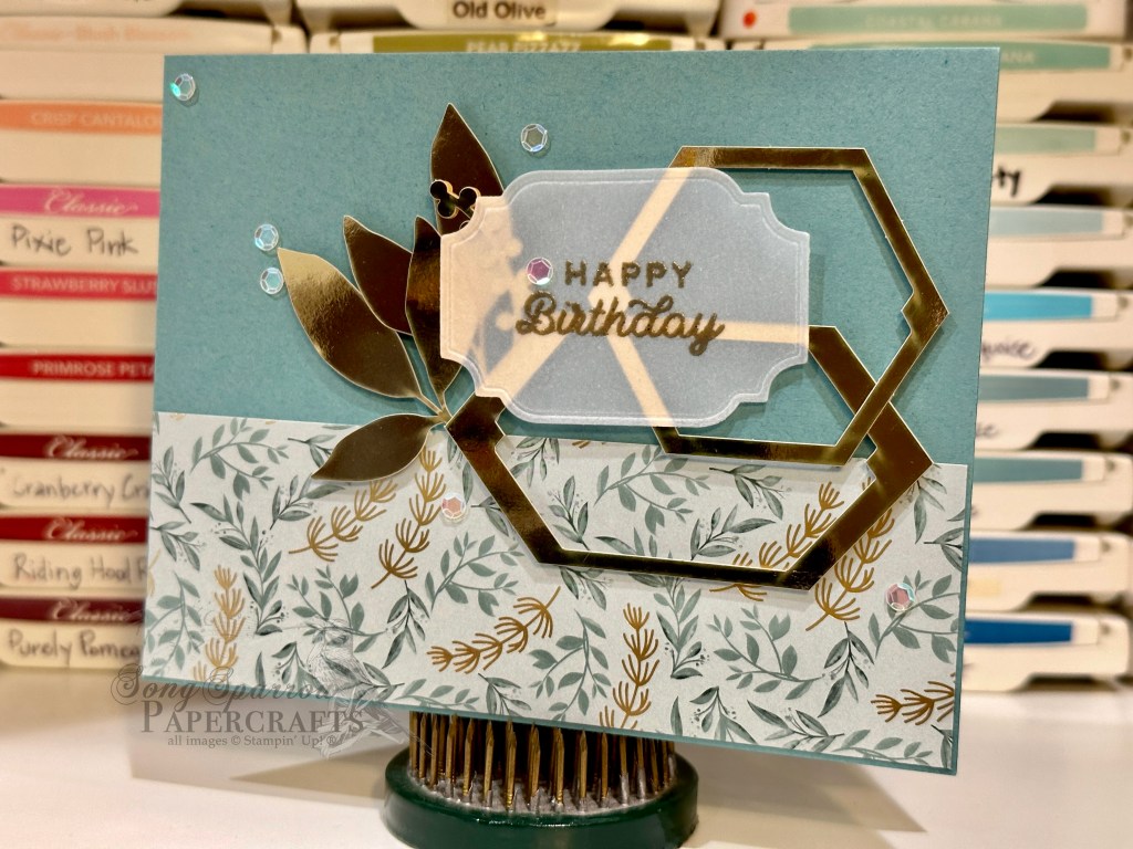
Did you know that even seasoned stampers look for inspiration? Sometimes designs just come to you and other times you have to look high and low for them! I actually stumbled across this design by Susan Campfield in my daily stroll through my Facebook feed and knew it needed to go in the Inspiration file. It can easily be adapted to so many different occasions, which makes it a design you can turn to again and again.

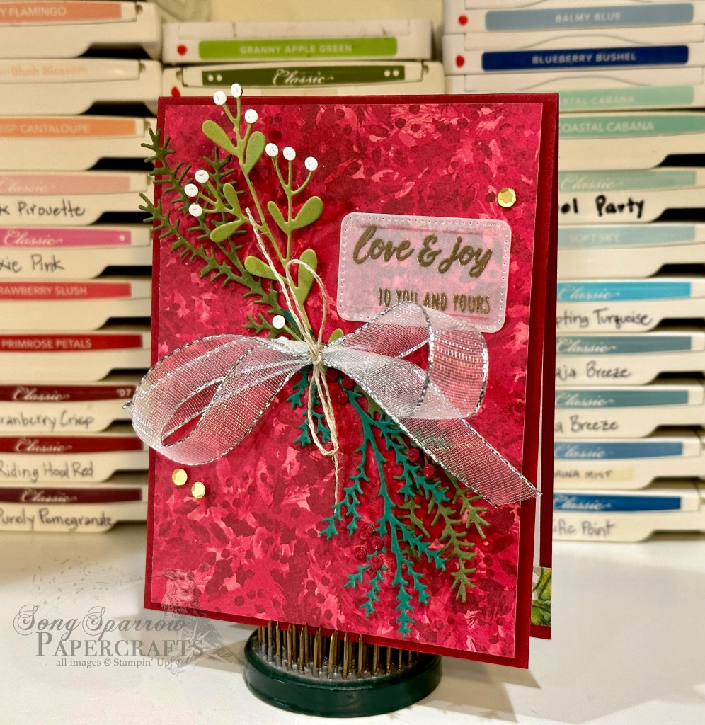
I love how the buffalo plaid is reminiscent of a warm winter flannel, making it a perfect design element for this holiday card. The base of the card is black cardstock and the plaid paper is matted by a sheet of Cherry Cobbler and black cardstock. The bear is punched from black cardstock using the Beary Cute punch. The red and white gingham ribbon allows the sentiment panel to function visually as a banner across the focal panel. If you’re making a set of cards, you can alternate the direction of the bear for some added interest. The sentiment panel is diecut from white cardstock using the Nested Essentials die and then the sentiment is stamped in Real Red using the Merriest Trees stamps. The adhesive hexagons help draw the eye across this playful design.

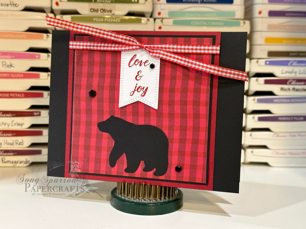
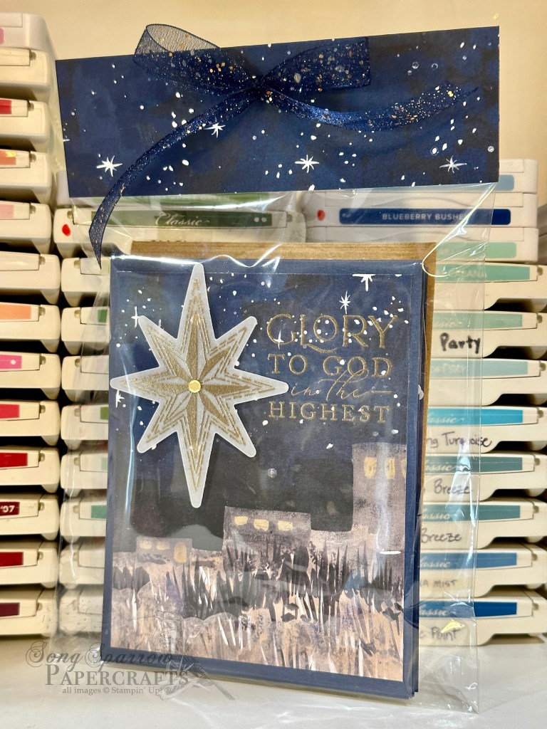
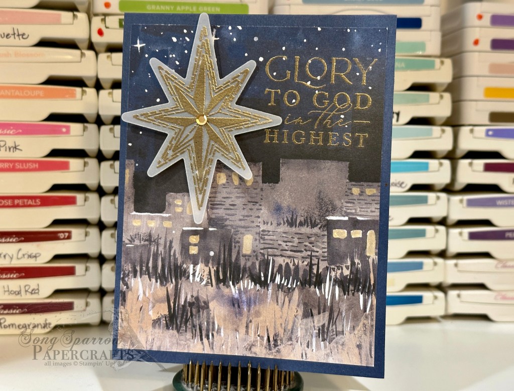
I just love the rustic feel of this card. It reminds me of a homey cabin in the snowy woods. Don’t you think?

Products used:
Cherry Cobbler, Basic Black and White cardstock
A Walk in the Forest DSP
Merriest Trees stamps
Beary Cute punch
Real Red and White gingham ribbon (retired)
Adhesive hexagons (retired)
Adhesives

All ads on this site are posted by WordPress and are based on your personal browsing history. I do not control ad content.

Card Sets · Christmas · Packaging

It’s All in the Packaging

Whether I’m preparing one card or a pack of cards for sale, I believe that the packaging is as important as the product itself. There are many iconic brands that are known as much for their packaging as what they’re selling — think Tiffany’s or Louis Vuitton.

Here are examples of a few card packs that I packaged for upcoming craft fairs. It’s important to me that the card design is clearly visible through the packaging and an insert is included on the back to show the inside sentiment, which can be especially important to customers when they’re selecting cards. Because larger sets of cards result in thicker packaging, a top closure is necessary and a nice coordinating paper and ribbon really dress things up!

Have you seen cards packaged list this before? What other methods have you seen?

All ads on this site are posted by WordPress and are based on your personal browsing history. I do not control ad content.

Christmas

Festive Tannenbaum

I have a thing for foiled papers. Nothing says festive quite like the sparkle of foiled paper! When Stampin’ Up! recently released some new foiled holiday designs in the Online Exclusives, I just had to have them.

I’ve been playing one of my favorite Christmas albums in the craft room this week because it seems to keep my newest office assistant (aka Nolan the 6-week-old kitten) from going full tilt all the time. There’s a particularly lovely arrangement of O Tannenbaum on the album which inspired this card design.

The beauty of the Shining Christmas specialty paper pack is how beautifully each of the patterns stands on its own. The lovely sheet of trees just called for a prominent spot, and so it comprises most of the front of the card with a sheet of Cherry Cobbler serving as the base. And all of the remaining design elements are simple to allow the trees to shine (literally). The velvet ribbon adds a little texture, while the gold holly leaves carry the sparkle across the design. With just the right group of elements, a simple design can still have eye-catching appeal!

Products used:
Cherry Cobbler, white cardstock
Shining Christmas DSP
All That dies
Gold holly leaves (retired)
Glitter sequins
Adhesive-backed sequins
Papertrey Ink Think Big Favorites #8 (sentiment)(retired)
Velvet ribbon (retired)
Dimensionals
Adhesives

All ads on this site are posted by WordPress and are based on your personal browsing history. I do not control ad content.

Christmas

Behold the Star

I’ve been busy in craft fair mode for many weeks now. I’m teaming up with my mom, who also happens to be my upline, and sponsoring a booth in a local fair at the end of the month. And to boot, the church where I work is having a craft fair this weekend, and last week I offered to contribute some items for the church’s booth. So I have been working on new designs for that.

I wanted to use the beautiful O Holy Night suite of products for at least one card. The paper is so thoughtfully designed, which makes it easy to put together beautiful cards with very few elements.

Here, I started with a base of Night of Navy cardstock. I selected the Bethlehem scene from the O Holy Night designer paper pack. I wanted the Star of Bethlehem to be shining brightly over the city and I wanted to capture the ethereal look of that bright and magical heavenly star. Using the Stars at Night stamp set, the largest star is heat embossed in gold atop vellum and then diecut using the accompanying dies. The sentiment is heat embossed directly atop the designer paper as if the words of the angels’ song is hanging over the blessed city. Just a few simple elements with such a stunning impact, don’t you think?

Products used:
Night of Navy, vellum cardstock
O Holy Night DSP
Stars at Night stamps & dies
Adhesive-backed sequins
Dimensionals
Adhesives

All ads on this site are posted by WordPress and are based on your personal browsing history. I do not control ad content.

birthday

Birthday Bouquet

Welcome to this shiny new week! It’s going to be a busy one for me with appointments, rehearsals, and professional meetings, but I’m ready for it.

Did you see the SU! Clearance Rack refresh last week? I love swiping things on sale. My hubby thinks I’m just about the most frugal person who ever lived. I mean, I save my paper scraps. Lol! But when there’s so much pretty paper, who wants to throw even the tiniest bit away?!

Speaking of swiping sale items, I nabbed the lovely Regency Park designer paper last week and was excited when it arrived on Friday, along with all of the other goodies I got on clearance. The whole paper pack is full of bright and cheery patterns, and I couldn’t wait to get started making some things.

A sheet of Blushing Bride cardstock serves as the base for this birthday card. The sheet of Regency Park is front and center here. To allow relief for the sentiment, I added ribbon under the patterned paper. To really draw the eye to the sentiment, I added the trio of sparkly sequins. This birthday bouquet just makes me happy. What about you?

Products used:
Blushing Bride cardstock (retired)
Regency Park DSP (retired)
Ribbon duo
Adhesive-backed sequins
Dimensionals
Adhesives

All ads on this site are posted by WordPress and are based on your personal browsing history. I do not control ad content.

birthday

Birthday Best

We made it to the weekend! I hope your weekend has gotten off to a good start.

Today, we’re taking a look at one of the complementary birthday designs that I mentioned yesterday. As I was working on September birthday cards for friends, I found myself in a groove making a set of complementary birthday cards.

You’ll notice that this design also has a base of Lost Lagoon cardstock and that the gold elements from the Expressions in Ink Ephemera serve as the focal point of the design. The pattern of the designer paper is more delicate in this design, as are the focal elements. The leaves and berries complemented the designer paper pattern well. I have found that, with a little creativity, you can use just about every element in the ephemera set, even the negatives that may have otherwise been discarded. Here, I’ve used two negatives and selected them because of the interesting details in the interior corners. To me, it feels as though these details point to the sentiment, which is embossed on vellum to allow all of the beauty underneath to show through. I added some sequins for a bit of sparkle and to help the eye move more easily across the entire design.

Products used:
Lost Lagoon, vellum cardstock
Ever Eden DSP (retired)
Expressions in Ink Ephemera (retired)
Gold embossing powder
Dimensionals
Adhesives

birthday

Birthday Buzz

Do you ever get in a groove when you’re creating projects? As I was making a whole host of birthday cards for my friends with September birthdays, I found myself making a complementary set of designs. When I’m designing cards for friends, the designs are usually very reflective of the person. In the case of this set of complementary designs, the colors and sparkle were “just right” for each card recipient.

Here, a sheet of Lost Lagoon cardstock serves as the card base. I really love how it pulls the lighter details from the designer paper to the forefront. The Expressions in Ink Ephemera provides so many different looks depending on which of the gold elements you use. I wanted the gold elements to have more prominence and weight, and I especially loved using the solid centers as accents to the detailed hexagons in the middle. The sentiment is heat embossed in gold on vellum to allow the sentiment to be part of the geometric focal point without covering the beautiful details. A scattering of gold sequins helps draw the eye across the design and ensure the gold accents in the designer paper catch the eye, as well.

Products used:
Lost Lagoon, vellum cardstock
Ever Eden DSP (retired)
Expressions in Ink Ephemera (retired)
Gold embossing powder
Adhesive-backed sequins
Dimensionals
Adhesives

All ads on this site are posted by WordPress and are based on your personal browsing history. I do not control ad content.

Thinking of You Week

Rustic Joy

If you’re following me over on Facebook, you might have caught mention of the new Office Assistant in-training that has joined our family. Earlier this week, we adopted a 6-week old kitten from the local animal shelter. I’m a cat person and have had cats for years, but the last 4 cats we’ve adopted have all been adults. So needless to say, I’ve forgotten just how much work kittens are – they’re just like having toddlers! And Nolan, when he’s not napping, is into EVERYthing so I’ve been thrown off my usual routine this week. So I hope you’ll hang with me as we all adjust and get back into the swing of a normal routine.

I really loved getting into the groove of Thinking of You Week last week. And having some new supplies certainly added to the fun. The Heartfelt Hexagon bundle that Stampin’ Up! just launched was perfect for the occasion, and today’s design is another take on a clean and simple design using this bundle and the new Tartan Foil designer paper.

I have a hard time using Cajun Craze, but this was the perfect card to pull it out and use it as the card base. I wanted this design to feel very fall-like, so I stuck with a simple color combo of oranges and browns. The sentiment panel is punched from a sheet of Crumb Cake and the sentiment is heat embossed in copper. The natural wavy trim served as the perfect compliment to the sentiment panel. I added a little sparkle and tied it altogether with the copper thread and brown sequins. I just loved how this turned out & plan to make several for my personal stash of cards.

Products used:
Cajun Craze, Crumb Cake cardsock
Tartan Foil DSP
Heartfelt Hexagon stamps & punch
Natural wavy trim
Copper thread (retired)
Adhesive-backed sequins
Dimensionals
Adhesives

All ads on this site are posted by WordPress and are based on your personal browsing history. I do not control ad content.

Christmas

Holiday Greenery

Our family makes it a point to gather together often and especially for holidays. One of my favorite things about Christmas gatherings is dressing the table, and my favorite part of table dressing is a fresh holiday centerpiece.

I designed this card with a holiday centerpiece in mind. A piece of Cherry Cobbler cardstock serves as the card base. I chose a sheet of Joy of Christmas designer paper that resembled a bed of greenery, and I love the surprise of it being printed in shades of red rather than green. The sentiment panel is heat embossed on vellum to allow the lovely patterned paper to shine through. To provide a more realistic look of holiday evergreens, I pulled several different shades of green from which I diecut each branch. The evergreen branches are tied together with both sheer ribbon and twine. The gold sequins provide a touch of sparkle and allow the eye to pass easily from left to right.

I’m super pleased with this design because it reminds me of my grandmother’s Christmas dinner table! ❤️ Do you have any favorite parts about preparing for holiday dinners?

Products used:
Cherry Cobbler, Granny Apple Green, Mossy Meadow, Shaded Spruce, white cardstock
Joy of Christmas DSP
Vellum
Magical Meadow, Nested Essentials dies
Merriest Trees stamps (sentiment)
Sheer ribbon
Gold embossing powder
Adhesive-backed sequins
Adhesives

All ads on this site are posted by WordPress and are based on your personal browsing history. I do not control ad content.

Christmas · Clean and Simple

Joy to the World

I love making designs that are out of my comfort zone, particularly when I know a design is going to require a bit of “winging it” when I don’t have the materials to copy it exactly. When I saw the inspiration design for this card, originally posted by Linda Dalke on Instagram, I was immediately struck by it. It was so simple and not my usual style.

The base is a simple piece of white cardstock. I loved the natural look of the gold woodgrain pattern from the Joyful designer paper pack, which is a substitute for the more streaky gold pattern of the card base from the inspiration card. The beautiful starry night sky is diecut from a sheet of Shining Brightly DSP using the Nested Essentials dies. I wanted the star element to be more ethereal so I chose to diecut each layer from a sheet of gold shimmer vellum using the Stars at Night dies. As I was arranging the layers, I felt like the dimensionals behind the middle layer added more visual interest and depth to the panel, particularly when paired with the star trinkets. The sentiment is stamped directly on the card base below the star panel with the blue and gold glittered ribbon completing the visual triangle.

I just love how this turned out and the gold elements really shimmer in the light in person!

Products used:
Basic White cardstock
Shining Brightly, Joyful DSP
Gold shimmer vellum (retired)
Stars at Night, Nested Essentials dies
Papertrey Ink Christmas Blessings stamps (sentiment) (retired)
Night of Navy & Gold glittered ribbon
Star trinkets
Gold pearls
Dimensionals
Adhesives

All ads on this site are posted by WordPress and are based on your personal browsing history. I do not control ad content.