Happy Monday, everyone! We survived our busy weekend of activities and birthday fun. The weather was beautiful and the company was superb. I would have loved a do-over. Anyone else?
But we’re back at it in this shiny new week, and it’s going to be a busy one in the life of this church musician. With rehearsals and services, Holy Week surpasses any other church holiday as the most time-consuming. But when you consider that Holy Week is the turning point of the Christian faith, then it truly makes sense.
So in honor of Holy Week this week, I’ll be bringing you some Easter-inspired designs in fits & spurts between rehearsals & services. Today we’re getting started with a super easy card using the Easter Joy paper and Easter Time ephemera.
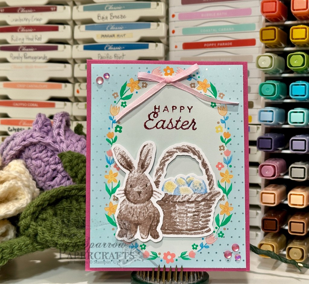
We get started with a base of Berry Burst cardstock. I used one of the ready-made panels from the Easter Joy paper pack as the backdrop for our little Easter scene with the ephemera bunny and basket of colored eggs, which are colored with Wink of Stella and gold embossing powder. They’re adhered to the backdrop with dimensionals. The sentiment from the Saying Hey retired stamp set is a combination of two stamps from the set. I used Blackberry Bliss ink and heat embossed with clear embossing powder. We finish things off with a pink bow and some pink iridescent dots.
This one is so fun and so easy, making it a perfect design for a quick batch of Easter hello cards. I hope you’ll drop back by and see what else we get into this week.
![Blackberry Bliss 8-1/2" X 11" Cardstock [ 133675 ]](https://assets1.tamsnetwork.com/images/EC042017NF/133675s.jpg "Blackberry Bliss 8-1/2\" X 11\" Cardstock [ 133675 ]")
![Basic White 8 1/2" X 11" Cardstock [ 166780 ]](https://assets1.tamsnetwork.com/images/EC042017NF/166780s.jpg "Basic White 8 1/2\" X 11\" Cardstock [ 166780 ]")
![Splendid Autumn 6" X 6" (15.2 X 15.2 Cm) Designer Series Paper [ 164173 ]](https://assets1.tamsnetwork.com/images/EC042017NF/164173s.jpg "Splendid Autumn 6\" X 6\" (15.2 X 15.2 Cm) Designer Series Paper [ 164173 ]")
![Pastels Shimmer 12" X 12" (30.5 X 30.5 Cm) Specialty Paper [ 167198 ]](https://assets1.tamsnetwork.com/images/EC042017NF/167198s.jpg "Pastels Shimmer 12\" X 12\" (30.5 X 30.5 Cm) Specialty Paper [ 167198 ]")
![More Messages Die [ 165472 ]](https://assets1.tamsnetwork.com/images/EC042017NF/165472s.jpg "More Messages Die [ 165472 ]")
![12 Days Of Crafting Advent Calendar (English) [ 167335 ]](https://assets1.tamsnetwork.com/images/EC042017NF/167335s.jpg "12 Days Of Crafting Advent Calendar (English) [ 167335 ]")
![Fresh Freesia Classic Stampin' Pad [ 155611 ]](https://assets1.tamsnetwork.com/images/EC042017NF/155611s.jpg "Fresh Freesia Classic Stampin' Pad [ 155611 ]")
![Daffodil Delight Classic Stampin' Pad [ 147094 ]](https://assets1.tamsnetwork.com/images/EC042017NF/147094s.jpg "Daffodil Delight Classic Stampin' Pad [ 147094 ]")
![Calypso Coral Classic Stampin' Pad [ 147101 ]](https://assets1.tamsnetwork.com/images/EC042017NF/147101s.jpg "Calypso Coral Classic Stampin' Pad [ 147101 ]")
![Pearlized Faceted Circles [ 166978 ]](https://assets1.tamsnetwork.com/images/EC042017NF/166978s.jpg "Pearlized Faceted Circles [ 166978 ]")
![Stampin' Dimensionals [ 104430 ]](https://assets1.tamsnetwork.com/images/EC042017NF/104430s.jpg "Stampin' Dimensionals [ 104430 ]")
![Mini Glue Dots [ 103683 ]](https://assets1.tamsnetwork.com/images/EC042017NF/103683s.jpg "Mini Glue Dots [ 103683 ]")
![Lost Lagoon 8-1/2" X 11" Cardstock [ 133679 ]](https://assets1.tamsnetwork.com/images/EC042017NF/133679s.jpg "Lost Lagoon 8-1/2\" X 11\" Cardstock [ 133679 ]")
![Layers Of Beauty Photopolymer Stamp Set (English) [ 163514 ]](https://assets1.tamsnetwork.com/images/EC042017NF/163514s.jpg "Layers Of Beauty Photopolymer Stamp Set (English) [ 163514 ]")
![Peace On Earth Photopolymer Stamp Set (English) [ 165918 ]](https://assets1.tamsnetwork.com/images/EC042017NF/165918s.jpg "Peace On Earth Photopolymer Stamp Set (English) [ 165918 ]")
![Textured Notes Dies [ 165555 ]](https://assets1.tamsnetwork.com/images/EC042017NF/165555s.jpg "Textured Notes Dies [ 165555 ]")
![Lost Lagoon Classic Stampin' Pad [ 161678 ]](https://assets1.tamsnetwork.com/images/EC042017NF/161678s.jpg "Lost Lagoon Classic Stampin' Pad [ 161678 ]")
![Pretty Peacock Classic Stampin’ Pad [ 150083 ]](https://assets1.tamsnetwork.com/images/EC042017NF/150083s.jpg "Pretty Peacock Classic Stampin’ Pad [ 150083 ]")
![Versamark Pad [ 102283 ]](https://assets1.tamsnetwork.com/images/EC042017NF/102283s.jpg "Versamark Pad [ 102283 ]")
![Basics Wow! Embossing Powder [ 165679 ]](https://assets1.tamsnetwork.com/images/EC042017NF/165679s.jpg "Basics Wow! Embossing Powder [ 165679 ]")
![White With Gold 3/8" (1 Cm) Ribbon [ 166979 ]](https://assets1.tamsnetwork.com/images/EC042017NF/166979s.jpg "White With Gold 3/8\" (1 Cm) Ribbon [ 166979 ]")
![Frosted Iridescent Dots [ 165766 ]](https://assets1.tamsnetwork.com/images/EC042017NF/165766s.jpg "Frosted Iridescent Dots [ 165766 ]")
![Crumb Cake 8-1/2" X 11" Cardstock [ 120953 ]](https://assets1.tamsnetwork.com/images/EC042017NF/120953s.jpg "Crumb Cake 8-1/2\" X 11\" Cardstock [ 120953 ]")
![Wood Grain Wonders 12" X 12" (30.5 X 30.5 Cm) Designer Series Paper [ 167428 ]](https://assets1.tamsnetwork.com/images/EC042017NF/167428s.jpg "Wood Grain Wonders 12\" X 12\" (30.5 X 30.5 Cm) Designer Series Paper [ 167428 ]")
![Nature Walk 12" X 12" (30.5 X 30.5 Cm) Designer Series Paper [ 166912 ]](https://assets1.tamsnetwork.com/images/EC042017NF/166912s.jpg "Nature Walk 12\" X 12\" (30.5 X 30.5 Cm) Designer Series Paper [ 166912 ]")
![With You In Mind Photopolymer Stamp Set (English) [ 169063 ]](https://assets1.tamsnetwork.com/images/EC042017NF/169063s.jpg "With You In Mind Photopolymer Stamp Set (English) [ 169063 ]")
![Perennial Postage Dies [ 162607 ]](https://assets1.tamsnetwork.com/images/EC042017NF/162607s.jpg "Perennial Postage Dies [ 162607 ]")
![Pool Party Classic Stampin' Pad [ 147107 ]](https://assets1.tamsnetwork.com/images/EC042017NF/147107s.jpg "Pool Party Classic Stampin' Pad [ 147107 ]")
![Linen Thread [ 104199 ]](https://assets1.tamsnetwork.com/images/EC042017NF/104199s.jpg "Linen Thread [ 104199 ]")
![Sparkle Dot Essentials [ 166991 ]](https://assets1.tamsnetwork.com/images/EC042017NF/166991s.jpg "Sparkle Dot Essentials [ 166991 ]")
![Flowers Fair Photopolymer Stamp Set [ 167217 ]](https://assets1.tamsnetwork.com/images/EC042017NF/167217s.jpg "Flowers Fair Photopolymer Stamp Set [ 167217 ]")
![Rolling Waves Photopolymer Stamp Set [ 167142 ]](https://assets1.tamsnetwork.com/images/EC042017NF/167142s.jpg "Rolling Waves Photopolymer Stamp Set [ 167142 ]")
![Jet Black Stāzon Ink Pad [ 101406 ]](https://assets1.tamsnetwork.com/images/EC042017NF/101406s.jpg "Jet Black Stāzon Ink Pad [ 101406 ]")
![Metallics Wow! Embossing Powder [ 165678 ]](https://assets1.tamsnetwork.com/images/EC042017NF/165678s.jpg "Metallics Wow! Embossing Powder [ 165678 ]")
![Stylish Shapes Dies [ 159183 ]](https://assets1.tamsnetwork.com/images/EC042017NF/159183s.jpg "Stylish Shapes Dies [ 159183 ]")
![Old Olive Stampin' Blends Combo Pack [ 154892 ]](https://assets1.tamsnetwork.com/images/EC042017NF/154892s.jpg "Old Olive Stampin' Blends Combo Pack [ 154892 ]")
![Pretty In Pink Stampin’ Blends Combo Pack [ 163824 ]](https://assets1.tamsnetwork.com/images/EC042017NF/163824s.jpg "Pretty In Pink Stampin’ Blends Combo Pack [ 163824 ]")
![Daffodil Delight Stampin' Blends Combo Pack [ 154883 ]](https://assets1.tamsnetwork.com/images/EC042017NF/154883s.jpg "Daffodil Delight Stampin' Blends Combo Pack [ 154883 ]")
![2024–2026 In Color™ Shimmer Gems [ 163781 ]](https://assets1.tamsnetwork.com/images/EC042017NF/163781s.jpg "2024–2026 In Color™ Shimmer Gems [ 163781 ]")
![Bubble Bath 1/8" (3.2 Mm) Faux Linen Ribbon [ 167075 ]](https://assets1.tamsnetwork.com/images/EC042017NF/167075s.jpg "Bubble Bath 1/8\" (3.2 Mm) Faux Linen Ribbon [ 167075 ]")
![Delicate Dreams 12" X 12" (30.5 X 30.5 Cm) Specialty Designer Series Paper [ 167498 ]](https://assets1.tamsnetwork.com/images/EC042017NF/167498s.jpg "Delicate Dreams 12\" X 12\" (30.5 X 30.5 Cm) Specialty Designer Series Paper [ 167498 ]")
![Peaceful Garden 12" X 12" (30.5 X 30.5 Cm) Glimmer Paper [ 165929 ]](https://assets1.tamsnetwork.com/images/EC042017NF/165929s.jpg "Peaceful Garden 12\" X 12\" (30.5 X 30.5 Cm) Glimmer Paper [ 165929 ]")
![Sentimental Framing Photopolymer Stamp Set (English) [ 165475 ]](https://assets1.tamsnetwork.com/images/EC042017NF/165475s.jpg "Sentimental Framing Photopolymer Stamp Set (English) [ 165475 ]")
![Everyday Arches Dies [ 164629 ]](https://assets1.tamsnetwork.com/images/EC042017NF/164629s.jpg "Everyday Arches Dies [ 164629 ]")
![Words Of Beauty Dies (English) [ 167089 ]](https://assets1.tamsnetwork.com/images/EC042017NF/167089s.jpg "Words Of Beauty Dies (English) [ 167089 ]")
![Secret Sea Classic Stampin' Pad [ 165285 ]](https://assets1.tamsnetwork.com/images/EC042017NF/165285s.jpg "Secret Sea Classic Stampin' Pad [ 165285 ]")
![Hues Of Blue Flowers [ 165930 ]](https://assets1.tamsnetwork.com/images/EC042017NF/165930s.jpg "Hues Of Blue Flowers [ 165930 ]")
![Opal Rounds Assortment [ 163298 ]](https://assets1.tamsnetwork.com/images/EC042017NF/163298s.jpg "Opal Rounds Assortment [ 163298 ]")
![Perennial Lavender 12" X 12" (30.5 X 30.5 Cm) Designer Series Paper [ 162593 ]](https://assets1.tamsnetwork.com/images/EC042017NF/162593s.jpg "Perennial Lavender 12\" X 12\" (30.5 X 30.5 Cm) Designer Series Paper [ 162593 ]")
![Garden Textures 12" X 12" (30.5 X 30.5 Cm) Specialty Foil Sheets [ 167125 ]](https://assets1.tamsnetwork.com/images/EC042017NF/167125s.jpg "Garden Textures 12\" X 12\" (30.5 X 30.5 Cm) Specialty Foil Sheets [ 167125 ]")
![Cutest Crew Photopolymer Stamp Set (English) [ 167146 ]](https://assets1.tamsnetwork.com/images/EC042017NF/167146s.jpg "Cutest Crew Photopolymer Stamp Set (English) [ 167146 ]")
![Gorgeous Grape Classic Stampin' Pad [ 147099 ]](https://assets1.tamsnetwork.com/images/EC042017NF/147099s.jpg "Gorgeous Grape Classic Stampin' Pad [ 147099 ]")
![Purple Fine Shimmer Gems [ 162611 ]](https://assets1.tamsnetwork.com/images/EC042017NF/162611s.jpg "Purple Fine Shimmer Gems [ 162611 ]")
![Mini Stampin' Dimensionals [ 144108 ]](https://assets1.tamsnetwork.com/images/EC042017NF/144108s.jpg "Mini Stampin' Dimensionals [ 144108 ]")
![Secret Sea 8 1/2" X 11" Cardstock [ 165624 ]](https://assets1.tamsnetwork.com/images/EC042017NF/165624s.jpg "Secret Sea 8 1/2\" X 11\" Cardstock [ 165624 ]")
![Peaceful Garden 12" X 12" (30.5 X 30.5 Cm) Designer Series Paper [ 165917 ]](https://assets1.tamsnetwork.com/images/EC042017NF/165917s.jpg "Peaceful Garden 12\" X 12\" (30.5 X 30.5 Cm) Designer Series Paper [ 165917 ]")
![Layers Of Beauty Bundle (English) [ 163519 ]](https://assets1.tamsnetwork.com/images/EC042017NF/163519s.jpg "Layers Of Beauty Bundle (English) [ 163519 ]")
![Granny Apple Green Stampin' Blends Combo Pack [ 154885 ]](https://assets1.tamsnetwork.com/images/EC042017NF/154885s.jpg "Granny Apple Green Stampin' Blends Combo Pack [ 154885 ]")
![Old Olive 3/8" (1 Cm) Specialty Rickrack [ 167006 ]](https://assets1.tamsnetwork.com/images/EC042017NF/167006s.jpg "Old Olive 3/8\" (1 Cm) Specialty Rickrack [ 167006 ]")
![Clear Wink Of Stella Glitter Brush [ 141897 ]](https://assets1.tamsnetwork.com/images/EC042017NF/141897s.jpg "Clear Wink Of Stella Glitter Brush [ 141897 ]")
![Florals In Bloom 12" X 12" (30.5 X 30.5 Cm) Designer Series Paper [ 165175 ]](https://assets1.tamsnetwork.com/images/EC042017NF/165175s.jpg "Florals In Bloom 12\" X 12\" (30.5 X 30.5 Cm) Designer Series Paper [ 165175 ]")
![Berry Burst 1/4" (6.4 Mm) Shiny Ribbon [ 167126 ]](https://assets1.tamsnetwork.com/images/EC042017NF/167126s.jpg "Berry Burst 1/4\" (6.4 Mm) Shiny Ribbon [ 167126 ]")
![Garden Epoxy Dots [ 167124 ]](https://assets1.tamsnetwork.com/images/EC042017NF/167124s.jpg "Garden Epoxy Dots [ 167124 ]")
![Cloud Cover 8 1/2" X 11" Cardstock [ 165621 ]](https://assets1.tamsnetwork.com/images/EC042017NF/165621s.jpg "Cloud Cover 8 1/2\" X 11\" Cardstock [ 165621 ]")
![Lovely Blossoms 12" X 12" (30.5 X 30.5 Cm) Designer Series Paper [ 167168 ]](https://assets1.tamsnetwork.com/images/EC042017NF/167168s.jpg "Lovely Blossoms 12\" X 12\" (30.5 X 30.5 Cm) Designer Series Paper [ 167168 ]")
![Cloud Cover 5/8" (1.6 Cm) Textured Ribbon [ 167182 ]](https://assets1.tamsnetwork.com/images/EC042017NF/167182s.jpg "Cloud Cover 5/8\" (1.6 Cm) Textured Ribbon [ 167182 ]")
![Gray Granite 1/4" (6.4 Mm) Variegated Trim [ 167511 ]](https://assets1.tamsnetwork.com/images/EC042017NF/167511s.jpg "Gray Granite 1/4\" (6.4 Mm) Variegated Trim [ 167511 ]")
![Moody Palette Glossy Dots [ 167180 ]](https://assets1.tamsnetwork.com/images/EC042017NF/167180s.jpg "Moody Palette Glossy Dots [ 167180 ]")
