Welcome back, my friends. I hope you’re enjoying your weekend. It’s been a busy one for us so far, but we’ve gotten to enjoy lots of time together. So although we’ve been on the go, I’ll count together time a win any day!
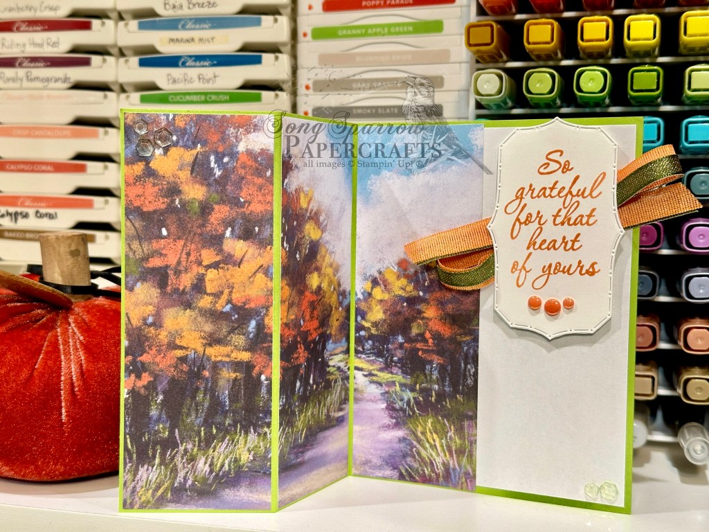
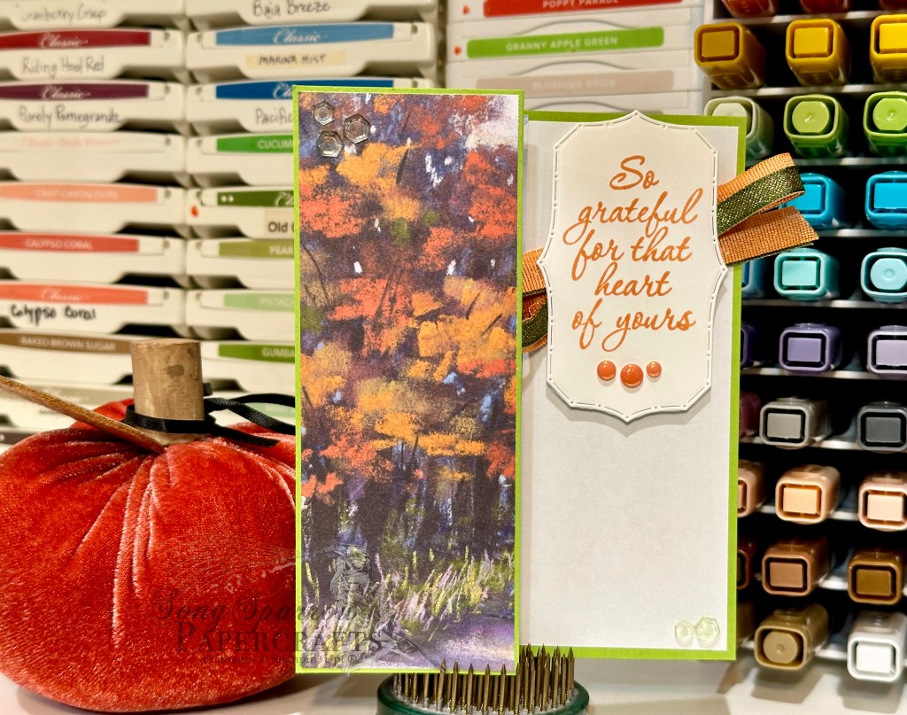
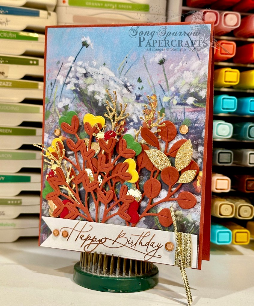
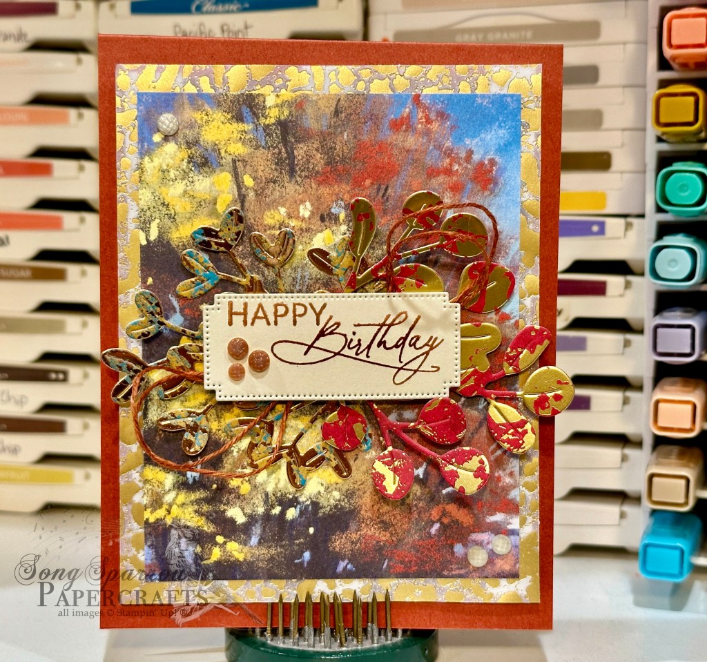
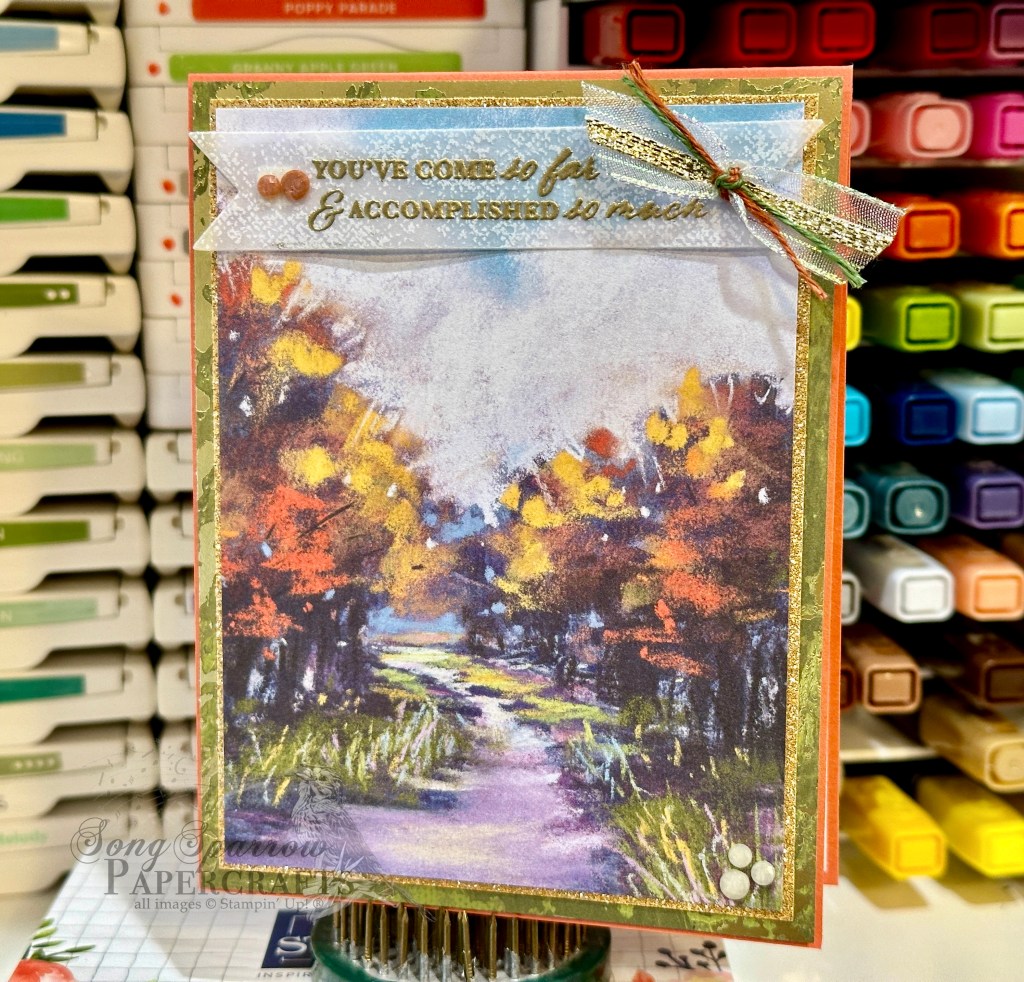
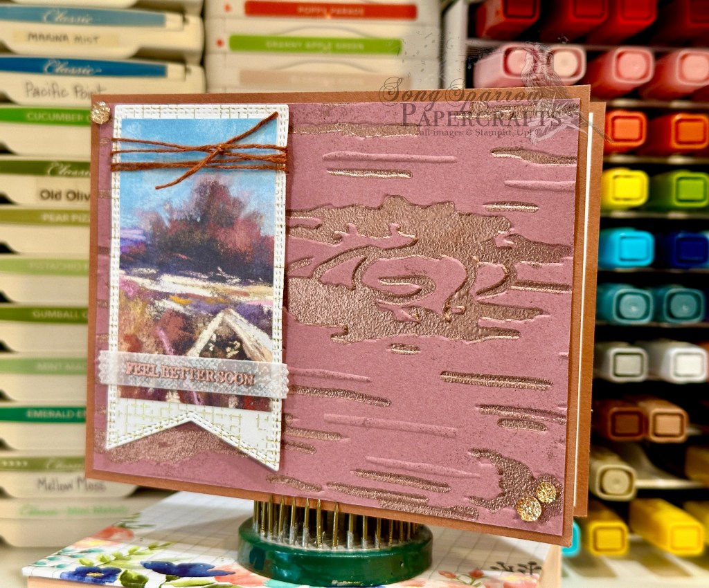
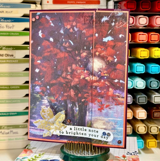
This week, we’re exploring the spotlight technique and looking at all the different ways you can shine a spotlight on your focal points. Did you know you can use the spotlight technique with paper and not just stamps? Today we’re using dimension to highlight a beautiful section of a sheet of the Splendid Autumn paper.
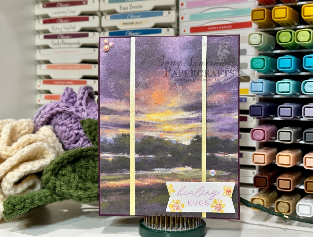
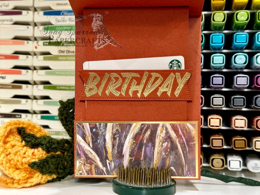
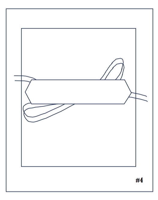
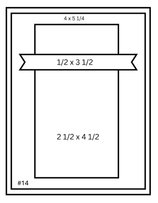
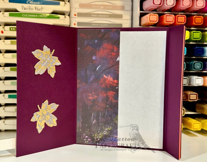
We get started with a base of Blackberry Bliss cardstock. A beautiful dusky scene from the Splendid Autumn paper pack serves as our focal point and cut just shy of a quarter panel for the card front. I chose a 2-inch section in the center to highlight with dimension and a small mat of Lemon Lolly shimmer paper. I ran a panel of white cardstock through with the More Messages die to create some sentiment panels and chose a banner for this card. The stamp set from the 2025 Advent Calendar gives us our decorative flowers and the sentiment. The sentiment panel is adhered with dimensionals and glue dots at the bottom of the spotlight panel. And then we finish things off with a pop of sparkle with some pearlized faceted circles.
I hope you’ve enjoyed learning some of the different ways that you can spotlight elements of your card designs. And remember, there’s never a right or a wrong way to do it. So have fun and just play! Next week, we’ll be hopping into a couple of Easter designs in between all of the Holy Week activities I have coming up.
Product List![Blackberry Bliss 8-1/2" X 11" Cardstock [ 133675 ]](https://assets1.tamsnetwork.com/images/EC042017NF/133675s.jpg "Blackberry Bliss 8-1/2\" X 11\" Cardstock [ 133675 ]")
![Basic White 8 1/2" X 11" Cardstock [ 166780 ]](https://assets1.tamsnetwork.com/images/EC042017NF/166780s.jpg "Basic White 8 1/2\" X 11\" Cardstock [ 166780 ]")
![Splendid Autumn 6" X 6" (15.2 X 15.2 Cm) Designer Series Paper [ 164173 ]](https://assets1.tamsnetwork.com/images/EC042017NF/164173s.jpg "Splendid Autumn 6\" X 6\" (15.2 X 15.2 Cm) Designer Series Paper [ 164173 ]")
![Pastels Shimmer 12" X 12" (30.5 X 30.5 Cm) Specialty Paper [ 167198 ]](https://assets1.tamsnetwork.com/images/EC042017NF/167198s.jpg "Pastels Shimmer 12\" X 12\" (30.5 X 30.5 Cm) Specialty Paper [ 167198 ]")
![More Messages Die [ 165472 ]](https://assets1.tamsnetwork.com/images/EC042017NF/165472s.jpg "More Messages Die [ 165472 ]")
![12 Days Of Crafting Advent Calendar (English) [ 167335 ]](https://assets1.tamsnetwork.com/images/EC042017NF/167335s.jpg "12 Days Of Crafting Advent Calendar (English) [ 167335 ]")
![Fresh Freesia Classic Stampin' Pad [ 155611 ]](https://assets1.tamsnetwork.com/images/EC042017NF/155611s.jpg "Fresh Freesia Classic Stampin' Pad [ 155611 ]")
![Daffodil Delight Classic Stampin' Pad [ 147094 ]](https://assets1.tamsnetwork.com/images/EC042017NF/147094s.jpg "Daffodil Delight Classic Stampin' Pad [ 147094 ]")
![Calypso Coral Classic Stampin' Pad [ 147101 ]](https://assets1.tamsnetwork.com/images/EC042017NF/147101s.jpg "Calypso Coral Classic Stampin' Pad [ 147101 ]")
![Pearlized Faceted Circles [ 166978 ]](https://assets1.tamsnetwork.com/images/EC042017NF/166978s.jpg "Pearlized Faceted Circles [ 166978 ]")
![Stampin' Dimensionals [ 104430 ]](https://assets1.tamsnetwork.com/images/EC042017NF/104430s.jpg "Stampin' Dimensionals [ 104430 ]")
![Mini Glue Dots [ 103683 ]](https://assets1.tamsnetwork.com/images/EC042017NF/103683s.jpg "Mini Glue Dots [ 103683 ]")
![Granny Apple Green 8-1/2" X 11" Cardstock [ 146990 ]](https://assets1.tamsnetwork.com/images/EC042017NF/146990s.jpg "Granny Apple Green 8-1/2\" X 11\" Cardstock [ 146990 ]")
![Label Me Grateful Cling Stamp Set (English) [ 166108 ]](https://assets1.tamsnetwork.com/images/EC042017NF/166108s.jpg "Label Me Grateful Cling Stamp Set (English) [ 166108 ]")
![Timid Tiger Classic Stampin' Pad [ 165278 ]](https://assets1.tamsnetwork.com/images/EC042017NF/165278s.jpg "Timid Tiger Classic Stampin' Pad [ 165278 ]")
![Traditional Labels Dies [ 165864 ]](https://assets1.tamsnetwork.com/images/EC042017NF/165864s.jpg "Traditional Labels Dies [ 165864 ]")
![Timid Tiger 3/8" (1 Cm) Faux Linen Ribbon [ 165275 ]](https://assets1.tamsnetwork.com/images/EC042017NF/165275s.jpg "Timid Tiger 3/8\" (1 Cm) Faux Linen Ribbon [ 165275 ]")
![Mossy Meadow & Gold 1/4" (6.4 Mm) [ 166158 ]](https://assets1.tamsnetwork.com/images/EC042017NF/166158s.jpg "Mossy Meadow & Gold 1/4\" (6.4 Mm) [ 166158 ]")
![2025–2027 In Color™ Flat Pearls [ 165192 ]](https://assets1.tamsnetwork.com/images/EC042017NF/165192s.jpg "2025–2027 In Color™ Flat Pearls [ 165192 ]")
![Shades Of Green Hexagons [ 165233 ]](https://assets1.tamsnetwork.com/images/EC042017NF/165233s.jpg "Shades Of Green Hexagons [ 165233 ]")
![Cajun Craze 8-1/2" X 11" Cardstock [ 119684 ]](https://assets1.tamsnetwork.com/images/EC042017NF/119684s.jpg "Cajun Craze 8-1/2\" X 11\" Cardstock [ 119684 ]")
![Season Of Elegance 12" X 12" (30.5 X 30.5 Cm) Specialty Designer Series Paper [ 164144 ]](https://assets1.tamsnetwork.com/images/EC042017NF/164144s.jpg "Season Of Elegance 12\" X 12\" (30.5 X 30.5 Cm) Specialty Designer Series Paper [ 164144 ]")
![Gold Foil Sheets [ 132622 ]](https://assets1.tamsnetwork.com/images/EC042017NF/132622s.jpg "Gold Foil Sheets [ 132622 ]")
![Layered Thoughts Photopolymer Stamp Set (English) [ 165346 ]](https://assets1.tamsnetwork.com/images/EC042017NF/165346s.jpg "Layered Thoughts Photopolymer Stamp Set (English) [ 165346 ]")
![Versamark Pad [ 102283 ]](https://assets1.tamsnetwork.com/images/EC042017NF/102283s.jpg "Versamark Pad [ 102283 ]")
![Metallics Wow! Embossing Powder [ 165678 ]](https://assets1.tamsnetwork.com/images/EC042017NF/165678s.jpg "Metallics Wow! Embossing Powder [ 165678 ]")
![Everyday Arches Dies [ 164629 ]](https://assets1.tamsnetwork.com/images/EC042017NF/164629s.jpg "Everyday Arches Dies [ 164629 ]")
![Stylish Shapes Dies [ 159183 ]](https://assets1.tamsnetwork.com/images/EC042017NF/159183s.jpg "Stylish Shapes Dies [ 159183 ]")
![Mixed Florals Dies [ 164641 ]](https://assets1.tamsnetwork.com/images/EC042017NF/164641s.jpg "Mixed Florals Dies [ 164641 ]")
![Gold & Silver 1/8" (3.2 Mm) Trim Combo Pack [ 161633 ]](https://assets1.tamsnetwork.com/images/EC042017NF/161633s.jpg "Gold & Silver 1/8\" (3.2 Mm) Trim Combo Pack [ 161633 ]")
![Drusy Adhesive Backed Embellishments [ 164223 ]](https://assets1.tamsnetwork.com/images/EC042017NF/164223s.jpg "Drusy Adhesive Backed Embellishments [ 164223 ]")
![Tear & Tape Adhesive [ 154031 ]](https://assets1.tamsnetwork.com/images/EC042017NF/154031s.jpg "Tear & Tape Adhesive [ 154031 ]")


 Specialty Designer Series Paper")
 Specialty Paper")

")
")


 Specialty Designer Series Paper")


 Specialty Designer Series Paper")
")
 Striped Trim")


 Specialty Designer Series Paper")


")


")

