Welcome to the weekend, everyone! I don’t know about you, but I had the Monday-ist Friday everrrrrrrr. So needless to say, by the time work was over and I was home, I had zero energy or creativity left for getting crafty. But I’m hoping to make up for it today as we close out our design series using the new SU! Lights of Aurora suite set to launch in a little over a week.
Today we’re pairing up the Lights of Aurora paper and dies to create this stunning fun fold scene. I’m calling this the Dutch Door fold because it reminds me of the divided swinging doors. What do you think?
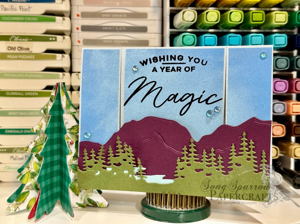
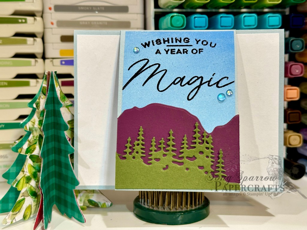
Our card gets started with a base of Cloud Cover cardstock. I have to say that I think this might be my new favorite neutral background starter! I chose a sheet of blue paper from the Lights of Aurora paper pack that reminded me of the sky, which happens to look bright & blue just like this in our area today. The card front is cut into three sections to create the center section and then spanning section over the top. The Light & Wonder dies help us create the mountains and trees that span the front of the card. A small lake created with the pastel ombre paper peeks out from the glad in the middle of the trees. The sentiment from the Light & Wonder stamp set is stamped on the center panel and heat embossed in black. When the connected panel is lifted to reveal the center section of the card front, you can see that I’ve used the Light & Wonder dies to recreate a portion of the larger scene – a lot like a picture-in-picture effect. A scattering of some frosted iridescent dots finish things off with a little twinkle.
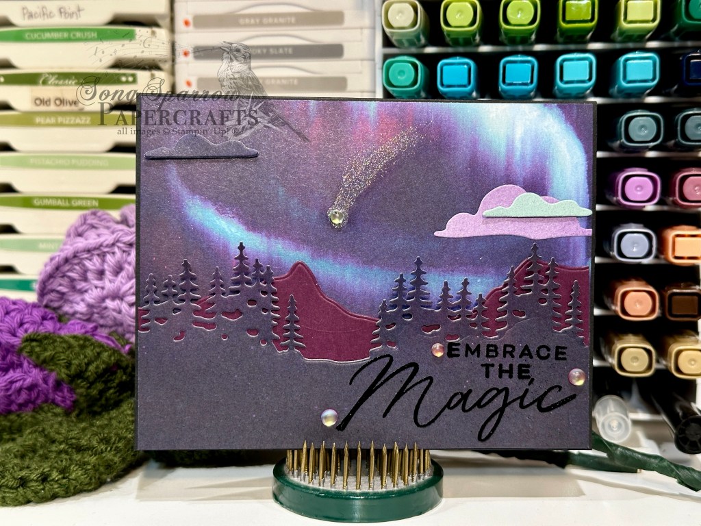
I think the Dutch Fold would work perfectly with similar die sets that create a cut that spans a longer distance. Think tree lines, mountains, or something similar. Would you like to try your hand at this fold? You can download the free PDF tutorial here.
Products used in today’s card:
Cloud Cover, Blackberry Bliss, Mossy Meadow, Basic White cardstock
Lights of Aurora (coming in Sept), pastel ombre glimmer DSP
Light & Wonder stamps & dies (coming in Sept)
Black embossing powder
Frosted iridescent dots (coming in Sept)
Dimensionals
Adhesives


![Pastel Ombre Glimmer 12" X 12" (30.5 X 30.5 Cm) Specialty Paper [ 164851 ]](https://assets1.tamsnetwork.com/images/EC042017NF/164851s.jpg "Pastel Ombre Glimmer 12\" X 12\" (30.5 X 30.5 Cm) Specialty Paper [ 164851 ]")
![Soft Waves 3 D Embossing Folder [ 164695 ]](https://assets1.tamsnetwork.com/images/EC042017NF/164695s.jpg "Soft Waves 3 D Embossing Folder [ 164695 ]")
![Jar Of Joy Photopolymer Stamp Set (English) [ 166176 ]](https://assets1.tamsnetwork.com/images/EC042017NF/166176s.jpg "Jar Of Joy Photopolymer Stamp Set (English) [ 166176 ]")
![Sweet Jar Builder Punch [ 165506 ]](https://assets1.tamsnetwork.com/images/EC042017NF/165506s.jpg "Sweet Jar Builder Punch [ 165506 ]")
![Notes & Totes Photopolymer Stamp Set (English) [ 165239 ]](https://assets1.tamsnetwork.com/images/EC042017NF/165239s.jpg "Notes & Totes Photopolymer Stamp Set (English) [ 165239 ]")
![Pool Party Classic Stampin' Pad [ 147107 ]](https://assets1.tamsnetwork.com/images/EC042017NF/147107s.jpg "Pool Party Classic Stampin' Pad [ 147107 ]")
![Secret Sea Classic Stampin' Pad [ 165285 ]](https://assets1.tamsnetwork.com/images/EC042017NF/165285s.jpg "Secret Sea Classic Stampin' Pad [ 165285 ]")
![Strawberry Slush Classic Stampin' Pad [ 165286 ]](https://assets1.tamsnetwork.com/images/EC042017NF/165286s.jpg "Strawberry Slush Classic Stampin' Pad [ 165286 ]")
![Lost Lagoon Classic Stampin' Pad [ 161678 ]](https://assets1.tamsnetwork.com/images/EC042017NF/161678s.jpg "Lost Lagoon Classic Stampin' Pad [ 161678 ]")
![Starburst Sequins [ 165539 ]](https://assets1.tamsnetwork.com/images/EC042017NF/165539s.jpg "Starburst Sequins [ 165539 ]")
![Stampin' Dimensionals [ 104430 ]](https://assets1.tamsnetwork.com/images/EC042017NF/104430s.jpg "Stampin' Dimensionals [ 104430 ]")
![Basic White 8 1/2" X 11" Cardstock [ 166780 ]](https://assets1.tamsnetwork.com/images/EC042017NF/166780s.jpg "Basic White 8 1/2\" X 11\" Cardstock [ 166780 ]")
![Real Red 8-1/2" X 11" Cardstock [ 102482 ]](https://assets1.tamsnetwork.com/images/EC042017NF/102482s.jpg "Real Red 8-1/2\" X 11\" Cardstock [ 102482 ]")
![Take A Bow 6" X 6" (15.2 X 15.2 Cm) Designer Series Paper [ 164309 ]](https://assets1.tamsnetwork.com/images/EC042017NF/164309s.jpg "Take A Bow 6\" X 6\" (15.2 X 15.2 Cm) Designer Series Paper [ 164309 ]")
![Festive 12" X 12" (30.5 X 30.5 Cm) Glimmer Paper [ 164106 ]](https://assets1.tamsnetwork.com/images/EC042017NF/164106s.jpg "Festive 12\" X 12\" (30.5 X 30.5 Cm) Glimmer Paper [ 164106 ]")
![Cute Crochet 3 D Embossing Folder [ 163792 ]](https://assets1.tamsnetwork.com/images/EC042017NF/163792s.jpg "Cute Crochet 3 D Embossing Folder [ 163792 ]")
![Nested Essentials Dies [ 161597 ]](https://assets1.tamsnetwork.com/images/EC042017NF/161597s.jpg "Nested Essentials Dies [ 161597 ]")
![Shaded Spruce Classic Stampin' Pad [ 147088 ]](https://assets1.tamsnetwork.com/images/EC042017NF/147088s.jpg "Shaded Spruce Classic Stampin' Pad [ 147088 ]")
![Cajun Craze Classic Stampin' Pad [ 147085 ]](https://assets1.tamsnetwork.com/images/EC042017NF/147085s.jpg "Cajun Craze Classic Stampin' Pad [ 147085 ]")
![Real Red Classic Stampin' Pad [ 147084 ]](https://assets1.tamsnetwork.com/images/EC042017NF/147084s.jpg "Real Red Classic Stampin' Pad [ 147084 ]")
![Versamark Pad [ 102283 ]](https://assets1.tamsnetwork.com/images/EC042017NF/102283s.jpg "Versamark Pad [ 102283 ]")
![Basics Wow! Embossing Powder [ 165679 ]](https://assets1.tamsnetwork.com/images/EC042017NF/165679s.jpg "Basics Wow! Embossing Powder [ 165679 ]")
![Real Red & White Baker's Twine [ 164051 ]](https://assets1.tamsnetwork.com/images/EC042017NF/164051s.jpg "Real Red & White Baker's Twine [ 164051 ]")
![Real Red & White Adhesive Backed Peppermints [ 164050 ]](https://assets1.tamsnetwork.com/images/EC042017NF/164050s.jpg "Real Red & White Adhesive Backed Peppermints [ 164050 ]")
![Rhinestone Basic Jewels [ 144220 ]](https://assets1.tamsnetwork.com/images/EC042017NF/144220s.jpg "Rhinestone Basic Jewels [ 144220 ]")

![Secret Sea 8 1/2" X 11" Cardstock [ 165624 ]](https://assets1.tamsnetwork.com/images/EC042017NF/165624s.jpg "Secret Sea 8 1/2\" X 11\" Cardstock [ 165624 ]")
![Strawberry Slush 8 1/2" X 11" Cardstock [ 165625 ]](https://assets1.tamsnetwork.com/images/EC042017NF/165625s.jpg "Strawberry Slush 8 1/2\" X 11\" Cardstock [ 165625 ]")
![Pretty In Pink 8 1/2" X 11" Cardstock [ 163793 ]](https://assets1.tamsnetwork.com/images/EC042017NF/163793s.jpg "Pretty In Pink 8 1/2\" X 11\" Cardstock [ 163793 ]")
![Pool Party 8-1/2" X 11" Cardstock [ 122924 ]](https://assets1.tamsnetwork.com/images/EC042017NF/122924s.jpg "Pool Party 8-1/2\" X 11\" Cardstock [ 122924 ]")
![Pretty Peacock 8-1/2" X 11" Cardstock [ 150880 ]](https://assets1.tamsnetwork.com/images/EC042017NF/150880s.jpg "Pretty Peacock 8-1/2\" X 11\" Cardstock [ 150880 ]")
![Smoky Slate 8-1/2" X 11" Cardstock [ 131202 ]](https://assets1.tamsnetwork.com/images/EC042017NF/131202s.jpg "Smoky Slate 8-1/2\" X 11\" Cardstock [ 131202 ]")
![Plaster Painting 3 D Embossing Folder [ 164656 ]](https://assets1.tamsnetwork.com/images/EC042017NF/164656s.jpg "Plaster Painting 3 D Embossing Folder [ 164656 ]")
![Pretty Florals Dies [ 165178 ]](https://assets1.tamsnetwork.com/images/EC042017NF/165178s.jpg "Pretty Florals Dies [ 165178 ]")
![More Messages Bundle (English) [ 165473 ]](https://assets1.tamsnetwork.com/images/EC042017NF/165473s.jpg "More Messages Bundle (English) [ 165473 ]")
![Gray Granite Classic Stampin' Pad [ 147118 ]](https://assets1.tamsnetwork.com/images/EC042017NF/147118s.jpg "Gray Granite Classic Stampin' Pad [ 147118 ]")
![Gold & Silver 1/8" (3.2 Mm) Trim Combo Pack [ 161633 ]](https://assets1.tamsnetwork.com/images/EC042017NF/161633s.jpg "Gold & Silver 1/8\" (3.2 Mm) Trim Combo Pack [ 161633 ]")
![Clear Wink Of Stella Glitter Brush [ 141897 ]](https://assets1.tamsnetwork.com/images/EC042017NF/141897s.jpg "Clear Wink Of Stella Glitter Brush [ 141897 ]")
![Drusy Adhesive Backed Embellishments [ 164223 ]](https://assets1.tamsnetwork.com/images/EC042017NF/164223s.jpg "Drusy Adhesive Backed Embellishments [ 164223 ]")
![Strawberry Slush & Pretty In Pink Gems [ 165615 ]](https://assets1.tamsnetwork.com/images/EC042017NF/165615s.jpg "Strawberry Slush & Pretty In Pink Gems [ 165615 ]")
![Tear & Tape Adhesive [ 154031 ]](https://assets1.tamsnetwork.com/images/EC042017NF/154031s.jpg "Tear & Tape Adhesive [ 154031 ]")
![Coastal Cabana 8-1/2" X 11" Cardstock [ 131297 ]](https://assets1.tamsnetwork.com/images/EC042017NF/131297s.jpg "Coastal Cabana 8-1/2\" X 11\" Cardstock [ 131297 ]")
![The Right Words Cling Stamp Set (English) [ 165316 ]](https://assets1.tamsnetwork.com/images/EC042017NF/165316s.jpg "The Right Words Cling Stamp Set (English) [ 165316 ]")
![Pretty Florals Bundle [ 165179 ]](https://assets1.tamsnetwork.com/images/EC042017NF/165179s.jpg "Pretty Florals Bundle [ 165179 ]")
![Textured Notes Dies [ 165555 ]](https://assets1.tamsnetwork.com/images/EC042017NF/165555s.jpg "Textured Notes Dies [ 165555 ]")
![Everyday Arches Dies [ 164629 ]](https://assets1.tamsnetwork.com/images/EC042017NF/164629s.jpg "Everyday Arches Dies [ 164629 ]")
![Countryside Corners Dies [ 161471 ]](https://assets1.tamsnetwork.com/images/EC042017NF/161471s.jpg "Countryside Corners Dies [ 161471 ]")
![Distressed Tile 3 D Embossing Folder [ 162189 ]](https://assets1.tamsnetwork.com/images/EC042017NF/162189s.jpg "Distressed Tile 3 D Embossing Folder [ 162189 ]")
![Pretty In Pink Classic Stampin Pad [ 163807 ]](https://assets1.tamsnetwork.com/images/EC042017NF/163807s.jpg "Pretty In Pink Classic Stampin Pad [ 163807 ]")
![Daffodil Delight Classic Stampin' Pad [ 147094 ]](https://assets1.tamsnetwork.com/images/EC042017NF/147094s.jpg "Daffodil Delight Classic Stampin' Pad [ 147094 ]")
![Crushed Curry Classic Stampin' Pad [ 147087 ]](https://assets1.tamsnetwork.com/images/EC042017NF/147087s.jpg "Crushed Curry Classic Stampin' Pad [ 147087 ]")
![Peach Pie Classic Stampin Pad [ 163810 ]](https://assets1.tamsnetwork.com/images/EC042017NF/163810s.jpg "Peach Pie Classic Stampin Pad [ 163810 ]")
![Timid Tiger Classic Stampin' Pad [ 165278 ]](https://assets1.tamsnetwork.com/images/EC042017NF/165278s.jpg "Timid Tiger Classic Stampin' Pad [ 165278 ]")
![Flirty Flamingo Classic Stampin' Pad [ 147052 ]](https://assets1.tamsnetwork.com/images/EC042017NF/147052s.jpg "Flirty Flamingo Classic Stampin' Pad [ 147052 ]")
![Calypso Coral Classic Stampin' Pad [ 147101 ]](https://assets1.tamsnetwork.com/images/EC042017NF/147101s.jpg "Calypso Coral Classic Stampin' Pad [ 147101 ]")
![Cloud Cover Classic Stampin' Ink Refill [ 165279 ]](https://assets1.tamsnetwork.com/images/EC042017NF/165279s.jpg "Cloud Cover Classic Stampin' Ink Refill [ 165279 ]")
![Gold Striped 3/8" (1 Cm) Mesh Ribbon [ 165599 ]](https://assets1.tamsnetwork.com/images/EC042017NF/165599s.jpg "Gold Striped 3/8\" (1 Cm) Mesh Ribbon [ 165599 ]")
![Iridescent Foil Gems [ 162842 ]](https://assets1.tamsnetwork.com/images/EC042017NF/162842s.jpg "Iridescent Foil Gems [ 162842 ]")
![Mini Stampin' Dimensionals [ 144108 ]](https://assets1.tamsnetwork.com/images/EC042017NF/144108s.jpg "Mini Stampin' Dimensionals [ 144108 ]")
![Mini Glue Dots [ 103683 ]](https://assets1.tamsnetwork.com/images/EC042017NF/103683s.jpg "Mini Glue Dots [ 103683 ]")

![Florals In Bloom 12" X 12" (30.5 X 30.5 Cm) Designer Series Paper [ 165175 ]](https://assets1.tamsnetwork.com/images/EC042017NF/165175s.jpg "Florals In Bloom 12\" X 12\" (30.5 X 30.5 Cm) Designer Series Paper [ 165175 ]")
![Beautiful Bokeh 6" X 6" (15.2 X 15.2 Cm) Designer Series Paper [ 164607 ]](https://assets1.tamsnetwork.com/images/EC042017NF/164607s.jpg "Beautiful Bokeh 6\" X 6\" (15.2 X 15.2 Cm) Designer Series Paper [ 164607 ]")
![Beautiful Butterflies Hybrid Embossing Folder [ 164614 ]](https://assets1.tamsnetwork.com/images/EC042017NF/164614s.jpg "Beautiful Butterflies Hybrid Embossing Folder [ 164614 ]")
![Spotlight On Nature Dies [ 163580 ]](https://assets1.tamsnetwork.com/images/EC042017NF/163580s.jpg "Spotlight On Nature Dies [ 163580 ]")
![Sentimental Framing Photopolymer Stamp Set (English) [ 165475 ]](https://assets1.tamsnetwork.com/images/EC042017NF/165475s.jpg "Sentimental Framing Photopolymer Stamp Set (English) [ 165475 ]")
![Iridescent 1/2" (1.3 Cm) Striped Trim [ 163299 ]](https://assets1.tamsnetwork.com/images/EC042017NF/163299s.jpg "Iridescent 1/2\" (1.3 Cm) Striped Trim [ 163299 ]")
![2025–2027 In Color™ Flat Pearls [ 165192 ]](https://assets1.tamsnetwork.com/images/EC042017NF/165192s.jpg "2025–2027 In Color™ Flat Pearls [ 165192 ]")
