Kits

Painted Wishes Kit Alternatives

Happy Saturday, crafty friends! Today is class day here in the studio and class prep took a bit longer than anticipated, which is why Sketchy Fridays was a no-go this week. Sometimes it just works out that way and we have to pivot. BUT I have lots to share with you today!

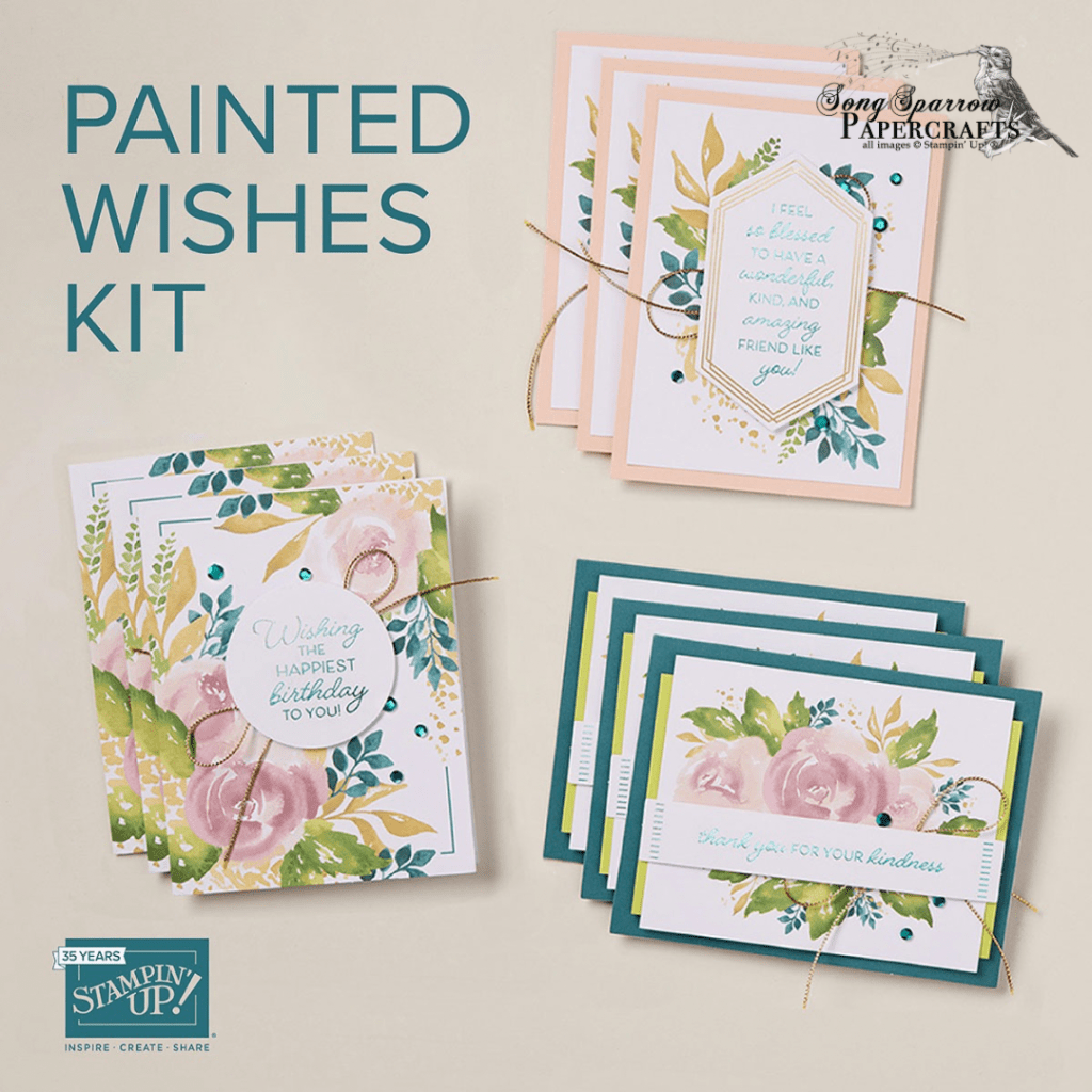
In today’s class, we’re going to be working with the Painted Wishes Kit by Stampin’ Up! These kits are terrific for those who are new to paper crafting or for seasoned pros with not enough time for a full-on crafting session. This is an all-in-one kit, meaning it comes with everything you need to make beautiful cards. You can make them exactly as shown and have 3 birthday cards, 3 thank you cards, and 3 friendship cards. OR with a few things from your crafty stash, you can elevate the card designs into beautiful alternatives. Today, I’m going to show you how I adapted this kit to make 6 alternative designs.

For our first 3 design alternatives, we’re adding some paper and ribbon from the crafty stash and otherwise just taking liberties with the way things are combined and how they look.

Alternative 1

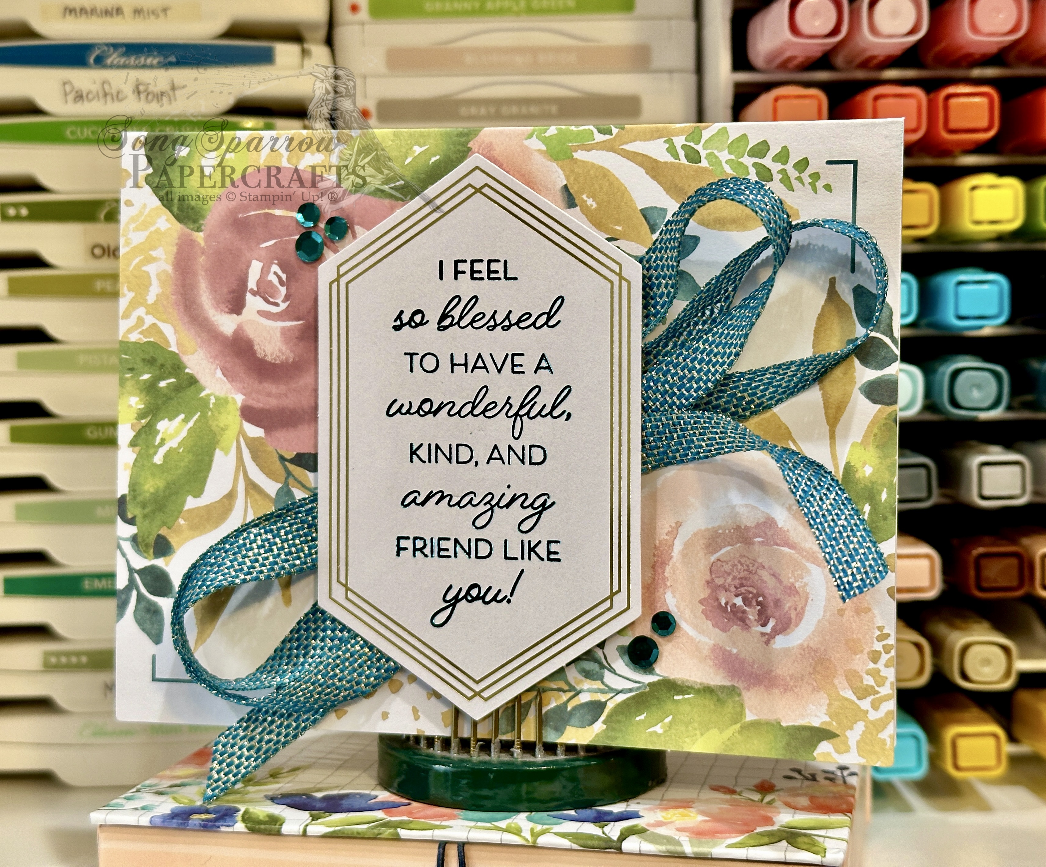
The kit uses the birthday sentiment with the rose card base, but here we’re substituting the friendship sentiment and adding Pretty Peacock & Gold metallic ribbon behind the sentiment to help it stand out.
Alternative 2

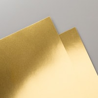
To punch up the backdrop for our sentiment panel, we’re adding a panel of the Pretty Peacock Season of Elegance paper over the peacock card base. I’ve also cut around the greenery to give more delicate detailing to the sentiment panel, along with adding gold foil specialty paper behind the sentiment to help it stand out. Some Pretty Peacock & Gold metallic ribbon ties everything together.

Alternative 3

For our third alternative, we’re cutting our rose panel into two pieces and giving them lots of detailing along the edges. I’ve also used the Spotlight on Nature dies to add the edging detail to the circle sentiment panel. Isn’t it amazing how those two simple things totally transform these kit elements?

Two of our next three kit design alternatives incorporate items from the crafty stash to punch things up.

Alternative 4

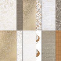
I wanted the gold foiling in the sentiment panel to pop as the main design element, so I chose a lovely foiled leaf pattern paper from the Nature’s Sweetness paper pack and diecut it using the Countryside Corners dies. A little crisscross of Pretty Peacock & gold metallic ribbon behind the sentiment helps it pop. I cut apart the rose panel and used just the greenery as the side accent for the sentiment. The detailing of the greenery pulls together the leaf elements.

Alternative 5

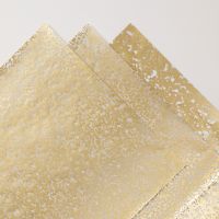
The rose card base is gorgeous all by itself, and I wanted as much of the watercolor beauty to stand out as possible, so we’re keeping things simple behind our sentiment panel with just a few sparkly diecut pieces. I cut a circle from the gold mercury vellum using the Spotlight on Nature dies and then added a Pretty Peacock banner die cut with the Countryside Corners set. A faux bow of the Pretty Peacock & gold metallic ribbon ties all of our sparkly elements together and makes the sentiment pop.

Alternative 6

Our final alternative design uses all of the kit elements but in an unexpected way. First, I mounted each of the background panels a little askew for some visual interest. This really helps pull all of the subtle colors to the forefront and give the card a sense of movement. Using the other portion of the rose panel I cut for card #4, I mounted it along with the sentiment on dimensionals, giving us two planes of view for our greenery.

It doesn’t take much from the crafty stash to transform kit elements into elevated designs. Dig through your stash of leftover kit elements, scraps of paper, or extra diecuts and see what you can pull together.

Next week, we’re taking to the sky with the Everyday Skies designer series paper. I hope you’ll come along and check out all the fun ways we can make this paper soar!

Product List
Fun Folds · Sale-a-Bration

Toadstool Birthday

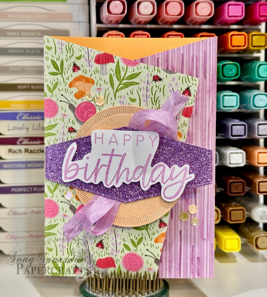
We’re continuing our patterns & sentiments design series as we tiptoe through the toadstools today. It’s been a long while since I’ve made an angled gatefold card, and I saw the cutest card using the Sale-a-Bration Toadstool Gardens designer series paper. So I’m taking a stab at this fun fold using our patterns & sentiments design theme.

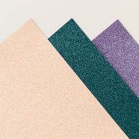
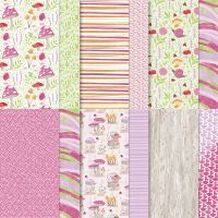
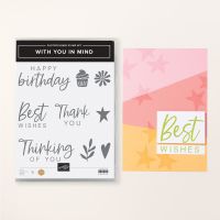
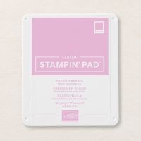
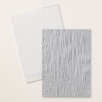
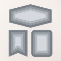
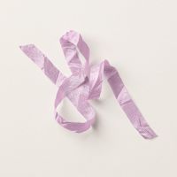
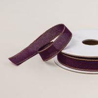
Our card starts with Peach Pie cardstock. Each of the angled flaps are covered with a pattern from the Toadstool Gardens paper pack. I added some additional patterned texture o the purple stripe panel by running it through the machine embossed using the Birch Wood embossing folder. To bring out the woodgrain pattern, I then went over the top with a Fresh Freesia ink pad. The sentiment panel has two base layers. I cut the circle from Petal Pink glimmer paper using the Spotlight on Nature dies while the long hexagon is cut from Fresh Freesia glimmer paper using the Nested Essential dies. The sentiment from With You in Mind is stamped in Fresh Freesia on white cardstock and then cut out using paper snips. Before assembling the sentiment base layers, I adhered some Fresh Freesia seam binding ribbon in between and then adhered the panel to the left panel with dimensionals. The sentiment is adhered with a few extra layers of dimensionals to ensure that it stands out on the center panel. A few shiny sequins finish things off with a little sparkle. You can find the full PDF tutorial here.

Tomorrow we’ll be pairing up a sketch with our pattern & sentiment design theme. I hope you’ll pop by and check it out!

Product List
Inspiration

Miss You

Welcome to this wonderful Wednesday. I’m telling myself it’s wonderful even though our temps here in North Texas are currently in the teens and wind chills are below zero. 🥶 For some of you, this is a typical winter day, but we are simply not accustomed to brutally cold and windy days.

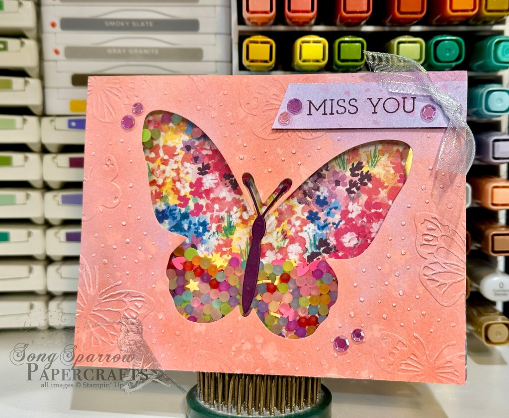
This week, our design theme explores pattern & texture with sentiments. And today’s design is totally inspired by a card by fellow demo over at Creative Stamping Designs. I don’t often make shaker cards, but when I saw this combination of Beautiful Butterflies and Bloom Impressions, I just had to give it a go!

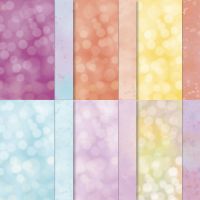
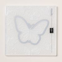
We get started with a base of white cardstock. Since the base is only visible on the inside, I keep things simple. But you could easily choose a complimentary color if you wish. A quarter sheet of the rainbow Bloom Impressions paper covers the card front and serves as the base for our shaker elements. I chose a coordinating pink/orange/purple medley sheet from the Beautiful Bokeh paper pack and machine embossed it with the Beautiful Butterflies hybrid embossing folder to imprint the butterfly pattern and cut the center butterfly at the same time. I made a deep impression by passing the embossing folder through my machine twice, which allows the white center of the paper to show through for a distressed look. I used the butterfly cutout on the inside panel of my card (not shown).

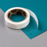
Next, we construct our shaker cover by adhering a window sheet to the back of the Beautiful Bokeh panel using tear-n-tape for a strong hold. (Tip: I save the acetate sheets from new stamp sets to use a window sheets. Simply give them a good wipe with a damp cloth on both sides and you’re good to go!) Apply a square of foam tape around the butterfly (still on the back of the sheet), leaving plenty of room for your shaker pieces to move. Be sure your foam strips meet and overlap at each corner to prevent any shaker pieces from escaping! Apply dimensionals around the edges (or you could use foam strips) to adhere this panel to your card front over the Bloom Impressions paper. Remove all of the backings, fill the center with your chosen shaker elements (I used a stash of retired shaker pieces I had on hand), and then adhere your card front over the filled shaker panel as it stays flat on your craft table.

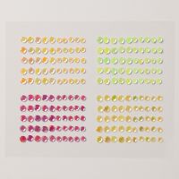
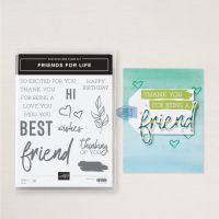
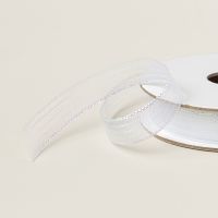
I used a scrap of the Beautiful Bokeh to stamp the sentiment from Friends for Life in Blackberry Bliss and cut the end on the diagonal with my paper snips. Adhere in the upper corner with dimensionals. I added a knot of iridescent striped trim on the straight end. The card front is embellished with purple sequins to help our eyes pass across the design over the major elements. Voila!

Tomorrow we’ll be tiptoeing through the toadstools. I hope you’ll come along!

Product List
Inspiration

Inspired by You

Happy Tuesday, crafty friends! We enjoyed a very restful day off yesterday. We got to enjoy a bonus day off doing things together as a family, which is always nice. And it was a beautifully sunny day, so we got to enjoy time outside before we get another round of arctic air.

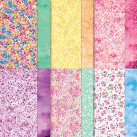
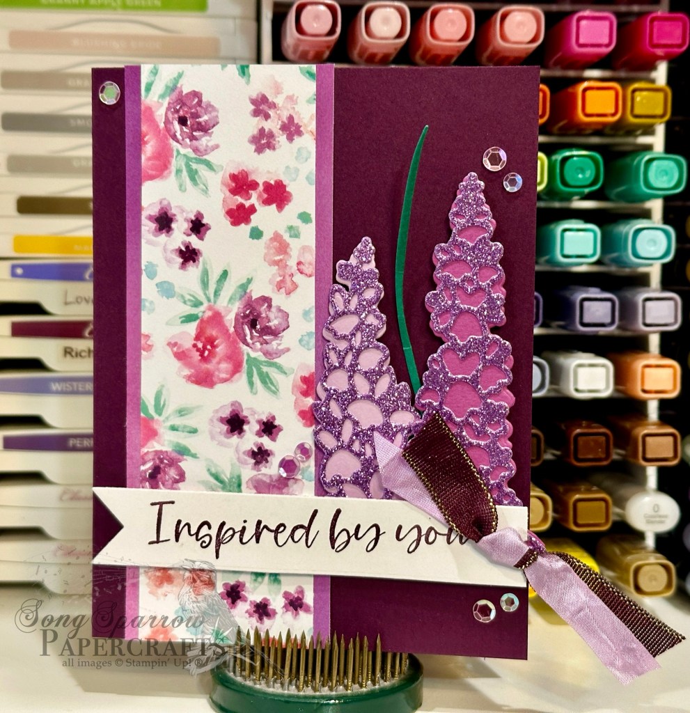
This week, we’re using patterns and textures to help our sentiments really shine. And today we’re pairing up the lovely Bloom Impressions Sale-a-Bration paper with the Inspiring Snapdragons bundle for this encouragement card.

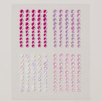
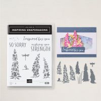
We started with a base of Blackberry Bliss cardstock. I used both sides of the sheet of Bloom Impressions paper for the patterned element. Using the Inspiring Snapdragons dies, we create two stems. I used Fresh Freesia and Petunia Pop as the base colors and then the Fresh Freesia glimmer paper as the detail piece on top. The sprig of grass is cut from Shaded Spruce. They’re all adhered to the base with layers of dimensionals. The sentiment from Inspiring Snapdragons is stamped in BlackBerry Bliss on white cardstock and then cut out with the large banner die from Greetings of the Season (but could also be cut with paper snips). A bow of Fresh Freesia seam binding ribbon and Blackberry Bliss & Gold metallic ribbon finish off the sentiment panel which is adhered across the card front using dimensionals. Some purple sequins add a touch of sparkle and help the eye move across the design.

Tomorrow things will take flight as we continue this fun pattern & sentiment series. I hope you’ll stop in.

Product List
Inspiration

Patterned Thoughts

Happy Monday, everyone! For those in the U.S., happy Presidents’ Day. Did you know that the holiday we commonly call Presidents’ Day was originally established to celebrate George Washington our nation’s founding father’s birthday? It wasn’t until an ad campaign in the 1980s that the 3rd Monday in February came to be known as it is today as Presidents’ Day.

As we do each Monday, we’re introducing a new design theme today. I enjoyed last week’s textures & sentiments so much that I thought we would expand on the theme this week and incorporate patterns. So we’ll be exploring the combination of patterns & textures to highlight some of the wonderful sentiments in the current Stampin’ Up! lineup. Today we’re getting started with a more masculine-feeling design with a combination of the Timeless Plaid paper, Distressed Tiles embossing folder, and With You in Mind stamp set.

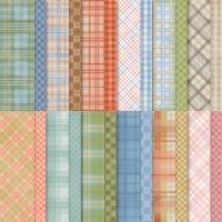
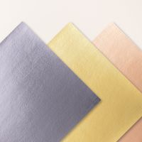
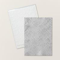
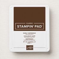
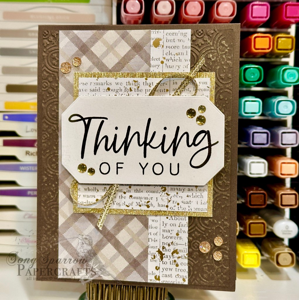
Our design gets started with a base of Early Espresso cardstock. I machine embossed a quarter-panel of Early Espresso with the Distressed Tiles embossing folder and then cut it down to serve as the backdrop for this design. I rubbed the panel with some gold ink to highlight the embossing. A strip of the brown Timeless Plaid paper is adhered to a piece of the gold-splattered text sheet from Nature’s Sweetness and adhered over the embossed panel. A 3×3 panel serves as the backdrop for our oversized sentiment. The square of textured gold paper serves as the mat for piece of the gold-splattered text paper that is adhered slightly off-center onto our card front. The sentiment from With You in Mind is stamped in Early Espresso on white cardstock and then diecut with the Countryside Corners dies. The sentiment panel is adhered over gold trim to the backdrop with dimensionals. A few drusy embellishments and low profile dots finish things off with a little sparkly pizzazz.

I love showing how designs can have lots of sparkle and still be more masculine-looking. Never be afraid to add some touches of bling to a masculine card design. Just think of it like the sprinkles on a cupcake! Tune in tomorrow for an “inspiring” design.

Product List
Holidays

Take Love to the Skies

This week, we’ve been looking through our crafty stash at products to pair together to make cards for our special Valentines, creating everything from more traditional to very whimsical designs. And to me, that’s the beauty of paper crafting – having the ability to adapt each design to the intended recipient.

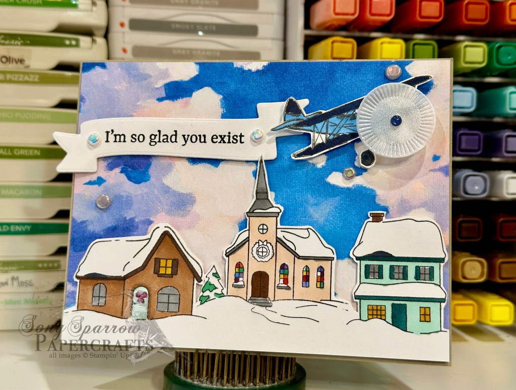
Today, we’re closing out our Valentines series with a very whimsical design that pairs together some unexpected products. Our plane from Adventurous Sky is flying in with a very special message across a lovely afternoon sky from the Everyday Skies designer series paper pack over a sleepy little town from the Yuletide Village. While this design requires some fussy cutting with our paper snips, none of the images are terribly difficult to cut around and the detailed cutting is what really makes this design soar!

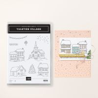
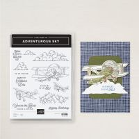
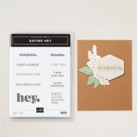
We get started with a base of Gray Granite cardstock. Our background panel is a sheet of the Everyday Skies paper. I stamped 3 of the 4 buildings from the Yuletide Village stamp set onto white cardstock, colored each with Stampin’ Blends, and then cut around the scene and adhered to the background with dimensionals. I stamped the medium-sized plane from the Adventurous Sky set onto white cardstock using the transfer method, colored with Stampin’ Blends, and then cut around it with my paper snips. I added a circle of some older luster vellum to give the illusion that the propeller is moving, using a navy regal dot as the hub. The sentiment from Saying Hey is stamped on white cardstock cut using the Mixed Labels banner die. The plane and banner are adhered in the sky above the village using varying layers of dimensionals. Some riverside irregular pearls finish off our scene with just a small pop of sparkle.

I really loved the unconventional combination of products as we often forget that our sets that we might consider to be holiday can be used across different times of the year if we make small modifications here and there. The beauty of Yuletide Village is that there are so many areas that remain snow-covered for Valentine’s Day, so how perfect is that?!

Next week is all about sentiments & texture. I hope you’ll come along for the inspiration!

Products used in today’s card:
Gray Granite, Basic White cardstock
Everyday Skies DSP
Adventurous Sky, Yuletide Village, Saying Hey stamps
Spotlight on Nature, Mixed Labels dies
Stampin’ Blends
Riverside irregular pearls, Regal foiled dots
Dimensionals
Adhesives

Product List
Fun Folds · Sketchy Fridays

Sketchy Fridays: I Love You

Here we are again – back to Friday! What do you have on the weekend agenda? I’m hoping to finish everything from last weekend’s to-do list myself. We got about halfway through our storage unit transfer. One wouldn’t think it would take all that long to move junk across town, but even with 2 people and 2 carts, each trip was almost an hour! The plan is to finish up this weekend. Now whether that leaves me time to get to all of the other things on my to-do list…well, that remains to be seen! Haha!

But how about we get to our task at hand – Sketchy Fridays! For those of you who are new here, Sketchy Fridays is a weekly series where we’re using a card sketch to design our featured card. Right now, we’re working through a full series of designs using the card sketches found in current Stampin’ Up! catalogs.

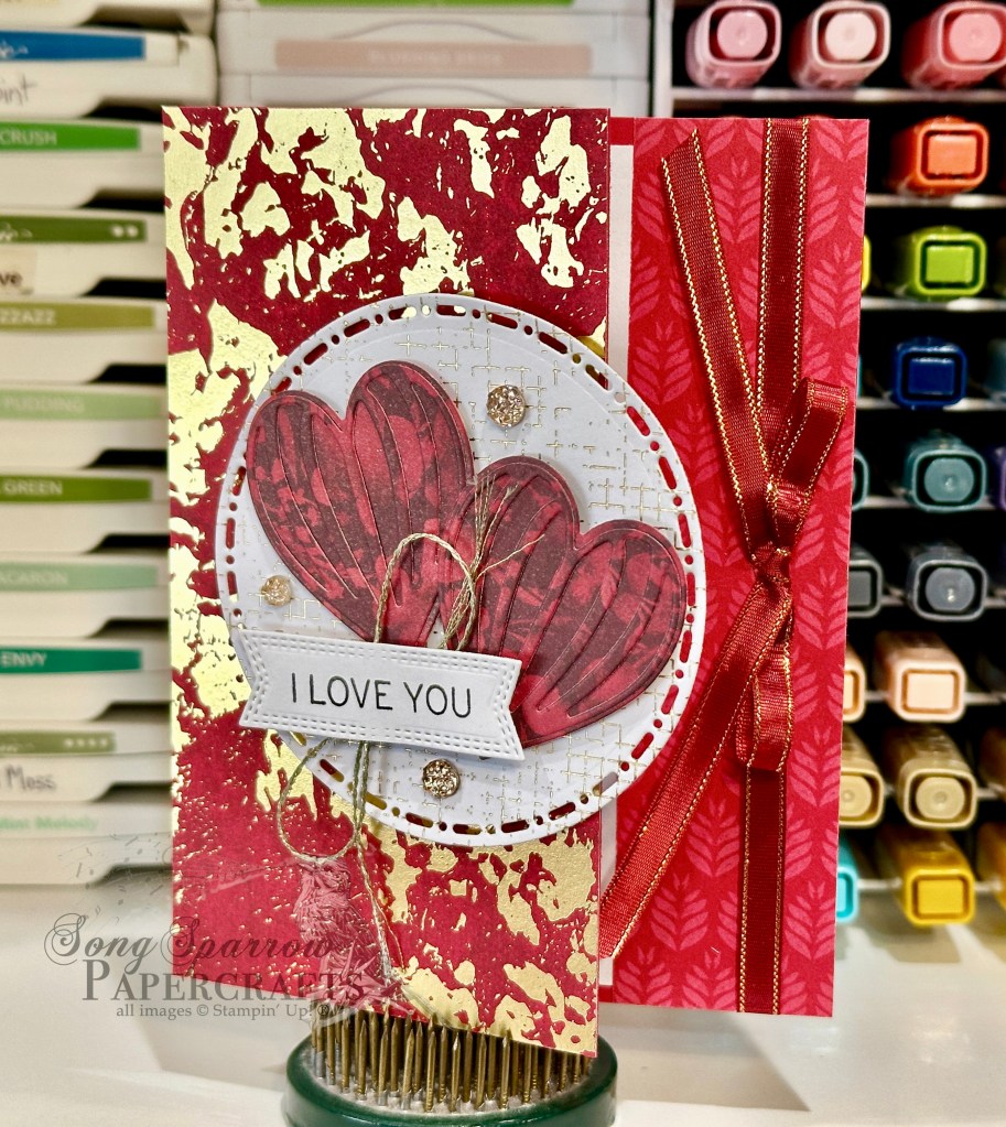
This week’s card is based on a card sketch I drew up of a card from the Stampin’ Up! Sale-a-Bration Catalog. Today, we’re pairing up the Season of Elegance and Marbled Elegance papers with several die sets to create this lovely Valentine design.

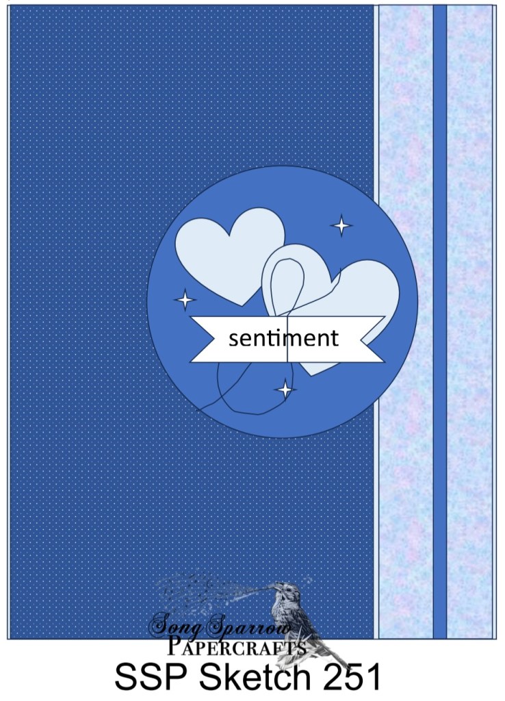
We get started with a base of Real Red cardstock. Today’s card is a peek-through fun fold design, where we’re removing 1 1/4-inches from the card front to create a small peek-through strip to the inside card panel. Our front flap is covered with a sheet of the red Season of Elegance foiled paper. The inside message panel is simply a sheet of white paper. The peek-through section is a strip of the Marbled Elegance paper, which is covered with a strip of Cherry Cobbler & gold ribbon that is tied in a bow in the center. Our front focal panel base is piece of foiled paper from the Nature’s Sweetness paper pack that is diecut with the Spotlight on Nature dies. It’s adhered to the front panel with dimensionals. Our hearts are cut from a piece red floral patterned paper from the Regal Winter pack and is diecut with the Hot Air Balloon dies. They’re adhered to the panel with dimensionals. The sentiment from Saying Hey is stamped on white cardstock and diecut with the Nested Essentials banner die using the extension method. I used an extra layer of dimensionals behind the sentiment to ensure that it stood proud over the hearts. Some gold thread and drusy embellishments finish things off with a touch of sparkle.

Tomorrow we’re going to be closing out our Valentines series in the air. I hope you’ll come take flight with me!

Products used in today’s card:
Real Red, Basic White cardstock
Season of Elegance, Marbled Elegance, Nature’s Sweetness, Regal Winter DSP
Saying Hey stamps
Spotlight on Nature, Hot Air Balloon, Nested Essentials dies
Gold thread, Cherry Cobbler & gold satin ribbon
Drusy embellishments
Dimensionals
Adhesives

Product List
Fun Folds · Holidays

Sending a Little Love

This week is all about honoring the Valentines in our life – be they friends, family, or significant others. Anyone whose special to you deserves a little handmade love from time to time. And today we’re pairing up some older Stampin’ Up! bundles with some of the newer papers to create this super cute spanner fun fold card design. We’re also going to be using the reverse stamp technique to flip an image. So let’s get to it.

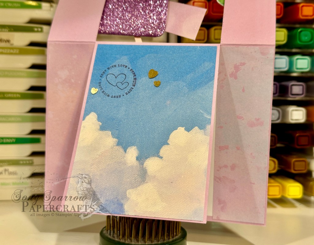
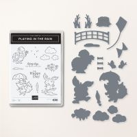
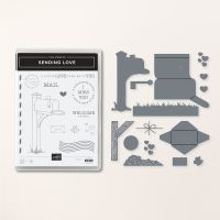
We get started with a base of Fresh Freesia cardstock, which is cut to standard A2 size. We’re creating a fun fold today that is inspired by the Spanner Panel fold by fellow demo Jackie Bolhuis. To create the front spanner panel, the front panel of the card is cut from the bottom edge to the center score line on each side at the 1 1/4-inch mark, giving you a front panel that has 3 flaps – 1 1/4-inch, 3-inch, and 1 1/4-inch. The two smaller front flaps are covered with strips of the striped pattern from the Toadstool Gardens paper pack. The center flap is covered with a piece of the Everyday Skies paper, which is going to serve as the backdrop for our focal scene. We’ll cut a 3/4-inch strip of Fresh Freesia to span the front card panel and connect only the two smaller side panels, which are going to lift up separately from the center panel. This strip is going to serve as the structural base for our focal scene, so we’ll begin by covering it with grass. Our grass is cut from Old Olive and a piece of the Floral Delight paper using the Bright Skies long cloud edge die. This provides some nice rolling tufts of grass that don’t distract from our scene. These strips of grass are adhered to the strip of Fresh Freesia with dimensionals, layering one on top of the other to give depth. Using the Playing in the Rain dies, we’ll cut some tufts of grass from Shaded Spruce and Granny Apple Green cardstock and tuck them in, adhering with glue dots. The mailbox is diecut using the Sending Love dies. The post is cut from Blackberry Bliss, while the box is cut from Fresh Freesia glimmer paper and Fresh Freesia cardstock. The flag is Petal Pink for a pop of contrast. An industrial trinket serves as the screw that affixes the flag to our mailbox. A larger envelope is diecut from Beautiful Bokeh paper and closed with a heart sequin. Once assembled, we’ll tuck the mailbox into the grass and adhere to the far left panel with dimensionals, ensuring that we don’t have any overlap onto our center panel of clouds. Tuck the envelope inside the box an adhere with a dimensional or two inside the box.

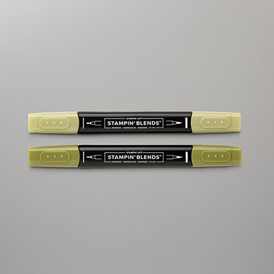
Now for our main character. Turtle is from the Playing in the Rain stamp set, but when stamped as-is, he will be facing the wrong direction. To get our turtle facing toward the left, you’ll want to stamp the image onto your silicone mat and then carefully press your white cardstock on top to transfer the image onto the paper. Be sure that you’ve inked the stamp heavily to ensure that the image is dark enough once you’ve transferred from the silicone mat to paper. Next, I colored the turtle with a combination of Old Olive and Shaded Spruce Stampin’ Blends. I used a color lifter on the shell to lighten things up a bit and provide good contrast with the skin of turtle’s body. I cut him out with paper snips and then adhered to the grass with several layers of dimensionals for plenty of height. I stamped a smaller envelope from Sending Love on Beautiful Bokeh and cut out with the coordinating die.

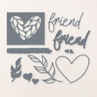
The front sentiment is stamped in Blackberry Bliss using the Sending Love sentiment and then diecut with the Friends for Life banner using the extension method so that each end has matching shape. I adhered over the grass with dimensionals. We finish off the front with a selection of purple sequins. On the center panel, tucked discretely behind the mailbox, I stamped the small “sent with love” sentiment and added a few heart sequins around it. The inside panel of the card is left blank for a personalized message. The message panel is flanked with two strips of Beautiful Bokeh paper.

Isn’t this such a fun card?! I love creating scenes, and while we have some terrific products in the current mini catalog, Stampin’ Up! has some great go-tos in the main catalog that should get a little love, as well! Tune in tomorrow for Sketchy Fridays…with a twist!

Products used in today’s card:
Fresh Freesia, Old Olive, Granny Apple Green, Shaded Spruce, Blackberry Bliss, Petal Pink, Basic White cardstock
Everyday Skies, Floral Delight, Three Color glimmer, Toadstool Gardens, Beautiful Bokeh DSP
Playing in the Rain bundle
Sending Love bundle
Stampin’ Blends
Bright Skies, Friends for Life dies
Industrial Trinkets, purple sequins, heart sequins
Dimensionals
Adhesives

Product List
Holidays

Love You Lots

This week, our design theme revolves around love. While love doesn’t really have a season, we do tend to focus on it a little bit more as we get into February each year. My main goal for this week’s design theme is to show you how you can use what’s in your crafting stash to make beautiful cards that really show a recipient how much you care.

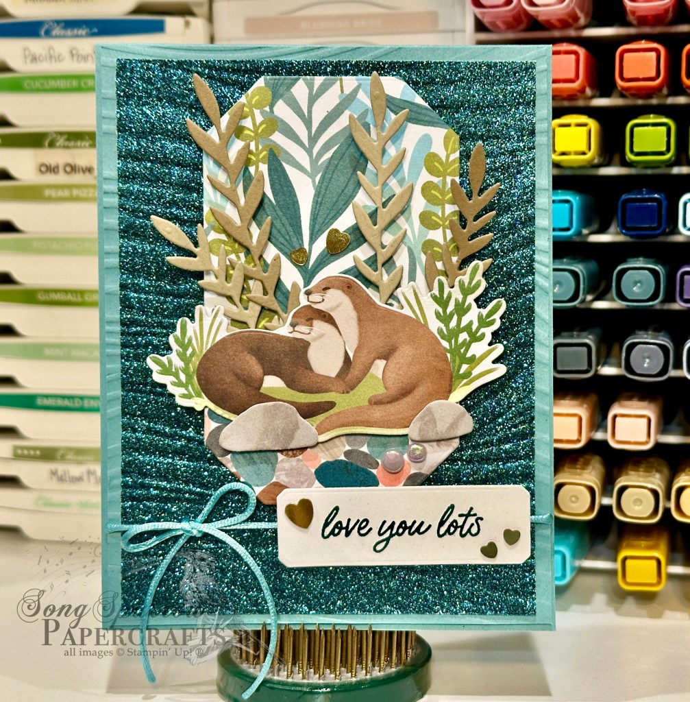
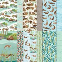
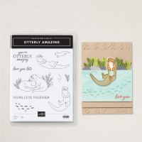
Today’s card uses the current SU! Online Exclusive bundle called Otterly Adorable and it’s just as adorable as its name implies! We’re pairing up the adorable paper from the bundle with the Soft Waves embossing folder to create this design. I just love how these product pairing makes you feel like you’re by the river peeking in on these two twitterpated otters.

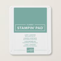
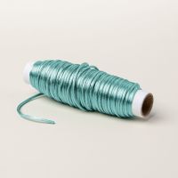
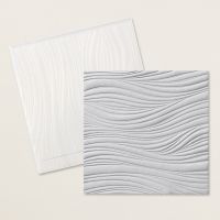
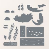
We get started on today’s card with a base of Lost Lagoon cardstock. The background panel consists of the Lost Lagoon base and Pretty Peacock glimmer paper, both of which have been embossed with the Soft Waves embossing folder to give the look of a moving brook. Our focal panel combines two patterns in the Otterly Adorable paper pack – the river rock and water weeds – and sits on a base of white cardstock for stability. This panel has been diecut using the Countryside Corners dies. For our scene, I started by cutting a pair of rocks from the mottled gray paper in the Otterly Adorable paper pack using the coordinating dies. I also cut some older water weeds from Crumb Cake and Pecan Pie, also using the coordinating Otterly Amazing dies. Our pair of otters is cut from the Otterly Adorable paper using the larger scene die from the set. I layered all of these elements on dimensionals to give depth to our focal scene and then mounted the full focal panel on the sparkly background with dimensionals. Some Lost Lagoon soft cording tied around the panel under the focal scene draws the eye in to both the focal scene and sentiment. The sentiment from Otterly Amazing is stamped in Pretty Peacock on white cardstock and then diecut with the smaller Countryside Corners die. A few riverside pearls and heart sequins finish off our scene and the theme of this card design.

Tomorrow we’re going to be headed to the mailbox. I hope you’ll pop in and check it out!

Products used in today’s card:
Lost Lagoon, Crumb Cake, Pecan Pie, Basic White cardstock
Three Color Glimmer, Otterly Adorable DSP
Otterly Amazing, Countryside Corners dies
Soft Waves embossing folder
Lost Lagoon soft cording
Heart sequins, riverside irregular pearls
Dimensionals
Adhesives

Product List
Holidays · Sale-a-Bration

Heart to Heart

It’s hard to believe that we’re already into February. And that means it’s time to start thinking about all of those special someones. Whether it’s kids, spouses, significant others, or close friends, I’m going to show you how your crafty stash has you covered.

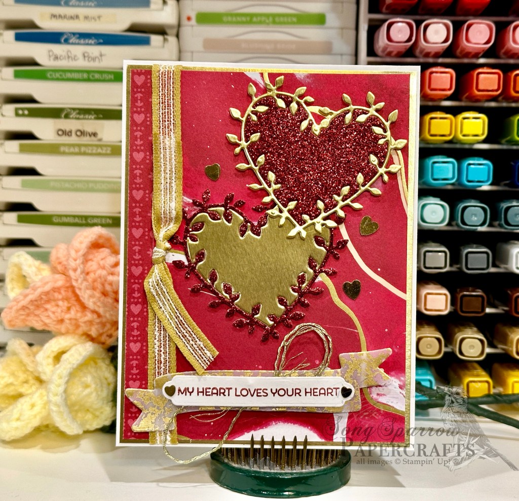
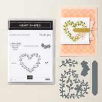
Today, we’re getting started with the Sale-a-Bration bundle called Heart Shaped and pairing up these stamps & dies with the beautiful Marbled Elegance patterned paper. If you’ve followed me for any length of time, you know that I can’t resist having a little sparkle on my designs and today we’re going all out. After all, isn’t that what we do for the ones we love?!
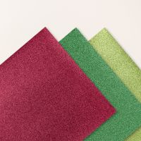
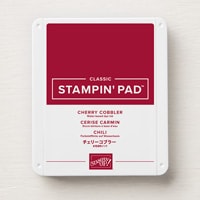
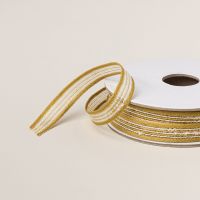
We get started on today’s design with a base of white cardstock. Our background panel is built on a base of gold foil and then a single sheet of the Marbled Elegance paper but using both sides – the foiled side and the print side. I used a piece of the Wild Wheat rustic striped ribbon to bridge the two patterns and tie our golden elements together. Our focal elements are two hearts cut with the Heart Shaped dies using both gold foil paper and the Real Red festive glimmer paper. I wanted the hearts to have a lot of visual weight and so I opted to keep the decorative outlines with their center negatives, but I swapped the centers to outline the gold in red and red in gold. They’re both adhered to the background panel with varying heights of dimensionals and then surrounded with gold heart sequins. The sentiment from the Heart Shaped stamp set is stamped in Cherry Cobbler on white cardstock and then diecut with the label die from the coordinating Heart Shaped die set. I flanked the sentiment on either side with a small gold heart sequin. The sentiment panel is mounted over a twist of gold thread on a decorative banner cut from gold mercury vellum using the Mixed Labels die. The full panel is then adhered to the background panel with dimensionals toward the bottom center of the design.
We’re going to be touring through a whole host of products this week as we make card some love-themed card designs. So I hope you’ll pop in and see how you can create some cute designs for the special people in your life!
Products used in today’s card:
Basic White cardstock
Marbled Elegance, Gold foil, Festive glimmer, Mercury vellum DSP
Heart Shaped stamps & dies
Mixed Labels dies
Wild Wheat rustic ribbon, gold thread
Heart sequins
Dimensionals
Adhesives

Product List