Happy Thursday, everyone! Whew — it’s been a rough week as we have all transitioned back to normal life after the Winter Storm Fern. Work and school and all of the things are back in full swing, and I guess I just wasn’t ready. Hopefully next week will go a little more smoothly.
But all that aside, I’m back with some more tips & tricks for those masculine cards. This week, we’re looking for those shortcuts to make cards for the fellas come together a little quicker. We started by using a sketch with geometric patterns. Today, we’re focusing on color palette as we take our cues from the new Nature Walk paper released by Stampin’ Up! This gorgeous paper combines hues of blue and brown and green to create perfect subtle patterns. We’re pairing it up with the newer Outdoor Adventure stamp & die set to make our adventure-themed card.
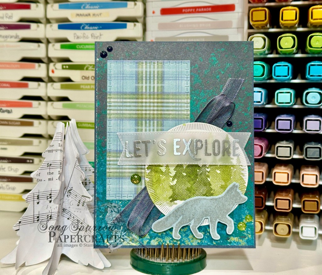
We get started with a base of Secret Sea cardstock and then add a sheet of the Nature Walk patterned paper as our backdrop. We cut an accent piece from a sheet of Timeless Plaid using the Textured Notes rectangle dies and adhered on the left side of our card. I stamped a stand of trees on white cardstock in a combination of Mossy Meadow, Old Olive, and Soft Sea Foam using the Outdoor Adventure stamp and then cut it out with one of the smaller Spotlight on Nature dies. It’s adhered over a bow of Secret Sea cardstock with dimensionals. Our wolf is stamped in Smoky Slate on Cloud Cover cardstock and then cut with the coordinating die from the Outdoor Adventure die set. It’s adhered at the bottom of our tree panel with several layers of dimensionals for some extra depth in the scene. I stamped the sentiment from the Outdoor Adventure set onto vellum with Versamark and then heat embossed with silver embossing powder. It’s cut out with the banner die from the Stylish Shapes set using the extension method to make it long enough to capture the full sentiment. The sentiment banner is adhered at the top of our focal panel using glue dots on either end to make it look like the banner is rippling in the wind. We finish things off with some Mossy Meadow and Secret Sea embellishments from the Moody Palette and Sparkle dot sets.
I hope you’ll drop in tomorrow to see a clean and simple design that comes together in minutes.
Product List![Secret Sea 8 1/2" X 11" Cardstock [ 165624 ]](https://assets1.tamsnetwork.com/images/EC042017NF/165624s.jpg "Secret Sea 8 1/2\" X 11\" Cardstock [ 165624 ]")
![Cloud Cover 8 1/2" X 11" Cardstock [ 165621 ]](https://assets1.tamsnetwork.com/images/EC042017NF/165621s.jpg "Cloud Cover 8 1/2\" X 11\" Cardstock [ 165621 ]")
![Basic White 8 1/2" X 11" Cardstock [ 166780 ]](https://assets1.tamsnetwork.com/images/EC042017NF/166780s.jpg "Basic White 8 1/2\" X 11\" Cardstock [ 166780 ]")
![Nature Walk 12" X 12" (30.5 X 30.5 Cm) Designer Series Paper [ 166912 ]](https://assets1.tamsnetwork.com/images/EC042017NF/166912s.jpg "Nature Walk 12\" X 12\" (30.5 X 30.5 Cm) Designer Series Paper [ 166912 ]")
![Timeless Plaid 6" X 6" (15.2 X 15.2 Cm) Designer Series Paper [ 164678 ]](https://assets1.tamsnetwork.com/images/EC042017NF/164678s.jpg "Timeless Plaid 6\" X 6\" (15.2 X 15.2 Cm) Designer Series Paper [ 164678 ]")
![Vellum 12" X 12" (30.5 X 30.5 Cm) Specialty Paper [ 167099 ]](https://assets1.tamsnetwork.com/images/EC042017NF/167099s.jpg "Vellum 12\" X 12\" (30.5 X 30.5 Cm) Specialty Paper [ 167099 ]")
![Outdoor Adventure Bundle (English) [ 168009 ]](https://assets1.tamsnetwork.com/images/EC042017NF/168009s.jpg "Outdoor Adventure Bundle (English) [ 168009 ]")
![Textured Notes Dies [ 165555 ]](https://assets1.tamsnetwork.com/images/EC042017NF/165555s.jpg "Textured Notes Dies [ 165555 ]")
![Spotlight On Nature Dies [ 163580 ]](https://assets1.tamsnetwork.com/images/EC042017NF/163580s.jpg "Spotlight On Nature Dies [ 163580 ]")
![Stylish Shapes Dies [ 159183 ]](https://assets1.tamsnetwork.com/images/EC042017NF/159183s.jpg "Stylish Shapes Dies [ 159183 ]")
![Smoky Slate Classic Stampin' Pad [ 147113 ]](https://assets1.tamsnetwork.com/images/EC042017NF/147113s.jpg "Smoky Slate Classic Stampin' Pad [ 147113 ]")
![Mossy Meadow Classic Stampin' Pad [ 147111 ]](https://assets1.tamsnetwork.com/images/EC042017NF/147111s.jpg "Mossy Meadow Classic Stampin' Pad [ 147111 ]")
![Old Olive Classic Stampin' Pad [ 147090 ]](https://assets1.tamsnetwork.com/images/EC042017NF/147090s.jpg "Old Olive Classic Stampin' Pad [ 147090 ]")
![Soft Sea Foam Classic Stampin' Pad [ 147102 ]](https://assets1.tamsnetwork.com/images/EC042017NF/147102s.jpg "Soft Sea Foam Classic Stampin' Pad [ 147102 ]")
![Versamark Pad [ 102283 ]](https://assets1.tamsnetwork.com/images/EC042017NF/102283s.jpg "Versamark Pad [ 102283 ]")
![Metallics Wow! Embossing Powder [ 165678 ]](https://assets1.tamsnetwork.com/images/EC042017NF/165678s.jpg "Metallics Wow! Embossing Powder [ 165678 ]")
![Secret Sea 3/8" (1 Cm) Bordered Open Weave Ribbon [ 166932 ]](https://assets1.tamsnetwork.com/images/EC042017NF/166932s.jpg "Secret Sea 3/8\" (1 Cm) Bordered Open Weave Ribbon [ 166932 ]")
![Moody Palette Glossy Dots [ 167180 ]](https://assets1.tamsnetwork.com/images/EC042017NF/167180s.jpg "Moody Palette Glossy Dots [ 167180 ]")
![Sparkle Dot Essentials [ 166991 ]](https://assets1.tamsnetwork.com/images/EC042017NF/166991s.jpg "Sparkle Dot Essentials [ 166991 ]")
![Mini Glue Dots [ 103683 ]](https://assets1.tamsnetwork.com/images/EC042017NF/103683s.jpg "Mini Glue Dots [ 103683 ]")
![Stampin' Dimensionals [ 104430 ]](https://assets1.tamsnetwork.com/images/EC042017NF/104430s.jpg "Stampin' Dimensionals [ 104430 ]")