Autumn Trees · Fall

Means the World

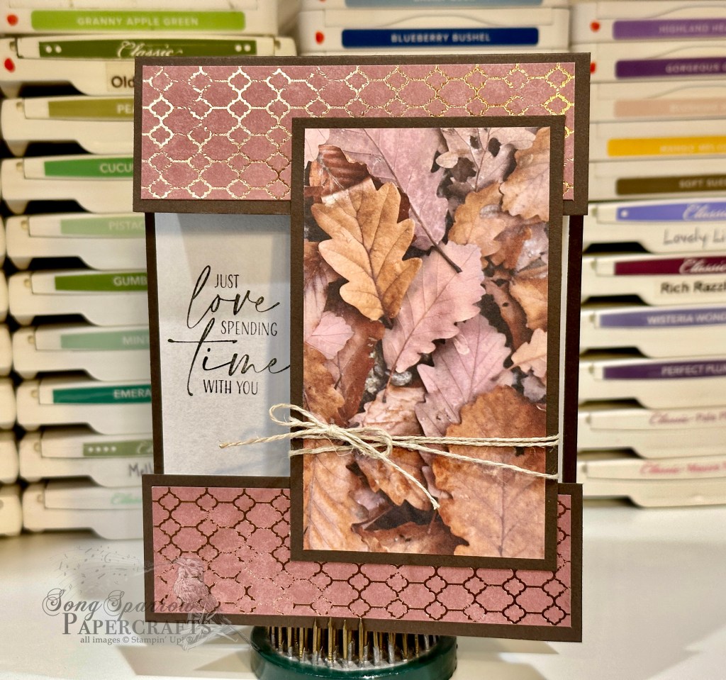
Here we are at the start of another week. Did you enjoy last week’s series as we worked our way through the Stampin’ Up! 12 Days of Crafting Advent Calendar? I had a lot of fun coming up with things to make from each day’s new crafting goodies.

Well, this week, we’re turning back to autumn. I just got the new Autumn Trees bundle in a recent order, and I’ve been dying to get crafty with this awesome new set. The stamps and dies are so detailed and there are so many ways to really punch things up with this set. Today, the beautiful oak tree is taking center stage, along with our doe & fawn. Let’s see how this all comes together.

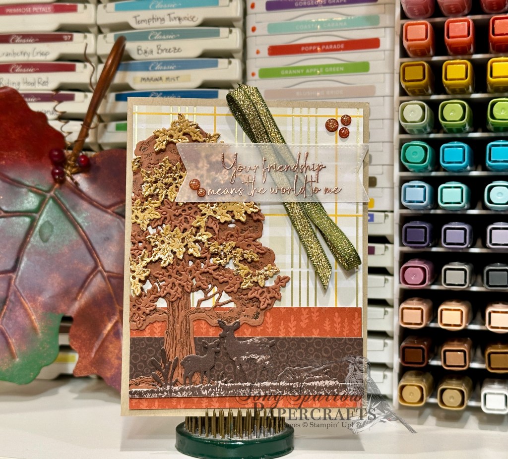
We get started with a base of Crumb Cake cardstock. This provides a nice neutral base that plays along with our nature-themed design. I used several different patterns from the Gathering Together patterned paper pack to create the backdrop for our focal images. The contrast from dark to light really let the beautiful tree and its foliage shine. The base image of our tree from the Autumn Tree set is stamped in Early Espresso on Copper Clay cardstock and then diecut with the coordinating die. (While this color is retired, you could just as easily substitute the Cajun Craze — it will simply be a bit brighter and I was going for a little more subdued.) The tree is adhered to the card front with glue dots. To really give some depth and realism to our beautiful fall foliage, I used the detailed leaves die from the die set and cut both Copper Clay and Oxidized Copper leaves and layered them a bit offset and affixed with dimensionals. I just love how the oxidized copper catches the light. The doe & fawn are the perfect addition to this serene scene. They’re cut from the woodgrain patterned sheet in the Gathering Together paper pack. The sentiment panel needed to be soft to allow our autumn scene to shine so I opted for some vellum. The sentiment from Gathering Moments is heat embossed in copper on the vellum and then diecut with the medium-sized banner in the Stylish Shapes set. It’s mounted over some Mossy Meadow & gold ribbon. And we finish things off with a touch of copper & gold in our Cajun Craze & Gold dots.

Tune in tomorrow as we take a stroll through the autumn meadow.

Product List
Fall · Gathering Together

Let’s Gather

Welcome back, everyone! I hope you enjoyed a restful weekend. We always enjoy a weekend where we’re able to spend time together. And we had the perfect weekend for that. The weather was glorious. It’s really starting to feel like fall here.

And speaking of fall, this week we’re going to be creating fall-inspired designs with our crafty stash. We’re getting started with the Gathering Moments stamps and a more unconventional color palette. I love looking for unique color pairings and there’s no better way to pull inspiration than simply taking a walk and making mental notes of all the hues you see! And today’s color palette is inspired by the pinks, blues, and purples that we see but that don’t get as much attention.

We get started with a neutral base of white cardstock. Our focal panel is a piece of white cardstock that is diecut with the Textured Notes die and matted with a piece of the pink Flower Garden Foils textured specialty paper cut with the largest Perennial Postage die. The smaller leaf stamp from the Gathering Moments stamp set provides the repeated image for our wreath of foliage. The leaves are stamped in a combination of pinks, blues, and purple. The sentiment is also from the Gathering Moments stamp set and is heat embossed with copper embossing powder before being cut with the Stylish Shapes circle die. The sentiment banner is cut from the pink textured foil and the sentiment panel is then mounted in the center of our foliage with dimensionals. We finish things off with a bow of Petunia Pop iridescent ribbon and some two-tone sparkle gems.

I really love how combining the lesser-scene hues of changing leaves provides such a stunning result. Tune in tomorrow as we continue our tour of fall design ideas.

Product List
Autumn · Fall

A Brighter Tomorrow

Happy Veterans’ Day to all of those who have served in the Armed Forces! We are ever so thankful for the sacrifices you and your family have made to make our way of life possible. Your service is always respected and appreciated!

I can’t believe we’re already starting another week. Is it just me or does it feel like August to the end of the year is always on fast forward?! Another new week means another new theme for our card designs. And this week, we’re going to be in the woods, which is one of my favorite places to be! I look forward to showing you some unique ways to use this theme in your designs.

Today, we’re getting started in the treetops. My favorite stretch of road in our neighborhood is just starting to show hints that the foliage is about to put on its fall foray. And I can’t wait! Before it’s all done, this stretch of road will look like it’s on fire. So today’s design is another nod to the changing foliage of fall.

We get started with a base of Copper Clay cardstock. Our focal panel consists of a background of Very Vanilla and a mat of Oxidized Copper. We build our forest of trees using the Frosted Forest dies. The base color is Mossy Meadow and then the changing foliage is a combination of Blackberry Bliss, Daffodil Delight, and Pumpkin Pie. The trees are adhered on varying levels of dimensionals to give some dimension to the scene and realism to the depth of forest. A few birds stamped using the Frosted Forest stamps add another layer of realism to our forest scene. The sentiment from Unbounded Love is stamped on the vanilla backdrop. The strip of Pretty Peacock & Gold metallic ribbon add some sparkle and help draw the eye to the top and the sentiment. A few Blooming Pearls help finish things off.

We’re going to be in the forest all week. So I hope you’ll tag along for the trip!

Products used in today’s card:
Copper Clay, Very Vanilla, Crumb Cake, Early Espresso, Pecan Pie, Blackberry Bliss, Daffodil Delight, Pumpkin Pie, Mossy Meadow cardstock
Oxidized Copper DSP
Frosted Forest bundle
Unbounded Love stamps
Pretty Peacock & Gold metallic ribbon
Blooming Pearls
Dimensionals
Adhesives

Product List
Fall · Thankful

Amazing Leaves

Fall is my favorite season of the year. Thus far, Texas isn’t really cooperating. It’s unseasonably warm for November and the leaves have only just started to hint at changing color. I’m ready for sweater weather and a big pile of leaves in the yard!

This week, we’re working within the theme of thankfulness. Aside from this time of year lending itself to this type of reflection, it just really feels like we all need a little reminder to slow down and appreciate all of the little things. Even when we don’t have it all, there are so many small ways we are living in the overflow of God’s grace and goodness.

For today’s card design, I took inspiration from the usual color palette of fall foliage that we see in our area. I really love the combination of foliage color and texture in today’s design.

We get started with a base of Early Espresso cardstock. Our leaf patterned focal panel is matted with lots of shimmer between the Oxidized Copper specialty paper and the Old Olive glimmer paper. For the focal panel, I inked the Leaf Collection background stamp with a combination of Blackberry Bliss, Copper Clay, Cherry Cobbler, and Mossy Meadow ink and stamped on Very Vanilla cardstock. I then embossed with the Changing Leaves embossing folder. I used gold ink to bring out the embossing and add a sparkly sheen to the leaves. The sentiment from the Changing Leaves stamp set is heat embossed in gold on a piece of Early Espresso that was embossed with the Leaf Fall embossing folder and then diecut with the Nested Essentials dies. Another rub of some gold ink helps bring out the pattern in the sentiment panel and match the sheen of our focal panel. A twist of the Natural Tones linen thread and some gold Blooming Pearls add the final touches.

Next week we’re going to take a trek through the trees and see what we can find. Hope you will tag along.

Autumn · Fall · L2S Group Instahop

Give Thanks

This time of year is always a little interesting in Texas because you’re never quite sure whether it’s summer or fall. And honestly, it just depends on the day as to what it feels like! The last several days we’ve settled into a fall-ish pattern and it gets me all excited because it means we’re almost into my favorite part of the year.

This week, we’ve been looking at all the ways we can use the Stampin’ Up! Season of Green & Gold suite. And today, we’re starting a little mini-series where we’re thinking a little outside the box. I don’t know about you, but sometimes I find myself falling into the trap of only looking at products from a very finite lens. For example, it would be super easy to see the Golden Greenery stamp set, and honestly the whole Season of Green & Gold suite as a whole, as a “Christmas set.” But I have to remind myself, especially with greenery, that all sorts of foliage goes through a seasonal transformation.

So today’s card starts with a base of Moody Mauve cardstock. I really took color palette hues from all my favorite foliage colors. Our focal panel backdrop combines Pretty Peacock cardstock with the gorgeous gold mercury vellum, and I chose the sheet that is particularly textured to add to the layers of texture in this design. Our focal section begins with a backdrop of Very Vanilla cardstock embossed using the Leaf Fall embossing folder, and then I lightly went over the raised portions with my finger and Copper Clay ink.

Next up, we build our main focal point beginning with the large leaf cut from Blackberry Bliss cardstock using the Autumn Leaves dies. The sentiment from the Courage & Faith set is then heat embossed in gold in the center. Our foliage stamps are from the Golden Greenery stamp set and are stamped in a variety of colors, including Mossy Meadow, Copper Clay, Crushed Curry, Pumpkin Pie, and Blackberry Bliss, on Very Vanilla cardstock and then diecut using the coordinating Golden Greenery dies. Our foliage is combined and then adhered over Pretty Peacock & Gold and Blackberry Bliss & Gold ribbons using dimensionals. A few brown and copper sequins finish things off with a little sparkle.

I really love this card design for its unique product combination and funky, nature-inspired color palette. I hope this card design helps you look at your stash a little differently. Think about how things look “in the wild” and see if that applies to something in your stash and helps you make a stamp set or paper go that much further for your designs!

Today’s card is a part of the Luv 2 Stamp Group Instagram Hop, which goes live today at 9 AM Pacific Time (PST).  Click here to head over to my Instagram feed at 11 AM Central and check out what the other demos in our L2S Group have created for you today! And tune in tomorrow as we create another fun fall card using the Season of Green & Gold suite!

Products used in today’s card:
Moody Mauve, Pretty Peacock, Very Vanilla cardstock
Gold mercury vellum
Leaf Fall embossing folder
Golden Greenery stamps & dies
Autumn Leaves dies
Gold embossing powder
Pretty Peacock & Gold metallic, Blackberry Bliss & Gold metallic ribbon
Neutrals sequins
Dimensionals
Adhesives

Product List
Autumn · Fall

Joy to My Heart

We’ve made it through the first week of September. I don’t know about you, but holiday weeks always feel longer, for some reason.

This week, we’ve been all about the autumn designs and looking at a variety of different ways to pair Stampin’ Up! products or to use techniques. Today, we’re revisiting the emboss resist technique with this card design which features the Leaf Collection background stamp. I recently saw a card posted by a fellow demonstrator that paired this stamp with a Blackberry Bliss and metallic gold color palette. It was super elegant and I wanted to give it a twist. So let’s see how it all comes together.

We get started with a base of Blackberry Bliss cardstock. The focal panel is also Blackberry Bliss that has been stamped with the Leaf Collection stamp and then heat embossed with clear embossing powder. To help the pattern pop, I went over the panel with metallic gold ink which gives the entire panel a subtle sheen and really makes the clear embossing twinkle. This panel is matted with Rose Gold textured specialty paper and then wrapped with Blackberry Bliss & Gold textured ribbon and tied with a bow. The sentiment from So Sincere is stamped on Blackberry Bliss cardstock and then heat embossed with gold before being diecut with the Greetings of the Season die using the extension method. The sentiment panel is adhered underneath the bow using several layers of dimensionals. I cut some sprigs of leaves from gold foil using the Changing Leaves die and adhered them with dimensionals around the bow to keep things cohesive. Drusy embellishments finish things off with lots of extra sparkle.

It’s been a lot of fun designing cards all about autumn, and I hope you’ve enjoyed the inspiration. Next week is all about Christmas as we get a better look at the new product from the Stampin’ Up! Holiday Mini Catalog. In the meantime, I hope you’ll tune in on the socials for a little bonus All About Autumn content this afternoon.

Products used in today’s card:
Blackberry Bliss cardstock
Gold foil, Rose Gold textured SP
Leaf Collection, So Sincere stamps
Greetings of the Season, Changing Leaves dies
Clear, gold embossing powder
Blackberry Bliss & Gold textured ribbon
Drusy embellishments
Dimensionals
Adhesives

Product List
Autumn · Fall · sketches · Sketchy Fridays

Sketchy Fridays: Accomplished So Much

This week is all about autumn, and we’re using unique combinations of Stampin’ Up! products to make some beautiful card designs.

And it’s already time again for another installment of Sketchy Fridays, where each week we’ll be using a card sketch to design our featured card. Right now, we’re working through a full series of designs using the card sketches found on page 22 of the current Stampin’ Up! Annual Catalog.

This week’s card is based on Sketch #14 and features the gorgeous Splendid Autumn designer paper from the new Stampin’ Up! Holiday Mini catalog.

As I was thumbing through the papers in the Splendid Autumn paper pack, I was looking for a sheet that would lend itself to an unexpected combination of products. When I saw this beautiful sheet of the groves of trees separated by a stream with its hues of greens and purples, along with the usual fall foliage colors, I knew I had found the sheet I was looking for.

The beauty of today’s Sketch #14 is it lets us use this gorgeous paper as the focal point and then support it with mats as complements. We get started with a base of Calypso Coral cardstock. I love how this base color makes the oranges in the trees pop over the golden hues. Our sheet of Splendid Autumn is matted in two different colors. We use a very thin mat of Peach Pie glimmer paper right up against the Splendid Autumn, and it’s such a nice complement to the golden hues in our paper. Then we’re using a larger secondary mat of Old Olive Season of Elegance designer paper. Just look at how this brings out the grass along either side of our creek that’s reflecting our gorgeous dusky sky. And in person, the sparkle of the gold foiling in this sheet plays along perfectly with the glimmer paper. The sentiment from Wonderful Thoughts is heat embossed in gold on a sheet of white vellum from the Graceful Greenery vellum pack and then diecut using the Greetings of the Season dies using the extension method to give us a full banner. We finish things off with a twist of ribbons, including iridescent striped sheer ribbon, gold trim, and two colors of linen thread from the new Natural Tones pack, and a few of the new Earth Tones shimmer gems in opposing corners for a little sparkle.

I hope you tune in tomorrow as we round out our All About Autumn card series. I’ll be bringing you another emboss resist project, as well as a BONUS post showing how you can make a simple easel project that packs a big punch!

Products used in today’s card:
Calypso Coral cardstock
Season of Elegance, Splendid Autumn, Graceful Greenery vellum, Gold textured DSP
Wonderful Thoughts stamps
Greetings of the Season dies
Iridescent striped ribbon
Gold trim
Natural Tones linen thread
Earth Tones shimmer gems
Dimensionals
Adhesives

Product List
Autumn · Fall

Feel Better

This week’s designs are all about autumn. Aside from using some great new product from Stampin’ Up!, we’re using some fun new techniques to boot!

Today, we’re pairing up the beautiful new Splendid Autumn patterned paper pack with the new Birch Wood embossing folder and a cool heat embossing effect that I learned from a team member. So let’s check it out.

For today’s color palette, we’re drawing out all of the beautiful autumn hues in our Splendid Autumn patterned paper — Copper Clay, Moody Mauve, and Very Vanilla. So we get started with a card base of Copper Clay. Our focal panel is a piece of Moody Mauve that’s been embossed using the new Birch Wood embossing folder. I then filled in all of the debossed sections with Versamark and embossed with copper, BUT I did not completely set the embossing powder. Instead, I only embossed it to the point of looking grainy and then quickly moved on to another section. I felt like the grainy texture looks much more like bark. I wanted a polaroid look for the sentiment panel, so we get started by diecutting a cross-hatch gold foiled sheet from the Nature’s Sweetness paper pack using the largest Nested Essentials banner die. The sheet of Splendid Autumn is then cut to size to fit within, leaving a small border. The sentiment from Unbounded Love is heat embossed in copper on a banner diecut from a sheet of the white Graceful Greenery vellum using the Happy Little Things die. The top of the sentiment panel is wrapped in the new Copper Clay linen thread and the full panel is adhered to the focal panel using dimensionals. A few of the new drusy embellishments in each corner help move the eye across the card.

Isn’t this such a fun embossing technique? I really love the realism it adds to the woodgrain embossed panel. Speaking of embossing techniques, tomorrow we’ll be using another oldie but goodie. I hope you’ll pop by and check it out!

Products used in today’s card:
Copper Clay, Moody Mauve cardstock
Nature’s Sweetness, Splendid Autumn DSP
Graceful Greenery vellum
Birch Wood embossing folder
Unbounded Love stamps
Nested Essentials, Happy Little Things dies
Copper embossing powder
Copper Clay linen thread
Drusy embellishments
Dimensionals
Adhesives

Product List
Fall

Piles of Blessings

Welcome to a brand new week AND month, crafty friends! This week, we have a new design theme — All About Autumn. And I have all kinds of fun new twists and techniques to show you using a whole host of products from Stampin’ Up! We get started today with the Changing Leaves bundle and the emboss resist watercolor technique.

Our card base is Copper Clay cardstock and scored at the top for this portrait orientation design. For our focal panel, we start with a panel of watercolor paper. I stamped the largest leaf from Changing Leaves and heat embossed with white embossing powder. Using the water color painter, I used a combination of Blackberry Bliss, Copper Clay, and Flirty Flamingo ink to watercolor the leaves. The focal panel is then matted with a frame of Blackberry Bliss that has been embossed with the Changing Leaves embossing folder and the center portion is cut out using the Deckled Rectangles dies to make the frame. The framed panel is then mounted to the card base with dimensionals. The sentiment from Unbounded Love is stamped in black on Very Vanilla cardstock and then diecut with the decorative circle from Changing Leaves. The leaves are cut from Pretty Peacock Oxidized Copper paper using the elm leaves from the Changing Leaves die set. A twist of Blackberry Bliss & Gold textured ribbon is adhered over the leaves at the bottom of the sentiment panel using glue dots. The sentiment panel is adhered to the focal panel with dimensionals.

I just love the emboss resist technique and need to remember to incorporate it more into card designs. There are so many different applications and effects that can be achieved with this one technique!

Tune in tomorrow as we get a second look at the very cool Stampin’ Blends acetate rub technique.

Products used in today’s card:
Copper Clay, Blackberry Bliss, Very Vanilla cardstock
Oxidized Copper, watercolor SP
Changing Leaves bundle
Unbounded Love stamps
Deckled Rectanges dies
White embossing powder
Blackberry Bliss & Gold textured ribbon (coming tomorrow!)
Dimensionals
Adhesives

Product List
Fall · Fun Folds

Love Spending Time With You

Do you love learning new things? I’m learning new fun folds to add interest to my card designs, and I really love this one that I learned from fellow demonstrator Jacki Bolhuis with Klompen Stampers. She calls it the Split Front Fold, but I like to think of it as the Cut and Twist because you cut out the center of the front panel and twist it up to make it a focal panel. What I really love about this fun fold is that you can get stellar results whether you dress up the front focal panel or leave it as a stand-alone, like I did here. So many possibilities!

For this card, we begin with a base of Early Espresso and a single sheet of the leaf pattern from the All About Autumn designer paper pack. The base is is a standard size but scored at the top rather than on the side. To achieve the cut and flip, with the long edge up, you cut 1 1/2-inches from one side and then make a second cut of 2 1/2-inches. This leaves a 1 1/2-inch strip just beyond the center fold, along with the two pieces that were cut. The larger piece gets twisted up vertically to serve as the focal panel on the card front and also holds the smaller pieces of the card front together. I chose the leaf pattern of All About Autumn to serve as the star of the vertical focal panel. The foiled pattern on the back side of the leaf sheet serves as the two decorative strips at the top and bottom. A little twist of linen thread gives a little punch to the focal panel. To allow the beautiful patterned paper to really shine, the sentiment is stamped on the card base so that it shows through the peek-through window in the card front.

What do you think of this new Cut and Twist method? I’m excited to try some other designer papers with this unique fun fold!

Products used:
Early Espresso cardstock
All About Autumn DSP
Linen thread
Adhesives

All ads on this site are posted by WordPress and are based on your personal browsing history. I do not control ad content.