Autumn · Holiday Mini Catalog

Autumn Birthday Greenery

It’s a beautiful weekend here in North Texas and things are beginning to feel a little more fall-like. The Great State Fair is now underway and morning temperatures are cooling off. I would be remiss if I didn’t express thoughtful concern for all of those who have been or will be impacted by Hurricane Helene. Please know that our thoughts and prayers are with you and we wish you fair weather for cleanup very soon!

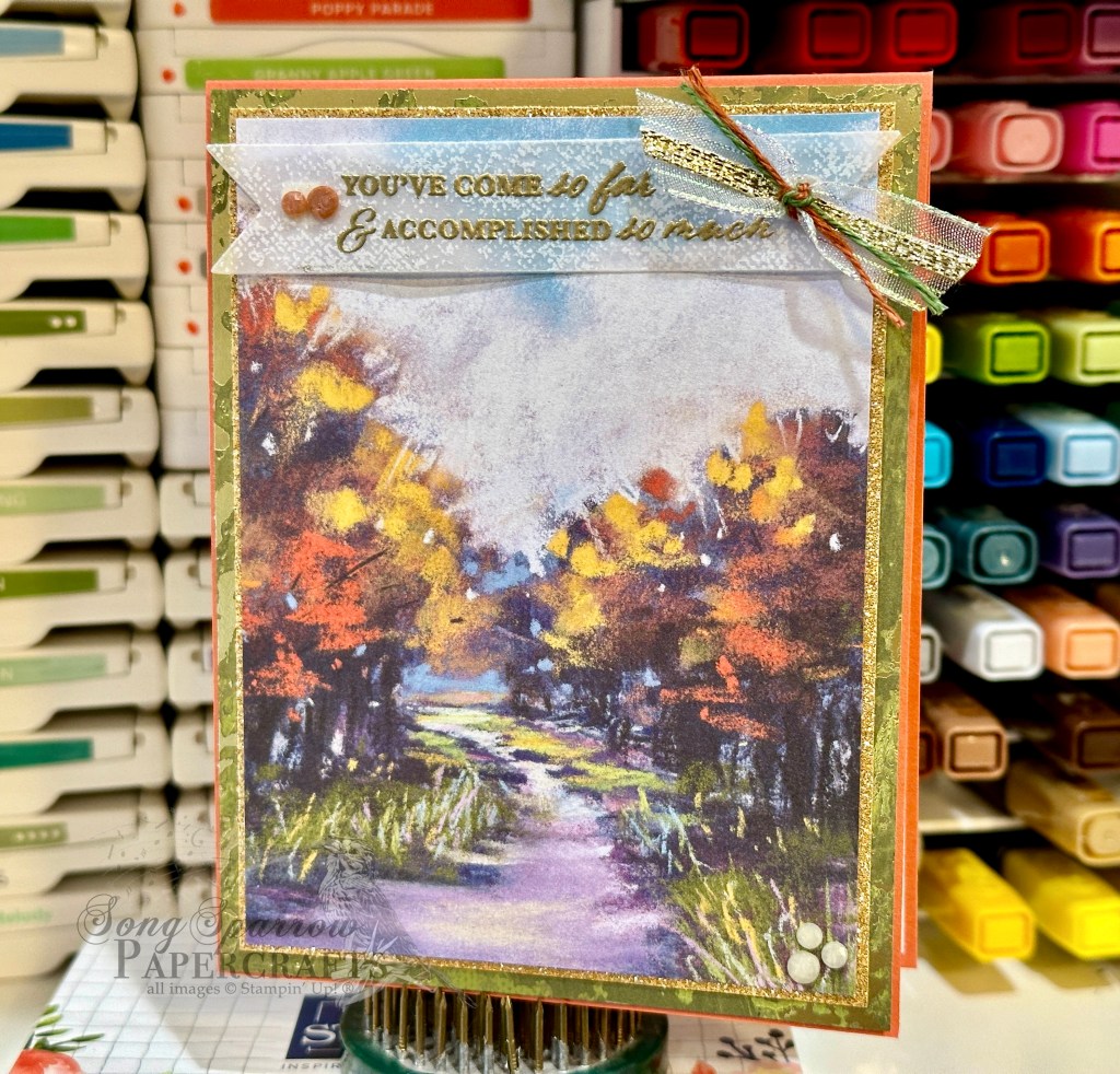
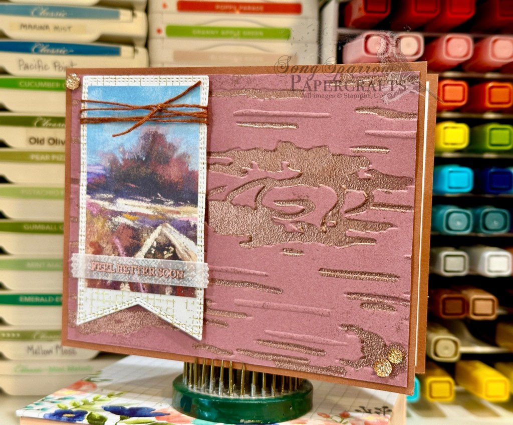
Today we’re wrapping up our series of card designs using the Stampin’ Up! Season of Green & Gold suite, which is concluding with a mini series of fall designs using these products. One of the many ways that you can get more “bang for your buck” is to look for unique ways to use your crafting supplies. In the case of the Golden Greenery stamps and dies, we’re taking inspiration from all of the fall foliage that begins its color transformation this time of year. And today’s design highlights some fronds of fall foliage in the foreground of a field of Queen Anne’s lace.

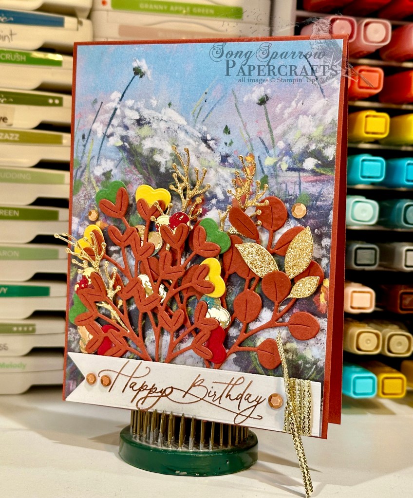
We get started with a base of Cajun Craze cardstock. Our background panel is a sheet of Splendid Autumn patterned paper. Our fall foliage is diecut from Cajun Craze using the Golden Greenery dies. To create the buds on one of the stems, we use the heart die from the Filled with Fun set to cut hearts from a variety of cardstock colors, including Crushed Curry, Real Red, Garden Green, red Season of Elegance foiled paper, and blue Oxidized Copper paper, and then adhere them to the base stems with glue dots. Our rusty stems of foliage are adhered to our background panel with dimensionals. We then layer in a little sparkle in the background with some sprigs diecut from Peach Pie glimmer paper using the Changing Leaves dies. The sentiment from Greetings of the Season and Everyday Greetings is stamped in Copper Clay on white cardstock and then diecut using the Greetings of the Season banner die. Some gold trim is tied around the end and the panel is then adhered in front of our foliage with dimensionals. A few copper sequins finish things off and help the eye pass neatly over the card front and settle on the sentiment.

Next week we’re touring the Nests of Winter suite. I hope you’ll pop by and see all the ways you can make this beautiful suite of products work for you!

Products used in today’s card:
Cajun Craze, Crushed Curry, Real Red, Garden Green, Basic White cardstock
Season of Elegance, Oxidized Copper, In Color glimmer, Splendid Autumn DSP
Everyday Greetings, Greetings of the Season stamps
Golden Greenery, Filled with Fun, Changing Leaves, Greetings of the Season dies
Gold trim
Neutrals sequins
Dimensionals
Adhesives

Product List
Autumn · Holiday Mini Catalog · Sketchy Fridays

Sketchy Fridays: Birthday Greenery

We’ve made it to another Friday, and you know what that means? It’s time for another Sketchy Fridays!

Each week we’ll be using a card sketch to design our featured card. Right now, we’re working through a full series of designs using the card sketches found in current Stampin’ Up! catalogs.

This week’s card is based on Sketch #4 in the Holiday Mini catalog and features the Golden Greenery dies and the Splendid Autumn designer series paper in the new Stampin’ Up! Holiday Mini catalog.

One of my dearest girlfriends is celebrating a birthday in a few weeks, and I knew that I wanted to create something special for her. I’m always a little nervous creating things for her because she’s such a gifted artist. She draws, she paints, she watercolors….and everything is just stunning! So it seemed only fitting to use the beautiful Splendid Autumn designer series paper with its gorgeous watercolor look. And I really love how you can change the look and feel of the sheet of paper simply in the way that you selectively cut it to size.

Our design gets started with a base of Cajun Craze cardstock. The focal panel is a combination of Splendid Autumn patterned paper and gold mercury vellum as a mat. The Splendid Autumn paper in this design is trimmed so that only the trees from the scene are showcased in the panel. I think it’s such a neat look, especially considered in context with the full sheet of paper.

Our focal section consists of the sentiment panel. The sentiment from Everyday Greetings is stamped in Copper Clay on Very Vanilla and then diecut using the Autumn Leaves dies. We have two sets of fall foliage behind our sentiment panel. One is cut from Oxidized Copper, while the other is cut from Season of Elegance paper. Both are cut using the Golden Greenery dies. A twist of linen thread in between ties our fall color palette together nicely. And we finish things off with the sparkle of Earth Tones shimmer gems.

The next time you’re cutting down a sheet of patterned paper, think about how you can create a different and interesting look based on the overall feel you want to convey in your design. I think you’ll be surprised how it changes the look of the panel you trim down!

Tomorrow we’ll be finishing off our Season of Green & Gold series with another fall-inspired design. I hope you’ll drop in and check it out!

Products used in today’s card:
Cajun Craze, Very Vanilla cardstock
Splendid Autumn, gold mercury vellum, Oxidized Copper, Season of Elegance DSP
Everyday Greetings stamps
Golden Greenery, Autumn Leaves dies
Natural Tones linen thread
Earth Tones shimmer gems
Dimensionals
Adhesives

Product List
Autumn · Fall · L2S Group Instahop

Give Thanks

This time of year is always a little interesting in Texas because you’re never quite sure whether it’s summer or fall. And honestly, it just depends on the day as to what it feels like! The last several days we’ve settled into a fall-ish pattern and it gets me all excited because it means we’re almost into my favorite part of the year.

This week, we’ve been looking at all the ways we can use the Stampin’ Up! Season of Green & Gold suite. And today, we’re starting a little mini-series where we’re thinking a little outside the box. I don’t know about you, but sometimes I find myself falling into the trap of only looking at products from a very finite lens. For example, it would be super easy to see the Golden Greenery stamp set, and honestly the whole Season of Green & Gold suite as a whole, as a “Christmas set.” But I have to remind myself, especially with greenery, that all sorts of foliage goes through a seasonal transformation.

So today’s card starts with a base of Moody Mauve cardstock. I really took color palette hues from all my favorite foliage colors. Our focal panel backdrop combines Pretty Peacock cardstock with the gorgeous gold mercury vellum, and I chose the sheet that is particularly textured to add to the layers of texture in this design. Our focal section begins with a backdrop of Very Vanilla cardstock embossed using the Leaf Fall embossing folder, and then I lightly went over the raised portions with my finger and Copper Clay ink.

Next up, we build our main focal point beginning with the large leaf cut from Blackberry Bliss cardstock using the Autumn Leaves dies. The sentiment from the Courage & Faith set is then heat embossed in gold in the center. Our foliage stamps are from the Golden Greenery stamp set and are stamped in a variety of colors, including Mossy Meadow, Copper Clay, Crushed Curry, Pumpkin Pie, and Blackberry Bliss, on Very Vanilla cardstock and then diecut using the coordinating Golden Greenery dies. Our foliage is combined and then adhered over Pretty Peacock & Gold and Blackberry Bliss & Gold ribbons using dimensionals. A few brown and copper sequins finish things off with a little sparkle.

I really love this card design for its unique product combination and funky, nature-inspired color palette. I hope this card design helps you look at your stash a little differently. Think about how things look “in the wild” and see if that applies to something in your stash and helps you make a stamp set or paper go that much further for your designs!

Today’s card is a part of the Luv 2 Stamp Group Instagram Hop, which goes live today at 9 AM Pacific Time (PST).  Click here to head over to my Instagram feed at 11 AM Central and check out what the other demos in our L2S Group have created for you today! And tune in tomorrow as we create another fun fall card using the Season of Green & Gold suite!

Products used in today’s card:
Moody Mauve, Pretty Peacock, Very Vanilla cardstock
Gold mercury vellum
Leaf Fall embossing folder
Golden Greenery stamps & dies
Autumn Leaves dies
Gold embossing powder
Pretty Peacock & Gold metallic, Blackberry Bliss & Gold metallic ribbon
Neutrals sequins
Dimensionals
Adhesives

Product List
Autumn · No Stamp Design

Easy Easel that Failed

Welcome to today’s BONUS post! It’s the time of year where many of us crafty creators begin thinking about items that we will put in our booths at craft fairs. I have two upcoming craft fairs and am already well underway in the product creation department. One of the many items that I love to offer craft fair customers is an easel calendar. And this year, I’ve been playing around with several different layouts and methods of constructing them.

Today, I’m sharing a prototype with you that didn’t make the cut. Why am I sharing a “failure,” you might ask? Well, it may not work for my customers, but it’s still a lovely design that I intend to enjoy on my own desk. And we’re going to talk about why it doesn’t work because I think there’s value in sharing things that didn’t work out as planned and how we “fix” it.

I knew that I wanted to build a calendar on a standard-sized card base in an easel design. I wanted the calendar to lie flat and be mailable for anyone who purchased one in my craft booth and wanted to mail it to a loved one. So I began with the simplest of easel stands where the easel folds up in the back to prop up the front-facing portion. But what doesn’t work about this design is the prop catch in the back to ensure that the easel stays in place. The only thing I could find that worked to keep the easel in place was a very large stack of dimensionals, which is not at all pretty. And for me, I like for every angle of a crafty creation I made to be lovely to look at. And that’s how this lovely calendar (from the front) became my new desk companion. But let’s talk about how it comes together outside of my faulty easel design.

I love the new Splendid Autumn designer series paper pack and really wanted to pull out the lovely, more subtle colors in the patterned sheet I chose for this easel calendar. After placing a lot of different color combinations behind the Splendid Autumn sheet, I felt like the combination of Cajun Craze and Blackberry Bliss worked best at pulling forward the lovely shades of fall in the field of blooms AND all of the lovely colors of dusk in the sky. So our Cajun Craze sheet serves as our base for the calendar easel and the Blackberry Bliss serves as the mat directly behind the Splendid Autumn sheet. To pull forward the yellows, I matted the small tear-off calendar (by Taylored Expressions) in Crushed Curry. I added a few Peach Pie shimmer gems in the bottom corner for just a little sparkle. I just love how it turned out!

In this week’s episode of Terrific Tuesdays, I’m going to be sharing the full details on this easel calendar with you, including how this particular design was a fail for me PLUS how I changed things up to create an easel that works how I intended. So I hope you’ll tune in!

Products used in today’s featured design:
Cajun Craze, Blackberry Bliss, Crushed Curry cardstock
Splendid Autumn DSP
Taylored Expressions mini tear-off calendar
In Color shimmer gems

Product List
Autumn · Fall

Joy to My Heart

We’ve made it through the first week of September. I don’t know about you, but holiday weeks always feel longer, for some reason.

This week, we’ve been all about the autumn designs and looking at a variety of different ways to pair Stampin’ Up! products or to use techniques. Today, we’re revisiting the emboss resist technique with this card design which features the Leaf Collection background stamp. I recently saw a card posted by a fellow demonstrator that paired this stamp with a Blackberry Bliss and metallic gold color palette. It was super elegant and I wanted to give it a twist. So let’s see how it all comes together.

We get started with a base of Blackberry Bliss cardstock. The focal panel is also Blackberry Bliss that has been stamped with the Leaf Collection stamp and then heat embossed with clear embossing powder. To help the pattern pop, I went over the panel with metallic gold ink which gives the entire panel a subtle sheen and really makes the clear embossing twinkle. This panel is matted with Rose Gold textured specialty paper and then wrapped with Blackberry Bliss & Gold textured ribbon and tied with a bow. The sentiment from So Sincere is stamped on Blackberry Bliss cardstock and then heat embossed with gold before being diecut with the Greetings of the Season die using the extension method. The sentiment panel is adhered underneath the bow using several layers of dimensionals. I cut some sprigs of leaves from gold foil using the Changing Leaves die and adhered them with dimensionals around the bow to keep things cohesive. Drusy embellishments finish things off with lots of extra sparkle.

It’s been a lot of fun designing cards all about autumn, and I hope you’ve enjoyed the inspiration. Next week is all about Christmas as we get a better look at the new product from the Stampin’ Up! Holiday Mini Catalog. In the meantime, I hope you’ll tune in on the socials for a little bonus All About Autumn content this afternoon.

Products used in today’s card:
Blackberry Bliss cardstock
Gold foil, Rose Gold textured SP
Leaf Collection, So Sincere stamps
Greetings of the Season, Changing Leaves dies
Clear, gold embossing powder
Blackberry Bliss & Gold textured ribbon
Drusy embellishments
Dimensionals
Adhesives

Product List
Autumn · Fall · sketches · Sketchy Fridays

Sketchy Fridays: Accomplished So Much

This week is all about autumn, and we’re using unique combinations of Stampin’ Up! products to make some beautiful card designs.

And it’s already time again for another installment of Sketchy Fridays, where each week we’ll be using a card sketch to design our featured card. Right now, we’re working through a full series of designs using the card sketches found on page 22 of the current Stampin’ Up! Annual Catalog.

This week’s card is based on Sketch #14 and features the gorgeous Splendid Autumn designer paper from the new Stampin’ Up! Holiday Mini catalog.

As I was thumbing through the papers in the Splendid Autumn paper pack, I was looking for a sheet that would lend itself to an unexpected combination of products. When I saw this beautiful sheet of the groves of trees separated by a stream with its hues of greens and purples, along with the usual fall foliage colors, I knew I had found the sheet I was looking for.

The beauty of today’s Sketch #14 is it lets us use this gorgeous paper as the focal point and then support it with mats as complements. We get started with a base of Calypso Coral cardstock. I love how this base color makes the oranges in the trees pop over the golden hues. Our sheet of Splendid Autumn is matted in two different colors. We use a very thin mat of Peach Pie glimmer paper right up against the Splendid Autumn, and it’s such a nice complement to the golden hues in our paper. Then we’re using a larger secondary mat of Old Olive Season of Elegance designer paper. Just look at how this brings out the grass along either side of our creek that’s reflecting our gorgeous dusky sky. And in person, the sparkle of the gold foiling in this sheet plays along perfectly with the glimmer paper. The sentiment from Wonderful Thoughts is heat embossed in gold on a sheet of white vellum from the Graceful Greenery vellum pack and then diecut using the Greetings of the Season dies using the extension method to give us a full banner. We finish things off with a twist of ribbons, including iridescent striped sheer ribbon, gold trim, and two colors of linen thread from the new Natural Tones pack, and a few of the new Earth Tones shimmer gems in opposing corners for a little sparkle.

I hope you tune in tomorrow as we round out our All About Autumn card series. I’ll be bringing you another emboss resist project, as well as a BONUS post showing how you can make a simple easel project that packs a big punch!

Products used in today’s card:
Calypso Coral cardstock
Season of Elegance, Splendid Autumn, Graceful Greenery vellum, Gold textured DSP
Wonderful Thoughts stamps
Greetings of the Season dies
Iridescent striped ribbon
Gold trim
Natural Tones linen thread
Earth Tones shimmer gems
Dimensionals
Adhesives

Product List
Autumn · Fall

Feel Better

This week’s designs are all about autumn. Aside from using some great new product from Stampin’ Up!, we’re using some fun new techniques to boot!

Today, we’re pairing up the beautiful new Splendid Autumn patterned paper pack with the new Birch Wood embossing folder and a cool heat embossing effect that I learned from a team member. So let’s check it out.

For today’s color palette, we’re drawing out all of the beautiful autumn hues in our Splendid Autumn patterned paper — Copper Clay, Moody Mauve, and Very Vanilla. So we get started with a card base of Copper Clay. Our focal panel is a piece of Moody Mauve that’s been embossed using the new Birch Wood embossing folder. I then filled in all of the debossed sections with Versamark and embossed with copper, BUT I did not completely set the embossing powder. Instead, I only embossed it to the point of looking grainy and then quickly moved on to another section. I felt like the grainy texture looks much more like bark. I wanted a polaroid look for the sentiment panel, so we get started by diecutting a cross-hatch gold foiled sheet from the Nature’s Sweetness paper pack using the largest Nested Essentials banner die. The sheet of Splendid Autumn is then cut to size to fit within, leaving a small border. The sentiment from Unbounded Love is heat embossed in copper on a banner diecut from a sheet of the white Graceful Greenery vellum using the Happy Little Things die. The top of the sentiment panel is wrapped in the new Copper Clay linen thread and the full panel is adhered to the focal panel using dimensionals. A few of the new drusy embellishments in each corner help move the eye across the card.

Isn’t this such a fun embossing technique? I really love the realism it adds to the woodgrain embossed panel. Speaking of embossing techniques, tomorrow we’ll be using another oldie but goodie. I hope you’ll pop by and check it out!

Products used in today’s card:
Copper Clay, Moody Mauve cardstock
Nature’s Sweetness, Splendid Autumn DSP
Graceful Greenery vellum
Birch Wood embossing folder
Unbounded Love stamps
Nested Essentials, Happy Little Things dies
Copper embossing powder
Copper Clay linen thread
Drusy embellishments
Dimensionals
Adhesives

Product List