Do you ever include a gift with a Christmas card? Do you ever find yourself looking for cute and/or creative ways to include the gift? Today, we’re looking at a fun way to include a gift card with this year’s Christmas card to friends or relatives. This card is literally a gift that keeps giving!

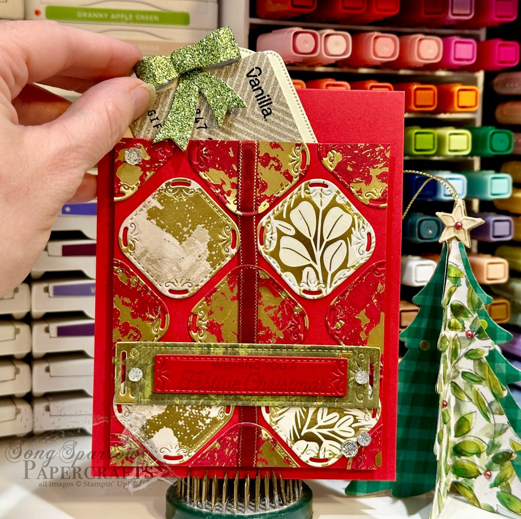
For our special gift card, we’re pairing some of the beautiful new patterned paper packs with the dies from the Season of Elegance Suite included in the new Stampin’ Up! Holiday Mini catalog. So let’s take a closer look at how this all comes together.
We get started with a base of Real Red cardstock. Our focal gift panel also starts with a base of Real Red that is cut down to leave enough room at the top for our decorative gift card insert. Using the smaller square from the Peaceful Season dies, we cut squares from two sheets of the Season of Elegance paper and one sheet of the Season of Green & Gold paper pack. I alternated the red and cream-colored rows and tried to ensure the center squares lined up so that the Cherry Cobbler & Gold ribbon element ran cleanly from top to bottom. Our sentiment from the Trucking Along stamp set is stamped tone-on-tone on Real Red cardstock and then diecut using the Peaceful Season die, which is matted with the larger rectangle banner from the same die set. The sentiment panel is adhered at the bottom of our package focal panel using dimensionals. I added Drusy embellishments to the panel for added sparkle and to ensure the eye moves to the sentiment. We adhere our full focal panel to the card front using foam strips on three sides to create a pocket behind the panel.
Our gift card holder is a piece of Very Vanilla cardstock that is diecut with the largest tag in the Greetings of the Season die set. We create the bow for the top by cutting Garden Green Festive glimmer paper with the Peaceful Evergreens dies. The bow is assembled with glue dots and then adhered to the top of our tag with dimensionals. You can lightly hold a gift card in place by placing a few glue dots on the back and then placing it on the tag. Tuck it into the pocket and you have an instant gift in more ways than one!
I really love how this turned out and can’t wait to use this design this year. It’s always fun to be able to present a gift card in a fun and creative way and with a lengthier note.
Tune in tomorrow for a new Sketchy Fridays card design and see what our snowman is getting up to!
Products used in today’s card:
Real Red, Very Vanilla cardstock
Season of Elegance, Season of Green & Gold, Festive glimmer DSP
Trucking Along stamps
Peaceful Season, Peaceful Evergreens, Greetings of the Season dies
Cherry Cobbler & gold metallic ribbon
Drusy embellishments
Foam strips
Dimensionals
Adhesives


 Specialty Designer Series Paper")
 Specialty Designer Series Paper")
 Glimmer Paper")
")

")


 Metallic Ribbon")


 Designer Series Paper")


")


")


 Glimmer Specialty Paper")


 Designer Series Paper")


 Specialty Paper")


")


 Textured Ribbon")

 Specialty Paper")
 Specialty Designer Series Paper")
")
 Striped Trim")
 Trim Combo Pack")


 Designer Series Paper")
 Specialty Designer Series Paper")


")


 Specialty Designer Series Paper")


")