This week is all about MOM as we pull out all the stops to create some super fun designs worthy of all of the love, care, and encouragement that moms give. Today’s card is a combination of products that might be akin to the kitchen sink. *haha* But our biggest stars of the show are the Country Woods bundle (hurry, it’s on Last Chance in the shop!) and the new Notes & Totes bundle, along with two new paper packs called Florals in Bloom and Flower Garden foils. Together, they build this cute little scene you might find on the front porch next to the porch swing.

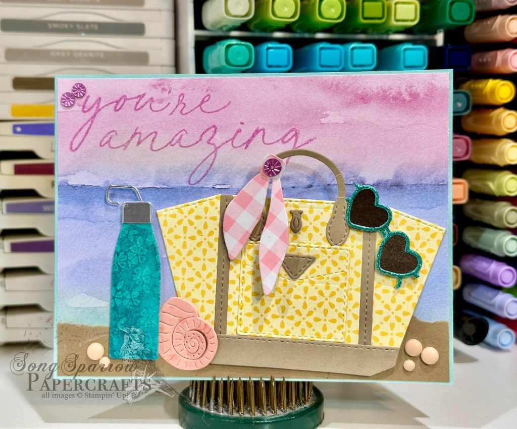
I love this color palette of soft blue hues. We get started with a very neutral base of Basic White cardstock. We turn to the Florals in Bloom papers for our backdrop which we cut using the largest Textured Notes die. And then we follow it with a sheet of the Flower Garden foil and cut it with the next Textured Notes die. I love how the foil is just a tick darker than the striped pattern sheet underneath and how the cross-hatch pattern of the foil plays so well off the stripes below. I adhered the two layers together with dimensionals.
Next up, we work on our focal images. The stool and water jug are stamped onto sheets of the Country Woods woodgrain papers using the Country Flowers set and then diecut with their coordinating dies. The smaller flowers are cut from the Florals in Bloom paper using the coordinating Sweet Blooms die. I layered the stool and jug of flowers using varying layers of dimensionals on focal panel background. I used the scarf die from the Notes & Totes setto cut a gold accent ribbon for the water jug of flowers. I made a smaller handbag using the Notes & Totes bundle. I stamped the hibiscus pattern onto Pretty Peacock and then used the pocket die to cut it out. For the flap, I used the pocket die and cut just the top portion out of the Pretty Peacock Season of Elegance foiled paper. I fussy cut to clean it up and then adhered to the stamped layer. I cut the latch and handle from Crumb Cake cardstock, again using the Notes & Totes set, and adhered with glue dots. The purse is affixed next to the flowers with dimensionals.
The sentiment combines two stamps from the She’s the Greatest set and are stamped in Balmy Blue on white cardstock. I fussy cut the letters of MOM and then diecut a banner for love you using the Nested Essentials small banner die. I loved the look of them in the top corner and affixed them with dimensionals. I added adhesive hearts to finish of the sentiment and a few of the new In Color flat pearls around the flowers for a little touch of shine.
We’ll be closing out our series tomorrow with the last little bit of Mother’s Day inspiration. I hope you’ll drop by!
Product List![Basic White 8 1/2" X 11" Cardstock [ 166780 ]](https://assets1.tamsnetwork.com/images/EC042017NF/166780s.jpg "Basic White 8 1/2\" X 11\" Cardstock [ 166780 ]")
![Pretty Peacock 8-1/2" X 11" Cardstock [ 150880 ]](https://assets1.tamsnetwork.com/images/EC042017NF/150880s.jpg "Pretty Peacock 8-1/2\" X 11\" Cardstock [ 150880 ]")
![Crumb Cake 8-1/2" X 11" Cardstock [ 120953 ]](https://assets1.tamsnetwork.com/images/EC042017NF/120953s.jpg "Crumb Cake 8-1/2\" X 11\" Cardstock [ 120953 ]")
![Florals In Bloom 12" X 12" (30.5 X 30.5 Cm) Designer Series Paper [ 165175 ]](https://assets1.tamsnetwork.com/images/EC042017NF/165175s.jpg "Florals In Bloom 12\" X 12\" (30.5 X 30.5 Cm) Designer Series Paper [ 165175 ]")
![Flower Garden Foils 12" X 12" (30.5 X 30.5 Cm) Specialty Paper [ 165511 ]](https://assets1.tamsnetwork.com/images/EC042017NF/165511s.jpg "Flower Garden Foils 12\" X 12\" (30.5 X 30.5 Cm) Specialty Paper [ 165511 ]")
![Season Of Elegance 12" X 12" (30.5 X 30.5 Cm) Specialty Designer Series Paper [ 164144 ]](https://assets1.tamsnetwork.com/images/EC042017NF/164144s.jpg "Season Of Elegance 12\" X 12\" (30.5 X 30.5 Cm) Specialty Designer Series Paper [ 164144 ]")
![Country Woods 12" X 12" (30.5 X 30.5 Cm) Designer Series Paper [ 163393 ]](https://assets1.tamsnetwork.com/images/EC042017NF/163393s.jpg "Country Woods 12\" X 12\" (30.5 X 30.5 Cm) Designer Series Paper [ 163393 ]")
![Textured Metallic 12" X 12" (30.5 X 30.5 Cm) Specialty Paper [ 163772 ]](https://assets1.tamsnetwork.com/images/EC042017NF/163772s.jpg "Textured Metallic 12\" X 12\" (30.5 X 30.5 Cm) Specialty Paper [ 163772 ]")
![Country Flowers Bundle (English) [ 163411 ]](https://assets1.tamsnetwork.com/images/EC042017NF/163411s.jpg "Country Flowers Bundle (English) [ 163411 ]")
![Notes & Totes Bundle (English) [ 165241 ]](https://assets1.tamsnetwork.com/images/EC042017NF/165241s.jpg "Notes & Totes Bundle (English) [ 165241 ]")
![Balmy Blue Classic Stampin' Pad [ 147105 ]](https://assets1.tamsnetwork.com/images/EC042017NF/147105s.jpg "Balmy Blue Classic Stampin' Pad [ 147105 ]")
![Sweet Blooms Dies (English) [ 165186 ]](https://assets1.tamsnetwork.com/images/EC042017NF/165186s.jpg "Sweet Blooms Dies (English) [ 165186 ]")
![Textured Notes Dies [ 165555 ]](https://assets1.tamsnetwork.com/images/EC042017NF/165555s.jpg "Textured Notes Dies [ 165555 ]")
![Nested Essentials Dies [ 161597 ]](https://assets1.tamsnetwork.com/images/EC042017NF/161597s.jpg "Nested Essentials Dies [ 161597 ]")
![2025–2027 In Color™ Flat Pearls [ 165192 ]](https://assets1.tamsnetwork.com/images/EC042017NF/165192s.jpg "2025–2027 In Color™ Flat Pearls [ 165192 ]")
![Adhesive Backed Heart Sequins [ 164920 ]](https://assets1.tamsnetwork.com/images/EC042017NF/164920s.jpg "Adhesive Backed Heart Sequins [ 164920 ]")
![Mini Stampin' Dimensionals [ 144108 ]](https://assets1.tamsnetwork.com/images/EC042017NF/144108s.jpg "Mini Stampin' Dimensionals [ 144108 ]")

![Timeless Plaid 6" X 6" (15.2 X 15.2 Cm) Designer Series Paper [ 164678 ]](https://assets1.tamsnetwork.com/images/EC042017NF/164678s.jpg "Timeless Plaid 6\" X 6\" (15.2 X 15.2 Cm) Designer Series Paper [ 164678 ]")
![Melon Mambo Classic Stampin' Pad [ 147051 ]](https://assets1.tamsnetwork.com/images/EC042017NF/147051s.jpg "Melon Mambo Classic Stampin' Pad [ 147051 ]")
![Pretty In Pink 3/8" (1 Cm) Bordered Ribbon [ 163784 ]](https://assets1.tamsnetwork.com/images/EC042017NF/163784s.jpg "Pretty In Pink 3/8\" (1 Cm) Bordered Ribbon [ 163784 ]")
![Tear & Tape Adhesive [ 154031 ]](https://assets1.tamsnetwork.com/images/EC042017NF/154031s.jpg "Tear & Tape Adhesive [ 154031 ]")
![Mini Glue Dots [ 103683 ]](https://assets1.tamsnetwork.com/images/EC042017NF/103683s.jpg "Mini Glue Dots [ 103683 ]")

![Flirty Flamingo 8-1/2" X 11" Cardstock [ 141416 ]](https://assets1.tamsnetwork.com/images/EC042017NF/141416s.jpg "Flirty Flamingo 8-1/2\" X 11\" Cardstock [ 141416 ]")
![Vellum 8-1/2" X 11" Cardstock [ 101856 ]](https://assets1.tamsnetwork.com/images/EC042017NF/101856s.jpg "Vellum 8-1/2\" X 11\" Cardstock [ 101856 ]")
![With You In Mind Photopolymer Stamp Set (English) [ 164747 ]](https://assets1.tamsnetwork.com/images/EC042017NF/164747s.jpg "With You In Mind Photopolymer Stamp Set (English) [ 164747 ]")
![She's The Greatest Photopolymer Stamp Set (English) [ 165439 ]](https://assets1.tamsnetwork.com/images/EC042017NF/165439s.jpg "She's The Greatest Photopolymer Stamp Set (English) [ 165439 ]")
![Spotlight On Nature Dies [ 163580 ]](https://assets1.tamsnetwork.com/images/EC042017NF/163580s.jpg "Spotlight On Nature Dies [ 163580 ]")
![Flirty Flamingo Classic Stampin' Pad [ 147052 ]](https://assets1.tamsnetwork.com/images/EC042017NF/147052s.jpg "Flirty Flamingo Classic Stampin' Pad [ 147052 ]")
![Poppy Parade Classic Stampin' Pad [ 147050 ]](https://assets1.tamsnetwork.com/images/EC042017NF/147050s.jpg "Poppy Parade Classic Stampin' Pad [ 147050 ]")
![Basics Wow! Embossing Powder [ 165679 ]](https://assets1.tamsnetwork.com/images/EC042017NF/165679s.jpg "Basics Wow! Embossing Powder [ 165679 ]")
![Gold Striped 3/8" (1 Cm) Mesh Ribbon [ 165599 ]](https://assets1.tamsnetwork.com/images/EC042017NF/165599s.jpg "Gold Striped 3/8\" (1 Cm) Mesh Ribbon [ 165599 ]")
![Iridescent Faceted Gems [ 163368 ]](https://assets1.tamsnetwork.com/images/EC042017NF/163368s.jpg "Iridescent Faceted Gems [ 163368 ]")
![Stampin' Dimensionals [ 104430 ]](https://assets1.tamsnetwork.com/images/EC042017NF/104430s.jpg "Stampin' Dimensionals [ 104430 ]")


![Gray Granite 8-1/2" X 11" Cardstock [ 146983 ]](https://assets1.tamsnetwork.com/images/EC042017NF/146983s.jpg "Gray Granite 8-1/2\" X 11\" Cardstock [ 146983 ]")
![Misty Moonlight 8-1/2" X 11" Cardstock [ 153081 ]](https://assets1.tamsnetwork.com/images/EC042017NF/153081s.jpg "Misty Moonlight 8-1/2\" X 11\" Cardstock [ 153081 ]")
![Nature's Sweetness 12" X 12" (30.5 X 30.5 Cm) Specialty Designer Series Paper [ 162616 ]](https://assets1.tamsnetwork.com/images/EC042017NF/162616s.jpg "Nature's Sweetness 12\" X 12\" (30.5 X 30.5 Cm) Specialty Designer Series Paper [ 162616 ]")
![Gray Granite Classic Stampin' Pad [ 147118 ]](https://assets1.tamsnetwork.com/images/EC042017NF/147118s.jpg "Gray Granite Classic Stampin' Pad [ 147118 ]")
![Versamark Pad [ 102283 ]](https://assets1.tamsnetwork.com/images/EC042017NF/102283s.jpg "Versamark Pad [ 102283 ]")
![Calypso Coral Stampin' Blends Markers Combo Pack [ 144045 ] (Retired)](https://assets1.tamsnetwork.com/images/EC042017NF/144045s.jpg "Calypso Coral Stampin' Blends Markers Combo Pack [ 144045 ] (Retired)")
![Pretty In Pink Stampin’ Blends Combo Pack [ 163824 ]](https://assets1.tamsnetwork.com/images/EC042017NF/163824s.jpg "Pretty In Pink Stampin’ Blends Combo Pack [ 163824 ]")
![Melon Mambo Stampin' Blends Combo Pack [ 153112 ]](https://assets1.tamsnetwork.com/images/EC042017NF/153112s.jpg "Melon Mambo Stampin' Blends Combo Pack [ 153112 ]")
![Moody Mauve Stampin’ Blends Combo Pack [ 161660 ]](https://assets1.tamsnetwork.com/images/EC042017NF/161660s.jpg "Moody Mauve Stampin’ Blends Combo Pack [ 161660 ]")
![Granny Apple Green Stampin' Blends Combo Pack [ 154885 ]](https://assets1.tamsnetwork.com/images/EC042017NF/154885s.jpg "Granny Apple Green Stampin' Blends Combo Pack [ 154885 ]")
![Soft Sea Foam Stampin' Blends Markers Combo Pack [ 148059 ] (Retired)](https://assets1.tamsnetwork.com/images/EC042017NF/148059s.jpg "Soft Sea Foam Stampin' Blends Markers Combo Pack [ 148059 ] (Retired)")
![Shaded Spruce Stampin' Blends Combo Pack [ 154903 ]](https://assets1.tamsnetwork.com/images/EC042017NF/154903s.jpg "Shaded Spruce Stampin' Blends Combo Pack [ 154903 ]")
![Stampin’ Blends Light Combo Pack [ 159465 ]](https://assets1.tamsnetwork.com/images/EC042017NF/159465s.jpg "Stampin’ Blends Light Combo Pack [ 159465 ]")
![Distressed Tile 3 D Embossing Folder [ 162189 ]](https://assets1.tamsnetwork.com/images/EC042017NF/162189s.jpg "Distressed Tile 3 D Embossing Folder [ 162189 ]")
![Gold & Silver 1/8" (3.2 Mm) Trim Combo Pack [ 161633 ]](https://assets1.tamsnetwork.com/images/EC042017NF/161633s.jpg "Gold & Silver 1/8\" (3.2 Mm) Trim Combo Pack [ 161633 ]")
![Drusy Adhesive Backed Embellishments [ 164223 ]](https://assets1.tamsnetwork.com/images/EC042017NF/164223s.jpg "Drusy Adhesive Backed Embellishments [ 164223 ]")
