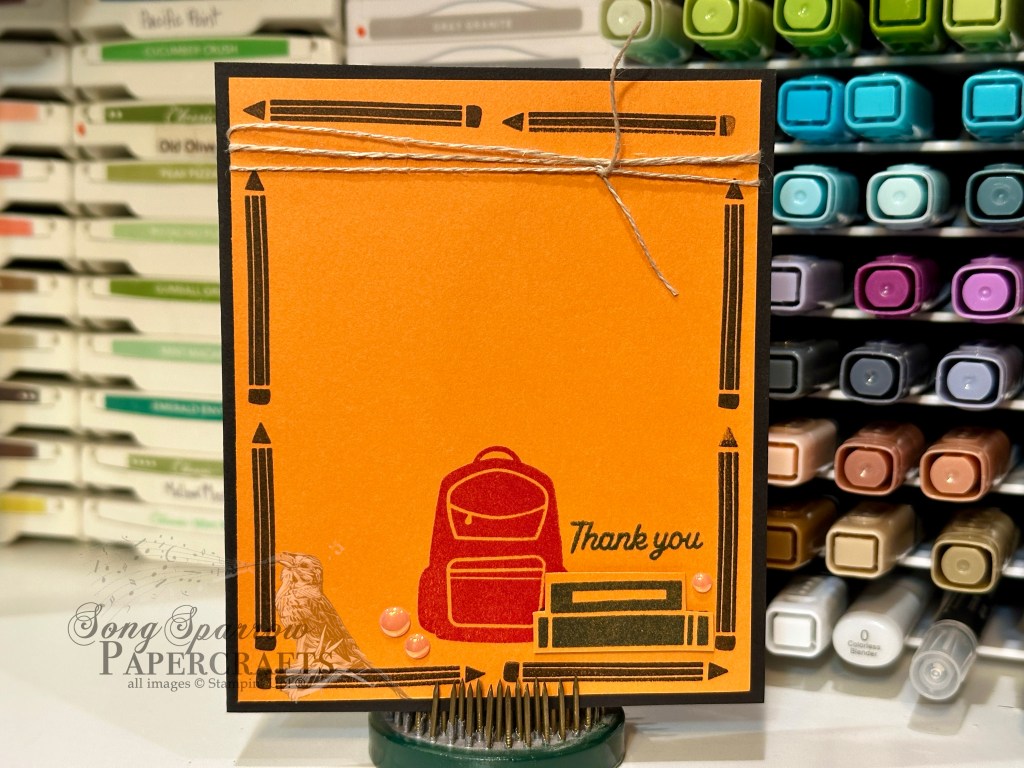
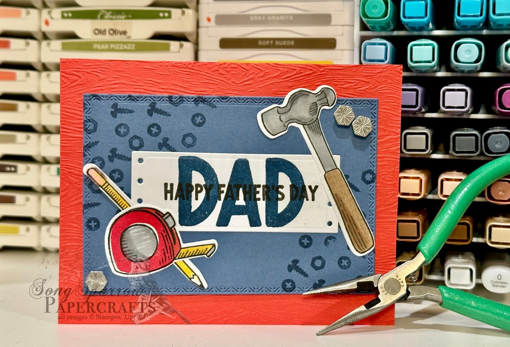
I hope you’re enjoying our design theme this week as we pull out our crafty stash to create some lovely cards to honor the special fellas in our lives. Today’s card is a combination of several products, including Trusty Tools and More Messages, to create this tribute to an incredible dad. This card uses a super fun color palette of Coastal Cabana, Peach Pie, and Strawberry Slush. Can you spot all of the colors?
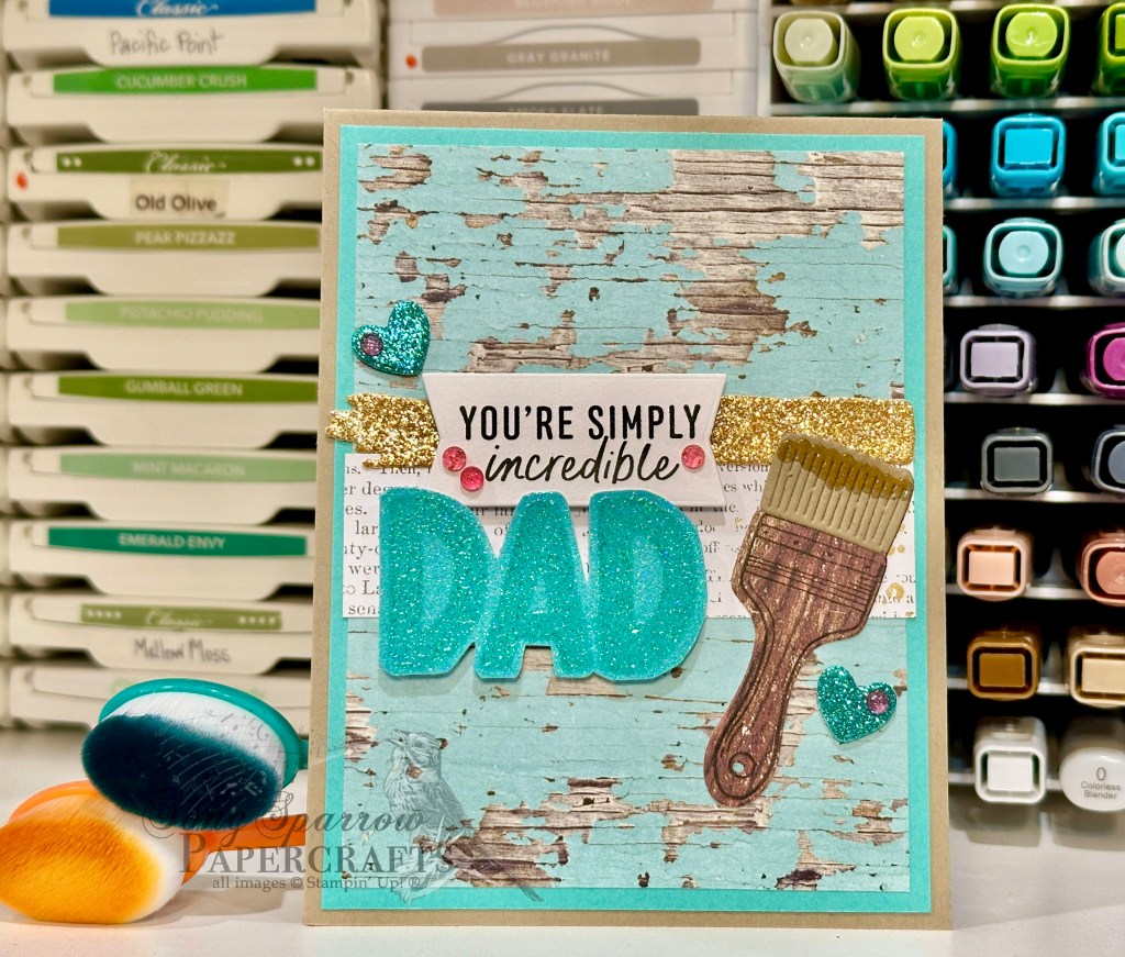
We get started with a base of Crumb Cake cardstock. Our focal panel begins with a sheet of Country Woods woodgrain paper and is matted in Coastal Cabana. A strip of the newsprint from Nature’s Sweetness adds a nice eye relief in the center of the panel to add our focal elements. The paintbrush is created using the Trusty Tools stamps and dies. I stamped the brush handle on Country Woods woodgrain. The bristles are cut from Crumb Cake. The dripping paint on the end is stamped in Peach Pie and then heat embossed with clear embossing powder to give the look of being wet. To give the look of a freshly painted stripe of paint, I cut Peach Pie glimmer paper with the Friends for Life smudge strip. It’s adhered just above the newsprint to create a nice border in the center of the card. The paintbrush is adhered directly to the focal panel.
The sentiment is a combination of the new More Messages you’re simply incredible sentiment, cut out with the coordinating die, and the DAD sentiment from Trusty Tools stamped in Coastal Cabana on pastel ombre glimmer paper, heat embossed with clear embossing powder, and then cut out with paper snips. The sentiment is layered and adhered with dimensionals to the left of the paintbrush. I used a few leftover hearts diecut from Summer Splash glimmer paper with the Sending Love dies to add some nice sparkly accents on either side of our focal section. The Strawberry Slush gems add a nice pop of color that stands out against the rest of the color palette and draws the eye across the focal section perfectly.
Product List![Basic White 8 1/2" X 11" Cardstock [ 166780 ]](https://assets1.tamsnetwork.com/images/EC042017NF/166780s.jpg "Basic White 8 1/2\" X 11\" Cardstock [ 166780 ]")
![2024–2026 In Color™ Glimmer 12" X 12" (30.5 X 30.5 Cm) Specialty Paper [ 163771 ]](https://assets1.tamsnetwork.com/images/EC042017NF/163771s.jpg "2024–2026 In Color™ Glimmer 12\" X 12\" (30.5 X 30.5 Cm) Specialty Paper [ 163771 ]")
![Pastel Ombre Glimmer 12" X 12" (30.5 X 30.5 Cm) Specialty Paper [ 164851 ]](https://assets1.tamsnetwork.com/images/EC042017NF/164851s.jpg "Pastel Ombre Glimmer 12\" X 12\" (30.5 X 30.5 Cm) Specialty Paper [ 164851 ]")
![Country Woods 12" X 12" (30.5 X 30.5 Cm) Designer Series Paper [ 163393 ]](https://assets1.tamsnetwork.com/images/EC042017NF/163393s.jpg "Country Woods 12\" X 12\" (30.5 X 30.5 Cm) Designer Series Paper [ 163393 ]")
![Nature's Sweetness 12" X 12" (30.5 X 30.5 Cm) Specialty Designer Series Paper [ 162616 ]](https://assets1.tamsnetwork.com/images/EC042017NF/162616s.jpg "Nature's Sweetness 12\" X 12\" (30.5 X 30.5 Cm) Specialty Designer Series Paper [ 162616 ]")
![Trusty Tools Photopolymer Stamp Set (English) [ 163274 ]](https://assets1.tamsnetwork.com/images/EC042017NF/163274s.jpg "Trusty Tools Photopolymer Stamp Set (English) [ 163274 ]")
![Trusty Tools Dies [ 162722 ]](https://assets1.tamsnetwork.com/images/EC042017NF/162722s.jpg "Trusty Tools Dies [ 162722 ]")
![More Messages Bundle (English) [ 165473 ]](https://assets1.tamsnetwork.com/images/EC042017NF/165473s.jpg "More Messages Bundle (English) [ 165473 ]")
![Sending Love Dies [ 162879 ]](https://assets1.tamsnetwork.com/images/EC042017NF/162879s.jpg "Sending Love Dies [ 162879 ]")
![Friends For Life Dies (English) [ 163364 ]](https://assets1.tamsnetwork.com/images/EC042017NF/163364s.jpg "Friends For Life Dies (English) [ 163364 ]")
![Peach Pie Classic Stampin Pad [ 163810 ]](https://assets1.tamsnetwork.com/images/EC042017NF/163810s.jpg "Peach Pie Classic Stampin Pad [ 163810 ]")
![Jet Black Stāzon Ink Pad [ 101406 ]](https://assets1.tamsnetwork.com/images/EC042017NF/101406s.jpg "Jet Black Stāzon Ink Pad [ 101406 ]")
![Coastal Cabana Classic Stampin' Pad [ 147097 ]](https://assets1.tamsnetwork.com/images/EC042017NF/147097s.jpg "Coastal Cabana Classic Stampin' Pad [ 147097 ]")
![Basics Wow! Embossing Powder [ 165679 ]](https://assets1.tamsnetwork.com/images/EC042017NF/165679s.jpg "Basics Wow! Embossing Powder [ 165679 ]")
![Strawberry Slush & Pretty In Pink Gems [ 165615 ]](https://assets1.tamsnetwork.com/images/EC042017NF/165615s.jpg "Strawberry Slush & Pretty In Pink Gems [ 165615 ]")
![Mini Stampin' Dimensionals [ 144108 ]](https://assets1.tamsnetwork.com/images/EC042017NF/144108s.jpg "Mini Stampin' Dimensionals [ 144108 ]")

![Crumb Cake 8-1/2" X 11" Cardstock [ 120953 ]](https://assets1.tamsnetwork.com/images/EC042017NF/120953s.jpg "Crumb Cake 8-1/2\" X 11\" Cardstock [ 120953 ]")
![Mossy Meadow 8-1/2" X 11" Cardstock [ 133676 ]](https://assets1.tamsnetwork.com/images/EC042017NF/133676s.jpg "Mossy Meadow 8-1/2\" X 11\" Cardstock [ 133676 ]")
![Shaded Spruce 8-1/2" X 11" Cardstock [ 146981 ]](https://assets1.tamsnetwork.com/images/EC042017NF/146981s.jpg "Shaded Spruce 8-1/2\" X 11\" Cardstock [ 146981 ]")
![Very Vanilla 8 1/2" X 11" Cardstock [ 166784 ]](https://assets1.tamsnetwork.com/images/EC042017NF/166784s.jpg "Very Vanilla 8 1/2\" X 11\" Cardstock [ 166784 ]")
![Three Color Glimmer 12" X 12" (30.5 X 30.5 Cm) Specialty Paper [ 162813 ]](https://assets1.tamsnetwork.com/images/EC042017NF/162813s.jpg "Three Color Glimmer 12\" X 12\" (30.5 X 30.5 Cm) Specialty Paper [ 162813 ]")
![Crushed Curry Classic Stampin' Pad [ 147087 ]](https://assets1.tamsnetwork.com/images/EC042017NF/147087s.jpg "Crushed Curry Classic Stampin' Pad [ 147087 ]")
![Pumpkin Pie Classic Stampin' Pad [ 147086 ]](https://assets1.tamsnetwork.com/images/EC042017NF/147086s.jpg "Pumpkin Pie Classic Stampin' Pad [ 147086 ]")
![Flirty Flamingo Classic Stampin' Pad [ 147052 ]](https://assets1.tamsnetwork.com/images/EC042017NF/147052s.jpg "Flirty Flamingo Classic Stampin' Pad [ 147052 ]")
![Textured Notes Dies [ 165555 ]](https://assets1.tamsnetwork.com/images/EC042017NF/165555s.jpg "Textured Notes Dies [ 165555 ]")
![Nested Essentials Dies [ 161597 ]](https://assets1.tamsnetwork.com/images/EC042017NF/161597s.jpg "Nested Essentials Dies [ 161597 ]")
![Scenic Adventure Bundle (English) [ 165468 ]](https://assets1.tamsnetwork.com/images/EC042017NF/165468s.jpg "Scenic Adventure Bundle (English) [ 165468 ]")
![He's The Greatest Photopolymer Stamp Set (English) [ 165684 ]](https://assets1.tamsnetwork.com/images/EC042017NF/165684s.jpg "He's The Greatest Photopolymer Stamp Set (English) [ 165684 ]")
![Versamark Pad [ 102283 ]](https://assets1.tamsnetwork.com/images/EC042017NF/102283s.jpg "Versamark Pad [ 102283 ]")
![Metallics Wow! Embossing Powder [ 165678 ]](https://assets1.tamsnetwork.com/images/EC042017NF/165678s.jpg "Metallics Wow! Embossing Powder [ 165678 ]")
![2025–2027 In Color™ Flat Pearls [ 165192 ]](https://assets1.tamsnetwork.com/images/EC042017NF/165192s.jpg "2025–2027 In Color™ Flat Pearls [ 165192 ]")
![Riverside Irregular Pearls [ 164937 ]](https://assets1.tamsnetwork.com/images/EC042017NF/164937s.jpg "Riverside Irregular Pearls [ 164937 ]")
![Linen Thread [ 104199 ]](https://assets1.tamsnetwork.com/images/EC042017NF/104199s.jpg "Linen Thread [ 104199 ]")
![Clear Wink Of Stella Glitter Brush [ 141897 ]](https://assets1.tamsnetwork.com/images/EC042017NF/141897s.jpg "Clear Wink Of Stella Glitter Brush [ 141897 ]")
![Misty Moonlight 8-1/2" X 11" Cardstock [ 153081 ]](https://assets1.tamsnetwork.com/images/EC042017NF/153081s.jpg "Misty Moonlight 8-1/2\" X 11\" Cardstock [ 153081 ]")
![Timeless Plaid 6" X 6" (15.2 X 15.2 Cm) Designer Series Paper [ 164678 ]](https://assets1.tamsnetwork.com/images/EC042017NF/164678s.jpg "Timeless Plaid 6\" X 6\" (15.2 X 15.2 Cm) Designer Series Paper [ 164678 ]")
![Countryside Corners Dies [ 161471 ]](https://assets1.tamsnetwork.com/images/EC042017NF/161471s.jpg "Countryside Corners Dies [ 161471 ]")
![Notes & Totes Dies [ 165240 ]](https://assets1.tamsnetwork.com/images/EC042017NF/165240s.jpg "Notes & Totes Dies [ 165240 ]")
![She's The Greatest Photopolymer Stamp Set (English) [ 165439 ]](https://assets1.tamsnetwork.com/images/EC042017NF/165439s.jpg "She's The Greatest Photopolymer Stamp Set (English) [ 165439 ]")
![Misty Moonlight Classic Stampin' Pad [ 153118 ]](https://assets1.tamsnetwork.com/images/EC042017NF/153118s.jpg "Misty Moonlight Classic Stampin' Pad [ 153118 ]")
![Natural Tones Linen Thread [ 164071 ]](https://assets1.tamsnetwork.com/images/EC042017NF/164071s.jpg "Natural Tones Linen Thread [ 164071 ]")
![Adhesive Backed Heart Sequins [ 164920 ]](https://assets1.tamsnetwork.com/images/EC042017NF/164920s.jpg "Adhesive Backed Heart Sequins [ 164920 ]")
![Faceted Gems Trio Pack [ 162148 ]](https://assets1.tamsnetwork.com/images/EC042017NF/162148s.jpg "Faceted Gems Trio Pack [ 162148 ]")
![Silver Foil 12" X 12" (30.5 X 30.5 Cm) Specialty Pack [ 163096 ]](https://assets1.tamsnetwork.com/images/EC042017NF/163096s.jpg "Silver Foil 12\" X 12\" (30.5 X 30.5 Cm) Specialty Pack [ 163096 ]")
![Berry Burst, Old Olive & White 12" X 12" (30.5 X 30.5 Cm) Glimmer Specialty Paper [ 163769 ]](https://assets1.tamsnetwork.com/images/EC042017NF/163769s.jpg "Berry Burst, Old Olive & White 12\" X 12\" (30.5 X 30.5 Cm) Glimmer Specialty Paper [ 163769 ]")
![Festive 12" X 12" (30.5 X 30.5 Cm) Glimmer Paper [ 164106 ]](https://assets1.tamsnetwork.com/images/EC042017NF/164106s.jpg "Festive 12\" X 12\" (30.5 X 30.5 Cm) Glimmer Paper [ 164106 ]")
![Gone Fishing Dies [ 161541 ]](https://assets1.tamsnetwork.com/images/EC042017NF/161541s.jpg "Gone Fishing Dies [ 161541 ]")
![Gone Fishing Photopolymer Stamp Set (English) [ 161535 ]](https://assets1.tamsnetwork.com/images/EC042017NF/161535s.jpg "Gone Fishing Photopolymer Stamp Set (English) [ 161535 ]")
![Lost Lagoon Soft Cording [ 164938 ]](https://assets1.tamsnetwork.com/images/EC042017NF/164938s.jpg "Lost Lagoon Soft Cording [ 164938 ]")
![Industrial Trinkets [ 163450 ]](https://assets1.tamsnetwork.com/images/EC042017NF/163450s.jpg "Industrial Trinkets [ 163450 ]")
![Mini Glue Dots [ 103683 ]](https://assets1.tamsnetwork.com/images/EC042017NF/103683s.jpg "Mini Glue Dots [ 103683 ]")
![Foam Adhesive Strips [ 141825 ]](https://assets1.tamsnetwork.com/images/EC042017NF/141825s.jpg "Foam Adhesive Strips [ 141825 ]")
![Poppy Parade 8-1/2" X 11" Cardstock [ 119793 ]](https://assets1.tamsnetwork.com/images/EC042017NF/119793s.jpg "Poppy Parade 8-1/2\" X 11\" Cardstock [ 119793 ]")
![Trusty Tools Bundle (English) [ 162723 ]](https://assets1.tamsnetwork.com/images/EC042017NF/162723s.jpg "Trusty Tools Bundle (English) [ 162723 ]")
![Timber 3 D Embossing Folder [ 163094 ]](https://assets1.tamsnetwork.com/images/EC042017NF/163094s.jpg "Timber 3 D Embossing Folder [ 163094 ]")
![Poppy Parade Classic Stampin' Pad [ 147050 ]](https://assets1.tamsnetwork.com/images/EC042017NF/147050s.jpg "Poppy Parade Classic Stampin' Pad [ 147050 ]")
![Gray Granite Stampin' Blends Combo Pack [ 154886 ]](https://assets1.tamsnetwork.com/images/EC042017NF/154886s.jpg "Gray Granite Stampin' Blends Combo Pack [ 154886 ]")
![Daffodil Delight Stampin' Blends Combo Pack [ 154883 ]](https://assets1.tamsnetwork.com/images/EC042017NF/154883s.jpg "Daffodil Delight Stampin' Blends Combo Pack [ 154883 ]")
![Crumb Cake Stampin' Blends Combo Pack [ 154882 ]](https://assets1.tamsnetwork.com/images/EC042017NF/154882s.jpg "Crumb Cake Stampin' Blends Combo Pack [ 154882 ]")
![Pretty In Pink Stampin’ Blends Combo Pack [ 163824 ]](https://assets1.tamsnetwork.com/images/EC042017NF/163824s.jpg "Pretty In Pink Stampin’ Blends Combo Pack [ 163824 ]")
![Stampin' Dimensionals [ 104430 ]](https://assets1.tamsnetwork.com/images/EC042017NF/104430s.jpg "Stampin' Dimensionals [ 104430 ]")
![Tear & Tape Adhesive [ 154031 ]](https://assets1.tamsnetwork.com/images/EC042017NF/154031s.jpg "Tear & Tape Adhesive [ 154031 ]")