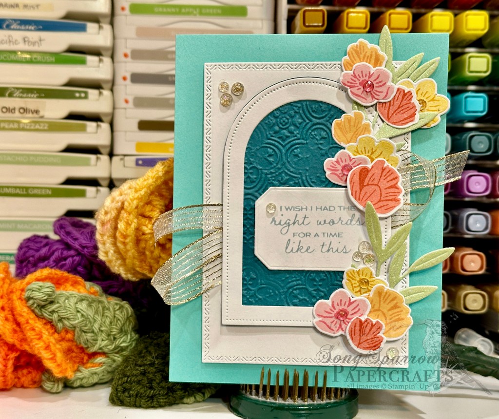
This week, we’re giving the elements in the Florals in Bloom suite a bit more love and combining them with other fun products in the stash. Today, we’re pairing up the Pretty Florals stamp set with the Thoughtful Designs specialty paper and Country Corners dies.

Our card begins with a base of Cloud Cover cardstock. A sheet of the blue Thoughtful Designs specialty paper serves as the dramatic backdrop for our focal panel. I love the intricate foiled detailing in this paper. I chose the darker end of the blue ombre sheet for the contrasting drama that it adds to this happy garden scene. Our focal panel begins with a base of Cloud Cover cardstock that is cut with the largest Country Corners die. A small stand of wildflowers stamped with the Pretty Florals stamps set adorn the panel in shades of pink, purple, and yellow. The sentiment from The Right Words stamp set is stamped in Secret Sea onto white cardstock and then cut with a combination of paper trimmer and paper snips to create a banner. I tied a length of white diagonal trim around the top of the panel and then adhered the sentiment panel over it with dimensionals. A bow of silver & white sheer ribbon over the center of the white trim adds the perfect touch of sparkle, along with a little Wink of Stella on the cone flowers, some gold foil gems over the purple flowers, and drusy embellishments scattered across the front.
Even cards that take a more serious tone can have touches of sparkle here and there to help invoke feelings of genuine care and heartfelt wishes.
Product List![Cloud Cover 8 1/2" X 11" Cardstock [ 165621 ]](https://assets1.tamsnetwork.com/images/EC042017NF/165621s.jpg "Cloud Cover 8 1/2\" X 11\" Cardstock [ 165621 ]")
![Thoughtful Designs 12" X 12" (30.5 X 30.5 Cm) Specialty Designer Series Paper [ 163317 ]](https://assets1.tamsnetwork.com/images/EC042017NF/163317s.jpg "Thoughtful Designs 12\" X 12\" (30.5 X 30.5 Cm) Specialty Designer Series Paper [ 163317 ]")
![Pretty Florals Photopolymer Stamp Set [ 165177 ]](https://assets1.tamsnetwork.com/images/EC042017NF/165177s.jpg "Pretty Florals Photopolymer Stamp Set [ 165177 ]")
![The Right Words Cling Stamp Set (English) [ 165316 ]](https://assets1.tamsnetwork.com/images/EC042017NF/165316s.jpg "The Right Words Cling Stamp Set (English) [ 165316 ]")
![Countryside Corners Dies [ 161471 ]](https://assets1.tamsnetwork.com/images/EC042017NF/161471s.jpg "Countryside Corners Dies [ 161471 ]")
![Secret Sea Classic Stampin' Pad [ 165285 ]](https://assets1.tamsnetwork.com/images/EC042017NF/165285s.jpg "Secret Sea Classic Stampin' Pad [ 165285 ]")
![Garden Green Classic Stampin' Pad [ 147089 ]](https://assets1.tamsnetwork.com/images/EC042017NF/147089s.jpg "Garden Green Classic Stampin' Pad [ 147089 ]")
![Strawberry Slush Classic Stampin' Pad [ 165286 ]](https://assets1.tamsnetwork.com/images/EC042017NF/165286s.jpg "Strawberry Slush Classic Stampin' Pad [ 165286 ]")
![Timid Tiger Classic Stampin' Pad [ 165278 ]](https://assets1.tamsnetwork.com/images/EC042017NF/165278s.jpg "Timid Tiger Classic Stampin' Pad [ 165278 ]")
![Fresh Freesia Classic Stampin' Pad [ 155611 ]](https://assets1.tamsnetwork.com/images/EC042017NF/155611s.jpg "Fresh Freesia Classic Stampin' Pad [ 155611 ]")
![Blackberry Bliss Classic Stampin' Pad [ 147092 ]](https://assets1.tamsnetwork.com/images/EC042017NF/147092s.jpg "Blackberry Bliss Classic Stampin' Pad [ 147092 ]")
![Crushed Curry Classic Stampin' Pad [ 147087 ]](https://assets1.tamsnetwork.com/images/EC042017NF/147087s.jpg "Crushed Curry Classic Stampin' Pad [ 147087 ]")
![Daffodil Delight Classic Stampin' Pad [ 147094 ]](https://assets1.tamsnetwork.com/images/EC042017NF/147094s.jpg "Daffodil Delight Classic Stampin' Pad [ 147094 ]")
![Clear Wink Of Stella Glitter Brush [ 141897 ]](https://assets1.tamsnetwork.com/images/EC042017NF/141897s.jpg "Clear Wink Of Stella Glitter Brush [ 141897 ]")
![Iridescent Foil Gems [ 162842 ]](https://assets1.tamsnetwork.com/images/EC042017NF/162842s.jpg "Iridescent Foil Gems [ 162842 ]")
![Drusy Adhesive Backed Embellishments [ 164223 ]](https://assets1.tamsnetwork.com/images/EC042017NF/164223s.jpg "Drusy Adhesive Backed Embellishments [ 164223 ]")
![Petal Pink & White 1/4" (6.4 Mm) Diagonal Trim Combo Pack [ 163417 ]](https://assets1.tamsnetwork.com/images/EC042017NF/163417s.jpg "Petal Pink & White 1/4\" (6.4 Mm) Diagonal Trim Combo Pack [ 163417 ]")
![Silver & White 1/2" (1.3 Cm) Sheer Ribbon [ 162149 ]](https://assets1.tamsnetwork.com/images/EC042017NF/162149s.jpg "Silver & White 1/2\" (1.3 Cm) Sheer Ribbon [ 162149 ]")
![Stampin' Dimensionals [ 104430 ]](https://assets1.tamsnetwork.com/images/EC042017NF/104430s.jpg "Stampin' Dimensionals [ 104430 ]")


![Highland Heather 8-1/2" X 11" Cardstock [ 146986 ]](https://assets1.tamsnetwork.com/images/EC042017NF/146986s.jpg "Highland Heather 8-1/2\" X 11\" Cardstock [ 146986 ]")
![Basic White 8 1/2" X 11" Cardstock [ 166780 ]](https://assets1.tamsnetwork.com/images/EC042017NF/166780s.jpg "Basic White 8 1/2\" X 11\" Cardstock [ 166780 ]")
![Florals In Bloom 12" X 12" (30.5 X 30.5 Cm) Designer Series Paper [ 165175 ]](https://assets1.tamsnetwork.com/images/EC042017NF/165175s.jpg "Florals In Bloom 12\" X 12\" (30.5 X 30.5 Cm) Designer Series Paper [ 165175 ]")
![Three Color Glimmer 12" X 12" (30.5 X 30.5 Cm) Specialty Paper [ 162813 ]](https://assets1.tamsnetwork.com/images/EC042017NF/162813s.jpg "Three Color Glimmer 12\" X 12\" (30.5 X 30.5 Cm) Specialty Paper [ 162813 ]")
![Pastel Ombre Glimmer 12" X 12" (30.5 X 30.5 Cm) Specialty Paper [ 164851 ]](https://assets1.tamsnetwork.com/images/EC042017NF/164851s.jpg "Pastel Ombre Glimmer 12\" X 12\" (30.5 X 30.5 Cm) Specialty Paper [ 164851 ]")
![Silver Foil 12" X 12" (30.5 X 30.5 Cm) Specialty Pack [ 163096 ]](https://assets1.tamsnetwork.com/images/EC042017NF/163096s.jpg "Silver Foil 12\" X 12\" (30.5 X 30.5 Cm) Specialty Pack [ 163096 ]")
![Gorgeous Grape Classic Stampin' Pad [ 147099 ]](https://assets1.tamsnetwork.com/images/EC042017NF/147099s.jpg "Gorgeous Grape Classic Stampin' Pad [ 147099 ]")
![Everyday Arches Dies [ 164629 ]](https://assets1.tamsnetwork.com/images/EC042017NF/164629s.jpg "Everyday Arches Dies [ 164629 ]")
![Petunia Pop 1/4" (6.4 Mm) Iridescent Ribbon [ 166203 ]](https://assets1.tamsnetwork.com/images/EC042017NF/166203s.jpg "Petunia Pop 1/4\" (6.4 Mm) Iridescent Ribbon [ 166203 ]")
![Purple Adhesive Backed Sequins [ 164970 ]](https://assets1.tamsnetwork.com/images/EC042017NF/164970s.jpg "Purple Adhesive Backed Sequins [ 164970 ]")
![Coastal Cabana 8-1/2" X 11" Cardstock [ 131297 ]](https://assets1.tamsnetwork.com/images/EC042017NF/131297s.jpg "Coastal Cabana 8-1/2\" X 11\" Cardstock [ 131297 ]")
![Pretty Peacock 8-1/2" X 11" Cardstock [ 150880 ]](https://assets1.tamsnetwork.com/images/EC042017NF/150880s.jpg "Pretty Peacock 8-1/2\" X 11\" Cardstock [ 150880 ]")
![Pretty Florals Bundle [ 165179 ]](https://assets1.tamsnetwork.com/images/EC042017NF/165179s.jpg "Pretty Florals Bundle [ 165179 ]")
![Textured Notes Dies [ 165555 ]](https://assets1.tamsnetwork.com/images/EC042017NF/165555s.jpg "Textured Notes Dies [ 165555 ]")
![Distressed Tile 3 D Embossing Folder [ 162189 ]](https://assets1.tamsnetwork.com/images/EC042017NF/162189s.jpg "Distressed Tile 3 D Embossing Folder [ 162189 ]")
![Pretty In Pink Classic Stampin Pad [ 163807 ]](https://assets1.tamsnetwork.com/images/EC042017NF/163807s.jpg "Pretty In Pink Classic Stampin Pad [ 163807 ]")
![Peach Pie Classic Stampin Pad [ 163810 ]](https://assets1.tamsnetwork.com/images/EC042017NF/163810s.jpg "Peach Pie Classic Stampin Pad [ 163810 ]")
![Flirty Flamingo Classic Stampin' Pad [ 147052 ]](https://assets1.tamsnetwork.com/images/EC042017NF/147052s.jpg "Flirty Flamingo Classic Stampin' Pad [ 147052 ]")
![Calypso Coral Classic Stampin' Pad [ 147101 ]](https://assets1.tamsnetwork.com/images/EC042017NF/147101s.jpg "Calypso Coral Classic Stampin' Pad [ 147101 ]")
![Cloud Cover Classic Stampin' Ink Refill [ 165279 ]](https://assets1.tamsnetwork.com/images/EC042017NF/165279s.jpg "Cloud Cover Classic Stampin' Ink Refill [ 165279 ]")
![Gold Striped 3/8" (1 Cm) Mesh Ribbon [ 165599 ]](https://assets1.tamsnetwork.com/images/EC042017NF/165599s.jpg "Gold Striped 3/8\" (1 Cm) Mesh Ribbon [ 165599 ]")
![Strawberry Slush & Pretty In Pink Gems [ 165615 ]](https://assets1.tamsnetwork.com/images/EC042017NF/165615s.jpg "Strawberry Slush & Pretty In Pink Gems [ 165615 ]")
![Mini Stampin' Dimensionals [ 144108 ]](https://assets1.tamsnetwork.com/images/EC042017NF/144108s.jpg "Mini Stampin' Dimensionals [ 144108 ]")
![Mini Glue Dots [ 103683 ]](https://assets1.tamsnetwork.com/images/EC042017NF/103683s.jpg "Mini Glue Dots [ 103683 ]")

![Basic Gray 8-1/2" X 11" Cardstock [ 121044 ]](https://assets1.tamsnetwork.com/images/EC042017NF/121044s.jpg "Basic Gray 8-1/2\" X 11\" Cardstock [ 121044 ]")
![Layered Thoughts Photopolymer Stamp Set (English) [ 165346 ]](https://assets1.tamsnetwork.com/images/EC042017NF/165346s.jpg "Layered Thoughts Photopolymer Stamp Set (English) [ 165346 ]")
![Natural Tones Linen Thread [ 164071 ]](https://assets1.tamsnetwork.com/images/EC042017NF/164071s.jpg "Natural Tones Linen Thread [ 164071 ]")
![Charming Shimmer Faceted Dots [ 166139 ]](https://assets1.tamsnetwork.com/images/EC042017NF/166139s.jpg "Charming Shimmer Faceted Dots [ 166139 ]")

![Peach Pie 8 1/2" X 11" Cardstock [ 163799 ]](https://assets1.tamsnetwork.com/images/EC042017NF/163799s.jpg "Peach Pie 8 1/2\" X 11\" Cardstock [ 163799 ]")
![2024–2026 In Color™ Glimmer 12" X 12" (30.5 X 30.5 Cm) Specialty Paper [ 163771 ]](https://assets1.tamsnetwork.com/images/EC042017NF/163771s.jpg "2024–2026 In Color™ Glimmer 12\" X 12\" (30.5 X 30.5 Cm) Specialty Paper [ 163771 ]")
![Label Me Grateful Cling Stamp Set (English) [ 166108 ]](https://assets1.tamsnetwork.com/images/EC042017NF/166108s.jpg "Label Me Grateful Cling Stamp Set (English) [ 166108 ]")
![Mixed Labels Dies [ 164652 ]](https://assets1.tamsnetwork.com/images/EC042017NF/164652s.jpg "Mixed Labels Dies [ 164652 ]")
![Riverside Irregular Pearls [ 164937 ]](https://assets1.tamsnetwork.com/images/EC042017NF/164937s.jpg "Riverside Irregular Pearls [ 164937 ]")
![2025–2027 In Color™ Flat Pearls [ 165192 ]](https://assets1.tamsnetwork.com/images/EC042017NF/165192s.jpg "2025–2027 In Color™ Flat Pearls [ 165192 ]")
![Summer Splash 3/8" (1 Cm) Bordered Ribbon [ 163786 ]](https://assets1.tamsnetwork.com/images/EC042017NF/163786s.jpg "Summer Splash 3/8\" (1 Cm) Bordered Ribbon [ 163786 ]")


![Misty Moonlight 8-1/2" X 11" Cardstock [ 153081 ]](https://assets1.tamsnetwork.com/images/EC042017NF/153081s.jpg "Misty Moonlight 8-1/2\" X 11\" Cardstock [ 153081 ]")
![Mossy Meadow 8-1/2" X 11" Cardstock [ 133676 ]](https://assets1.tamsnetwork.com/images/EC042017NF/133676s.jpg "Mossy Meadow 8-1/2\" X 11\" Cardstock [ 133676 ]")
![Berry Burst, Old Olive & White 12" X 12" (30.5 X 30.5 Cm) Glimmer Specialty Paper [ 163769 ]](https://assets1.tamsnetwork.com/images/EC042017NF/163769s.jpg "Berry Burst, Old Olive & White 12\" X 12\" (30.5 X 30.5 Cm) Glimmer Specialty Paper [ 163769 ]")
![Versamark Pad [ 102283 ]](https://assets1.tamsnetwork.com/images/EC042017NF/102283s.jpg "Versamark Pad [ 102283 ]")
![Basics Wow! Embossing Powder [ 165679 ]](https://assets1.tamsnetwork.com/images/EC042017NF/165679s.jpg "Basics Wow! Embossing Powder [ 165679 ]")
![Label Me Grateful Bundle (English) [ 166112 ]](https://assets1.tamsnetwork.com/images/EC042017NF/166112s.jpg "Label Me Grateful Bundle (English) [ 166112 ]")
![Country Flowers Dies [ 163410 ]](https://assets1.tamsnetwork.com/images/EC042017NF/163410s.jpg "Country Flowers Dies [ 163410 ]")

![Spooky Sweet 12" X 12" (30.5 X 30.5 Cm) Specialty Designer Series Paper [ 166191 ]](https://assets1.tamsnetwork.com/images/EC042017NF/166191s.jpg "Spooky Sweet 12\" X 12\" (30.5 X 30.5 Cm) Specialty Designer Series Paper [ 166191 ]")
![Purple Fine Shimmer Gems [ 162611 ]](https://assets1.tamsnetwork.com/images/EC042017NF/162611s.jpg "Purple Fine Shimmer Gems [ 162611 ]")
![Rhinestone Basic Jewels [ 144220 ]](https://assets1.tamsnetwork.com/images/EC042017NF/144220s.jpg "Rhinestone Basic Jewels [ 144220 ]")

![Basic Black 8-1/2" X 11" Cardstock [ 121045 ]](https://assets1.tamsnetwork.com/images/EC042017NF/121045s.jpg "Basic Black 8-1/2\" X 11\" Cardstock [ 121045 ]")
![Shimmer Star Foam Stickers [ 166202 ]](https://assets1.tamsnetwork.com/images/EC042017NF/166202s.jpg "Shimmer Star Foam Stickers [ 166202 ]")

![Crumb Cake 8-1/2" X 11" Cardstock [ 120953 ]](https://assets1.tamsnetwork.com/images/EC042017NF/120953s.jpg "Crumb Cake 8-1/2\" X 11\" Cardstock [ 120953 ]")
![Timeless Plaid 6" X 6" (15.2 X 15.2 Cm) Designer Series Paper [ 164678 ]](https://assets1.tamsnetwork.com/images/EC042017NF/164678s.jpg "Timeless Plaid 6\" X 6\" (15.2 X 15.2 Cm) Designer Series Paper [ 164678 ]")
![Flower Garden Foils 12" X 12" (30.5 X 30.5 Cm) Specialty Paper [ 165511 ]](https://assets1.tamsnetwork.com/images/EC042017NF/165511s.jpg "Flower Garden Foils 12\" X 12\" (30.5 X 30.5 Cm) Specialty Paper [ 165511 ]")
