This week we are working with the Perennial Postage stamps and dies. Does anyone collect stamps or enjoy looking through the Philatelic magazine from the U.S. Postal Service? I have enjoyed stamp designs since I was a little girl and even have a small collection from my childhood. Now I mostly enjoy the Philatelic as a purchaser and user of stamps more than as a collector. Today’s card is inspired by the sheets of stamps that formed one image, sort-of like a puzzle is made. Does anyone remember when the USPS used to offer those? They were my absolute favorite!
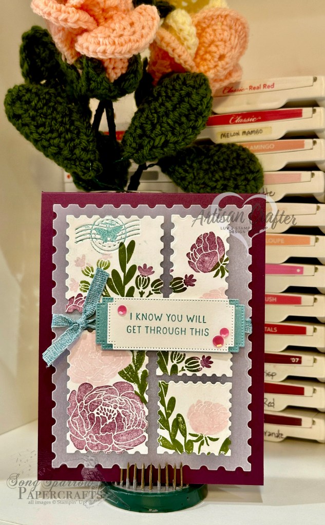
This card design sits atop a base of Blackberry Bliss cardstock. I chose to build my focal image on white cardstock using the Bold Bouquet stamp set. And just like those sheets once sold by the USPS, I chose to vary the stamp sizes and selected a variety of dies to accomplish this. Before stamping, I laid out dies to get the desired effect and have the totality of the image fit on the vellum mat, which is diecut with the largest Perennial Postage die. I ultimately stamped the images on each little stamp separately, but in hindsight, stamping the whole scene and then diecutting each stamp would have provided much better continuity in the scene on the whole sheet without all of the fuss of the tedious alignment that was required the way I did it! Lesson learned for the next one for sure!
I used Lost Lagoon as an accent color and built a visual triangle with it to help the sentiment stand out in the busy-ness of the stamp montage. I used the die extension method to make the Lost Lagoon mat behind the sentiment panel a little longer. Both the mat and sentiment panel are diecut using the Autumn Leaves dies. I used the debossing die included in the Perennial Postage set and carefully inked it with Lost Lagoon before I debossed my diecut stamp. The next time I do this I am going to apply a long strip of washi tape to the back of the die so that it is easier to place it on the cardstock for an impression. Hot tip from me to you….this will avoid inky fingers and ruining whatever element you’re trying to deboss!
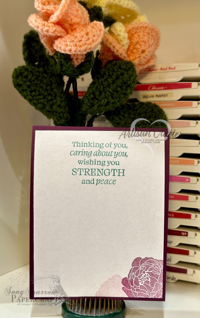
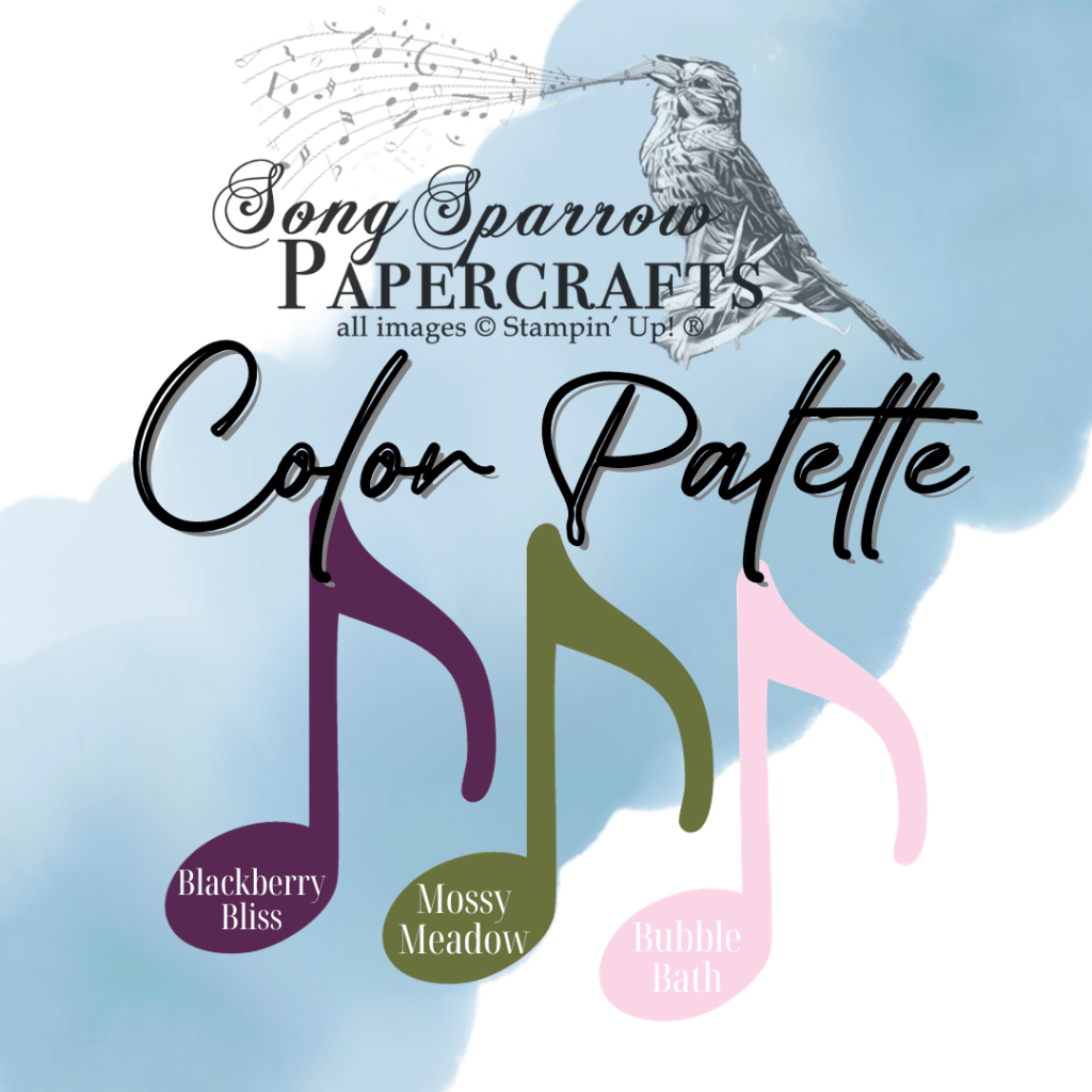
I wanted a bold but soft color palette for this sympathy card. So I started with Blackberry Bliss as the bold element. I softened things with a bit of Bubble Bath and added Mossy Meadow as an accent. I would love to see what you can do with this color palette, if you’re up for the challenge. Simply post your designs over on Facebook or Instagram using the hashtag #SSP1Jan2024.
Interested in more inspiration for using the Perennial Postage bundle? Check out this week’s Terrific Tuesdays episode for more designs!
Products used in this design:
Blackberry Bliss, Basic White, vellum cardstock
Lost Lagoon soft shimmer paper
Perennial Postage, Bold Bouquet stamps
Perennial Postage, Autumn Leaves dies
Lost Lagoon bordered ribbon
Sequins trio
Dimensionals
Adhesives
All ads on this site are posted by WordPress. Song Sparrow Papercrafts is not responsible for ad content.
