Happy Monday, friends! We were traveling over the weekend for a family memorial service, so the weekend went by quickly. It was a beautiful service and it was wonderful to see everyone.
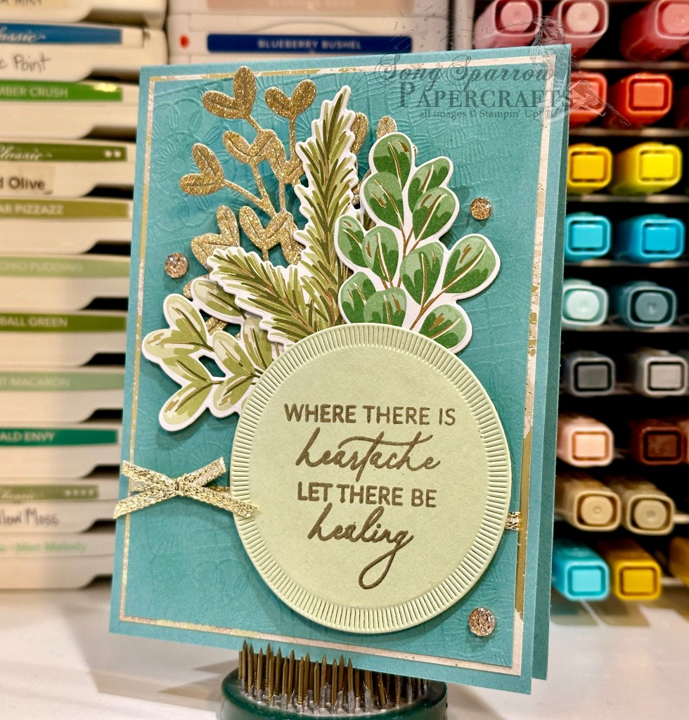
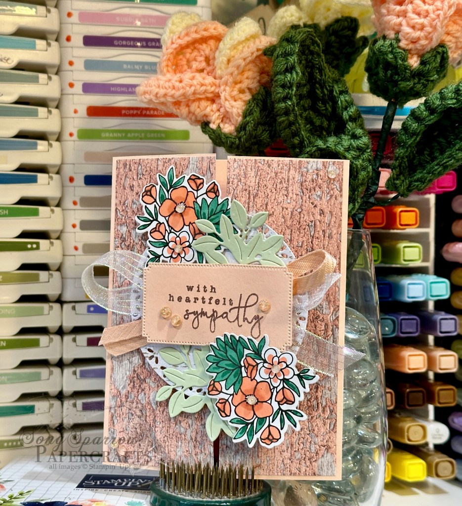
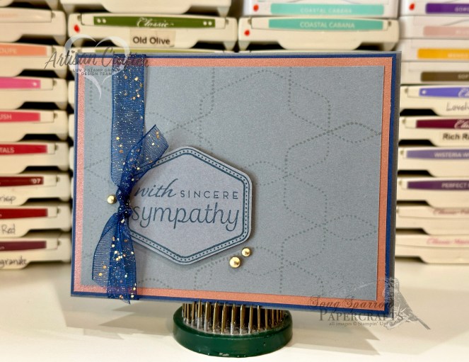
And honestly, this weekend’s activities spurred the idea for this week’s design theme centering on the new Prayers & Promises stamp set. This beautiful sentiment set can be used for a whole variety of cards — from sympathy to encouragement to recovery. There are so many ways to lift someone up with this set. Today, we’re pairing it with a whole collection of new products, including the Pleasant Patterns foiled paper, the Lovely Blossoms paper, and new embellishments.
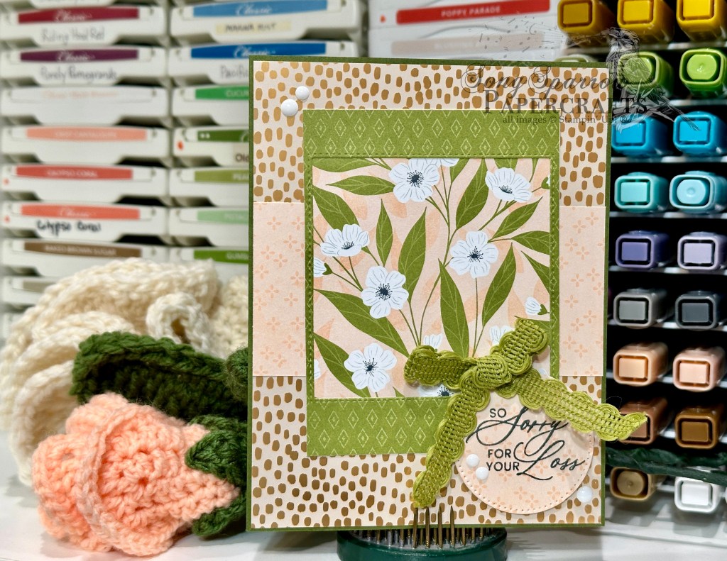
We get started with a base of Mossy Meadow cardstock, which pairs beautifully with the focal panel and gives grounding for the green accent color. The backdrop for our card front is the Peach Pie spotted sheet from the Pleasant Patterns paper pack. I loved the soft glimmer this panel provides and helps the focal panel pop. The focal panel itself is a combination of two of the ready-made elements from the Lovely Blossoms paper pack. I had the green panel left after removing a square from the center for another design and found that it made the perfect frame for the peachy floral & vine panel. A strip of the peachy eyelet-patterned paper from Lovely Blossoms gave the perfect eye relief in the background pattern, tying everything together. The sentiment panel is cut from the eyelet pattern using the Stylish Shapes dies and then the sentiment from the Prayers & Promises set is stamped in Secret Sea in the center and adhered in the corner with dimensionals. A bow of Old Olive rickrack adds a decorative touch of green and the white glossy dots give the perfect pop of shine to draw the eye across the full card front.
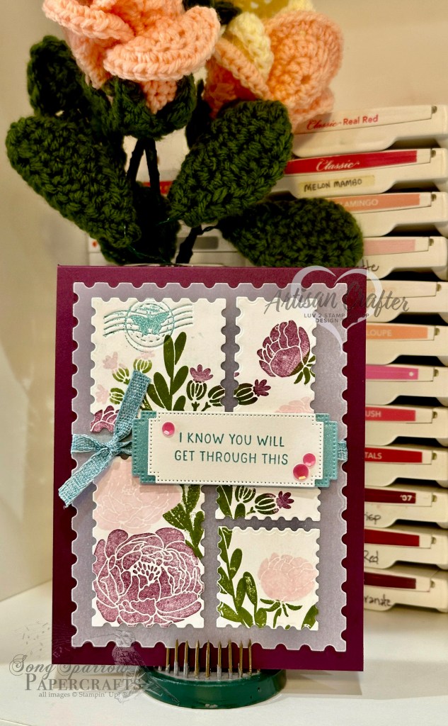
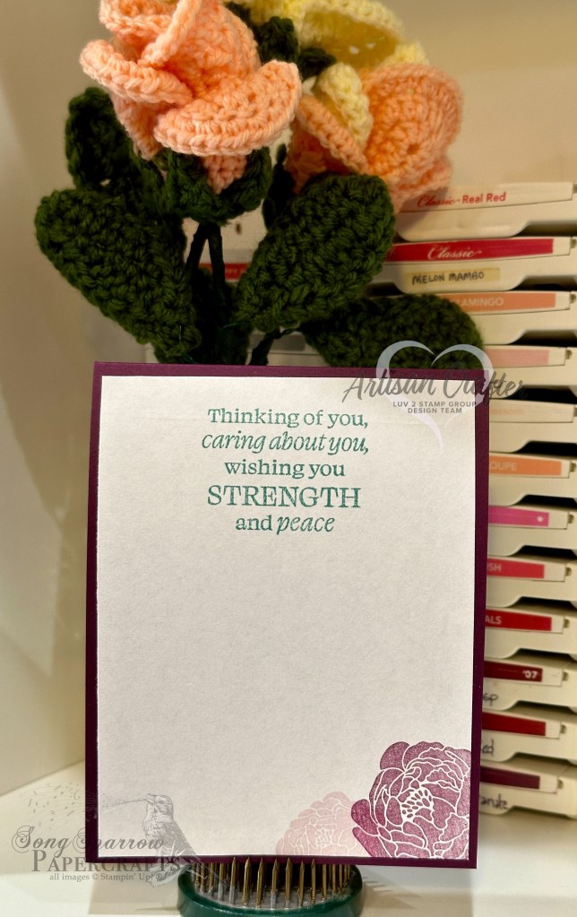
I hope you’ll drop in tomorrow as we pair this sentiment set with some of the newest SU! releases.
Product List![Mossy Meadow 8-1/2" X 11" Cardstock [ 133676 ]](https://assets1.tamsnetwork.com/images/EC042017NF/133676s.jpg "Mossy Meadow 8-1/2\" X 11\" Cardstock [ 133676 ]")
![Pleasant Patterns 12" X 12" (30.5 X 30.5 Cm) Specialty Designer Series Paper [ 166950 ]](https://assets1.tamsnetwork.com/images/EC042017NF/166950s.jpg "Pleasant Patterns 12\" X 12\" (30.5 X 30.5 Cm) Specialty Designer Series Paper [ 166950 ]")
![Lovely Blossoms 12" X 12" (30.5 X 30.5 Cm) Designer Series Paper [ 167168 ]](https://assets1.tamsnetwork.com/images/EC042017NF/167168s.jpg "Lovely Blossoms 12\" X 12\" (30.5 X 30.5 Cm) Designer Series Paper [ 167168 ]")
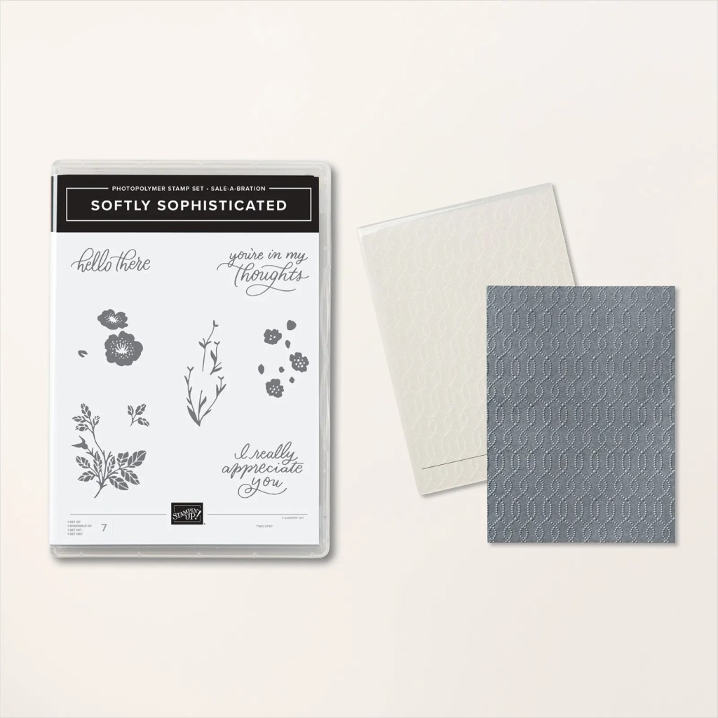
![Prayers & Promises Photopolymer Stamp Set (English) [ 167014 ]](https://assets1.tamsnetwork.com/images/EC042017NF/167014s.jpg "Prayers & Promises Photopolymer Stamp Set (English) [ 167014 ]")
![Stylish Shapes Dies [ 159183 ]](https://assets1.tamsnetwork.com/images/EC042017NF/159183s.jpg "Stylish Shapes Dies [ 159183 ]")
![Secret Sea Classic Stampin' Pad [ 165285 ]](https://assets1.tamsnetwork.com/images/EC042017NF/165285s.jpg "Secret Sea Classic Stampin' Pad [ 165285 ]")
![Old Olive 3/8" (1 Cm) Specialty Rickrack [ 167006 ]](https://assets1.tamsnetwork.com/images/EC042017NF/167006s.jpg "Old Olive 3/8\" (1 Cm) Specialty Rickrack [ 167006 ]")
![Moody Palette Glossy Dots [ 167180 ]](https://assets1.tamsnetwork.com/images/EC042017NF/167180s.jpg "Moody Palette Glossy Dots [ 167180 ]")
![Mini Stampin' Dimensionals [ 144108 ]](https://assets1.tamsnetwork.com/images/EC042017NF/144108s.jpg "Mini Stampin' Dimensionals [ 144108 ]")