Welcome to Monday! I hope everyone enjoyed a blessed and restful Easter weekend. While Holy Week is always busy in the life of a church singer, it’s still one of my favorite times of the liturgical year.
This week, we’re starting a brand new design series. We are all about the flowers this week. I don’t know about your area, but here in North Texas, the spring showers are certainly perking up all of the flowers that have been planted.
We’re starting off our design series this week with the Enduring Beauty bundle by Stampin’ Up! This bundle includes coordinating stamps, dies, and decorative masks. If you’ve been around a minute, you’ve heard me talk about decorative masks before. But for those of you who are new, I was a total decorative mask hater in the very beginning — just straight up refused to buy them or even try them. And in hindsight, I can’t give you a single good reason why (other than just plain stubbornness) because decorative masks make it SO easy to create beautiful colored images with terrific detail every single time.
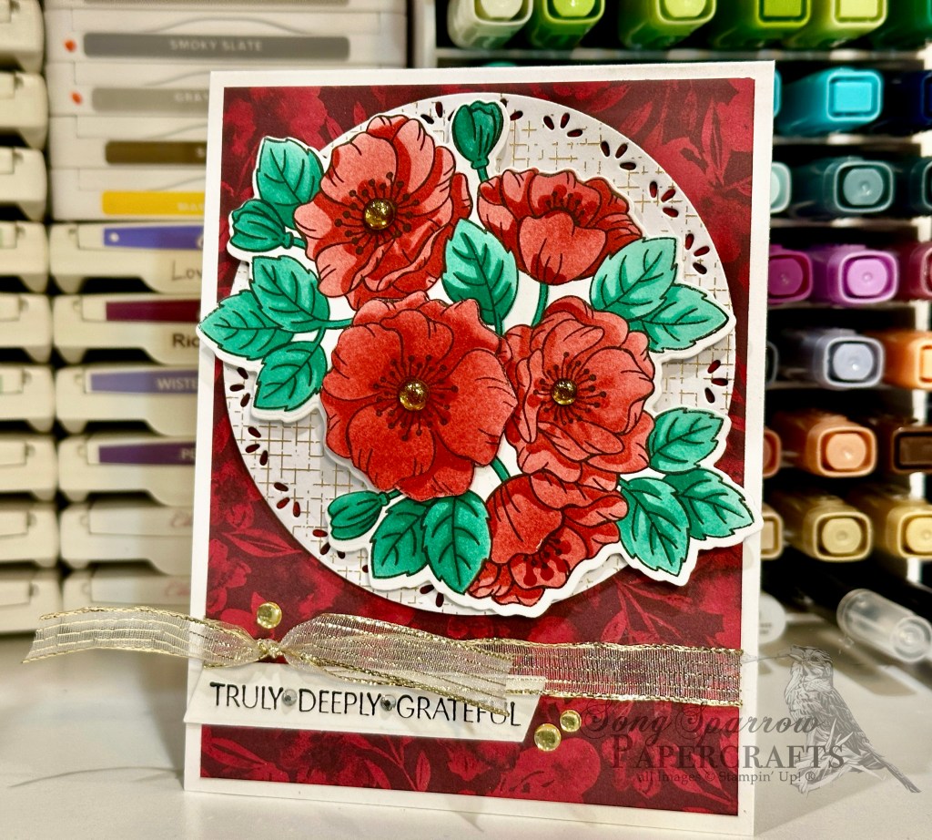
Today our card gets started with a base of white cardstock. I’m using a sheet of the retired designer series paper from the Regal Winter pack as the backdrop for our focal panel. I tied some gold stripe ribbon (coming soon!) around the bottom before adhering to the card base. The focal panel gets started with a circle base of Nature’s Sweetness paper diecut using one of the largest Spotlight on Nature dies. I stamped the focal image from the Enduring Beauty set in black on white cardstock . I also stamped the center portion of the florals a second time to be able to cut out a flower and pop it up for some realistic dimension to the flowers. I used the decorative masks to color the images with a combination of Real Red and Shaded Spruce. Hint: you don’t have to use different shades to create the darker detailed areas; use the same color for all of the subsequent layers of color and it will have the same effect as using a different shade. I cut out the full image with the coordinating die from the Enduring Beauty set and then used my paper snips to cut out the single flower that I adhered on top with dimensionals. I added gold textured dots as the flower centers. The full image is then adhered to the circle panel with dimensionals. The sentiment from the Hope You Know stamp set is stamped in black on white cardstock and then diecut with the Something Fancy angled banner die and adhered under the ribbon. I added a few rhinestones in between the words of the sentiment and some gold low profile dots around to draw the eye.
We’re going to continue our tiptoe through the garden tomorrow with one of the new Online Exclusive bundles. I hope you’ll drop by and check it out.
Product List![Basic White 8 1/2" X 11" Cardstock [ 166780 ]](https://assets1.tamsnetwork.com/images/EC042017NF/166780s.jpg "Basic White 8 1/2\" X 11\" Cardstock [ 166780 ]")
![Nature's Sweetness 12" X 12" (30.5 X 30.5 Cm) Specialty Designer Series Paper [ 162616 ]](https://assets1.tamsnetwork.com/images/EC042017NF/162616s.jpg "Nature's Sweetness 12\" X 12\" (30.5 X 30.5 Cm) Specialty Designer Series Paper [ 162616 ]")
![Regal Winter 12" X 12" (30.5 X 30.5 Cm) Designer Series Paper [ 164156 ]](https://assets1.tamsnetwork.com/images/EC042017NF/164156s.jpg "Regal Winter 12\" X 12\" (30.5 X 30.5 Cm) Designer Series Paper [ 164156 ]")
![Enduring Beauty Bundle (English) [ 162674 ]](https://assets1.tamsnetwork.com/images/EC042017NF/162674s.jpg "Enduring Beauty Bundle (English) [ 162674 ]")
![Hope You Know Cling Stamp Set (English) [ 161409 ]](https://assets1.tamsnetwork.com/images/EC042017NF/161409s.jpg "Hope You Know Cling Stamp Set (English) [ 161409 ]")
![Spotlight On Nature Dies [ 163580 ]](https://assets1.tamsnetwork.com/images/EC042017NF/163580s.jpg "Spotlight On Nature Dies [ 163580 ]")
![Something Fancy Dies [ 160424 ]](https://assets1.tamsnetwork.com/images/EC042017NF/160424s.jpg "Something Fancy Dies [ 160424 ]")
![Jet Black Stāzon Ink Pad [ 101406 ]](https://assets1.tamsnetwork.com/images/EC042017NF/101406s.jpg "Jet Black Stāzon Ink Pad [ 101406 ]")
![Real Red Classic Stampin' Pad [ 147084 ]](https://assets1.tamsnetwork.com/images/EC042017NF/147084s.jpg "Real Red Classic Stampin' Pad [ 147084 ]")
![Shaded Spruce Classic Stampin' Pad [ 147088 ]](https://assets1.tamsnetwork.com/images/EC042017NF/147088s.jpg "Shaded Spruce Classic Stampin' Pad [ 147088 ]")
![Gold Textured Adhesive Backed Dots [ 164027 ]](https://assets1.tamsnetwork.com/images/EC042017NF/164027s.jpg "Gold Textured Adhesive Backed Dots [ 164027 ]")
![Rhinestone Basic Jewels [ 144220 ]](https://assets1.tamsnetwork.com/images/EC042017NF/144220s.jpg "Rhinestone Basic Jewels [ 144220 ]")
![Low Profile Dots [ 164658 ]](https://assets1.tamsnetwork.com/images/EC042017NF/164658s.jpg "Low Profile Dots [ 164658 ]")
![Stampin' Dimensionals [ 104430 ]](https://assets1.tamsnetwork.com/images/EC042017NF/104430s.jpg "Stampin' Dimensionals [ 104430 ]")

![Azure Afternoon 8 1/2" X 11" Cardstock [ 161719 ]](https://assets1.tamsnetwork.com/images/EC042017NF/161719s.jpg "Azure Afternoon 8 1/2\" X 11\" Cardstock [ 161719 ]")
![Pretty In Pink 8 1/2" X 11" Cardstock [ 163793 ]](https://assets1.tamsnetwork.com/images/EC042017NF/163793s.jpg "Pretty In Pink 8 1/2\" X 11\" Cardstock [ 163793 ]")
![Everyday Skies 6" X 6" (15.2 X 15.2 Cm) Designer Series Paper [ 164622 ]](https://assets1.tamsnetwork.com/images/EC042017NF/164622s.jpg "Everyday Skies 6\" X 6\" (15.2 X 15.2 Cm) Designer Series Paper [ 164622 ]")
![Pastel Ombre Glimmer 12" X 12" (30.5 X 30.5 Cm) Specialty Paper [ 164851 ]](https://assets1.tamsnetwork.com/images/EC042017NF/164851s.jpg "Pastel Ombre Glimmer 12\" X 12\" (30.5 X 30.5 Cm) Specialty Paper [ 164851 ]")
![Silver Foil 12" X 12" (30.5 X 30.5 Cm) Specialty Pack [ 163096 ]](https://assets1.tamsnetwork.com/images/EC042017NF/163096s.jpg "Silver Foil 12\" X 12\" (30.5 X 30.5 Cm) Specialty Pack [ 163096 ]")
![Saying Hey Photopolymer Stamp Set (English) [ 163697 ]](https://assets1.tamsnetwork.com/images/EC042017NF/163697s.jpg "Saying Hey Photopolymer Stamp Set (English) [ 163697 ]")
![Balmy Blue Classic Stampin' Pad [ 147105 ]](https://assets1.tamsnetwork.com/images/EC042017NF/147105s.jpg "Balmy Blue Classic Stampin' Pad [ 147105 ]")
![Blueberry Bushel Classic Stampin' Pad [ 147138 ]](https://assets1.tamsnetwork.com/images/EC042017NF/147138s.jpg "Blueberry Bushel Classic Stampin' Pad [ 147138 ]")
![Heartfelt Hexagon Punch [ 162888 ]](https://assets1.tamsnetwork.com/images/EC042017NF/162888s.jpg "Heartfelt Hexagon Punch [ 162888 ]")
![Friends For Life Dies (English) [ 163364 ]](https://assets1.tamsnetwork.com/images/EC042017NF/163364s.jpg "Friends For Life Dies (English) [ 163364 ]")
![Inspiring Snapdragons Dies [ 163673 ]](https://assets1.tamsnetwork.com/images/EC042017NF/163673s.jpg "Inspiring Snapdragons Dies [ 163673 ]")
![Pretty In Pink 3/8" (1 Cm) Bordered Ribbon [ 163784 ]](https://assets1.tamsnetwork.com/images/EC042017NF/163784s.jpg "Pretty In Pink 3/8\" (1 Cm) Bordered Ribbon [ 163784 ]")
![Adhesive Backed Sequins Trio [ 161206 ]](https://assets1.tamsnetwork.com/images/EC042017NF/161206s.jpg "Adhesive Backed Sequins Trio [ 161206 ]")
![Mini Glue Dots [ 103683 ]](https://assets1.tamsnetwork.com/images/EC042017NF/103683s.jpg "Mini Glue Dots [ 103683 ]")
![Fine-Tip Glue Pen [ 138309 ]](https://assets1.tamsnetwork.com/images/EC042017NF/138309s.jpg "Fine-Tip Glue Pen [ 138309 ]")
![Fresh Freesia 8 1/2" X 11" Cardstock [ 155613 ]](https://assets1.tamsnetwork.com/images/EC042017NF/155613s.jpg "Fresh Freesia 8 1/2\" X 11\" Cardstock [ 155613 ]")
![Pool Party 8-1/2" X 11" Cardstock [ 122924 ]](https://assets1.tamsnetwork.com/images/EC042017NF/122924s.jpg "Pool Party 8-1/2\" X 11\" Cardstock [ 122924 ]")
![Old Olive 8-1/2" X 11" Cardstock [ 100702 ]](https://assets1.tamsnetwork.com/images/EC042017NF/100702s.jpg "Old Olive 8-1/2\" X 11\" Cardstock [ 100702 ]")
![Season Of Elegance 12" X 12" (30.5 X 30.5 Cm) Specialty Designer Series Paper [ 164144 ]](https://assets1.tamsnetwork.com/images/EC042017NF/164144s.jpg "Season Of Elegance 12\" X 12\" (30.5 X 30.5 Cm) Specialty Designer Series Paper [ 164144 ]")
![2024–2026 In Color™ Glimmer 12" X 12" (30.5 X 30.5 Cm) Specialty Paper [ 163771 ]](https://assets1.tamsnetwork.com/images/EC042017NF/163771s.jpg "2024–2026 In Color™ Glimmer 12\" X 12\" (30.5 X 30.5 Cm) Specialty Paper [ 163771 ]")
![Berry Burst, Old Olive & White 12" X 12" (30.5 X 30.5 Cm) Glimmer Specialty Paper [ 163769 ]](https://assets1.tamsnetwork.com/images/EC042017NF/163769s.jpg "Berry Burst, Old Olive & White 12\" X 12\" (30.5 X 30.5 Cm) Glimmer Specialty Paper [ 163769 ]")
![Three Color Glimmer 12" X 12" (30.5 X 30.5 Cm) Specialty Paper [ 162813 ]](https://assets1.tamsnetwork.com/images/EC042017NF/162813s.jpg "Three Color Glimmer 12\" X 12\" (30.5 X 30.5 Cm) Specialty Paper [ 162813 ]")
![Heartfelt Hellos Cling Stamp Set (English) [ 162964 ]](https://assets1.tamsnetwork.com/images/EC042017NF/162964s.jpg "Heartfelt Hellos Cling Stamp Set (English) [ 162964 ]")
![Fresh Freesia Classic Stampin' Pad [ 155611 ]](https://assets1.tamsnetwork.com/images/EC042017NF/155611s.jpg "Fresh Freesia Classic Stampin' Pad [ 155611 ]")
![Perennial Postage Dies [ 162607 ]](https://assets1.tamsnetwork.com/images/EC042017NF/162607s.jpg "Perennial Postage Dies [ 162607 ]")
![Sending Love Dies [ 162879 ]](https://assets1.tamsnetwork.com/images/EC042017NF/162879s.jpg "Sending Love Dies [ 162879 ]")
![Country Flowers Dies [ 163410 ]](https://assets1.tamsnetwork.com/images/EC042017NF/163410s.jpg "Country Flowers Dies [ 163410 ]")
![Mixed Labels Dies [ 164652 ]](https://assets1.tamsnetwork.com/images/EC042017NF/164652s.jpg "Mixed Labels Dies [ 164652 ]")
![Fresh Freesia 3/8" (1 Cm) Seam Binding Ribbon [ 164971 ]](https://assets1.tamsnetwork.com/images/EC042017NF/164971s.jpg "Fresh Freesia 3/8\" (1 Cm) Seam Binding Ribbon [ 164971 ]")
![Purple Fine Shimmer Gems [ 162611 ]](https://assets1.tamsnetwork.com/images/EC042017NF/162611s.jpg "Purple Fine Shimmer Gems [ 162611 ]")
![2024–2026 In Color™ Shimmer Gems [ 163781 ]](https://assets1.tamsnetwork.com/images/EC042017NF/163781s.jpg "2024–2026 In Color™ Shimmer Gems [ 163781 ]")
![Iridescent Faceted Gems [ 163368 ]](https://assets1.tamsnetwork.com/images/EC042017NF/163368s.jpg "Iridescent Faceted Gems [ 163368 ]")
![Purple Adhesive Backed Sequins [ 164970 ]](https://assets1.tamsnetwork.com/images/EC042017NF/164970s.jpg "Purple Adhesive Backed Sequins [ 164970 ]")
![Smoky Slate 8-1/2" X 11" Cardstock [ 131202 ]](https://assets1.tamsnetwork.com/images/EC042017NF/131202s.jpg "Smoky Slate 8-1/2\" X 11\" Cardstock [ 131202 ]")
![Mossy Meadow 8-1/2" X 11" Cardstock [ 133676 ]](https://assets1.tamsnetwork.com/images/EC042017NF/133676s.jpg "Mossy Meadow 8-1/2\" X 11\" Cardstock [ 133676 ]")
![Silver 12" X 12" (30.5 X 30.5 Cm) Foil Sheets [ 163387 ]](https://assets1.tamsnetwork.com/images/EC042017NF/163387s.jpg "Silver 12\" X 12\" (30.5 X 30.5 Cm) Foil Sheets [ 163387 ]")
![Painted Lavender Dies [ 162596 ]](https://assets1.tamsnetwork.com/images/EC042017NF/162596s.jpg "Painted Lavender Dies [ 162596 ]")
![Wanted To Say Dies [ 161594 ]](https://assets1.tamsnetwork.com/images/EC042017NF/161594s.jpg "Wanted To Say Dies [ 161594 ]")
![Fresh Freesia 1/8" (3.2 Mm) Faux Velvet Ribbon [ 165540 ]](https://assets1.tamsnetwork.com/images/EC042017NF/165540s.jpg "Fresh Freesia 1/8\" (3.2 Mm) Faux Velvet Ribbon [ 165540 ]")

![Basic Black 8-1/2" X 11" Cardstock [ 121045 ]](https://assets1.tamsnetwork.com/images/EC042017NF/121045s.jpg "Basic Black 8-1/2\" X 11\" Cardstock [ 121045 ]")
![Textured Metallic 12" X 12" (30.5 X 30.5 Cm) Specialty Paper [ 163772 ]](https://assets1.tamsnetwork.com/images/EC042017NF/163772s.jpg "Textured Metallic 12\" X 12\" (30.5 X 30.5 Cm) Specialty Paper [ 163772 ]")
![Bright Skies Dies [ 162793 ]](https://assets1.tamsnetwork.com/images/EC042017NF/162793s.jpg "Bright Skies Dies [ 162793 ]")
![Countryside Corners Dies [ 161471 ]](https://assets1.tamsnetwork.com/images/EC042017NF/161471s.jpg "Countryside Corners Dies [ 161471 ]")
![Take To The Sky Suite Collection (English) [ 163832 ]](https://assets1.tamsnetwork.com/images/EC042017NF/163832s.jpg "Take To The Sky Suite Collection (English) [ 163832 ]")
![Clear Wink Of Stella Glitter Brush [ 141897 ]](https://assets1.tamsnetwork.com/images/EC042017NF/141897s.jpg "Clear Wink Of Stella Glitter Brush [ 141897 ]")
![Night Of Navy Stampin' Blends Combo Pack [ 154891 ]](https://assets1.tamsnetwork.com/images/EC042017NF/154891s.jpg "Night Of Navy Stampin' Blends Combo Pack [ 154891 ]")
![Basic Black Stampin' Blends Combo Pack [ 154843 ]](https://assets1.tamsnetwork.com/images/EC042017NF/154843s.jpg "Basic Black Stampin' Blends Combo Pack [ 154843 ]")
![Smoky Slate Stampin' Blends Combo Pack [ 154904 ]](https://assets1.tamsnetwork.com/images/EC042017NF/154904s.jpg "Smoky Slate Stampin' Blends Combo Pack [ 154904 ]")

![Night Of Navy 8-1/2" X 11" Cardstock [ 100867 ]](https://assets1.tamsnetwork.com/images/EC042017NF/100867s.jpg "Night Of Navy 8-1/2\" X 11\" Cardstock [ 100867 ]")
![Graceful Greenery Vellum 12" X 12" (30.5 X 30.5 Cm) Specialty Designer Series Paper [ 164118 ]](https://assets1.tamsnetwork.com/images/EC042017NF/164118s.jpg "Graceful Greenery Vellum 12\" X 12\" (30.5 X 30.5 Cm) Specialty Designer Series Paper [ 164118 ]")
![Hot Air Balloon Bundle (English) [ 162755 ]](https://assets1.tamsnetwork.com/images/EC042017NF/162755s.jpg "Hot Air Balloon Bundle (English) [ 162755 ]")
![Cherry Cobbler & Gold 1/2'' (1.3 Cm) Metallic Ribbon [ 156312 ]](https://assets1.tamsnetwork.com/images/EC042017NF/156312s.jpg "Cherry Cobbler & Gold 1/2'' (1.3 Cm) Metallic Ribbon [ 156312 ]")
![Iridescent Adhesive Backed Discs [ 161954 ]](https://assets1.tamsnetwork.com/images/EC042017NF/161954s.jpg "Iridescent Adhesive Backed Discs [ 161954 ]")
![Starburst Sequins [ 165539 ]](https://assets1.tamsnetwork.com/images/EC042017NF/165539s.jpg "Starburst Sequins [ 165539 ]")
![Melon Mambo 8-1/2" X 11" Cardstock [ 115320 ]](https://assets1.tamsnetwork.com/images/EC042017NF/115320s.jpg "Melon Mambo 8-1/2\" X 11\" Cardstock [ 115320 ]")
![Gold Mercury Vellum 12" X 12" (30.5 X 30.5 Cm) Specialty Designer Series Paper [ 164142 ]](https://assets1.tamsnetwork.com/images/EC042017NF/164142s.jpg "Gold Mercury Vellum 12\" X 12\" (30.5 X 30.5 Cm) Specialty Designer Series Paper [ 164142 ]")
![Melon Mambo & Granny Apple Green 12" X 12" (30.5 X 30.5 Cm) Foil Sheets [ 161953 ]](https://assets1.tamsnetwork.com/images/EC042017NF/161953s.jpg "Melon Mambo & Granny Apple Green 12\" X 12\" (30.5 X 30.5 Cm) Foil Sheets [ 161953 ]")
![Melon Mambo Classic Stampin' Pad [ 147051 ]](https://assets1.tamsnetwork.com/images/EC042017NF/147051s.jpg "Melon Mambo Classic Stampin' Pad [ 147051 ]")
![Changing Leaves Bundle (English) [ 164139 ]](https://assets1.tamsnetwork.com/images/EC042017NF/164139s.jpg "Changing Leaves Bundle (English) [ 164139 ]")
![Sunny Day Iridescent Dots [ 164696 ]](https://assets1.tamsnetwork.com/images/EC042017NF/164696s.jpg "Sunny Day Iridescent Dots [ 164696 ]")
![Gold Twisted Thread [ 164603 ]](https://assets1.tamsnetwork.com/images/EC042017NF/164603s.jpg "Gold Twisted Thread [ 164603 ]")
![Pecan Pie 8 1/2" X 11" Cardstock [ 161717 ]](https://assets1.tamsnetwork.com/images/EC042017NF/161717s.jpg "Pecan Pie 8 1/2\" X 11\" Cardstock [ 161717 ]")
![Country Woods 12" X 12" (30.5 X 30.5 Cm) Designer Series Paper [ 163393 ]](https://assets1.tamsnetwork.com/images/EC042017NF/163393s.jpg "Country Woods 12\" X 12\" (30.5 X 30.5 Cm) Designer Series Paper [ 163393 ]")
![Gold Foil Sheets [ 132622 ]](https://assets1.tamsnetwork.com/images/EC042017NF/132622s.jpg "Gold Foil Sheets [ 132622 ]")
![Something Fancy Bundle (English) [ 160425 ]](https://assets1.tamsnetwork.com/images/EC042017NF/160425s.jpg "Something Fancy Bundle (English) [ 160425 ]")
![Natural Tones Linen Thread [ 164071 ]](https://assets1.tamsnetwork.com/images/EC042017NF/164071s.jpg "Natural Tones Linen Thread [ 164071 ]")
![Transparent Adhesive Backed Dots [ 163432 ]](https://assets1.tamsnetwork.com/images/EC042017NF/163432s.jpg "Transparent Adhesive Backed Dots [ 163432 ]")
![Neutrals Adhesive Backed Sequins [ 161627 ]](https://assets1.tamsnetwork.com/images/EC042017NF/161627s.jpg "Neutrals Adhesive Backed Sequins [ 161627 ]")