Botanicals · Mother’s Day

Lavender for You

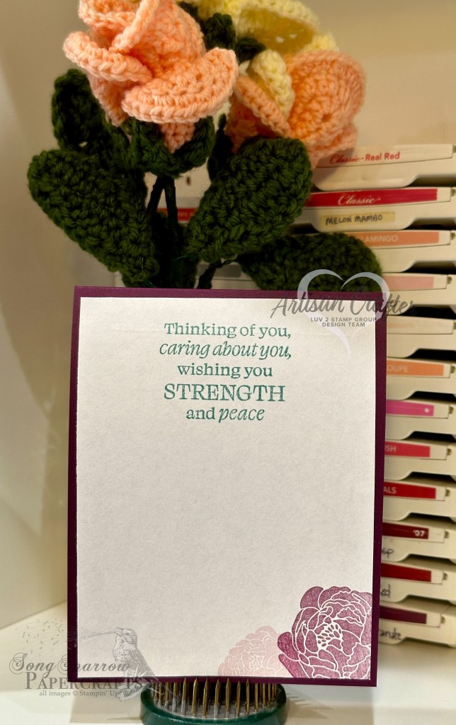
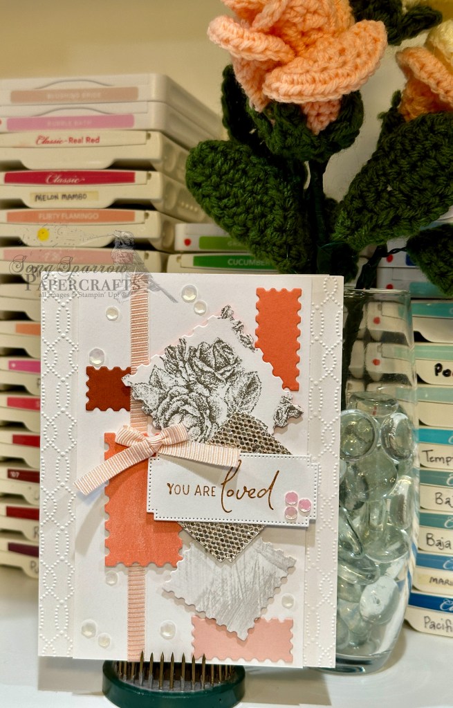
This week, we’re touring fields and flowers as we explore some of my favorite Stampin’ Up! products. And stopping to smell the lavender from yesterday’s lovely hillside was just too tempting. In fact, today we have a whole bouquet.

From top to bottom, the Perennial Lavender suite in the January Mini Catalog is one of my favorite releases to date. There is not one single element in the suite of products that leaves me wondering what I’ll do with it, which is honestly pretty rare for me. Portions of this suite of products will be fully retired when the new Annual Catalog releases. So if you’ve been on the fence about buying this suite, time is of the essence before portions of it are gone for good!

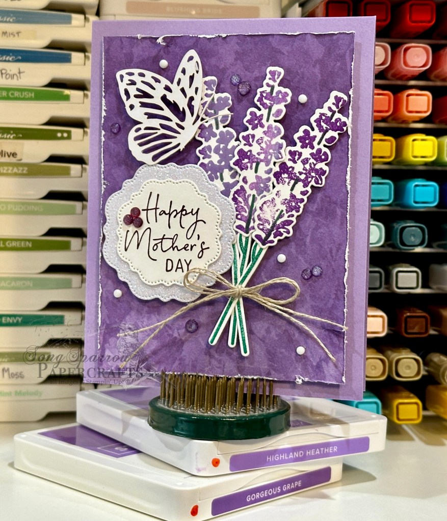
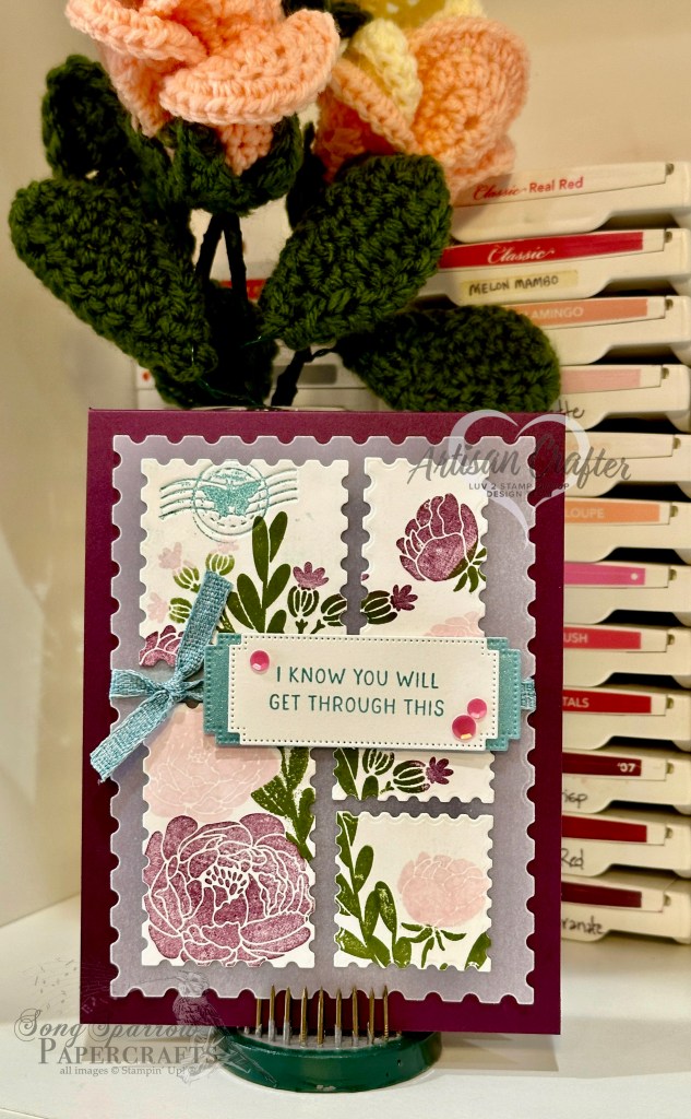
Being that Mother’s Day is just around the corner, it seemed fitting to design a card perfect for the occasion. Today’s card design begins with a base of Highland Heather cardstock. The focal panel base is a sheet of the Perennial Lavender designer series paper, and I have distressed the edges with my paper trimmers to give it a well-worn look. The lavender bunch is stamped on white cardstock using the Painted Lavender stamp set and then diecut using the coordinating die set. To give the fronds of lavender a more realistic look, I used three different shades of purple — Highland Heather, Gorgeous Grape, and Fresh Freesia. The flower bunch is tied together with linen thread. The sentiment from the Perennial Postage set is stamped on white cardstock and diecut using the Thoughtful Expressions dies. I cut a coordinating mat from white glimmer paper using the next die size up. I added a paper butterfly to further soften the feel of the card and finished things off with classic matte dots and purple shimmer gems.

Later today, we’ll be enjoying another fresh bouquet. I’ll hope you’ll pop back by to check it out!

Products used in today’s card:
Highland Heather, Basic White cardstock
Perennial Lavender, white glimmer DSP
Painted Lavender stamps & dies
Perennial Postage stamps
Thoughtful Expressions dies
Paper butterfly
Classic matte dots, purple shimmer gems
Linen thread
Dimensionals
Adhesives

Luv 2 Stamp Artisan Design Team · Terrific Tuesdays

Thankful for Friendship

This week, we’ve been exploring all of the fun designs we can make with the new Perennial Postage bundle. This bundle includes a set of cling stamps and dies that cut shapes that resemble postage stamps, and the stamps nestle perfectly within a coordinating die. 

Our Luv to Stamp Group team challenge for the month is to use designated Color Buddies. For today’s design, I thought it would be great to choose a buddy group to work with. I chose a neutral color palette with Crumb Cake, Pecan Pie, and Early Espresso.

Today’s card design also uses a new technique known as dry embossing. Dry embossing involves using your regular dies to emboss rather than cut. One very valuable tip I can pass along is that the way you build your “sandwich” on your die cutting machine absolutely matters to your results. I found a terrific article that discusses a whole host of die cutting machines and what order works best for dry embossing with each. And I wish I had found it before I made this card!

This card begins with a base of Early Espresso, which serves to frame the whole design. A piece of Crumb Cake serves as the mat for our focal panel and is embossed using the Softly Sophisticated embossing folder (currently available in the Sale-a-Bration catalog) to help soften the look and add a bit of interest. This layer is thinly matted with Pecan Pie, which helps to draw out the lighter elements of the stamped images in the focal panel. The focal panel is diecut from Basic White using one of the largest of the Perennial Postage dies. I wanted this panel to resemble a partial book of stamps. Using three of the smaller dies, I made impressions to create stamp windows in the white panel. The Planted Paradise stamps serve as the images for each of the stamps. I was careful to mask the edges of each of the stamp frames to ensure the stamp look really shone through. The sentiment is stamped in Early Espresso atop a strip of Crumb Cake and then cut into a thin strip with each end snipped at an angle. To ensure the sentiment stood out, I diecut a small Deckled Rectangle from Early Espresso to serve as the sentiment backdrop. A few iridescent foil gems add a little sparkle and help draw the eye across the design. I stamped a coordinating image and sentiment in the inside of the card to tie everything together.

Interested in seeing all of the designs we made this week with the Perennial Postage bundle? Check out Episode 8 of Terrific Tuesdays to see the 3 projects we made from start to finish!

Products used in today’s design:
Early Espresso, Crumb Cake, Pecan Pie, Basic White cardstock
Perennial Postage, Planted Paradise stamps
Perennial Postage, Deckled Rectangles dies
Softly Sophisticated embossing folder
Iridescent foil gems
Dimensionals
Adhesives

All ads on this site are posted by WordPress.  Song Sparrow Papercrafts is not responsible for ad content.

Terrific Tuesdays

Beyond Measure

I often find that starting the design process with a particular layout in mind helps things come together faster. For me, that often means turning to my collection of sketches. I keep sketches in a few different places based on whether I saved it digitally or it’s hand-drawn.

Today’s card design began with a sketch that I recently saved in my digital sketch file. This sketch is from the lovely folks over at Freshly Made Sketches. If you’re ever looking for a great repository of sketch inspiration, you should check them out!

So this card begins with a base of Blackberry Bliss. I really love how it pulls out the subtle purples in the sheet of Delightfully Eclectic designer series paper that is the backdrop for this card. The little images are supposed to resemble a mini picture wall. The mats for each image are diecut using the Perennial Postage dies. A strip of rose gold and white striped ribbon provides a little grounding for the small image panels amongst the busy-ness of the floral patterned background. The focal sentiment is fussy cut to accentuate the word “loved” in the sentiment. Some fine shimmer gems are scattered across the card front to draw the eye across the design.

You can see this design come together in its entirety in this week’s Terrific Tuesdays video.

All ads on this site are posted by WordPress.  Song Sparrow Papercrafts is not responsible for ad content.

Terrific Tuesdays

Can’t Thank You Enough

This week is all about the Perennial Postage bundle, which includes a set of sentiments and dies. I really love this bundle because it is so versatile, especially if you take a moment to think outside the box. Today’s card is a perfect example of taking a minute and realizing that those diecutting scraps on your craft table can make an awesome card!

This design began with the three narrow frames that were diecutting leftovers from other card designs. The combination of Mossy Meadow and Pebble Path are nice a neutral and allow you to go in just about any direction with the color palette. I decided to play up the neutrals and add an accent color with the pinky hues of copper and rose gold.

The base of this card is Early Espresso. The background paper is a sheet from the new Nature’s Sweetness paper pack, currently available in the new Winter Mini Catalog. This is the perfect backdrop because of its coordinating neutral color palette. The sentiment from the Perennial Postage stamp set is stamped in Versamark and then heat embossed using copper embossing powder. The sentiment panel is diecut using the coordinating Perennial Postage die. This panel is matted in Rose Gold specialty paper to accentuate the sentiment. A strip of Flirty Flamingo metallic ribbon behind the sentiment panel repeats the accent color and draws the eye to the sentiment. A scattering of copper brushed metallic dots finish things off perfectly.

Curious where the frames in today’s card design came from? Check out this week’s episode of Terrific Tuesdays and see if you can find them.

Products used in today’s featured design:
Early Espresso, Basic White cardstock
Rose Gold, One Horse Open Sleigh, Nature’s Sweetness DSP
Perennial Postage stamps & dies
Copper embossing powder
Flirty Flamingo metallic ribbon
Brushed metallic dots
Dimensionals
Adhesives

All ads on this site are posted by WordPress.  Song Sparrow Papercrafts is not responsible for ad content.

Terrific Tuesdays

Thank You Curtain Fold

Today we’re revisiting a relatively new-to-me fun fold. One of our Luv to 2 Stamp team members shared this Curtain Fold with the group during the holidays, and I wanted to give it another try. The beauty of this fun fold is that it shows off both sides of a sheet of designer series paper, and for today’s card, I chose a sheet with a foil side for a little extra pizzazz.

A sheet of Pretty Peacock cardstock serves as the base for this card. The backdrop for the beautiful pleated fold is a sheet of the Tartan Foil paper, which is still available in my online store as an Online Exclusive. I love the pairing of the Lost Lagoon Tartan Foil with the Pretty Peacock because the tartan pattern really shows through with this color palette. The pleated fold is made with a sheet of the Nature’s Sweetness designer series paper and was actually the other portion of the sheet that I used for one of the Terrific Tuesday designs. The sentiment from Perennial Postage is stamped in Pretty Peacock and diecut with the coordinating Perennial Postage die. The sentiment panel is matted with a Pretty Peacock banner that is diecut using the Nested Essentials die with the extension method. A twist of gold trim and a scattering of Pretty Peacock and gold sequins add a touch of sparkle to draw the eye to the center fold and sentiment.

Interested in seeing the other designs we made together during this week’s Terrific Tuesdays episode? You can tune in here to catch it all.

Products used in today’s featured design:
Pretty Peacock, Basic White cardstock
Tartan Foil, Nature’s Sweetness DSP
Perennial Postage stamps & dies
Nested Essentials dies
Gold trim
Neutrals sequins, sequins trio
Dimensionals
Adhesives

All ads on this site are posted by WordPress.  Song Sparrow Papercrafts is not responsible for ad content.

Luv 2 Stamp Artisan Design Team · Terrific Tuesdays

You’ll Get Through This

This week we are working with the Perennial Postage stamps and dies. Does anyone collect stamps or enjoy looking through the Philatelic magazine from the U.S. Postal Service? I have enjoyed stamp designs since I was a little girl and even have a small collection from my childhood. Now I mostly enjoy the Philatelic as a purchaser and user of stamps more than as a collector. Today’s card is inspired by the sheets of stamps that formed one image, sort-of like a puzzle is made. Does anyone remember when the USPS used to offer those? They were my absolute favorite!

This card design sits atop a base of Blackberry Bliss cardstock. I chose to build my focal image on white cardstock using the Bold Bouquet stamp set. And just like those sheets once sold by the USPS, I chose to vary the stamp sizes and selected a variety of dies to accomplish this. Before stamping, I laid out dies to get the desired effect and have the totality of the image fit on the vellum mat, which is diecut with the largest Perennial Postage die. I ultimately stamped the images on each little stamp separately, but in hindsight, stamping the whole scene and then diecutting each stamp would have provided much better continuity in the scene on the whole sheet without all of the fuss of the tedious alignment that was required the way I did it! Lesson learned for the next one for sure! 

I used Lost Lagoon as an accent color and built a visual triangle with it to help the sentiment stand out in the busy-ness of the stamp montage. I used the die extension method to make the Lost Lagoon mat behind the sentiment panel a little longer. Both the mat and sentiment panel are diecut using the Autumn Leaves dies. I used the debossing die included in the Perennial Postage set and carefully inked it with Lost Lagoon before I debossed my diecut stamp. The next time I do this I am going to apply a long strip of washi tape to the back of the die so that it is easier to place it on the cardstock for an impression. Hot tip from me to you….this will avoid inky fingers and ruining whatever element you’re trying to deboss!

I wanted a bold but soft color palette for this sympathy card. So I started with Blackberry Bliss as the bold element. I softened things with a bit of Bubble Bath and added Mossy Meadow as an accent. I would love to see what you can do with this color palette, if you’re up for the challenge. Simply post your designs over on Facebook or Instagram using the hashtag #SSP1Jan2024.

Interested in more inspiration for using the Perennial Postage bundle? Check out this week’s Terrific Tuesdays episode for more designs!

Products used in this design:
Blackberry Bliss, Basic White, vellum cardstock
Lost Lagoon soft shimmer paper
Perennial Postage, Bold Bouquet stamps
Perennial Postage, Autumn Leaves dies
Lost Lagoon bordered ribbon
Sequins trio
Dimensionals
Adhesives

All ads on this site are posted by WordPress.  Song Sparrow Papercrafts is not responsible for ad content.

Terrific Tuesdays

Loved to Pieces

This week, we’re exploring a myriad of ways that we can using the Perennial Postage bundle to make fun projects. Today’s design is based on a card layout I sketched in my idea book. When you run across a card layout you love, how do you save it? Sometimes I sketch it in my idea book, sometimes I save a screenshot in an inspiration folder, and other times I’ll pin it in Pinterest. Or maybe even all three if I really like it!

Today’s card is set atop a white base. I embossed an entire quarter sheet of white cardstock with the Softly Sophisticated embossing folder and then adhered it to my card front. The focal panel is built on a narrow sheet of plain white cardstock. 

The Luv 2 Stamp team is currently participating in a month-long color challenge to use pre-selected color combinations to make projects to share with the group. For this card, I chose a group of colors that I typically avoid—Cajun Craze, Calypso Coral, Petal Pink. Why would I do this? Well, sometimes you avoid colors because you DON’T use them, so I wanted to get out of my comfort zone.

A majority of the shapes on the focal panel are within this color palette. I supplemented with a few neutrals from the Stippled Roses paper pack and the More Dazzled specialty paper. The Petal Pink ribbon helps build that visual triangle around the sentiment and provides overall balance to the design. The sentiment is stamped in Cajun Craze on white cardstock that is diecut using the Autumn Leaves dies. White and pink sequins are scattered across the focal panel for sparkle and to draw the eye across the busy design. Although these are not my favorite colors, I had a lot of fun designing around them!

Are you looking for some more inspiration for the Perennial Postage bundle? Check out this week’s episode of Terrific Tuesdays for 3 great designs!

Products used in today’s featured design:
Basic White, Calypso Coral, Petal Pink, Cajun Craze cardstock
Stippled Roses, More Dazzle DSP
Perennial Postage stamps
Perennial Postage, Autumn Leaves dies
Softly Sophisticated embossing folder
Sequins trio, pastel sequins
Petal Pink ribbon duo
Dimensionals
Adhesives

All ads on this site are posted by WordPress.  Song Sparrow Papercrafts is not responsible for ad content.