Back to School

Welcome Back

As we enjoy our last week of summer break here in our area of North Texas, I felt it was appropriate to have this week’s theme revolve around back to school designs. The fun and challenging thing about this particular theme is that I don’t actually have a ready supply of images or sentiments to easily work out designs. So this week is all about putting on the creativity hat.

Today, we’re heading to the garage to modify the Trucking Along truck into a school bus. Yep, that’s right. We’re splicing and dicing to lengthen our truck. So let’s talk about how this design comes together.

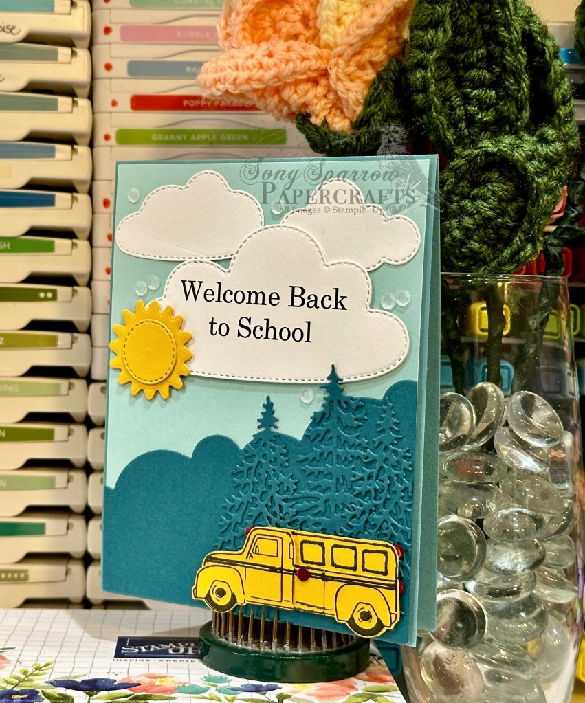
We get started with a base of Lost Lagoon cardstock. The background panel of our full focal panel is a quarter sheet of Pool Party cardstock. Our mountainous terrain in the background is a piece of Pretty Peacock that has been diecut using the long cloud die from the Bright Skies die set and cutting on an angle to give the look of a hill. Our trees are also diecut from Pretty Peacock with the Frosted Forest evergreen dies.

To make our school bus, we start with a stamped image of the truck from Trucking Along on Crushed Curry cardstock, which is then punched with the coordinating truck punch. I separated the cab from the bed with paper snips and then joined them back together with a small strip of Crushed Curry and filled in the outline with a black pen. Using the cab as a guide for the shape of the back of the bus, I traced and then cut a separate piece of Crushed Curry for the back of the bus. The lights and stop sign are all red iridescent discs. The bus is then adhered over our mountain with dimensionals to help it stand apart.

Our sentiment is another one that I set up in Word and printed on white cardstock with my printer. I used a larger cloud die from the Bright Skies dies to cut it out, along with a few smaller clouds to add behind. A spot of sunshine beams through in Crushed Curry compliments of the sun dies in the Bright Skies set. I finished things off with a hint of shine in the white sequins from the sequins trio.

What do you think? Did our chop shop bus fit the bill? Tomorrow we’re heading back to the drawing board, and I hope you’ll pop by!

Products used in today’s card:
Lost Lagoon, Pool Party, Pretty Peacock, Crushed Curry, Basic White cardstock
Trucking Along stamps & punch
Bright Skies, Frosted Forest dies
Iridescent discs, sequins trio
Dimensionals
Adhesives

Product List
Back to School

New Heights

Welcome back to a brand new week! I hope everyone enjoyed a restful weekend. We enjoyed watching more of the Olympic Games. Hard to pick a favorite event because we enjoy watching many of them. Have you been watching?

This week is our last week of summer break. School will be back in session on Monday and we’re still squeezing in all the end-of-summer fun. Break felt both short and long all at the same time! Did summer feel that way to you?

In honor of a new school year, this week’s design theme is back to school. And I must admit that I may have bitten off a little more than I can chew with this one. But I promised a week of using our products in surprising ways, didn’t I?! Well, I will certainly have to in order to work within our theme!

Today’s outside the box opportunity is solving a sentiment dilemma when you don’t have a stamp that fits the bill. How did I solve it? Well, let’s talk about our card and find out.

We get started with a base of Pool Party cardstock. After cutting a pice of white cardstock into quarter sheets, I used the Bright Skies dies to cut the two large clouds for the bottom of our front panel scene. Layers of dimensionals give the clouds are more realistic look against our Pool Party backdrop. I used my computer to set up a Word document sized to my quarter panel, sized up the space I would need to fill the medium cloud die, and printed my sentiment on the white cardstock. I then diecut the sentiment with the cloud die. I really wanted large font for the sentiment and that meant orienting my cloud in an unconventional way. But then, when you think about it, clouds come in all sorts of shapes and sizes, so is there really a conventional orientation? *grin* Several layers of dimensionals allow the sentiment panel to rise above the rest of our scene.

For the balloons, I pulled out the Hot Air Balloon stamps and dies set. I really liked the patterns that the Bright and Beautiful designer paper pack had to offer and decided I would layer the balloon shaping stamps on top. I think it turned out pretty neat. Our balloon baskets are cut from gold foil specialty paper. Each balloon is adhered on a different layer to give lots of dimension to our scene and really reinforce the sentiment theme of rising to new heights.

One of the fun things about challenging ourselves with various themes or ideas is that we don’t always have everything we think we need to pull it off. But with a little creative thinking and using tools that we maybe don’t turn to as often in a certain medium, like the printer in this case, we can usually make it work with beautiful results.

Tomorrow, we’ll be trucking along to school. I hope you’ll tune in to see what that’s all about!

Products used in today’s card:
Pool Party, Basic White cardstock
Bright & Beautiful, gold foil DSP
Hot Air Balloon stamps & dies
Bright Skies dies
Rainbow dots
Dimensionals
Adhesives

Product List
Botanicals

Everyday Magic

I couldn’t think of a better way to close out our In the Garden series of cards than with this knockout card, which was inspired by Mitosu Crafts. Don’t you just love the layers of white on white? So elegant. And what a terrific way to showcase a beautiful focal image and sentiment!

A piece of white cardstock serves as our card base. Various sizes of circles are diecut from a sheet of white cardstock using the Spotlight on Nature dies. I made sure to vary the edge patterns while still keeping things symmetrical. Layers of dimensionals allow the various circles to stand on different visual planes, adding interest to our card front. Our focal image is the zinnia bunch from the Simply Zinnia stamp set and is stamped in black on white cardstock, colored with Stampin’ Blends, and then diecut with the coordinating die from the Simply Zinnia die set. I added Wink of Stella over each bloom for a subtle glimmer. The sentiment from Something Fancy is stamped in black on white cardstock and then diecut with the Greetings of the Season die using the extension method. I used the zinnia to cover the tag hole in our sentiment panel. A few shiny sequins scattered on our card front draw the eye across the stunning design.

I hope you’ll tune in next week as we head back to school and use our stamps in some unconventional ways!

Products used in today’s card:
White cardstock
Simply Zinnia, Something Fancy stamps
Simply Zinnia, Spotlight on Nature, Greetings of the Season dies
Stampin’ Blends
Wink of Stella
Shiny sequins
Dimensionals
Adhesives

Product List
Botanicals · Sketchy Fridays

Sketchy Fridays: Nothing Fancy

This week has been quite the whirlwind. And how did we get to Friday so quickly?! Whew. The weekend is now upon us and we’ll be closing out our last week of summer break next week. Anyone have any ideas for fun things to do with a preteen?

It’s time for another installment of Sketchy Fridays, where each week we’ll be using a card sketch to design our featured card. Right now, we’re working through a full series of designs using the card sketches found on page 22 of the current Stampin’ Up! Annual Catalog.

This week’s card is based on Sketch #10 and features the Unbounded Beauty designer series paper by Stampin’ Up!. While I have found this paper to be challenging to incorporate into designs, what I have found is that I simply needed to look at the paper differently. Sometimes the paper gives design inspiration on its own, but I work better with this pack when I have a solid design and then work with sheets that fit. That was true with the tuxedo fold and grid designs, and it’s true for today’s sketch where the backdrop of the focal section allows for a busy pattern. So let’s see how this comes together.

We get started with a simple card base of Basic White cardstock. I was drawn to the sheet of Unbounded Beauty designer paper that resembled the lavender stem from the Painted Lavender die set. We pull out the darker pink of the patterned paper in several ways. First, we use a piece of Petunia Pop glimmer paper diecut with the Nested Essentials dies to serve as the banner behind the sentiment panel. Next, we use Petunia Pop cardstock to cut small flowers for our Summer Splash floral stems that are diecut using the Painted Lavender die set. Our floral stems are tied with linen thread to bring a natural element to the design. The sentiment from Something Fancy is stamped in black on white cardstock and then diecut using the Radiating Stitches dies. Our floral bunch is then adhered next to the sentiment. A faux bow of diagonal trim sits behind the sentiment over the sparkly banner. A few carefully placed In Color shimmer gems finish things off by drawing the eye to the focal panel in the center.

Isn’t this the perfect sketch for just about any sheet of patterned paper? No more fumbling for ideas for how to use that busy pattern. Here’s an easy, go-to sketch that will suit even the busiest pattern!

Tune in tomorrow as we close out our week in the garden with a clean and simple zinnia design! It’s a knockout!

Products used in today’s card:
Petunia Pop, Summer Splash, Basic White cardstock
Unbounded Beauty, In Color glimmer paper
Something Fancy stamps
Painted Lavender, Radiating Stitches, Nested Essentials dies
White diagonal trim, linen thread
In Color shimmer gems
Dimensionals
Adhesives

Product List
Botanicals

Incredible

We’re moving right along here in our tour of the garden this week. And today, we’re keeping things simple with a focal image taken directly from the Nature’s Sweetness designer paper pack by Stampin’ Up! Did you know that SU! will often have at least one pattern in a 12×12 pack of paper that can be divided evenly into 6 card front panels? Several current packs that include a sheet like this are Nature’s Sweetness, Perennial Lavender, and Flowering Zinnias. These types of sheets are what I often refer to as one sheet wonders, where one sheet of paper creates 6 cards. I’m sure other stamps refer to these sheets by other names, but that’s how I like to think of them.

For today’s card, we get started with a base of Moody Mauve cardstock. Our background panel is a sheet of Pretty Peacock cardstock that is cut slightly smaller than our card front and is then machine embossed using the Dotted Circles embossing folder. Our focal image mat is the gold-flecked bookprint sheet from the Nature’s Sweetness paper pack that has been diecut using one of the largest circles from the Spotlight on Nature die set. I then pulled the one sheet wonder pattern sheet from the Nature’s Sweetness designer paper pack and cut one 4-inch strip and then cut the two-image panel in half in order to use one image for our card front. The image is colored using Stampin’ Blends and then cut out using paper snips before being adhered to the diecut circle. Our sentiment from Happy Little Things is stamped in black on white cardstock and then diecut with the Everyday Details dies using the extension method. The mat is Moody Mauve luster paper diecut with the smallest Deckled Rectangle die, also using the extension method. The sentiment is adhered over a faux bow of gold trim using dimensionals. A few shiny sequins finish things off with a little sparkle.

The beauty of these one sheet wonder patterned paper sheets is how quickly you can make a whole stack of cards without sacrificing a single bit of ooo-la-la. And speaking of ooo-la-la, you must tune in tomorrow to check out the newest installment of Sketchy Fridays.

Products used in today’s card:
Moody Mauve, Pretty Peacock, Basic White cardstock
Nature’s Sweetness, Moody Mauve luster DSP
Happy Little Things stamps
Spotlight on Nature, Deckled Rectangles, Everyday Details dies
Stampin’ Blends
Gold trim
Shiny sequins
Dimensionals
Adhesives

Product List
Botanicals · Terrific Tuesdays

Busy Florals

We are already halfway through this week. Every time I get to Wednesday, I feel like the week is just whizzing by! Maybe it’s because it feels like we still have so much to do before the regular routine of school days gets started. Or maybe it just comes with getting older.

This week, we’re tiptoeing through the garden as we make cards inspired by the beauty of nature. And today, I’m going to show you ways to use “difficult” patterned paper. Do you ever fall in love with a pack of patterned paper but then find yourself stumped when it comes to actually using it? That’s precisely what has happened to me with the Unbounded Beauty paper pack by Stampin’ Up! I fell in love with the patterns but then just haven’t been able to find designs where the patterns make sense. Until now.

In this week’s episode of Terrific Tuesdays, we are using two card layouts to showcase that paper that you are finding hard to use. We get started with a card that I like to call the tuxedo fold. We choose two complimentary paper patterns, bearing in mind the backside of one sheet will be visible and must also be considered in our paper choice. And one sheet will be folded to reveal a portion underneath so that it almost looks like the collar of a tux shirt on each end. Then our sentiment panel sits on top as a prominent feature on our card. Suddenly, our overwhelming pattern now fits perfectly in a design — no longer overwhelming but instead a beautiful backdrop.

Our second design literally cuts our busy patterns down to size. I like to call this design a patterned paper or designer paper (DSP) grid since we use strips of busy patterns to build a grid on our card front, leaving the center section for a small sentiment. The patterned paper strips can be of any size from 1- to 2-inches, depending on how large you wish to make your center sentiment. Not only does this design tame some wild patterns, it also allows you to use up scraps of even your favorite patterned papers.

To see the tuxedo fold and DSP grid designs at work, tune in to this week’s episode of Terrific Tuesdays where we made 2 cards from scratch using these two card layouts.

Tomorrow, we’re making things easy with the Nature’s Sweetness paper. Pop by and check it out.

Products used in card above — tuxedo fold:
Summer Splash, Pretty in Pink, Basic White cardstock
Unbounded Beauty DSP
Inspiring Snapdragons, Something Fancy stamps
Spotlight on Nature, Inspiring Snapdragons dies
Pretty in Pink ribbon
In Color shimmer gems, tinsel gems
Dimensionals
Adhesives

Products used in card above — DSP grid:
Basic White cardstock
Berry Burst, Unbounded Beauty DSP
Unbounded Love stamps
Everyday Details dies
Iridescent striped trim
Iridescent discs
Dimensionals
Adhesives

Product List
Product List
Botanicals

You Matter

As we are wrapping up our final two weeks of summer before the kiddo heads back to school, we’re squeezing in lots of last-minute fun. One of things we enjoy doing every summer is going to our local bowling alley. The USBC hosts a program known as Kids Bowl Free and our local bowling alley participates. For a one-time fee, you can enroll the whole family and get 2 free games every weekday. My son has taken a particular interest in bowling and is actually quite good at it. This summer, he has added the youth bowling league to his list of regular activities and is planning to continue for the fall league. Right now, his team is about midway in the pack as far as standings so he’s working hard to improve his game. As with any sport, this is adding up to new equipment and lessons and time, but we absolutely love how much he loves it! And I can think of far worse things to spend money on!

We’re continuing our series this week called In the Garden. And today, we’re making our way through the cut flowers. One of my absolute favorite summer flowers is the zinnia. They come in so many happy colors and their blooms just keep going and going. I also love that they’re fairly hard to kill. *wink* Stampin’ Up! has a wonderful bundle of products called Flowering Zinnias that includes paper, stamps, dies, and embellishments; and today’s card features a portion of those products.

I recently saw a card by Stamp With Brenda that combined shades of red and light pink and just loved it, so that inspires our card today. We get started with a base of Poppy Parade cardstock. A quarter sheet of embossed Poppy Parade serves as our backdrop. It’s been cut down slightly and then machine embossed using the Zinnia embossing folder. Our focal panel has lots of beautiful layers. We get started by cutting a large square of white cardstock using the largest square from the Nested Essentials die set. Using the Painted Lavender and Simply Zinnia dies, we cut a combination of greenery stems. Our zinnia blooms are cut from Real Red cardstock to give a little contrast and help them pop against the busy backdrop. Our sentiment from the Something Fancy set is stamped in Poppy Parade on Petal Pink cardstock and then diecut using the smallest diamond die from the Nested Essentials set. This is all layered on top of a bit of iridescent striped trim and adhered to our card front with varying layers of dimensionals. A few iridescent discs are scattered on our card front to draw the eye to our focal section.

Tomorrow we’re going to look at several ways to use busy patterned paper to create stunning floral card designs. I hope you’ll drop by.

Products used in today’s card:
Poppy Parade, Shaded Spruce, Summer Splash, Mossy Meadow, Petal Pink, Real Red, Basic White cardstock
Something Fancy stamps
Deckled Rectangles, Painted Lavender, Simply Zinnia dies
Zinnia embossing folder
Iridescent striped trim
Iridescent discs
Dimensionals
Adhesives

Product List
Botanicals

So Lucky to Know You

Here we are — already back to Monday and working to finish out the month of July. Our kiddos have just 2 weeks of summer left and then it’s back to school time. So we’ll be packing in as much last-minute fun as we can. What about you? Are kids in your area headed back to school? What do you do to finish off the summer?

This week, we’re beginning a new series of designs that I’m calling In the Garden. We’ll be pulling out all of our papers and stamps that afford us the opportunity to feel like we’re strolling through the garden. And today, we’re getting started with some of my all-time favorite patterned paper called Perennial Lavender by Stampin’ Up! For me personally, it’s not often that there is an entire pack of paper — every single sheet — that is my favorite, but Perennial Lavender is certainly one of them. So we’re pairing up this gorgeous paper with a sketch from my sketch book. Let’s get a closer look.

We get started on today’s card with a base of Blackberry Bliss cardstock. Our background panel is the sheet of lavender stems from the Perennial Lavender designer series paper pack. Our focal section is very simple but certainly a show-stopper. We started with a sheet of the lavender field pattern from the Perennial Lavender pack and diecut it using one of the larger Spotlight on Nature dies. We stamp our sentiment from the Country Flowers stamp set in Blackberry Bliss ink on white cardstock and then diecut it using the Spotlight on Nature dies. Both circular panels are adhered to our card base with dimensionals. We use two paper butterflies and a simple twist of iridescent striped trim to complete our focal section. Purple shimmer gems are scattered across the card front to help move the eye across the card design.

One of these things I love about this particular design is that it comes together so quickly and works perfectly with any patterned paper set you have on hand. Tomorrow we’ll be walking through the cut flowers for a zinnia bouquet. I hope you’ll pop in!

Products used in today’s card:
Blackberry Bliss, Basic White cardstock
Perennial Lavender DSP
Country Flowers stamps
Spotlight on Nature dies
Paper butterflies
Iridescent striped trim
Purple shimmer gems
Dimensionals
Adhesives

Product List
Holidays · Winter

Decorate With Happiness

We’re wrapping up our week of winter-themed designs today with a simple fun fold card. This peek-through design uses the Stampin’ Up! Online Exclusive bundle called Sophisticated Sled paired with the Winter Meadow patterned paper. I have to give credit to Create With Christy for the idea to transform the sled into a window pane. Absolutely brilliant! So let’s dive in and take a closer look at today’s card.

We get started with a base of Balmy Blue cardstock. This is a standard sized card base. To create our peek-through panel, we cut a one-inch section from the card front to allow our inside message panel to “peek through” to the card front. A sheet of berry and greenery patterned paper serves as our base panel on the card front, while a strip of Boho Blue luster paper peeks through from the inside panel. Our focal panel sits on a base of snowy vellum from the Graceful Greenery vellum pack that has been diecut using the Deckled Rectangles dies. Our window pane is built from three different papers. The molding is a sheet of white glimmer specialty paper. The paning is blue woodgrain paper from the Country Woods paper pack that has been diecut using the sled die in the Sophisticated Sled die set. The bottom rungs have been removed to give it a truer window pane look. The window pane is mounted over a snowy pattern from the Winter Meadow paper pack, which has been cut to size. These three layers are adhered together and then adhered to the vellum panel with dimensionals. Our decorative wreath from Sophisticated Sled is stamped on white cardstock, colored with Stampin’ Blends, and then diecut using the coordinating die. A few red iridescent discs add some sparkle to the berries on our wreath. A ribbon of gold twine adds the finishing touch. The wreath is adhered to the top of our window pane with dimensionals. The sentiment from Sophisticated Sled is heat embossed in white on a piece of blue woodgrain from the Country Woods paper pack. The sentiment is adhered to the card front with dimensionals and our focal panel is then adhered over it using an additional layer of dimensionals. We finish things off with a scattering of iridescent discs across the card front to help draw the eye across the design.

Next week, we’re heading to the garden. I hope you’ll drop in and check it out!

Products used in today’s card:

Product List
Holidays · sketches · Sketchy Fridays · Winter

Sketchy Fridays: Season’s Greetings

Whew, we all made it to Friday. Anyone have exciting weekend plans? I’ll be hosting a virtual Kit Together this evening where I will be assembling the Hello Hollyhocks kit. If you’re free, I would love for you to join me! Simply click this link to register and join in on the fun.

But for now, it’s time for the second installment of Sketchy Fridays, where each week we’ll be using a card sketch to design our featured card. Right now, we’re working through a full series of designs using the card sketches found on page 22 of the current Stampin’ Up! Annual Catalog.

This week, we’re using Sketch #2 and pairing it up with the gorgeous Seasons of Green & Gold patterned paper pack and coordinating Graceful Greenery vellum pack. Let’s see how it all comes together.

We get started with a base of Garden Green cardstock. Our background panel is a sheet of mistletoe paper from the Seasons of Green & Gold patterned paper pack. The focal panel consists of a mat of gold foil specialty paper and a sheet of greenery patterned paper, which is also from the Seasons of Green & Gold designer series paper pack. Our sentiment panel is matted with a lovely gold banner which is diecut from gold foil using the Greetings of the Season die. The sentiment from the coordinating stamp set is stamped in Shaded Spruce on white cardstock and then diecut with the oval die from Greetings of the Season. The tag holes in each of the sentiment panel pieces are covered with small bunches of mistletoe berries and sprigs of greenery that have been cut with paper snips from a sheet of Seasons of Green & Gold designer paper. Additional sprigs of greenery are cut from the edge of the same sheet of patterned paper, as well as a sheet of vellum from the Graceful Greenery pack. In conjunction with a twist of gold trim, the greenery serves as an eye-catcher for the sentiment panel. A sprinkling of rhinestone jewels across the card front draw the eye across the design.

Tomorrow we’ll be closing out our wintery designs in the snowdrifts. I hope you’ll stop by and check it out.

Products used in today’s card:
Garden Green, Basic White cardstock
Seasons of Green & Gold, Gold foil, Graceful Greenery vellum DSP
Greetings of the Season stamps & dies
Gold trim
Rhinestone basic jewels
Dimensionals
Adhesives

Product List