We continue our look at a good sampling of the Stampin’ Up! products that stand to make great Father’s Day cards. Today we’re revisiting a terrific set called Trusty Tools, which includes a photopolymer stamp set and a set of coordinating dies (sold separately). When I first bought this set, I only bought the stamps, but then I found myself fussy cutting way more than I really like to do when making projects. And I also realized that the set of dies includes things like a peg board and a tool box that really help give my stamps even greater value. And this set can go well beyond just Father’s Day designs.
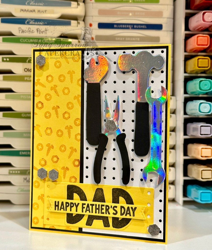
This super fun design begins with a base of Daffodil Delight cardstock. The background panel mat is Basic Black. The background panel is a strip of Daffodil Delight stamped tone-on-tone with the nuts and bolts from the Trusty Tools stamp set and then a panel of white cardstock that has been diecut using the peg board die from the Trusty Tools die set. Each of these smaller panels is adhered directly to the black mat. The tools are diecut from a combination of black cardstock and silver foil specialty paper. I felt like this really gave the tools a more realistic look. The tools are adhered over the peg board using varying heights of dimensionals so that you really feel like you’re sitting at the tool chest. The sentiment panel is the bottom portion of the toolbox die and cut from Daffodil Delight. The word DAD is stamped in black in the center. The Happy Father’s Day sentiment is stamped on a banner diecut using the Happy Little Things dies. The design is finished off with some industrial trinkets to keep with the tool-look.
Tune in tomorrow to check out a brand new fun fold and fun outdoorsy theme!
Products used in today’s card: Daffodil Delight, Basic Black, Basic White cardstock Silver foil specialty paper Trusty Tools stamps & dies Happy Little Things dies Industrial trinkets Dimensionals Adhesives
Howdy, crafting friends. Welcome to another sparkly day filled with crafty fun. This week, we’re pulling out a whole host of Stampin’ Up! products to make some masculine cards. And with Father’s Day around the corner, it only seems appropriate to make a few masculine cards to honor the special dads in our lives.
Today, we’re keeping things on the simple side with this high-flying design. You’ll notice that the bulk of this card is comprised of the new Take to the Sky designer paper. Did you know that there is a full sheet of perfect focal images included in the Take to the Sky designer series paper pack? Simply cut them apart and you have an instant focal point for your cards! Let’s take a closer look at how this design comes together.
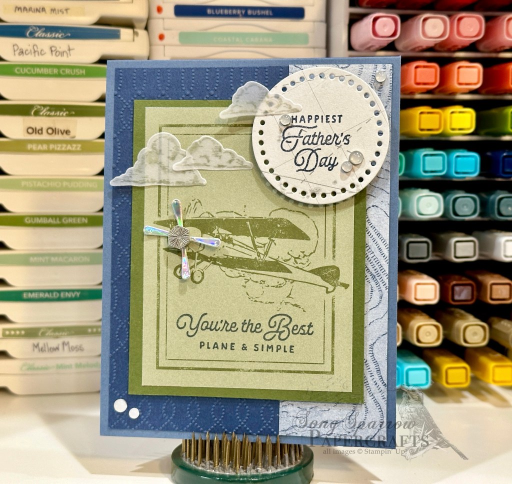
We get started with a base of Misty Moonlight cardstock. Our background panel consists of a base of Night of Navy cardstock that has been machine embossed with the Softly Sophisticated embossing folder — a retired Sale-a-Bration product from earlier this year. I loved that the pattern resembled a topography map, which is the piece of patterned paper from Take to the Sky that I’ve paired with it here. The current So Swirly embossing folder would work equally as well here for the same reason.
Our focal panel consists of a mat of Mossy Meadow cardstock for the perfectly pre-printed panel from the Take to the Sky paper. To dress up the pre-printed panel and tie it with our theme, I diecut the pair of propellers from silver foil specialty paper using the Adventurous Sky dies. An Industrial Trinket serves as the propeller hub. To complete the illusion of our plane flying in the sky, I stamped clouds on vellum using the Adventurous Sky stamps and then diecut them with the coordinating die. They’re affixed to our focal panel and sentiment panel using glue dots. The sentiment panel is diecut from the navigation map paper using the Everyday Details dies and the sentiment from the Adventurous Sky stamp set is stamped in the center. The sentiment panel is adhered using dimensionals so it stands above the scene. White transparent dots finish off our card and help draw the eye diagonally across the design.
Tomorrow we’re going to rummage through the tool box. I hope you’ll pop in and see what shows up!
Products used in today’s card: Misty Moonlight, Night of Navy, Mossy Meadow, vellum cardstock Take to the Sky, Silver foil DSP Adventurous Sky stamps & dies Everyday Details dies Softly Sophisticated embossing folder (retired) Transparent dots Dimensionals Adhesives
Happy Monday, everyone! We were thankful to have a few days of beautiful weather here in North Texas — with sunshine anyway. This summer we’ve done the abrupt gear shift from lovely spring to straight into the fire. But we were glad to see a string of dry days nonetheless. And we did our best to make the most of it. How about you?
This week, we’re going to be looking at a whole host of wonderful Stampin’ Up! products that you can use to honor the dads in your life. Today, we’re getting started with the Gone Fishing stamps and dies.
There are so many things that you can do with the combination of stamps and dies. And today’s card shows the most straight forward way — filling a tackle box. I don’t know about you, but I grew up fishing with my family. And it was always a treat when we could choose something to use from dad’s tackle box!
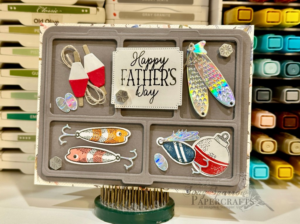
We get started with today’s card with a base of Crumb Cake cardstock, which won’t be visible when your card is closed. I chose a patterned background from the (now retired) Let’s Go Fishing designer paper pack. As you can see, only a tiny portion of the background pattern peeks out from behind the tackle box, so any subtle pattern will do. Next up, we diecut the tackle box from Basic Grey cardstock using the Gone Fishing dies. The tackle box is comprised of the base and topper dies. By using dimensionals to adhere to the two layers to the card front, you’ll get a realistic look into your tackle box from top view.
TIP: Don’t throw away the squares that are cut with the tackle box topper die. Save them to use as sentiment panels on other cards. You’re welcome! *grin* (Genius idea from my upline Patty Bennett!)
Now comes the fun part — filling your tackle box. On white cardstock, I stamped some of my favorite lures and tackle from the Gone Fishing stamp set. I chose minnows, a spoon, and a bobber. I used the detail stamps to fill in each image with some color. Then I diecut each one using the coordinating die. For added detail, I chose to remove the stamped hooks on the minnows and spoon and replaced them with hooks diecut from silver foil specialty paper, which gives the hooks a more realistic look. I added an additional spinner element to the spoon with the silver foil wing.
Now we fill the remaining bins in our tackle box. I assembled two peg-style bobbers. Using the larger bobber die, I cut white cardstock and then used the smaller portion to cut Real Red. The white pieces serve as the base for the red element. The bobber peg is cut from Crumb Cake and affixed to the back of each bobber. I used a twist of linen thread to represent fishing line behind one of the peg bobbers and added a few sinkers, diecut from silver foil, to the bin for a complete bobber setup. I adhered one bobber with a dimensional for a realistic look to the bin. From the silver foil specialty paper, I also diecut two larger spoons and a small triangular turning element. I tied them together using linen thread. The sentiment from the Gone Fishing stamp set is stamped on white cardstock that is diecut using the Autumn Leaves dies with the extension method. The sentiment is adhered over the tackle box to catch the eye. The scene is finished off with some Industrial Trinkets to catch the eye and draw it across the full scene.
This super cute design can be adapted with any sentiment to make a masculine card perfect for just about any occasion. And while it looks complicated to put together, it really does come together in a snap!
Tomorrow, we’ll be taking to the sky for our next design. And you won’t want to miss tomorrow’s episode of Terrific Tuesdays either — we’re going to learn a neat (and quick) fun fold and how to use the die extension method! I hope you’ll buzz by and check it all out!
Products used in today’s card: Crumb Cake, Basic Gray, Real Red, Basic White cardstock Let’s Go Fishing (retired), Silver Foil DSP Gone Fishing stamps & dies Autumn Leaves dies Linen thread Industrial Trinkets Dimensionals Adhesives
While I don’t always find it easy to make masculine cards, sometimes you sketch a layout from an inspiration card and find that it’s absolutely perfect for all sorts of occasions. Such is the case with a card layout I sketched a long while back that calls for swapping out the corner of the background panel. As soon as I ran across the sketch, it immediately went in the to-do project list for this week’s masculine-themed card designs.
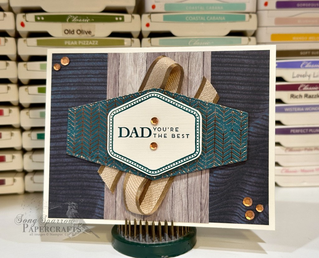
This card design begins with a base of one of my favorite colors right now — Pretty Peacock. The diamond patterned sheet is from the One Horse Open Sleigh paper pack and the corner piece is from Inked Botanicals. A thin border of Pretty Peacock is allowed to peek through in between the two patterned pieces. The sentiment is stamped in Pretty Peacock and is from the Heartfelt Hellos stamp set in the newly-released Sale-a-Bration catalog. The sentiment panel is punched using the coordinating Heartfelt Hexagon punch. A twist of iridescent ribbon helps draw the eye to the sentiment, along with the Pretty Peacock sequins.
There are a number of ways that you can use this sketch, but in this case I wanted to use two coordinating patterns of patterned paper for the two background panel elements. And one major take-away I have from designing cards for this week is to never count out an unlikely pack of paper for masculine designs because that’s where you’re likely to find a perfect fit for your project. Today’s card is a perfect example of that. Never in a million years did I think I would find a likely candidate in One Horse Open Sleigh or Inked Botanicals! So, in short, leave no stone unturned — and consider all of the options you have in your stash.
Interested in seeing what other masculine designs we were able to put together using the Heartfelt Hexagon bundle? Hop on over to YouTube and check out this week’s episode of Terrific Tuesdays!
Products used in today’s design: Pretty Peacock, Basic White cardstock One Horse Open Sleigh, Inked Botanicals DSP Heartfelt Hexagon stamps & punch Heartfelt Hellos stamps Iridescent ribbon (retired) Sequins trio Dimensionals Adhesives
All ads on this site are posted by WordPress. Song Sparrow Papercrafts is not responsible for ad content.
This week’s focus is all about masculine cards. I sometimes find it challenging to design masculine cards. And that often has to do with my mindset — particularly this idea that the theme has to be clear through the images and/or patterns I choose. But that’s how we end up boxing ourselves in creatively. Sometimes it’s all about reminding ourselves to trust the creative process as much when designing masculine cards as we do with any other occasion.
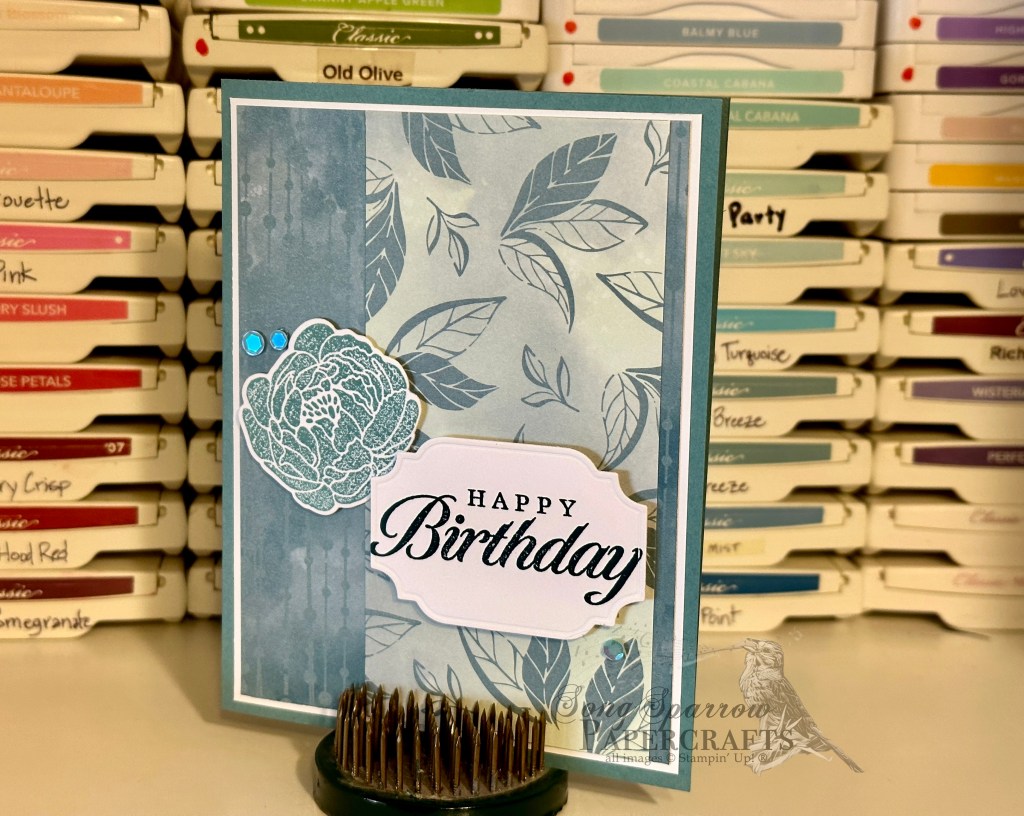
For today’s design, I wanted to create something that was warm and inviting. I was carrying that comfy old Victorian library feeling forward from another design. And that helped shape the patterned paper options I pulled for this card. I kept the card base light but warm by choosing Very Vanilla. All of the patterned papers are from the All About Autumn paper pack. To add extra emphasis to the sentiment panel, I used a mat of the foiled paper diecut using the Nested Essentials set. The sentiment from Heartfelt Hellos is stamped in Pretty Peacock on Very Vanilla and then punched with the coordinating hexagon punch. The Pecan Pie bordered ribbon adds another layer of emphasis to the sentiment panel, and the touch of sparkle from the copper sequins adds that “you’re special” feeling to the design.
So the next time you really like a layout but find it difficult to adapt to feeling more masculine, try picturing the feeling you’d like to evoke with your design and see how that influences your decisions on design elements. I think you’ll be surprised!
Curious what other masculine card designs we made during this week’s episode of Terrific Tuesdays? You can check it out on my YouTube channel!
Products used in today’s design: Very Vanilla cardstock All About Autumn (retired) DSP Heartfelt Hexagon stamps & punch Heartfelt Hellos stamps Pecan Pie bordered ribbon Neutrals sequins Dimensionals Adhesives
All ads on this site are posted by WordPress. Song Sparrow Papercrafts is not responsible for ad content.
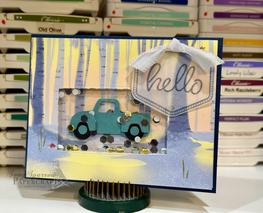
Just because we’re looking to create a more masculine design doesn’t mean we have to leave fun at the door! I don’t often make shaker cards and so I thought this would be a perfect opportunity to stretch the ol’ creative wings. With the idea of making it fun, I decided a truck scene would be just the ticket.
This card is built on a base of Night of Navy to help the scene stand out in a dramatic way. I used two identical sheets of designer series paper from the One Horse Open Sleigh pack — one serves as the forefront, while the other gives the backdrop for the truck in the shaker window. I used a Deckled Rectangle die to cut the window out of the front panel for the truck, making sure that the window allowed just enough room for the truck to be visible and allow space for the shaker elements. A piece of acetate is adhered to the back of the window on the front panel and then the back edges of the window are lined with foam adhesive strips to create a box in which the shaker elements will be poured and then closed in with the back panel. The truck is punched from Lost Lagoon and black using the Trucking Along punch and adhered to the back panel with dimensionals. The sentiment from Heartfelt Hellos is stamped in Night of Navy on vellum and then punched with the coordinating hexagon punch. The vellum panel allows the scene to show through.
Interested in a few more conventional masculine card designs? Check out this week’s Terrific Tuesdays episode where we made 3 masculine cards together.
Products used in today’s design: Night of Navy, vellum, acetate cardstock One Horse Open Sleigh DSP Heartfelt Hexagon stamps & punch Heartfelt Hellos stamps Sequins for Everything (retired) Foam adhesive strips Iridescent ribbon (retired) Glue dots Dimensionals Adhesives
All ads on this site are posted by WordPress. Song Sparrow Papercrafts is not responsible for ad content.
This week’s project focus is masculine cards using the Heartfelt Hexagon bundle, including the fabulous coordinating Sale-a-Bration set called Heartfelt Hellos which will be available with qualifying orders beginning tomorrow. I don’t know about you, but sometimes I really struggle to make cute designs for the guys. So we’ll be exploring how we can look at our stash in new ways to make gorgeous projects with a more masculine feel.
For me, the hardest part of making more masculine feeling cards is finding a good color palette amongst my patterned paper stash. I absolutely fell in love with the Garden Walk designer series paper from the Holiday Mini Catalog. I was initially drawn to the beautiful mix of floral patterns in this paper pack, but as I was looking through my stash of DSP to design this card, I found so many lovely masculine options on the reverse sides of the florals in the Garden Walk pack. So my first tip for designing masculine cards is to never count out a pack of DSP simply because one side leans more to a more feminine feel — turn those pages over and look at the other side because you are bound to find some surprises!
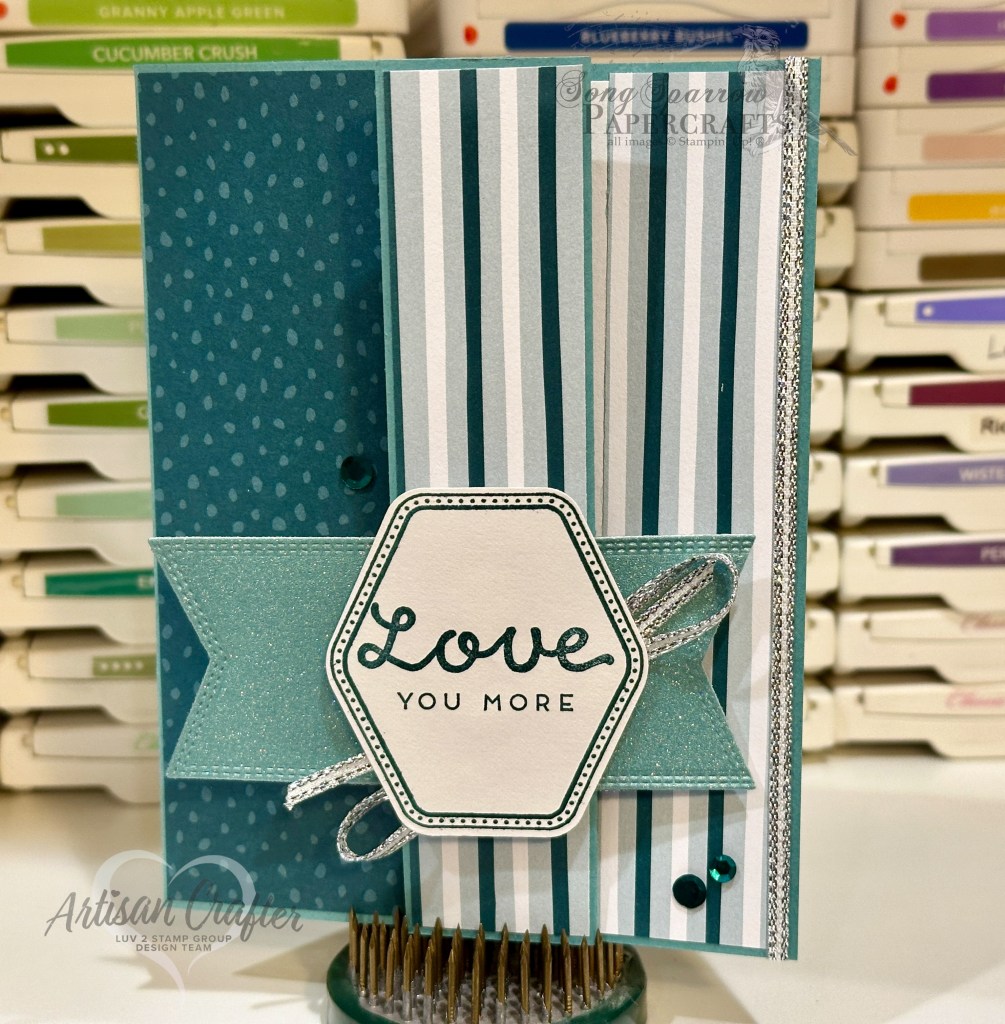
So this fun fold design is all about showcasing beautiful patterned paper. We begin with a base of Lost Lagoon cut to standard size. It’s scored as usual but with an added 1-inch fold-back panel on the card front to reveal a section of the inside card base. I chose two separate patterns of Lost Lagoon and Pretty Peacock from the Garden Walk DSP pack and decided the striped pattern worked perfectly for the fold-back and peek-through sections of the design. The speckled pattern is adhered to both sides of the small panel on both the card front and inside panel.
The sentiment from Heartfelt Hellos is stamped in Pretty Peacock on white cardstock punched with the Heartfelt Hexagon punch. For some pop, the sentiment panel is mounted with dimensionals atop a banner diecut from Lost Lagoon soft shimmer paper using the Nested Essentials banner dies. I added a little silver trim underneath the sentiment panel and along the peek-through edge for some sparkle because even our guys deserve a little sparkle! A few Pretty Peacock sequins bring a little extra emphasis to the sentiment.
Don’t you just love how this turned out?! A lovely fun fold and some out-of-the-box thinking about patterned papers helped bring this lovely masculine design to life.
Interested in seeing some other ways to make masculine cards using your patterned paper stash? Check out this week’s Terrific Tuesdays episode for more design ideas!
Products used in today’s design: Lost Lagoon, Basic White cardstock Lost Lagoon soft shimmer, Garden Walk (retiring today!) DSP Heartfelt Hexagons stamps & punch Heartfelt Hellos stamps Nested Essentials dies Silver trim Sequins trio Dimensionals Adhesives
All ads on this site are posted by WordPress. Song Sparrow Papercrafts is not responsible for ad content.
Howdy, everyone! It’s been a busy week in the studio. I’ve been taking a social media class and practicing what I’m learning. So there is lots of new content, exciting features, and new designs headed your way!
Today we’re taking a look at the first design in a new birthday pack called Irresistible Birthday that will be hitting the Etsy shoppe next week.
This set of designs is based on the SU! designer paper series called Hello Irresistible. The designs in this paper pack are divine! A mix of florals and hippie vibes but nothing too feminine, as you can see here with this more masculine design.
This card came together pretty quickly. As I mentioned earlier this week, “practice makes progress” and I’m certainly getting faster at pairing patterned papers. Filming the making of this card so I could show you the design process in an Instagram reel is what took the longest. (See, I’m putting my training to work!) I’m still getting the hang of how to set things up and working through how to have the right supplies at hand so filming goes smoothly .
Wanna see what it takes to put this card together? Head over to my Insta feed! (Link on the right ➡️)
Products used: Pool Party, Basic White cardstock Hello, Irresistible DSP Bold Bouquet stamps & dies All That dies Adhesive-backed sequins Dimensionals Adhesives
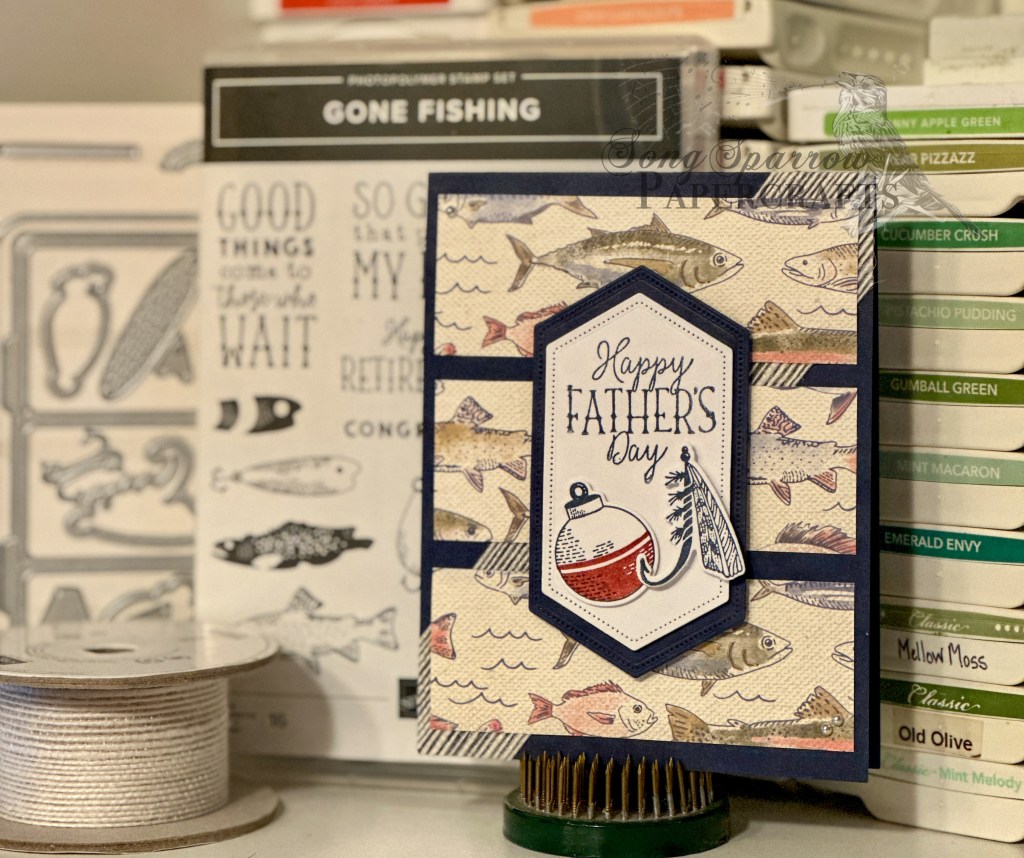
Thus far, I’ve showcased the Pansy Patch set from the new catalog. This week we’ll be taking a look at the Gone Fishing Suite. June is a busy month in our family between Father’s Day and birthdays, and this set will be perfect!
The Gone Fishing Suite includes the stamps, dies, designer paper, and the Twisted Rope 3D embossing folder. (Buy the suite here) For this design, I used the stamps, dies, and paper. I included jute ribbon in the background to give the look of netting and add a little visual interest. The center panel is popped up on dimensionals to ensure it stood out against the patterned paper, and the fishing tackle elements are also layered on dimensionals for visual interest.
I’m really loving this set so far and can’t wait to show you more designs with this suite all this week!
Products used: Let’s Go Fishing DSP Night of Navy cardstock Gone Fishing stamp set Gone Fishing dies Adhesive-backed pearls Dimensionals Adhesives Stitched Nested Labels dies (retired) Jute ribbon (retired)
All ads on this site are posted by WordPress and are based on your personal browsing history. I do not control ad content.