Happy Valentine’s Day, everybody! So glad you stopped by today. I’ve been so tired when I got home from the office on Thursday and Friday that I pretty much had dinner, did the usual family thing, and then went straight to bed! It’s a super busy time of year with the kiddo’s various activities, church activities picking up as we head into Lent, and just life stuff. Do you ever have weeks where you’re just done when you get home? I feel like I’m having a string of them.
Despite being pretty wiped out from the work day, I did actually play in the crafty goodies the last two days in preparation from Valentine’s Day. So today, I’m going to be bringing you two posts to show you what I pulled together from the crafty stash to make some folks feel a little love this week. I have oodles of Valentine-themed goodies in the retired Stampin’ Up! stash and that’s where I turned for my projects. I like to swipe holiday-themed things when they go on the sale rack in the store to prep for the next year. For anyone who likes to make things for craft fairs or just likes to make things to give away, this is a perfect way to give gifts from the heart on a budget! So we’re pulling out last year’s beautiful Most Adored foiled paper, Celebrate Love ephemera, and Sweet Sorbet metallic ribbon, along with some gift bags I bought on clearance a Christmas or two ago.
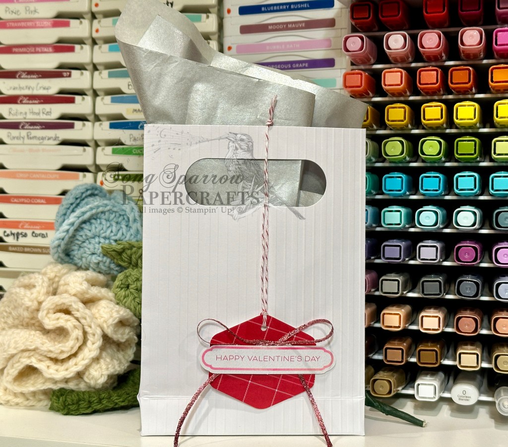
I like to make little gifties for my co-workers, and with some clearance chocolates in-hand, I just needed to whip up some cute packaging. I had a package of pre-scored, pre-assembled SU! gift bags in my stash and they were just the perfect size to fill with the assortment of chocolates I purchased — Hershey Kisses, Hershey Nuggets, and some Lindor truffles. I cut some smaller pieces of metallic tissue paper from my wrapping stash to stuff in each bag. And then I set about making the custom gift tags. I chose a red plaid pattern from the Most Adored paper pack and cut tags using the Heartfelt Hexagon punch. I punched a small hole in the top of each one and thread a loop of red & white baker’s twine to affix the tag to each bag. I made a bow of the Sweet Sorbet metallic ribbon and then placed a sentiment from the Celebrate Love ephemera pack on top using dimensionals. I tied the tag to the bag and voila — gift complete.
Sometimes it’s just a simple touch that really elevates a gift. And all we needed here to dress up the cute SU! gift bag was a tag. If you drop back by a little later today, I’m going to show you how I dressed up the little gifties I got for my boys for Valentine’s Day.
Products used:
Most Adored DSP, Celebrate Love ephemera, Sweet Sorbet metallic ribbon (retired)
Heartfelt Hexagon punch
Red & white baker’s twine
Dimensionals

![Azure Afternoon 8 1/2" X 11" Cardstock [ 161719 ]](https://assets1.tamsnetwork.com/images/EC042017NF/161719s.jpg "Azure Afternoon 8 1/2\" X 11\" Cardstock [ 161719 ]")
![Pretty In Pink 8 1/2" X 11" Cardstock [ 163793 ]](https://assets1.tamsnetwork.com/images/EC042017NF/163793s.jpg "Pretty In Pink 8 1/2\" X 11\" Cardstock [ 163793 ]")
![Basic White 8 1/2" X 11" Cardstock [ 166780 ]](https://assets1.tamsnetwork.com/images/EC042017NF/166780s.jpg "Basic White 8 1/2\" X 11\" Cardstock [ 166780 ]")
![Everyday Skies 6" X 6" (15.2 X 15.2 Cm) Designer Series Paper [ 164622 ]](https://assets1.tamsnetwork.com/images/EC042017NF/164622s.jpg "Everyday Skies 6\" X 6\" (15.2 X 15.2 Cm) Designer Series Paper [ 164622 ]")
![Pastel Ombre Glimmer 12" X 12" (30.5 X 30.5 Cm) Specialty Paper [ 164851 ]](https://assets1.tamsnetwork.com/images/EC042017NF/164851s.jpg "Pastel Ombre Glimmer 12\" X 12\" (30.5 X 30.5 Cm) Specialty Paper [ 164851 ]")
![Silver Foil 12" X 12" (30.5 X 30.5 Cm) Specialty Pack [ 163096 ]](https://assets1.tamsnetwork.com/images/EC042017NF/163096s.jpg "Silver Foil 12\" X 12\" (30.5 X 30.5 Cm) Specialty Pack [ 163096 ]")
![Saying Hey Photopolymer Stamp Set (English) [ 163697 ]](https://assets1.tamsnetwork.com/images/EC042017NF/163697s.jpg "Saying Hey Photopolymer Stamp Set (English) [ 163697 ]")
![Balmy Blue Classic Stampin' Pad [ 147105 ]](https://assets1.tamsnetwork.com/images/EC042017NF/147105s.jpg "Balmy Blue Classic Stampin' Pad [ 147105 ]")
![Blueberry Bushel Classic Stampin' Pad [ 147138 ]](https://assets1.tamsnetwork.com/images/EC042017NF/147138s.jpg "Blueberry Bushel Classic Stampin' Pad [ 147138 ]")
![Heartfelt Hexagon Punch [ 162888 ]](https://assets1.tamsnetwork.com/images/EC042017NF/162888s.jpg "Heartfelt Hexagon Punch [ 162888 ]")
![Friends For Life Dies (English) [ 163364 ]](https://assets1.tamsnetwork.com/images/EC042017NF/163364s.jpg "Friends For Life Dies (English) [ 163364 ]")
![Inspiring Snapdragons Dies [ 163673 ]](https://assets1.tamsnetwork.com/images/EC042017NF/163673s.jpg "Inspiring Snapdragons Dies [ 163673 ]")
![Pretty In Pink 3/8" (1 Cm) Bordered Ribbon [ 163784 ]](https://assets1.tamsnetwork.com/images/EC042017NF/163784s.jpg "Pretty In Pink 3/8\" (1 Cm) Bordered Ribbon [ 163784 ]")
![Adhesive Backed Sequins Trio [ 161206 ]](https://assets1.tamsnetwork.com/images/EC042017NF/161206s.jpg "Adhesive Backed Sequins Trio [ 161206 ]")
![Mini Glue Dots [ 103683 ]](https://assets1.tamsnetwork.com/images/EC042017NF/103683s.jpg "Mini Glue Dots [ 103683 ]")
![Fine-Tip Glue Pen [ 138309 ]](https://assets1.tamsnetwork.com/images/EC042017NF/138309s.jpg "Fine-Tip Glue Pen [ 138309 ]")
![Stampin' Dimensionals [ 104430 ]](https://assets1.tamsnetwork.com/images/EC042017NF/104430s.jpg "Stampin' Dimensionals [ 104430 ]")


 Specialty Paper")


 Bordered Ribbon")