Our design spotlight for this week is the Florals in Bloom suite by Stampin’ Up! Aside from the fact that this suite is gorgeous in every conceivable way, it’s been the perfect spot of sunshine in a week that hasn’t been the happiest here in North Texas. Whether you are personally impacted by the flooding in the Texas Hill Country or not, there seems to be a universal feeling of sadness as we all come to grips with the innocent lives lost in the blink of an eye.
Today’s card design is inspired by those difficult moments where we simply don’t have any words to say. We simply hope that a hug will do. And for cardmakers, sometimes we have to send a hug in the mail. This card pairs the Pretty Florals bundle with The Right Words stamp set for the perfect hug in the mail.
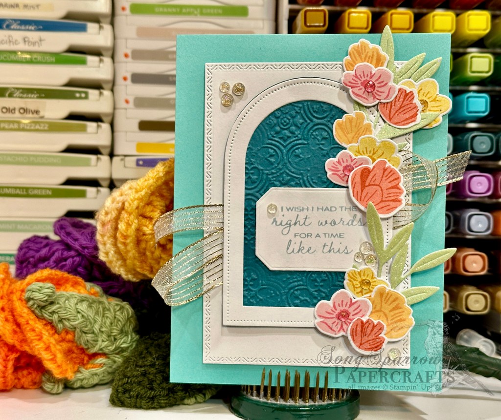
We get started with a base of Coastal Cabana cardstock. The focal panel backdrop is a simple piece of white cardstock diecut with one of the larger Textured Notes dies. I wanted to create a window look and so I used the Everyday Arches dies to create a window frame of white cardstock and then cut a backdrop of Pretty Peacock that is machine embossed with the Distressed Tiles embossing folder to give the look of a paneled wall in the background. Our window is mounted over gold striped mesh ribbon for a subtle bit of twinkle that spans the card front. I loved the idea of a flowering fine climbing outside the window to add that touch of happy color. The flowers are stamped in various shades of pink, yellow, orange, and red-orange on white carsdtock using the Pretty Florals stamps and then diecut with the coordinating dies. The vine is cut from a sheet of the green ombre glimmer paper in the pastel ombre paper pack. The vine and flowers are adhered next to the window using a combination of glue dots and dimensionals to create a layered look. We add little pops of sparkle across the card front with a combination of foil gems in a variety of colors.
The dies in the Florals in Bloom suite offer a lot of opportunity for beautiful designs. We’ll explore more of what the dies can do in our next design. I hope you’ll drop by and check it out.
Product List![Coastal Cabana 8-1/2" X 11" Cardstock [ 131297 ]](https://assets1.tamsnetwork.com/images/EC042017NF/131297s.jpg "Coastal Cabana 8-1/2\" X 11\" Cardstock [ 131297 ]")
![Pretty Peacock 8-1/2" X 11" Cardstock [ 150880 ]](https://assets1.tamsnetwork.com/images/EC042017NF/150880s.jpg "Pretty Peacock 8-1/2\" X 11\" Cardstock [ 150880 ]")
![Basic White 8 1/2" X 11" Cardstock [ 166780 ]](https://assets1.tamsnetwork.com/images/EC042017NF/166780s.jpg "Basic White 8 1/2\" X 11\" Cardstock [ 166780 ]")
![Pastel Ombre Glimmer 12" X 12" (30.5 X 30.5 Cm) Specialty Paper [ 164851 ]](https://assets1.tamsnetwork.com/images/EC042017NF/164851s.jpg "Pastel Ombre Glimmer 12\" X 12\" (30.5 X 30.5 Cm) Specialty Paper [ 164851 ]")
![The Right Words Cling Stamp Set (English) [ 165316 ]](https://assets1.tamsnetwork.com/images/EC042017NF/165316s.jpg "The Right Words Cling Stamp Set (English) [ 165316 ]")
![Pretty Florals Bundle [ 165179 ]](https://assets1.tamsnetwork.com/images/EC042017NF/165179s.jpg "Pretty Florals Bundle [ 165179 ]")
![Textured Notes Dies [ 165555 ]](https://assets1.tamsnetwork.com/images/EC042017NF/165555s.jpg "Textured Notes Dies [ 165555 ]")
![Everyday Arches Dies [ 164629 ]](https://assets1.tamsnetwork.com/images/EC042017NF/164629s.jpg "Everyday Arches Dies [ 164629 ]")
![Countryside Corners Dies [ 161471 ]](https://assets1.tamsnetwork.com/images/EC042017NF/161471s.jpg "Countryside Corners Dies [ 161471 ]")
![Distressed Tile 3 D Embossing Folder [ 162189 ]](https://assets1.tamsnetwork.com/images/EC042017NF/162189s.jpg "Distressed Tile 3 D Embossing Folder [ 162189 ]")
![Pretty In Pink Classic Stampin Pad [ 163807 ]](https://assets1.tamsnetwork.com/images/EC042017NF/163807s.jpg "Pretty In Pink Classic Stampin Pad [ 163807 ]")
![Strawberry Slush Classic Stampin' Pad [ 165286 ]](https://assets1.tamsnetwork.com/images/EC042017NF/165286s.jpg "Strawberry Slush Classic Stampin' Pad [ 165286 ]")
![Daffodil Delight Classic Stampin' Pad [ 147094 ]](https://assets1.tamsnetwork.com/images/EC042017NF/147094s.jpg "Daffodil Delight Classic Stampin' Pad [ 147094 ]")
![Crushed Curry Classic Stampin' Pad [ 147087 ]](https://assets1.tamsnetwork.com/images/EC042017NF/147087s.jpg "Crushed Curry Classic Stampin' Pad [ 147087 ]")
![Peach Pie Classic Stampin Pad [ 163810 ]](https://assets1.tamsnetwork.com/images/EC042017NF/163810s.jpg "Peach Pie Classic Stampin Pad [ 163810 ]")
![Timid Tiger Classic Stampin' Pad [ 165278 ]](https://assets1.tamsnetwork.com/images/EC042017NF/165278s.jpg "Timid Tiger Classic Stampin' Pad [ 165278 ]")
![Flirty Flamingo Classic Stampin' Pad [ 147052 ]](https://assets1.tamsnetwork.com/images/EC042017NF/147052s.jpg "Flirty Flamingo Classic Stampin' Pad [ 147052 ]")
![Calypso Coral Classic Stampin' Pad [ 147101 ]](https://assets1.tamsnetwork.com/images/EC042017NF/147101s.jpg "Calypso Coral Classic Stampin' Pad [ 147101 ]")
![Cloud Cover Classic Stampin' Ink Refill [ 165279 ]](https://assets1.tamsnetwork.com/images/EC042017NF/165279s.jpg "Cloud Cover Classic Stampin' Ink Refill [ 165279 ]")
![Gold Striped 3/8" (1 Cm) Mesh Ribbon [ 165599 ]](https://assets1.tamsnetwork.com/images/EC042017NF/165599s.jpg "Gold Striped 3/8\" (1 Cm) Mesh Ribbon [ 165599 ]")
![Strawberry Slush & Pretty In Pink Gems [ 165615 ]](https://assets1.tamsnetwork.com/images/EC042017NF/165615s.jpg "Strawberry Slush & Pretty In Pink Gems [ 165615 ]")
![Iridescent Foil Gems [ 162842 ]](https://assets1.tamsnetwork.com/images/EC042017NF/162842s.jpg "Iridescent Foil Gems [ 162842 ]")
![Stampin' Dimensionals [ 104430 ]](https://assets1.tamsnetwork.com/images/EC042017NF/104430s.jpg "Stampin' Dimensionals [ 104430 ]")
![Mini Stampin' Dimensionals [ 144108 ]](https://assets1.tamsnetwork.com/images/EC042017NF/144108s.jpg "Mini Stampin' Dimensionals [ 144108 ]")
![Mini Glue Dots [ 103683 ]](https://assets1.tamsnetwork.com/images/EC042017NF/103683s.jpg "Mini Glue Dots [ 103683 ]")

![Strawberry Slush 8 1/2" X 11" Cardstock [ 165625 ]](https://assets1.tamsnetwork.com/images/EC042017NF/165625s.jpg "Strawberry Slush 8 1/2\" X 11\" Cardstock [ 165625 ]")
![Pool Party 8-1/2" X 11" Cardstock [ 122924 ]](https://assets1.tamsnetwork.com/images/EC042017NF/122924s.jpg "Pool Party 8-1/2\" X 11\" Cardstock [ 122924 ]")
![Secret Sea 8 1/2" X 11" Cardstock [ 165624 ]](https://assets1.tamsnetwork.com/images/EC042017NF/165624s.jpg "Secret Sea 8 1/2\" X 11\" Cardstock [ 165624 ]")
![Florals In Bloom 12" X 12" (30.5 X 30.5 Cm) Designer Series Paper [ 165175 ]](https://assets1.tamsnetwork.com/images/EC042017NF/165175s.jpg "Florals In Bloom 12\" X 12\" (30.5 X 30.5 Cm) Designer Series Paper [ 165175 ]")
![Beautiful Bokeh 6" X 6" (15.2 X 15.2 Cm) Designer Series Paper [ 164607 ]](https://assets1.tamsnetwork.com/images/EC042017NF/164607s.jpg "Beautiful Bokeh 6\" X 6\" (15.2 X 15.2 Cm) Designer Series Paper [ 164607 ]")
![Beautiful Butterflies Hybrid Embossing Folder [ 164614 ]](https://assets1.tamsnetwork.com/images/EC042017NF/164614s.jpg "Beautiful Butterflies Hybrid Embossing Folder [ 164614 ]")
![Spotlight On Nature Dies [ 163580 ]](https://assets1.tamsnetwork.com/images/EC042017NF/163580s.jpg "Spotlight On Nature Dies [ 163580 ]")
![Sentimental Framing Photopolymer Stamp Set (English) [ 165475 ]](https://assets1.tamsnetwork.com/images/EC042017NF/165475s.jpg "Sentimental Framing Photopolymer Stamp Set (English) [ 165475 ]")
![Secret Sea Classic Stampin' Pad [ 165285 ]](https://assets1.tamsnetwork.com/images/EC042017NF/165285s.jpg "Secret Sea Classic Stampin' Pad [ 165285 ]")
![Iridescent 1/2" (1.3 Cm) Striped Trim [ 163299 ]](https://assets1.tamsnetwork.com/images/EC042017NF/163299s.jpg "Iridescent 1/2\" (1.3 Cm) Striped Trim [ 163299 ]")
![2025–2027 In Color™ Flat Pearls [ 165192 ]](https://assets1.tamsnetwork.com/images/EC042017NF/165192s.jpg "2025–2027 In Color™ Flat Pearls [ 165192 ]")

![Blackberry Bliss 8-1/2" X 11" Cardstock [ 133675 ]](https://assets1.tamsnetwork.com/images/EC042017NF/133675s.jpg "Blackberry Bliss 8-1/2\" X 11\" Cardstock [ 133675 ]")
![Shaded Spruce 8-1/2" X 11" Cardstock [ 146981 ]](https://assets1.tamsnetwork.com/images/EC042017NF/146981s.jpg "Shaded Spruce 8-1/2\" X 11\" Cardstock [ 146981 ]")
![Lovely Garden 12" X 12" (30.5 X 30.5 Cm) Designer Series Paper [ 165524 ]](https://assets1.tamsnetwork.com/images/EC042017NF/165524s.jpg "Lovely Garden 12\" X 12\" (30.5 X 30.5 Cm) Designer Series Paper [ 165524 ]")
![Thoughtful Designs 12" X 12" (30.5 X 30.5 Cm) Specialty Designer Series Paper [ 163317 ]](https://assets1.tamsnetwork.com/images/EC042017NF/163317s.jpg "Thoughtful Designs 12\" X 12\" (30.5 X 30.5 Cm) Specialty Designer Series Paper [ 163317 ]")
![Berry Burst, Old Olive & White 12" X 12" (30.5 X 30.5 Cm) Glimmer Specialty Paper [ 163769 ]](https://assets1.tamsnetwork.com/images/EC042017NF/163769s.jpg "Berry Burst, Old Olive & White 12\" X 12\" (30.5 X 30.5 Cm) Glimmer Specialty Paper [ 163769 ]")
![Silver Foil 12" X 12" (30.5 X 30.5 Cm) Specialty Pack [ 163096 ]](https://assets1.tamsnetwork.com/images/EC042017NF/163096s.jpg "Silver Foil 12\" X 12\" (30.5 X 30.5 Cm) Specialty Pack [ 163096 ]")
![Dotted Circles 3 D Embossing Folder [ 163789 ]](https://assets1.tamsnetwork.com/images/EC042017NF/163789s.jpg "Dotted Circles 3 D Embossing Folder [ 163789 ]")
![Thankful Garden Bundle (English) [ 165534 ]](https://assets1.tamsnetwork.com/images/EC042017NF/165534s.jpg "Thankful Garden Bundle (English) [ 165534 ]")
![She's The Greatest Photopolymer Stamp Set (English) [ 165439 ]](https://assets1.tamsnetwork.com/images/EC042017NF/165439s.jpg "She's The Greatest Photopolymer Stamp Set (English) [ 165439 ]")
![Sweet Blooms Dies (English) [ 165186 ]](https://assets1.tamsnetwork.com/images/EC042017NF/165186s.jpg "Sweet Blooms Dies (English) [ 165186 ]")
![Jet Black Stāzon Ink Pad [ 101406 ]](https://assets1.tamsnetwork.com/images/EC042017NF/101406s.jpg "Jet Black Stāzon Ink Pad [ 101406 ]")
![Blackberry Bliss Classic Stampin' Pad [ 147092 ]](https://assets1.tamsnetwork.com/images/EC042017NF/147092s.jpg "Blackberry Bliss Classic Stampin' Pad [ 147092 ]")
![Shy Shamrock Classic Stampin Pad [ 163808 ]](https://assets1.tamsnetwork.com/images/EC042017NF/163808s.jpg "Shy Shamrock Classic Stampin Pad [ 163808 ]")
![Clear Wink Of Stella Glitter Brush [ 141897 ]](https://assets1.tamsnetwork.com/images/EC042017NF/141897s.jpg "Clear Wink Of Stella Glitter Brush [ 141897 ]")
![Regal Foiled Adhesive Backed Dots [ 164038 ]](https://assets1.tamsnetwork.com/images/EC042017NF/164038s.jpg "Regal Foiled Adhesive Backed Dots [ 164038 ]")
![Drusy Adhesive Backed Embellishments [ 164223 ]](https://assets1.tamsnetwork.com/images/EC042017NF/164223s.jpg "Drusy Adhesive Backed Embellishments [ 164223 ]")
![Fine-Tip Glue Pen [ 138309 ]](https://assets1.tamsnetwork.com/images/EC042017NF/138309s.jpg "Fine-Tip Glue Pen [ 138309 ]")


![Gray Granite 8-1/2" X 11" Cardstock [ 146983 ]](https://assets1.tamsnetwork.com/images/EC042017NF/146983s.jpg "Gray Granite 8-1/2\" X 11\" Cardstock [ 146983 ]")
![Misty Moonlight 8-1/2" X 11" Cardstock [ 153081 ]](https://assets1.tamsnetwork.com/images/EC042017NF/153081s.jpg "Misty Moonlight 8-1/2\" X 11\" Cardstock [ 153081 ]")
![Country Woods 12" X 12" (30.5 X 30.5 Cm) Designer Series Paper [ 163393 ]](https://assets1.tamsnetwork.com/images/EC042017NF/163393s.jpg "Country Woods 12\" X 12\" (30.5 X 30.5 Cm) Designer Series Paper [ 163393 ]")
![Nature's Sweetness 12" X 12" (30.5 X 30.5 Cm) Specialty Designer Series Paper [ 162616 ]](https://assets1.tamsnetwork.com/images/EC042017NF/162616s.jpg "Nature's Sweetness 12\" X 12\" (30.5 X 30.5 Cm) Specialty Designer Series Paper [ 162616 ]")
![Textured Metallic 12" X 12" (30.5 X 30.5 Cm) Specialty Paper [ 163772 ]](https://assets1.tamsnetwork.com/images/EC042017NF/163772s.jpg "Textured Metallic 12\" X 12\" (30.5 X 30.5 Cm) Specialty Paper [ 163772 ]")
![Country Flowers Bundle (English) [ 163411 ]](https://assets1.tamsnetwork.com/images/EC042017NF/163411s.jpg "Country Flowers Bundle (English) [ 163411 ]")
![Gray Granite Classic Stampin' Pad [ 147118 ]](https://assets1.tamsnetwork.com/images/EC042017NF/147118s.jpg "Gray Granite Classic Stampin' Pad [ 147118 ]")
![Versamark Pad [ 102283 ]](https://assets1.tamsnetwork.com/images/EC042017NF/102283s.jpg "Versamark Pad [ 102283 ]")
![Basics Wow! Embossing Powder [ 165679 ]](https://assets1.tamsnetwork.com/images/EC042017NF/165679s.jpg "Basics Wow! Embossing Powder [ 165679 ]")
![Calypso Coral Stampin' Blends Markers Combo Pack [ 144045 ] (Retired)](https://assets1.tamsnetwork.com/images/EC042017NF/144045s.jpg "Calypso Coral Stampin' Blends Markers Combo Pack [ 144045 ] (Retired)")
![Pretty In Pink Stampin’ Blends Combo Pack [ 163824 ]](https://assets1.tamsnetwork.com/images/EC042017NF/163824s.jpg "Pretty In Pink Stampin’ Blends Combo Pack [ 163824 ]")
![Melon Mambo Stampin' Blends Combo Pack [ 153112 ]](https://assets1.tamsnetwork.com/images/EC042017NF/153112s.jpg "Melon Mambo Stampin' Blends Combo Pack [ 153112 ]")
![Moody Mauve Stampin’ Blends Combo Pack [ 161660 ]](https://assets1.tamsnetwork.com/images/EC042017NF/161660s.jpg "Moody Mauve Stampin’ Blends Combo Pack [ 161660 ]")
![Granny Apple Green Stampin' Blends Combo Pack [ 154885 ]](https://assets1.tamsnetwork.com/images/EC042017NF/154885s.jpg "Granny Apple Green Stampin' Blends Combo Pack [ 154885 ]")
![Soft Sea Foam Stampin' Blends Markers Combo Pack [ 148059 ] (Retired)](https://assets1.tamsnetwork.com/images/EC042017NF/148059s.jpg "Soft Sea Foam Stampin' Blends Markers Combo Pack [ 148059 ] (Retired)")
![Shaded Spruce Stampin' Blends Combo Pack [ 154903 ]](https://assets1.tamsnetwork.com/images/EC042017NF/154903s.jpg "Shaded Spruce Stampin' Blends Combo Pack [ 154903 ]")
![Stampin’ Blends Light Combo Pack [ 159465 ]](https://assets1.tamsnetwork.com/images/EC042017NF/159465s.jpg "Stampin’ Blends Light Combo Pack [ 159465 ]")
![Gold & Silver 1/8" (3.2 Mm) Trim Combo Pack [ 161633 ]](https://assets1.tamsnetwork.com/images/EC042017NF/161633s.jpg "Gold & Silver 1/8\" (3.2 Mm) Trim Combo Pack [ 161633 ]")
![Iridescent Faceted Gems [ 163368 ]](https://assets1.tamsnetwork.com/images/EC042017NF/163368s.jpg "Iridescent Faceted Gems [ 163368 ]")

![Beautiful Butterflies Bundle (English) [ 164615 ]](https://assets1.tamsnetwork.com/images/EC042017NF/164615s.jpg "Beautiful Butterflies Bundle (English) [ 164615 ]")
![Layers Of Beauty Bundle (English) [ 163519 ]](https://assets1.tamsnetwork.com/images/EC042017NF/163519s.jpg "Layers Of Beauty Bundle (English) [ 163519 ]")
![Fresh Freesia Classic Stampin' Pad [ 155611 ]](https://assets1.tamsnetwork.com/images/EC042017NF/155611s.jpg "Fresh Freesia Classic Stampin' Pad [ 155611 ]")
![Pretty Peacock Classic Stampin’ Pad [ 150083 ]](https://assets1.tamsnetwork.com/images/EC042017NF/150083s.jpg "Pretty Peacock Classic Stampin’ Pad [ 150083 ]")
![Small Blending Brushes [ 160518 ]](https://assets1.tamsnetwork.com/images/EC042017NF/160518s.jpg "Small Blending Brushes [ 160518 ]")
![Paper Butterfly Accents [ 162612 ]](https://assets1.tamsnetwork.com/images/EC042017NF/162612s.jpg "Paper Butterfly Accents [ 162612 ]")
![Two Tone Sparkle Gems [ 164633 ]](https://assets1.tamsnetwork.com/images/EC042017NF/164633s.jpg "Two Tone Sparkle Gems [ 164633 ]")
![Rhinestone Basic Jewels [ 144220 ]](https://assets1.tamsnetwork.com/images/EC042017NF/144220s.jpg "Rhinestone Basic Jewels [ 144220 ]")
![Pretty Peacock & Gold 3/8" (1 Cm) Metallic Ribbon [ 162588 ]](https://assets1.tamsnetwork.com/images/EC042017NF/162588s.jpg "Pretty Peacock & Gold 3/8\" (1 Cm) Metallic Ribbon [ 162588 ]")
![Blackberry Bliss & Gold 1/2" (1.3 Cm) Textured Ribbon [ 164039 ]](https://assets1.tamsnetwork.com/images/EC042017NF/164039s.jpg "Blackberry Bliss & Gold 1/2\" (1.3 Cm) Textured Ribbon [ 164039 ]")
![Pecan Pie 8 1/2" X 11" Cardstock [ 161717 ]](https://assets1.tamsnetwork.com/images/EC042017NF/161717s.jpg "Pecan Pie 8 1/2\" X 11\" Cardstock [ 161717 ]")
![Mossy Meadow 8-1/2" X 11" Cardstock [ 133676 ]](https://assets1.tamsnetwork.com/images/EC042017NF/133676s.jpg "Mossy Meadow 8-1/2\" X 11\" Cardstock [ 133676 ]")
![Early Espresso 8-1/2" X 11" Cardstock [ 119686 ]](https://assets1.tamsnetwork.com/images/EC042017NF/119686s.jpg "Early Espresso 8-1/2\" X 11\" Cardstock [ 119686 ]")
![Smoky Slate 8-1/2" X 11" Cardstock [ 131202 ]](https://assets1.tamsnetwork.com/images/EC042017NF/131202s.jpg "Smoky Slate 8-1/2\" X 11\" Cardstock [ 131202 ]")
![Gold Mercury Vellum 12" X 12" (30.5 X 30.5 Cm) Specialty Designer Series Paper [ 164142 ]](https://assets1.tamsnetwork.com/images/EC042017NF/164142s.jpg "Gold Mercury Vellum 12\" X 12\" (30.5 X 30.5 Cm) Specialty Designer Series Paper [ 164142 ]")
![Faith Collection Bundle (English) [ 164796 ]](https://assets1.tamsnetwork.com/images/EC042017NF/164796s.jpg "Faith Collection Bundle (English) [ 164796 ]")
![Unbounded Love Photopolymer Stamp Set (English) [ 163378 ]](https://assets1.tamsnetwork.com/images/EC042017NF/163378s.jpg "Unbounded Love Photopolymer Stamp Set (English) [ 163378 ]")
![Early Espresso Classic Stampin' Pad [ 147114 ]](https://assets1.tamsnetwork.com/images/EC042017NF/147114s.jpg "Early Espresso Classic Stampin' Pad [ 147114 ]")
![Mossy Meadow Classic Stampin' Pad [ 147111 ]](https://assets1.tamsnetwork.com/images/EC042017NF/147111s.jpg "Mossy Meadow Classic Stampin' Pad [ 147111 ]")
![Autumn Leaves Dies [ 162185 ]](https://assets1.tamsnetwork.com/images/EC042017NF/162185s.jpg "Autumn Leaves Dies [ 162185 ]")
![Gold Twisted Thread [ 164603 ]](https://assets1.tamsnetwork.com/images/EC042017NF/164603s.jpg "Gold Twisted Thread [ 164603 ]")
![Low Profile Dots [ 164658 ]](https://assets1.tamsnetwork.com/images/EC042017NF/164658s.jpg "Low Profile Dots [ 164658 ]")
![Fresh Freesia 8 1/2" X 11" Cardstock [ 155613 ]](https://assets1.tamsnetwork.com/images/EC042017NF/155613s.jpg "Fresh Freesia 8 1/2\" X 11\" Cardstock [ 155613 ]")
![Old Olive 8-1/2" X 11" Cardstock [ 100702 ]](https://assets1.tamsnetwork.com/images/EC042017NF/100702s.jpg "Old Olive 8-1/2\" X 11\" Cardstock [ 100702 ]")
![Season Of Elegance 12" X 12" (30.5 X 30.5 Cm) Specialty Designer Series Paper [ 164144 ]](https://assets1.tamsnetwork.com/images/EC042017NF/164144s.jpg "Season Of Elegance 12\" X 12\" (30.5 X 30.5 Cm) Specialty Designer Series Paper [ 164144 ]")
![2024–2026 In Color™ Glimmer 12" X 12" (30.5 X 30.5 Cm) Specialty Paper [ 163771 ]](https://assets1.tamsnetwork.com/images/EC042017NF/163771s.jpg "2024–2026 In Color™ Glimmer 12\" X 12\" (30.5 X 30.5 Cm) Specialty Paper [ 163771 ]")
![Three Color Glimmer 12" X 12" (30.5 X 30.5 Cm) Specialty Paper [ 162813 ]](https://assets1.tamsnetwork.com/images/EC042017NF/162813s.jpg "Three Color Glimmer 12\" X 12\" (30.5 X 30.5 Cm) Specialty Paper [ 162813 ]")
![Heartfelt Hellos Cling Stamp Set (English) [ 162964 ]](https://assets1.tamsnetwork.com/images/EC042017NF/162964s.jpg "Heartfelt Hellos Cling Stamp Set (English) [ 162964 ]")
![Perennial Postage Dies [ 162607 ]](https://assets1.tamsnetwork.com/images/EC042017NF/162607s.jpg "Perennial Postage Dies [ 162607 ]")
![Sending Love Dies [ 162879 ]](https://assets1.tamsnetwork.com/images/EC042017NF/162879s.jpg "Sending Love Dies [ 162879 ]")
![Country Flowers Dies [ 163410 ]](https://assets1.tamsnetwork.com/images/EC042017NF/163410s.jpg "Country Flowers Dies [ 163410 ]")
![Mixed Labels Dies [ 164652 ]](https://assets1.tamsnetwork.com/images/EC042017NF/164652s.jpg "Mixed Labels Dies [ 164652 ]")
![Fresh Freesia 3/8" (1 Cm) Seam Binding Ribbon [ 164971 ]](https://assets1.tamsnetwork.com/images/EC042017NF/164971s.jpg "Fresh Freesia 3/8\" (1 Cm) Seam Binding Ribbon [ 164971 ]")
![Purple Fine Shimmer Gems [ 162611 ]](https://assets1.tamsnetwork.com/images/EC042017NF/162611s.jpg "Purple Fine Shimmer Gems [ 162611 ]")
![2024–2026 In Color™ Shimmer Gems [ 163781 ]](https://assets1.tamsnetwork.com/images/EC042017NF/163781s.jpg "2024–2026 In Color™ Shimmer Gems [ 163781 ]")
![Purple Adhesive Backed Sequins [ 164970 ]](https://assets1.tamsnetwork.com/images/EC042017NF/164970s.jpg "Purple Adhesive Backed Sequins [ 164970 ]")
![Silver 12" X 12" (30.5 X 30.5 Cm) Foil Sheets [ 163387 ]](https://assets1.tamsnetwork.com/images/EC042017NF/163387s.jpg "Silver 12\" X 12\" (30.5 X 30.5 Cm) Foil Sheets [ 163387 ]")
![Painted Lavender Dies [ 162596 ]](https://assets1.tamsnetwork.com/images/EC042017NF/162596s.jpg "Painted Lavender Dies [ 162596 ]")
![Wanted To Say Dies [ 161594 ]](https://assets1.tamsnetwork.com/images/EC042017NF/161594s.jpg "Wanted To Say Dies [ 161594 ]")
![Fresh Freesia 1/8" (3.2 Mm) Faux Velvet Ribbon [ 165540 ]](https://assets1.tamsnetwork.com/images/EC042017NF/165540s.jpg "Fresh Freesia 1/8\" (3.2 Mm) Faux Velvet Ribbon [ 165540 ]")


 Designer Series Paper")
 Specialty Designer Series Paper")
")


