This week, we’re using the new Stampin’ Up! Sweet Jar stamp & punch bundle to create our projects. And today, we’re keeping things super simple with just a few scraps of patterned paper and a diecut panel. And I used a fun taping technique to make the sentiment into a horizontal strip.
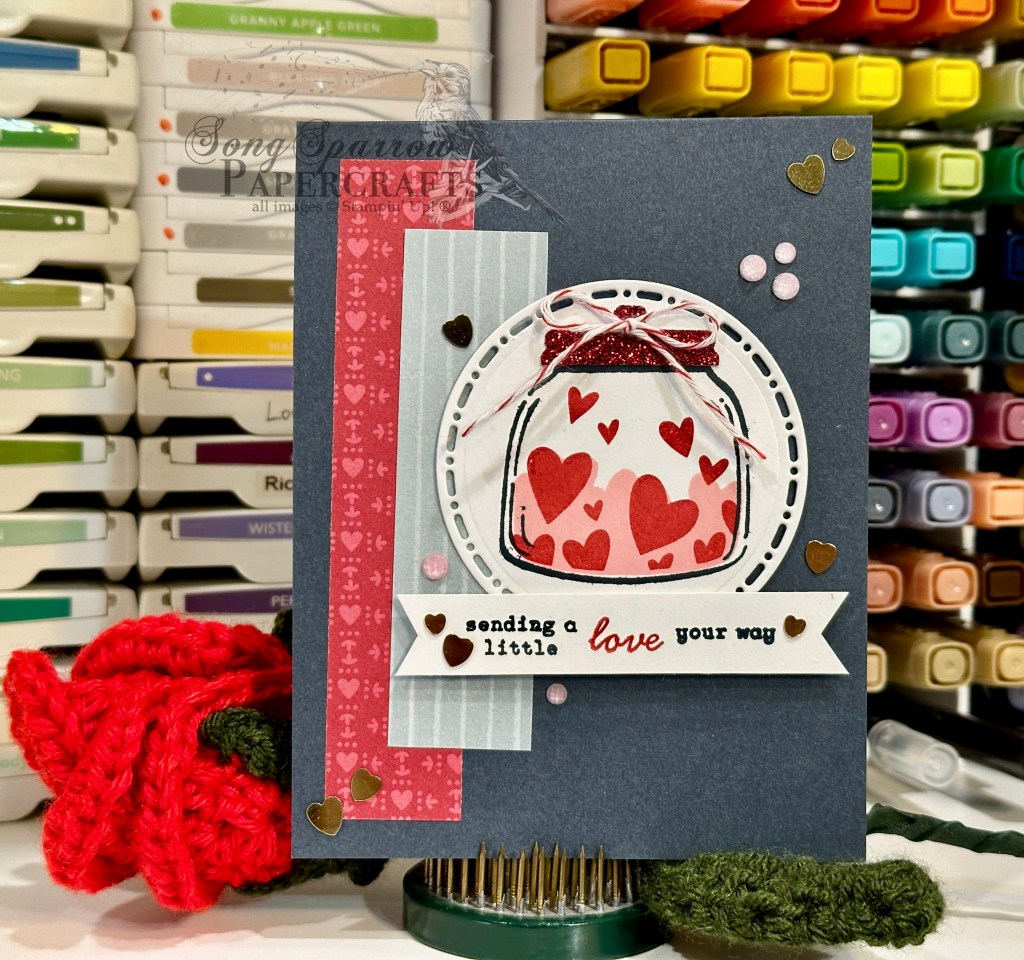
We get started with a standard base of Secret Sea cardstock. I used a scrap of the heart pattern from the Marbled Elegance paper pack along with a striped pattern from the Florals in Bloom pack to create the anchor for the focal panel. The focal panel starts with a piece of white cardstock diecut with one of the larger Spotlight on Nature dies and then we stamp the jar image and hearts directly onto the panel. To dress things up and add a touch of sparkle, I decided to punch the lid from a piece of red Festive glimmer paper (now retired). The focal panel is adhered directly over the paper strips onto the card front. I wanted to have a banner for the sentiment panel so I opted to break up the sentiment from the Sweet Jar stamp set to create a more horizontally-stretched sentiment. To ensure I didn’t have any ghost stamping on my sentiment panel, I covered the already-stamped portions of the sentiment with a strip of tape after I had the next portion inked up. The banner shape is created the simple way with just the trimmer and paper snips. And it’s popped up on dimensionals so that it stands up front and center. I scattered heart sequins and pink In Color shimmer gems across the front to draw the eye across the panel and provide some nice pops of sparkle.
The Sweet Jar bundle and its complimentary Jar of Joy stamp set provide possibilities for all sorts of different occasions. I hope you’ll drop in tomorrow to see what we celebrate next!
Product List![Secret Sea 8 1/2" X 11" Cardstock [ 165624 ]](https://assets1.tamsnetwork.com/images/EC042017NF/165624s.jpg "Secret Sea 8 1/2\" X 11\" Cardstock [ 165624 ]")
![Basic White 8 1/2" X 11" Cardstock [ 166780 ]](https://assets1.tamsnetwork.com/images/EC042017NF/166780s.jpg "Basic White 8 1/2\" X 11\" Cardstock [ 166780 ]")
![Marbled Elegance 12" X 12" (30.5 X 30.5 Cm) Specialty Designer Series Paper [ 164919 ]](https://assets1.tamsnetwork.com/images/EC042017NF/164919s.jpg "Marbled Elegance 12\" X 12\" (30.5 X 30.5 Cm) Specialty Designer Series Paper [ 164919 ]")
![Florals In Bloom 12" X 12" (30.5 X 30.5 Cm) Designer Series Paper [ 165175 ]](https://assets1.tamsnetwork.com/images/EC042017NF/165175s.jpg "Florals In Bloom 12\" X 12\" (30.5 X 30.5 Cm) Designer Series Paper [ 165175 ]")
![Festive 12" X 12" (30.5 X 30.5 Cm) Glimmer Paper [ 164106 ]](https://assets1.tamsnetwork.com/images/EC042017NF/164106s.jpg "Festive 12\" X 12\" (30.5 X 30.5 Cm) Glimmer Paper [ 164106 ]")
![Spotlight On Nature Dies [ 163580 ]](https://assets1.tamsnetwork.com/images/EC042017NF/163580s.jpg "Spotlight On Nature Dies [ 163580 ]")
![Sweet Jar Bundle (English) [ 165507 ]](https://assets1.tamsnetwork.com/images/EC042017NF/165507s.jpg "Sweet Jar Bundle (English) [ 165507 ]")
![Secret Sea Classic Stampin' Pad [ 165285 ]](https://assets1.tamsnetwork.com/images/EC042017NF/165285s.jpg "Secret Sea Classic Stampin' Pad [ 165285 ]")
![Pretty In Pink Classic Stampin Pad [ 163807 ]](https://assets1.tamsnetwork.com/images/EC042017NF/163807s.jpg "Pretty In Pink Classic Stampin Pad [ 163807 ]")
![Real Red Classic Stampin' Pad [ 147084 ]](https://assets1.tamsnetwork.com/images/EC042017NF/147084s.jpg "Real Red Classic Stampin' Pad [ 147084 ]")
![Real Red & White Baker's Twine [ 164051 ]](https://assets1.tamsnetwork.com/images/EC042017NF/164051s.jpg "Real Red & White Baker's Twine [ 164051 ]")
![Adhesive Backed Heart Sequins [ 164920 ]](https://assets1.tamsnetwork.com/images/EC042017NF/164920s.jpg "Adhesive Backed Heart Sequins [ 164920 ]")
![2024–2026 In Color™ Shimmer Gems [ 163781 ]](https://assets1.tamsnetwork.com/images/EC042017NF/163781s.jpg "2024–2026 In Color™ Shimmer Gems [ 163781 ]")
![Stampin' Dimensionals [ 104430 ]](https://assets1.tamsnetwork.com/images/EC042017NF/104430s.jpg "Stampin' Dimensionals [ 104430 ]")
![Mini Glue Dots [ 103683 ]](https://assets1.tamsnetwork.com/images/EC042017NF/103683s.jpg "Mini Glue Dots [ 103683 ]")
![Cloud Cover 8 1/2" X 11" Cardstock [ 165621 ]](https://assets1.tamsnetwork.com/images/EC042017NF/165621s.jpg "Cloud Cover 8 1/2\" X 11\" Cardstock [ 165621 ]")
![Unbounded Beauty 12" X 12" (30.5 X 30.5 Cm) Designer Series Paper [ 163372 ]](https://assets1.tamsnetwork.com/images/EC042017NF/163372s.jpg "Unbounded Beauty 12\" X 12\" (30.5 X 30.5 Cm) Designer Series Paper [ 163372 ]")
![Beautiful Bokeh 6" X 6" (15.2 X 15.2 Cm) Designer Series Paper [ 164607 ]](https://assets1.tamsnetwork.com/images/EC042017NF/164607s.jpg "Beautiful Bokeh 6\" X 6\" (15.2 X 15.2 Cm) Designer Series Paper [ 164607 ]")
![2024–2026 In Color™ Glimmer 12" X 12" (30.5 X 30.5 Cm) Specialty Paper [ 163771 ]](https://assets1.tamsnetwork.com/images/EC042017NF/163771s.jpg "2024–2026 In Color™ Glimmer 12\" X 12\" (30.5 X 30.5 Cm) Specialty Paper [ 163771 ]")
![Berry Burst, Old Olive & White 12" X 12" (30.5 X 30.5 Cm) Glimmer Specialty Paper [ 163769 ]](https://assets1.tamsnetwork.com/images/EC042017NF/163769s.jpg "Berry Burst, Old Olive & White 12\" X 12\" (30.5 X 30.5 Cm) Glimmer Specialty Paper [ 163769 ]")
![Melon Mambo Classic Stampin' Pad [ 147051 ]](https://assets1.tamsnetwork.com/images/EC042017NF/147051s.jpg "Melon Mambo Classic Stampin' Pad [ 147051 ]")
![Blackberry Bliss Classic Stampin' Pad [ 147092 ]](https://assets1.tamsnetwork.com/images/EC042017NF/147092s.jpg "Blackberry Bliss Classic Stampin' Pad [ 147092 ]")
![Cloud Cover Classic Stampin' Ink Refill [ 165279 ]](https://assets1.tamsnetwork.com/images/EC042017NF/165279s.jpg "Cloud Cover Classic Stampin' Ink Refill [ 165279 ]")
![Timid Tiger Classic Stampin' Pad [ 165278 ]](https://assets1.tamsnetwork.com/images/EC042017NF/165278s.jpg "Timid Tiger Classic Stampin' Pad [ 165278 ]")
![Daffodil Delight Classic Stampin' Pad [ 147094 ]](https://assets1.tamsnetwork.com/images/EC042017NF/147094s.jpg "Daffodil Delight Classic Stampin' Pad [ 147094 ]")
![Clear Wink Of Stella Glitter Brush [ 141897 ]](https://assets1.tamsnetwork.com/images/EC042017NF/141897s.jpg "Clear Wink Of Stella Glitter Brush [ 141897 ]")
![Charming Shimmer Faceted Dots [ 166139 ]](https://assets1.tamsnetwork.com/images/EC042017NF/166139s.jpg "Charming Shimmer Faceted Dots [ 166139 ]")
![Petunia Pop 1/4" (6.4 Mm) Iridescent Ribbon [ 166203 ]](https://assets1.tamsnetwork.com/images/EC042017NF/166203s.jpg "Petunia Pop 1/4\" (6.4 Mm) Iridescent Ribbon [ 166203 ]")
![Gold Twisted Thread [ 164603 ]](https://assets1.tamsnetwork.com/images/EC042017NF/164603s.jpg "Gold Twisted Thread [ 164603 ]")
![Mini Stampin' Dimensionals [ 144108 ]](https://assets1.tamsnetwork.com/images/EC042017NF/144108s.jpg "Mini Stampin' Dimensionals [ 144108 ]")
![Petunia Pop 8 1/2" X 11" Cardstock [ 163801 ]](https://assets1.tamsnetwork.com/images/EC042017NF/163801s.jpg "Petunia Pop 8 1/2\" X 11\" Cardstock [ 163801 ]")
![Blackberry Bliss 8-1/2" X 11" Cardstock [ 133675 ]](https://assets1.tamsnetwork.com/images/EC042017NF/133675s.jpg "Blackberry Bliss 8-1/2\" X 11\" Cardstock [ 133675 ]")
![Pool Party 8-1/2" X 11" Cardstock [ 122924 ]](https://assets1.tamsnetwork.com/images/EC042017NF/122924s.jpg "Pool Party 8-1/2\" X 11\" Cardstock [ 122924 ]")
![Smoky Slate 8-1/2" X 11" Cardstock [ 131202 ]](https://assets1.tamsnetwork.com/images/EC042017NF/131202s.jpg "Smoky Slate 8-1/2\" X 11\" Cardstock [ 131202 ]")
![Brushed Silver And Gold Foil 12" X 12" (30.5 X 30.5 Cm) Specialty Paper [ 164861 ]](https://assets1.tamsnetwork.com/images/EC042017NF/164861s.jpg "Brushed Silver And Gold Foil 12\" X 12\" (30.5 X 30.5 Cm) Specialty Paper [ 164861 ]")
![Country Woods 12" X 12" (30.5 X 30.5 Cm) Designer Series Paper [ 163393 ]](https://assets1.tamsnetwork.com/images/EC042017NF/163393s.jpg "Country Woods 12\" X 12\" (30.5 X 30.5 Cm) Designer Series Paper [ 163393 ]")
![Pretty Florals Dies [ 165178 ]](https://assets1.tamsnetwork.com/images/EC042017NF/165178s.jpg "Pretty Florals Dies [ 165178 ]")
![More Messages Bundle (English) [ 165473 ]](https://assets1.tamsnetwork.com/images/EC042017NF/165473s.jpg "More Messages Bundle (English) [ 165473 ]")
![Smoky Slate Classic Stampin' Pad [ 147113 ]](https://assets1.tamsnetwork.com/images/EC042017NF/147113s.jpg "Smoky Slate Classic Stampin' Pad [ 147113 ]")
![Drusy Adhesive Backed Embellishments [ 164223 ]](https://assets1.tamsnetwork.com/images/EC042017NF/164223s.jpg "Drusy Adhesive Backed Embellishments [ 164223 ]")

![Strawberry Slush 8 1/2" X 11" Cardstock [ 165625 ]](https://assets1.tamsnetwork.com/images/EC042017NF/165625s.jpg "Strawberry Slush 8 1/2\" X 11\" Cardstock [ 165625 ]")
![Pretty In Pink 8 1/2" X 11" Cardstock [ 163793 ]](https://assets1.tamsnetwork.com/images/EC042017NF/163793s.jpg "Pretty In Pink 8 1/2\" X 11\" Cardstock [ 163793 ]")
![Pretty Peacock 8-1/2" X 11" Cardstock [ 150880 ]](https://assets1.tamsnetwork.com/images/EC042017NF/150880s.jpg "Pretty Peacock 8-1/2\" X 11\" Cardstock [ 150880 ]")
![Plaster Painting 3 D Embossing Folder [ 164656 ]](https://assets1.tamsnetwork.com/images/EC042017NF/164656s.jpg "Plaster Painting 3 D Embossing Folder [ 164656 ]")
![Gray Granite Classic Stampin' Pad [ 147118 ]](https://assets1.tamsnetwork.com/images/EC042017NF/147118s.jpg "Gray Granite Classic Stampin' Pad [ 147118 ]")
![Gold & Silver 1/8" (3.2 Mm) Trim Combo Pack [ 161633 ]](https://assets1.tamsnetwork.com/images/EC042017NF/161633s.jpg "Gold & Silver 1/8\" (3.2 Mm) Trim Combo Pack [ 161633 ]")
![Strawberry Slush & Pretty In Pink Gems [ 165615 ]](https://assets1.tamsnetwork.com/images/EC042017NF/165615s.jpg "Strawberry Slush & Pretty In Pink Gems [ 165615 ]")
![Tear & Tape Adhesive [ 154031 ]](https://assets1.tamsnetwork.com/images/EC042017NF/154031s.jpg "Tear & Tape Adhesive [ 154031 ]")

![Shaded Spruce 8-1/2" X 11" Cardstock [ 146981 ]](https://assets1.tamsnetwork.com/images/EC042017NF/146981s.jpg "Shaded Spruce 8-1/2\" X 11\" Cardstock [ 146981 ]")
![Sweet Blooms Dies (English) [ 165186 ]](https://assets1.tamsnetwork.com/images/EC042017NF/165186s.jpg "Sweet Blooms Dies (English) [ 165186 ]")
![Everyday Arches Dies [ 164629 ]](https://assets1.tamsnetwork.com/images/EC042017NF/164629s.jpg "Everyday Arches Dies [ 164629 ]")
![Fine-Tip Glue Pen [ 138309 ]](https://assets1.tamsnetwork.com/images/EC042017NF/138309s.jpg "Fine-Tip Glue Pen [ 138309 ]")

![Thoughtful Designs 12" X 12" (30.5 X 30.5 Cm) Specialty Designer Series Paper [ 163317 ]](https://assets1.tamsnetwork.com/images/EC042017NF/163317s.jpg "Thoughtful Designs 12\" X 12\" (30.5 X 30.5 Cm) Specialty Designer Series Paper [ 163317 ]")
![Pretty Florals Photopolymer Stamp Set [ 165177 ]](https://assets1.tamsnetwork.com/images/EC042017NF/165177s.jpg "Pretty Florals Photopolymer Stamp Set [ 165177 ]")
![The Right Words Cling Stamp Set (English) [ 165316 ]](https://assets1.tamsnetwork.com/images/EC042017NF/165316s.jpg "The Right Words Cling Stamp Set (English) [ 165316 ]")
![Countryside Corners Dies [ 161471 ]](https://assets1.tamsnetwork.com/images/EC042017NF/161471s.jpg "Countryside Corners Dies [ 161471 ]")
![Garden Green Classic Stampin' Pad [ 147089 ]](https://assets1.tamsnetwork.com/images/EC042017NF/147089s.jpg "Garden Green Classic Stampin' Pad [ 147089 ]")
![Strawberry Slush Classic Stampin' Pad [ 165286 ]](https://assets1.tamsnetwork.com/images/EC042017NF/165286s.jpg "Strawberry Slush Classic Stampin' Pad [ 165286 ]")
![Fresh Freesia Classic Stampin' Pad [ 155611 ]](https://assets1.tamsnetwork.com/images/EC042017NF/155611s.jpg "Fresh Freesia Classic Stampin' Pad [ 155611 ]")
![Crushed Curry Classic Stampin' Pad [ 147087 ]](https://assets1.tamsnetwork.com/images/EC042017NF/147087s.jpg "Crushed Curry Classic Stampin' Pad [ 147087 ]")
![Iridescent Foil Gems [ 162842 ]](https://assets1.tamsnetwork.com/images/EC042017NF/162842s.jpg "Iridescent Foil Gems [ 162842 ]")
![Petal Pink & White 1/4" (6.4 Mm) Diagonal Trim Combo Pack [ 163417 ]](https://assets1.tamsnetwork.com/images/EC042017NF/163417s.jpg "Petal Pink & White 1/4\" (6.4 Mm) Diagonal Trim Combo Pack [ 163417 ]")
![Silver & White 1/2" (1.3 Cm) Sheer Ribbon [ 162149 ]](https://assets1.tamsnetwork.com/images/EC042017NF/162149s.jpg "Silver & White 1/2\" (1.3 Cm) Sheer Ribbon [ 162149 ]")


![Highland Heather 8-1/2" X 11" Cardstock [ 146986 ]](https://assets1.tamsnetwork.com/images/EC042017NF/146986s.jpg "Highland Heather 8-1/2\" X 11\" Cardstock [ 146986 ]")
![Three Color Glimmer 12" X 12" (30.5 X 30.5 Cm) Specialty Paper [ 162813 ]](https://assets1.tamsnetwork.com/images/EC042017NF/162813s.jpg "Three Color Glimmer 12\" X 12\" (30.5 X 30.5 Cm) Specialty Paper [ 162813 ]")
![Pastel Ombre Glimmer 12" X 12" (30.5 X 30.5 Cm) Specialty Paper [ 164851 ]](https://assets1.tamsnetwork.com/images/EC042017NF/164851s.jpg "Pastel Ombre Glimmer 12\" X 12\" (30.5 X 30.5 Cm) Specialty Paper [ 164851 ]")
![Silver Foil 12" X 12" (30.5 X 30.5 Cm) Specialty Pack [ 163096 ]](https://assets1.tamsnetwork.com/images/EC042017NF/163096s.jpg "Silver Foil 12\" X 12\" (30.5 X 30.5 Cm) Specialty Pack [ 163096 ]")
![Gorgeous Grape Classic Stampin' Pad [ 147099 ]](https://assets1.tamsnetwork.com/images/EC042017NF/147099s.jpg "Gorgeous Grape Classic Stampin' Pad [ 147099 ]")
![Purple Adhesive Backed Sequins [ 164970 ]](https://assets1.tamsnetwork.com/images/EC042017NF/164970s.jpg "Purple Adhesive Backed Sequins [ 164970 ]")
![Coastal Cabana 8-1/2" X 11" Cardstock [ 131297 ]](https://assets1.tamsnetwork.com/images/EC042017NF/131297s.jpg "Coastal Cabana 8-1/2\" X 11\" Cardstock [ 131297 ]")
![Pretty Florals Bundle [ 165179 ]](https://assets1.tamsnetwork.com/images/EC042017NF/165179s.jpg "Pretty Florals Bundle [ 165179 ]")
![Textured Notes Dies [ 165555 ]](https://assets1.tamsnetwork.com/images/EC042017NF/165555s.jpg "Textured Notes Dies [ 165555 ]")
![Distressed Tile 3 D Embossing Folder [ 162189 ]](https://assets1.tamsnetwork.com/images/EC042017NF/162189s.jpg "Distressed Tile 3 D Embossing Folder [ 162189 ]")
![Peach Pie Classic Stampin Pad [ 163810 ]](https://assets1.tamsnetwork.com/images/EC042017NF/163810s.jpg "Peach Pie Classic Stampin Pad [ 163810 ]")
![Flirty Flamingo Classic Stampin' Pad [ 147052 ]](https://assets1.tamsnetwork.com/images/EC042017NF/147052s.jpg "Flirty Flamingo Classic Stampin' Pad [ 147052 ]")
![Calypso Coral Classic Stampin' Pad [ 147101 ]](https://assets1.tamsnetwork.com/images/EC042017NF/147101s.jpg "Calypso Coral Classic Stampin' Pad [ 147101 ]")
![Gold Striped 3/8" (1 Cm) Mesh Ribbon [ 165599 ]](https://assets1.tamsnetwork.com/images/EC042017NF/165599s.jpg "Gold Striped 3/8\" (1 Cm) Mesh Ribbon [ 165599 ]")

![Basic Gray 8-1/2" X 11" Cardstock [ 121044 ]](https://assets1.tamsnetwork.com/images/EC042017NF/121044s.jpg "Basic Gray 8-1/2\" X 11\" Cardstock [ 121044 ]")
![Layered Thoughts Photopolymer Stamp Set (English) [ 165346 ]](https://assets1.tamsnetwork.com/images/EC042017NF/165346s.jpg "Layered Thoughts Photopolymer Stamp Set (English) [ 165346 ]")
![Natural Tones Linen Thread [ 164071 ]](https://assets1.tamsnetwork.com/images/EC042017NF/164071s.jpg "Natural Tones Linen Thread [ 164071 ]")

![Peach Pie 8 1/2" X 11" Cardstock [ 163799 ]](https://assets1.tamsnetwork.com/images/EC042017NF/163799s.jpg "Peach Pie 8 1/2\" X 11\" Cardstock [ 163799 ]")
![Label Me Grateful Cling Stamp Set (English) [ 166108 ]](https://assets1.tamsnetwork.com/images/EC042017NF/166108s.jpg "Label Me Grateful Cling Stamp Set (English) [ 166108 ]")
![Mixed Labels Dies [ 164652 ]](https://assets1.tamsnetwork.com/images/EC042017NF/164652s.jpg "Mixed Labels Dies [ 164652 ]")
![Riverside Irregular Pearls [ 164937 ]](https://assets1.tamsnetwork.com/images/EC042017NF/164937s.jpg "Riverside Irregular Pearls [ 164937 ]")
![2025–2027 In Color™ Flat Pearls [ 165192 ]](https://assets1.tamsnetwork.com/images/EC042017NF/165192s.jpg "2025–2027 In Color™ Flat Pearls [ 165192 ]")
![Summer Splash 3/8" (1 Cm) Bordered Ribbon [ 163786 ]](https://assets1.tamsnetwork.com/images/EC042017NF/163786s.jpg "Summer Splash 3/8\" (1 Cm) Bordered Ribbon [ 163786 ]")
