We’re wrapping up our week(ish) of designs featuring the Florals in Bloom products by Stampin’ Up! I love the vibrant colors in the papers and the versatility of the stamps and dies. I decided to round out the design series with a card that really allows this suite to shine. Helping us out for this card are the Country Woods paper and More Messages stamps and die.
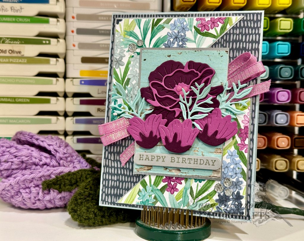
To keep the color palette lighter and brighter, we get started with a base of Cloud Cover cardstock. I’m not sure I’ve talked too much about the new In Colors, but this is probably one of my favorites of the bunch. Cloud Cover is the perfect combination of grey and blue that allows you to transform the mood of the card easily with just a few changes in your helper colors. In this case, I chose the moody blue of the Secret Sea hashed-pattern sheet from the Florals in Bloom paper pack. Our focal panel is broken into three interwoven sections. The opposing corners are a piece of the cheery hyacinth patterned paper from Florals in Bloom that is matted with some Brushed Silver to help give some definition between the two busy patterns. The center portion of the focal panel is where all of the action takes place. A sheet of the Pool Party woodgrain from the Country Woods pack – also matted in Brushed Silver – serves as our stage. It rests atop a bow of Petunia Pop iridescent ribbon. Our purple-hued flowers take center stage with the sentiment tucked quietly underneath. A few Petunia Pop shimmer dots add a touch of twinkle to the center of our floral bunch, while the silver drusy embellishments on opposing corners give the eye a path to follow down and across.
I hope you’ve enjoyed getting a closer look at this beautiful product suite. Next week, our design series is all about fun folds. I have a stash of them in my gotta-try-it folder that we’re going to take for a test drive! I hope you’ll come along for the ride.
Product List![Cloud Cover 8 1/2" X 11" Cardstock [ 165621 ]](https://assets1.tamsnetwork.com/images/EC042017NF/165621s.jpg "Cloud Cover 8 1/2\" X 11\" Cardstock [ 165621 ]")
![Petunia Pop 8 1/2" X 11" Cardstock [ 163801 ]](https://assets1.tamsnetwork.com/images/EC042017NF/163801s.jpg "Petunia Pop 8 1/2\" X 11\" Cardstock [ 163801 ]")
![Blackberry Bliss 8-1/2" X 11" Cardstock [ 133675 ]](https://assets1.tamsnetwork.com/images/EC042017NF/133675s.jpg "Blackberry Bliss 8-1/2\" X 11\" Cardstock [ 133675 ]")
![Pool Party 8-1/2" X 11" Cardstock [ 122924 ]](https://assets1.tamsnetwork.com/images/EC042017NF/122924s.jpg "Pool Party 8-1/2\" X 11\" Cardstock [ 122924 ]")
![Smoky Slate 8-1/2" X 11" Cardstock [ 131202 ]](https://assets1.tamsnetwork.com/images/EC042017NF/131202s.jpg "Smoky Slate 8-1/2\" X 11\" Cardstock [ 131202 ]")
![Brushed Silver And Gold Foil 12" X 12" (30.5 X 30.5 Cm) Specialty Paper [ 164861 ]](https://assets1.tamsnetwork.com/images/EC042017NF/164861s.jpg "Brushed Silver And Gold Foil 12\" X 12\" (30.5 X 30.5 Cm) Specialty Paper [ 164861 ]")
![Florals In Bloom 12" X 12" (30.5 X 30.5 Cm) Designer Series Paper [ 165175 ]](https://assets1.tamsnetwork.com/images/EC042017NF/165175s.jpg "Florals In Bloom 12\" X 12\" (30.5 X 30.5 Cm) Designer Series Paper [ 165175 ]")
![Country Woods 12" X 12" (30.5 X 30.5 Cm) Designer Series Paper [ 163393 ]](https://assets1.tamsnetwork.com/images/EC042017NF/163393s.jpg "Country Woods 12\" X 12\" (30.5 X 30.5 Cm) Designer Series Paper [ 163393 ]")
![Pretty Florals Dies [ 165178 ]](https://assets1.tamsnetwork.com/images/EC042017NF/165178s.jpg "Pretty Florals Dies [ 165178 ]")
![More Messages Bundle (English) [ 165473 ]](https://assets1.tamsnetwork.com/images/EC042017NF/165473s.jpg "More Messages Bundle (English) [ 165473 ]")
![Smoky Slate Classic Stampin' Pad [ 147113 ]](https://assets1.tamsnetwork.com/images/EC042017NF/147113s.jpg "Smoky Slate Classic Stampin' Pad [ 147113 ]")
![Petunia Pop 1/4" (6.4 Mm) Iridescent Ribbon [ 166203 ]](https://assets1.tamsnetwork.com/images/EC042017NF/166203s.jpg "Petunia Pop 1/4\" (6.4 Mm) Iridescent Ribbon [ 166203 ]")
![Charming Shimmer Faceted Dots [ 166139 ]](https://assets1.tamsnetwork.com/images/EC042017NF/166139s.jpg "Charming Shimmer Faceted Dots [ 166139 ]")
![Drusy Adhesive Backed Embellishments [ 164223 ]](https://assets1.tamsnetwork.com/images/EC042017NF/164223s.jpg "Drusy Adhesive Backed Embellishments [ 164223 ]")
![Mini Glue Dots [ 103683 ]](https://assets1.tamsnetwork.com/images/EC042017NF/103683s.jpg "Mini Glue Dots [ 103683 ]")
![Stampin' Dimensionals [ 104430 ]](https://assets1.tamsnetwork.com/images/EC042017NF/104430s.jpg "Stampin' Dimensionals [ 104430 ]")
![Mini Stampin' Dimensionals [ 144108 ]](https://assets1.tamsnetwork.com/images/EC042017NF/144108s.jpg "Mini Stampin' Dimensionals [ 144108 ]")

![Secret Sea 8 1/2" X 11" Cardstock [ 165624 ]](https://assets1.tamsnetwork.com/images/EC042017NF/165624s.jpg "Secret Sea 8 1/2\" X 11\" Cardstock [ 165624 ]")
![Strawberry Slush 8 1/2" X 11" Cardstock [ 165625 ]](https://assets1.tamsnetwork.com/images/EC042017NF/165625s.jpg "Strawberry Slush 8 1/2\" X 11\" Cardstock [ 165625 ]")
![Pretty In Pink 8 1/2" X 11" Cardstock [ 163793 ]](https://assets1.tamsnetwork.com/images/EC042017NF/163793s.jpg "Pretty In Pink 8 1/2\" X 11\" Cardstock [ 163793 ]")
![Pretty Peacock 8-1/2" X 11" Cardstock [ 150880 ]](https://assets1.tamsnetwork.com/images/EC042017NF/150880s.jpg "Pretty Peacock 8-1/2\" X 11\" Cardstock [ 150880 ]")
![Plaster Painting 3 D Embossing Folder [ 164656 ]](https://assets1.tamsnetwork.com/images/EC042017NF/164656s.jpg "Plaster Painting 3 D Embossing Folder [ 164656 ]")
![Gray Granite Classic Stampin' Pad [ 147118 ]](https://assets1.tamsnetwork.com/images/EC042017NF/147118s.jpg "Gray Granite Classic Stampin' Pad [ 147118 ]")
![Gold & Silver 1/8" (3.2 Mm) Trim Combo Pack [ 161633 ]](https://assets1.tamsnetwork.com/images/EC042017NF/161633s.jpg "Gold & Silver 1/8\" (3.2 Mm) Trim Combo Pack [ 161633 ]")
![Clear Wink Of Stella Glitter Brush [ 141897 ]](https://assets1.tamsnetwork.com/images/EC042017NF/141897s.jpg "Clear Wink Of Stella Glitter Brush [ 141897 ]")
![Strawberry Slush & Pretty In Pink Gems [ 165615 ]](https://assets1.tamsnetwork.com/images/EC042017NF/165615s.jpg "Strawberry Slush & Pretty In Pink Gems [ 165615 ]")
![Tear & Tape Adhesive [ 154031 ]](https://assets1.tamsnetwork.com/images/EC042017NF/154031s.jpg "Tear & Tape Adhesive [ 154031 ]")
![Shaded Spruce 8-1/2" X 11" Cardstock [ 146981 ]](https://assets1.tamsnetwork.com/images/EC042017NF/146981s.jpg "Shaded Spruce 8-1/2\" X 11\" Cardstock [ 146981 ]")
![Sweet Blooms Dies (English) [ 165186 ]](https://assets1.tamsnetwork.com/images/EC042017NF/165186s.jpg "Sweet Blooms Dies (English) [ 165186 ]")
![Everyday Arches Dies [ 164629 ]](https://assets1.tamsnetwork.com/images/EC042017NF/164629s.jpg "Everyday Arches Dies [ 164629 ]")
![Fine-Tip Glue Pen [ 138309 ]](https://assets1.tamsnetwork.com/images/EC042017NF/138309s.jpg "Fine-Tip Glue Pen [ 138309 ]")

![Thoughtful Designs 12" X 12" (30.5 X 30.5 Cm) Specialty Designer Series Paper [ 163317 ]](https://assets1.tamsnetwork.com/images/EC042017NF/163317s.jpg "Thoughtful Designs 12\" X 12\" (30.5 X 30.5 Cm) Specialty Designer Series Paper [ 163317 ]")
![Pretty Florals Photopolymer Stamp Set [ 165177 ]](https://assets1.tamsnetwork.com/images/EC042017NF/165177s.jpg "Pretty Florals Photopolymer Stamp Set [ 165177 ]")
![The Right Words Cling Stamp Set (English) [ 165316 ]](https://assets1.tamsnetwork.com/images/EC042017NF/165316s.jpg "The Right Words Cling Stamp Set (English) [ 165316 ]")
![Countryside Corners Dies [ 161471 ]](https://assets1.tamsnetwork.com/images/EC042017NF/161471s.jpg "Countryside Corners Dies [ 161471 ]")
![Secret Sea Classic Stampin' Pad [ 165285 ]](https://assets1.tamsnetwork.com/images/EC042017NF/165285s.jpg "Secret Sea Classic Stampin' Pad [ 165285 ]")
![Garden Green Classic Stampin' Pad [ 147089 ]](https://assets1.tamsnetwork.com/images/EC042017NF/147089s.jpg "Garden Green Classic Stampin' Pad [ 147089 ]")
![Strawberry Slush Classic Stampin' Pad [ 165286 ]](https://assets1.tamsnetwork.com/images/EC042017NF/165286s.jpg "Strawberry Slush Classic Stampin' Pad [ 165286 ]")
![Timid Tiger Classic Stampin' Pad [ 165278 ]](https://assets1.tamsnetwork.com/images/EC042017NF/165278s.jpg "Timid Tiger Classic Stampin' Pad [ 165278 ]")
![Fresh Freesia Classic Stampin' Pad [ 155611 ]](https://assets1.tamsnetwork.com/images/EC042017NF/155611s.jpg "Fresh Freesia Classic Stampin' Pad [ 155611 ]")
![Blackberry Bliss Classic Stampin' Pad [ 147092 ]](https://assets1.tamsnetwork.com/images/EC042017NF/147092s.jpg "Blackberry Bliss Classic Stampin' Pad [ 147092 ]")
![Crushed Curry Classic Stampin' Pad [ 147087 ]](https://assets1.tamsnetwork.com/images/EC042017NF/147087s.jpg "Crushed Curry Classic Stampin' Pad [ 147087 ]")
![Daffodil Delight Classic Stampin' Pad [ 147094 ]](https://assets1.tamsnetwork.com/images/EC042017NF/147094s.jpg "Daffodil Delight Classic Stampin' Pad [ 147094 ]")
![Iridescent Foil Gems [ 162842 ]](https://assets1.tamsnetwork.com/images/EC042017NF/162842s.jpg "Iridescent Foil Gems [ 162842 ]")
![Petal Pink & White 1/4" (6.4 Mm) Diagonal Trim Combo Pack [ 163417 ]](https://assets1.tamsnetwork.com/images/EC042017NF/163417s.jpg "Petal Pink & White 1/4\" (6.4 Mm) Diagonal Trim Combo Pack [ 163417 ]")
![Silver & White 1/2" (1.3 Cm) Sheer Ribbon [ 162149 ]](https://assets1.tamsnetwork.com/images/EC042017NF/162149s.jpg "Silver & White 1/2\" (1.3 Cm) Sheer Ribbon [ 162149 ]")


![Highland Heather 8-1/2" X 11" Cardstock [ 146986 ]](https://assets1.tamsnetwork.com/images/EC042017NF/146986s.jpg "Highland Heather 8-1/2\" X 11\" Cardstock [ 146986 ]")
![Basic White 8 1/2" X 11" Cardstock [ 166780 ]](https://assets1.tamsnetwork.com/images/EC042017NF/166780s.jpg "Basic White 8 1/2\" X 11\" Cardstock [ 166780 ]")
![Three Color Glimmer 12" X 12" (30.5 X 30.5 Cm) Specialty Paper [ 162813 ]](https://assets1.tamsnetwork.com/images/EC042017NF/162813s.jpg "Three Color Glimmer 12\" X 12\" (30.5 X 30.5 Cm) Specialty Paper [ 162813 ]")
![Pastel Ombre Glimmer 12" X 12" (30.5 X 30.5 Cm) Specialty Paper [ 164851 ]](https://assets1.tamsnetwork.com/images/EC042017NF/164851s.jpg "Pastel Ombre Glimmer 12\" X 12\" (30.5 X 30.5 Cm) Specialty Paper [ 164851 ]")
![Silver Foil 12" X 12" (30.5 X 30.5 Cm) Specialty Pack [ 163096 ]](https://assets1.tamsnetwork.com/images/EC042017NF/163096s.jpg "Silver Foil 12\" X 12\" (30.5 X 30.5 Cm) Specialty Pack [ 163096 ]")
![Gorgeous Grape Classic Stampin' Pad [ 147099 ]](https://assets1.tamsnetwork.com/images/EC042017NF/147099s.jpg "Gorgeous Grape Classic Stampin' Pad [ 147099 ]")
![Purple Adhesive Backed Sequins [ 164970 ]](https://assets1.tamsnetwork.com/images/EC042017NF/164970s.jpg "Purple Adhesive Backed Sequins [ 164970 ]")
![Coastal Cabana 8-1/2" X 11" Cardstock [ 131297 ]](https://assets1.tamsnetwork.com/images/EC042017NF/131297s.jpg "Coastal Cabana 8-1/2\" X 11\" Cardstock [ 131297 ]")
![Pretty Florals Bundle [ 165179 ]](https://assets1.tamsnetwork.com/images/EC042017NF/165179s.jpg "Pretty Florals Bundle [ 165179 ]")
![Textured Notes Dies [ 165555 ]](https://assets1.tamsnetwork.com/images/EC042017NF/165555s.jpg "Textured Notes Dies [ 165555 ]")
![Distressed Tile 3 D Embossing Folder [ 162189 ]](https://assets1.tamsnetwork.com/images/EC042017NF/162189s.jpg "Distressed Tile 3 D Embossing Folder [ 162189 ]")
![Pretty In Pink Classic Stampin Pad [ 163807 ]](https://assets1.tamsnetwork.com/images/EC042017NF/163807s.jpg "Pretty In Pink Classic Stampin Pad [ 163807 ]")
![Peach Pie Classic Stampin Pad [ 163810 ]](https://assets1.tamsnetwork.com/images/EC042017NF/163810s.jpg "Peach Pie Classic Stampin Pad [ 163810 ]")
![Flirty Flamingo Classic Stampin' Pad [ 147052 ]](https://assets1.tamsnetwork.com/images/EC042017NF/147052s.jpg "Flirty Flamingo Classic Stampin' Pad [ 147052 ]")
![Calypso Coral Classic Stampin' Pad [ 147101 ]](https://assets1.tamsnetwork.com/images/EC042017NF/147101s.jpg "Calypso Coral Classic Stampin' Pad [ 147101 ]")
![Cloud Cover Classic Stampin' Ink Refill [ 165279 ]](https://assets1.tamsnetwork.com/images/EC042017NF/165279s.jpg "Cloud Cover Classic Stampin' Ink Refill [ 165279 ]")
![Gold Striped 3/8" (1 Cm) Mesh Ribbon [ 165599 ]](https://assets1.tamsnetwork.com/images/EC042017NF/165599s.jpg "Gold Striped 3/8\" (1 Cm) Mesh Ribbon [ 165599 ]")

![Basic Gray 8-1/2" X 11" Cardstock [ 121044 ]](https://assets1.tamsnetwork.com/images/EC042017NF/121044s.jpg "Basic Gray 8-1/2\" X 11\" Cardstock [ 121044 ]")
![Layered Thoughts Photopolymer Stamp Set (English) [ 165346 ]](https://assets1.tamsnetwork.com/images/EC042017NF/165346s.jpg "Layered Thoughts Photopolymer Stamp Set (English) [ 165346 ]")
![Natural Tones Linen Thread [ 164071 ]](https://assets1.tamsnetwork.com/images/EC042017NF/164071s.jpg "Natural Tones Linen Thread [ 164071 ]")

![Peach Pie 8 1/2" X 11" Cardstock [ 163799 ]](https://assets1.tamsnetwork.com/images/EC042017NF/163799s.jpg "Peach Pie 8 1/2\" X 11\" Cardstock [ 163799 ]")
![2024–2026 In Color™ Glimmer 12" X 12" (30.5 X 30.5 Cm) Specialty Paper [ 163771 ]](https://assets1.tamsnetwork.com/images/EC042017NF/163771s.jpg "2024–2026 In Color™ Glimmer 12\" X 12\" (30.5 X 30.5 Cm) Specialty Paper [ 163771 ]")
![Label Me Grateful Cling Stamp Set (English) [ 166108 ]](https://assets1.tamsnetwork.com/images/EC042017NF/166108s.jpg "Label Me Grateful Cling Stamp Set (English) [ 166108 ]")
![Mixed Labels Dies [ 164652 ]](https://assets1.tamsnetwork.com/images/EC042017NF/164652s.jpg "Mixed Labels Dies [ 164652 ]")
![Riverside Irregular Pearls [ 164937 ]](https://assets1.tamsnetwork.com/images/EC042017NF/164937s.jpg "Riverside Irregular Pearls [ 164937 ]")
![2025–2027 In Color™ Flat Pearls [ 165192 ]](https://assets1.tamsnetwork.com/images/EC042017NF/165192s.jpg "2025–2027 In Color™ Flat Pearls [ 165192 ]")
![Summer Splash 3/8" (1 Cm) Bordered Ribbon [ 163786 ]](https://assets1.tamsnetwork.com/images/EC042017NF/163786s.jpg "Summer Splash 3/8\" (1 Cm) Bordered Ribbon [ 163786 ]")
