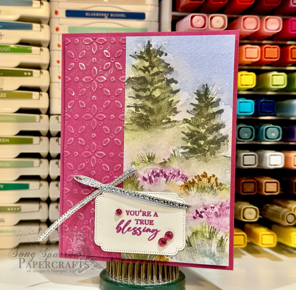
Thus far this week, we’ve been exploring how a sketch and a few supplies can give you to terrific cards in no time flat. Today’s card is a slight variation on yesterday’s card design with a slightly wider designer paper section that begins on the edge of the embossed panel.
I really love this particular sheet of the Thoughtful Journey designer paper pack. The cedars set on the hill with the wildflowers down below reminds me of the prairie that was behind my childhood home.
This card begins with a base of Berry Burst. I cut an additional quarter-panel and embossed with the Eyelet embossing folder then cut the panel down to be one-quarter inch smaller, leaving just a small border behind on the base. I wanted to ensure that the beautiful embossed pattern stood out to compliment the soft white in the patterned paper, so I used my finger to rub a thin layer of silver ink over the top of the pattern. Then I adhered the designer paper panel to the right side of the embossed panel before adhering the full panel to the base using dimensionals. The sentiment from Unbounded Love is stamped on white cardstock diecut using the coordinating Unbounded Love dies. To draw the eye to the sentiment, I finished the card with tinsel gems and silver trim tied in a small bow.
Tomorrow, I’ll be rounding out this series with one final variation. I hope you’ll come check it out!
Products used in this card design: Berry Burst, Basic White cardstock Thoughtful Journey DSP Unbounded Love stamps & dies Eyelet embossing folder Tinsel gems Silver trim Dimensionals Adhesives
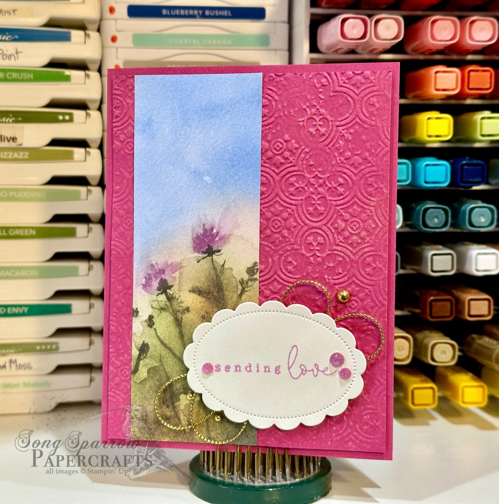
When you’re low on crafting time, keeping things simple is key. I typically choose a simple sketch and a few coordinating supplies when I’m needing to make a card but don’t have time for lots of layers or fussy cutting. The beautiful thing about the products Stampin’ Up! offers is how wonderfully they coordinate to give you consistent results each and every time. And I don’t say that simply because I’m a demonstrator. It’s one of THE reasons that I became a demonstrator!
We begin our card today with a base of Berry Burst cardstock. The background panel is cut a tad smaller than the card base and then machine embossed using the Distressed Tile embossing folder. I decided from the get-go that I wanted metallic gold to be an accent color for this card design, so after embossing the Berry Burst quarter-sheet and cutting it to size, I used my finger to lightly rub metallic gold ink across the card front to bring out the gorgeous pattern. A two-inch strip of Thoughtful Journey designer paper is adhered to the left side of the embossed panel, leaving a small strip of the panel exposed on the left so that the pattern goes from edge to edge in the background. This whole panel is then adhered to the base using dimensionals. The sentiment from Country Flowers is stamped on white cardstock diecut using the Unbounded Love dies and it, too, is adhered with dimensionals. A twist of gold trim and a few gold Blooming Pearls add that bit of sparkle and bring out the golden hues in the designer paper. And a few In Color shimmer gems on either side of the sentiment ensure your eye lands here last.
Tune in tomorrow to check out a variation on this card layout that gives us a very different look but results in a card that’s just as stunning!
Products used for today’s card: Berry Burst, Basic White cardstock Thoughtful Journey DSP Country Flowers stamps Unbounded Love dies Distressed Tile embossing folder In Color shimmer gems, Blooming Pearls Gold trim Dimensionals Adhesives
This week, we’ll be frolicking in the meadows and stopping to smell a few flowers along the way. Stampin’ Up! has a whole host of papers and stamps that put us squarely in the middle of beautiful fields and fragrant flower patches. And we’re going to explore some of my favorites throughout this week.
We begin today with a new take on an old fun fold. I recently ran across the hidden barn fold design and knew I had to give it a try. Why is it called a hidden fold? When the card is completely closed, the two sections of the front panel meet, they make the center cut virtually disappear.
So our take on this card begins with a base of Blackberry Bliss cardstock. The focal panel consists of a bottom mat of Lost Lagoon soft shimmer paper that is diecut using the largest Perennial Postage die, followed by a layer of Highland Heather cut just a tick smaller, and finally with our section of Meandering Meadow designer paper on top. To accomplish the two perfect sections, I cut the shimmery layer in half after I diecut it. I adhered the DSP and Highland Heather mat together first before also cutting them in half with the trimmer. Then these three layers were adhered together before carefully adhering them in place on the card front so that they meet together perfectly at the center. The sentiment from Charming Sentiments is stamped on white cardstock and diecut using the smallest Thoughtful Expressions die. The sentiment mat is cut from Lost Lagoon shimmer paper. A twist of silver & white sheer ribbon and Lost Lagoon bordered ribbon are adhered in between the two sentiment layers. Using dimensionals, the sentiment is adhered to the left flap of the card front. I added a few purple fine shimmer gems for sparkle and to move the eye diagonally across the card front.
This particular design is super easy to put together. And by changing the color palette and DSP, each card has a completely different look. This is going to be a go-to design for me if I need to make a whole host of simple yet beautiful cards!
Tune in tomorrow as we explore the rolling Hills of Tuscany!
Products used in today’s card: Blackberry Bliss, Highland Heather, Basic White cardstock Meandering Meadow, Lost Lagoon soft shimmer DSP Charming Sentiments stamps Thoughtful Expressions, Perennial Postage dies Silver & white sheer trim, Lost Lagoon bordered ribbon Purple fine shimmer gems Dimensionals Adhesives
One of the things that I really love about crafting is the variety of projects that you can create. From the simplest to the most advanced designs, each one is beautiful in its own way and never fails to deliver a smile to its recipient. This week, we’ve been exploring designs using a number of different botanical products from Stampin’ Up!
Today’s card design is borrowed from a fellow demonstrator over at Stampaholic. She made a series of cards that spanned from easiest to advanced using the Planted Paradise stamps and this same soft color palette. I love the combination of earth tones with the botanical images. For my card, I swapped out a few elements and added a few too. And that’s the beauty of finding inspiration for your designs — they don’t have to be exact, but they certainly can be.
The base of this card is Early Espresso cardstock. The Calypso Coral strip of designer paper in the middle is from the Sale-a-Bration paper pack called Softly Stippled. I added a strip of the natural wavy trim to the center. The image panel is diecut from white cardstock using the Everyday Details dies. The clay pot is stamped upside down to more resemble a vase and then each of the twigs is stamped to come out the top. The sentiment from the Botanical Layers stamp set is stamped on Crumb Cake and then diecut using the Thoughtful Expressions dies. A small bow of linen thread is added to the top of the vase to dress it up and add a layer of the natural brown that ties together with the wavy trim and sentiment panel to complete a visual triangle. I added fine shimmer gems to finish things off.
This card design can easily be simplified or dressed up. And that’s what makes the layout on for the inspiration folder. It comes together beautifully and quickly and is lovely whether it is simple or more ornate.
Next week, we’re going to go flying. I hope you’ll come along as we take to the skies!
Products used in this card: Early Espresso, Crumb Cake, Basic White cardstock Softly Stippled DSP (retired SAB) Planted Paradise, Botanical Layers stamps Everyday Details, Thoughtful Expressions dies Natural wavy trim, linen thread Fine shimmer gems (retired) Dimensionals Adhesives
All ads on this site are posted by WordPress. Song Sparrow Papercrafts is not responsible for ad content.
Ever since I can remember, I’ve had an interest in plants and insects. I’d like to think that I got that from my grandparents, who both loved to garden and my grandfather was a beekeeper. As the seasons change, I love going to the local nursery and buying new seasonal annuals. I love the challenge of finding plants that will do well despite the scorching summer heat. And I definitely have my favorites. Right now, I’m enjoying the new spring plantings and the lovely pops of color they bring to the barely-green landscapes. So naturally, I love crafting products that incorporate flowers and plants.
This week, we’re looking at some of the current products that Stampin’ Up! offers that feature plants of all sorts. Today’s card pairs stamps and an embossing folder.
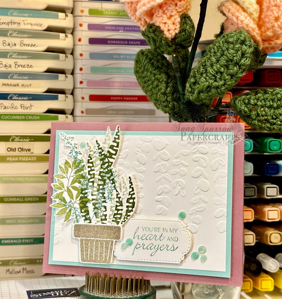
We start with a base of Moody Mauve for this design. For this soft color palette, I embossed white cardstock with the Elegant Eucalyptus embossing folder and then matted the entire panel with Pool Party. I stamped the focal image separately using the Planted Paradise and Botanical Layers stamp sets. I cut them out with paper snips and then mounted to the embossed base with dimensionals. The sentiment from the So Sincere set is stamped on white cardstock and diecut using the Thoughtful Expressions dies. I added some Pool Party fine sparkle gems to finish things off.
Tomorrow I’ll be showing you a sneak peek of a brand new background stamp. Hope you’ll come check it out!
Products used in today’s design: Moody Mauve, Pool Party, Basic White cardstock Botanical Layers, Planted Paradise, So Sincere stamps Thoughtful Expressions dies Fine sparkle gems (retired) Dimensionals Adhesives
All ads on this site are posted by WordPress. Song Sparrow Papercrafts is not responsible for ad content.
This week, we’re exploring card designs that use botanical images. I love stamp sets that include flowers and greenery but then sometimes find myself stuck for ideas on how to use them. We’re so fortunate to have so many different inspiration forums, and in cases where I’m fresh out of ideas, that’s precisely where I turn.
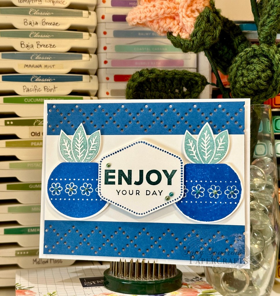
Today’s card design was inspired by a Stampin’ Up! Artisan design. The inspiration card used the lovely argyle detail die from Everyday Details — a die that I have had a really hard time finding a use for — and the lovely Planted Paradise stamp set.
This card design is a built on a base of white cardstock. The focal image panel sits atop a Blueberry Bushel panel where each long edge has been diecut using the argyle die from Everyday Details. A strip of white cardstock serves as the focal image base in the center. The pots and greenery are stamped on separate sheet of white cardstock and then cut with paper snips before being mounted with dimensionals. The sentiment panel consists of the Heartfelt Hellos sentiment that is punched with the coordinating Heartfelt Hexagon punch. I also added an additional layer of dimensionals to the sentiment panel to ensure that it stood above the supporting images. I added Blooming Pearls on the pots and near the sentiment for added detail and to draw the eye across the focal panel.
Yesterday, I mentioned the TIP for stamping crisp images when your photopolymer stamps tend to pool ink and stamp blotchy images. When you’re going for a more vintagey feel, I would definitely allow the ink to pool on the stamps. But if you’re going for a clean look, you’ll definitely want to use that layer of Versamark first before applying your selected colored ink. Today, I elected to use both types of stamped images on my card design so that you could see the difference. Can you spot which stamped elements look more vintage than crisp?
Products used in today’s design: Blueberry Bushel, Basic White cardstock Planted Paradise, Heartfelt Hellos stamps Heartfelt Hexagon bundle Blooming pearls Dimensionals Adhesives
All ads on this site are posted by WordPress. Song Sparrow Papercrafts is not responsible for ad content.
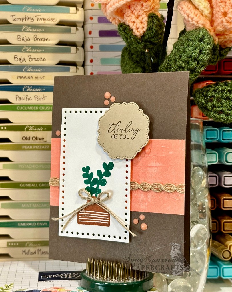
While I’m always inspired by designs with florals or botanicals, in spring, cards with these images always seem to jump out at me. And lately I’ve saved so many wonderful ideas using the variety of sets Stampin’ Up! has to offer.
Today, we’re using two of my current go-to all-purpose botanical sets — Botanical Layers (soon to retire!) and Planted Paradise. I’m sad to see the Botanical Layers stamp set go. It has a combination of images of common potted plant varieties and some lovely sentiments. And this set pairs beautifully with the Planted Paradise stamp set, which is comprised of just images of leaves and stems (mostly succulents) and some pottery designs. The pottery is mostly larger in scale, so you instantly have a really nice focal image.
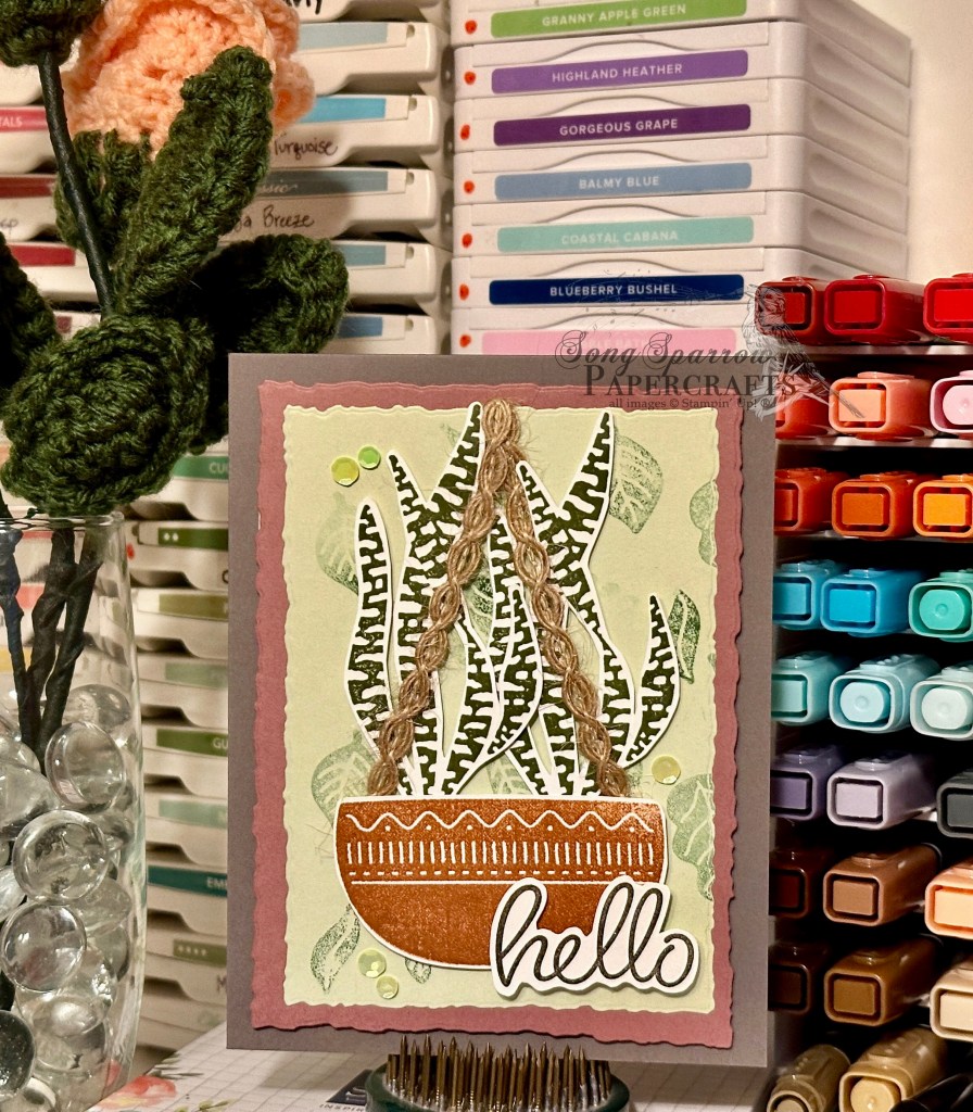
Today’s design starts with a base of Pebbled Path. This is one of the current 2023-25 In Colors, and I’ve only just come to discover how very versatile it is. Pebbled Path is a lovely mix of brown and grey — the perfect neutral. The focal panel consists of a mat of Moody Mauve (another 23-25 In Color) and a background panel of Soft Sea Foam. I used two of the largest nesting sizes of the Deckled Rectangles dies to cut them. Using the Planted Paradise stamps, I created a falling leaf pattern and used it to stamp the background on the Soft Sea Foam panel. To keep the background stamping light, I used the stamp-off method with my Garden Green ink.
For the focal image, I stamped the pottery image from Planted Paradise in Cajun Craze ink on white cardstock and then fussy cut it with a very narrow border. Next, I stamped two snake plant images from Botanical Layers in Mossy Meadow on white cardstock and fussy cut them, as well. I made sure to cut out the white background between the tall fronds to allow more of the background to show through and give a more realistic look to my potted plant. I then stamped the Hello sentiment from the Heartfelt Hellos stamp set in Early Espresso onto white cardstock and cut it out with a narrow border.
I added dimensionals to the back of both the pottery and plant images. Before adhering, I added two longer strips of natural wavy trim on either corner of the pottery and strung it over the top of the panel to create a hanging basket look. I gave an additional layer of dimensionals on the back of the sentiment to ensure it stood above my focal image.
TIP: if you find that your stamps, particularly your photopolymer stamps, are giving you a blotchy-looking image, try adding a layer of Versamark ink first and then your chosen ink color. This will give you a nice, smooth stamped image. That’s what I had to do here for the pottery.
I personally find that I don’t use my botanical sets often enough. Perhaps it’s because, on their own, they’re not the flashy, eye-catching images that we’re drawn to. BUT when we spend a little time with these stamp sets, what we’ll find is very versatile images that make gorgeous card designs — just as eye-catching and appealing as the immediately flashy sets that we’re drawn to more often. I hope that I can show you more of what I mean through this week’s series of botanical cards. I hope you’ll tune in each day!
Products used in today’s featured card: Pebbled Path, Soft Sea Foam, Moody Mauve, Basic White cardstock Botanical Layers, Planted Paradise, Heartfelt Hellos stamps Deckled Rectangles dies Natural wavy trim Shiny sequins Dimensionals Adhesive
All ads on this site are posted by WordPress. Song Sparrow Papercrafts is not responsible for ad content.
One of my favorite times of year is right now — spring! I love to admire all of the beautiful flowers, including the ones that I plant myself! Some of my favorites include zinnias, morning glory, dianthus, and salvia, to name just a few. Stampin’ Up! has some really wonderful botanical stamp sets, and this week we’ll be exploring a number of them.
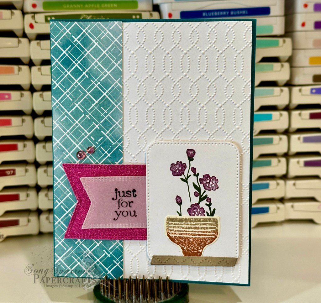
Today we have a super clean and simple card. This card is built on a base of Pretty Peacock. The backdrop for our focal section is a strip of Hello, Irresistible designer series paper and quarter-sheet of white cardstock embossed with the Softly Sophisticated embossing folder, which was a most recent Sale-a-Bration item. For the image panel, I diecut a piece of white using the Nested Essentials dies and a lovely floral arrangement is stamped in the center. This lovely stem of flowers is stamped using the Softly Sophisticated stamp set, also a most recent Sale-a-Bration set. The pottery bowl is stamped on Very Vanilla using the Planted Paradise stamp set. Our sentiment is stamped on vellum and diecut using the Nested Essentials dies, along with the nesting banner die cut from Berry Burst shimmer paper.
We’ll be using the Planted Paradise set for tomorrow’s card and I can’t wait for you to see it!
The Country Floral Lane designer paper is so fun to work with. When I saw the sheet of patterned paper used in today’s card design, I knew it needed to become an encouragement card.
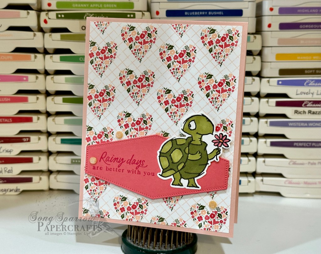
A sheet of Blushing Bride cardstock serves as the card base. I used the Playing in the Rain stamps for the sentiment and focal image. The adorable turtle holding the flower is the perfect complement to this designer paper. The sentiment panel base is diecut from Calypso Coral using the Nested Essentials dies. The sentiment is stamped on the panel using the Playing in the Rain stamps. I stamped the turtle in black ink on white cardstock and colored with the Stampin’ Blends markers. Then it’s diecut using the coordinating Playing in the Rain dies and adhered directly to the panel. The panel and turtle are elevated with dimensionals. A few fine sparkle gems add a little touch of twinkle to the design and just that little bloop of happiness.
Products used: Blushing Bride (retired), Calpypso Coral, white cardstock Country Floral Lane DSP (retired) Playing in the Rain stamps & dies Nested Essentials dies Fine sparkle gems Stampin’ Blends markers Dimensionals Adhesives
All ads on this site are posted by WordPress and are based on your personal browsing history. I do not control ad content.
Today’s design features another pattern from the Country Floral Lane designer series paper. All of the designs in this paper pack are fun and happy and lend themselves well to all sorts of occasions — even thinking of you or encouragement cards. In this case, I designed a thank-you card to send to my upline for all of her help with a recent craft fair.
The bicycle design works great for this cute peek-a-boo fun fold design. I started with a base of Blushing Bride cardstock and cut 1″ from the bottom of the front panel to give the peek-through to the bottom of the base panel. To achieve the peek-through with the paper, I separated the designer paper between the bicycle and floral patterns and then adhered the strip of floral pattern to the bottom of the message panel inside the card so that it shows through when the card is closed. The sentiment is stamped on white using the Heartfelt Hexagon and Circle Sayings stamp sets. The sentiment panel is popped up on dimensionsals and is the visual center of the card front. A few sequins add some sparkle and draw the eye to the sentiment. Simple but so cute! Don’t you think?
This is such a fun design and can easily be adapted to use any product you have on hand. If you wanna give a peek-through card a try, feel free to download the PDF tutorial here.
Products used: Blushing Bride (retired), white cardstock Country Floral Lane DSP (retired) Circle Sayings, Heartfelt Hexagon stamps Heartfelt Hexagon punch Adhesive-backed sequins Dimensionals Adhesives
All ads on this site are posted by WordPress and are based on your personal browsing history. I do not control ad content.