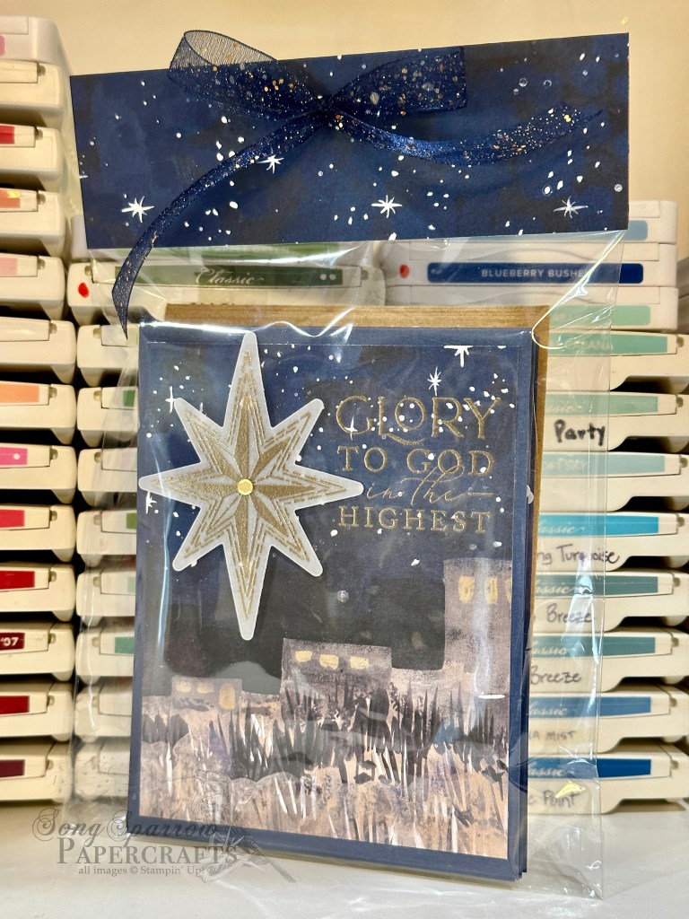
Whether I’m preparing one card or a pack of cards for sale, I believe that the packaging is as important as the product itself. There are many iconic brands that are known as much for their packaging as what they’re selling — think Tiffany’s or Louis Vuitton.
Here are examples of a few card packs that I packaged for upcoming craft fairs. It’s important to me that the card design is clearly visible through the packaging and an insert is included on the back to show the inside sentiment, which can be especially important to customers when they’re selecting cards. Because larger sets of cards result in thicker packaging, a top closure is necessary and a nice coordinating paper and ribbon really dress things up!
Have you seen cards packaged list this before? What other methods have you seen?
All ads on this site are posted by WordPress and are based on your personal browsing history. I do not control ad content.
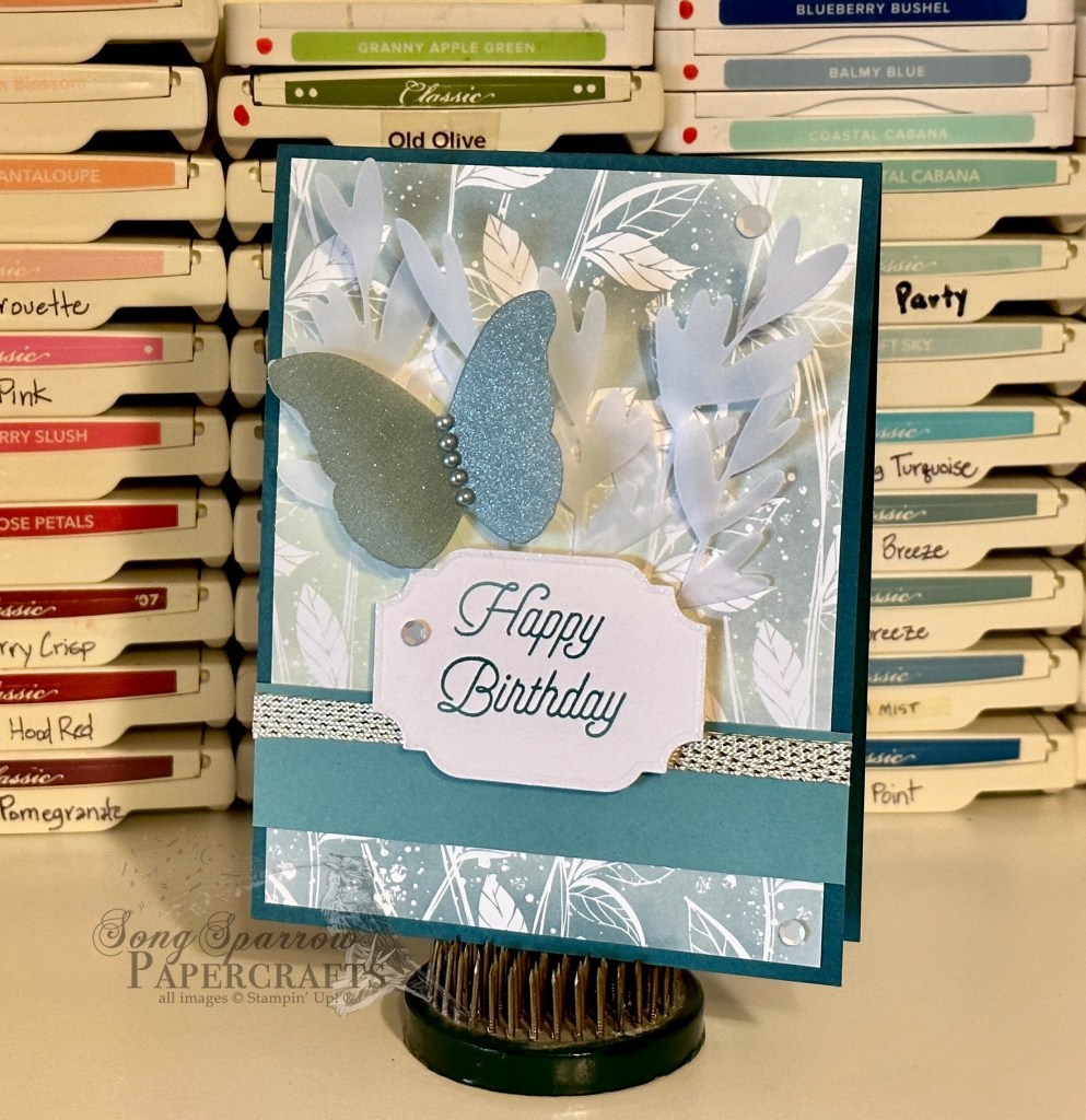
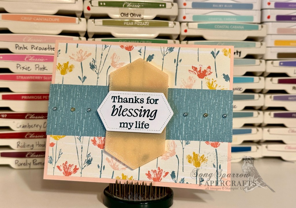
Today features the fifth of five designs in the newest card pack up in the Etsy shoppe. Irresistible Birthday highlights the Stampin’ Up! designer series paper pack called Hello Irresistible. This coordinating pack of paper has just been delightful to work with because it allows you to go so many different directions with designs. Let’s take a look at today’s card.
Funny enough, as I was working with the papers I had originally picked out for this design, it suddenly just seemed all wrong. I couldn’t quite get things to work together. I knew I wanted to have a more neutral design — one suitable for any recipient. But it had to have a wow factor that I just wasn’t finding with my paper choices. As I was flipping and rearranging things, I caught glimpse of the back of a piece of paper and stopped in my tracks. Aha! I found the wow. The grassy background in this card made me think of a fairy garden, but to keep the design more neutral, I focused on a softer, more ethereal feel. I’m thrilled with how it turned out!
To give a little life and depth to the grassy background but still keep the overall design soft and versatile, I cut branches from vellum and tucked them behind the sentiment panel and added a butterfly cut from glimmer vellum. The gold-laced ribbon and white sequins, along with the touch of Wink of Stella around the sentiment panel, add to the magical feel. Can you think of someone who would like this card?
Products used: Hello Irresistible DSP Lost Lagoon, Pretty Peacock, Basic White, vellum cardstock Glimmer vellum (retired) Gold-laced trim (retired) All That dies Special Moments stamps (retired) Wink of Stella Adhesive-backed sequins and pearls Dimensionals Adhesives
All ads on this site are posted by WordPress and are based on your personal browsing history. I do not control ad content.
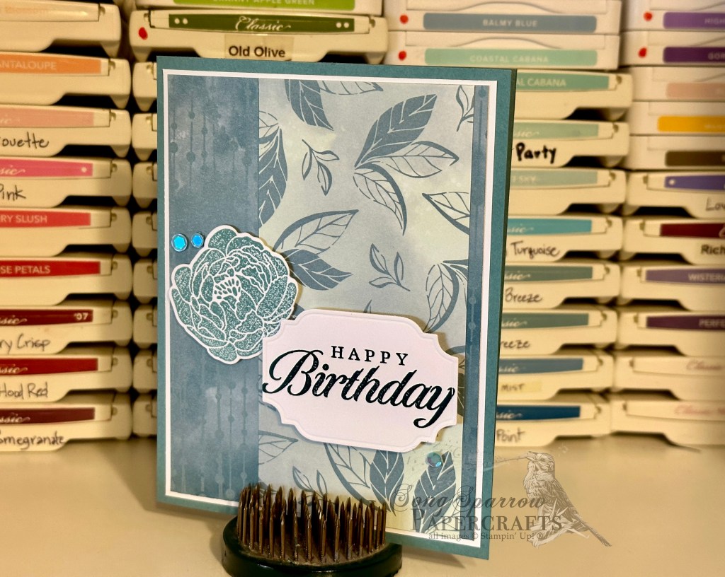
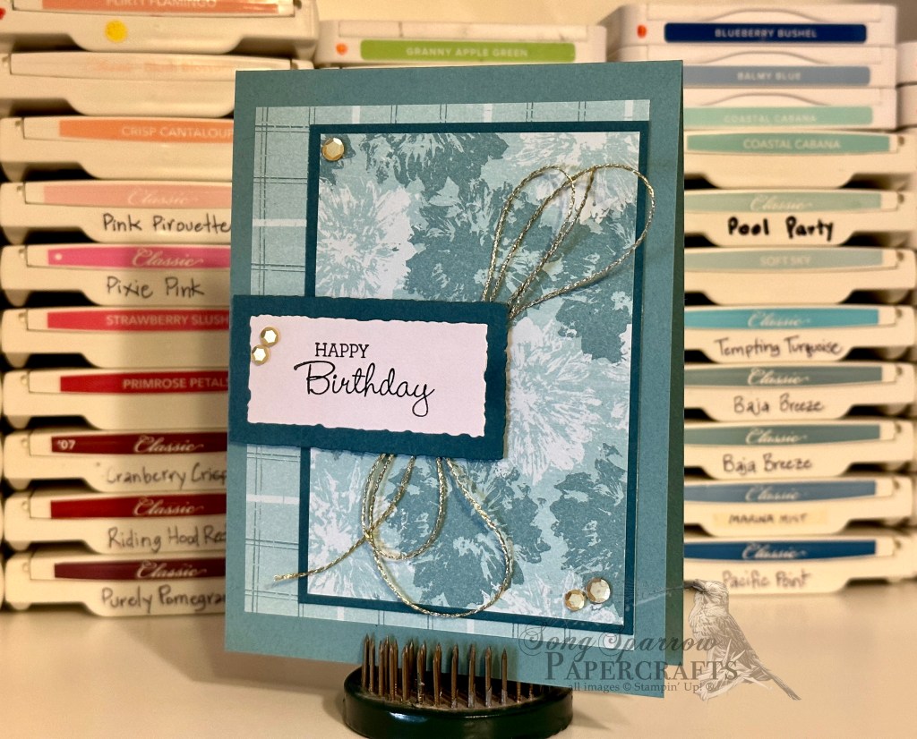
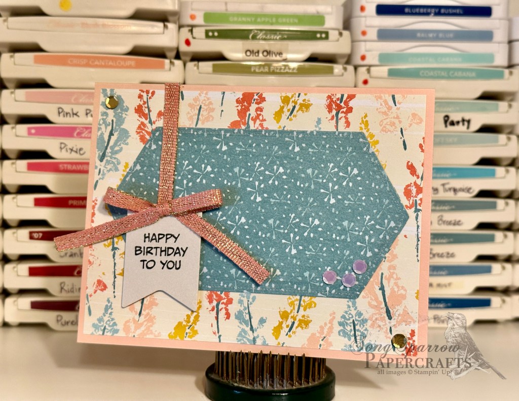
Today’s card design is the fourth in the Irresistible Birthday card pack series. This designer series paper has been so fun to work with because it lends itself to so many possibilities. And this card leans much more feminine in both palette and overall feel.
I really have a hard time working with shades of orange. Believe it or not, this card base is a shade of coral, and this card came together easily. Hello Irresistible has really been a delight to work with for that very reason.
This design plays to the feminine vibes with all of the sparkle. From the gold-laced ribbon to pops of gold in sequins to the tiniest sparkle around the sentiment panel with Wink of Stella, this card really shines!
This fun fold reminds me of a barn door with the card opening in the center. Don’t you think? If you’re interested in how this design came together, go check it out over on Instagram!
Products used: Hello, Irresistible DSP Calypso Coral, Basic White cardstock Bold Bouquet stamps Deckled Rectangles dies Flirty Flamingo ribbon Adhesive-backed sequins Wink of Stella Dimensionals Adhesives
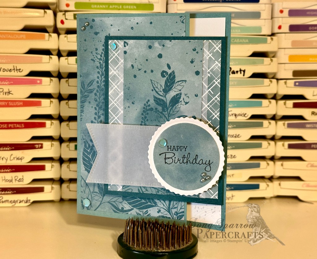
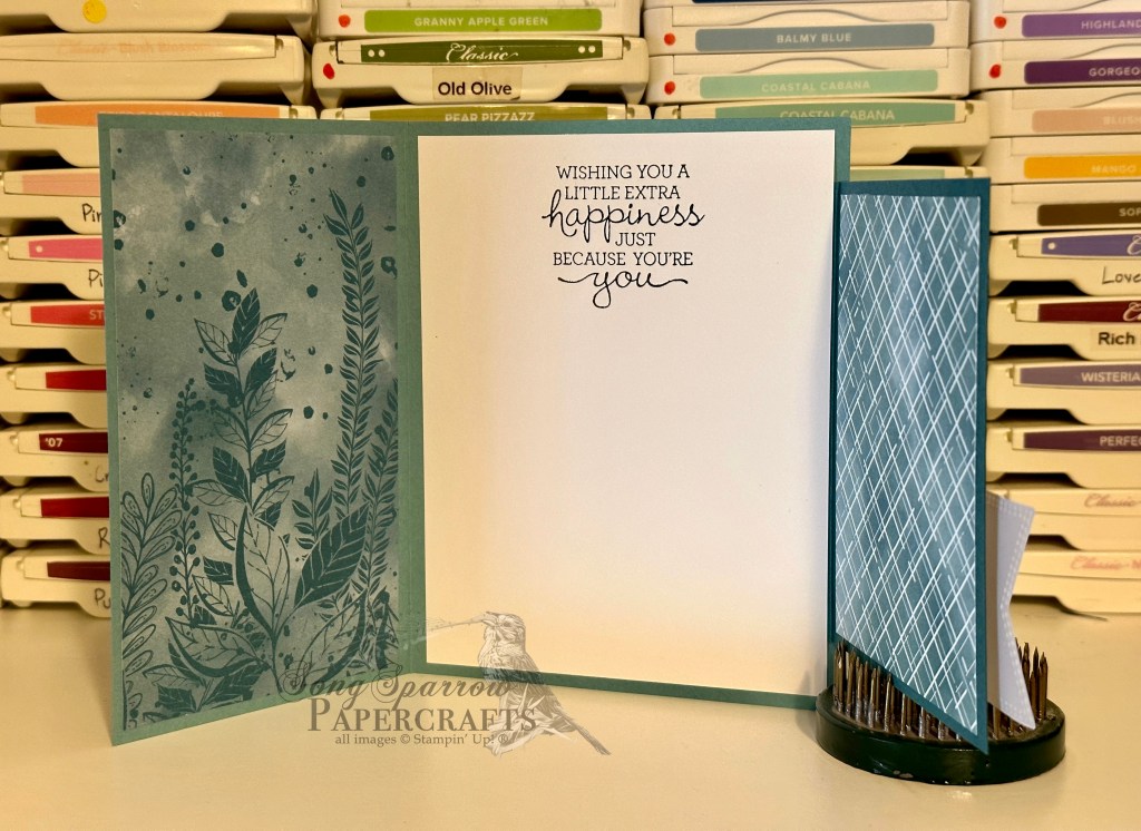
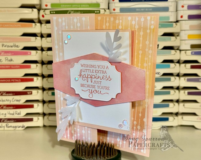
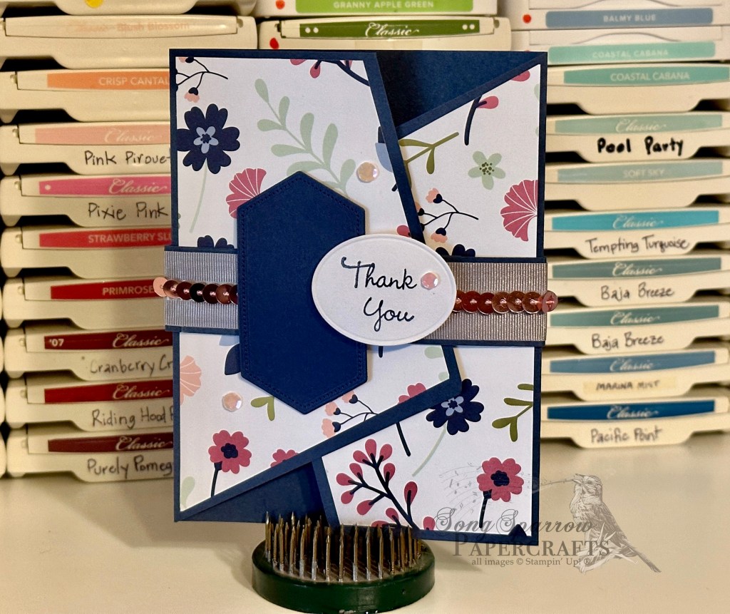
Today we’re taking a look at the third design in the new birthday pack called Irresistible Birthday that will be up in the Etsy shoppe later this week. This design is based on a new fun fold I learned from Sharon Armstrong. The original design has been adapted to exclude a few layers in order to lighten up the design, but it does not lose any of the drama of this unique fun fold.
This showcases yet another sampling of the SU! Hello, Irresistible designer paper. One of the things I really loved about this design was the ability to use every scrap of the gorgeous paper on both the inside and outside panels of the card. And who says a masculine card can’t have a little sparkle? This design is punched up with a few eye-catching features — silver pearls, iridescent sequins, and the touch of Wink of Stella around the edges of the sentiment elements.
Products used: Hello, Irresistible DSP Lost Lagoon, Pretty Peacock, Basic White, vellum cardstock Pansy Patch stamps Nested Essentials, All That dies Adhesive-backed pearls Adhesive-backed sequins Wink of Stella Dimensionals Adhesives
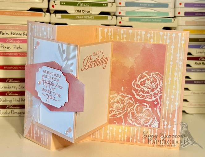
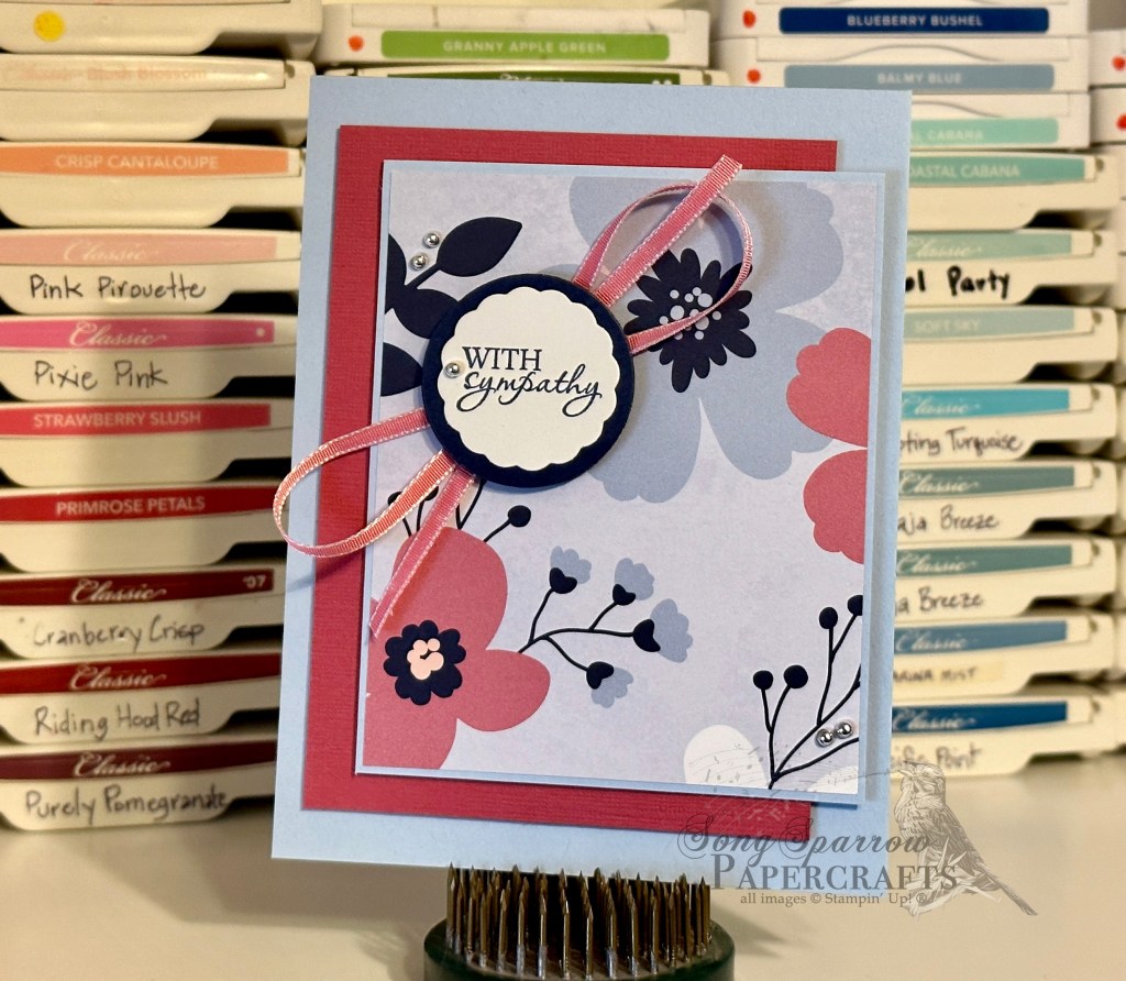
Today I’m sharing another design in the Irresistible Birthday card pack that will be available in the Etsy shoppe at the end of the week. I had a lot of fun learning this new fun fold that my mom shared with me (originally shared by Dawn Griffith). The original design is a square card, and I like to keep all of my designs a standard size that doesn’t require special envelopes or additional postage. So I resized the original to be a standard-sized vertical card. Because I didn’t want to make any mistakes with my “good paper,” I worked on getting all of the measurements and folds just right by using paper from our shredding bin. And now I have a workable template where I scribbled all of the measurements as I went. Do you ever make templates? It helps me to keep all of the instructions I scribble down straight with what they actually make!
I am really loving the versatility of this designer paper. The first design in the Irresistible Birthday card pack really lent itself to being more masculine, but this card is definitely softer and more feminine. It’s the perfect combination of pale pinks and soft, rosey oranges. And I think the fun fold design really adds some fun to this card!
Would you like to know how I made this card? Hop on over to my Instagram feed and check it out! Link over on the right ➡️➡️.
Products used: Petal Pink, Basic White cardstock Hello, Irresistible DSP Vellum Calypso Coral ink Pansy Petal, Bold Bouquet stamps Bold Bouquet, All That, Nested Essentials dies Wink of Stella Adhesive-backed sequins Dimensionals Adhesives
Howdy, everyone! It’s been a busy week in the studio. I’ve been taking a social media class and practicing what I’m learning. So there is lots of new content, exciting features, and new designs headed your way!
Today we’re taking a look at the first design in a new birthday pack called Irresistible Birthday that will be hitting the Etsy shoppe next week.
This set of designs is based on the SU! designer paper series called Hello Irresistible. The designs in this paper pack are divine! A mix of florals and hippie vibes but nothing too feminine, as you can see here with this more masculine design.
This card came together pretty quickly. As I mentioned earlier this week, “practice makes progress” and I’m certainly getting faster at pairing patterned papers. Filming the making of this card so I could show you the design process in an Instagram reel is what took the longest. (See, I’m putting my training to work!) I’m still getting the hang of how to set things up and working through how to have the right supplies at hand so filming goes smoothly .
Wanna see what it takes to put this card together? Head over to my Insta feed! (Link on the right ➡️)
Products used: Pool Party, Basic White cardstock Hello, Irresistible DSP Bold Bouquet stamps & dies All That dies Adhesive-backed sequins Dimensionals Adhesives
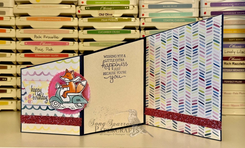
I’m working more with combinations of patterns with the latest designs. It’s still quite a challenge for me, but I do feel like designs came much more easily with this set. And what could be more fun than bright designs and fun folds?! This newest card pack called Bright and Beautiful Birthday will be available in the shoppe later this week.
I focused on the SU! Bright and Beautiful and Zoo Crew designer series paper packs in designing this set. As I was sketching out design ideas, it seemed natural to focus on a birthday theme. The bright colors and fun patterns just lent themselves easily to it. And to me, birthday designs call for fun folds! Let’s take a closer look at each card.
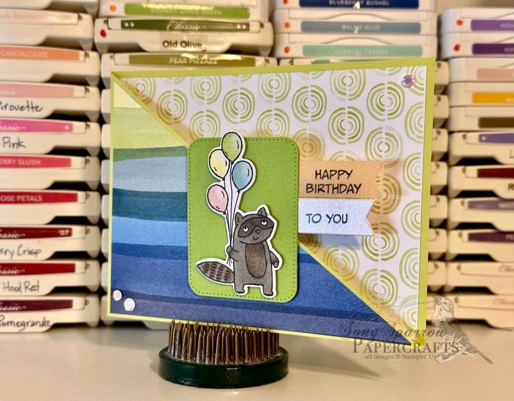
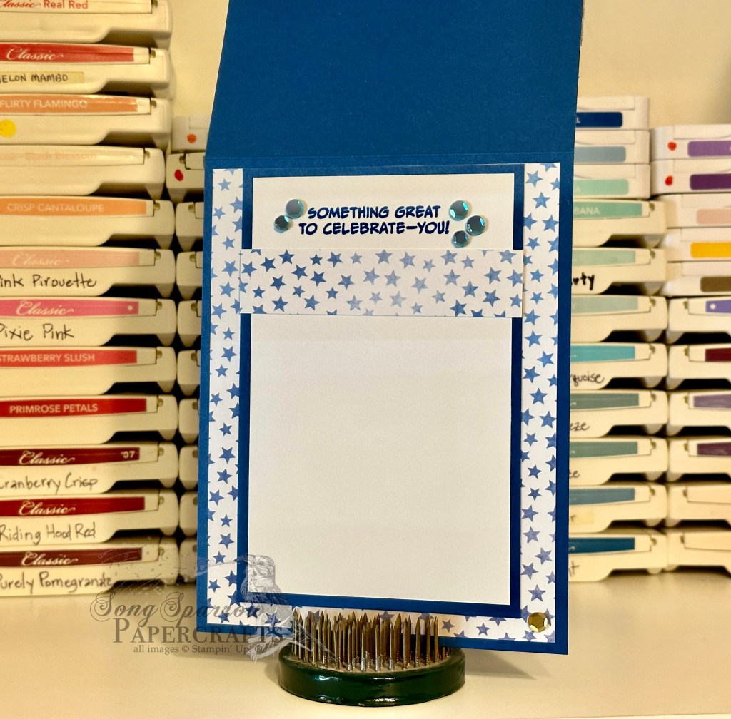
Something to Celebrate flap fold: Blueberry Bushel, Shimmer White, Basic White cardstock Bright & Beautiful DSP Zany Zoo stamps All That dies Circle punch Lemon Lime, Smoky Slate ribbon Adhesive-backed sequins Dimensionals Adhesives
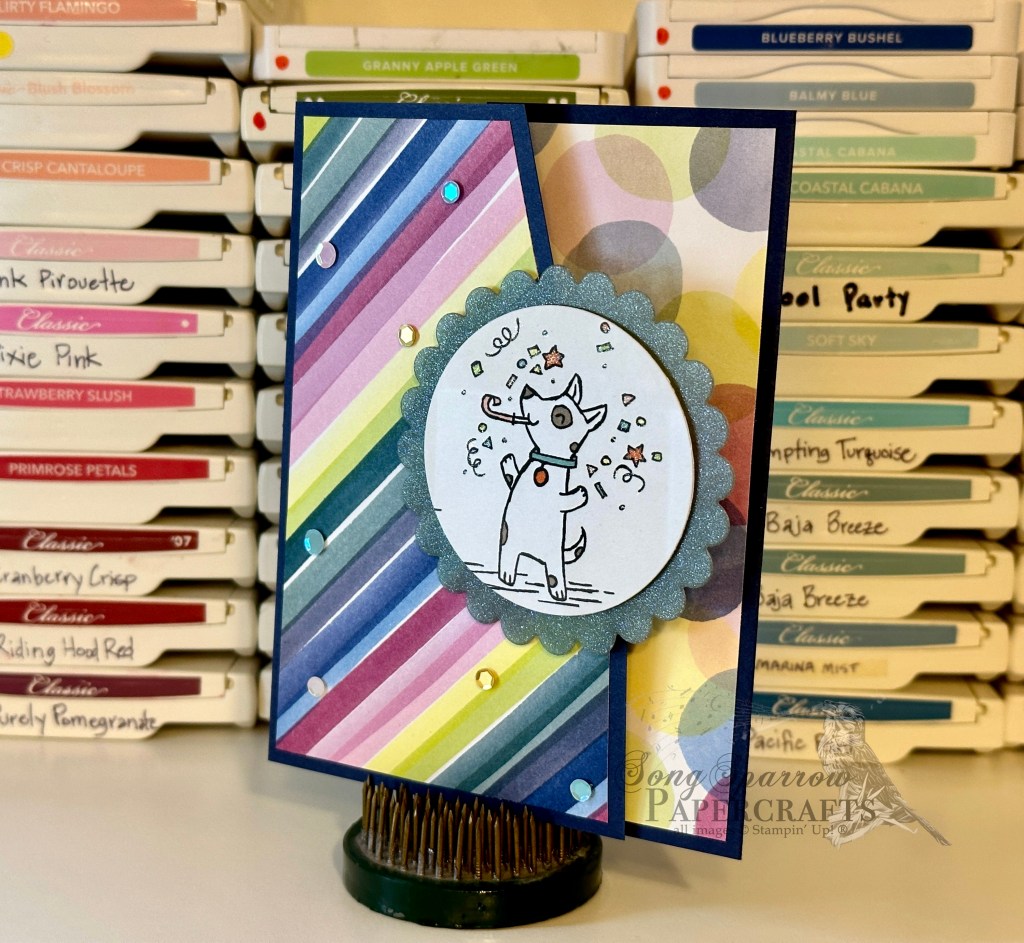
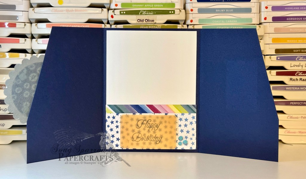
Birthday Confetti angled gate fold: Night of Navy, Basic White cardstock Bright & Beautiful, Zoo Crew DSP Shimmer vellum (retired) Special Moments stamps (retired) Scallop punch Adhesive-backed sequins Wink of Stella Dimensionals Adhesives
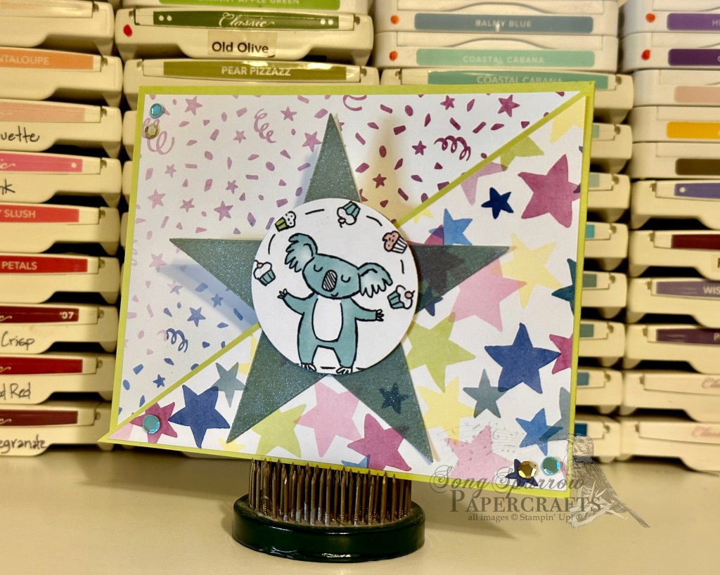
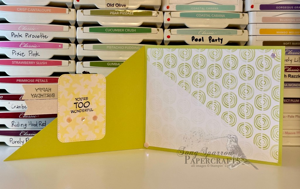
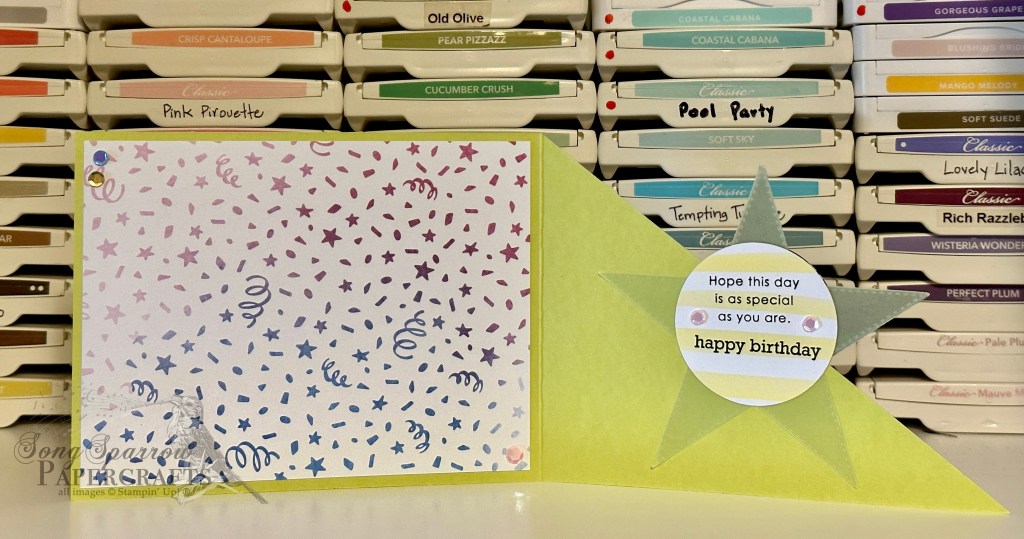
Birthday Balloons angle fold: Lemon Lime Twist, Shimmer White, Granny Apple Green cardstock Bright & Beautiful, Zoo Crew DSP Shimmer vellum (retired) Zany Zoo stamps All That, Nested Essentials dies Adhesive-backed sequins Wink of Stella Dimensionals Adhesives
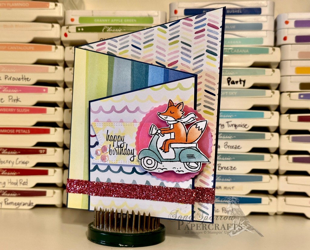
Birthday Fox angled trifold: Night of Navy, Basic White cardstock Bright & Beautiful, Zoo Crew DSP Shimmer vellum (retired) Wink of Stella Pansy Patch stamps All That, Nested Essentials dies Adhesive-backed sequins Dimensionals Adhesives
All ads on this site are posted by WordPress and are based on your personal browsing history. I do not control ad content.
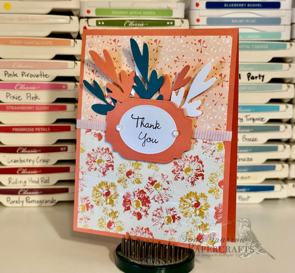
I’ve always found working with patterned paper to be a bit challenging, particularly when working to use multiple patterns in one design. So I decided to challenge myself by creating a pack of cards using multiple patterns on each design. As I tell my son when he encounters a challenge, “practice makes progress.” And naturally, practice also allows us to feel more comfortable within a particular challenge.
I received the SU! Inked Botanicals designer series paper as part of one of my most recent supply orders. I was really drawn to the cheery designs included in this paper pack and how they could lend themselves to all types of occasions. I was also a little surprised to discover that using floral patterns does not necessarily equate to a feminine design. My biggest take-away while designing this card pack is that working with several patterns is easier when you focus on combining smaller and larger patterns into one design. This way, the patterns compliment one another rather than competing for attention.
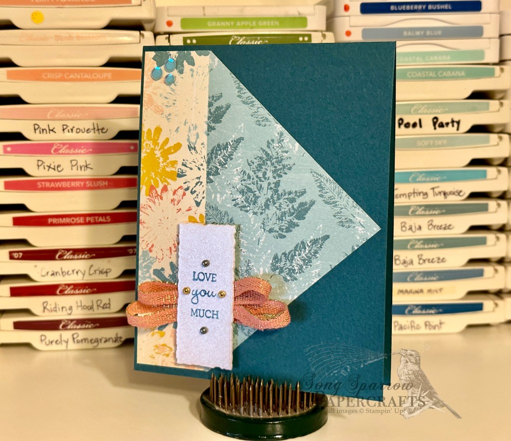
I tried out some new card folds over the weekend. I like to experiment with retired papers so that, if it happens to not go well, I haven’t sacrificed new product in the process of learning a new technique.
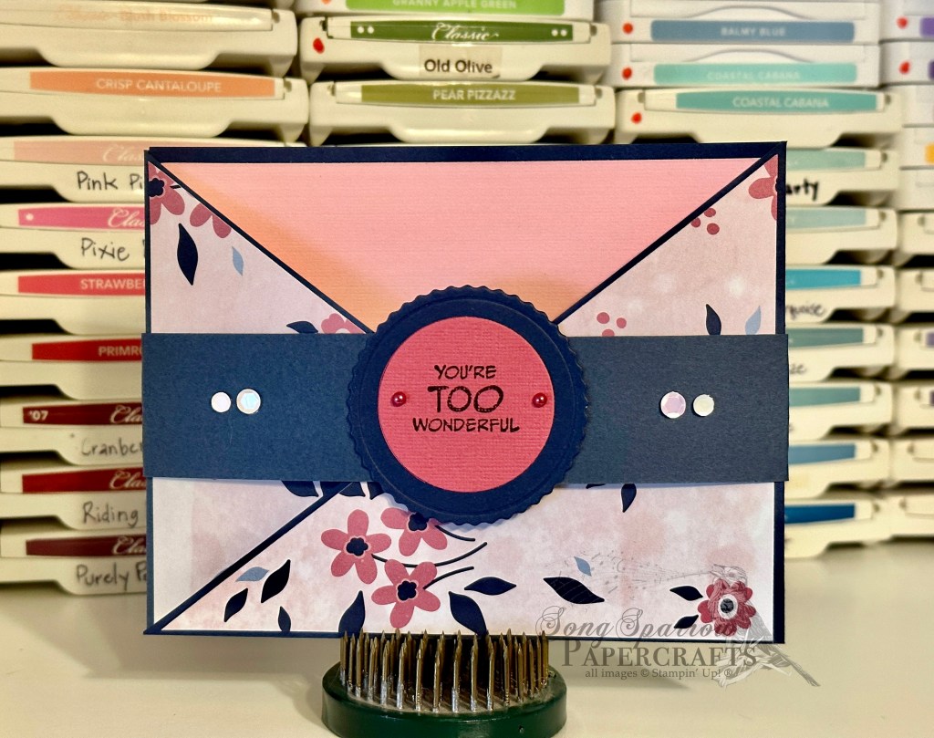
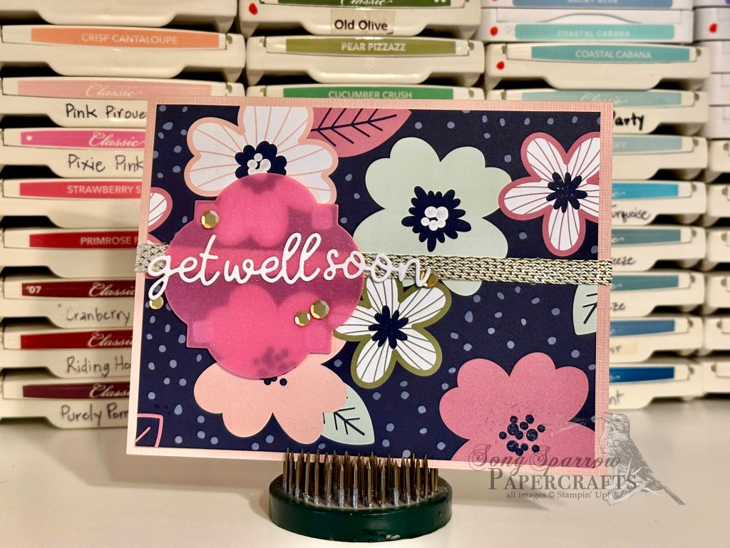
This suite of cards features the Paper Blooms designer paper. I’m especially pleased with the two new foldover designs and will definitely be incorporating these folds on a more regular basis. Both are simple to make and produce stunning designs.
If you’re interested in purchasing any of the designs you see featured here, pop over to my Etsy shop.
Products used: Paper Blooms DSP (retired) Night of Navy, Basic White, Petal Pink, Melon Mambo, Pretty in Pink (retired) cardstock Glimmer vellum Pastel adhesive-backed sequins Festive pearls Wink of Stella
All ads on this site are posted by WordPress and are based on your personal browsing history. I do not control ad content.