Botanicals · Clean and Simple

Pots of Joy

This week, we’re exploring card designs that use botanical images. I love stamp sets that include flowers and greenery but then sometimes find myself stuck for ideas on how to use them. We’re so fortunate to have so many different inspiration forums, and in cases where I’m fresh out of ideas, that’s precisely where I turn.
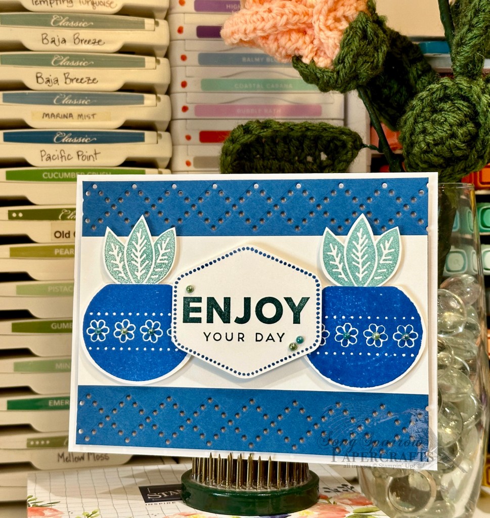
Today’s card design was inspired by a Stampin’ Up! Artisan design. The inspiration card used the lovely argyle detail die from Everyday Details — a die that I have had a really hard time finding a use for — and the lovely Planted Paradise stamp set.

This card design is a built on a base of white cardstock. The focal image panel sits atop a Blueberry Bushel panel where each long edge has been diecut using the argyle die from Everyday Details. A strip of white cardstock serves as the focal image base in the center. The pots and greenery are stamped on separate sheet of white cardstock and then cut with paper snips before being mounted with dimensionals. The sentiment panel consists of the Heartfelt Hellos sentiment that is punched with the coordinating Heartfelt Hexagon punch. I also added an additional layer of dimensionals to the sentiment panel to ensure that it stood above the supporting images. I added Blooming Pearls on the pots and near the sentiment for added detail and to draw the eye across the focal panel.

Yesterday, I mentioned the TIP for stamping crisp images when your photopolymer stamps tend to pool ink and stamp blotchy images. When you’re going for a more vintagey feel, I would definitely allow the ink to pool on the stamps. But if you’re going for a clean look, you’ll definitely want to use that layer of Versamark first before applying your selected colored ink. Today, I elected to use both types of stamped images on my card design so that you could see the difference. Can you spot which stamped elements look more vintage than crisp?

Products used in today’s design:
Blueberry Bushel, Basic White cardstock
Planted Paradise, Heartfelt Hellos stamps
Heartfelt Hexagon bundle
Blooming pearls
Dimensionals
Adhesives

All ads on this site are posted by WordPress.  Song Sparrow Papercrafts is not responsible for ad content.
Botanicals · Clean and Simple

Hello Planter

While I’m always inspired by designs with florals or botanicals, in spring, cards with these images always seem to jump out at me. And lately I’ve saved so many wonderful ideas using the variety of sets Stampin’ Up! has to offer.

Today, we’re using two of my current go-to all-purpose botanical sets — Botanical Layers (soon to retire!) and Planted Paradise. I’m sad to see the Botanical Layers stamp set go. It has a combination of images of common potted plant varieties and some lovely sentiments. And this set pairs beautifully with the Planted Paradise stamp set, which is comprised of just images of leaves and stems (mostly succulents) and some pottery designs. The pottery is mostly larger in scale, so you instantly have a really nice focal image.

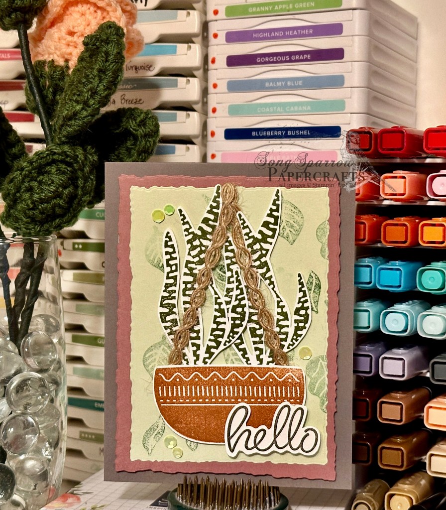
Today’s design starts with a base of Pebbled Path. This is one of the current 2023-25 In Colors, and I’ve only just come to discover how very versatile it is. Pebbled Path is a lovely mix of brown and grey — the perfect neutral. The focal panel consists of a mat of Moody Mauve (another 23-25 In Color) and a background panel of Soft Sea Foam. I used two of the largest nesting sizes of the Deckled Rectangles dies to cut them. Using the Planted Paradise stamps, I created a falling leaf pattern and used it to stamp the background on the Soft Sea Foam panel. To keep the background stamping light, I used the stamp-off method with my Garden Green ink.

For the focal image, I stamped the pottery image from Planted Paradise in Cajun Craze ink on white cardstock and then fussy cut it with a very narrow border. Next, I stamped two snake plant images from Botanical Layers in Mossy Meadow on white cardstock and fussy cut them, as well. I made sure to cut out the white background between the tall fronds to allow more of the background to show through and give a more realistic look to my potted plant. I then stamped the Hello sentiment from the Heartfelt Hellos stamp set in Early Espresso onto white cardstock and cut it out with a narrow border.

I added dimensionals to the back of both the pottery and plant images. Before adhering, I added two longer strips of natural wavy trim on either corner of the pottery and strung it over the top of the panel to create a hanging basket look. I gave an additional layer of dimensionals on the back of the sentiment to ensure it stood above my focal image.

TIP: if you find that your stamps, particularly your photopolymer stamps, are giving you a blotchy-looking image, try adding a layer of Versamark ink first and then your chosen ink color. This will give you a nice, smooth stamped image. That’s what I had to do here for the pottery.

I personally find that I don’t use my botanical sets often enough. Perhaps it’s because, on their own, they’re not the flashy, eye-catching images that we’re drawn to. BUT when we spend a little time with these stamp sets, what we’ll find is very versatile images that make gorgeous card designs — just as eye-catching and appealing as the immediately flashy sets that we’re drawn to more often. I hope that I can show you more of what I mean through this week’s series of botanical cards. I hope you’ll tune in each day!

Products used in today’s featured card:
Pebbled Path, Soft Sea Foam, Moody Mauve, Basic White cardstock
Botanical Layers, Planted Paradise, Heartfelt Hellos stamps
Deckled Rectangles dies
Natural wavy trim
Shiny sequins
Dimensionals
Adhesive

All ads on this site are posted by WordPress.  Song Sparrow Papercrafts is not responsible for ad content.