Howdy, friends! Did you miss me? Last week didn’t exactly turn out as I had planned. I had grand plans for all of last week’s posts and then our schedules just kinda imploded. Between a major office furniture swap out and then a home update project, last week was chocked FULL and I didn’t have anything left for crafts.
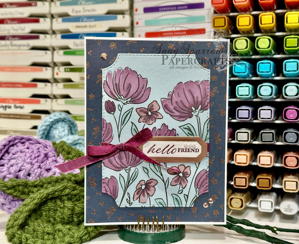
Sooo here we are in a brand new week and I finally get to bring you all the fun ideas I have for this new design theme — the spotlight technique. Typically, this technique will, in some way, repeat a pattern or an image in a fresh, new way. Today, we’re using the elevated coloring method to spotlight a portion of the Flowers Fair stamped image.
We get started with a background of Blackberry Bliss cardstock. The focal panel backdrop is a quarter panel of white cardstock stamped with the Flowers Fair stamp and then cut to size with the largest Perennial Postage die. A second white quarter panel is also stamped with the identical image and then we use one of 2025 Advent Calendar dies to cut out a small portion of the image and then color it with Stampin Blends. The small colored panel is matted with pink shimmer paper and the two are adhered together with dimensionals. We wrap our background panel with pink ribbon before adhering it to our card front with dimensionals. The spotlight panel is adhered in place with dimensionals so it is just above its uncolored counterpart in the image below. The sentiment from the Rolling Waves stamp set is heat embossed in silver on Blackberry Bliss cardstock and then cut out with the Stylish Shapes banner due. Some pink flat pearls in opposing corners finish things off perfectly.
I hope you’ll drop in again to see what other spotlight methods we’ll be using this week!
Welcome to the weekend. I hope you enjoyed some weather as lovely as we did here today. It was spring in every way — warm temps, breezy, and sunny. We got some spring cleaning done both inside and outside today.
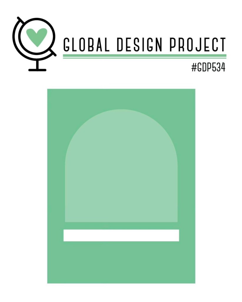
And speaking of spring, this week we’ve been using all the spring flowers to create our projects and using a sketch as design inspiration. Today we’re pairing up the Delicate Dreams paper with a sketch from the gold folks over at the Global Design Project.
We get started with a base of Crumb Cake cardstock. our background panel comes from the Nature Walk paper pack. I used the Everyday Arches dies to create our focal panel. Our mat is a sheet of Misty Moonlight glimmer paper from the Peaceful Garden glimmer pack and then our focal panel is from the Delicate Dreams pack. The panel is wrapped with some white & gold ribbon tied in a decorative knot. The sentiment from the Sentimental Framing stamp set is stamped in Secret Sea on white cardstock and then diecut with the Word of Beauty dies and then adhered at the base of the focal panel with dimensionals. We finish things off with opal rounds and hues of blue flowers.
Thanks for hopping along with me this week. I hope you’ve enjoyed this series.
TGIF — am I right friends? It’s been a long week, but we all made it! I must say I’m lamenting the fact that’s it’s Friday just a little bit, but that’s because my kiddo is gone for the next week. It sure will be quiet around here!
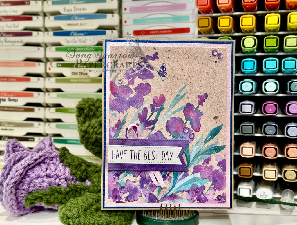
This week, our design them has circled around spring and we’ve been using sketches to get the ball rolling. Today we’re bringing out an oldie but goodie. We’re pairing up the Perennial Lavender paper with a sketch from the good folks over at Freshly Made Sketches.
We get started with a neutral base of Crumb Cake cardstock. Our focal panel from the Perennial Lavender pack is double matted with a combination of garden textures foil paper and shimmer paper. The combination of the dark blue and light pink really bring out the darks and lights of the floral pattern sheet. The banner is cut from a purple sheet from the pack using the Stylish Shapes banner die, which serves as the perfect backdrop for the sentiment. The sentiment from the Cutest Crew stamp set is stamped in Gorgeous Grape on a white banner cut with the smaller banner die from the same set. The two banners are adhered together to form one panel and are then adhered over the pink ribbon with dimensionals. We finish everything off with a scattering of purple shimmer gems.
We’ll be wrapping up our series tomorrow and I hope you’ll drop by to see what pairing finishes things off.
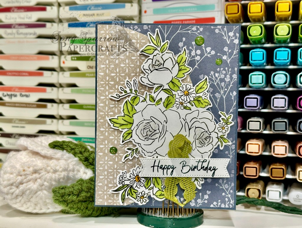
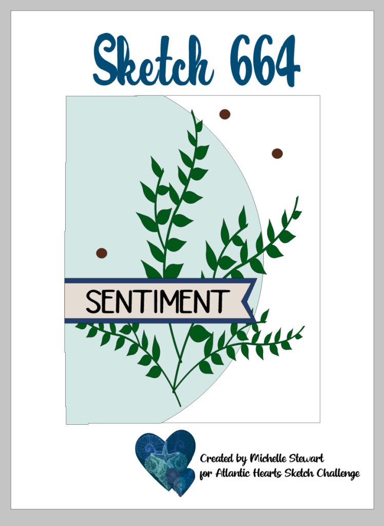
Welcome back! I’m sure glad you stopped by today. This week, our design theme is inspired by spring and we’re pairing up our spring theme with a sketch each day to make it super easy to pull together a card each day. Today we’re using the Peaceful Garden patterned papers and pairing it with a sketch from the folks over at Atlantic Hearts Sketch Challenge.
We get started on our card with a base of Secret Sea cardstock. I chose a more neutral pattern from the Peaceful Garden pack and then a sheet that would compliment my chosen focal image. I placed the busier Secret Sea floral pattern on the bottom and then have the neutral Crumb Cake pattern as the half circle on top. The Layers of Beauty image is stamped in black on white cardstock and then the leaves and daisy centers are colored with Stampin’ Blends. The centers of the roses have a touch of Wink of Stella for a little twinkle. Our focal image is adhered onto the card front with dimensionals. The sentiment from the new Rolling Waves set is stamped in Secret Sea on a white banner that has been cut with one of the smaller banner dies from the Stylish Shapes set. The sentiment is mounted over some Old Olive rickrack with several layers of dimensionals. We finish things off with a few Old Olive sparkle dots.
This one is truly easy to make and such a stunner! I’m going to try it with some other larger floral images in the stash! I hope you’ll drop in tomorrow to see what goodies come to the party next.
Welcome in on this wonderful Wednesday! I’ve been confused about what day of the week it is all day today. I’m pretty sure I’ve called it every day of the week but Wednesday. Not sure what exactly has me turned upside down, but hopefully I’ll keep things straight tomorrow!
This week, we’re exploring the crafty stash to create some spring-inspired cards and we’re using a new sketch each day to get started. Funny enough, Texas weather has decided to send us back to winter and we’re expecting temps back down close to freezing tomorrow morning. This week has truly been a don’t like the weather? just wait a minute kinda situation! So needless to say, I’m dreaming of all the pretty flowers I’ll be buying over the weekend.
Today we’re pairing up the Florals in Bloom paper with a sketch by the good folks over at Atlantic Hearts Sketch Challenge. We get started with a base of Secret Sea cardstock because I really love how the contrast provides an extra pop for our focal panel. The background pattern is a sheet of the Secret Sea patterned paper from the Florals in Bloom pack. Our focal panel is double-matted with a combination of Pool Party shimmer paper and some Berry Burst garden textures specialty paper. I love how this combination really pulls out the colors in the floral pattern sheet of the Florals in Bloom that sits in the center. I used a double twist of the new Berry Burst shiny ribbon as the drop-down element and backdrop for the sentiment. The sentiment is from the new Cutest Crew stamp set and is stamped in Secret Sea on white cardstock and then cut into a banner shape with the Stylish Shapes die. We finish things off with some Berry Burst garden epoxy dots.
I took some liberties with today’s sketch. What do you think of this variation? Can you see where I made some swaps? Do you ever go off the reservation from your inspiration piece? I hope you’ll drop in tomorrow to see what combo we play with next!
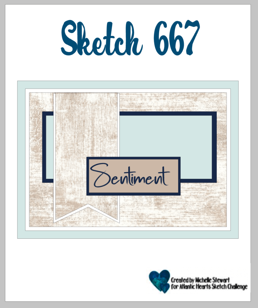
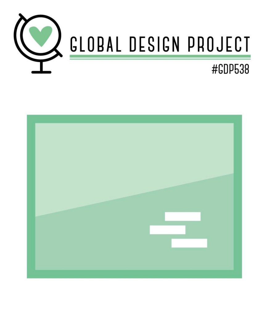
Welcome back, friends! It’s quite the rumbly Tuesday here in our area as another line of spring storms is due to push through. But that’s okay because we’re bringing our own sunshine this week as we make more spring-inspired designs. This week, we’re pulling spring-inspired products from the crafty stash and pairing them up with a daily sketch. Today we’re using our Lovely Blossoms paper and Sketch 538 from the good folks over at Global Design Project. What I love about today’s sketch is it’s a two-for — two cards at once!
We get started with a base of Cloud Cover cardstock. I chose two separate patterns from the Lovely Blossoms paper pack — the Secret Sea diamond pattern sheet and the small white floral pattern. Each pattern piece is cut to fit the card front on its own and then cut on the diagonal. We then mix and match our two patterned halves to create our two card fronts. I used ribbon to add a pop of interest between the two sections and decided to mix it up a bit between the two cards — one of the Cloud Cover wide ribbon and the other is Gray Granite trim. The sentiment from the new Rolling Waves stamp set is stamped in Secret Sea on white cardstock and then cut apart to create our two-part sentiment. I liked the contrast of the white sentiment panel with the darker Secret Sea pattern, so the sentiment stayed with that pattern across the two designs. We finish things off with some embellishments — moody palette glossy dots and opal rounds.
If you’re looking for a great way to turn out a lot of really cute cards for your stash, this sketch should be in your go-to stash! I hope you’ll pop in tomorrow to see what combo we put together next.
Happy Monday, everybody! I hope your week is off to a good start. I feel like the weekend went by in a flash. Anyone else hate the spring time change as much as I do?? I don’t know what it is about springing forward but it just doesn’t sit well with me. My poor body is doomed to be confused by the whole thing for at least another month. But onward and upward, I guess, right?
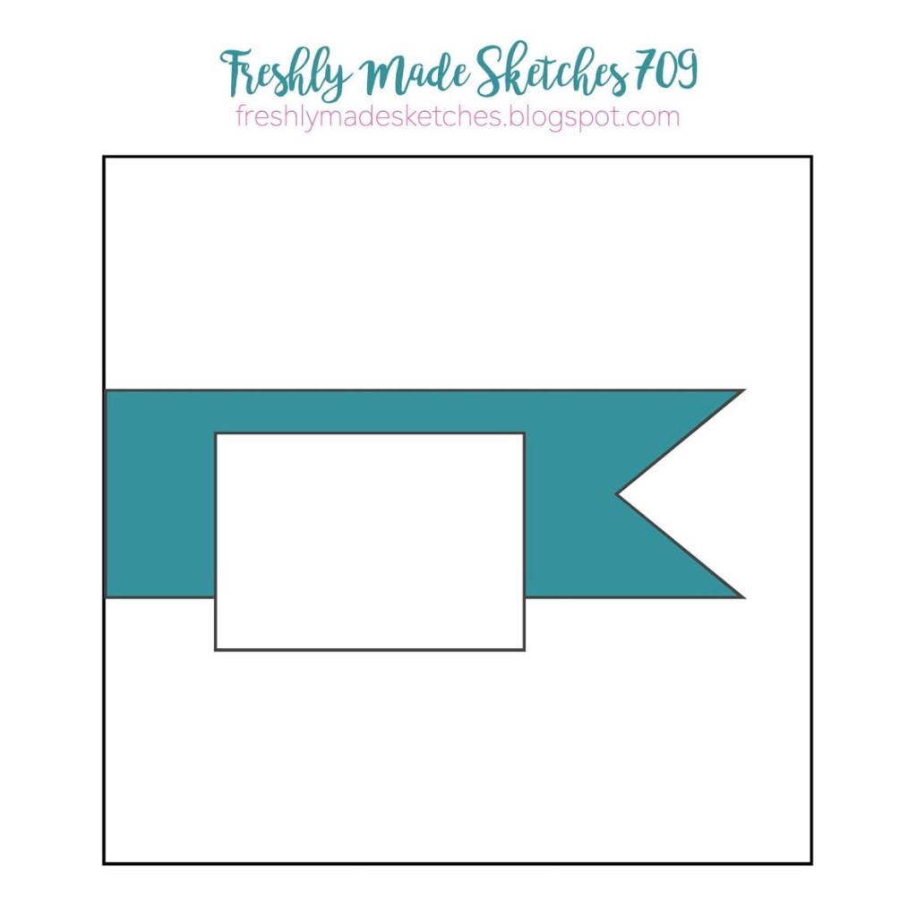
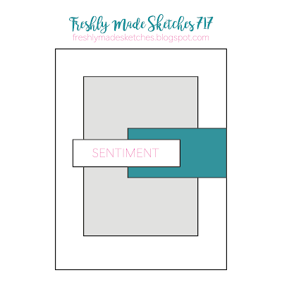
This week we are onward & upward to a new design theme. Except I would more call it a repeat theme with a twist. I enjoyed last week’s florals series in honor of spring so much and had many more ideas I didn’t get to that I decided it needed another week. So here we are enjoying another week of spring florals BUT we’re adding the twist of using a different sketch each day to get started. Today we’re pairing up the Lovely & Beautiful paper with Sketch 717 from the folks over at Freshly Made Sketches.
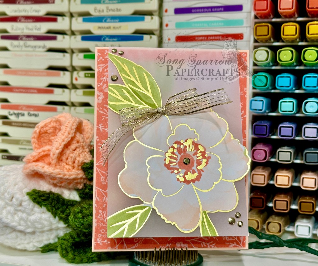
Our beautiful patterned paper is driving the bus on our color scheme today. We get started with a card base of Petal Pink cardstock. Our background is a sheet of the Calypso Coral floral pattern from the Lovely & Beautiful pack. Our front overlay panel is a sheet of vellum that folds over our card front and covers the sentiment panel and has one oversized flower in the center. When the see-through panel is closed, it nicely compliments the smaller foiled floral pattern underneath. We add some metallic gems and gold striped ribbon to this front-facing panel.
The smaller panel is the medium floral pattern with gold foiling and actually serves as our hidden sentiment panel. The sentiment from the With You in Mind stamp set is stamped in Versamark over the center flower in gold and is then heat set. Some pearlized faceted dots are added across the panel to draw the eye down and across.
What do you think of this fun variation on the sketch? I love the breezy feel of this card design. Can’t you just imagine yourself running in a field of wildflowers that are softly blowing in the wind? I hope you’ll drop in tomorrow to see what fun products we put together with our new design sketch!
Welcome to the weekend, everyone! It’s a rainy Saturday here in North Texas. And while I have lots of things on the outside spring to-do list, the indoor activities won out today. I started the day providing music for a funeral and then spent the afternoon at the kiddo’s Academic Pentathlon district meet, where he placed individually in Literature and then took several medals with his team. And before hitting the home to-do list, I’ve stolen a little time in the craft room to bring some of my own sunshine to this overall dreary day.
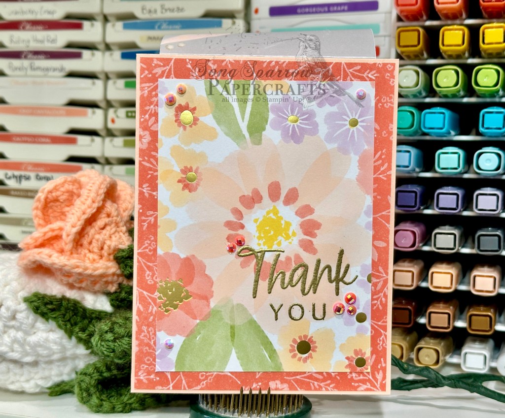
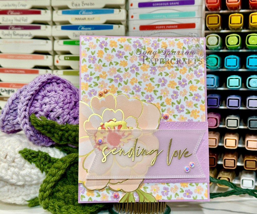
This week, we’ve been letting spring inspire our designs. And today is all about the gorgeous Lovely & Beautiful patterned paper, along with a few other things from the crafty stash, and a sketch as we create this beautiful encouragement card.
Because I’ve got a list of things to do, I wanted to create a beautiful card but without a lot of time spent on designing from the ground up. And what helps the most in those situations? For me, sketches are a must! So we’re using #719 by the Freshly Made Sketches team to make quick work of today’s card.
We get started with a base of Fresh Freesia cardstock. A sheet of the small floral pattern from the Lovely & Beautiful paper pack serves as our background pattern. A strip of Fresh Freesia helps break up our busy patterned background and we spruce it up just a touch by machine embossing our strip with the Beautiful Patterns embossing folder. From a scrap of one of the larger floral patterned sheets from the Lovely & Beautiful pack, I cut a gorgeous peony and adhered it on the left with dimensionals. The sentiment from the Fabulous Sayings stamp set is stamped in Versamark and then heat embossed in gold before being diecut with the Nested Essentials banner die using the extension method to get it just the right size. The vellum sentiment panel is adhered over the flower with mini glue dots. We finish things off with some pearlized faceted gems for just a touch of twinkle.
There are so many more beautiful spring florals in the current Stampin’ Up! lineup that I think we’re going to continue it for one more week. Do you have any current floral-y favorites you’d like to see? Maybe they’re in my stash. Drop me some suggestions in the comments! Until then, see you next week.
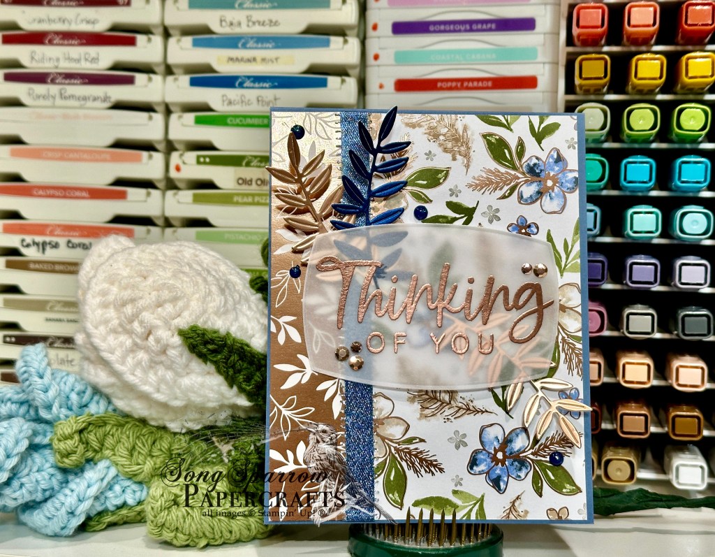
Welcome back for today’s bonus post. This week’s theme is all about spring as things here in my area are certainly starting to feel like spring, including last night’s storms! But with spring showers come spring flowers and isn’t that what we’re all in for?! Today’s bonus card is showcasing more of the Delicate Dreams suite as we pair the Delicate Dreams and Delicate Designs foil papers to create this lovely thinking of you design.
The layout for today’s card uses Sketch 276 from the Freshly Made Sketches team as the starting point. We get started with a base of Misty Moonlight cardstock. Our base layer combines the small blue floral pattern from the Delicate Dreams pack and the leaf pattern from the Delicate Designs pack and then separated with some Misty Moonlight and silver edged ribbon in a faux book binding look. Our focal panel plays double duty as our sentiment panel. The sentiment from With You In Mind is stamped in Versamark on vellum and then heat embossed with copper. The panel is cut with the Label Me Grateful panel die and then adhered over some leaf fronds cut with the same die set from a combination of earthen toned metallic and blue garden textures foil sheets. We finish things off with a combination of metallic gems on our sentiment panel and then blue opal rounds surrounding our focal panel.
This paper is just so beautiful that I keep turning to it. But I promise I’ll be branching out into some other goodies in the crafty stash tomorrow as we continue our spring design series! Hope to see you then!
Edited to add: would you like to know what happens when you get in a hurry to post your card because you’re so excited about how it turns out? You forget to actually insert it in your post. DOH!
Welcome in, friends, on this very soggy day. We experienced some record-breaking rainfall in our area yesterday, which made yesterday’s commute home very interesting and is sure to impact this morning’s commute, as well.
Today is going to be a two-post day since my evening didn’t go quite as planned yesterday — I’ll tell you a bit more about that later. This week, we’re tipping our hats to spring with all of our projects. And today we’re letting the brand new Flowers Fair background stamp and the Delicate Dreams foiled paper take center stage.
We get started with a base of white cardstock. A sheet of the small floral patterned paper from the new Delicate Dreams paper pack serves as the backdrop for our focal panel. The focal panel starts with a quarter-panel of Cloud Cover cardstock where we stamp the new Flowers Fair image in black. Using a combination of Pretty in Pink, Berry Burst, and Lost Lagoon Stampin’ Blend markers, the image is colored in. The panel is cut down to size for our card front using the Branching Out dies. I wrapped some of the new Berry Burst shiny ribbon around the midsection of the panel and then adhered the sentiment panel over it. The sentiment panel starts with a mat of the Earthen Toned metallic paper that is cut with the larger sentiment die from the Words of Beauty set. The sentiment panel is cut from white cardstock with the smaller sentiment die from the same die set. Then we carefully stamp the sentiment using a combination of stamps from the Wonderful Thoughts stamp set using Blackberry Bliss ink. We finish things off with our embellishments — a dash of Wink of Stella to the lighter pink flowers, some smaller iridescent pearls to the sentiment panel, and a few metallic dots on either side of our focal panel.
I really love how this card came together. And this is truly one of those instances where the whole design evolved as I went and pulled new crafty goodness that I wanted to be sure to include.
Now how about a little backstory on how my evening didn’t go to plan. Aside from the exceedingly long and rainy commute home, one of the feral kitties we’ve been feeding finally returned to our porch last night in between bands of rain. Yes, we’re some of those crazy cat people!
She’s quite young — likely approaching her first season — and super friendly. While she’s naturally skittish, if she figures out that you’re one of the nice ones, she sticks to you like glue and just wants all the pets. We’re calling her Ava. So needless to say, we quickly began formulating a plan to try to catch her the next time she appeared so that we could get her vetted, fixed, and put up for adoption through our local rescue group.
Last night, she was being pursued by a suitor in our driveway and I went outside to see if I could call her up. I called once and she came running — suitor hot on her tail….until he caught sight of me. After she snacked for a bit and got lots of pets, I swooped her up and brought her inside with our feral momma kitty who is close to her release date. So she got to stay safe and dry during last night’s torrential rains and we’re now making plans to find her a happy home.
Hopefully this evening will be a little less eventful and I can bring you the card I have in mind for today. As always, thanks for popping in and I hope you’re enjoying this week’s series so far!
Products used in today’s card: Basic White, Cloud Cover cardstock Delicate Dreams, Earthen Toned metallic DSP Branching Out, Words of Beauty dies Flowers Fair, Wonderful Thoughts stamps Stampin’ Blends Wink of Stella Berry Burst shiny ribbon Iridescent basic pearls, metallic dots Dimensionals
![Blackberry Bliss 8-1/2" X 11" Cardstock [ 133675 ]](https://assets1.tamsnetwork.com/images/EC042017NF/133675s.jpg "Blackberry Bliss 8-1/2\" X 11\" Cardstock [ 133675 ]")
![Basic White 8 1/2" X 11" Cardstock [ 166780 ]](https://assets1.tamsnetwork.com/images/EC042017NF/166780s.jpg "Basic White 8 1/2\" X 11\" Cardstock [ 166780 ]")
![Pastels Shimmer 12" X 12" (30.5 X 30.5 Cm) Specialty Paper [ 167198 ]](https://assets1.tamsnetwork.com/images/EC042017NF/167198s.jpg "Pastels Shimmer 12\" X 12\" (30.5 X 30.5 Cm) Specialty Paper [ 167198 ]")
![Flowers Fair Photopolymer Stamp Set [ 167217 ]](https://assets1.tamsnetwork.com/images/EC042017NF/167217s.jpg "Flowers Fair Photopolymer Stamp Set [ 167217 ]")
![Rolling Waves Photopolymer Stamp Set [ 167142 ]](https://assets1.tamsnetwork.com/images/EC042017NF/167142s.jpg "Rolling Waves Photopolymer Stamp Set [ 167142 ]")
![Jet Black Stāzon Ink Pad [ 101406 ]](https://assets1.tamsnetwork.com/images/EC042017NF/101406s.jpg "Jet Black Stāzon Ink Pad [ 101406 ]")
![Versamark Pad [ 102283 ]](https://assets1.tamsnetwork.com/images/EC042017NF/102283s.jpg "Versamark Pad [ 102283 ]")
![Metallics Wow! Embossing Powder [ 165678 ]](https://assets1.tamsnetwork.com/images/EC042017NF/165678s.jpg "Metallics Wow! Embossing Powder [ 165678 ]")
![Perennial Postage Dies [ 162607 ]](https://assets1.tamsnetwork.com/images/EC042017NF/162607s.jpg "Perennial Postage Dies [ 162607 ]")
![Stylish Shapes Dies [ 159183 ]](https://assets1.tamsnetwork.com/images/EC042017NF/159183s.jpg "Stylish Shapes Dies [ 159183 ]")
![12 Days Of Crafting Advent Calendar (English) [ 167335 ]](https://assets1.tamsnetwork.com/images/EC042017NF/167335s.jpg "12 Days Of Crafting Advent Calendar (English) [ 167335 ]")
![Old Olive Stampin' Blends Combo Pack [ 154892 ]](https://assets1.tamsnetwork.com/images/EC042017NF/154892s.jpg "Old Olive Stampin' Blends Combo Pack [ 154892 ]")
![Pretty In Pink Stampin’ Blends Combo Pack [ 163824 ]](https://assets1.tamsnetwork.com/images/EC042017NF/163824s.jpg "Pretty In Pink Stampin’ Blends Combo Pack [ 163824 ]")
![Daffodil Delight Stampin' Blends Combo Pack [ 154883 ]](https://assets1.tamsnetwork.com/images/EC042017NF/154883s.jpg "Daffodil Delight Stampin' Blends Combo Pack [ 154883 ]")
![2024–2026 In Color™ Shimmer Gems [ 163781 ]](https://assets1.tamsnetwork.com/images/EC042017NF/163781s.jpg "2024–2026 In Color™ Shimmer Gems [ 163781 ]")
![Bubble Bath 1/8" (3.2 Mm) Faux Linen Ribbon [ 167075 ]](https://assets1.tamsnetwork.com/images/EC042017NF/167075s.jpg "Bubble Bath 1/8\" (3.2 Mm) Faux Linen Ribbon [ 167075 ]")
![Stampin' Dimensionals [ 104430 ]](https://assets1.tamsnetwork.com/images/EC042017NF/104430s.jpg "Stampin' Dimensionals [ 104430 ]")
![Crumb Cake 8-1/2" X 11" Cardstock [ 120953 ]](https://assets1.tamsnetwork.com/images/EC042017NF/120953s.jpg "Crumb Cake 8-1/2\" X 11\" Cardstock [ 120953 ]")
![Delicate Dreams 12" X 12" (30.5 X 30.5 Cm) Specialty Designer Series Paper [ 167498 ]](https://assets1.tamsnetwork.com/images/EC042017NF/167498s.jpg "Delicate Dreams 12\" X 12\" (30.5 X 30.5 Cm) Specialty Designer Series Paper [ 167498 ]")
![Peaceful Garden 12" X 12" (30.5 X 30.5 Cm) Glimmer Paper [ 165929 ]](https://assets1.tamsnetwork.com/images/EC042017NF/165929s.jpg "Peaceful Garden 12\" X 12\" (30.5 X 30.5 Cm) Glimmer Paper [ 165929 ]")
![Sentimental Framing Photopolymer Stamp Set (English) [ 165475 ]](https://assets1.tamsnetwork.com/images/EC042017NF/165475s.jpg "Sentimental Framing Photopolymer Stamp Set (English) [ 165475 ]")
![Everyday Arches Dies [ 164629 ]](https://assets1.tamsnetwork.com/images/EC042017NF/164629s.jpg "Everyday Arches Dies [ 164629 ]")
![Words Of Beauty Dies (English) [ 167089 ]](https://assets1.tamsnetwork.com/images/EC042017NF/167089s.jpg "Words Of Beauty Dies (English) [ 167089 ]")
![Secret Sea Classic Stampin' Pad [ 165285 ]](https://assets1.tamsnetwork.com/images/EC042017NF/165285s.jpg "Secret Sea Classic Stampin' Pad [ 165285 ]")
![Hues Of Blue Flowers [ 165930 ]](https://assets1.tamsnetwork.com/images/EC042017NF/165930s.jpg "Hues Of Blue Flowers [ 165930 ]")
![Opal Rounds Assortment [ 163298 ]](https://assets1.tamsnetwork.com/images/EC042017NF/163298s.jpg "Opal Rounds Assortment [ 163298 ]")
![White With Gold 3/8" (1 Cm) Ribbon [ 166979 ]](https://assets1.tamsnetwork.com/images/EC042017NF/166979s.jpg "White With Gold 3/8\" (1 Cm) Ribbon [ 166979 ]")
![Perennial Lavender 12" X 12" (30.5 X 30.5 Cm) Designer Series Paper [ 162593 ]](https://assets1.tamsnetwork.com/images/EC042017NF/162593s.jpg "Perennial Lavender 12\" X 12\" (30.5 X 30.5 Cm) Designer Series Paper [ 162593 ]")
![Garden Textures 12" X 12" (30.5 X 30.5 Cm) Specialty Foil Sheets [ 167125 ]](https://assets1.tamsnetwork.com/images/EC042017NF/167125s.jpg "Garden Textures 12\" X 12\" (30.5 X 30.5 Cm) Specialty Foil Sheets [ 167125 ]")
![Cutest Crew Photopolymer Stamp Set (English) [ 167146 ]](https://assets1.tamsnetwork.com/images/EC042017NF/167146s.jpg "Cutest Crew Photopolymer Stamp Set (English) [ 167146 ]")
![Gorgeous Grape Classic Stampin' Pad [ 147099 ]](https://assets1.tamsnetwork.com/images/EC042017NF/147099s.jpg "Gorgeous Grape Classic Stampin' Pad [ 147099 ]")
![Purple Fine Shimmer Gems [ 162611 ]](https://assets1.tamsnetwork.com/images/EC042017NF/162611s.jpg "Purple Fine Shimmer Gems [ 162611 ]")
![Mini Stampin' Dimensionals [ 144108 ]](https://assets1.tamsnetwork.com/images/EC042017NF/144108s.jpg "Mini Stampin' Dimensionals [ 144108 ]")
![Secret Sea 8 1/2" X 11" Cardstock [ 165624 ]](https://assets1.tamsnetwork.com/images/EC042017NF/165624s.jpg "Secret Sea 8 1/2\" X 11\" Cardstock [ 165624 ]")
![Peaceful Garden 12" X 12" (30.5 X 30.5 Cm) Designer Series Paper [ 165917 ]](https://assets1.tamsnetwork.com/images/EC042017NF/165917s.jpg "Peaceful Garden 12\" X 12\" (30.5 X 30.5 Cm) Designer Series Paper [ 165917 ]")
![Layers Of Beauty Bundle (English) [ 163519 ]](https://assets1.tamsnetwork.com/images/EC042017NF/163519s.jpg "Layers Of Beauty Bundle (English) [ 163519 ]")
![Granny Apple Green Stampin' Blends Combo Pack [ 154885 ]](https://assets1.tamsnetwork.com/images/EC042017NF/154885s.jpg "Granny Apple Green Stampin' Blends Combo Pack [ 154885 ]")
![Old Olive 3/8" (1 Cm) Specialty Rickrack [ 167006 ]](https://assets1.tamsnetwork.com/images/EC042017NF/167006s.jpg "Old Olive 3/8\" (1 Cm) Specialty Rickrack [ 167006 ]")
![Clear Wink Of Stella Glitter Brush [ 141897 ]](https://assets1.tamsnetwork.com/images/EC042017NF/141897s.jpg "Clear Wink Of Stella Glitter Brush [ 141897 ]")
![Sparkle Dot Essentials [ 166991 ]](https://assets1.tamsnetwork.com/images/EC042017NF/166991s.jpg "Sparkle Dot Essentials [ 166991 ]")
![Florals In Bloom 12" X 12" (30.5 X 30.5 Cm) Designer Series Paper [ 165175 ]](https://assets1.tamsnetwork.com/images/EC042017NF/165175s.jpg "Florals In Bloom 12\" X 12\" (30.5 X 30.5 Cm) Designer Series Paper [ 165175 ]")
![Berry Burst 1/4" (6.4 Mm) Shiny Ribbon [ 167126 ]](https://assets1.tamsnetwork.com/images/EC042017NF/167126s.jpg "Berry Burst 1/4\" (6.4 Mm) Shiny Ribbon [ 167126 ]")
![Garden Epoxy Dots [ 167124 ]](https://assets1.tamsnetwork.com/images/EC042017NF/167124s.jpg "Garden Epoxy Dots [ 167124 ]")
![Cloud Cover 8 1/2" X 11" Cardstock [ 165621 ]](https://assets1.tamsnetwork.com/images/EC042017NF/165621s.jpg "Cloud Cover 8 1/2\" X 11\" Cardstock [ 165621 ]")
![Lovely Blossoms 12" X 12" (30.5 X 30.5 Cm) Designer Series Paper [ 167168 ]](https://assets1.tamsnetwork.com/images/EC042017NF/167168s.jpg "Lovely Blossoms 12\" X 12\" (30.5 X 30.5 Cm) Designer Series Paper [ 167168 ]")
![Cloud Cover 5/8" (1.6 Cm) Textured Ribbon [ 167182 ]](https://assets1.tamsnetwork.com/images/EC042017NF/167182s.jpg "Cloud Cover 5/8\" (1.6 Cm) Textured Ribbon [ 167182 ]")
![Gray Granite 1/4" (6.4 Mm) Variegated Trim [ 167511 ]](https://assets1.tamsnetwork.com/images/EC042017NF/167511s.jpg "Gray Granite 1/4\" (6.4 Mm) Variegated Trim [ 167511 ]")
![Moody Palette Glossy Dots [ 167180 ]](https://assets1.tamsnetwork.com/images/EC042017NF/167180s.jpg "Moody Palette Glossy Dots [ 167180 ]")
![Mini Glue Dots [ 103683 ]](https://assets1.tamsnetwork.com/images/EC042017NF/103683s.jpg "Mini Glue Dots [ 103683 ]")
![Petal Pink 8-1/2" X 11" Cardstock [ 146985 ]](https://assets1.tamsnetwork.com/images/EC042017NF/146985s.jpg "Petal Pink 8-1/2\" X 11\" Cardstock [ 146985 ]")
![Lovely & Beautiful 12" X 12" (30.5 X 30.5 Cm) Specialty Designer Series Paper [ 166957 ]](https://assets1.tamsnetwork.com/images/EC042017NF/166957s.jpg "Lovely & Beautiful 12\" X 12\" (30.5 X 30.5 Cm) Specialty Designer Series Paper [ 166957 ]")
![Vellum 12" X 12" (30.5 X 30.5 Cm) Specialty Paper [ 167099 ]](https://assets1.tamsnetwork.com/images/EC042017NF/167099s.jpg "Vellum 12\" X 12\" (30.5 X 30.5 Cm) Specialty Paper [ 167099 ]")
![With You In Mind Photopolymer Stamp Set (English) [ 169063 ]](https://assets1.tamsnetwork.com/images/EC042017NF/169063s.jpg "With You In Mind Photopolymer Stamp Set (English) [ 169063 ]")
![Adhesive Backed Metallic Gems [ 163780 ]](https://assets1.tamsnetwork.com/images/EC042017NF/163780s.jpg "Adhesive Backed Metallic Gems [ 163780 ]")
![Pearlized Faceted Circles [ 166978 ]](https://assets1.tamsnetwork.com/images/EC042017NF/166978s.jpg "Pearlized Faceted Circles [ 166978 ]")
![Gold Striped 3/8" (1 Cm) Mesh Ribbon [ 165599 ]](https://assets1.tamsnetwork.com/images/EC042017NF/165599s.jpg "Gold Striped 3/8\" (1 Cm) Mesh Ribbon [ 165599 ]")
![Fresh Freesia 8 1/2" X 11" Cardstock [ 155613 ]](https://assets1.tamsnetwork.com/images/EC042017NF/155613s.jpg "Fresh Freesia 8 1/2\" X 11\" Cardstock [ 155613 ]")
![Beautiful Pattern 3 D Embossing Folder [ 167097 ]](https://assets1.tamsnetwork.com/images/EC042017NF/167097s.jpg "Beautiful Pattern 3 D Embossing Folder [ 167097 ]")
![Fabulous Sayings Photopolymer Stamp Set (English) [ 167972 ]](https://assets1.tamsnetwork.com/images/EC042017NF/167972s.jpg "Fabulous Sayings Photopolymer Stamp Set (English) [ 167972 ]")
![Nested Essentials Dies [ 161597 ]](https://assets1.tamsnetwork.com/images/EC042017NF/161597s.jpg "Nested Essentials Dies [ 161597 ]")
![Misty Moonlight 8-1/2" X 11" Cardstock [ 153081 ]](https://assets1.tamsnetwork.com/images/EC042017NF/153081s.jpg "Misty Moonlight 8-1/2\" X 11\" Cardstock [ 153081 ]")
![Delicate Designs 12" X 12" (30.5 X 30.5 Cm) Specialty Designer Series Paper [ 167509 ]](https://assets1.tamsnetwork.com/images/EC042017NF/167509s.jpg "Delicate Designs 12\" X 12\" (30.5 X 30.5 Cm) Specialty Designer Series Paper [ 167509 ]")
![Earthen Toned Metallic 12" X 12" (30.5 X 30.5 Cm) Specialty Paper [ 165901 ]](https://assets1.tamsnetwork.com/images/EC042017NF/165901s.jpg "Earthen Toned Metallic 12\" X 12\" (30.5 X 30.5 Cm) Specialty Paper [ 165901 ]")
![Label Me Grateful Dies [ 166111 ]](https://assets1.tamsnetwork.com/images/EC042017NF/166111s.jpg "Label Me Grateful Dies [ 166111 ]")
![Misty Moonlight & Silver Edged 1/2" (1.3 Cm) Ribbon [ 165931 ]](https://assets1.tamsnetwork.com/images/EC042017NF/165931s.jpg "Misty Moonlight & Silver Edged 1/2\" (1.3 Cm) Ribbon [ 165931 ]")