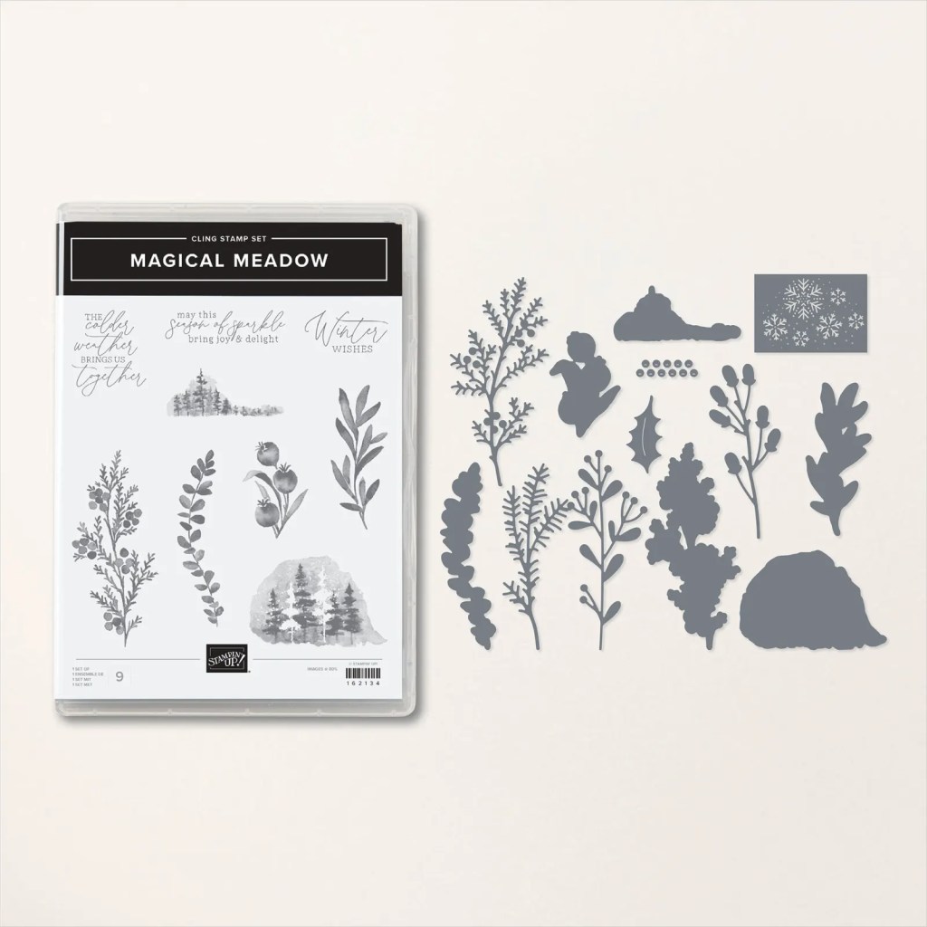
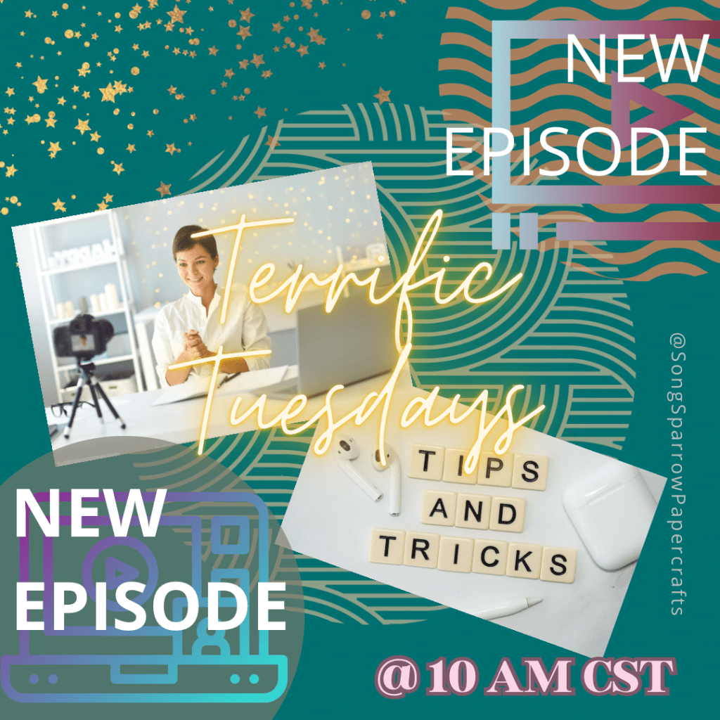
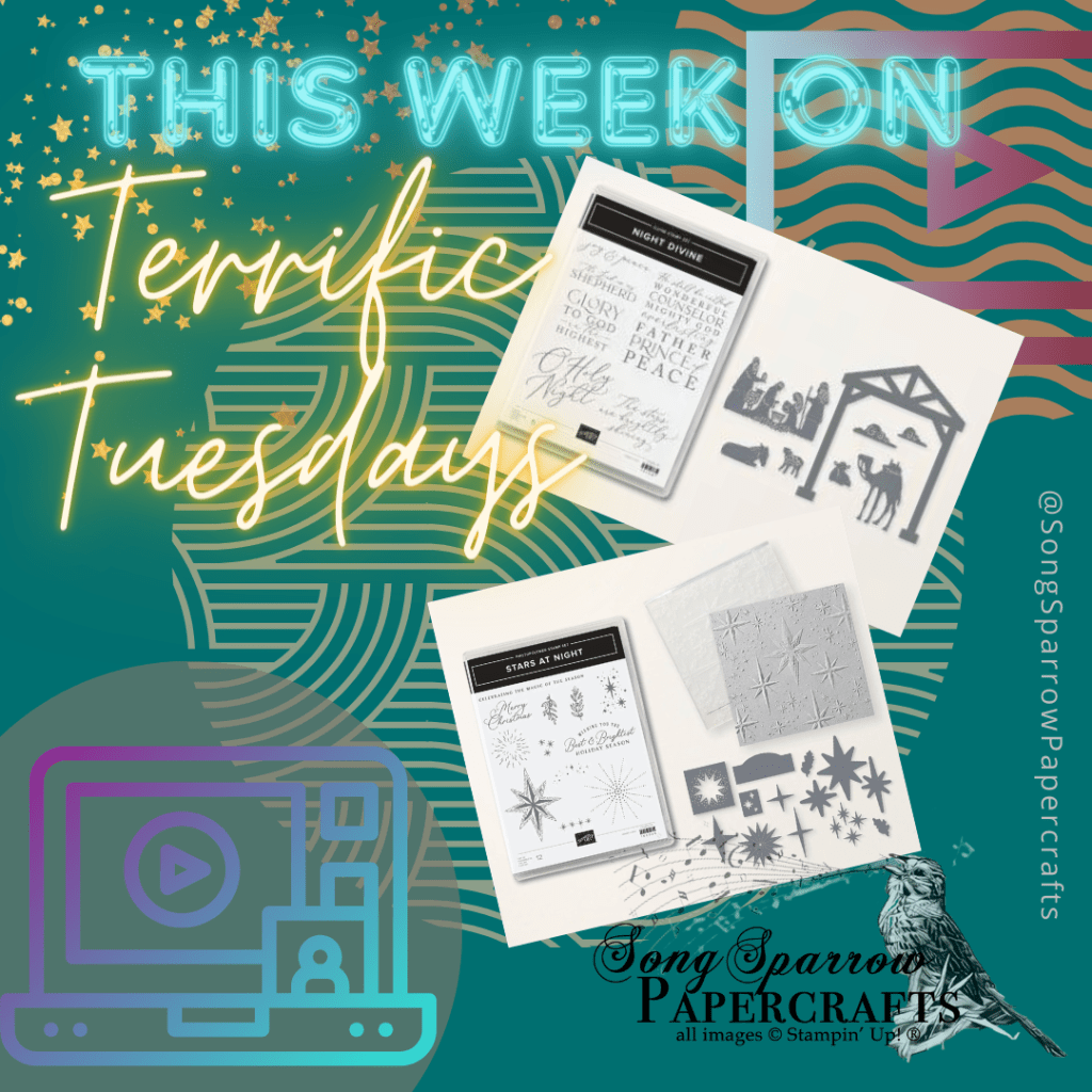
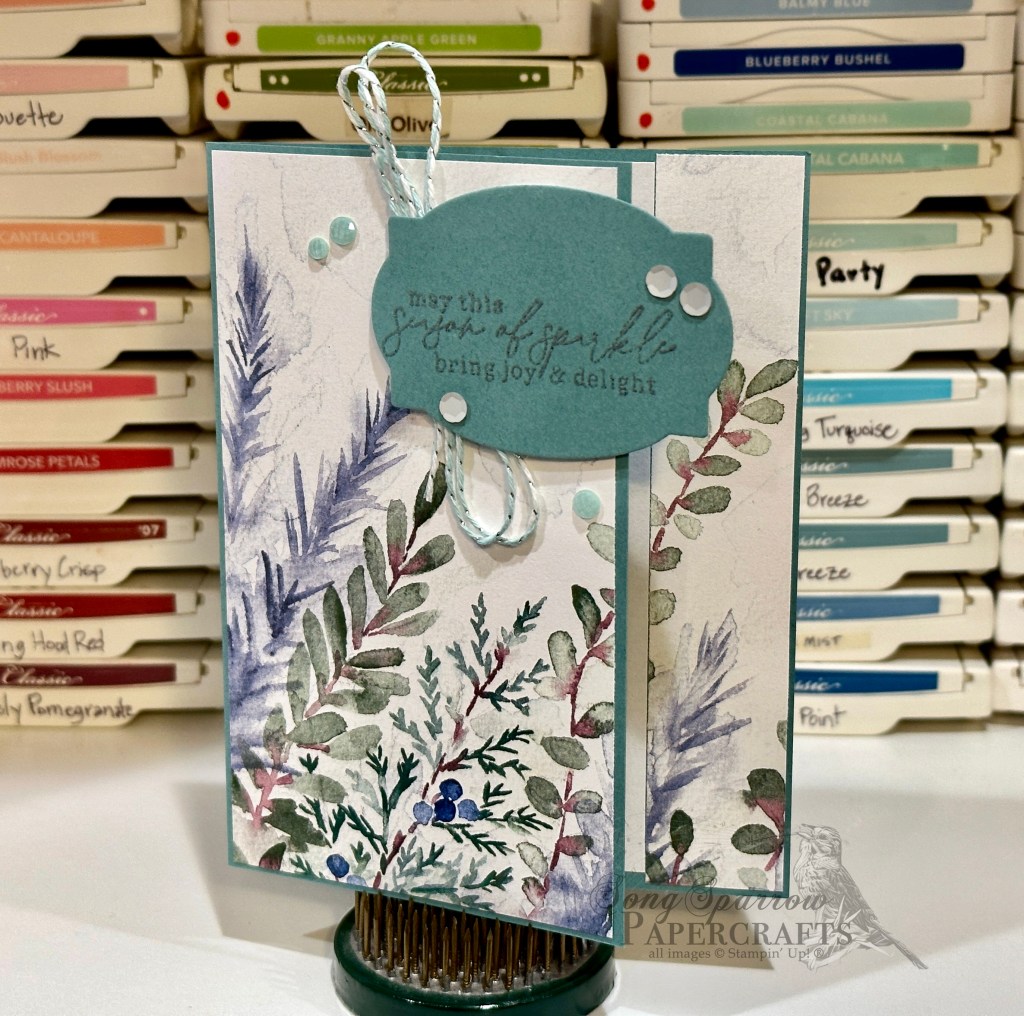
Did you catch yesterday’s episode of Terrific Tuesdays? This week’s episode is all about the Magical Meadow suite of products. Today, I wanted to highlight the gorgeous Winter Meadow designer series paper and show how you need very little else in order to create beautiful projects.
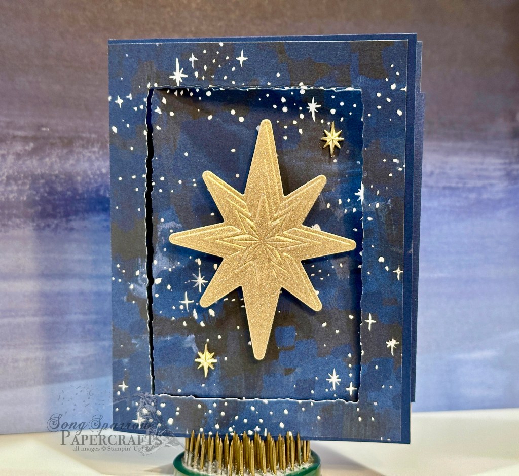
This card design is built on a base of Lost Lagoon cardstock that is cut with a peek-through design. I chose the winter branches pattern from the Winter Meadow paper pack to serve as the focal image for the card. A 1-inch strip is adhered to the message panel on the card base and serves as the peek-through element for this fun fold design. The sentiment panel is diecut from Lost Lagoon using the All That dies. The sentiment from the Magical Meadow stamp set is stamped tone-on-tone. A mixture of matte white sequins, fine sparkle gems, and Silver & Pool Party baker’s twine add a touch of sparkle to the scene.
Would you like to see the designs from this week’s Terrific Tuesdays episode? Check out the full video here:
Tune in the rest of the week to see more projects you can create using this gorgeous suite of Stampin’ Up! products.
Products used in today’s design:
Lost Lagoon cardstock
Winter Meadow DSP
Adhesive-backed sequins
Fine sparkle gems
Silver & Pool Party baker’s twine (retired)
Dimensionals
Adhesives
All ads on this site are posted by WordPress and are based on personal browsing history. Song Sparrow Papercrafts is not responsible for ad content.